



The Flexbox Container is a powerful new feature of the renowned Elementor page builder plugin. It simplifies the process of crafting web layouts with precise alignment and perfect distribution of elements, resulting in design consistency.
This feature also empowers you to overcome the limitations of curating highly responsive, interactive, and flexible layouts. So it is hoped that the Flexbox Container will soon replace the Elementor’s traditional design process in the near future.
In this article, we’ll cover a detailed analysis of how to use Elementor Flexbox Container, its benefits, differences in the features with the section-based design system, and more. Get started without wasting any further time!
What is the Elementor Flexbox Container?
Elementor Flexbox Container uses the CSS Flexbox layout model concept to align and organize elements flexibly. It acts as a parent box because it contains all the elements like text, images, and widgets. Plus, the box also controls the positioning, distribution, and alignment of the elements in it.
In the section box-based Elementor, you can’t create as many sections as you want within a particular section. Plus, you can’t create a mapping for your page at the beginning. You have to design the above parts serially before moving on to the next.
But using the Elementor Flexbox Content, you can create an initial mapping for your pages and then add widgets one by one. You’ll get a feel of website wireframing. As a result, Elementor Flexbox Container is going to be a popular feature within a few days.
Benefits of Using the Elementor Flexbox Container
This feature was in the beta version for a long time. The Elementor developer team did a lot of research and gradually improved the usability before releasing the plugin. Let’s now take a quick look at the key benefits of the Elementor Flexbox Container.
- Flexbox can decrease the need to use too many columns and inner sections.
- This can result in increasing website speed.
- It gives you advanced control in ordering web elements.
- You can add containers within a container as many as you want.
- You can create an initial layout/skeleton with the container and start designing.
- Making web pages responsive becomes super-easy.
Key Differences Between the Traditional Section and New Elementor Flex Containers
There are several key differences between the traditional section and the new Elementor flexbox container in terms of technical, visual, performance, and alignment. Read them below.
a. Technical Differences
In traditional Elementor, you must create a section and divide it into columns, meaning you have to define a grid. After that, you can add widgets and elements. But the problem is you can add only one section inside a section which limits your ability to define personalized grids.
The Flexbox Container is also like a section. But you can place as many containers as you want inside a container. This lets you create personalized grids before adding widgets and elements to your desired posts and pages.
b. Easy to Align Elements
The traditional Elementor offers limited alignment options: left, center, and right. But the Flexbox Container provides more alignment options. You can align content horizontally and vertically to ensure the perfect space distribution among all the elements.
Use the Justify Content options (start, center, end, space between, space around, and space evenly) for vertical alignment. Use the Align Items options (start, center, end, and stretch) for horizontal alignment.
c. Performance Difference
Since personalized grid creation isn’t easy in traditional Elementor, you have to rely on things like z-index, margins, and additional CSS coding. This may cause coad bloat, resulting in slowing down the website page loading speed.
But you don’t have to depend on the same things in the case of Elementor Flexbox, empowering your website to uphold page loading speed. These differences will be clear if you create two complex websites using these two features separately.
How to Use Elementor Flexbox Container (Step-by-Step Guide)
Using Flexbox is almost similar to using the traditional section-based Elementor page builder. So, it won’t take you much time to learn about this feature. In this section, we’ll show you a step-by-step guide on how to use the Elementor Flexbox container.
Step 01: Activate the Flexbox Container in Elementor Settings
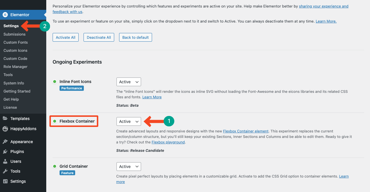
Get into your WordPress dashboard. Navigate to Elementor > Settings > Ongoing Experiments. You’ll get the Flexbox Container by scrolling down the page. Activate the Flexbox Container.
If you feel like activating or deactivating any other feature, you can do this from this page.
Step 02: Use the Elementor Flexbox Container on Your Web Page
Open a page with Elementor from Pages > Add New. Hope you know the process well.
You’ll get the Flexbox Container on top of all widgets on the Elementor panel. You can drag and drop it on the Elementor Canvas as you do in the case of other widgets.
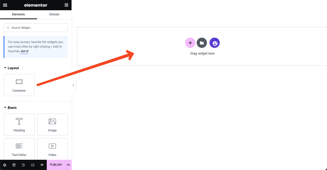
Or you can create a layout by clicking the Plus (+) icon. You’ll get two options Flexbox and Grid. Clicking the Flexbox option, you can create a section of Flexboxes.
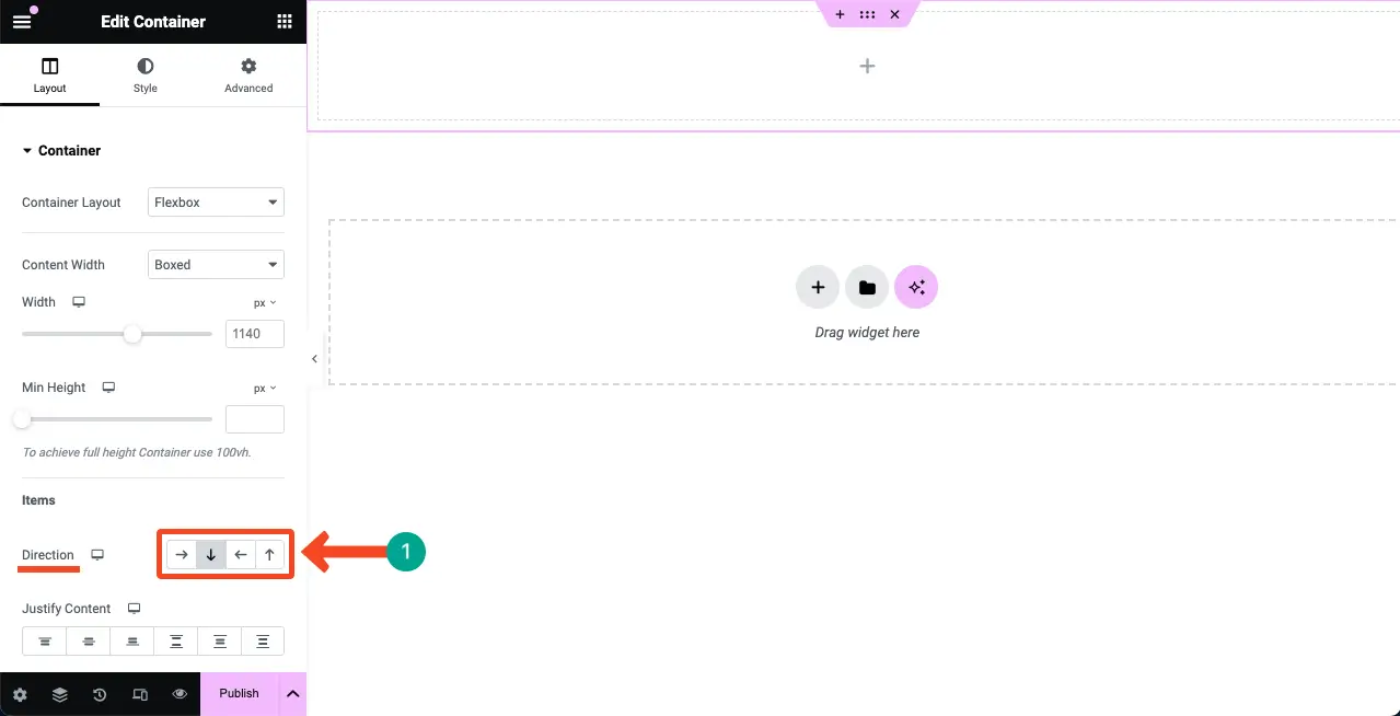
The first two columns are called the directional columns. By selecting them, you can specify whether the content you add to it will be displayed horizontally or vertically.
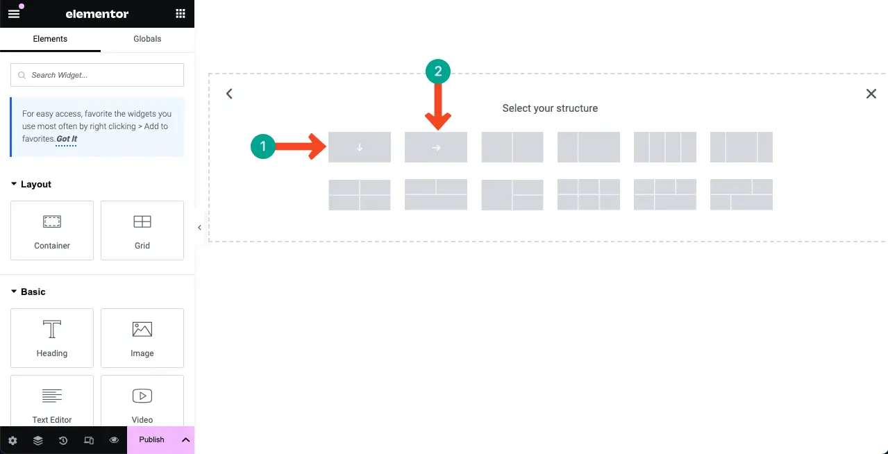
Let’s select the vertically directional column. Add widgets to the area. You’ll see the widgets are coming vertically one after one.
Now, select the horizontally directional column. You’ll see the widgets are coming on the right side of each one.
But no worries. You can change the content direction of any column from the Elementor Panel. Navigate to Layout > Container > Direction. You’ll get the options marked below.
Step 03: Customize the Flexbox Container
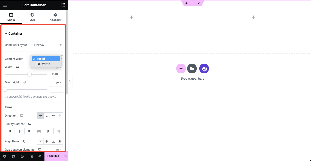
You can make the entire section Boxed or Full Width. After that, you can set your preferred width and minimum height. Touch the alignment sections once you add content and widgets on the flexboxes.
Step 04: Add Widgets to the Flexbox Container
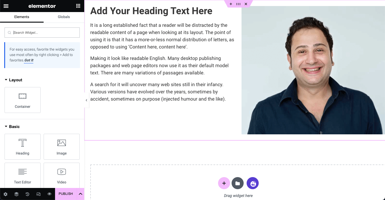
Drag and drop the necessary widgets from the Elementor panel to Flexboxes. This process is similar to the section-based traditional Elementor. For example, we have used the Heading, Image, and Text Editor widgets in the below image.
Step 05: Align the Web Elements
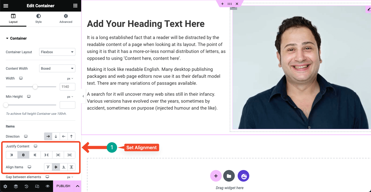
Select the entire section by clicking the six-dotted icon. Next, press the preferred alignment options. Your elements in the area will be aligned in a second. You can also select the flexboxes one by one and align elements in them individually.
Publish the page when you are done designing your web pages.
How to Convert Section-Based Elementor Page to Flexbox Container
Select the section you designed with the traditional Elementor by clicking the Six-dotted icon. You will see a Convert button under the layout section on Elementor Panel. Click the Convert button. It will take a few seconds to complete the process.
Once the conversion is done, you’ll see another copy of the section has been created. The second (copy) section is the converted section. So, keep it and delete the first section by pressing the cross (x) sign. Thus, keep converting all the other sections on the page one by one.
Bonus Point: Use HappyAddons with Elementor Flexbox Container for More Design Opportunities
HappyAddons is a popular add-on to the Elementor page builder plugin. It includes an extensive collection of features and widgets to further power up your Elementor site with more features and functionalities. HappyAddons currently have 125+ widgets and 20+ features.
But what stands out the HappyAddons most is its free theme builder and a huge library of pre-designed templates. If you are looking for a solution to create a header, footer, and single post template without the Elementor Pro version, you must try out HappyAddons.
What’s more! The HappyAddons version provides so many features and widgets that you can use to create more than basic-level websites. You can easily upgrade to its premium version when you start feeling the need for advanced functionalities.
FAQ on How to Use Elementor Flexbox Container
Since the Elementor Flexbox Container is a new addition to Elementor, you may have numerous questions regarding this. We’ll answer some most common and curious questions about the Flexbox Container in this FAQ section.
Is Elementor Flexbox Container a feature or widget?
Elementor Flexbox Container is a feature though you’ll find it on top of all the widgets on the Elementor panel. So, don’t get confused from now on.
Is Elementor Flexbox Container free to use?
Yes, the Elementor Flexbox container is a free feature, coming with the Elementor Lite version.
Can I use the Elementor Flexbox Container with any theme?
Yes, the Elementor Flexbox Container is fully compatible with any WordPress theme. But we recommend you use the Hello Elementor theme to keep your website lightweight.
Is Elementor Flexbox a CSS or bootstrap element?
Elementor Flexbox is a CSS element. It allows you to include a number of elements to be automatically arranged depending on the viewpoint size.
What are the best use cases of the Elementor Flexbox Container?
There are no fixed rules as to where the Elementor Flexbox Container can be used and where not. However, using it is more efficient in cases like hero sections, galleries, theme builder templates, card layouts, etc.
Final Takeaways!
Elementor Flexbox Container is undoubtedly a commendable gift to all WordPress users who want to make their websites better optimized, faster, and perfectly responsive for all devices. And the feature is equally beneficial for part-time web developers as well.
Whether you want to design eCommerce, agency, business, photography, or portfolio websites, the Flexbox Container can definitely save you time a lot. It’s now your time to start using it. Also, don’t forget to leverage HappyAddons and its extensive library.
![Black Friday and Cyber Monday are around the corner, and people are waiting for these festivals to grab the best product deals. That is why giving an attractive look to your website during this festive season is very necessary. But, creating a whole new landing page might be difficult in a short period of time. Don't worry. By using Happy Elementor Addons Black Friday and Cyber Monday Landing Page templates, you can easily develop a whole new landing page in a few minutes. In this today's blog, we are going to show how to boost your website design using HappyAddons templates during this festival season. Before that, we'll talk a bit about these two festivals and why they are important to online business communities. What are Black Friday and Cyber Monday? Black Friday is the immediate following of the famous Thanksgiving day. This is when people start shopping to celebrate the Christmas festival. Since the late 1980s, retail sales on this day have constantly been suppressing the past volumes. See the graph below. Source: Salecycle.com The first Monday following Thanksgiving day each year is called Cyber Monday. It was first introduced in 2005 by the USA National Retail Federation to encourage people to buy online. Though this festival originated in the USA, it is celebrated globally today. See the stats below. Source: Salecycle.com It indicates customers' buying behavior around this day is growing up over time. Many customers today keep a budget to buy products on these two days. So, why won’t you prepare a Cyber Monday landing page if you have an online store? Importance of Designing Landing Pages for Black Friday and Cyber Monday Festival Having a well-design website is one of the major checklists if you are running an online business. Most importantly, you have to make sure that your website remains up-to-date to boost your sales. That is why you need to redesign your website or make a new landing page during the Black Friday and Cyber Monday festivals. Because most online product & service-based businesses promote special deals during these two festivals. Here are some remarkable ways dedicated landing pages during these festivals can positively impact the performance of your online business. Boosts your product salesIncreases conversion rateOpportunity to collect potential email leadsGrabs users' attention toward your siteReduces bounce rateIncreases website visitors. Elementor Black Friday New Seasonal Kit is Already Here! Source: Elementor To make this Black Friday more enjoyable, Elementor has launched a New Seasonal Kit that includes landing pages, sections, pop-ups, and vector assets. All these design elements are made by the Elementor team so that one can easily use them on their website to ensure more sales and conversions. New Elementor Black Friday Seasonal Kit offers: 3 Landing pages6 Sections 6 Popups A collection of stickers & animations You can only get these ready-made Black Friday landing pages and sections if you have Installed Elementor Pro on your site. However, if you are looking for templates that are outside of the box, you can go with Happy Addons, the fastest Elementor Addons on the market. It's very easy to use, flexible and has tons of advanced features and widgets that can ease your website design journey. Also, you'll get several festival landing page templates & blocks. Moreover, you can use free Black Friday and Cyber Monday design blocks and templates to decorate your site. Most importantly, these templates and blocks are easy to customize and can be used for multiple purposes. Now let's see how you can use the Happy Addons templates to design your website according to the Black Friday theme. Pre-Requisites to Use HappyAddons Templates to Design Black Friday and Cyber Monday Landing Pages You must have the following plugins installed on your site to get access to the HappyAddons Template library. Make sure you’ve installed and activated the Happy Addons Free & Premium version of your website. Elementor (Free)Happy Addons (Free)Happy Addons Pro If you are new to Elementor, check this Step By Step Guide For Beginners. If you want to explore the readymade templates of HappyAddons before installing these plugins, you may visit by clicking on the button below. Check out Happy Addons Templates How to Design Black Friday Landing Page on Your Website Once you have the plugins (mentioned above) installed, your website is ready to follow the tutorial guide explained in this section. Get ready now! Step 1: Open a New Page with Elementor Create a new page or open the existing page with Elementor. Next, you have to select the Elementor Canvas option.Unless you select Elementor Canvas, you may watch the header, footer, and unnecessary other texts on the page. These might be irritating to you.Once you open the page with Elementor Canvas, your page will be completely clean. Watch the video below on how to do it. Step 02: Go to HappyAddons Library Click on the HappyAddons Library Icon. It will open up a modal popup. Here you'll find numerous stunning premade Blocks and Pages created by the Happy Addons team. Kindly explore them to create a list of your favorite items. Step 03: Import a HappyAddons Black Friday Template Go to the Page tab on the modal popup.Select Black Friday from the left-side filter option.You will several good-looking templates on your screen.Take your cursor on the one you like and hit on the INSERT button. Wait for a while to finish the installation process. You will get the template on your screen with editable sections and options. Step 04: Set the Black Friday Campaign Deadline A deadline creates a sense of urgency in customers' minds. So, better if you add a deadline section on the page to show your Black Friday deals. The good thing is that if you select the template as we did, you will automatically get a deadline or countdown option. You have to customize it as you want. Step 05: Show Image Carousel Slider on Your Black Friday Landing Page Using the Image Carousel, you can slide show demonstrating discounts on your product categories. Drag and drop the Image Carousel widget on any landing page section. Next, from the Elementor panel, you can add photos and text to the widget. Do it accordingly. Thus, you can add more sections and options on the landing page. Hope you can do it yourself. Step 06: Make the Black Friday Landing Page Mobile Responsive Making a web page mobile responsive with Elementor is super easy. You'll get the mobile responsive option on the Elementor footer section. Clicking on it will open up the option to view your landing page on different device screens. We have explained the process in the video below. Note: Don't delete any widget or section while customizing your landing page for any particular device. Because if you delete a widget or section on any device screen, it will also be applied on other devices. However, you may change their position or alignment or hide them. It won't make any impact on other devices. Step 07: Final Preview of Our Landing Page Here is the final interface of our Elementor Black Friday landing page that we've designed using the Happy Addons' ready-made Template. Get Happy Addons to Add a Black Friday Theme Landing Page on Your Website How to Design Cyber Monday Landing Page on Your Website You will require the same prerequisites (Elementor and HappyAddons Plugins) to design the Cyber Monday landing page on your website. Hope you have them ready on your website. Now, let's get into the tutorial part. Step 01: Import a Cyber Monday Readymade Landing Page Template Go to the HappyAddons Template library.Choose the Cyber Monday template you like.Click on the INSERT button. Wait for a while to finish the installation process. You'll get a page design like the following image below. Step 02: Edit Different Sections of the Page In the first tutorial, you saw the deadline/countdown option was already embedded in the template. But this template doesn't have it. So, you can bring it to your page? Very simple. Create a new section by clicking on the plus icon.Type Countdown on the Elementor search bar.Drag and drop the widget on the section. Customize the Countdown section from the Content and Style tabs of the Elementor panel. Using the Heading widget, we have added the FLASH DEALS text next to the countdown to make it more meaningful. Thus, you can use other exciting widgets on the template to make your landing page super gorgeous. Step 03: Promote Products on the Landing Page Promotional landing pages usually include a section to showcase some hot-selling products to generate instant sales. Using the Image and Button widgets, we have created this section under the FLASH DEALS.You may customize it more as you wish. Step 04: Make it Mobile Responsive We already showed you the process in the first tutorial on making a mobile web landing page responsive. Hope you can do it here as well, following the same guideline. Click on the Responsive Mode icon and do the rest yourself. Bonus: Black Friday and Cyber Monday Landing Page Design Key Considerations Whenever you design a landing page, you need to consider why you need to design this page and what elements they should keep on the page. Because if you are not adding all the necessary features to your page, it will not serve its purpose. This is why you need to focus on a few things before designing your Black Friday landing page. Here are some points you must consider in designing Black Friday and Cyber Monday landing pages. Add Black Friday textSet deals deadlineShow your best-discounted productsAdd coupon code Focus on responsive page designMake your page visually appealingImprove your page user experience or page structureSet a proper website navigation FAQ on Black Friday and Cyber Monday Landing Page Design Now, we'll answer some common questions on Black Friday and Cyber Monday Landing page designs commonly found online. How much does it cost to design a landing page?The cost of designing a landing page varies depending on the complexity of the design, the level of customization required, and whom to hire for the page. A simple landing page can be designed for as little as $25, while a more complex design with multiple customizations can cost upwards of $2,00.However, if you have Elementor and HappyAddons installed, you can design unlimited landing pages at a minimal cost. But like any other tool, you must have a kind of enterprise on them. As they are drag-and-drop builders and their numerous tutorials and documentation are available, they won't take you more than a month to be used to. Check out some wonderful YouTube tutorials on these two plugins. Hope you will enjoy them.How many hours does it take to design a landing page?It mainly depends on the level of design complexity and your web design skill. However, both in Elementor and HappyAddons, you will get countless readymade templates and block sections. You can design a beautiful landing page in 3-5 hours by making a proper combination of them.Can I design Black Friday and Cyber Monday Landing pages with Elementor and HappyAddons free versions?Surely, you can design Black Friday and Cyber Monday Landing pages with Elementor and HappyAddons free versions. But only with the pro versions, you can't add too many exciting features to your pages. For example, free versions will give you access to only a limited number of readymade templates.If you are just a beginner-level designer, free versions are enough. But if you are a professional designer or have a web designing agency, pro versions are a must. Are You Ready To Design Your Black Friday and Cyber Monday Landing Page? Customers look forward to this kind of occasion to buy their favorite products at a minimum price. Naturally, they are drawn to websites that look good and give a festive vibe. That is why adding a Black Friday and Cyber Monday landing page during the festival season will give you an extra edge over the competitors. The above guide shows how to design your Elementor Black Friday Landing page using the Happy Addons' Black Friday Templates and how it can help boost your holiday sales. So if you have any queries regarding this blog, you can comment on us in the below box. If you like this post, then share it on your social channel. Don't forget to subscribe to our newsletter. Also, follow our Facebook and Twitter channels for regular updates. Subscribe to our newsletter Get latest news & updates on Elementor [yikes-mailchimp form="1"] ":36560} /--](https://happyaddons.com/wp-content/uploads/2021/11/How-to-Design-Black-Friday-and-Cyber-Monday-Landing-Page-300x188.png)
2 Responses
Did happyaddons convert all of the demo content/blocks over to flexbox containers for seamless copy and paste experience?
Hello Rod,
Thanks for sharing your concern.
As per our testing you can convert the old section items. As we follow the common style of the Elementor.
If you face any issue don’t hesitate with our support team.
[email protected]
Thanks and regards,
Gobinda