


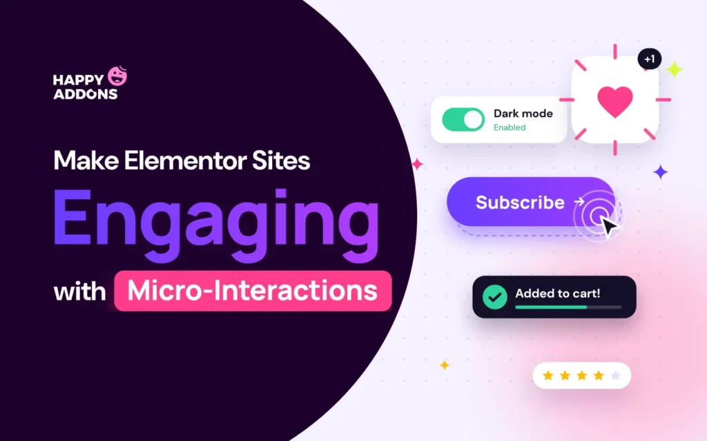

Micro-interactions are the tiny responses a website gives when a visitor does something. A button changes color on hover, a card lifts a little, or a tooltip explains an icon before anyone has to ask.
They look small, but they do a big job. They tell visitors what is clickable, confirm that an action worked, and make the whole site feel polished and alive. One of the most common questions our support team gets is how to add these effects in Elementor without writing CSS or JavaScript.
Elementor is one of the most user-friendly drag-and-drop page builders, and with the right addon, these effects take only a few clicks. In this blog post, we’ll show you how to make Elementor websites more engaging with micro-interactions, step by step. Let’s get started!
What Are Micro-Interactions?
A micro-interaction is a small, single-purpose moment of feedback. It starts when the visitor does something and ends when the page responds. Every micro-interaction has four parts.
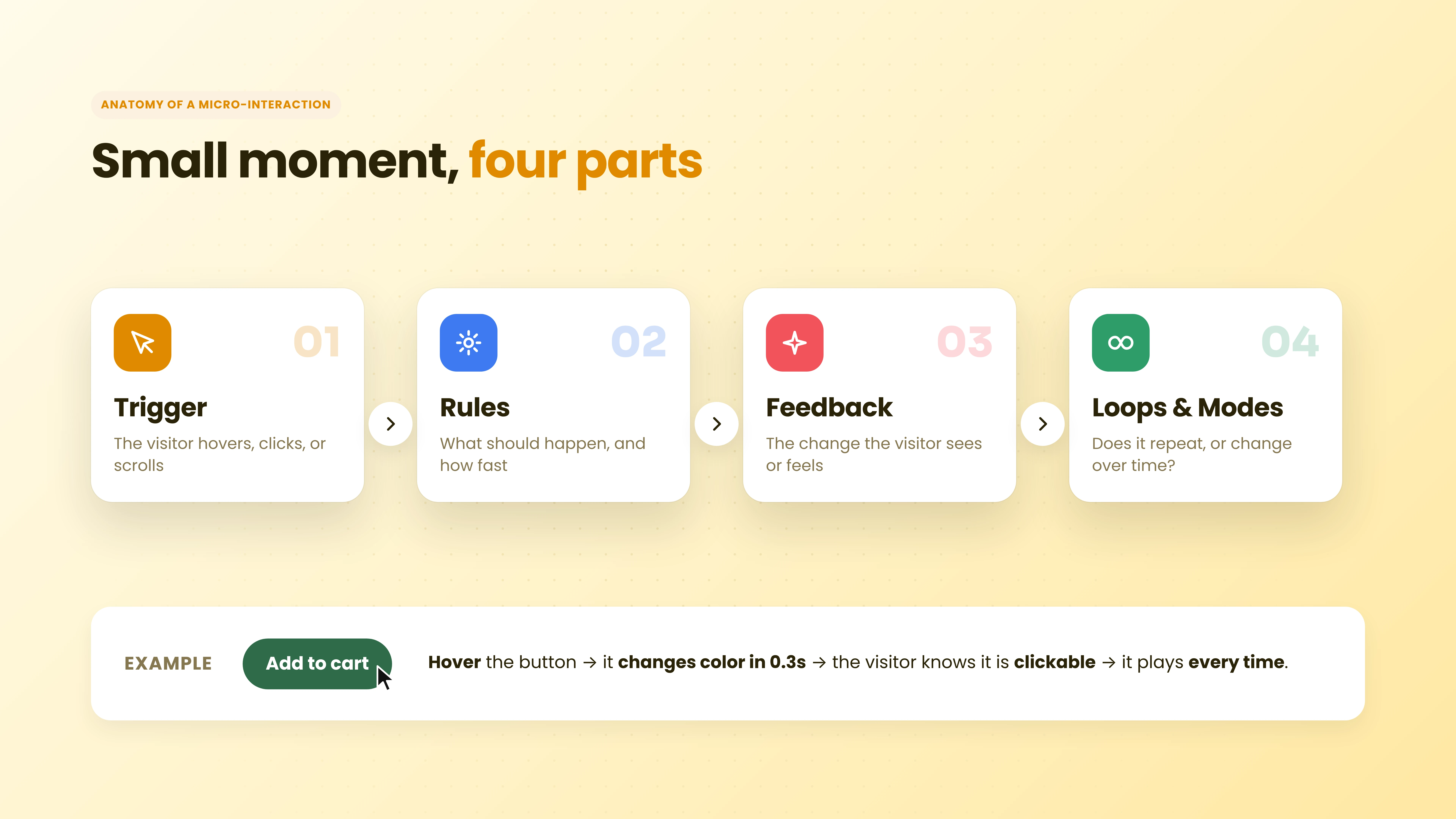
a. Trigger
The trigger is what starts the micro-interaction. Most often it is the visitor hovering, clicking, or scrolling. It can also be the page itself, like a progress bar that moves as the visitor reads.
b. Rules
Rules decide what happens after the trigger. For example, the button turns dark green, the card moves up 12 pixels, or the tooltip appears above the icon. In Elementor, you set these rules in the widget panel.
c. Feedback
Feedback is the change the visitor actually sees. A color shift, a small movement, or a short message tells the visitor that the page noticed them, so they know they are on the right track.
d. Loops and Modes
Loops and modes decide whether the effect repeats or changes over time. A floating badge loops forever, while a hover effect plays every time the mouse enters and returns to normal when it leaves.
Why Micro-Interactions Make Your Website More Engaging
A page without any feedback feels flat. Visitors have to guess what to click and whether something worked. Micro-interactions remove that guessing in five ways.
a. They Show What Is Clickable
When a card changes color or a cursor turns into a “View” label, visitors instantly understand that the element does something. This simple signal helps them explore more of your site with confidence.
b. They Guide Attention
A gentle float on a badge or a magnetic pull on a button draws the eye to what matters most. You decide where visitors look first, without adding more text or louder colors to the page.
c. They Reduce Confusion
Tooltips answer small questions right where they come up. Visitors don’t need to open a new page or a popup to understand an icon, a feature, or a policy, so fewer of them leave confused.
d. They Make Long Pages Easier
A reading progress bar shows how much is left, and a scroll to top button brings visitors back up in one click. Both make long pages and blog posts much easier to move through.
e. They Add Brand Personality
The way your buttons move and your cards react says something about your brand. Soft and calm effects feel friendly, while bold and snappy ones feel modern. Small details make a site memorable.
How to Make Elementor Websites More Engaging with Micro-Interactions (Step by Step)
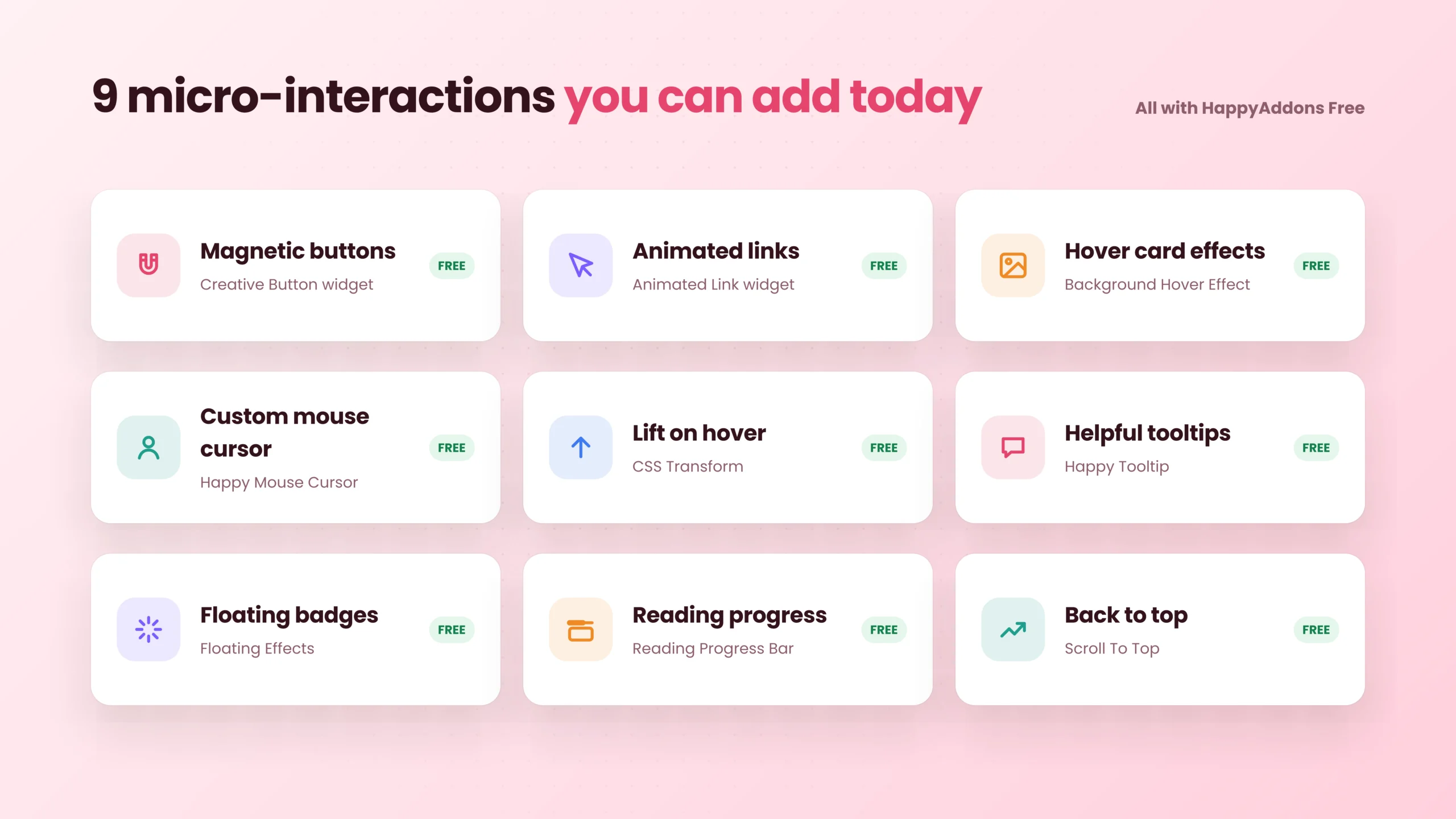
Elementor gives you basic hover colors and entrance animations. For effects like magnetic buttons, custom cursors, hover lifts, tooltips, and progress bars, you need custom code or an addon.
HappyAddons is a GSAP-powered Elementor addon with 160+ widgets and 40+ features. Every micro-interaction in this tutorial is available in the free version, so you don’t need to pay for anything to follow along.
Prerequisites
- Elementor (Free)
- HappyAddons (Free)
For the tutorial, we built a demo homepage for Fernly, a made-up plant shop. You can follow the same steps on any page of your own site. Once these plugins are ready on your site, start following the tutorial explained below.
Step 01: Turn On the Features and Widgets You Need
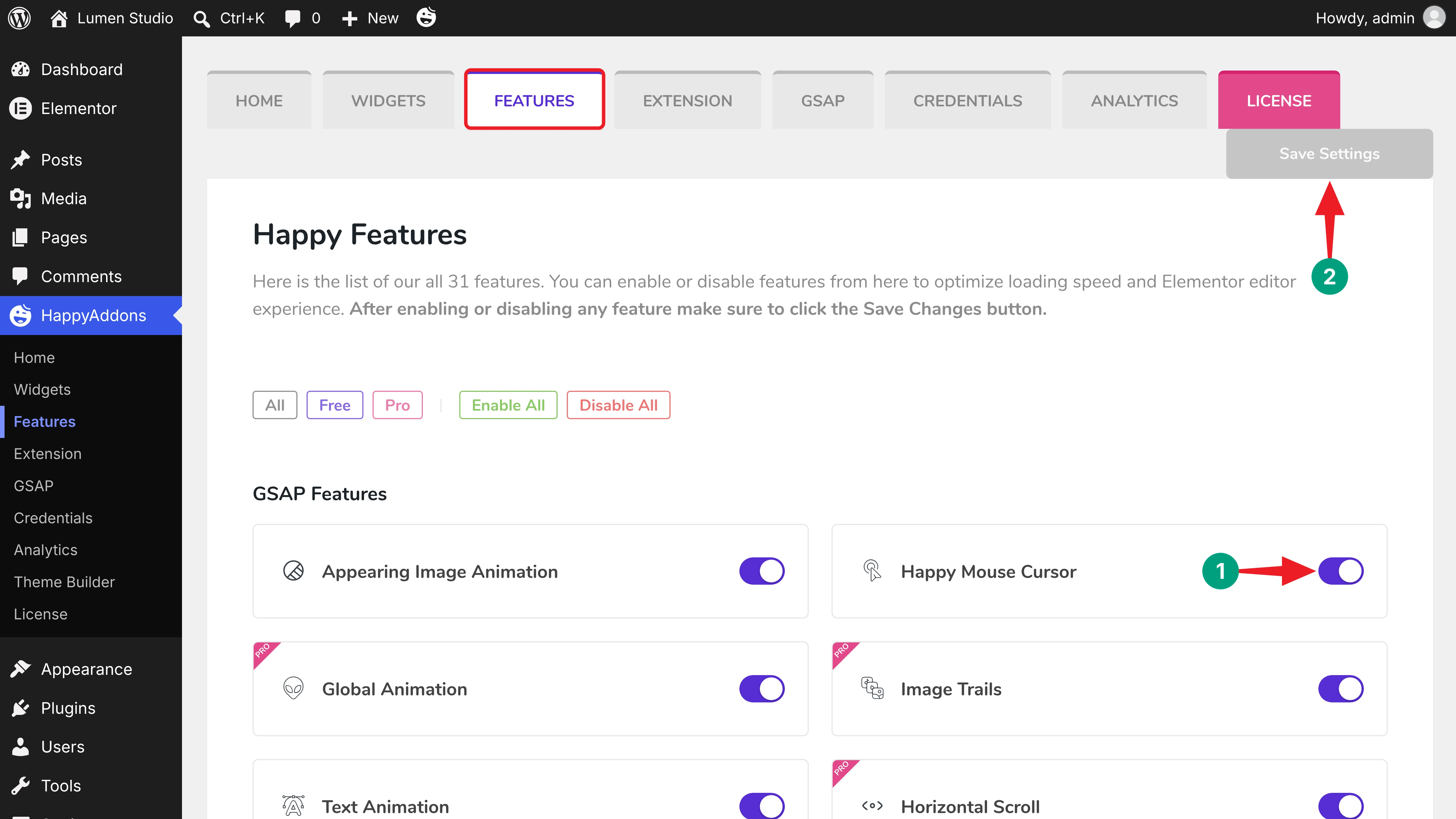
All HappyAddons features are on by default. If you turned some off earlier, here’s how to enable them again. Navigate to HappyAddons > Features from your WordPress dashboard. Make sure Happy Mouse Cursor is on, then click the Save Settings button.
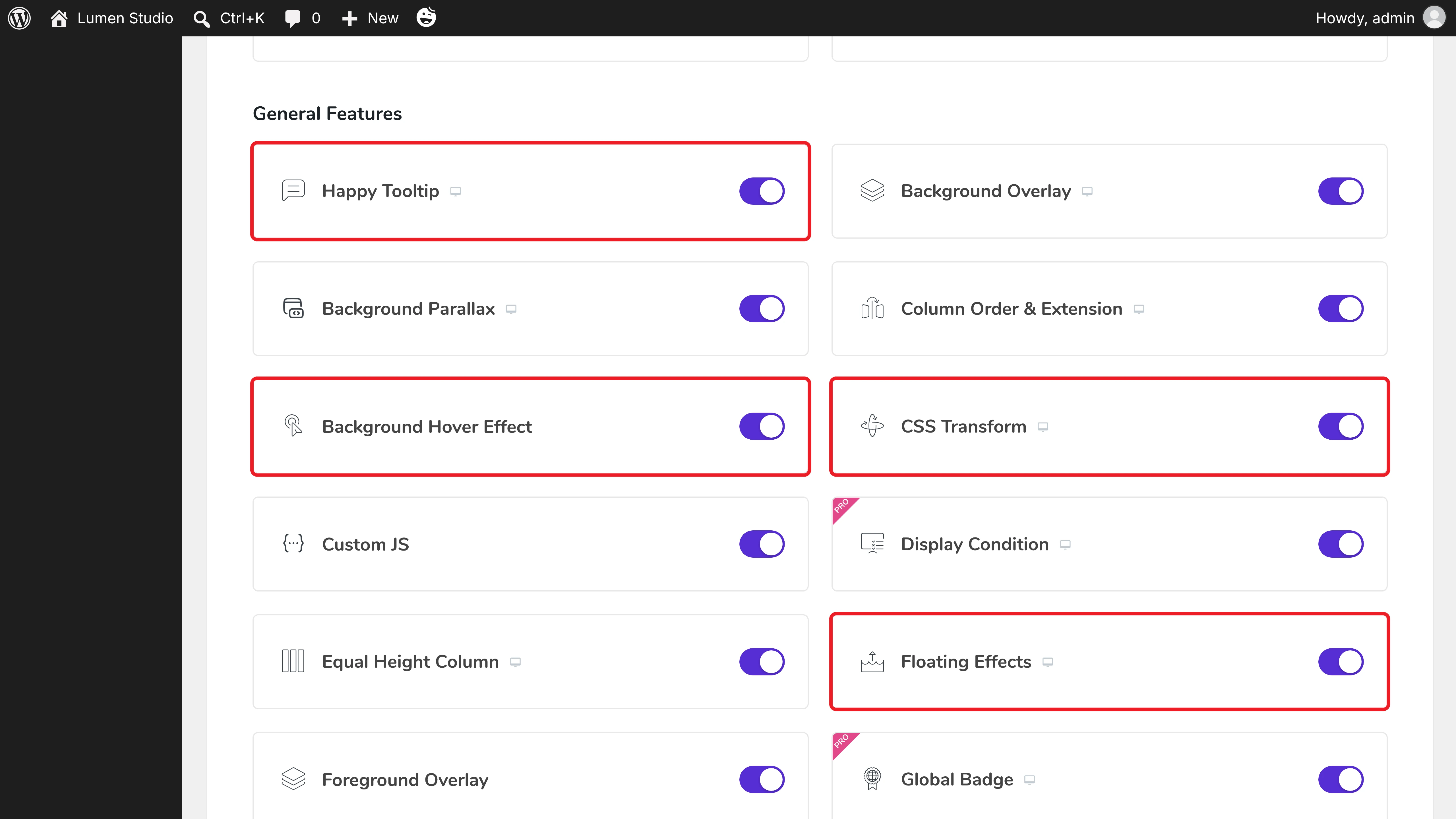
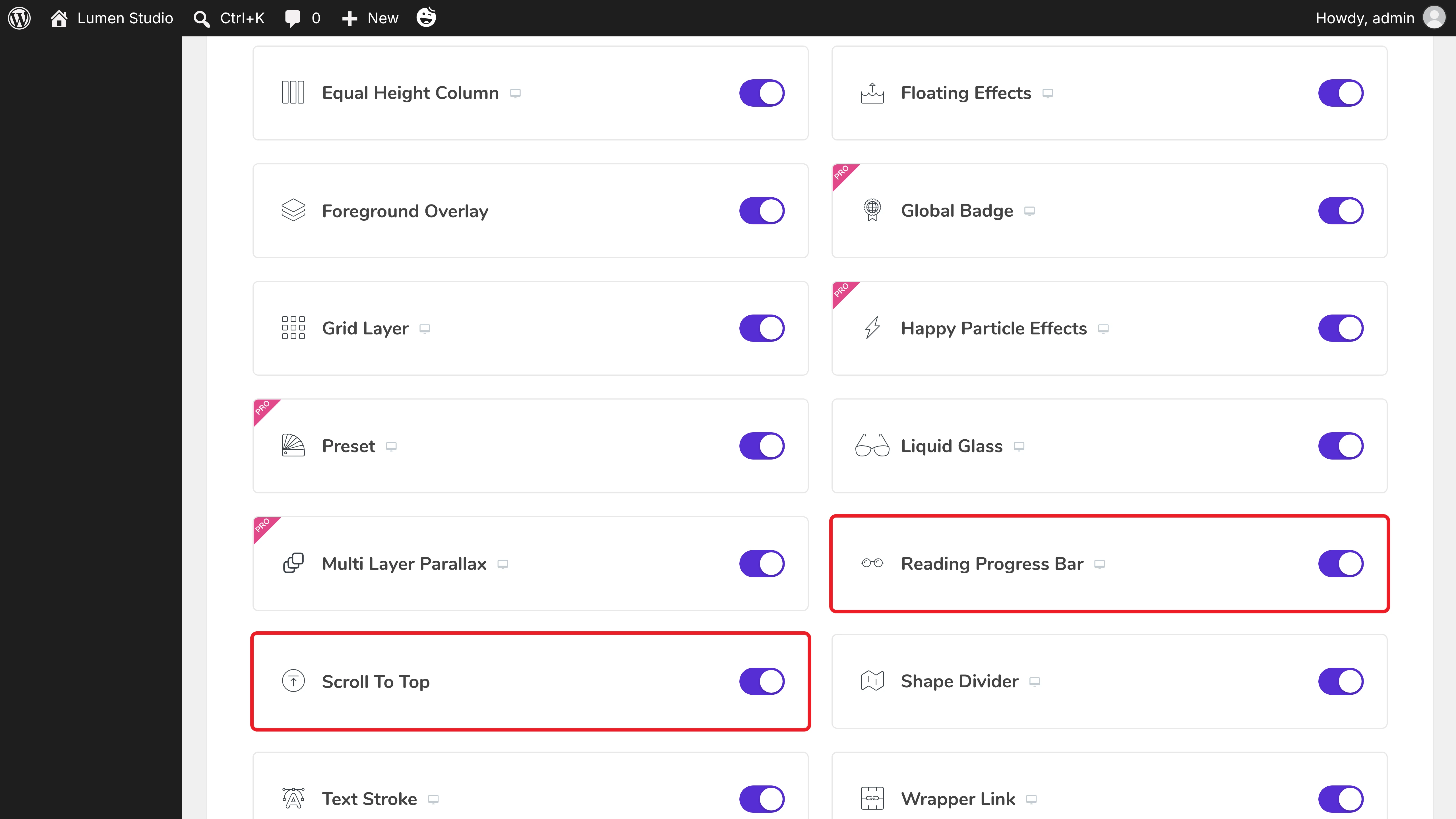
Scroll down to the General Features list. Toggle on Happy Tooltip, Background Hover Effect, CSS Transform, and Floating Effects.
In the same way, toggle on Reading Progress Bar and Scroll To Top. Then save the settings.
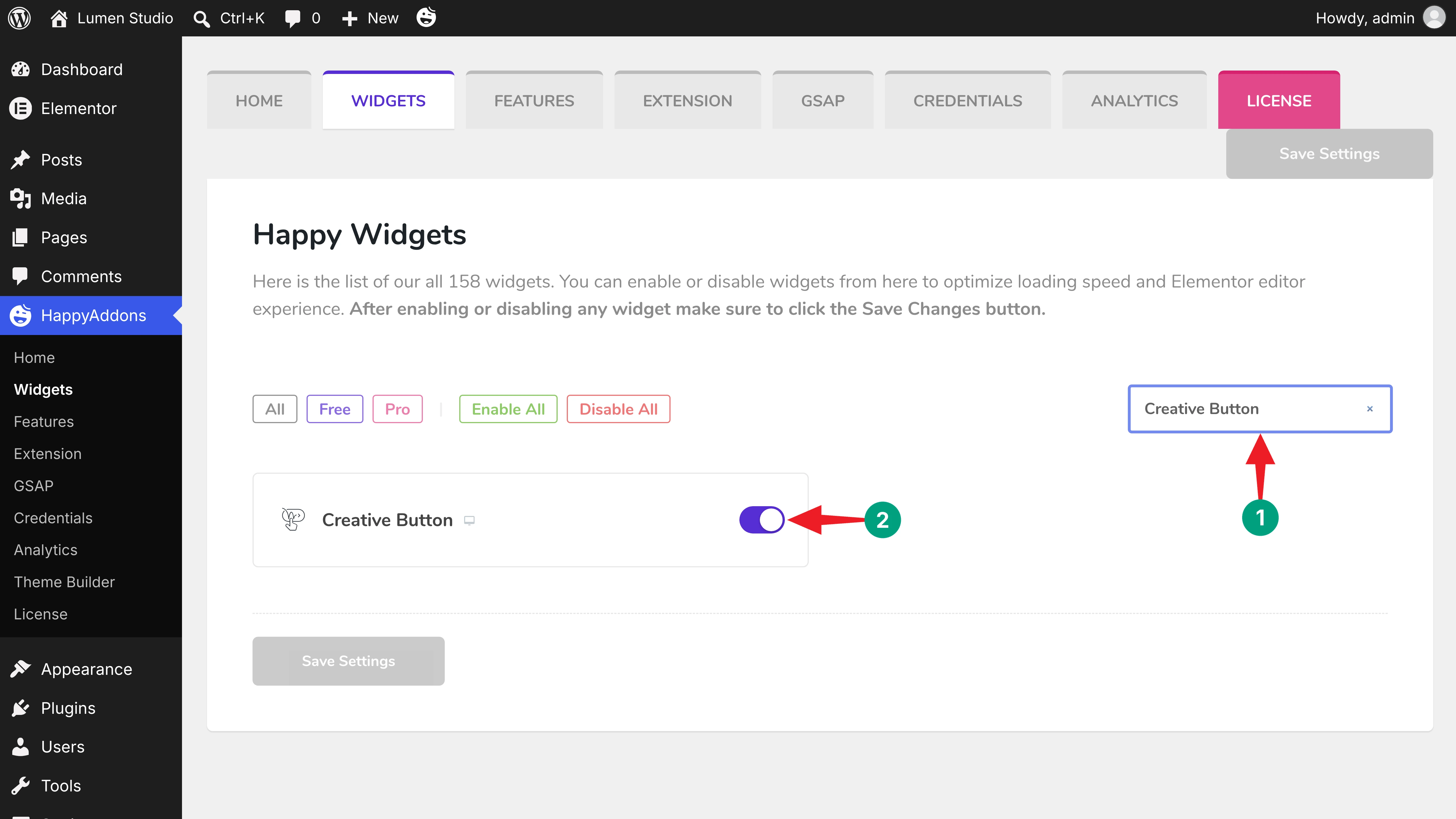
Now come to HappyAddons > Widgets. Type “Creative Button” in the Search box and toggle on the widget.
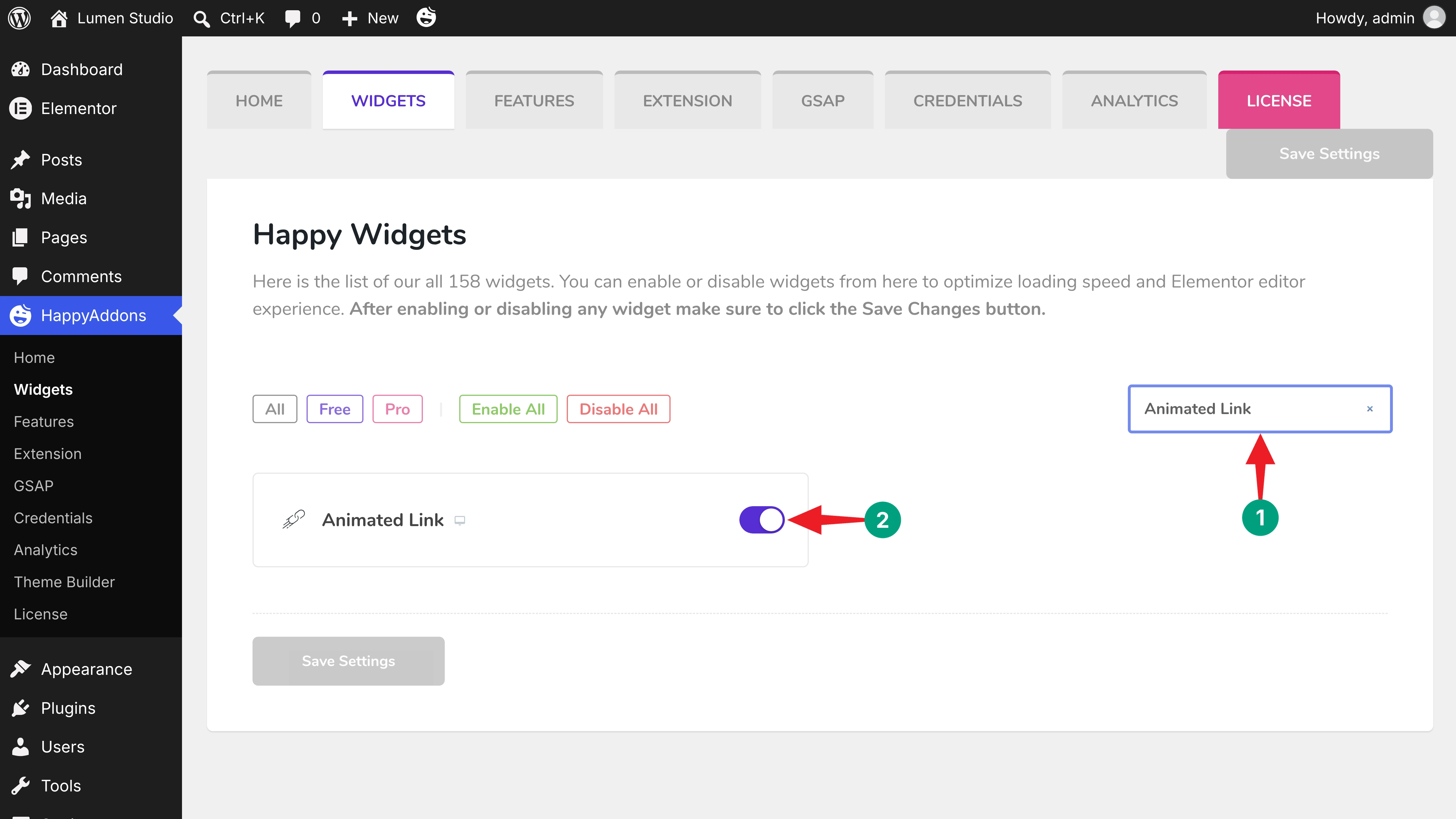
Do the same for the Animated Link widget, and click Save Settings.
Step 02: Animate Your Menu Links on Hover
Menu links are the first thing visitors hover. The Animated Link widget adds a smooth underline or text effect to each one. Drag and drop the widget on your header, then select a style from the Animation Style dropdown. We used Carme, which draws a wavy line under the link.
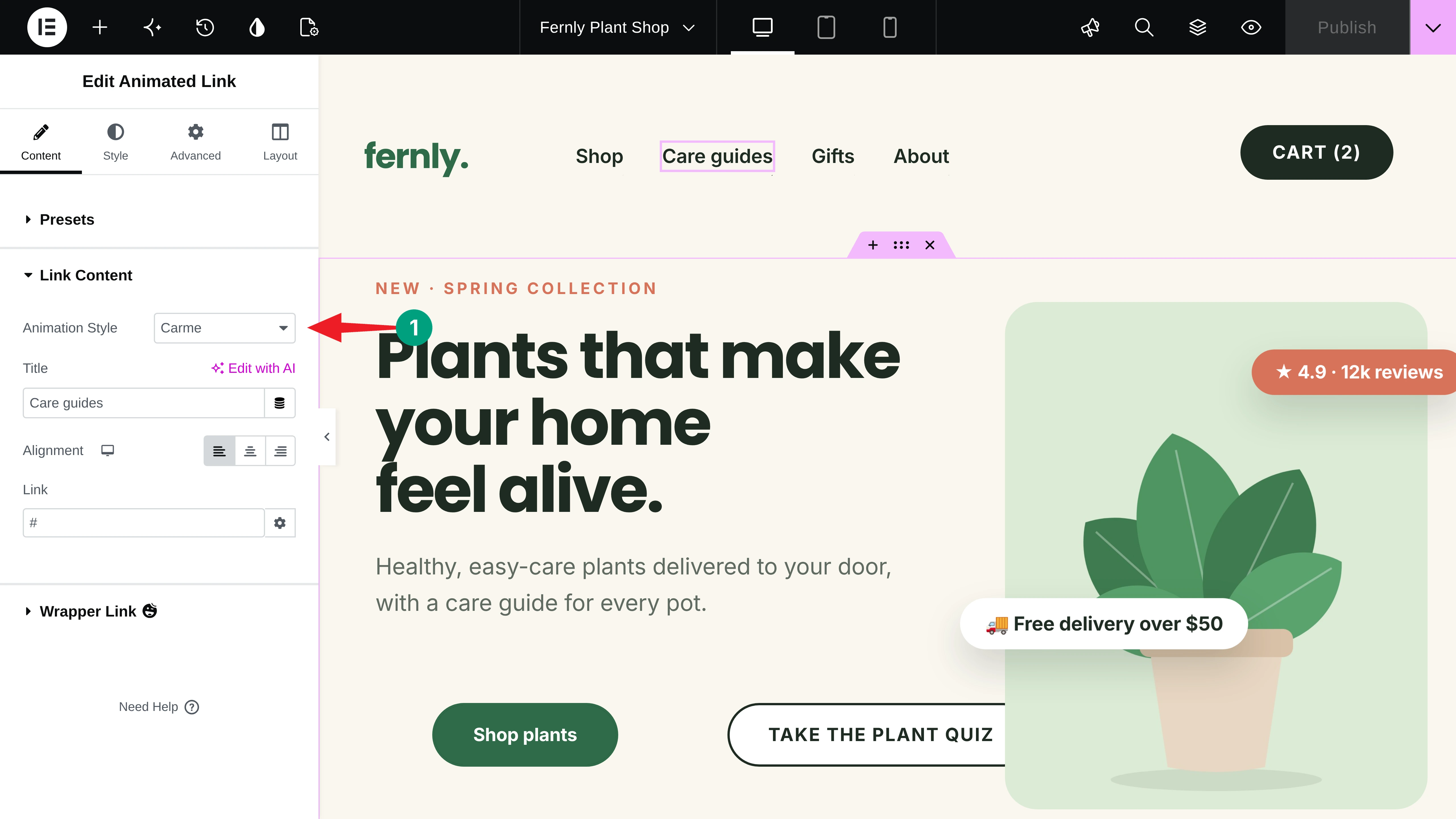
Add your link Title and Link, and repeat this for every menu item.
Step 03: Add a Magnetic Hover Effect to Buttons
Buttons deserve the strongest feedback, since they lead to sales. Drag and drop the Creative Button widget on the canvas. Choose a Style and a hover Effect, then toggle on Magnetic Effect. The button now pulls gently toward the cursor.
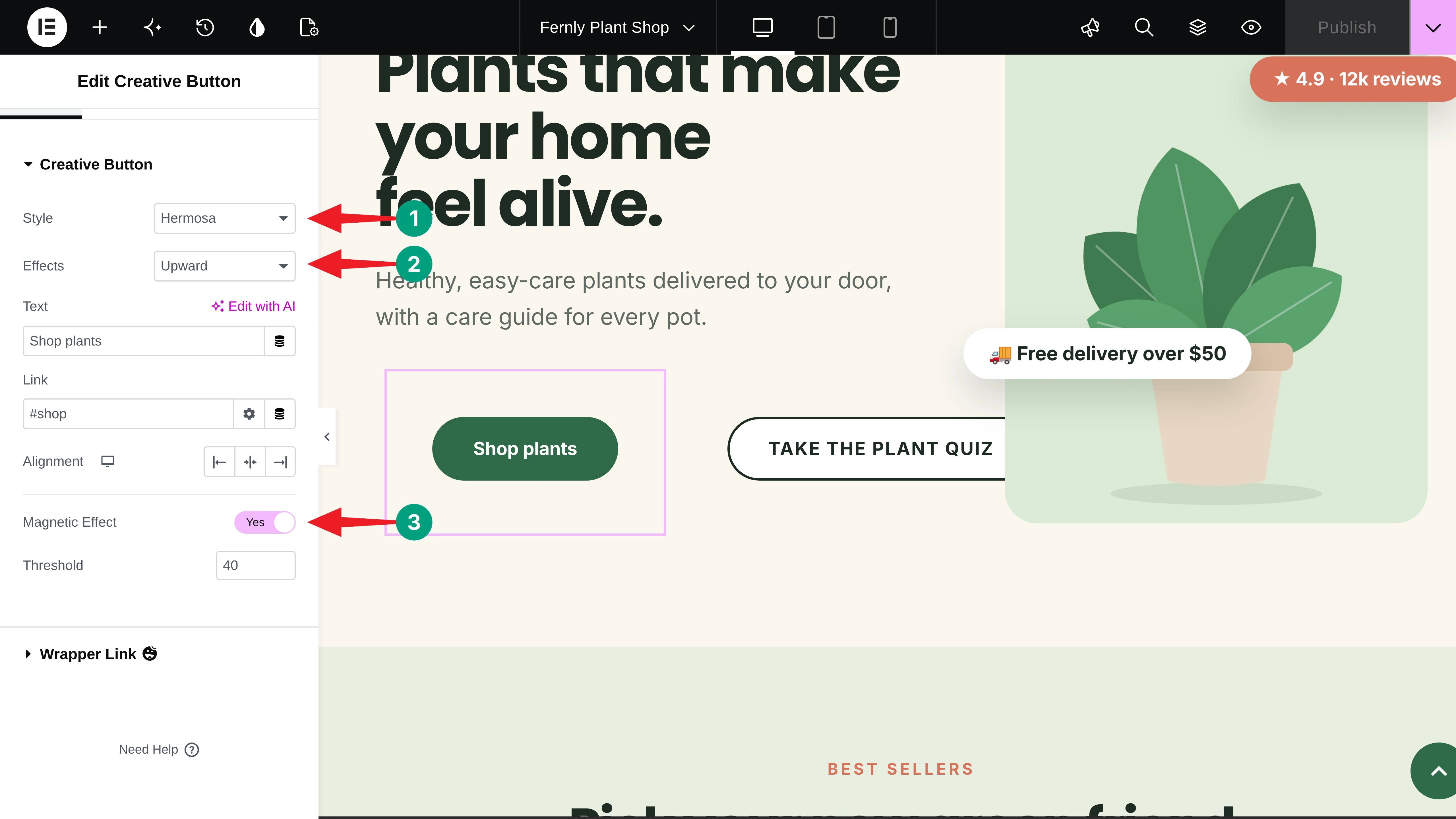
Note: The Threshold value controls how far the magnetic pull reaches. We kept it at 40 pixels, so the effect stays subtle.
Here’s how the animated links and magnetic buttons work together on the Fernly header and hero section.
Step 04: Change the Card Color on Hover
Product cards should react when visitors point at them. Select the card container and go to Style > Background. Click the Hover tab and pick a hover Color. Then set a white Text Color, which comes from the HappyAddons Background Hover Effect feature.
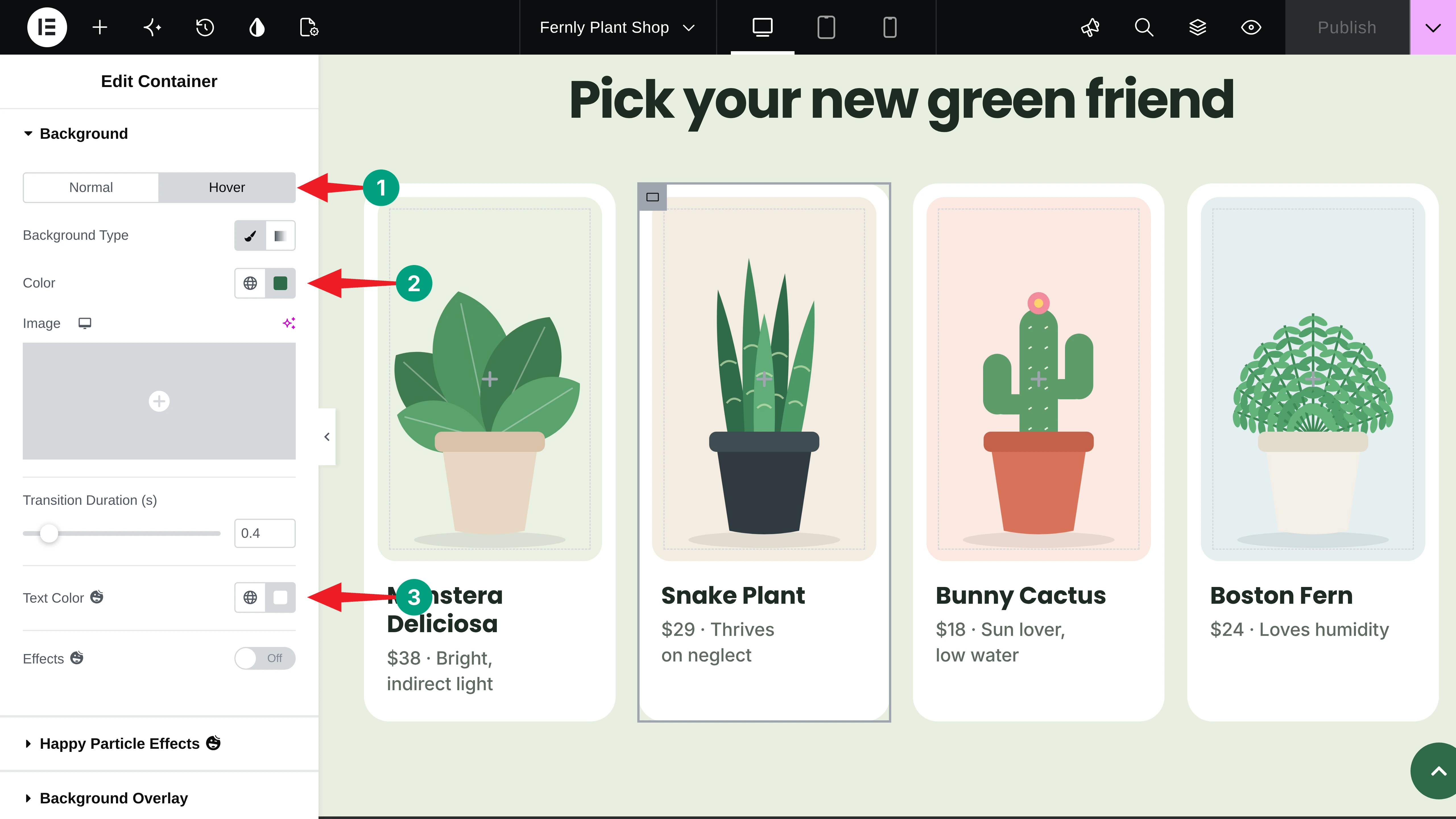
Now the whole card turns green and its text turns white on hover, without any custom CSS.
Step 05: Zoom the Card Image on Hover
A slow zoom makes product photos feel alive. Select the inner container that holds the product image as its background. Go to Style > Background > Hover, toggle on Effects, and choose Grow from the Animation dropdown.
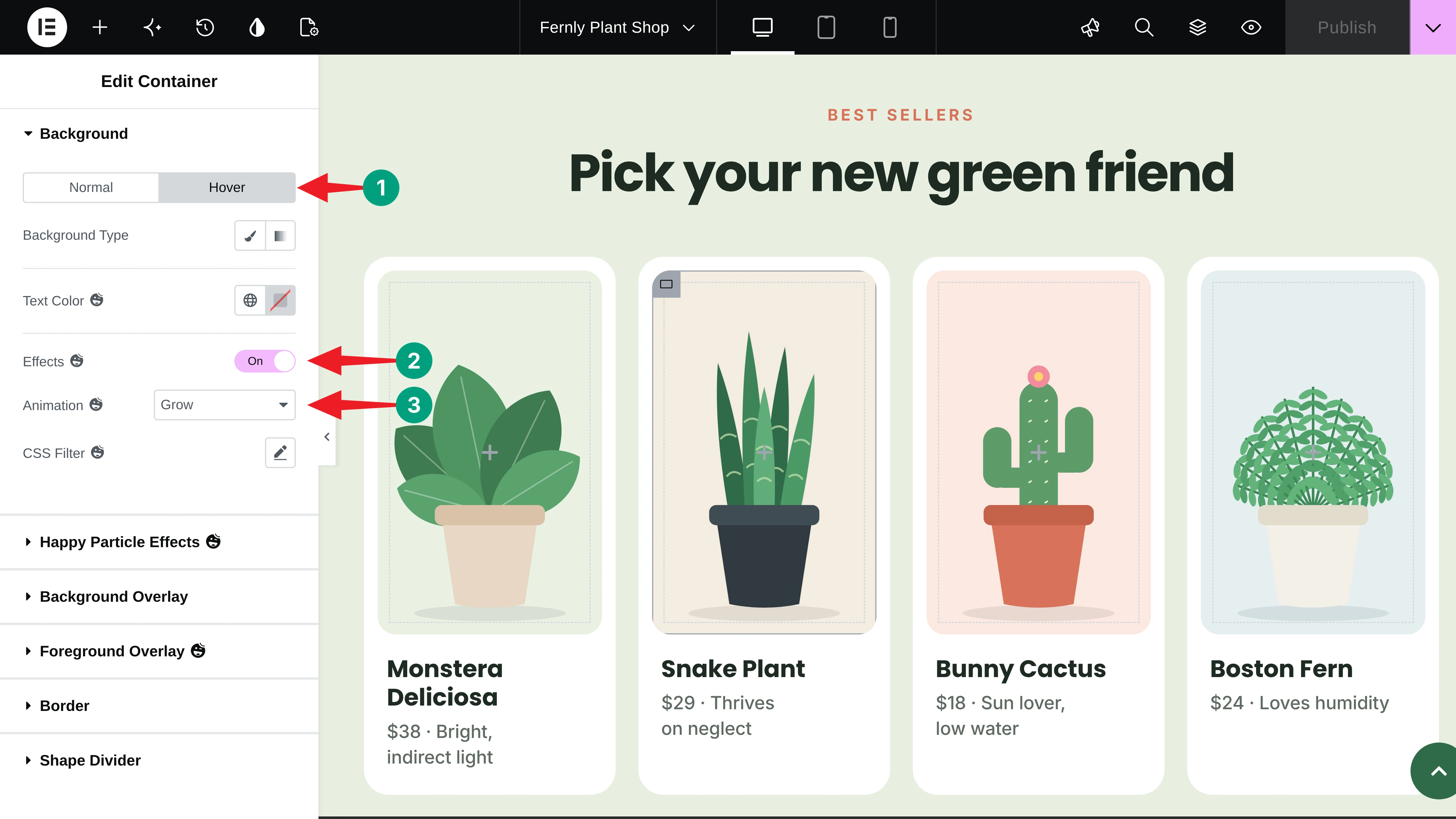
You can also add a CSS Filter, like a light blur or brightness change, for a different look.
Step 06: Show a Custom Mouse Cursor over Cards
A custom cursor tells visitors exactly what will happen if they click. Select the card container and go to Layout > Happy Mouse Cursor. Toggle on Enable Happy Mouse Cursor, choose Text as the Cursor Type, and type your Cursor Text. We used “View plant”.
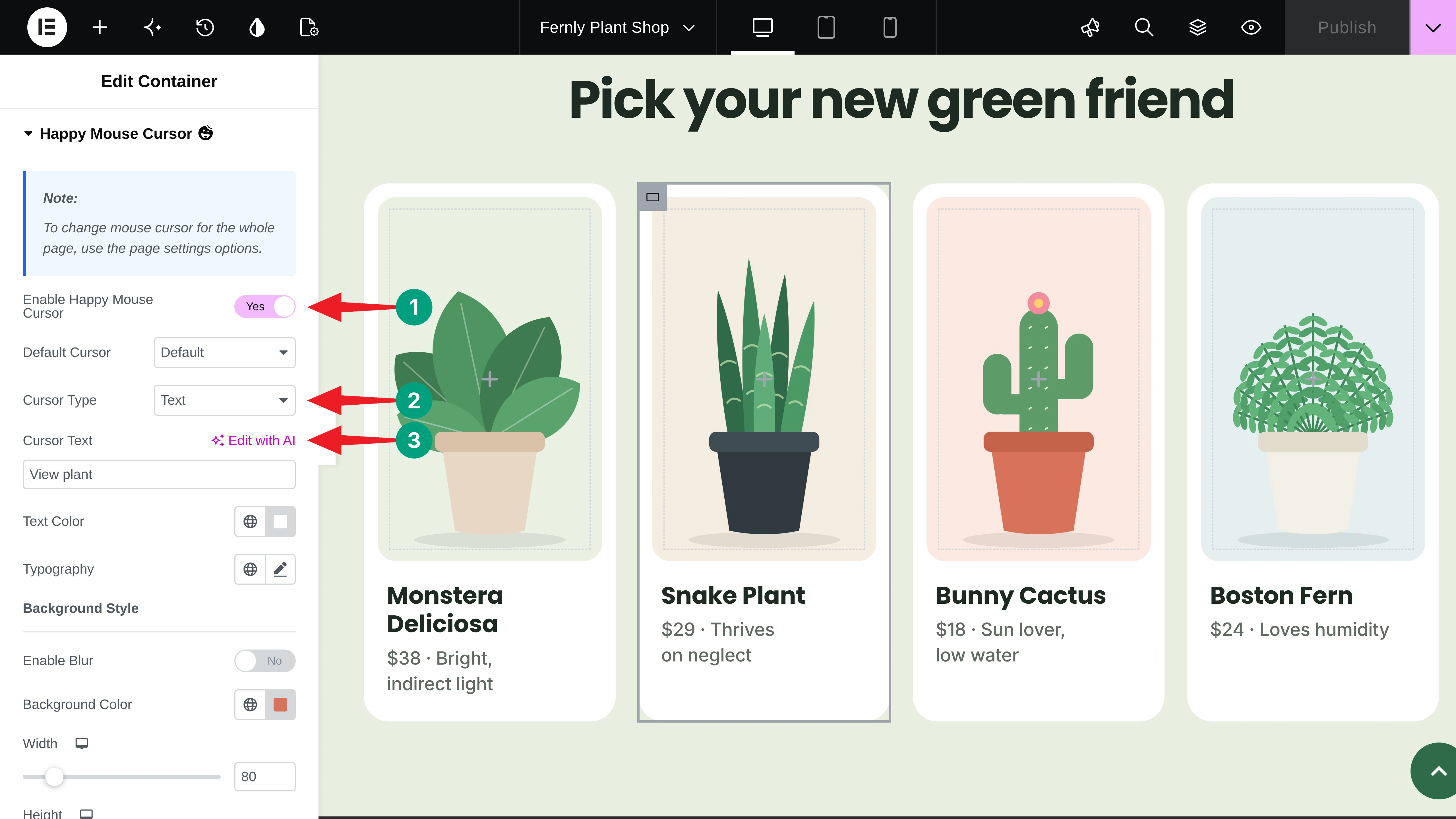
Style the cursor’s text color, background color, and padding to match your brand. You can see the card color change, the image zoom, and the custom cursor working together below.
Step 07: Lift Cards on Hover with CSS Transform
A small lift makes any card feel like it can be picked up. Select the widget (we used an Icon Box), then go to Advanced > CSS Transform. Toggle on Enable, click the Hover tab, and open the Translate options.
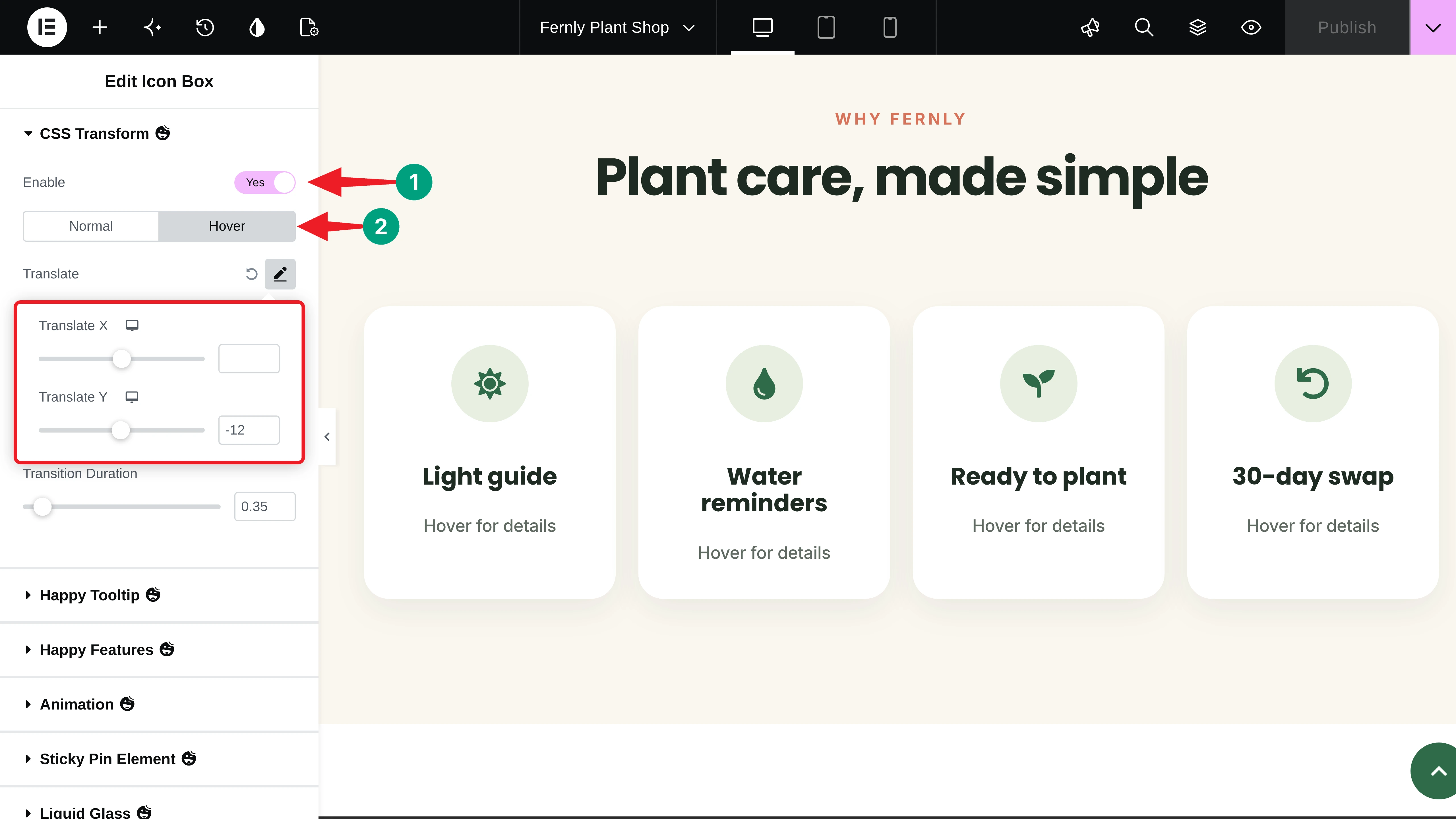
Set Translate Y to -12 so the card moves up 12 pixels. Then set the Transition Duration to around 0.35 seconds for a smooth, natural movement.
Step 08: Add Helpful Tooltips
Tooltips are perfect for short explanations. With the same Icon Box selected, go to Advanced > Happy Tooltip. Toggle on Enable Happy Tooltip, type your message in Content, and choose the tooltip Position.
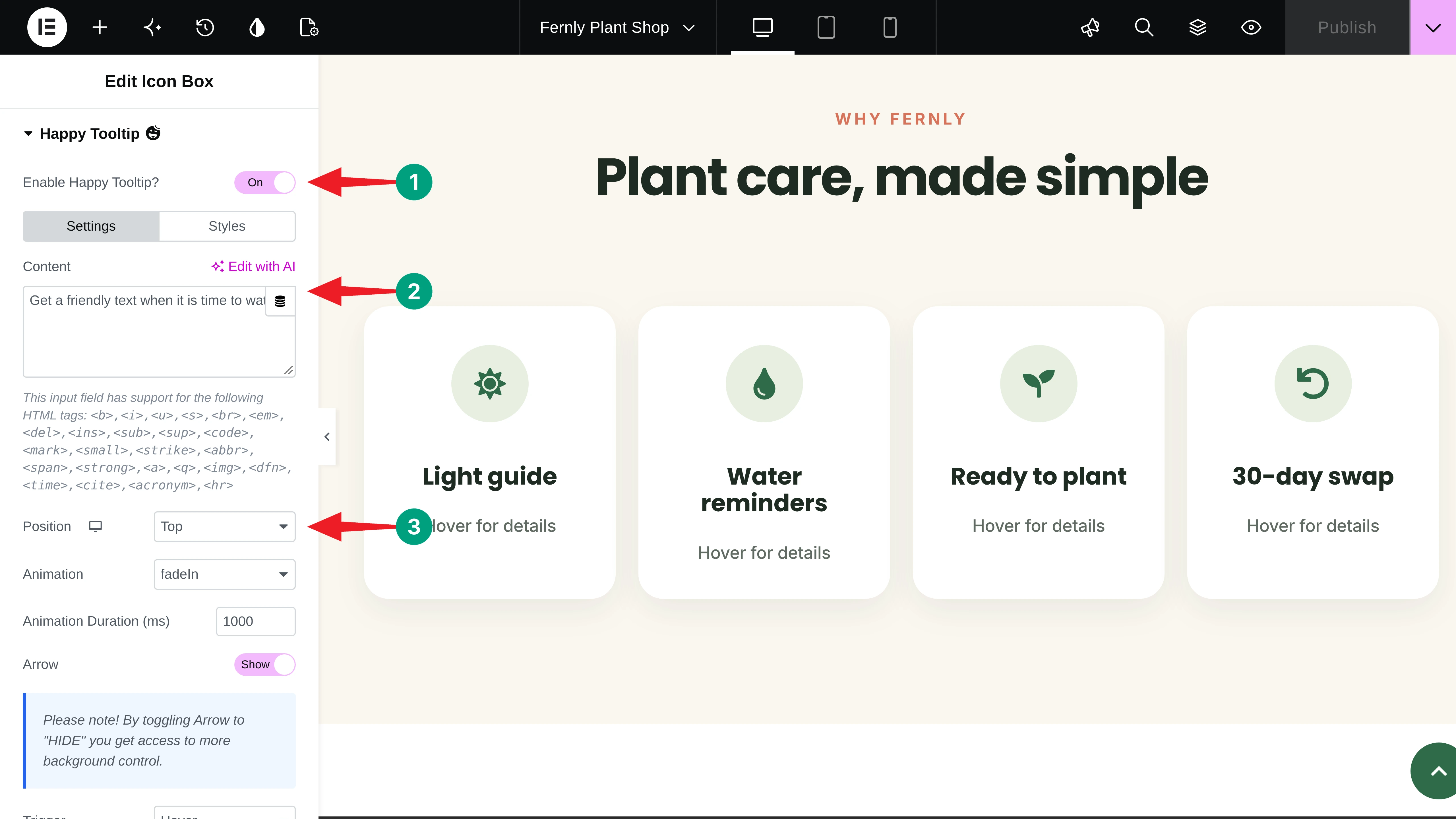
Switch to the Styles tab to change the tooltip’s background, text color, width, and border radius. Here’s the hover lift and the tooltips in action.
Step 09: Make Badges Float Gently
Floating badges keep key messages, like free delivery or ratings, in view. Select the badge and go to Advanced > Floating Effects. Toggle on Enable, turn on Translate, and set a small Translate Y range. We used -12 to 12 pixels.
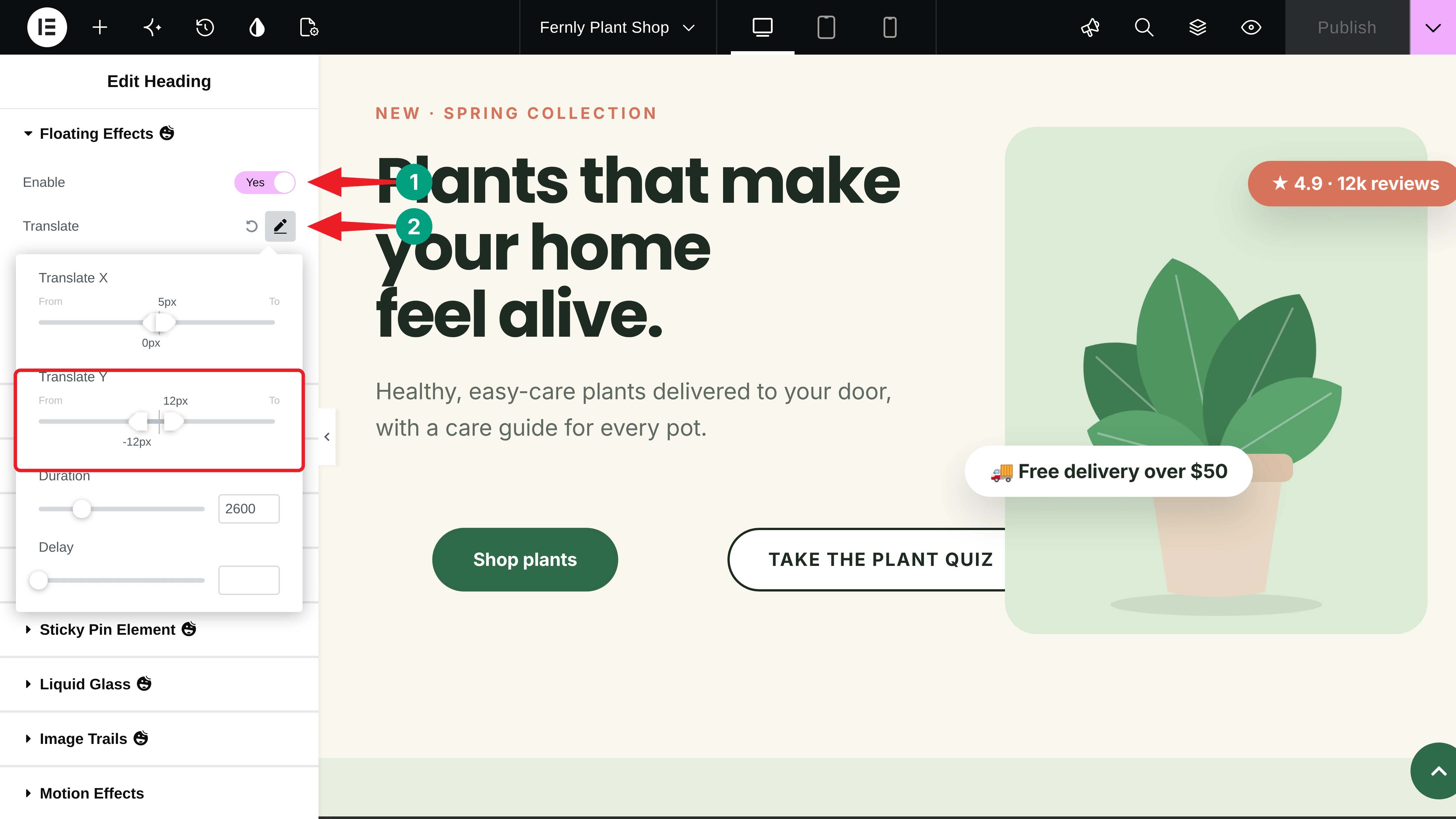
Give each badge a slightly different Duration, so they don’t move in sync. You can see that it’s working fine on our end.
Step 10: Add a Reading Progress Bar
A reading progress bar fills up as visitors scroll, so they always know how much is left. Open the Elementor menu and go to Site Settings. You’ll find Reading Progress Bar and Scroll to Top under the Settings list.
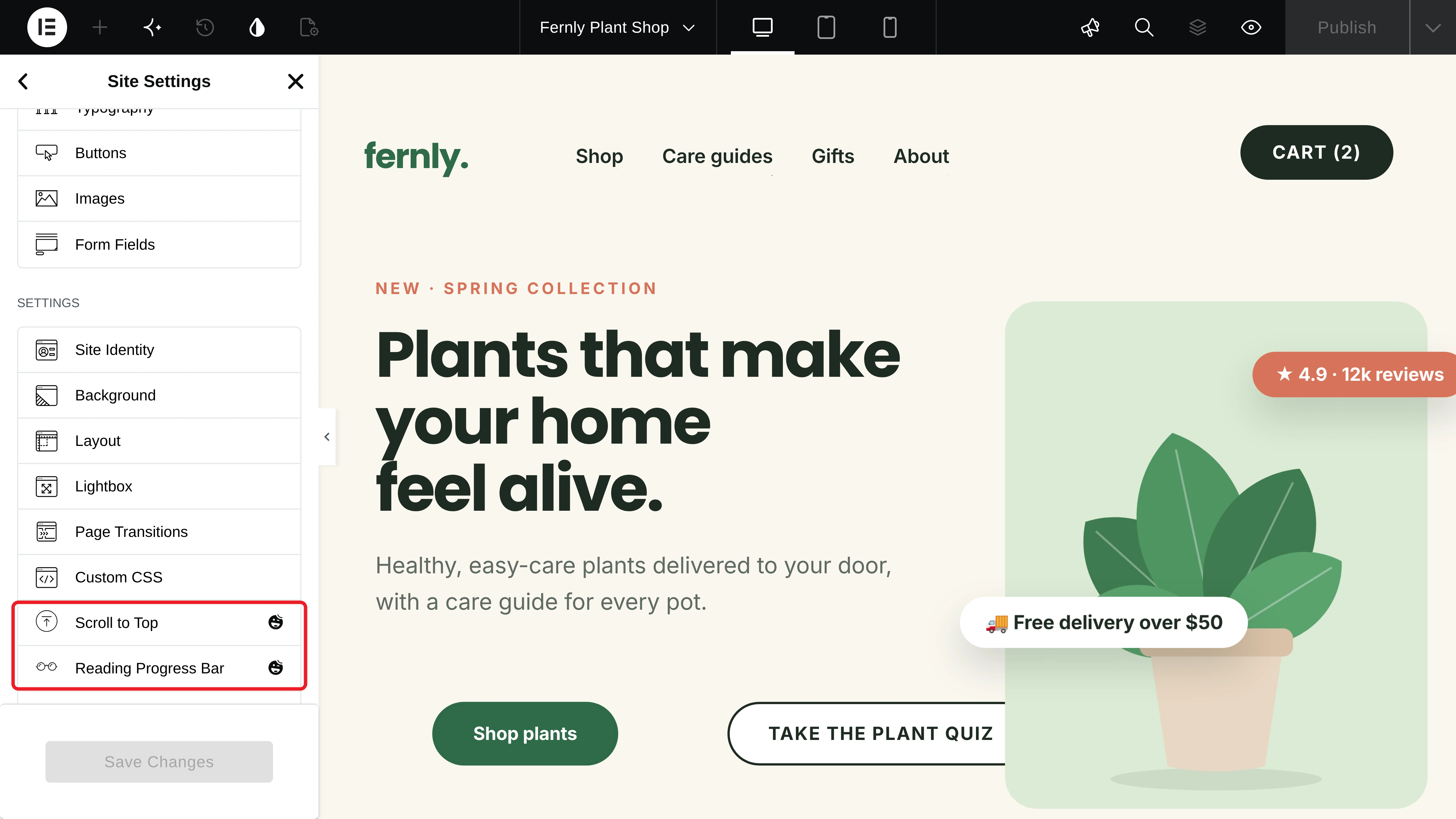
Click Reading Progress Bar and toggle on Enable. Choose where to apply it from Apply Setting, and select a Type: Horizontal, Vertical, or Circle.
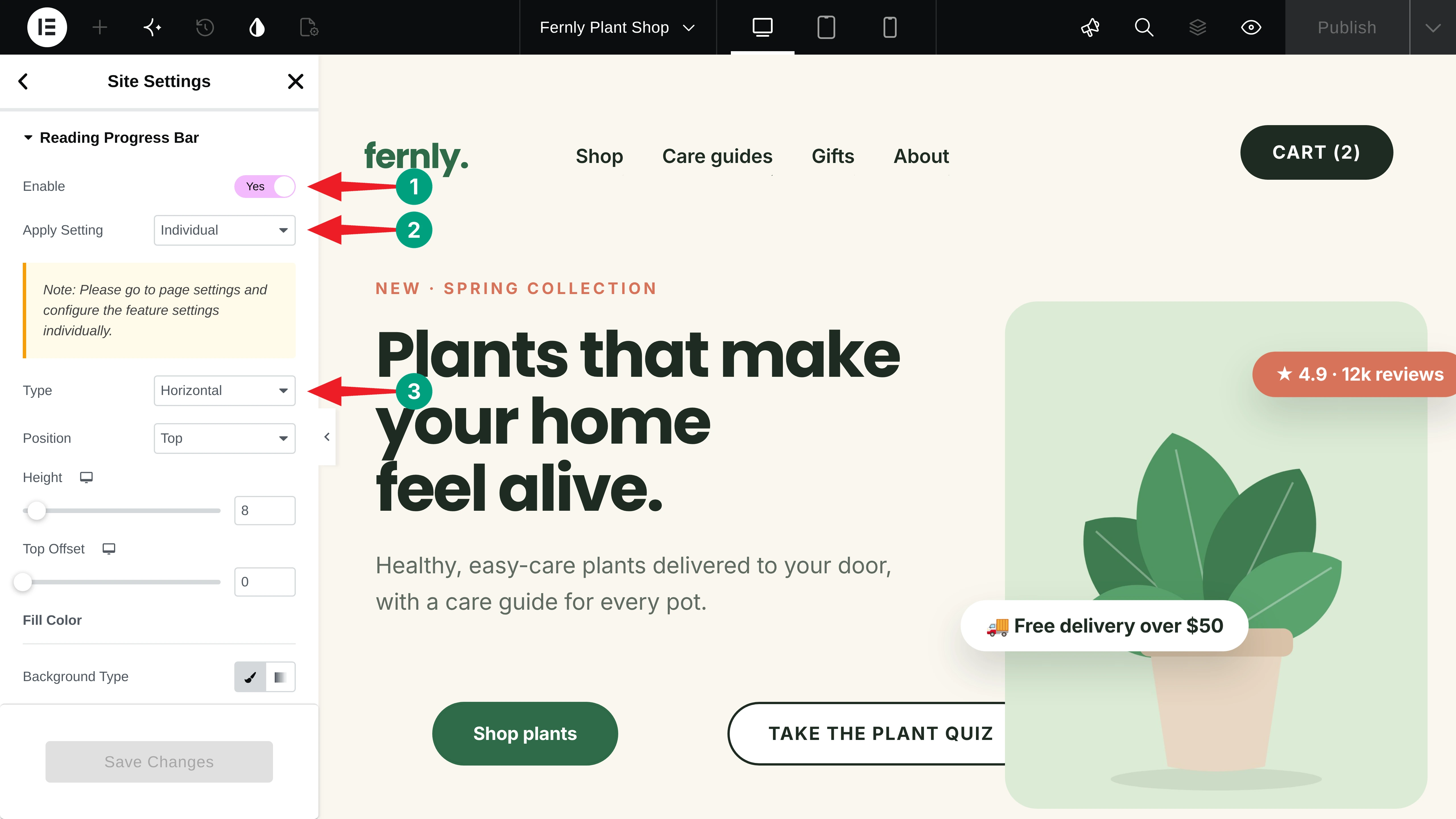
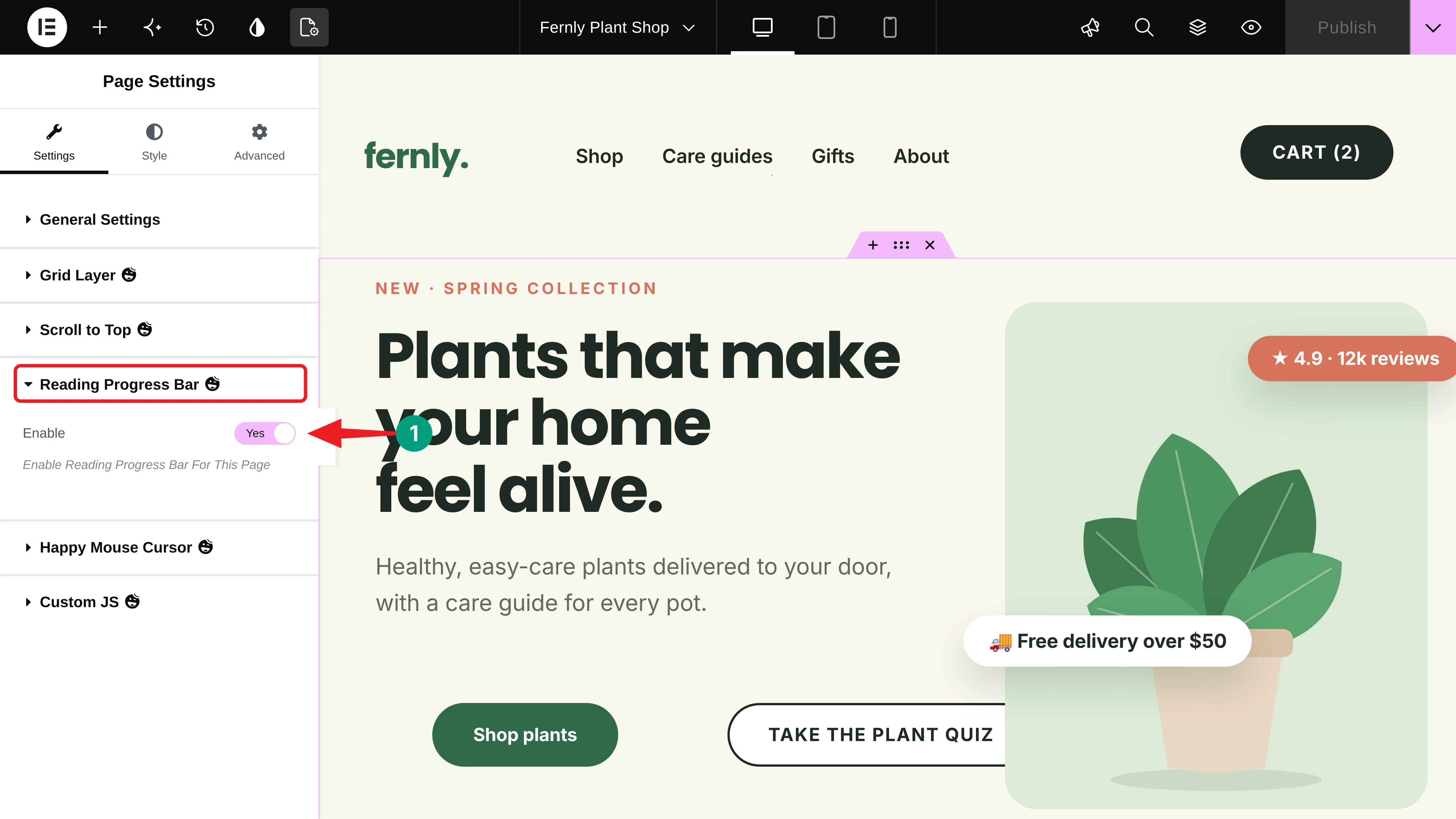
We chose Individual, so the bar only shows where we turn it on. To turn it on for a page, open Page Settings and toggle on Enable under Reading Progress Bar.
Step 11: Add a Scroll to Top Button
On long pages, a scroll to top button saves visitors from endless scrolling. In Site Settings, click Scroll to Top and toggle on Enable Scroll To Top. Then choose its Position and style it with your brand colors.
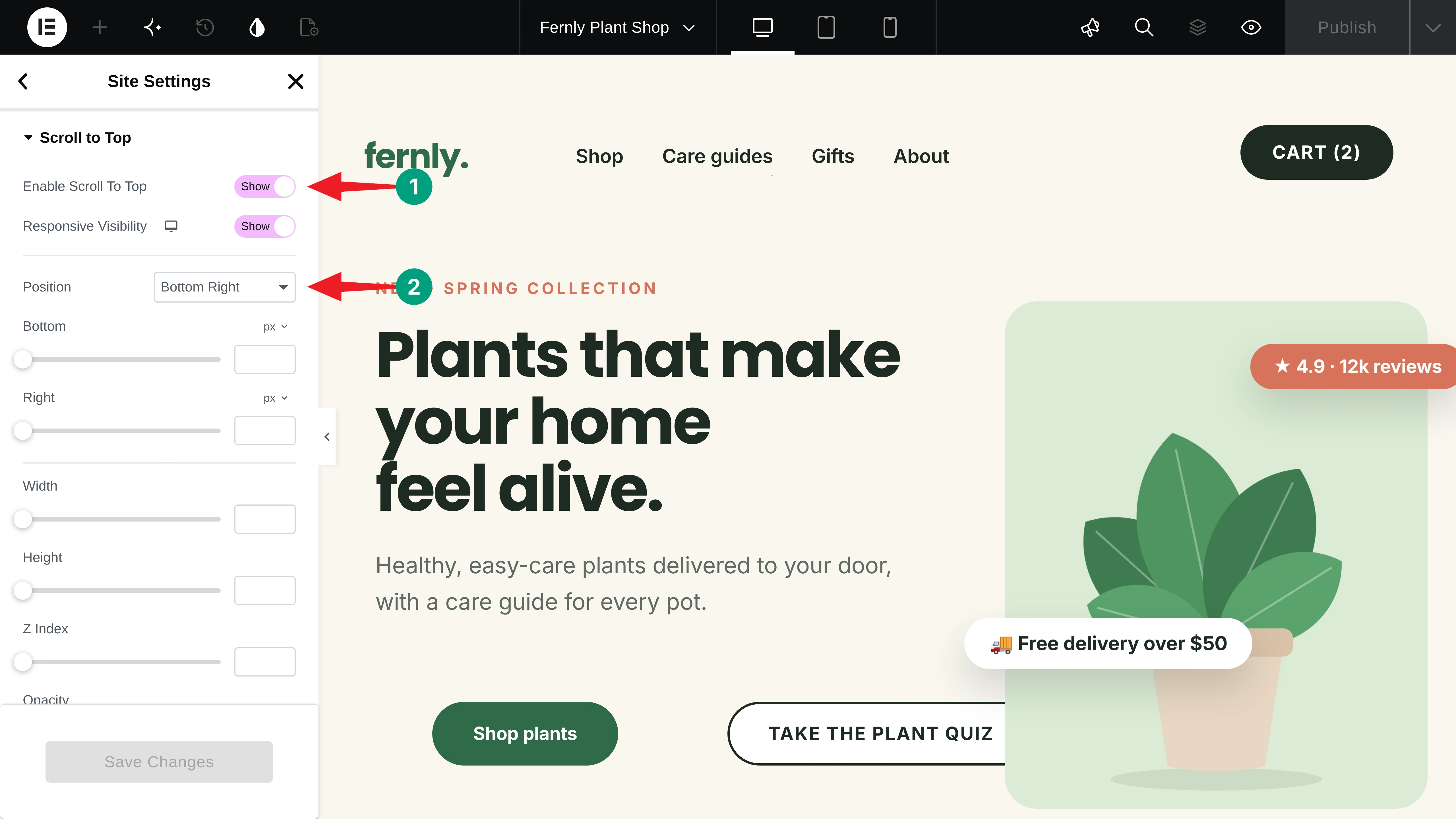
Click Save Changes. Here’s the progress bar filling up and the scroll to top button taking the visitor back up.
Step 12: Preview the Micro-Interactions
Finally, publish or update the page and open it in a new tab. Hover over the buttons, cards, and icons to test every effect.
Thus, you can make Elementor websites more engaging with micro-interactions using HappyAddons. Hope it will work well on your end as well.
Explore how to add GSAP animations in Elementor without coding.
Best Practices for Micro-Interactions That Visitors Love
Good micro-interactions feel natural. Too many, or too slow, and they start to get in the way. Keep these five rules in mind.
a. Keep Them Fast
Most hover effects feel best between 0.2 and 0.5 seconds. Anything slower makes visitors wait, and anything faster can feel jumpy. Test the timing on your own page until it feels effortless.
b. Give Every Effect a Purpose
Ask what each micro-interaction tells the visitor. A hover color shows something is clickable, and a tooltip explains a feature. If an effect has no message, it is probably just decoration you can remove.
c. Stay Consistent
Use the same hover color, lift distance, and timing for similar elements across the site. Consistent feedback teaches visitors how your site works, so every new page already feels familiar to them.
d. Think About Mobile
Phones have no hover, so hover-only details become hard to reach. Make sure key information is still visible without hovering, and use tooltips with the click trigger where it makes more sense.
e. Turn Off What You Don’t Use
Every active feature adds a little code to your site. Disable the HappyAddons widgets and features you don’t need from the dashboard, so your pages stay light and load quickly.
FAQ on Micro-Interactions in Elementor
In this section, we have answered some frequently asked questions we get from our users in support chats, forums, and social media.
Can I add micro-interactions in Elementor without coding?
Yes. With Elementor and the free HappyAddons plugin, you can add magnetic buttons, animated links, hover effects, custom cursors, tooltips, floating effects, a reading progress bar, and a scroll to top button right from the Elementor panel.
Do I need HappyAddons Pro for these effects?
No. Every micro-interaction in this tutorial is available in HappyAddons Free. HappyAddons Pro adds more motion, such as Marquee, Image Trails, and the GSAP Animation feature.
Will micro-interactions slow down my website?
Not if you use them wisely. These effects are light, mostly CSS-based, and HappyAddons only loads the code for features you turn on. Disable unused features to keep your pages fast.
Why can’t I see the Happy Mouse Cursor or Tooltip options in Elementor?
The feature is probably turned off. Go to HappyAddons > Features, toggle it on, and click Save Settings. Then reload the Elementor editor.
Do micro-interactions work on mobile?
Yes, most of them do. Tooltips can open on click, floating effects and the progress bar work on touch screens, and hover effects usually play when the visitor taps an element.
Final Thoughts!
Micro-interactions turn a static Elementor page into one that responds to every visitor. With HappyAddons, you can add magnetic buttons, hover cards, custom cursors, tooltips, floating badges, a reading progress bar, and a scroll to top button, all for free and without code.
Start with the elements visitors use most, like buttons and product cards. Keep every effect quick and purposeful, then test the page on both desktop and mobile before you publish.
If you have any questions, mention them in the comment box below. You can also give a knock on our live chat box. Thanks for being with us till the end.