A comparison table provides an impressive way to display multiple products side-by-side, highlighting their key features, images, specifications, prices, and more. It clearly presents this information in an organized way that helps customers make informed decisions with confidence.
If your site is built with Elementor, you might be looking for ways to create a comparison table with it. But unfortunately, Elementor doesn’t have a readymade comparison table-making option. But no worries, HappyAddons has an interesting Comparison Table widget to help you overcome this limitation.
If you don’t know yet, HappyAddons is a popular Elementor. It has 130+ widgets and dozens of features to further power up your site. This article will show you how to create a product comparison table with the Elementor comparison table widget using HappyAddons.
Why Product Comparison Tables are Important for Business Sites
A product comparison table provides a structured format for your customers, users, and visitors to research their product information to decide which one to buy. This can save them a huge amount of time, quickening the decision-making process.
Transparent and comprehensive product comparisons build trust with customers. This demonstrates that businesses have nothing to hide and are confident in their offerings. Below is an example of such a product comparison table.
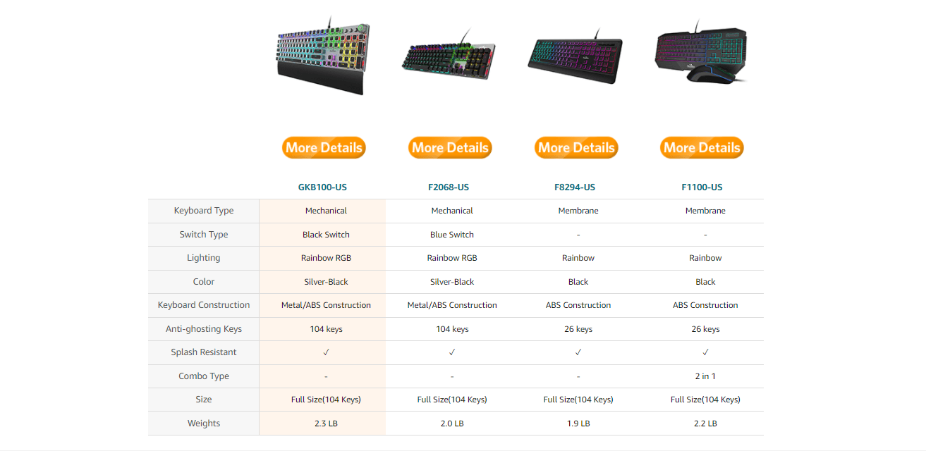
It is mainly used in eCommerce websites to share different product models, images, features, pricing, description, etc. However, website owners also use a comparison table to prove their product is the best product by comparing their competitor products under the same table.
It helps customers to find the pros & cons of a product in a glimpse. Using this effective comparison table data, customers can select the right product in minutes and save valuable time.
How HappyAddons Helps to Create Product Comparison Table

Indeed, you can create a table with the default Gutenberg table block. But the block lacks many advanced features required to create a captivating table. For example, you can’t add any image, CTA button, bullet list, etc., to the default table.
And in this case, you must use a third-party plugin, which has the ability to overcome these limitations. If your site is already designed with Elementor, why should you look for a Gutenberg plugin? HappyAddons Comparison Table widget is ready to overcome all these limitations.
Plus, this Elementor comparison table widget is completely free. You can use it with the HappyAddons lite version. Let’s see how this widget can benefit you.
- Mobile friendly
- Covers a large library of pre-made template
- Add images in a column
- A wide range of support icons
- Offer readymade table designs
How to Create a Comparison Table with the Elementor Comparison Table Widget
It’s now the tutorial time. But before you start the tutorial, make sure you have the following plugins installed on your site.
Once these plugins are installed and activated, open your desired post or page with Elementor and start following the below steps. You may follow this process from this YouTube tutorial as well.
What we have covered in this video is explained in the discussion below as well. Keep reading!
Step 1: Add Comparison Table Widget
Type Comparison Table in the search box on the Elementor panel. Once it appears, drag and drop it to your selected Elementor canvas area.
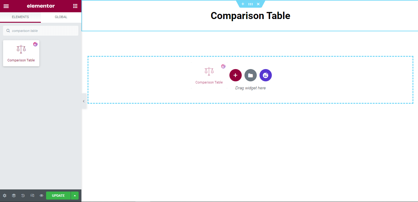
Comparison Table Content Area
After adding the widget, you get the default table design, as shown in the image below. The content area has the necessary settings to manage the table content.
Here you’ll get.
- Table Head
- Table Row
- Table Button
- Table Settings
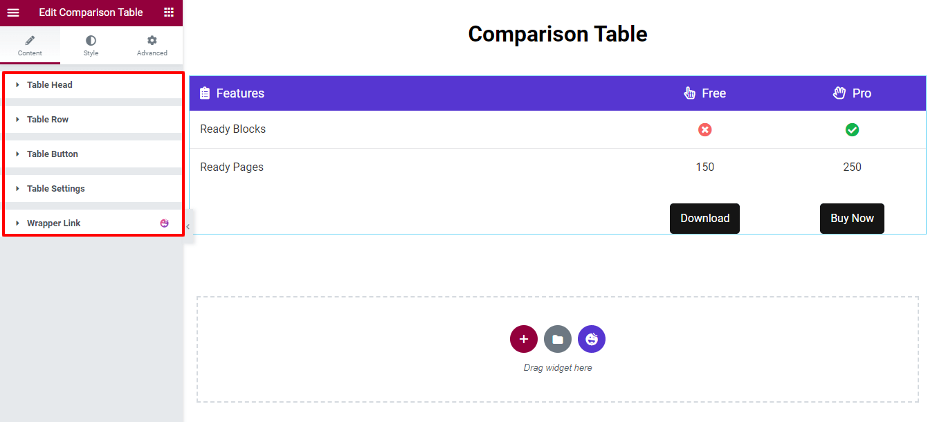
Now, we’ll cover each of the settings so that you can easily manage the table content.
Step 2: Manage Table Head
The Table Head option allows you to add the head item of the table by clicking the ADD ITEM button. You are able to Copy and Remove an item. Also, you can easily set the Alignment (left, center & right) and Icon Position (left & right) of the entire table head content.
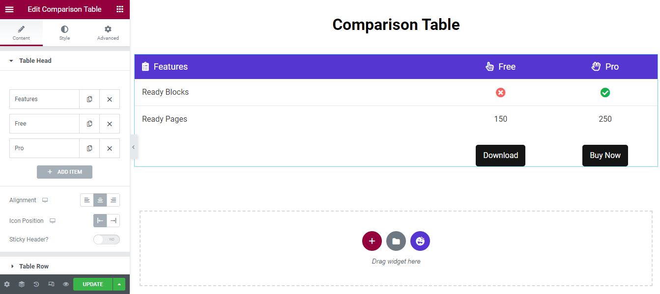
Customize Table Head Items
To customize the Table Head individual item, you need to open an item first. Then you can add the Title, select Title HTML Tag, set Content Width, insert an Icon, set the Icon Color, and write a Description.
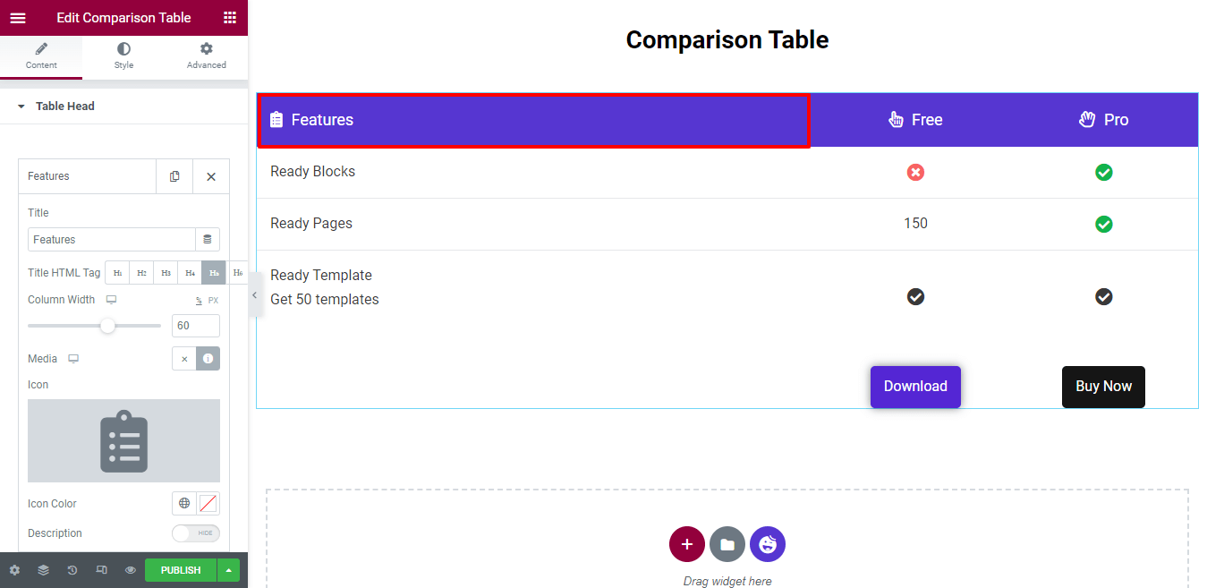
The entire Column Width is defined as 100%. Here, you notice that we’ve set the Column Width to 60(%). That means the feature column gets 60% space, and the other two columns get 20% space.
You can also write a Description. First, you switch on the Description option. Then, you’ll get the text editor to write the description. We don’t need to add the description, which is why we didn’t enable it.
Add a Sticky Header
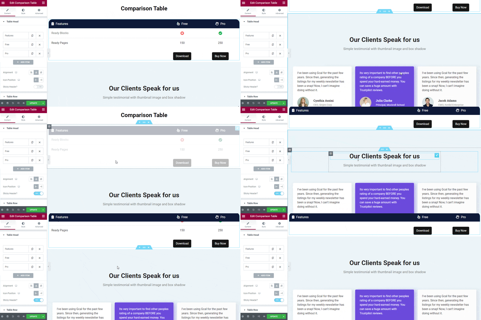
If you want to add the Sticky Header, you need to activate the Sticky Header option first. Then, your table header will display on the top whenever you scroll down.
Step 3: Manage Table Row
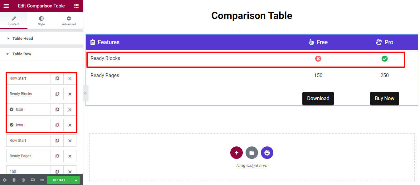
By default, the widget comes with two Rows with Columns. You can add a new row and insert the required columns in it.
To customize the row and column content, you need to open a row or a column and then change the content based on your purposes.
Add a New Table Row
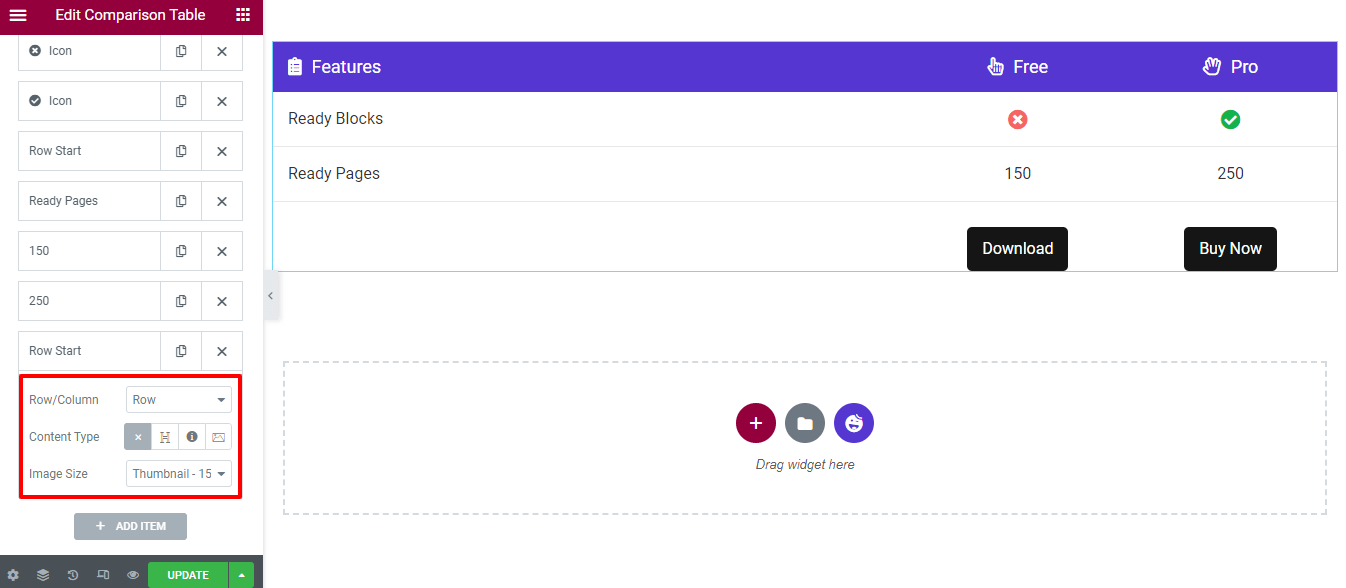
To add a new Table Row, you need to click on the ADD ITEM first.
After that, you’ll get the option to insert a Row. You have to choose the Row instead of a Column and set the Content Type > Blank as it’s a row. It’s not necessary to change the Image Size, so keep it default.
However, you are able to add three types of content in the column Heading, Icon, and Image.
Add a Column with a Heading
Let’s show you how to add a column in a row.
First, you need to add an item by simply clicking the ADD ITEM button. Second, select the Column (Row/Column) and set Content Type > Heading. Finally, you can write the Title of the heading.
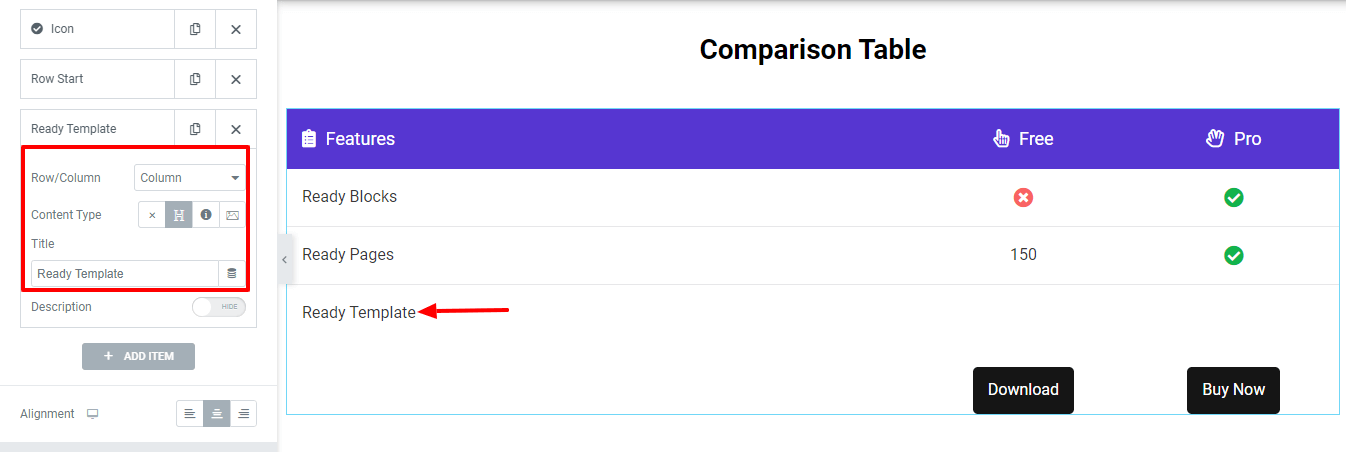
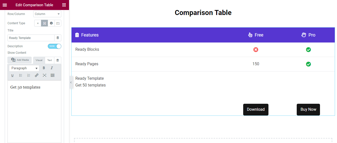
Write the Description
You are able to write a description under the Title. First, Show the Description option. Then you’ll get the text editor panel, and you can write the description in your own way.
We’ve also added two columns. This time we’ve used the Content Type > Icon. Here is the current table view.
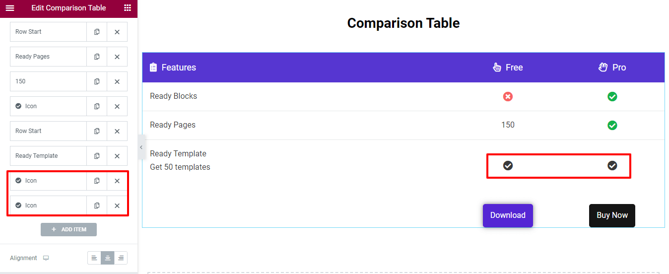
Note: Remember, whenever you add content to a column, the content will display from Right to Left.
Step 4: Manage Table Button
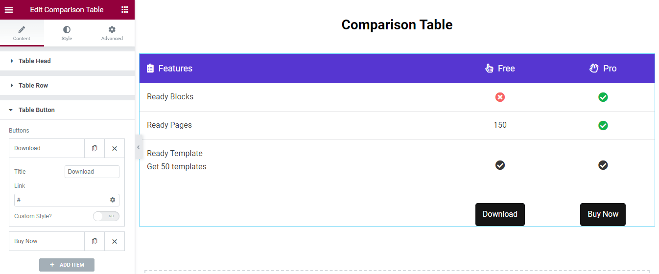
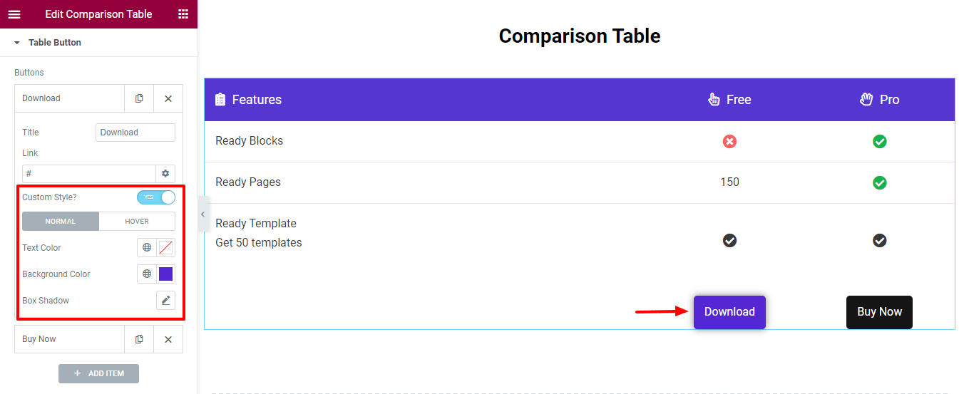
Go to the Content > Table Button area, then you can write the Title and insert a Link to the button.
Customize Button
You are able to add the Custom Style to decorate the button. Active the Custom Style first. Then, you’ll get the essential settings to add a new button style.
You add the Text Color, Background Color, and Box Shadow to the button. You can also add different styles to the Hover button.
Step 5: Table Settings
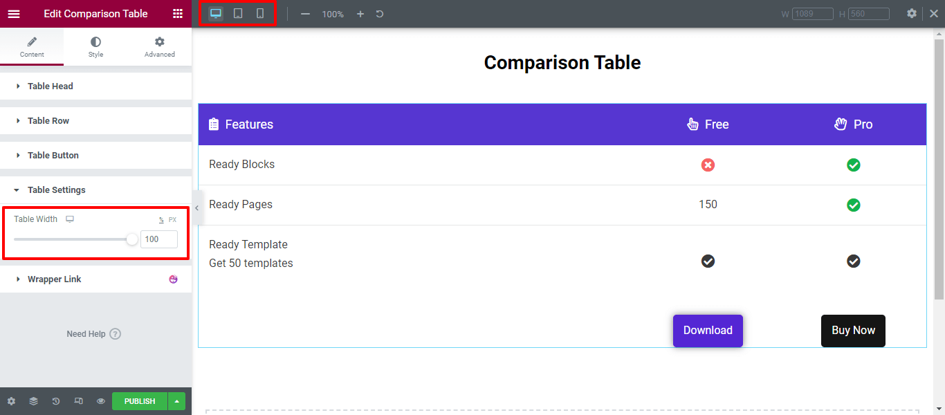
The Table Settings area gives you the option to set the Table Width according to your devices. In the Tablet and Mobile view, the table items will be scrollable. That way, you’ll control the table’s responsiveness.
Step 6: Style Comparison Table
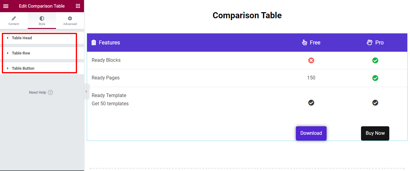
The Style area has the necessary styling options to customize the Table Head, Table Row, and Table Button.
Using this widget, you can design this type of Elementor comparison table to compare your product side-by-side.
Final Output of Your Product Comparison Table
After designing all the parts of your comparison table, you’ll get a perfect look to showcase your products in an attractive way, including features, images, and other elements. Below is the table we’ve created today-
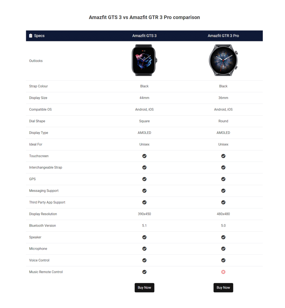
Use different style options to make a design that aligns with your brand. You can also check the full documentation of the Comparison Table widget.
Introducing The Advanced Comparison Table Widget of HappyAddons Pro
Our free version’s Comparison Table widget is somewhat limited in creating complex comparison tables. To overcome this, we have launched an Advanced Comparison Table widget. It allows web designers to create highly customizable and attractive comparison tables. Whether you’re comparing products, services, or features, this widget provides a wide range of functionalities to meet your needs.
Importance of Comparison Tables in Web Design
Comparison tables are vital in web design as they help users quickly compare different options and make informed decisions. They break down complex information into an easy-to-read format, enhancing user experience and engagement.
Overview of Advanced Elementor Comparison Table Widget
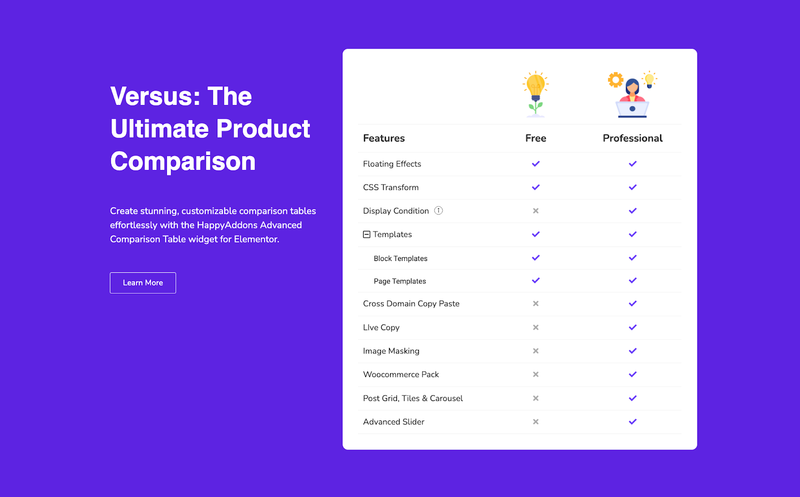
The Advanced Comparison Table widget from HappyAddons is designed to create detailed and visually appealing tables. Its primary purpose is to enable users to compare various elements side-by-side, offering a clear and structured layout.
Key Features
- Ability to add up to 10 columns
- Control over icon positions for headers
- Customizable collapse icons
- Responsive nav badges
- Diverse content types: Text, Icons, Images, Buttons, Pricing, and more
- Sticky Header
Creating an Advanced Comparison Table with Elementor
From here, we will guide you through the process of utilizing this powerful widget to its full potential.
Step-by-Step Guide
- Install Requirements: Ensure you have installed Elementor Free, HappyAddons Free, and HappyAddons Pro.
- Add the Widget: Search for the Advanced Comparison Table widget in Elementor and drag it to your canvas.
- Basic Setup: You will see a basic 3-column pricing table view. From the content tab’s General settings, add columns (up to 10).
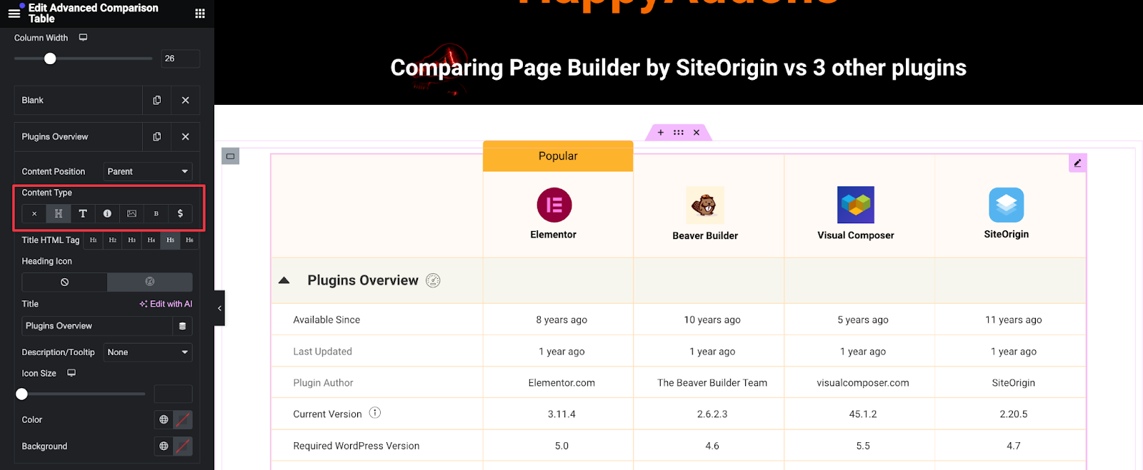
- Add Content: Expand each column to add data. Use different cell types like text, icons, images, buttons, and pricing fields to populate your table.
Customization Options
- Column Control: Set column width and content for each cell.
- Icon Position: Adjust the icon positions for headers.
- Collapse Options: Customize collapse icons and toggle the child items’ visibility.
- Tooltips: Add tooltips for each cell if needed.

Design and Styling Options
Explore the extensive design and styling options available for the Advanced Comparison Table Widget. Customize colors, typography, and backgrounds, and ensure responsive design for seamless viewing on any device. Create visually appealing and user-friendly comparison tables with ease.
Table Stylings
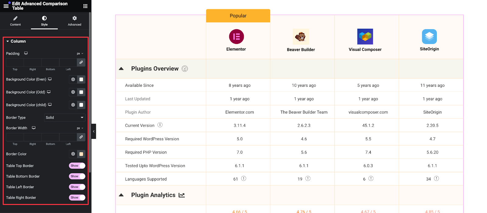
- Customize even, odd, and child background colors.
- Adjust the alignment of cell items.
- Set badge text and custom badge styles.
Color Schemes and Typography
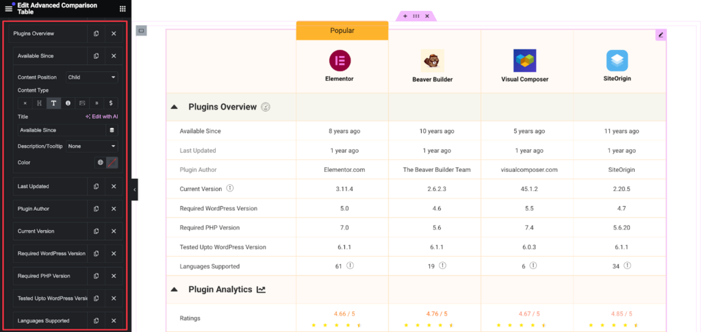
- Style headings, texts, descriptions, tooltips, images, icons, pricing, buttons, and badges.
- Use global color settings for consistency.
Responsive Design Features
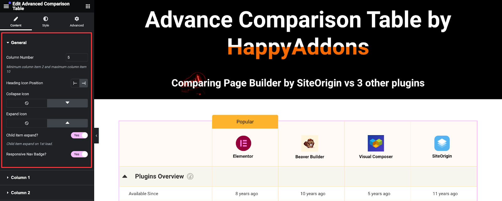
- Enable responsive nav badges for mobile devices.
- Set responsive nav button styling for mobile views.
Advanced Features of The Advanced Comparison Table Widget
Unlock the full potential of the Advanced Comparison Table Widget with dynamic content integration, sticky header animations, and advanced customization options. Learn how to enhance your tables with these powerful features for a more interactive and engaging user experience.
Dynamic Content Integration (Template Import)
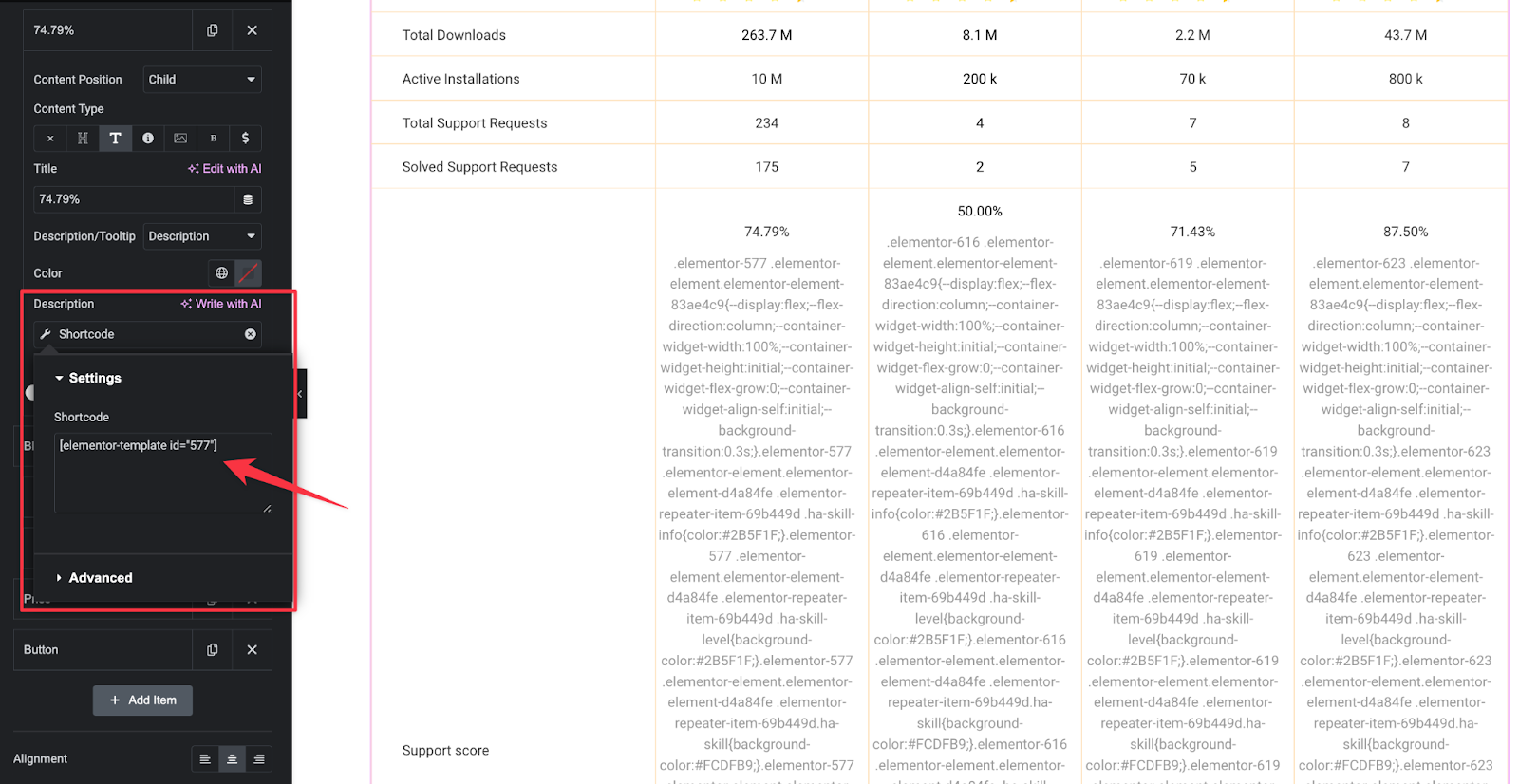
- Use shortcodes and dynamic tags to integrate dynamic content.
Import Elementor templates for a more sophisticated look.
- Animation Effects (Sticky Header)
Make your header sticky to keep important information visible as users scroll.
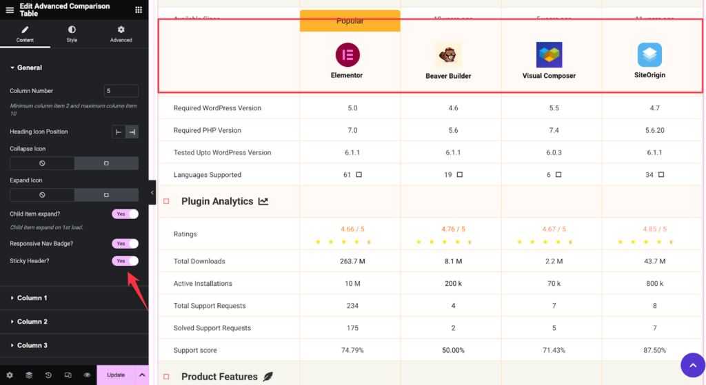
Here is the video tutorial for the Advanced Comparison Table widget.
Pros and Cons of Elementor Comparison Tables
Let’s dive into the Advanced Comparison table’s pros and cons.
Advantages
- Highly customizable and easy to use.
- Integrates seamlessly with Elementor.
- Offers a wide range of styling and design options.
- Sticky header support
- Tooltips or description support
- Shortcode support with Elementor Dynamic Tag feature
- Customizable badges
- Collapsible table rows
- Table creation from the Elementor Editor Panel
Limitations
- There are only 10 columns in the comparison table.
- Requires structured data for easier setup.
- Dynamic WooCommerce products are not supported.
Use Cases and Examples
Discover how to leverage the Advanced Comparison Table for various scenarios, including product comparisons, service plan evaluations, and feature analysis, to enhance your website’s user experience and decision-making process.
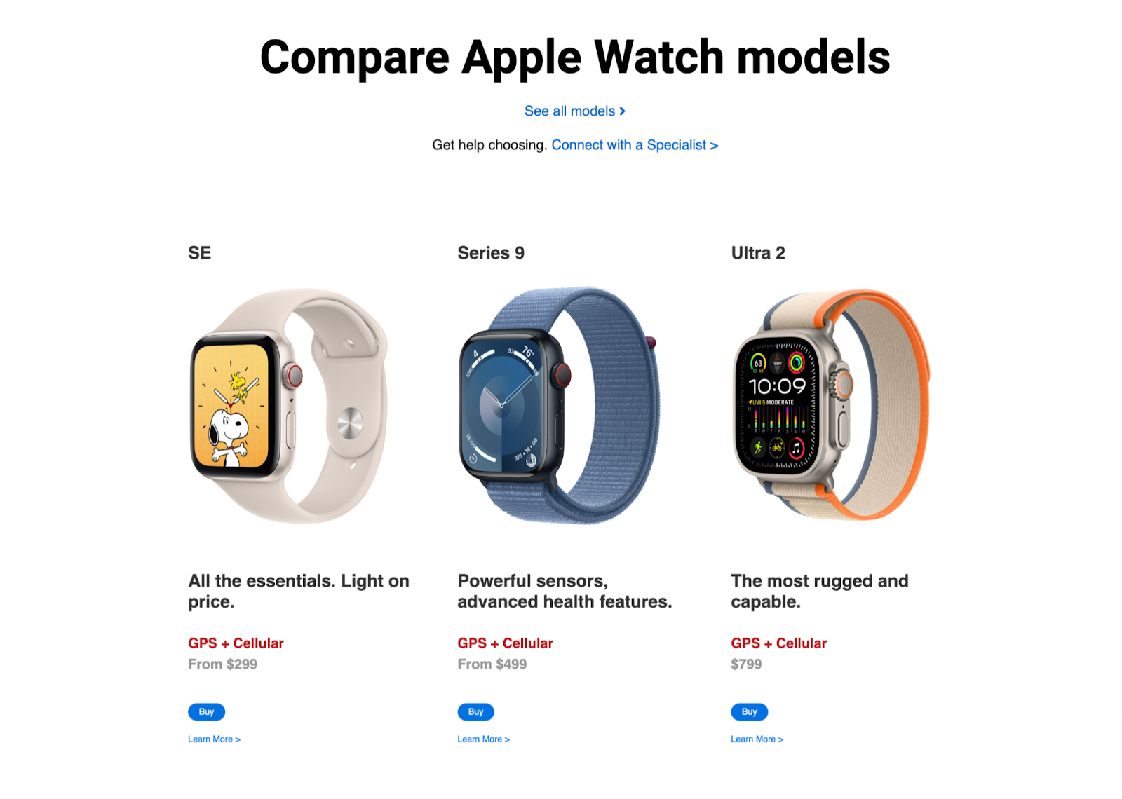
Product Comparisons
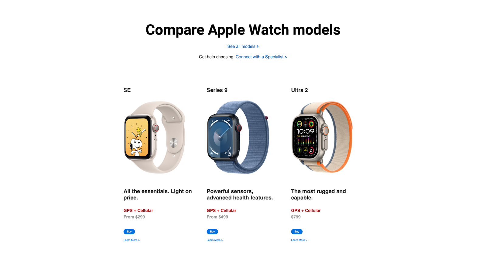
Create detailed product comparison tables to help customers make informed purchasing decisions. Here is an example of an Apple watch model comparison created with our Advanced Comparison Table widget.
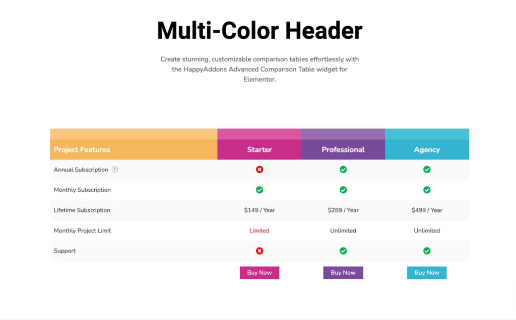
Service Plan Comparisons
Compare different service plans, highlighting the features and benefits of each tier. You can achieve this kind of advanced pricing table with this widget.
Feature Comparisons
Showcase the differences and similarities between various features or functionalities of your offerings. Here is an example,
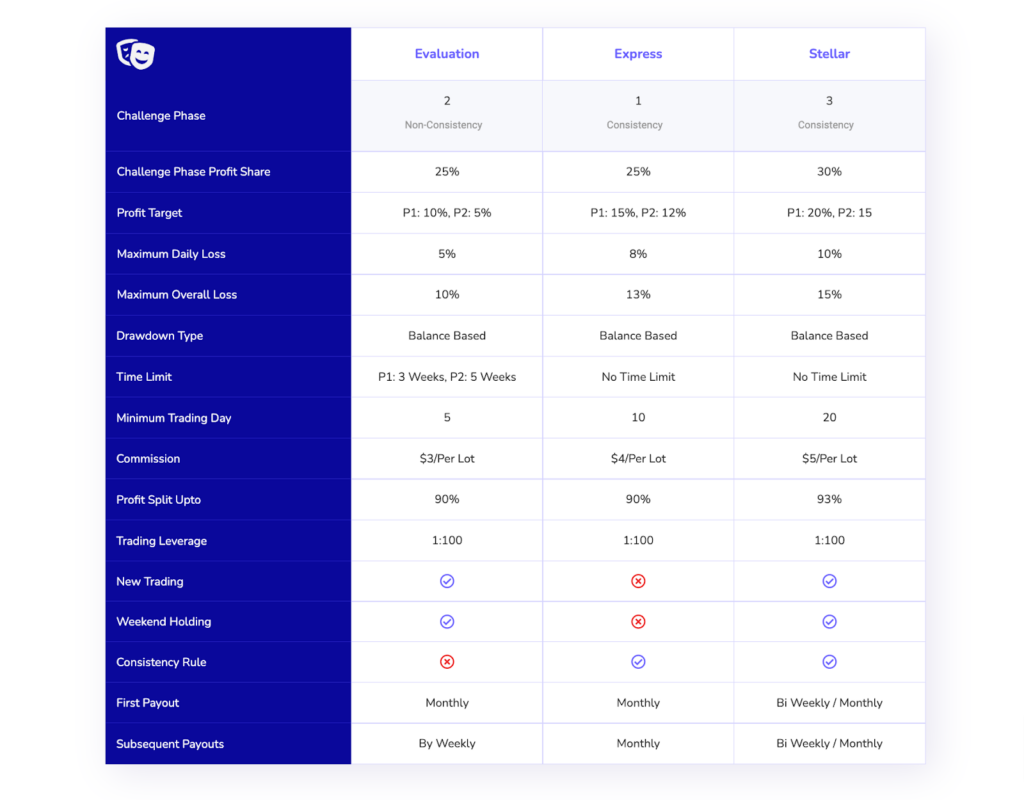
All the shared demos were created with our Advanced Comparison Tabel Widget.
FAQ on How to Create Comparison Table with Elementor Comparison Table Widget
Hope you are satisfied with the tutorial. In this section, we’ll now answer some frequently found questions online about the Elementor comparison table.
How many table widgets HappyAddons have?
1. Data Table
2. Advanced Data Table
3. Pricing Table
4. Comparison Table
What are the things we should display on product comparison tables?
Does Elementor have any table widgets?
Can I import and export comparison tables created with HappyAddons?
Note: Import and export is an Elementor feature.
Is there any chart widget in HappyAddons to present statistics data?
1. Bar Chart
2. Line Chart
3. Pie & Doghunt Chart
4. Polar Area Chart
5. Radar Chart
Ready To Create Comparison Tables with Elementor?
The Elementor Advanced Comparison Table Widget by HappyAddons is a powerful tool for web designers looking to create detailed and visually appealing comparison tables. By following the steps and tips outlined in this article, you can effectively utilize this widget to enhance your web design projects.
Whether you’re comparing products, services, or features, the Advanced Comparison Table provides the flexibility and functionality you need to present information clearly and attractively.
An interactive comparison table gives your users a better view while comparing the products. Designing a comparison table using Elementor and HappyAddons is no longer difficult if you follow the above steps.
In this guide, we’ve shown why you need to use the Happy Addons’ Comparison Table widget. Also, we’ve shown you how to create a comparison table on your WordPress site.
If you still have any queries regarding this blog, you can comment on us.
We request you to join our newsletter. Don’t forget to connect our social channels Facebook, Twitter, and YouTube.
Subscribe to our newsletter
Get latest news & updates on Elementor




4 Responses
The list is Great, well designed, and very creative thinking. I suggest a website where we can get more knowledge about web development, It helped me to succeed in my various projects.
Thanks for your comment. We are always trying to help others with our content. And we’ll produce more effective content in the future so join our newsletter to get new tutorials regarding WordPress and Elementor.
How to make it look good in mobile phone?
Hello Veeti,
By default we have settings for make it mobile responsive. If you have any specific design requirements then you will need to handle it with CSS.
Thanks and regards,
Gobinda
Team HappyAddons