It’s our new premium widget.
How to use HappyAddons Advanced Comparison Table
Welcome to the HappyAddons Advanced Comparison Table(ACT) documentation! This guide will help you understand how to use the Advanced Comparison Table widget to create highly customizable and attractive comparison tables.
Requirements
To create an advanced comparison table, you will need:
- Elementor Free
- HappyAddons Free
- HappyAddons Pro
Introduction
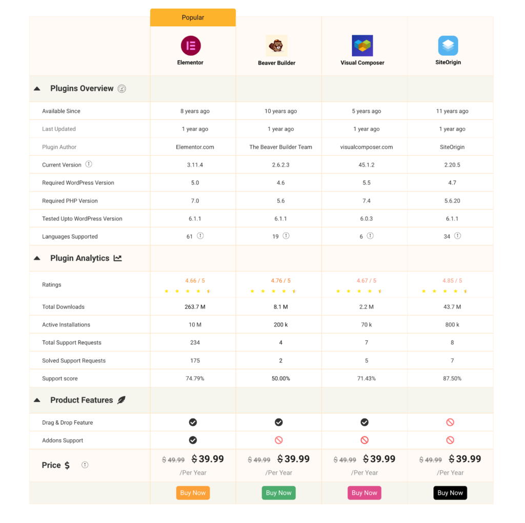
The Advanced Comparison Table widget allows you to build detailed and visually appealing comparison tables. Below is a demonstration of the types of tables you can create with this widget. This documentation will cover basic features and advanced customization options.
Setup
Step 1: Add the Widget
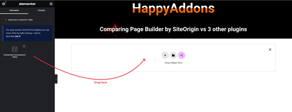
- In the Elementor editor, search for the Advanced Comparison Table widget.
- Drag and drop the widget onto your canvas. By default, you’ll see a basic 3-column pricing table.
Step 2: General Settings
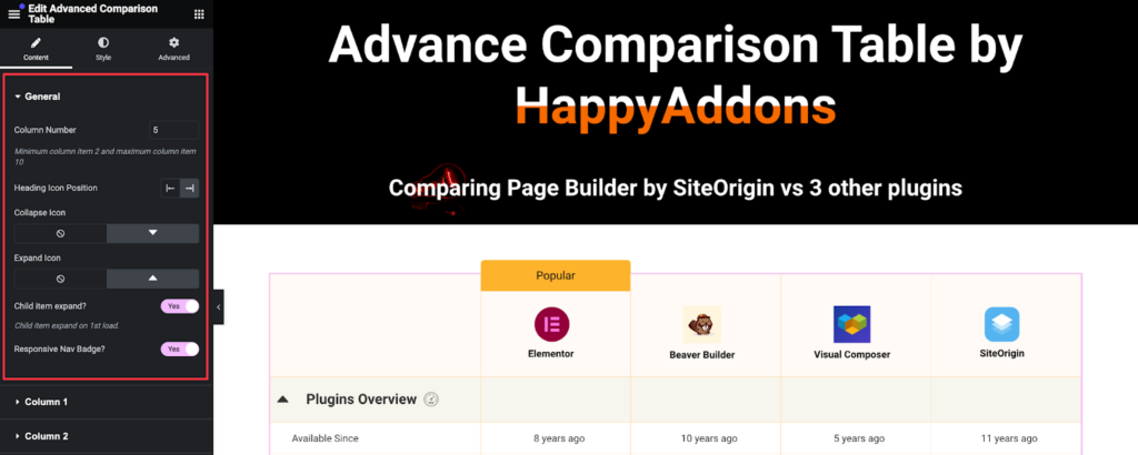
- In the content tab’s General settings, you can add columns (up to 10) for a comprehensive comparison table. For tables requiring more than 10 columns, consider using the Advanced Data Table widget.
- You can control the icon position for headers and change the collapse icon for rows. By default, child items are always open, but you can toggle this setting off.
Step 3: Responsive Nav Badge
- Enable the responsive nav badge to display badges on mobile devices (after the first column).
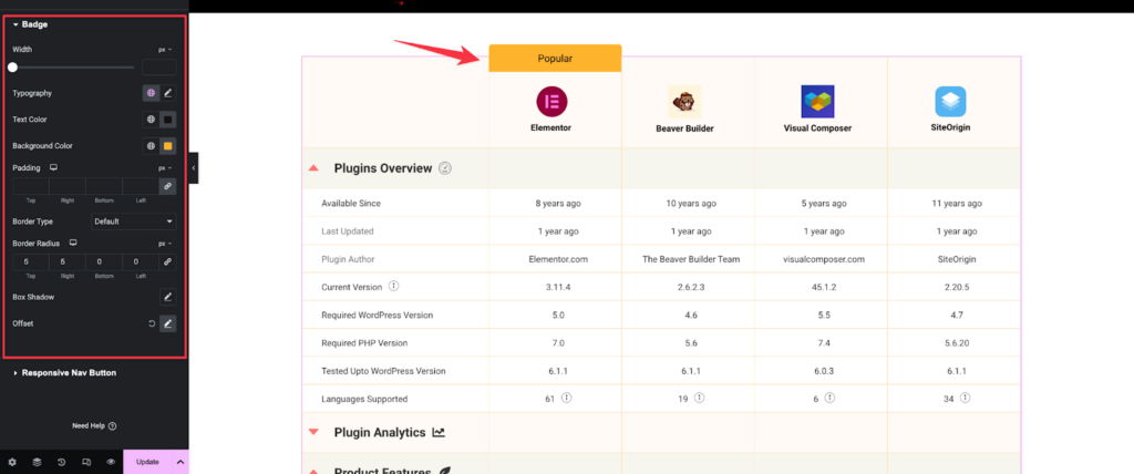
- Customize the badge design in the style tab.
Adding Data to the Table
Column and Row Setup
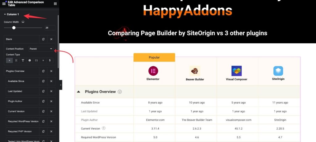
- Set the width for each column in the first column settings, with the rest of the columns adjusting automatically.
- Define each cell in a column. The first cell should be the header of the column, set as a parent cell, with subsequent cells as child cells if they need to collapse under the parent.
Content Types for Cells
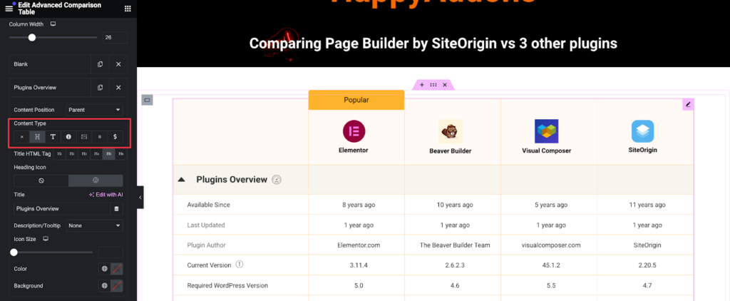
Each cell can contain various content types:
- Blank: An empty cell.
- Heading: Text with optional icons and description or tooltip. Icons can be selected from the Elementor and HappyAddons Icon library.
- Text: Simple text content.
- Icon: An icon from the library with adjustable size.
- Image: An image from your media library with customizable resolution.
- Button: A button with all Elementor button styling options.
- Pricing: Pricing content with options for discounted prices.
Data Entry Tips
- Use a structured data set for reference to ensure consistency.
- Parent cells should be consistent across the same row for proper data visibility.
- Data must be added column by column as live editing mode does not support direct row entry.
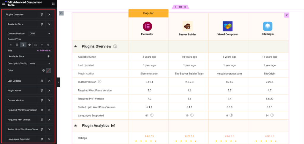
Managing Cells
- Duplicate cells as needed.
- Hide columns by toggling the button off (not available for the first column).
- Add new cells by clicking the add item button.
- Adjust alignment, add badge text, and customize badge styles.
Styling the Table
General Styling
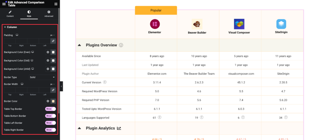
- Column: Change the color of even, odd, and child backgrounds in the column section.
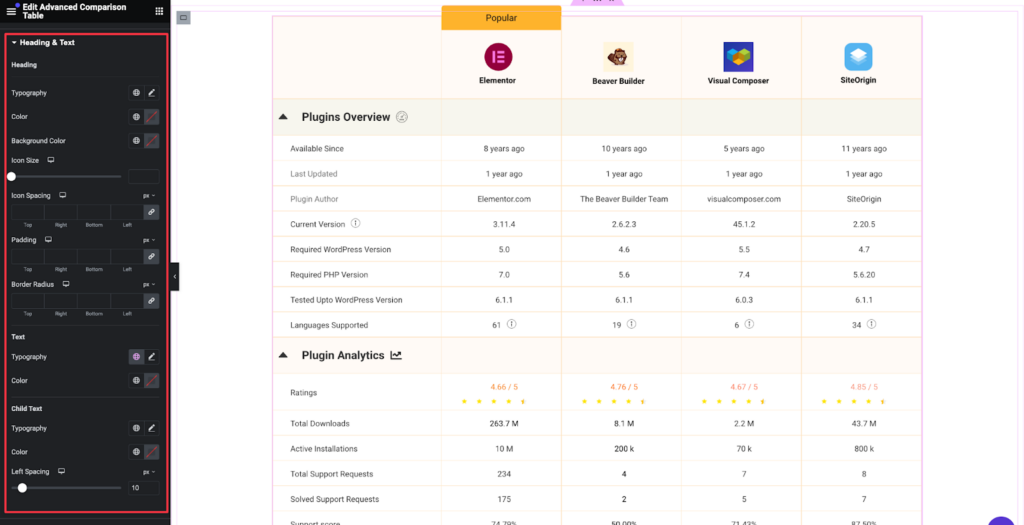
- Heading & Text: Customize text and heading colors.
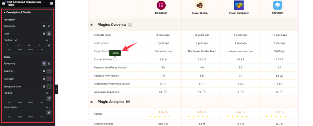
3. Descriptions and Tooltips: Set global colors for descriptions and tooltips:
You can adjust the width of the tooltip on the style tab:
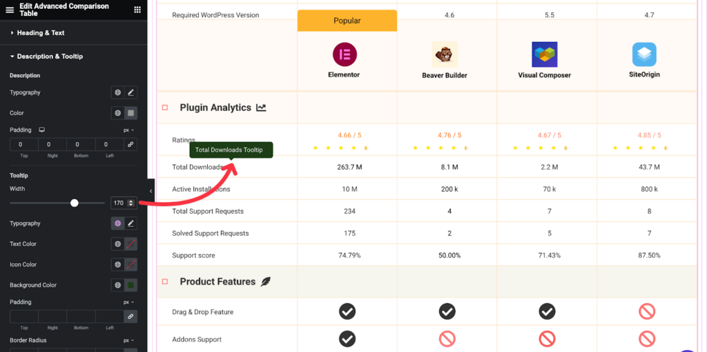
You can adjust the width of the tooltip on the style tab:
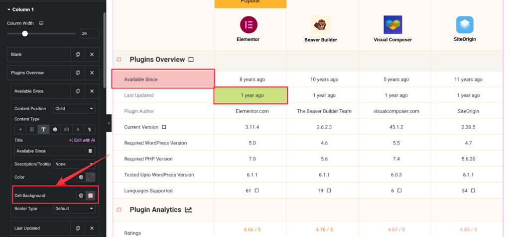
4. Cell Background: You can add a background color to each cell of the row/column.
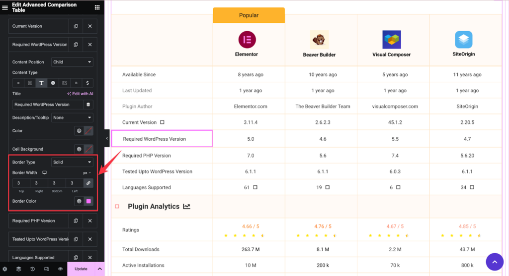
5. Border: You can now add and style a cell border for more visibility of your selected cell.
Specific Customizations
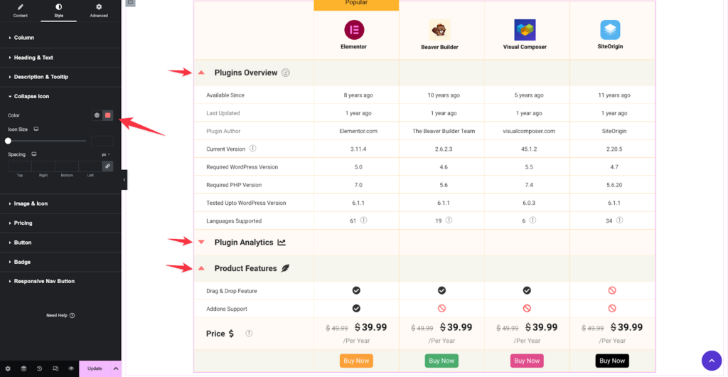
- Collapsable icons: Collapsable icon have their own styling options.
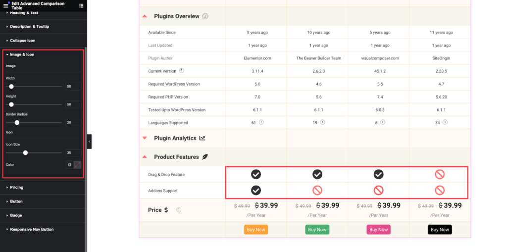
- Image & Icon: Customize image and icon styles are available individually.
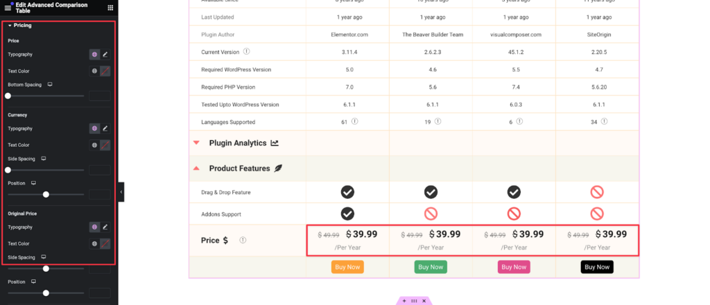
- Pricing: Adjust styling for pricing content.
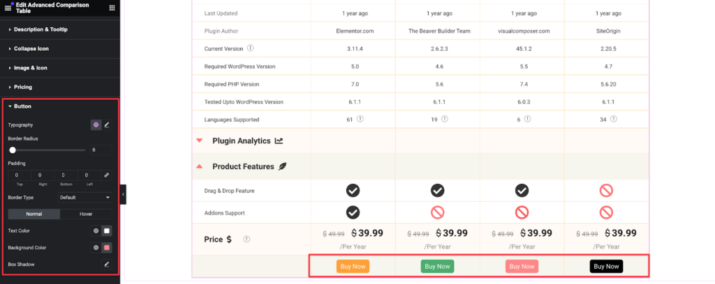
- Button: Set global button styles as follows:
- Badge: Style badges and responsive nav buttons.
Advanced Features
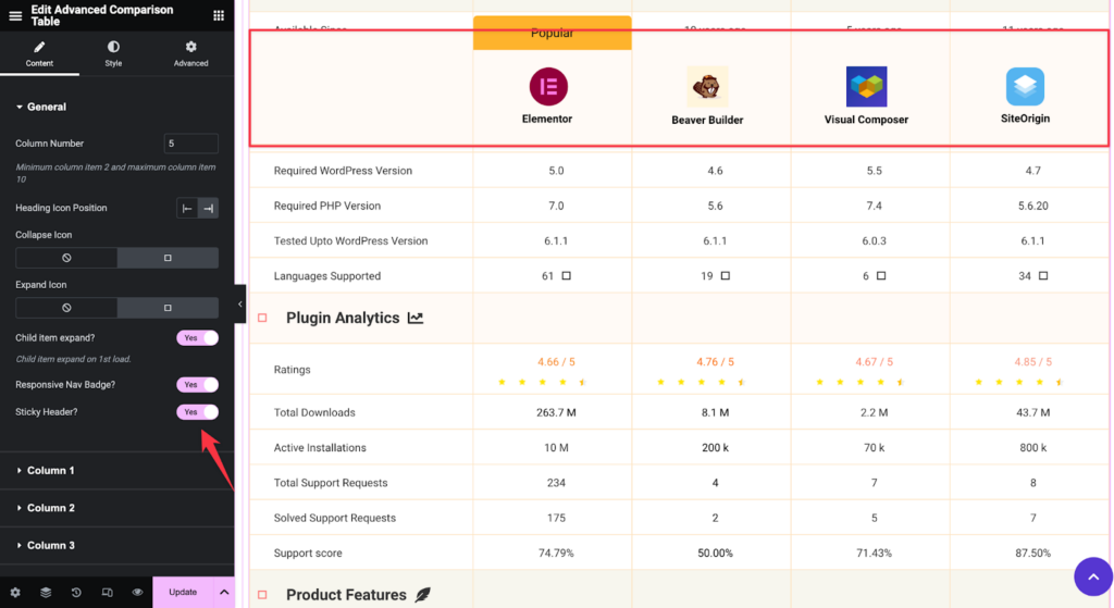
Sticky Header
You will find the Sticky Header option under the Content > General settings. You can enable the sticky header by toggling the button.
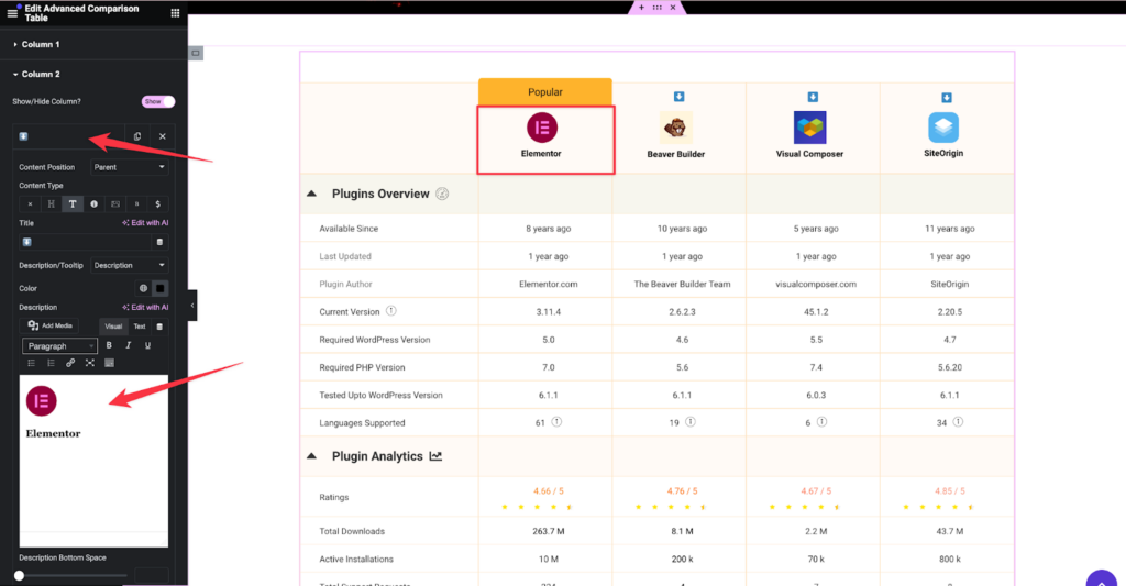
Header with Image and Text
For adding images and text in the header:
- Choose the Title content type and add a description. (Title field can not be blank)
- Set content in the title section to ensure visibility.
- Add images and text in the description section.
Adding Shortcodes or Templates
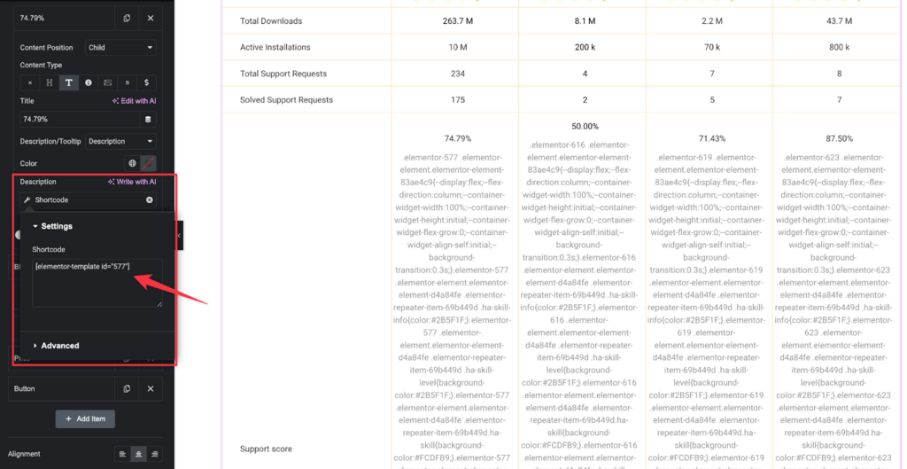
If using Elementor Pro, you can insert dynamic tags within the description section. Along with that, you can find your saved templates shortcode to your Templates section.
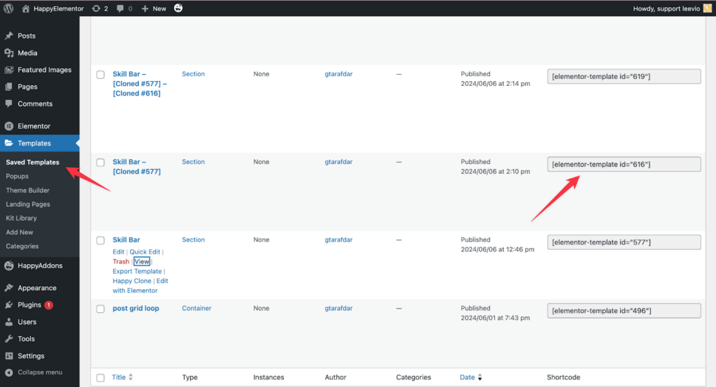
- Select the shortcode and insert a premade Elementor template shortcode.
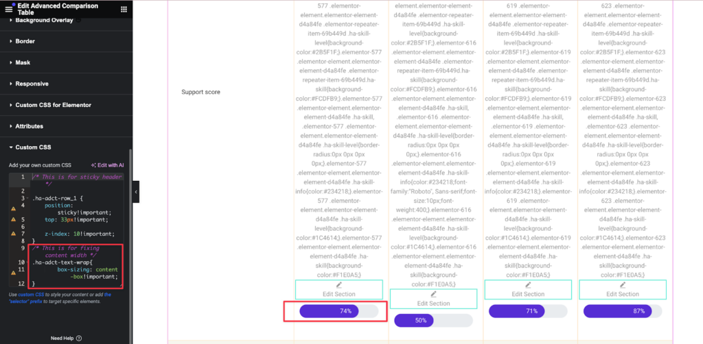
- Adjust the CSS for a perfect fit:
Code:
/* This is for fixing content width */

.ha-adct-text-wrap{

        box-sizing: content-box!important;

}
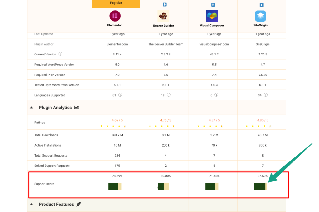
Here is the frontend view of the skillbar
Conclusion
With these tools and options, you can create stunning comparison tables using the HappyAddons Advanced Comparison Table widget. Use your imagination and the widget’s features to build unique tables that meet your needs. For any further assistance, feel free to reach out to our support team. Happy designing!
