A website is a window through which customers can look into your business. Big companies’ websites are usually large, complex, and filled with too much content (posts and pages). Users have to visit multiple pages to find the exact information they are looking for.
According to Marketing Dive, 53% of visitors move away from a website if the page takes over three to four seconds to load. Their dissatisfaction goes up if they find it difficult to find out the exact information they are looking for in the shortest possible time.
But with a one page website, you can assemble all the major information of your business on one page and help them load faster. It can improve user experience and conversion, both alongside. This article will provide you with a step-by-step tutorial on how to create a one page website.
We’ll also cover some additional topics like its importance, elements you should include in it, best one page themes, and more. So, have a cup of tea and keep reading this article till the end.
What Is a One Page Website?
As the name says, a one page website is a website that contains only one webpage. It doesn’t have additional pages for About, Services, Products, Pricing, Terms & Conditions, and else. Rather, all these sections are covered on a single page in a short and concise way.
The sole purpose of one page websites is to serve specific audience groups, highlight product value, promote sales offers, and increase conversion. The popularity of one page websites has reached the highest level among mobile phone users.
Due to the short screen size, the mobile phone isn’t a handy device for many people to explore multi-page websites. Single page websites give them more comfort in finding the exact product information and deciding whether to buy or not.
Why Should You Consider Creating a One Page Website?

One page websites are also known as single page websites. The present trend shows its popularity will continue to grow over time. Check out some of its key reasons below.
a. Simplifies The User Experience
When your users visit your website, they want to find information quickly and easily. A single page website can simplify the user experience by keeping all the major information on this single page.
b. Allows for Focus More on Content
On a single page website, you don’t have to bother much about mapping, optimization, linking, and else. So you can focus on presenting the important information more creatively to hook the readers.
c. Increases Conversion Rates
Creating a one page website can help you increase your conversion rates. It saves customers from clicking away to other websites and reduces their time exploring unnecessary things.
d. Handy for Mobile Devices
Single page websites are easy to navigate from mobile devices. We have explained the reason just a bit above. If you can present your discount offers and CTAs smartly, it can further boost your conversion rate.
e. Great for Small Projects
If you’re building a portfolio, a product landing page, an event site, or a small business website, a single page is often enough. You don’t need to create many pages when your content is short and direct.
f. Better Storytelling Flow
With a one-page layout, you can control how users see your content. You can place sections in a specific order and guide users through your message step by step. This helps create a smooth and engaging story.
What Are the Elements a One Page Website Must Have?
Due to limited space on a one page website, you may think of omitting many elements that you naturally maintain on a multi-page website. But there are some must-have elements that you cannot avoid on one page websites. Take a look at them.
Header: The header includes some very basic elements of brand identity, like a logo, slogan, corporate mascot, corporate color, etc. It also includes navigation menus. Clicking any of them will instantly take you to that particular section of your website.
Footer: The footer includes important legal disclaimers, authorship information, and social media icons.
Meaningful Images and videos: Long-form articles become boring if there are no images. You must include some meaningful images and videos wherever possible.
Services/Products: Whether it is a portfolio site or a corporate website, never forget to highlight the key products or services that you want to sell.
Testimonials: More than 80% of customers today read reviews before buying a product online. Add positive testimonials on your website to spread a good vibe among your potential customers.
Call-To-Action Button: Conversion is the key objective of any one page website. Having a proper call-to-action button can help you convert your customers instantly.
Contact Information: If visitors are convinced by your products, services, and offers, they may want to reach out to you. Add your contact information (email, phone number, social channels) so they can reach you anytime.
How to Create One Page Website with Elementor: Step-by-Step Guide
Now, get ready to build your one page website. Elementor is a renowned web-page builder plugin for WordPress. HappyAddons is a powerful extension of Elementor. With the help of both these tools, you can create a fully-functional single page website without any coding.
Besides, you will find numerous stunning ready-made templates in their library sections. You can use them to get rid of the hassle of creating a one page website from scratch. Here, we will use both this plugin and extension to show you the process. Let’s get prepared.
Prerequisite
- Elementor
- HappyAddons (Free)
- HappyAddons (Pro)
Finally, like any other traditional website, you need a domain and hosting here as well. Once your website and these plugins are ready, get into your dashboard and follow the tutorial below.
Step 01: Install and Activate a Theme
You need to install and activate a theme first. Navigate to Appearance > Themes. You can choose any theme you want. Here we have selected the Hello Elementor theme.
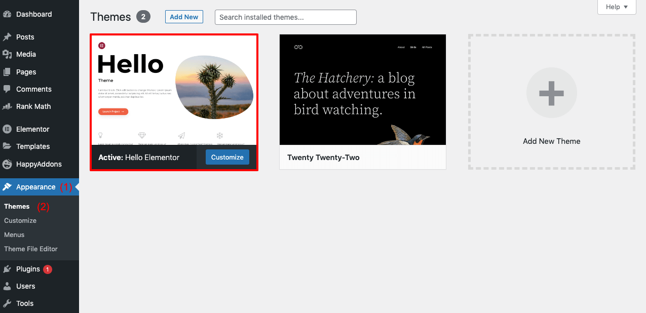
Step 02: Open a New Page with Elementor
To open a new page, go from the dashboard to Pages > Add New. Click on the button Edit with Elementor above. It will open up the default page layout of Elementor.
Step 03: Enable Elementor Canvas
You may get some unnecessary text and elements on the default layout. You shouldn’t publish them on the final page.
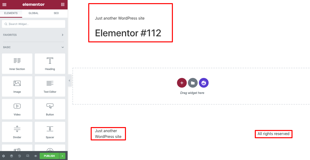
You need to enable Elementor Canvas to exclude them. To do that-
- Click on the Settings icon in the bottom-left corner.
- Then, from the Page Layout section, select Elementor Canvas.
Step 04: Select a Ready-Made Page Template
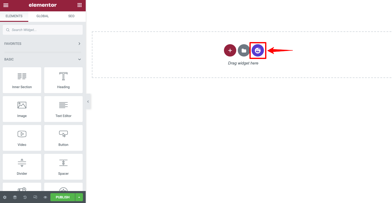
Click on the HappyAddons icon. It will open up the HappyAddons library, where you can select a ready-made page template.
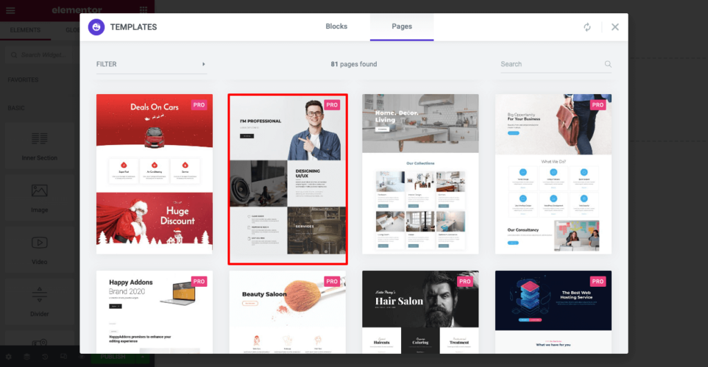
Both in the Blocks and Pages sections, you will get a good collection of ready-made templates. As we are creating a one page website, we are selecting a template from the Pages section. We are selecting a portfolio template from this collection. You can choose any one that you prefer.
You can see the page template imported on your Elementor Canvas. Next, you can customize the page by adding navigation menus, texts, images, and other content.

Step 05: Add Navigation Menus
Before adding navigation menus, you must decide what sections you want to have on your website. We want to add the following sections to this website.
- About Me
- My Services
- Special Skills
- My Clients
- Contact Me
To create these menus, go to your WordPress dashboard again.
- Then navigate to Appearance > Menu.
- Give a name to your Menu.
- Click on the Create Menu button at the end.
You will get a Happy Menu option afterward. Toggle it on. Then add a custom link for each of your menu items, as shown in the video. Follow the formula below to create Custom Links:
(Copy-paste your landing page URL)/#(page section)
http://local/?page_id=163&preview=true/#About Me
You can replace About Me on the link above with your preferred text. But make sure you copy the text, as we are going to need it while adding this to your live page.
In the same way, create custom links for other menu items. Finally, click on the Save Menu button from the bottom-right corner.
Get back to the Elementor Canvas again. Add a new section above the hero section. Select a suitable layout. Then drag and drop the Happy Menu on it, following the video below. It will bring all the menu items on top of this page that you created just a while ago.
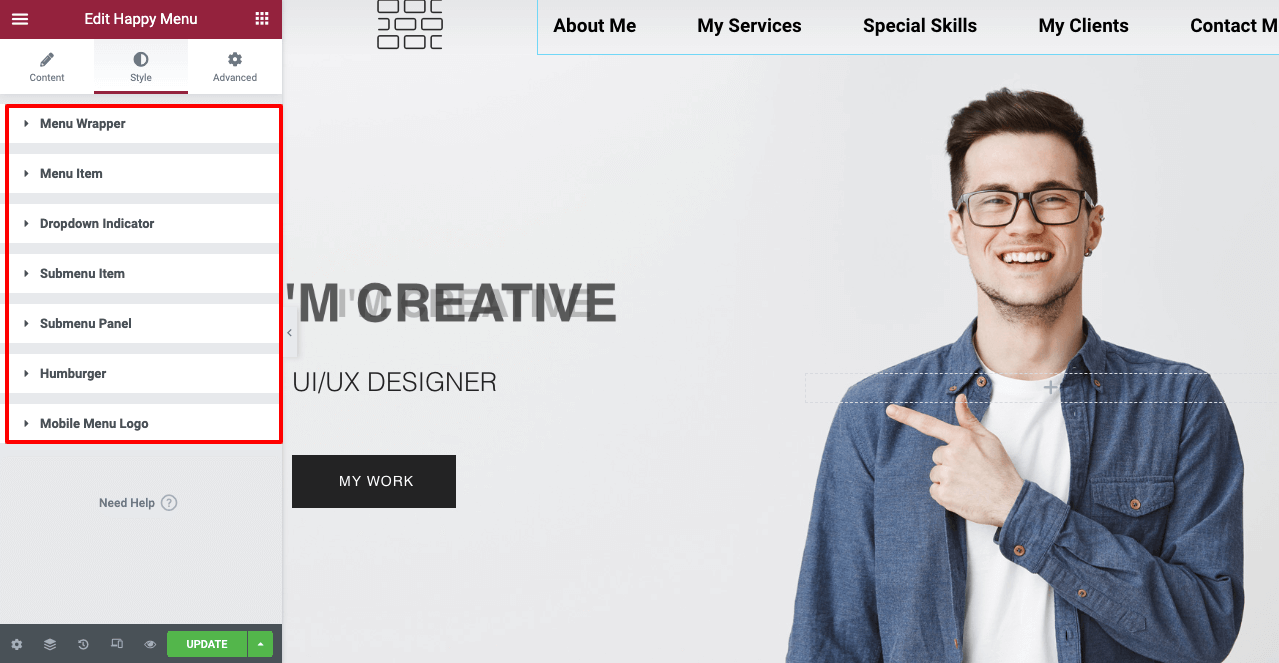
From the Style section, you can further customize your menu items. You can change their font size, font type, font color, and background color. Also, you can add a dropdown indicator, submenu items, submenu panels, logos, and more.
Step 06: Create Web Sections
Here we will show you the process of adding and building all the sections for this website stated above.
# About Me Section
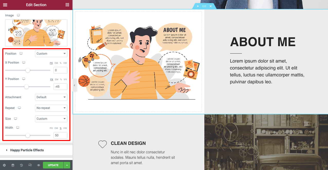
Scroll down to the second section of this page. You may convert the second section to About Me. The process is shown in this video. You may add an explanatory photo next to it if you want.
From the style option, you can perfectly position the photo on the layout of your Elementor Canvas.
# My Services Section
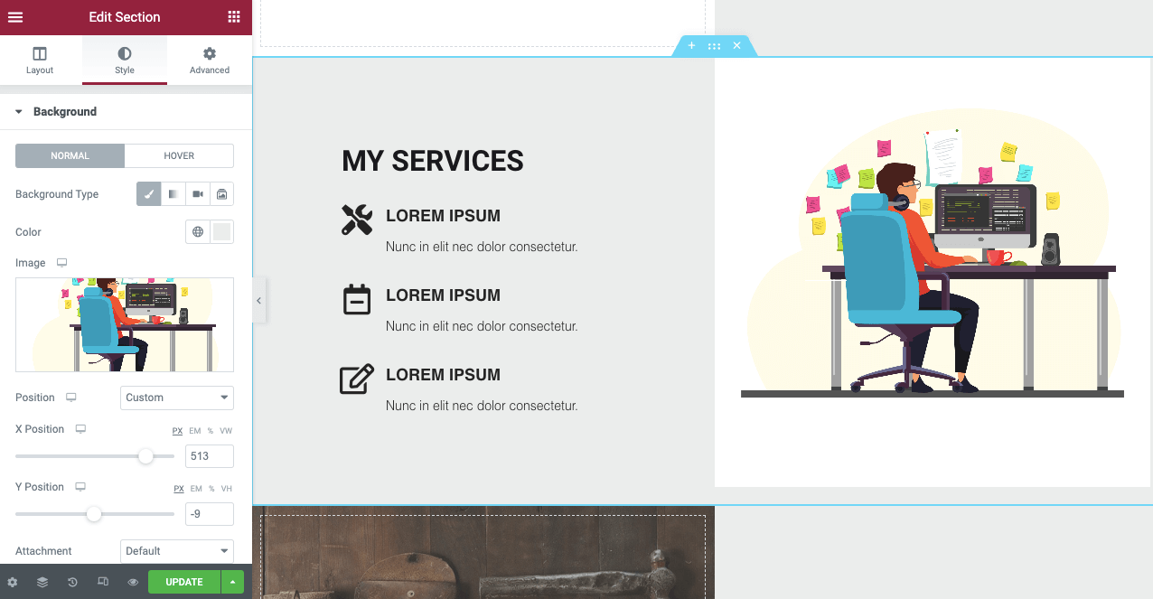
Following the exact same process as the above section, you can create and edit the My Services section.
# Special Skills Section
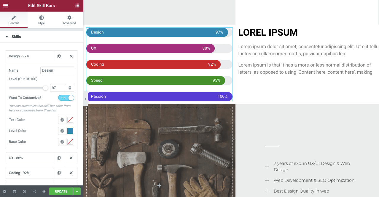
To create the Special Skills section, you can use the widget Skill Bars.
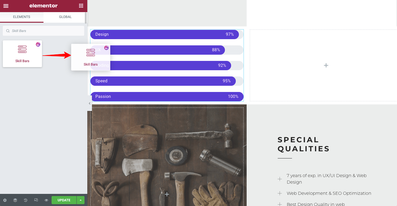
You can further customize it to make this section eye-catchy. Also, you can put explanatory text next to the skills bar section.
# My Clients Section
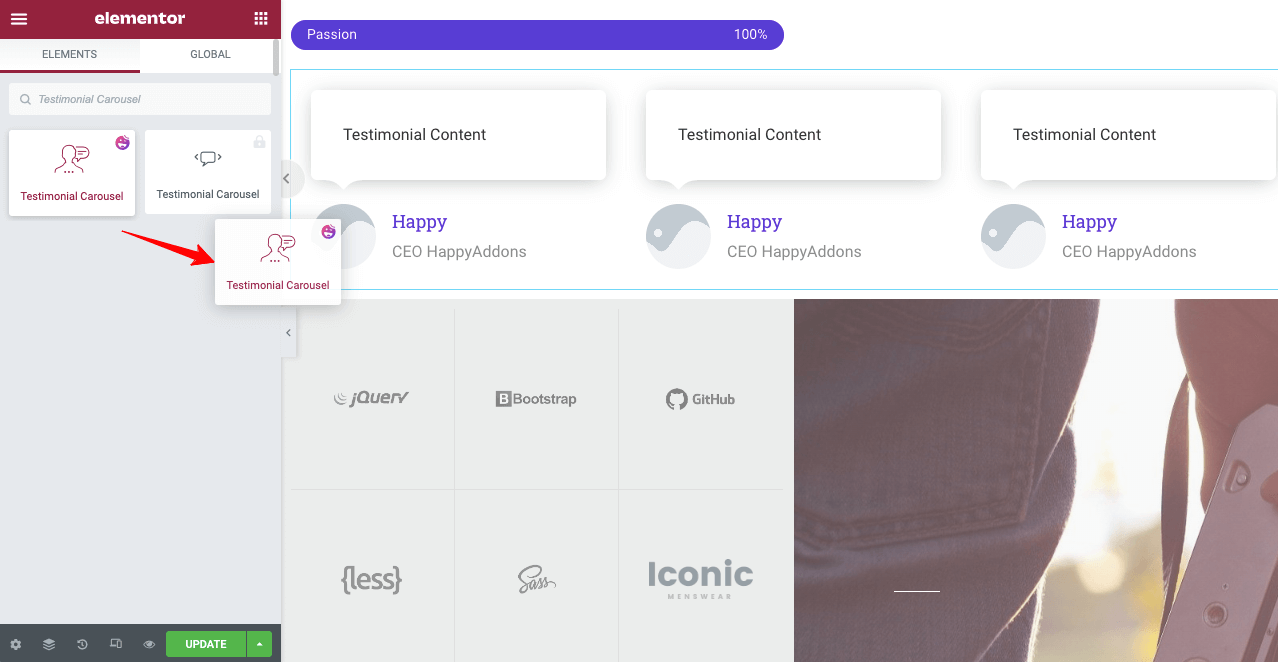
In the My Clients section, you must try to add your clients’ testimonials about you. It will work as social proof and create reliability among your potential customers. You can use the Testimonial Carousel widget. Drag and drop it on a new section on your website.
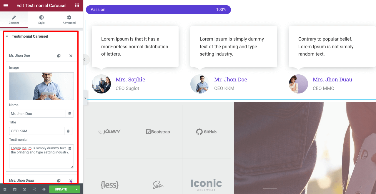
From the content and style options, you can upload your clients’ photos and add their reviews as testimonials on your website.
# Contact Me
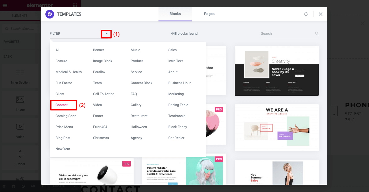
You may use the ready-made contact form with the page template or the HappyAddons contact form widgets to build one. HappyAddons has numerous contact form templates from which you can choose one to make this section more eye-catching.
Clicking on the HappyAddons icon, go to the library section again. From there, choose the contact form structure you want.
HappyAddons has integration with all the major contact form builder plugins. If you already have any built-up form, you can easily import it to your contact form section right away.
Let’s say you have the Contact Form 7 plugin installed. Drag and drop the Contact Form 7 widget on your form section. Then select the form you want to publish from your saved list.
# Add A Footer
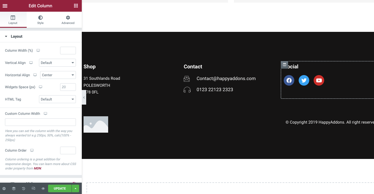
Finally, add a footer to your one page website. Here again, you can use the Happyaddons library to choose a footer template or use widgets to build one.
Step 07: Link Web Sections to the Navigation Menus
Now you have to link all these sections to the navigation menus respectively. It will enable readers to jump to different web sections by clicking the menu items.
Remember the About Me text you copied? You need to paste that in the CSS ID section, as shown below.
Thus, you can create a single page website with the help of Elementor and HappyAddons without a single line of code.
Step 08: Preview the One Page Website
Let’s check out the final preview of the single page website we have created.
This is really very difficult to show every single part of the one page website creation process with images and short clips. We tried our best to make it effective and highly educational. Hope you enjoyed this tutorial.
If you have any confusion with any part of this tutorial, just leave a message for us in the comments section. We will respond to you.
Bonus: Things to Remember While You Build One Page Websites
There are some common mistakes most users make in building one page website. Look at them below so you can avoid them while designing your website.
Maintain a Logical Structure
It refers to the chronology of sections you will cover on your website. Most successful websites usually maintain this chronology: About > Products/Services > Sales Offer/Pricing > Testimonials > Contact Information. There is no problem if you have a different idea. But make sure the structure is logical.
Make It Mobile Responsive
If you forget to make your one page website mobile responsive, it can never meet your objective. It will cause you to miss a good flow of traffic and many potential customers. You must make your website mobile responsive to make it accessible for all users.
Ensure Short Loading Time
Slowish loading time is a key reason why most websites lose a big chunk of visitors every day. Use a lightweight theme like Hello and compress your media files to reduce the loading time.
Choose Fitting Color Pallet and Font Type
Use a good color palette and font type that rightfully uphold your brand value to the users. Better you choose a theme that matches your content style. You won’t have to update your color palette and font type manually.
5 Best One Page WordPress Themes You Can Use
Selecting the right theme is very important because it determines the design, layout, loading speed, mobile responsiveness, and content presentation style of a website. Here we will introduce you to our recommended best one page WordPress themes.
Astra
Astra is a modern, lightweight, minimalistic, and fully-responsive WordPress theme built with an intuitive drag-and-drop builder. It features a clean design, live preview, and tons of demo templates to let you create any kind of web page right away.
Neve
Neve is another popular and lightweight WordPress theme ideal for one page websites. It also comes with a good collection of ready-to-import starter pages. Neve works perfectly well with any page builder plugin, including Elementor and HappyAddons.
Divi
Divi is a multi-purpose WordPress theme that you can use for almost any kind of website you can think of. It has an in-built page builder feature named Divi Builder, by which you can give a more stunning look to your website.
Ultra
If you are looking for the best one page WordPress theme, whether for restaurants, agencies, weddings, or hotel rooms, Ultra can be a great option. It’s a part of Themify’s collection. So, you will get all the elements of Themefiy builder in this theme.
Uncode
Uncode has one of the broadest libraries of demo templates. It has hundreds of ready-to-go designs and eight unique one page designs. Using these demo templates, you can get your one page site ready in a couple of hours.
FAQs on How to Create a One Page Website
Now have a look at the answers to the most frequently asked questions about how to create a one page website.
-
Who would use a one page website?
One page websites are getting increasingly popular. Over time, people of all classes, whether freelancers, industry experts, agencies, and startups, from small to big, are opting to use the one page website.
-
What elements should you include on a portfolio-based single page website?
You must include the following elements on a portfolio single page website:
1. A bio or About Me section
2. Personal branding elements
3. Your professional skills
4. Your educational certificates
5. Previous job experience/projects you have handled
6. Testimonials/Award information
7. A short pitch video
8. Valid contact information -
What elements should you include on an agency-based one-page website?
You must include the following elements on a portfolio one page website:
1. A short history of the agency
2. Services of the agency
3. A short bio of the team members
4. A snapshot of the projects handled
5. Testimonials received from the previous clients
6. A short pitch video
7. Offers and discounts
8. Valid contact information -
How can I do SEO for single page websites?
It’s really challenging to boost the SEO score for single page websites. However, you can try the following tried-and-tested tips.
1. Use a mobile responsive theme
2. Optimize quality keywords in the content section
3. Use multiple H1 if possible
4. Get backlinks from high-authority websites
5. Publish guest posts -
How many sections should I have on a single page website?
Never make your single page website so long that readers have to keep scrolling your website all day. A maximum of six to seven sections is enough. If you want to add more information in this limited space, you can add tooltips and long explanatory video clips.
Are You Ready to Build Your One Page Website?
We are now at the end of this article. Today single page website is a trendy thing online. The reason why its popularity is constantly increasing is that it has the power to convert a specific target audience group and meet your quest.
Hope you have found all the necessary resources in this article to get ready to create one page website. If you are looking for any further assistance to clarify your confusion, just state your message in the comment section. We will get back to your query as soon as possible.
If you love to read more interesting articles like this one, subscribe to us and follow our Facebook and Twitter channels.
Subscribe to our newsletter
Get latest news & updates on Elementor




2 Responses
You have mentioned some of the interesting ways using which can build an awsome single page website. Here I have extra points that you can use in your content which can be useful for your readers. Check them out below:
1. Choose a good theme
2. Focus on a clear message
3. Make use of white space
4. Use animations and interactive elements
5. Optimize for mobile
These are some of the points you can include in your blog.
Thanks Sophia for stopping by and sharing some valuable points.
Regards,
Team HappyAddons.