Creating an engaging and informative ‘Meet the Team’ page is essential for any agency or business organization today. This page isn’t only a list of names and photos of your employees but also an opportunity to showcase their skills, stories, and personalities. You can also attract potential employees who are interested in joining your company with this page.
Moreover, once you have a well-designed team page, it can build trust, humanize your brand, and give visitors an idea about your organization’s culture. In this blog post, we’ll help you explore some of the best “meet the team page” examples so you can take inspiration.
Before that, we’ll cover a few theoretical parts regarding our today’s topic.
What Is a Meet the Team Page?
A meet the team page is a separate page of a website designed to introduce the members working in an organization. You may also display a short biography of the people, including their contact information like email addresses and phone numbers. So, in short, meet the team pages include the following elements:
- High-quality photos
- Member’s names and job titles
- Short biographies
- Personal details
- Contact information
- Personal page links (optional)
15+ Best Meet the Team Page Examples
By now, you have an idea of what meet the team pages are and the elements that make up such pages. In this section, we’ll cover some of the best meet the team page examples so you can take inspiration for your design.
1. weDevs

weDevs is a software company specializing in WordPress and SaaS products. They are known for developing plugins like Dokan, WP Project Manager, WP ERP, Appsero, and many more. Around 90 to 100 workers from various backgrounds work in this company. It boasts a minimal design that displays only the workers’ images, names, and designations.
Logic behind the page: You can see all the employees working in the company on this page at a glance. If you are looking for a clean and minimalist meet the team page example, this could be an inspiration for you.
2. Namecheap
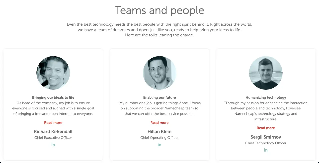
Who doesn’t know Namecheap? You’ll hardly find someone who has never heard of Namecheap. It is currently one of the leading domain registrars and hosting companies in the world. It’s a private company with 900+ active members. So, it’s difficult to display all the members working in this company. As a result, Namecheap displays only the key people on their meet the team page.
Logic behind the page: If you have lots of employees working but want to show only the C-level workers (CEO, COO, CTO, etc.) you can take this page as an example.
3. Awesome Motive
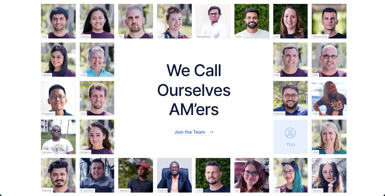
Awesome Motive is another well-known software development company, specializing in WordPress. It is founded by Syed Balkhi. OptinMonster, WPForms, SeedProd, All in One SEO, etc., are some of its most popular plugins.
In addition to plugin development, they also invest in various other plugin companies and acquire many plugins. Thus, they have become big and giant over the years. Currently, Awesome Motive has 330+ employees from 50+ countries.
As a result, it’s not quite possible to list and display the details of each worker on their meet the team page as it will be so long. That’s why they published only the pictures of some of their employees in grid form along with their locations.
Logic behind the page: With this strategy, they can display a large number of workers in a limited space, which is not possible with the traditional meet the team page.
4. Microsoft
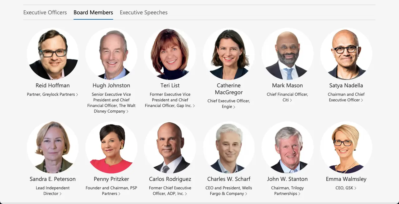
Microsoft is a global technological company with over 220,000+ employees worldwide. So you can easily understand that it is not possible to accommodate so many employees on their Meet the Team Page.
What they have done is displaying their employees in top leadership and managerial positions on their meet the team page. But the number of these employees is also quite high. So, they have created multiple tabs to display them according to their designation category.
Logic behind the page: If you want to display your top employees by their designation categories, this meet the team page example is perfect.
5. Apple

Like Microsoft, Apple is a globally renowned technological company with a wide variety of software and electrical products. It has over 150,000 employees working in various countries worldwide. So it is not possible for them to display all their employees on a single page.
Here too they follow the same strategy as the previous company. They display the company’s key leadership and board of directors on their meet the team page, but not using any switchable tabs.
Logic behind the page: If you want to display a number of important employees in a simple meet the team page without any switching tabs, then this page is ideal.
6. Shopify
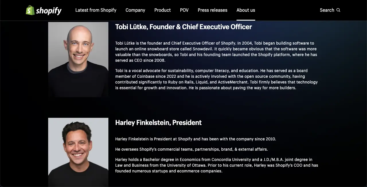
Shopify is a leading eCommerce platform that allows you to create and manage eCommerce stores with ease. So far, they host over four million eCommerce stores. To manage this big business, they have several thousands of employees Worldwide.
They are actively working in various departments, from technology and development to marketing. Their meet the team page hosts the most important persons of the organization with a short bio which isn’t usually seen on other websites.
Logic behind the page: Having a short bio about the team members can help you have SEO leverage if you can craft the copy optimizing relevant keywords.
7. Automattic
Automattic is the actual company that is behind the development of the entire WordPress ecosystem. It has a creative meet the team page which is eye-soothing to watch. Like many others, they also have a huge number of active workers but it has been successful in displaying them all on the page.
How they have done it! The website uses Google Maps to display employees according to their location. Visitors can zoom in to get a quick look at employees by location.
Logic behind the page: If your organization has numerous employees and you want to display all of them on the meet the team page, you can use this layout.
8. Elegant Themes

Elegant Themes is a prominent WordPress theme and plugin developer. They have millions of users who actively use their products today. They have around 100 employees at present in their organization.
Since this number is small, they list everyone on their meet the team page. In this case, they follow a similar page layout to weDevs. They only display employee photos, names, and designations on this page, which is a minimalistic approach.
Logic behind the page: This is another minimalistic meet the team page example after weDevs. Unless you want to apply a comprehensive complex design, you can follow this page layout.
9. Visme

Visme is a cloud-based graphic design tool. You can create stunning infographics, presentations, social media posts, resumes, and more in a short time with Visme. The most important thing is that you don’t even need to be an expert to design with this tool.
You will find numerous ready-made templates here that even beginners can complete the design in a short time. Visme also has a creative meet the team page, which displays hundreds of their employees together.
Logic behind the page: Visme doesn’t show any real picture of their employees on the page. Instead, they just set avatars for their employees with respective names. Finally, at the bottom of the page, a map points to the locations from where employees are working.
10. DigitaSilk
DigitaSilk is a digital marketing agency that creates digital solutions for businesses. They offer various services like web design, development, SEO, and online marketing strategies. They help you plan, create, and run marketing campaigns that result in targeted traffic and increased conversions.
They have a detailed meet the team page, which isn’t usually seen on traditional websites. On the page, they not only list their employees but also add a short biography for each. Once you move your cursor on the team members, you’ll see a hover effect.
Clicking on any team member will open their bio immediately below in a new section. The second click will hide the section again.
Logic behind the page: If you have a limited number of employees and want to show their details adding an expandable section, this meet the team page layout could be helpful for you.
10. Disruptive
Disruptive‘s meet the team page is more detailed than the other pages we have covered in the discussion above. The page has listed their employees according to their designation through a vertical tab.
Then each employee’s name has been linked to their respective biography page, which covers detailed information about them. Users can visit the biography pages just by clicking the names of the employees on the page.
Logic behind the page: If you have lots of employees on your organization and have an author/profile/bio page for each of them, want to link them to your meet the team page, you can take idea from this page.
11. Dentsu
Dentsu‘s meet the team page is very similar to the two websites above. On this website, they also maintain a detailed biography page for each employee, which is linked to each employee featured on the meet the team page.
As a result, visitors can first get a basic idea about all the employees from this page and then visit their page for details.
Logic behind the page: If you can optimize the author/profile/biography pages with the right keywords, it will definitely benefit your website’s SEO. That’s why they designed their Meet the team page this way.
12. Ogilvy
Ogilvy is a renowned creative advertising, marketing, and public relations agency. They offer a wide range of services like branding, digital marketing, content creation, and media planning in innovative ways to make your businesses unique.
They have designed their meet the team page in a unique way as well. They have displayed all their team members in a grid format with a hover effect. Hovering your cursor on the images will show the team members’ names. Clicking the images will open up a new section covering detailed information about the team member.
Logic behind the page: You can follow this page if you want to showcase your team members’ information on your meet the team page without creating additional author/profile/biography pages.
13. Thrive Digital
Thrive Digital is a performance marketing agency. They help businesses grow through data-driven advertising strategies. They provide you with measurable results through social media marketing, SEO, pay-per-click (PPC), and more.
They have a small team with few members, whom they present in a very unique way on their meet the team page. There are many web pages where you will see a feature called a tooltip, which will display information to you when clicked.
Using an almost identical feature, they arranged the layout of their meet the team page. Images of team members are spread across the page in small icon sizes. Once clicked, their information is displayed as slide shows.
Logic behind the page: If you have lots of employees, like hundreds or thousands, you can use this page layout to display them on your meet the team page.
14. WIX
WIX is a cloud-based leading website development platform. It allows you to create websites from scratch just by dragging and dropping elements. You don’t have to code anything. This is why it’s a great web-building platform for no-code users.
Like many, they have thousands of employees around the world. So, instead of displaying everyone on the meet the team page, workers in leading positions are listed and displayed on their page.
The interesting part of their page is that when you hover your cursor, team members’ information automatically appears. Therefore, no separate section needs to be extended.
Logic behind the page: If you want to display the information of your team members in a limited space without adding any additional sections or pages, you must consider the layout of this page.
15. Authlab

Authlab is a proud developer of many popular WordPress plugins used by millions of people worldwide. They maintain a clean and simple meet the team page. But the interesting thing we have seen is that instead of writing biographies of the team members, they have written a short copy of their expertise.
Wow, it’s amazing. It helps HRs from other companies to find desired candidates by reading out these copies and offering them new opportunities for their jobs. This boosts the career growth potential of the employees.
Logic behind the page: In addition to listing the names of team members, and thinking about adding a special value to their career growth, you can take inspiration from Authlab’s meet the page.
How to Create a Meet the Team Page in WordPress
You have to create the meet the team page using the platform or technology that you have used to create your website. There is certainly no shortage of website-building platforms and technologies in the market.
In this section we will show you how to create this page on a WordPress website. So, if your website is powered by WordPress, the following tutorial is for you.
Step 01: Install Elementor and HappyAddons
Elementor is a drag-and-drop page builder plugin for WordPress. You can design simple to complex websites using this plugin. HappyAddons is a feature-rich addon for the Elementor plugin.
Where Elementor has 100+ widgets and several helpful features, HappyAddons has an additional 130+ widgets with 20+ exciting features. Once you have both these plugins, you can do magic on your site.
Download the plugins and install them on your site by clicking the links below:
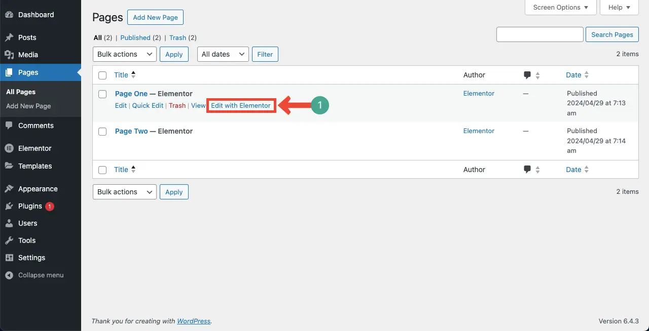
Step 02: Open a New Page with Elementor
Open a new page with Elementor.
Step 03: Use the Team Member Widget
Drag and drop the Team Member widget to the canvas and customize it.

The Team Member is a free widget of the HappyAddons plugin. Using it, you can create a clean, simple, and minimalistic meet the team page like the below image, which is similar to the pages of weDevs, Namecheap, Microsoft, and Authlab.

To learn in detail how to use the widget, visit the documentation of the Team Member widget.
Step 04: Use the Team Carousel Widget to Design Complex a Page
Using the Team Carousel widget, you can create complex meet the team pages. Drag and drop it on your Elementor canvas and customize it.
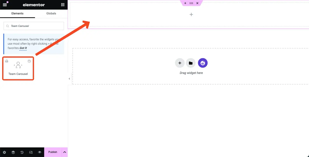
The Team Carousel is a premium widget of the HappyAddons plugin. Using it, you can create a complex meet the team page like the below image, which is similar to DigitaSilk, Disruptive, and Dentsu.
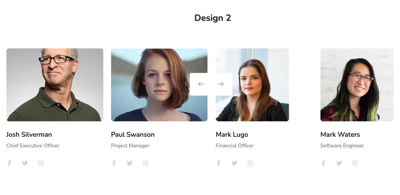
To learn how to use the widget in detail, visit the Team Carousel widget documentation.
Conclusion
Explaining how to design a meet the team page requires a separate blog post which isn’t possible to cover entirely in this running write-up. This is why we have given a glimpse of the tutorial at the end of this post.
If you want us to write a comprehensive guide on how to design a meet the team page as a new and dedicated blog post, please let us know through the comment box. We’ll consider doing it very soon.
You can also suggest which meet the team page examples you have loved that you want us to explain how to design it.


One Response
Thank you very much for providing important information.