Halloween is a yearly festival when people of all ages embrace the supernatural. They love to wear spooky outfits and decorate their homes with ghostly themes. Due to this intense popularity and demand, Halloween has become an ideal occasion for businesses to sell various products.
Most eCommerce and online enterprises create separate Halloween web pages on this day to run promotional campaigns more effectively. This article will guide you on how to design a Halloween web page with great Halloween website ideas, both from scratch and using ready-made templates.
Before that, we will briefly discuss what Halloween is and why it has become commercially important. Get started!
What Is Halloween?
Halloween is annually observed on October 31st, the evening before All Saints’ Day. Although the day is historically rooted in Celtic and Christian traditions, it is now being celebrated in other cultures and communities. It can be said without a doubt that its acceptance will increase with time.
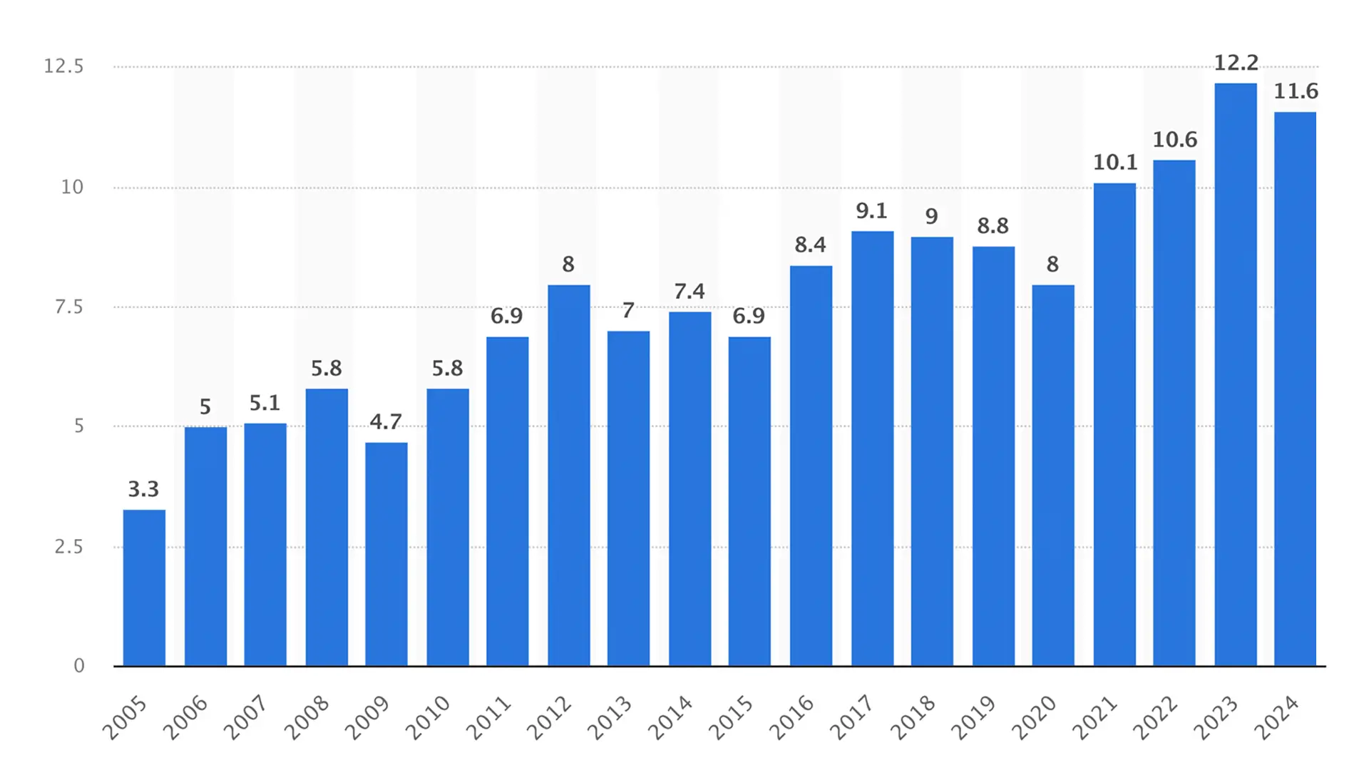
Products that are sold the most at this festival are masks, hats, wigs, makeup, candy, pumpkins, craving kits, party supplies, candles, home decor, spooky-themed books, snacks, beverages, and more. According to Forbes, consumers spent around $11.6 billion on products during Halloween in 2024.
And this figure crossed the threshold of $12.2 billion in 2022. Let’s now take a look at how much money people spent on celebrating Halloween over the past few years.
What are the Elements that Spice Up the Halloween Web Page Design?
There are some elements without which a Halloween theme is never complete. If you want to design a dedicated page for Halloween, it’s mandatory to have the elements present on it as well. Let’s now take a look at the elements that spice up the Halloween web page design.
a. A Scary Background
A scary background should be the main theme of any Halloween web page design. Use a dark-spooky background color scheme that creates a haunting atmosphere.
b. Haunted Icons
Icons like bats, spiders, skulls, brooms, witches, and cobwebs can enhance the visual narrative of the Halloween theme throughout the web page design.
c. Creey Fonts
Using unconventional and mysterious fonts for the header, footer, banner, and internal text can reinforce the spooky touch with a thematic feel on the web page.
d. Ghostly Illustrations
A haunted house, skulls of dead people hanging on banian trees, campfire, lightning pumpkins, etc., can help you present ghostly illustrations.
e. Animated Elements
Subtle animations like floating ghosts, moving witches, dancing scarecrows, and flicking lights can add extra scary Halloween flavors to your site.
f. Countdown Timer
It will convey to customers how much time is left for the Halloween campaign to end. This can trigger urgency among them to complete the purchases in a quick time.
How to Design a Halloween Web Page: Step-by-Step
Creating a web page is no longer difficult today. You’ll find lots of tools online to create web pages without a single line of code. But with Elementor and HappyAddons, you can create highly complex web pages that aren’t easily possible with other tools.
So install and activate them on your site from the link below. After that, you can jump into the tutorial steps on how to design a Halloween web page.
Note: HappyAddons is actually an addon of the Elementor plugin.
Step 01: Create a Wireframe for Your Halloween Web Page
A wireframe is a blueprint or visual representation of how the page will look after designing it. Wireframing defines the placement of elements like headers, footers, navigational menus, images, text content, buttons, contact forms, and other components.
Accordingly, you (the developer) can arrange the content on the web page and move on to more detailed design and development stages. Unless you have a wireframe, you will design the page entirely from imagination, which your clients may not like in the end.
In this case, you have to waste more time and money on correcting the design till your client is satisfied. This is why wireframing is so important. Dribble and Colorlib are two great platforms where you’ll get countless Halloween website ideas for wireframing.
Once your wireframe is done, get it approved by your client. Then, jump into the final designing process. The following video shows the wireframe of our Halloween page. We’ll follow it to design our Halloween web page. Take a look at how to create a website wireframe.
Step 02: Open a Page with Elementor
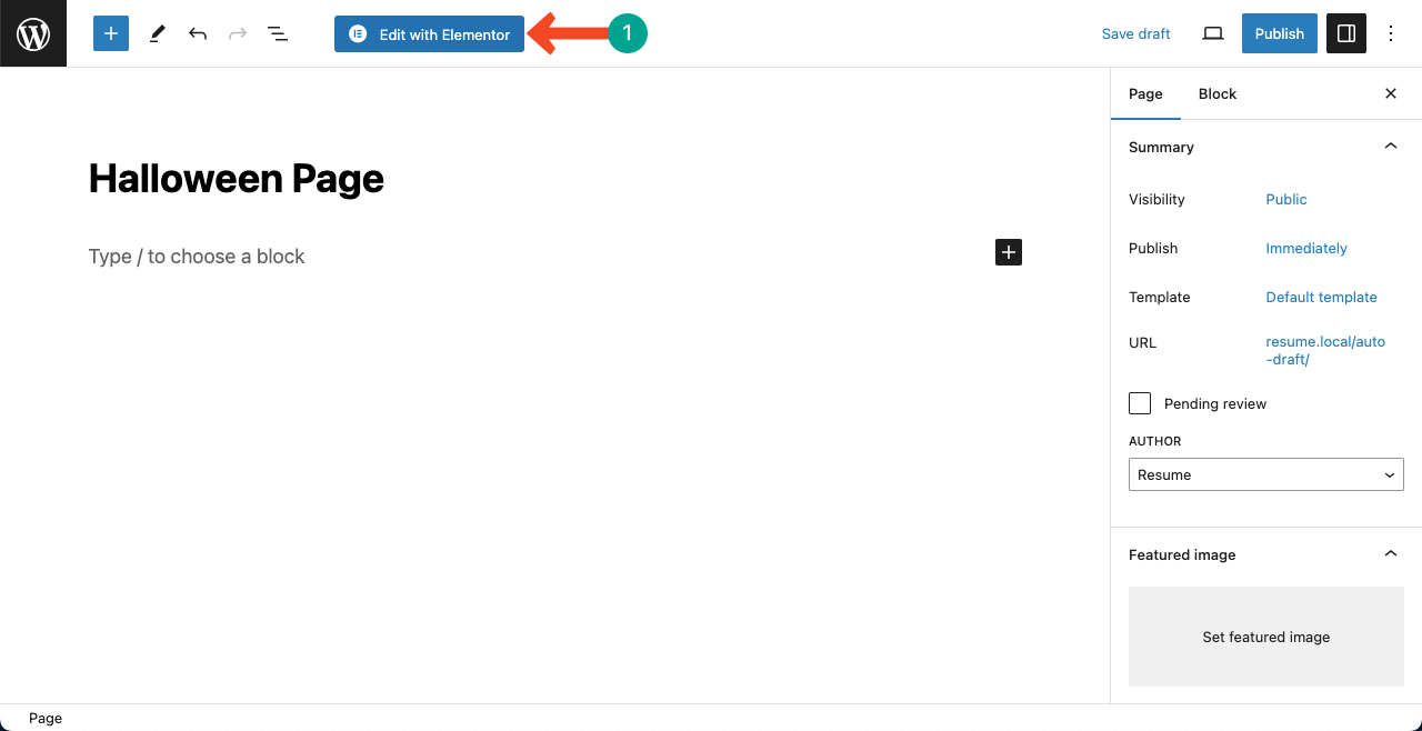
Open a new page on your WordPress site and give it a name. Then, open the page with Elementor pressing the Edit with Elementor button.
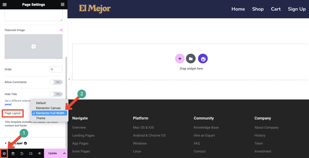
Click the settings icon on the bottom-left corner. This will open up new options on the left sidebar. Locate and open the dropdown list next to the Page Layout option. Select Elementor Full Width. This will erase all the unnecessary texts from the Elementor canvas.
If you are creating this new Halloween page on an established/running website, you’ll see its header and footer appearing on the canvas. You don’t have to worry about them. Your added content here will be stored only for the Halloween page.
Moreover, having the header and footer present will help you choose the right color scheme for designing the Halloween page.
Step 03: Use a Template or Design the Page from Scratch
HappyAddons provides you with a good collection of ready-made Halloween templates. You may design the landing page with these templates or start everything from scratch.
You need to open the HappyAddons Library to explore the readymade templates. Click the Happy icon on your Elementor canvas. This will open up the library.
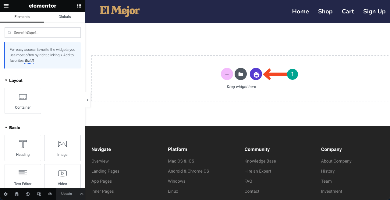
You will find both block and page templates here. First, get into the Blocks or Pages tab. Type Halloween in the search box. Related templates will appear on the screen. From here, you can INSERT the suitable template(s) on your canvas and customize them afterward.
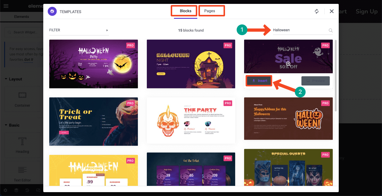
*** Note: We’ll show you how to design the Halloween landing page from scratch. Because this will give you an opportunity to get familiar with various features and widgets of Elementor and HappyAddons.
Step 04: Create the Welcome Hero Section with a Countdown Timer
You need to select a column structure whenever creating a new section on your landing page. Hit the Plus (+) icon. You’ll see various column structures available there. Select the one you need. We’re going with the double-column structure for creating the welcome section.
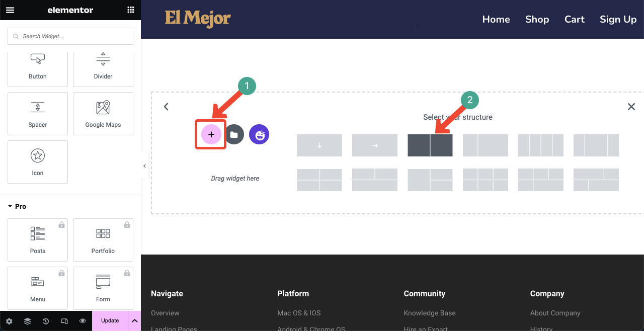
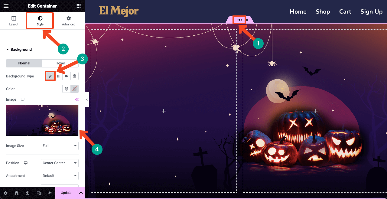
You must add a spooky background image to the welcome section so visitors instantly get a Halloween feel right after jumping onto the page. Hit the six-dotted icon to select the entire section. Go to the Style tab afterward.
Press the Classic Brush icon next to Background Type. You’ll get the option to add a background image to the section. Upload an image from your local drive.
Note: You cannot create this type of image using Elementor. But you’ll find tons of like this one on Dribble, Freepik, and Canva platforms.
# Add a Header Copy and Text
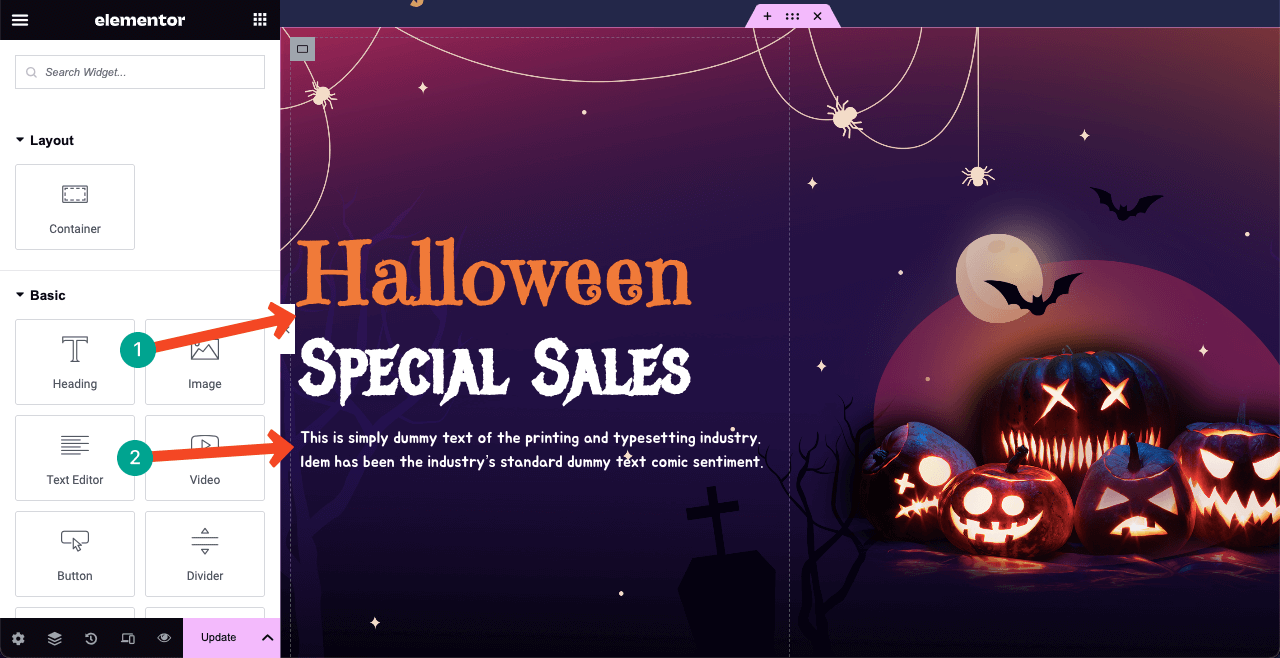
Every hero section includes some catchy, fancy copy. And for Halloween pages, you must use creepy-scary fonts. Some of the most popular scary Google fonts are Jua, Creepster, Jolly Lodger, Emilys Candy, Mystery Quest, and Metal Menia.
We used the Heading and Text Editor widgets to add our copy and text in the hero section. And used fonts: Emilys Candy, Metal Menia, and Jua.
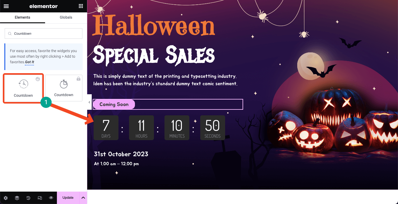
A countdown timer can create a sense of urgency and awareness in customers’ minds. So, we used the Countdown widget to add a countdown timer. Alongside that, we’ve added some more content using the Text Editor widget to describe the starting and ending times of the sales campaign.
Step 05: Feature Hot-Selling Halloween Products
From various statistics, we find that over 50% of visitors make their decision about a page within a maximum of 3-4 seconds. Unless they find their desired content on the page within this time, they move elsewhere.
This is why if you want to sell any product or service through the Halloween page, you must display it in the second section. Select a new column structure to add a space for creating the next section.
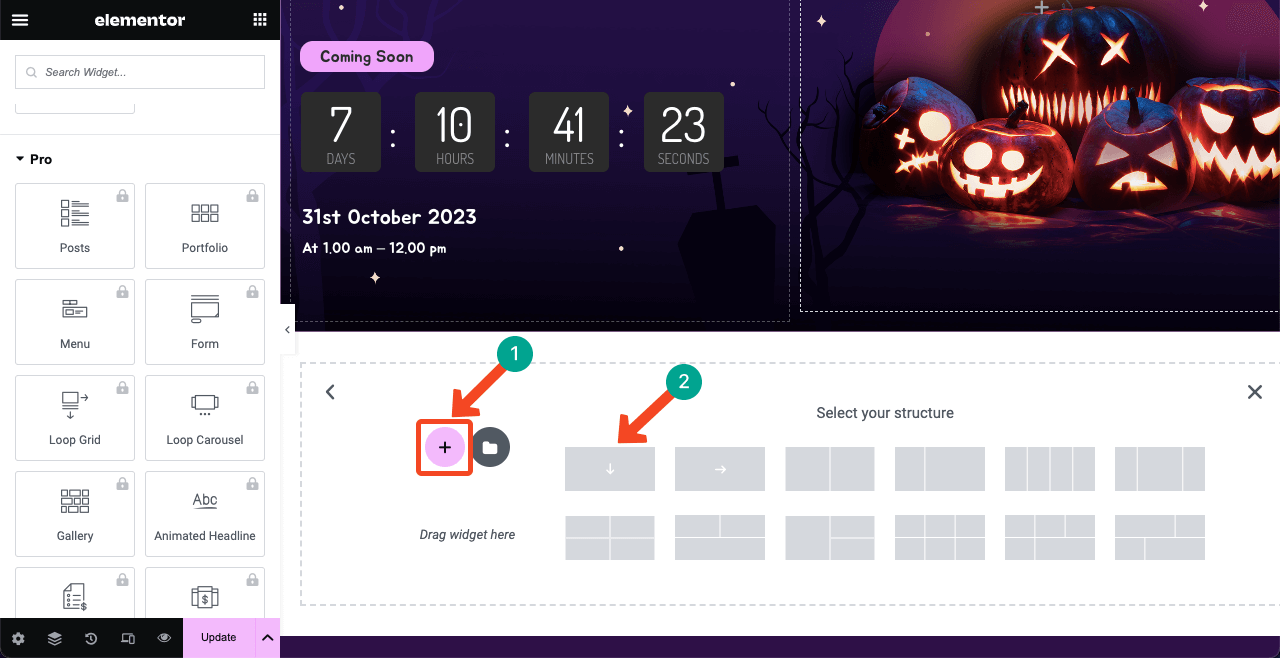
Since we are making this Halloween page for an eCommerce site, we’ll show the hottest-selling items in the second section with discount percentages. You need to choose a suitable widget from the left sidebar to present products the way you want.
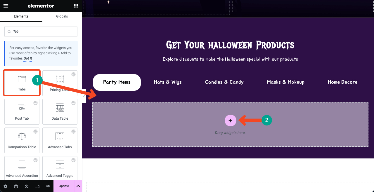
We are using the Tabs widget. This is a free Elementor widget that allows you to create switchable tabs for adding separate categories of products. Before that, we added a heading and a small description using the Heading and Text Editor widgets.
Press the Plus (+) icon inside the tab widget.
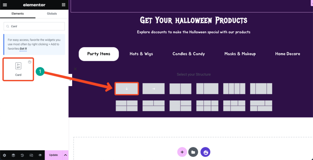
Find the Card widget. Drag and drop it into the column area.
You’ll get options to add the product image, discount percentage, product name, and buying button. You can customize the appearance of the card from the Style tab.
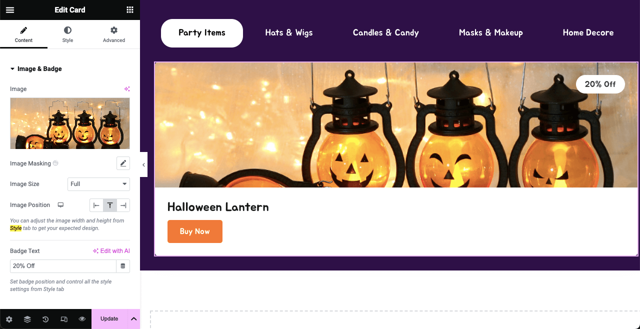
Once you are satisfied with the layout of your first card design, you can duplicate it so you don’t have to drag and drop the widget to add new images. Plus, duplicating the card widget can proportionately distribute the space for the perfect presentation of your product items.
Hover your cursor on the Edit Container icon and right-click. It will open up a list from which to press the Duplicate option. Thus, you can duplicate the card layout as many times as you want.
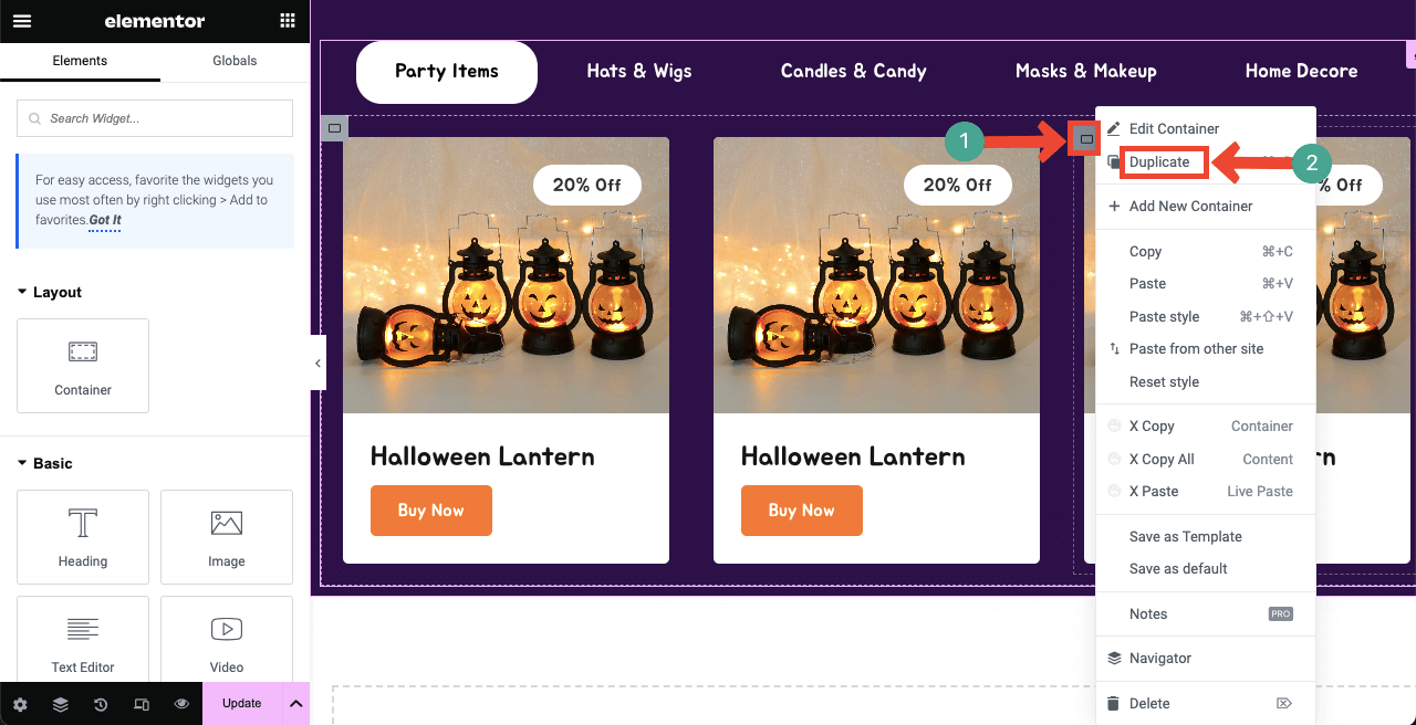
Then, update photos and information for the other card areas. Keep adding product images on the other tabs one by one, following the same method.
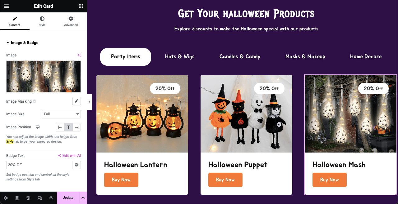
Step 06: Build a Spooky Pricing Table
If you are selling eCommerce products only, you won’t need a separate pricing table on the Halloween page. So, you may avoid this page. But there are many eCommerce enterprises selling additional services and software. Creating a pricing table is a must for them.
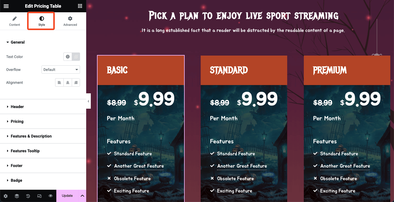
Suppose you are selling a sports live-streaming service. And you charge customers monthly for this service. We’ll now create a demo pricing table for it. HappyAddons has a Pricing Table widget, by which you can quickly do it without much hassle.
Before that, we added a header text and a short description using the Heading and Text Editor widgets.
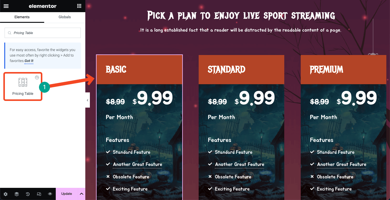
We have customized the table from the Style and Advanced tabs. The Style tab will let you customize the color, size, family, and alignment of the fonts.
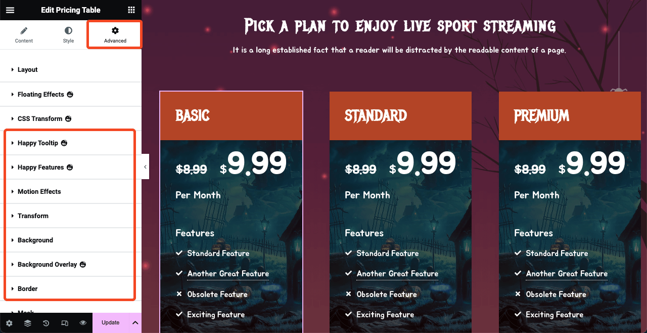
Go to the Advanced tab for further customization options. Explore options like Happy Tooltip, Happy Features, Motion Effects, Transform, Background, Background Overlay, and Border. We have changed the background of the pricing table from the Background option.
Step 07: Create an Invitation Section for Online Contests and Events
Online contests and parties have become a great way to engage and convert web visitors into customers. Some of the most popular types of Halloween online contests are photo, video, caption, copy, quiz, design, giveaway, art, recipe, and referral contests.
However, if too many users join the live event, streaming and technical problems may arise. Better to create a form to collect the email addresses of interested participants using a form and send them invitations immediately before the event.
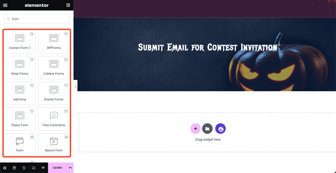
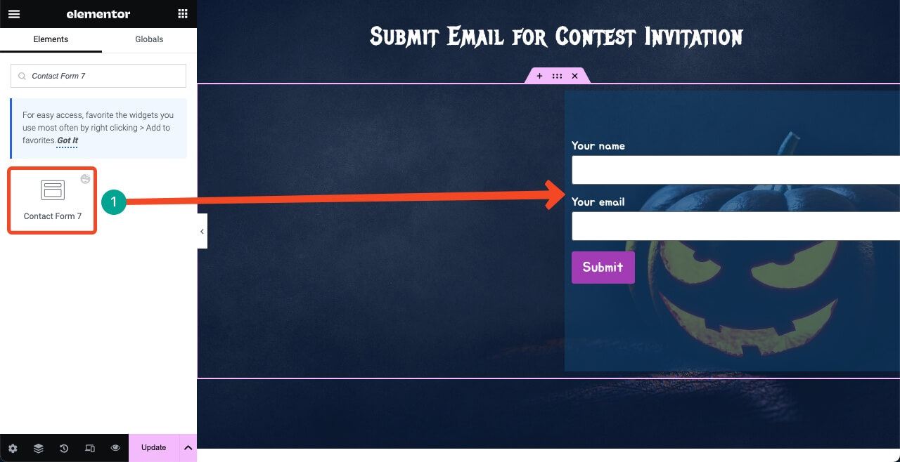
HappyAddons has integrations with all popular WordPress contact form plugins. Drag and drop your desired form widget on the canvas. Before that, create a form on your backend. We have used the Contact Form 7 plugin to create our form.
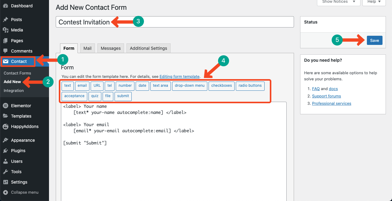
Get back to the Elementor canvas. Find the Contact Form 7 widget. Drag and drop it into your desired section. Select the form and customize it. We kept the left side blank to add some more content.
You can capitalize the blank space on the left side, adding text(s) and an image. Use the widgets: Image and Text Editor. Choose font sizes wisely that make the section look good.
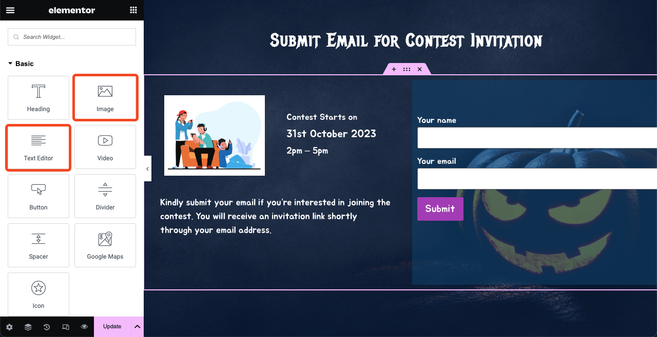
Once you are satisfied with the design, make the Halloween web page live by hitting the Publish button.
FAQ on How to Design a Halloween Web Page
So your Halloween web page is ready. But how to promote it and bring conversion? We’ll answer some of the most frequently asked questions related to the topic in this section.
-
How do I increase online sales on Halloween?
1. Focus on themed marketing
2. Offer limited-time discounts
3. Create related product bundles
4. Revamp the Halloween web page
5. Share your offers on social media -
What is the perfect time to launch the Halloween sales campaign?
You must live the Halloween sales campaign on 31st October, not before the day. But you may live the Halloween web page at the beginning of October with a countdown timer, specifying the campaign date. This will be good for customer engagement and spreading awareness.
-
Who should be the target customers during Halloween campaigns?
Party planners, home decorators, kids, fun-loving people, gift lovers, online product and service users, etc.
-
What are the common mistakes people make in Halloween website design?
1. Poor readability
2. Excessive animations
3. Inconsistent design
4. Lack of clear call-to-action
5. Misalignment with brand identity -
What are the best Google fonts for the Halloween web page design?
1. Creepster
2. Jua
3. Jolly Lodger
4. Emilys Candy
5. Mystery Quest
6. Metal Menia.
Final Recap
Halloween is a global festival celebrated in more than 35 countries, especially in the United States, Canada, and the United Kingdom. In terms of population, millions of people celebrate the day with much joy and enthusiasm.
If you properly select your target audiences, create a stunning landing page, and run the sales campaign, you can surely bring huge conversions. Hope you have learned well how to design stunning Halloween landing pages from this article.
Explore our other articles to learn more about no-code website design. But if you have any specific questions regarding Elementor and HappyAddons, let us know through the comment box or the live chat option.
