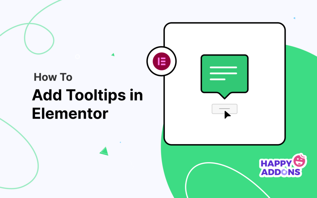

Are you looking to add informative tooltips to your website? Elementor can help you do that in no time. It is one of the easiest plugins by which you can add tooltips to any of your web elements with just a few clicks of your mouse. You are not required to know how to code at all.
Plus, Elementor has many helpful features that you can use to customize your tooltip appearance to match your website style. In this guide, we will provide you with a complete guide on how to add a tooltip in Elementor websites with the help of this plugin.
Also, we will cover a part on how to add tooltips using customer CSS codes. So whether you’re new to Elementor or you’ve been using it for years, this article is for you!
Table of Contents
- What Is A Tooltip?
- How Tooltips Help You Improve The User Experience On Your Website
- How To Add Tooltip In Elementor Website Using HappyAddons
- How To Add Tooltip In Elementor Website Using Custom CSS
- How To Avoid Tooltips Looking Spammy
- Some Great Tooltips Design Examples
- FAQs on How To Add Tooltip Using Elementor
- Over To You: Are You Ready To Add Tooltips To Your Website?
What Is A Tooltip?
A tooltip is a snippet of text that appears when you hover your mouse over certain web elements. It’s a CSS property that allows you to add extra information or content around your desired web elements. This can include buttons, links, and even photos.
You can use tooltips to add helpful advice, product information, or general context about the content. Tooltips also make navigation easy. So, users don’t have to visit multiple pages as you can display more and more information on the same web page.
How Tooltips Help You Improve The User Experience On Your Website
Tooltips can help you add additional information to improve user experience, satisfy their search intents, and upscale their web browsing speed simultaneously. Let’s explore some key benefits of using tooltips on a website.
a. Allows You To Add Contextual Information
Tooltips allow you to display contextual information about specific web elements. You can use it to simplify the process of any complicated instruction or web features, highlighting key points.
b. Assists In Form Fields
When completing an online application, you must fill out numerous fields. Tooltips can provide helpful instructions so that users don’t make any mistakes while typing their information. This help is a must to verify credit cards, apply for a passport, fill up billing addresses, etc.
c. Explains The Web Application Setup Process
Some web applications are always complicated for new users. It takes them a lot of time to understand the system and interface. Using tooltips, you can easily demonstrate the setup process of any complicated web application. It can save them valuable time.
d. Helps You Promote Products Features
Not just for explaining complex things, tooltips can also help you promote your product features. When customers hover over a product, you can display its feature through a tooltip.
How To Add Tooltip In Elementor Website Using HappyAddons
Some of us might find it difficult to create a tooltip by using Custom CSS codes. Today, creating and adding tooltips to your website is possible without a single line of coding. HappyAddons is providing you with a no-code CSS tooltip feature within Elementor.
Interestingly, you can get this feature free in HappyAddons. You will get not only text added but also advanced features in the HappyAddons tooltip.
- Change text color
- Change text typography
- Change the tooltip position
- Add text background color and background image
- Add dynamic tags
- Add animation
- Add tooltip arrow
Let’s explore below how to add tooltip in Elemnetor using this extension.
Prerequisites To Add Tooltips
Once you have these plugins installed on your site, go with the following process.
Step 01: Enable Advanced Tooltip
Since the tooltip is a feature, not a widget, you must enable it first. To enable this feature, select any widget or element of your website.
Then, go to the Advanced tab. Scroll down a bit and expand the Happy Tooltip option. Toggle on the Enable Advanced Tooltip.

After enabling this feature, you will get two more sections to customize your tooltip. They are Style and Content. You can see them in the above photo.
- Style: This section will allow you to add customize the design and add an image for your tooltip. We will talk about this option later in detail.
- Content: You can add and edit tooltip text, fix its position, add animation, and more from the content section.
Step 02: Add Your Tooltip Texts

In the content section, not only can you add your desired tooltip texts, but also HTML tags to give an extra advantage to your tooltip texts. HTML tags that you can use here are:
<b>,<i>,<u>,<s>,<br>,<em>,<del>,<ins>,<sub>,<sup>,<code>,<mark>,<small>,<strike>,<abbr>,<span>,<strong>,<a>,<q>,<img>,<dfn>,<time>,<cite>,<acronym>,<hr>
Add Dynamic Tags To Your Tooltip Content
HappyAddons has integration with dynamic support for your tooltip content. However, due to some limitations, it’s challenging for us to support all the tags. We don’t support shortcode dynamic tags at this moment.
Furthermore, you cannot see the dynamic data in the editing mode, only in the preview mode.
# Customize The Position of Your Elementor Tooltip
You will find the position control settings immediately below the content section. By default, your tooltip will be shown above any element. You will get four different options in this section to set your tooltip position. They are:
- Top
- Bottom
- Left
- Right
In the below photo, you can see we have changed our tooltip position to the right.

# Add Animation To Your Elementor Tooltips
Right below the position settings, you will find the animation section. You will get eight types of animation effects available there. They are:
- Fade in
- Roll in
- Zoom in
- Bounce
- Slide in down
- Slide in left
- Slide in right
- Slide in up
Choose the one that caters to the needs of your tooltip. Watch the photo below!
You can even customize the animation duration for your tooltip. By default, it is set to 1000ms (millisecond).

# Add or Remove The Arrow of Your Elementor Tooltip
You can call this tooltip pointer or tooltip navigation arrow. By default, you will get this arrow enabled. But you can deactivate it if you want to. The process is explained below.
Note: You have to turn off this feature if you want to add an image to your tooltip. Otherwise, you won’t find the image-adding option available.
# Trigger Your Tooltip
The trigger defines how the Elementor tooltip will appear on your screen. There are two trigger options available:
- Click
- Hover
You will get the Distance option right below the Trigger section. It will allow you to increase or decrease the distance between your web element and its distance with the tooltip.
# Align Your Tooltip Text
You will get the text alignment option below the Distance section.
Step 03: Style Your Elementor Tooltips
To customize your tooltips further, click on the style section in the photo below.

# Increase The Width of Your Tooltip
The first option will get in the style section is Width. Drag the width button and adjust it to your desired measurement.
# Increase The Size of Your Tooltip Arrow
You can adjust the arrow size of your tooltip using the Tooltip Arrow Size. You can do it by dragging the measurement button below.
# Change the Typography of Your Tooltips
You can add a variety of flavors to your tooltip from the typography settings. You will get all the Elementor Typography Settings here.

# Add Color to The Background of Your Tooltip Text
You can add color to the background of your tooltip text from the Background Color option.
# Add Border Radius to Your Tooltip
By default, the border radius for your tooltip is 5 px. But you can change it as you want. The border-radius control panel will give you complete authority to do this.

# Add Box Shadow to Your Tooltip
By dragging the measurement buttons, you can add shadow to your tooltips from the box shadow settings.

Step 04: Enable The Image Option
Already we told you once that you have to disable the tooltip arrow feature if you want to enable the image option. It will enable a new option in the style section.
# Add Image and Adjust Your Tooltip
Navigate to the style section. Click on the Background Type section and expand it. You will get an image file there. Click it and upload your desired photo for the tooltip. Afterward, you can change its position, attachment, size, text color, border radius, and more.
This is how you can create wonderful images and text-based tooltips for your website. Have a look at how your tooltips finally go after lots of customizations.
How To Add Tooltip In Elementor Website Using Custom CSS
There are multiple ways you can add tooltips to your Elementor website using custom CSS. Let’s explore some of the easiest methods for them.
Method One: Using <abbr> (abbreviation) Tag To Add Tooltips
Using <abbr> tag, you can create tooltips on your website anytime. You have to add your tooltip text inside the title=”…” tag. Below is a sample of the code you can use to create your tooltip.
John   <abbr style="text-decoration: none"
title="I'm an Elementor Expert!">DOE</abbr>
You can type this code on any Elementor field that supports the HTML tag. Once you have done this part, you will see your tooltip appearing whenever you hover your cursor on that element.

Note: You cannot stylize your tooltips using this method! But this is the easiest way to add a tooltip.
Method Two: Creating Tooltip With HTML And CSS
Now, we will show you how to create a customizable tooltip so that you can alter its color, change position, add animation, and more. To do that, first, you have to write simple codes for your tooltip in your HTML file.
In Elementor, you will get an HTML widget to create a field for writing this code. Drag and drop the HTML widget on your Elementor canvas.

You will automatically get a field opened in your Elementor content section. You have to add a class and give it a class name, we named it “tooltiptext”. This class will be used to customize the tooltip. Below is a sample of HTML code you can use to create your tooltips.
<span class="tooltiptext"
>My Skill Sets</span>
Here, we used “My Skill Sets” as our tooltip text. You must write your desired tooltip text into this section.

We have shared the CSS codes below to let you further customize your tooltips. You can directly copy-paste them into your Custom CSS section or modify them as you wish. You can add this code snippet to your Elementor Custom CSS panel or to your theme’s additional CSS section.
If you want to add this code to your Elementor Custom CSS, follow this navigation- Elementor Site Settings > Custom CSS. Here is the code. You can copy the whole CSS code snippet for the tooltip or customize them according to your needs.
Note: To navigate to the additional CSS panel of your theme, navigate to Admin Dashboard > Appearance > Customize > Additional CSS.
.tooltip {
  position: relative;
  display: inline-block;
  border-bottom: 1px dotted black;
}

.tooltip .tooltiptext {
  visibility: hidden;
  width: 120px;
  background-color: black;
  color: #fff;
  text-align: center;
  border-radius: 6px;
  padding: 5px 0;
  position: absolute;
  z-index: 1;
  bottom: 150%;
  left: 50%;
  margin-left: -60px;
}

.tooltip .tooltiptext::after {
  content: "";
  position: absolute;
  top: 100%;
  left: 50%;
  margin-left: -5px;
  border-width: 5px;
  border-style: solid;
  border-color: black transparent transparent transparent;
}

.tooltip:hover .tooltiptext {
  visibility: visible;
}
If you want to change your tooltip position, arrow position, and more, follow the code snippets below.
To change the tooltip position and place it at the bottom, use the following code.
.tooltip .tooltiptext {
  width: 120px;
  top: 100%;
  left: 50%;
  margin-left: -60px; /* Use half of the width (120/2 = 60), to center the tooltip */
}
To move it to the right side, use the code below.
.tooltip .tooltiptext {
  top: -5px;
  left: 105%;
}
To place it on the left side, use the following code.
.tooltip .tooltiptext {
  top: -5px;
  right: 105%;
}
To modify the arrow position of your tooltip and put it to the bottom, use the code below.
.tooltip .tooltiptext::after {
  content: " ";
  position: absolute;
  top: 100%; /* At the bottom of the tooltip */
  left: 50%;
  margin-left: -5px;
  border-width: 5px;
  border-style: solid;
  border-color: black transparent transparent transparent;
}
If you want to learn more about the customization of CSS tooltip, you can visit w3schools.
How To Avoid Tooltips Looking Spammy
Tooltips can be a great way to provide extra information to your web users. But if too many tooltips are displayed on a page, it may look spammy and irritating. There are several things you must consider to avoid while using tooltips so your web pages never look spammy.
Let’s explore them below.
1. Keep Your Tooltips Brief And Simple
Tooltips should contain information that is mandatory for users to understand – nothing else. This means you must avoid long lists of details, unnecessary texts, and flashy design elements. Instead, stick to plain and straightforward explanations.
2. Never Show Multiple Tooltips Together
Another way to avoid tooltips looking spammy is to limit the number of them to be displayed per block/same row. Show only one tooltip at a time and allow users to scroll down if they want more information.
If you feel the need to add more information, you may consider alternative ways. For example, you can embed videos and infographics instead of sharing all the loads with tooltips. This can even ensure a richer user experience for users.
3. Maintain Space Between Elements
Space is a big part of any UI design. There is an ideal ratio of how much space you must make sure on your web pages. And the ratio is 2:1, which means one-third of your web pages must have spaces.
The same goes for tooltips. Don’t make them too congested so that users can have some air while browsing your website.
4. Let Users Skip The Tutorial Part
If you’re providing tutorials or other helpful content, make sure that users are able to skip them if they don’t want to. This will help reduce the number of tooltips displayed on a page and encourage more people to take advantage of your content.
Some Great Tooltips Design Examples
Being able to use tooltips smartly can boost user experience in growing and exploring a website. Let’s have a quick eye on some best tooltip use-case examples.
1. Amazon
Amazon is currently the number one eCommerce website on the web. You will find countless tooltips Amazon uses to guide you on different pages and to explain all the essential processes. Whenever you land on its homepage, you will get a tooltip like the one below.
The best thing is that it includes not only instructions but also CTA buttons.

2. Wikipedia
Wikipedia is an online encyclopedia maintained by the volunteer writer community. Whenever you hover your cursor over any linked words, you will see a tooltip appearing that shows additional information about those words and terminologies.

3. AliExpress
Whenever you try to buy products from AliExpress using a credit or debit card, you will get some tooltips explaining how to complete the checkout process. In the photo below, you can see that the tooltips explain where you will get your card number on different digital cards and use them to complete an order.

Hope these three examples are enough for you to understand how you should display tooltips on your website.
FAQs on How To Add Tooltip Using Elementor
Let’s have an answer to some of the most frequently asked questions on how to add tooltips in Elementor websites.
-
When should tooltips be used?
There are some special situations when using tooltips is a must. For example:
1. To elaborate on critical terms and jargon.
2. Help users fill out forms, checkout pages, and install the software.
3. To explain the complicated processes.
4. To highlight key features.
5. To save spaces on a web page. -
Are tooltips good for SEO?
Your website ranks better on SERPs when it provides excellent user experiences and caters to the customers’ needs. Being able to use tooltips smartly can help you do both. This means tooltips can be a great way to improve your SEO score.
-
How long should a tooltip be?
Your tooltips should be within 150 characters. Don’t fill it with unnecessary words. Keep it very precise and just to the point.
-
Do tooltips work on mobile?
Yes, tooltips also work on mobile phones. They are actually small in-app messages that you can use to highlight specific UI elements.
-
What is the difference between a tooltip and a popover?
Tooltip provides very short and precious explanations to the users whenever they hover their cursors on specific words and icons. A popover is comparatively a long description, sometimes including external web page links. It also appears on the display whenever a user hovers his cursor on specific words or icons.
Over To You: Are You Ready To Add Tooltips To Your Website?
A good design is the first thing that can impress your audiences within a moment. According to Adobe, 38% of users stop engaging with a website if its content and layout are less attractive. Over 55% of internet users say they don’t love recommending a business with a very poor web design- SocPub.
So, if you want your website to stand out online, you must take care of every single web design element. With the help of tooltips, you can simplify complicated things for your users and improve the user experience.
After reading this article, we hope you know everything about how to add tooltip in Elementor websites, whether through custom CSS or through the tooltip future of Happyaddons. If you still have any questions or curiosity about this topic, just let us know through the comment section.
It will be our pleasure to help and guide you in case of any difficulty.