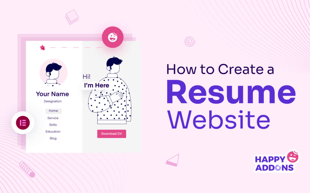
A professional resume website can be a powerful way to establish yourself as a brand online. It can help showcase your skills, accomplishments, and experience to potential employers. You can make yourself globally findable by expanding your reach from local to international markets.
Today’s recruiters don’t love to decide on a candidate only by seeing his CV. They love to check his online track records as well. Elementor is a great and intuitive tool by which you can create resume sites just by drag and drop.
This article will show you a comprehensive guide on how to create a resume website by drag and drop with the help of Elementor. Get started!
Table of Contents
- How to Create a Resume Website: A Guide From Scratch
- Step 01: Get a Domain and Web Hosting
- Step 02: Install WordPress on the cPanel and Configure the Domain
- Step 03: Create a Wireframe
- Step 04: Install Elementor and HappyAddons
- Step 05: Open a Page with Elementor
- Step 06: Add Your Personal Bio
- Step 07: Show Your Skills, Portfolio, Education, and Experience
- Step 08: Add Navigation Menus to the Right Sidebar
- Step 09: Add a Copyright Text
- Step 10: Make the Left Sidebar Sticky
- Step 11: Preview the Design
- Step 12: Make The One Page Resume Website Mobile Responsive
- FAQ on How to Create a Resume Website
- Final Words!
How to Create a Resume Website: A Guide From Scratch
There’re several steps involved in the process of building resume websites. We can divide them into two phases: pre-designing and designing. Pre-designing contains configuring the domain, hosting, CMS, and wireframing. Designing includes creating pages, sections, and content.
But remember, one-page resume sites are extremely popular than multi-page sites. So, this article will focus on how to create a one-page resume website in the following write-up covering all the steps.
Step 01: Get a Domain and Web Hosting
A domain is the name of a website. Better if you use your own name for the domain of your resume site. .com and .me are two popular extensions for resume sites. Our suggestion is you go with the .com extension. Your domain may look like johndoe.com.
Namecheap, GoDaddy, IONOS, NameSilo, etc., are some of the best domain registrars to find and buy your domains. If your domain name is already adopted, try searching for the new domain, modifying initials, and punctuation marks.
Hosting will store all the content (images, GIFs, videos, texts, templates, etc.) and your website’s database. IONOS, HostGator, BlueHost, DreamHost, etc., are the best hosting companies. Try to get a shared hosting plan. Because it’s cost-effective and suitable for resume sites.
Step 02: Install WordPress on the cPanel and Configure the Domain
Every hosting company offers you a cPanel. It will allow you to install your desired CMS and configure the domain. We’ll use WordPress as it’s one of the easiest CMS to build professional resume websites.
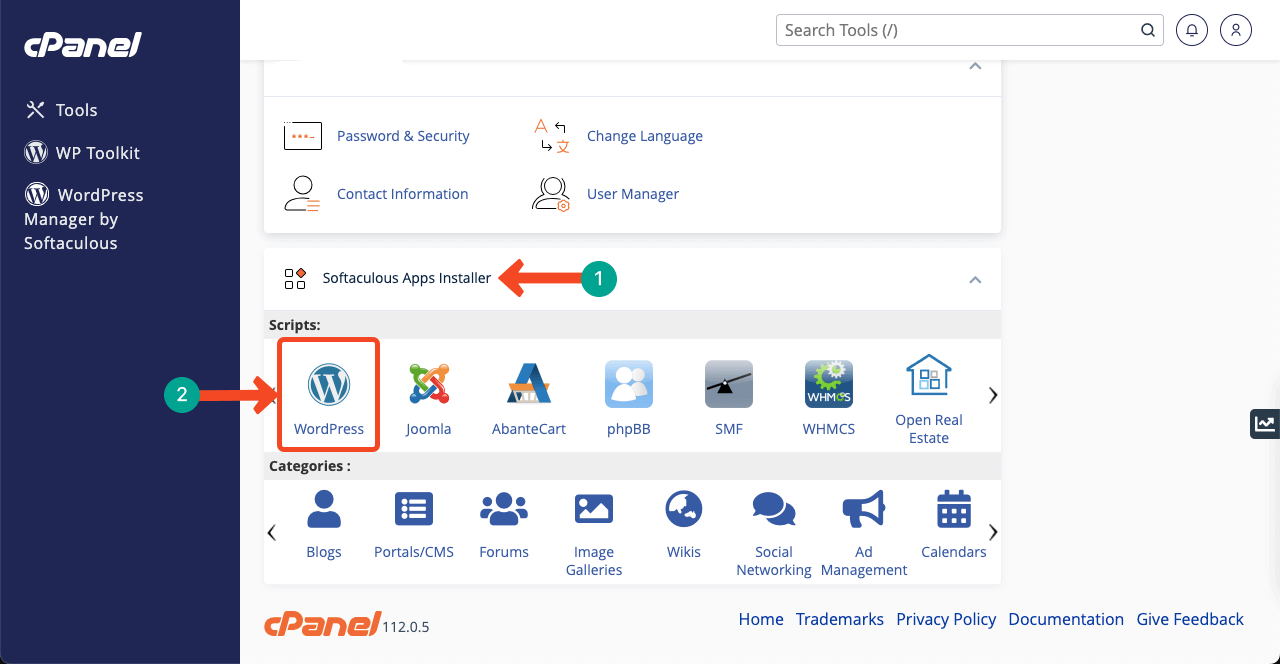
Get your cPanel access and log into it. Navigate to Softaculous Apps Installer > WordPress. Click on WordPress and do the rest to install it. This is a simple process you can carry out easily.
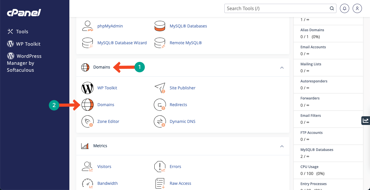
Once WordPress is installed, you have to connect your domain to the CMS. Come to the cPanel home page again. Go to Domains > Domains option. You’ll get the Create A New Domain button on the new page. The rest steps will be very simple as the CMS installation.
In case of any problem like DNS Name Server, take help from your domain registrar. They will guide you on what to do. Domain registrars like Namecheap, GoDaddy, IONOS, and NameSilo will offer you real-time support through live chat.
Step 03: Create a Wireframe
Wireframe is a brainstorming phase. In this step, you create a rough layout of how your website will look at the end of the design. You have to specify the page layout, font size, header, footer, and creative elements. It’s impossible to design a website properly without wireframing.
Because you won’t know where to start and where to end. Canva and Colorlib are wonderful platforms where you’ll get countless resume website ideas. Watch a resume template in the video below. We will try to create our resume website like the one in this post.
A specialty of the template is its sticky menu on the right sidebar, giving an excellent navigational experience to the users.
Step 04: Install Elementor and HappyAddons
Hope you have successfully configured the domain and hosting following the above steps. Now, you have to install the following theme and plugins on WordPress.
- Elementor (plugin)
- HappyAddons (plugin)
- HappyAddons Pro (plugin)
- Hello Elementor (theme)
HappyAddons is a powerful collection of addons of Elementor. It will offer you many additional features and widgets to customize your resume site further. And the reason to choose Hello Elementor is it’s a super-fast and very lightweight theme.
Step 05: Open a Page with Elementor
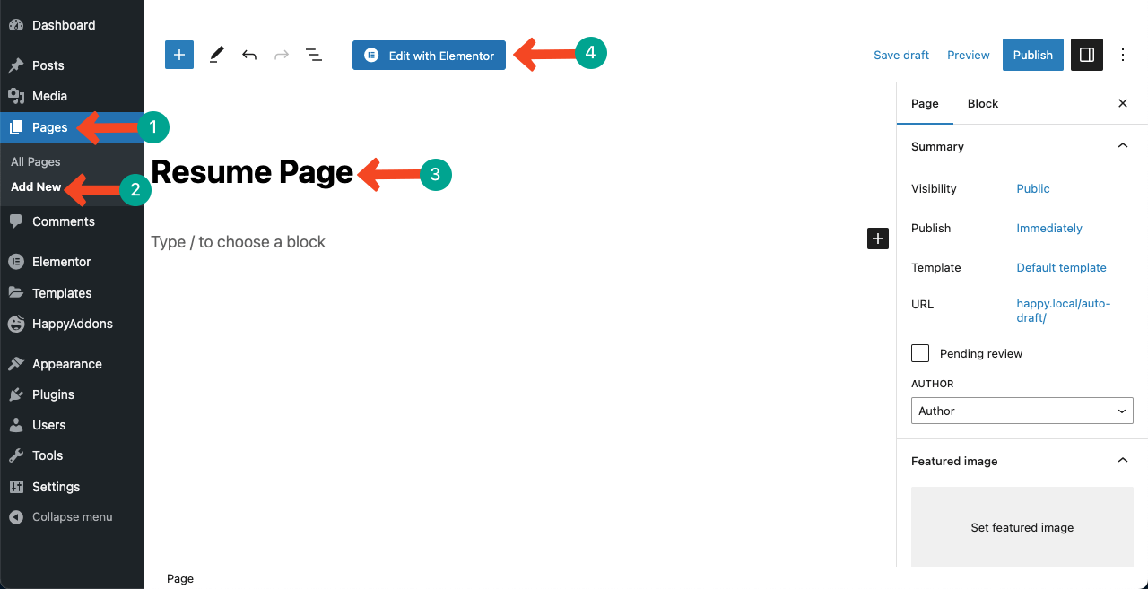
Go to WP Dashboard > Pages > Add New. Give the page a name and open it with Elementor by pressing the button Edit with Elementor.
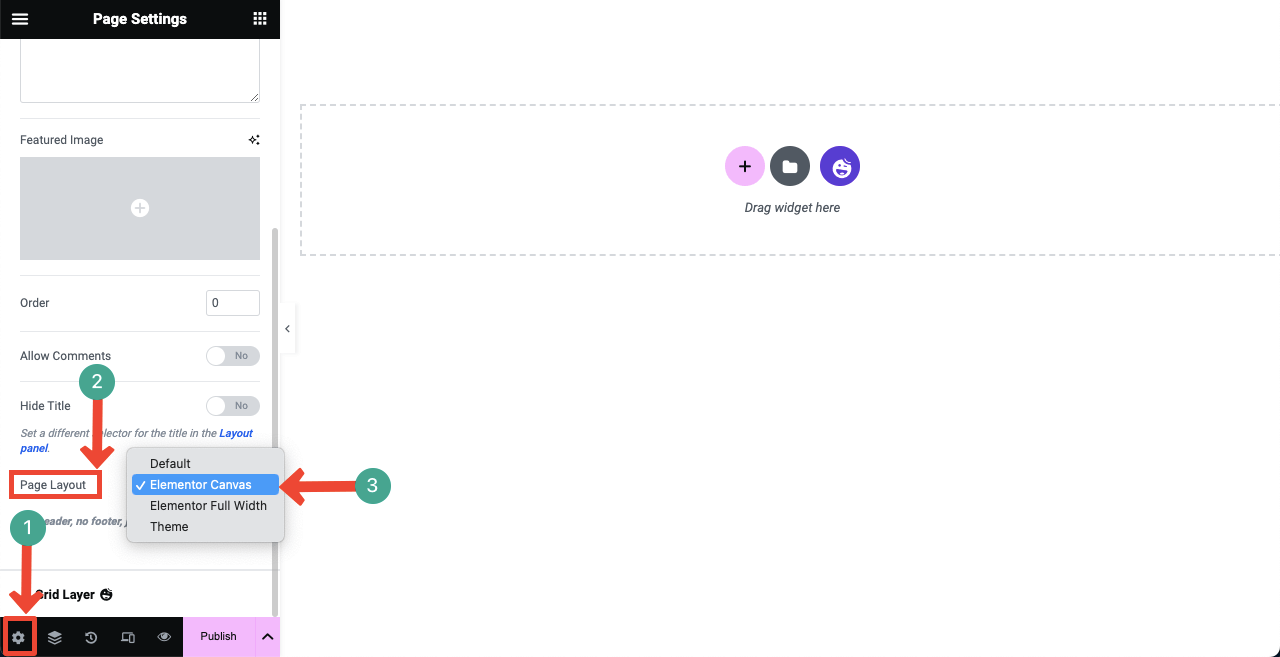
Since we’ll create a one-page resume site, open the page with Elementor Canvas. Navigate to Settings > Page Layout > Elementor Canvas. If it were a multi-page site, we could select the other options.
Step 06: Add Your Personal Bio
Now, it’s time to create sections for adding content. Elementor, HappyAddons, and HappyAddons Pro totaling over 150 widgets. You can create all the necessary sections for your resume site similar to the template using these widgets.
If you are new to Elementor, understanding these widgets’ functionalities may take you some time. But not more than one-two day. However, follow our guide now. You have to select a section layout first.
# Select a Section Layout Structure
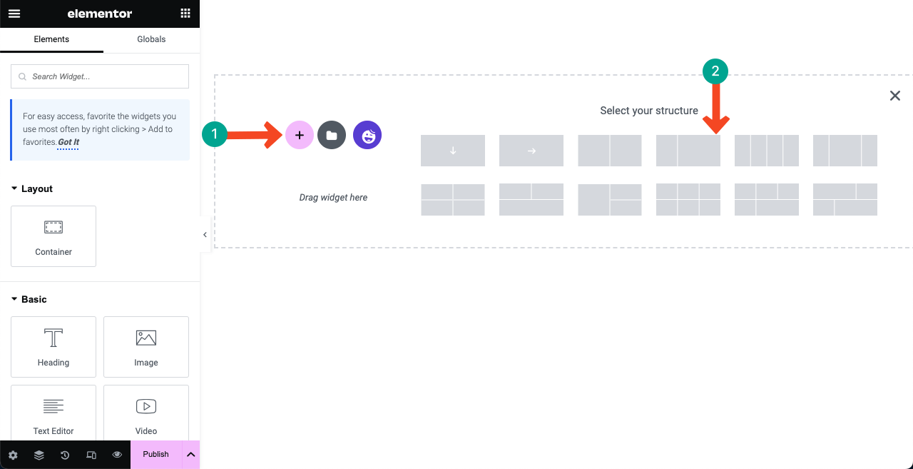
Press the plus (+) icon. Select your desired section layout. Since our demo template has two sections, we select the two-column layout.
# Add Content to the Left Sidebar
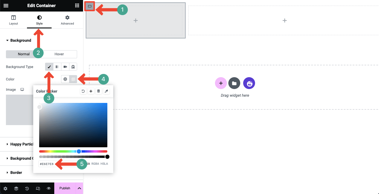
Select the left column by clicking the flex container icon. Then, navigate to Style > Background Type > Classic > Color. Apply your desired color code. We’ve used the color code (#F2F3F7).
# Add Your Image
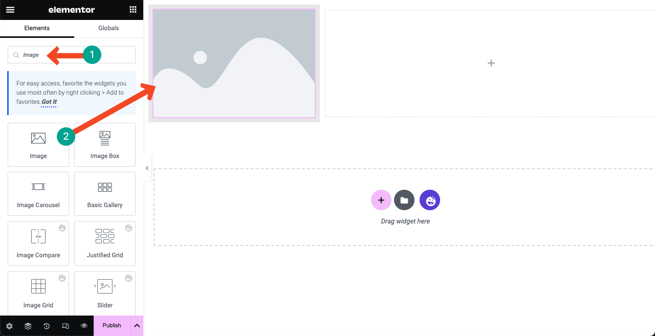
Type Image in the search box. Once the widget appears below, drag and drop it into the left column.
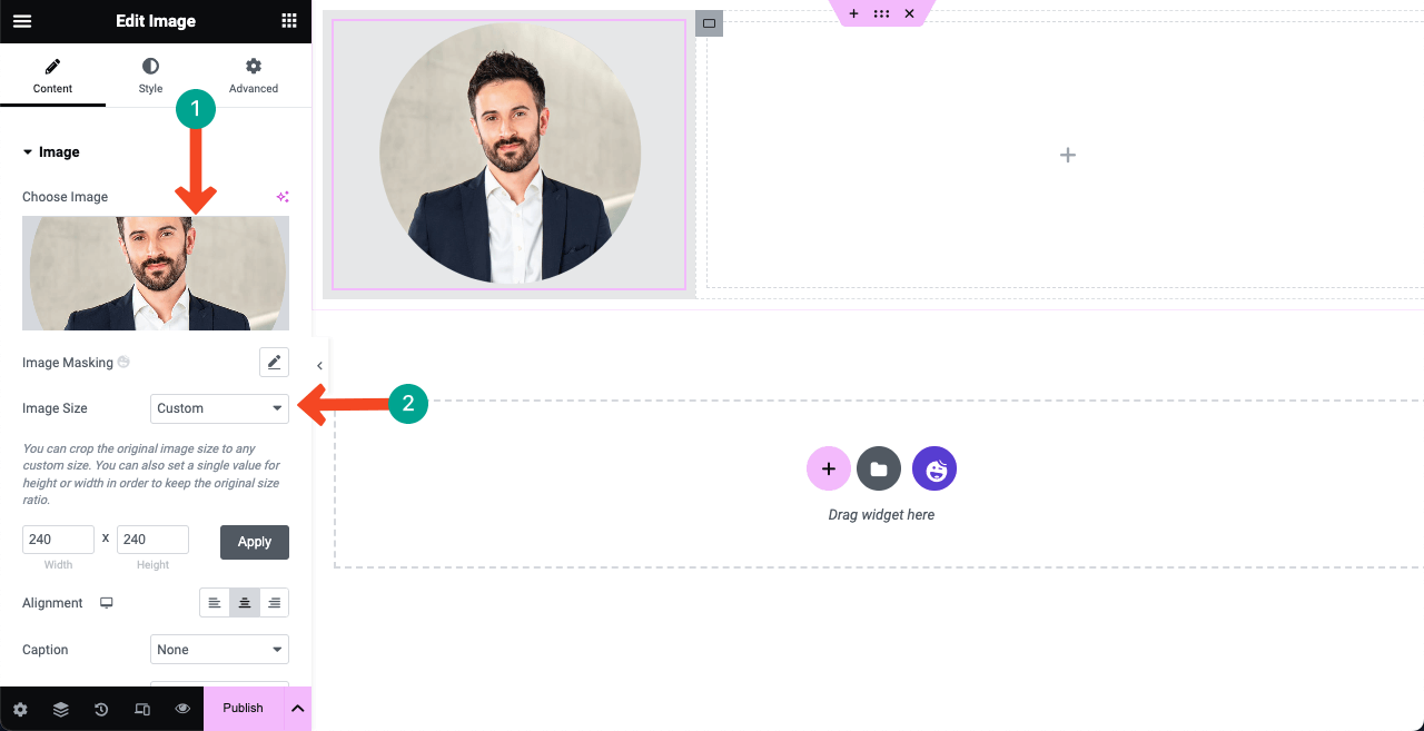
You’ll get an option to add your image. Here the image is round-shaped. Because we already designed it in Photoshop and uploaded it to the canvas. You can set a customized size for the image from the Image Size option and define its alignment.
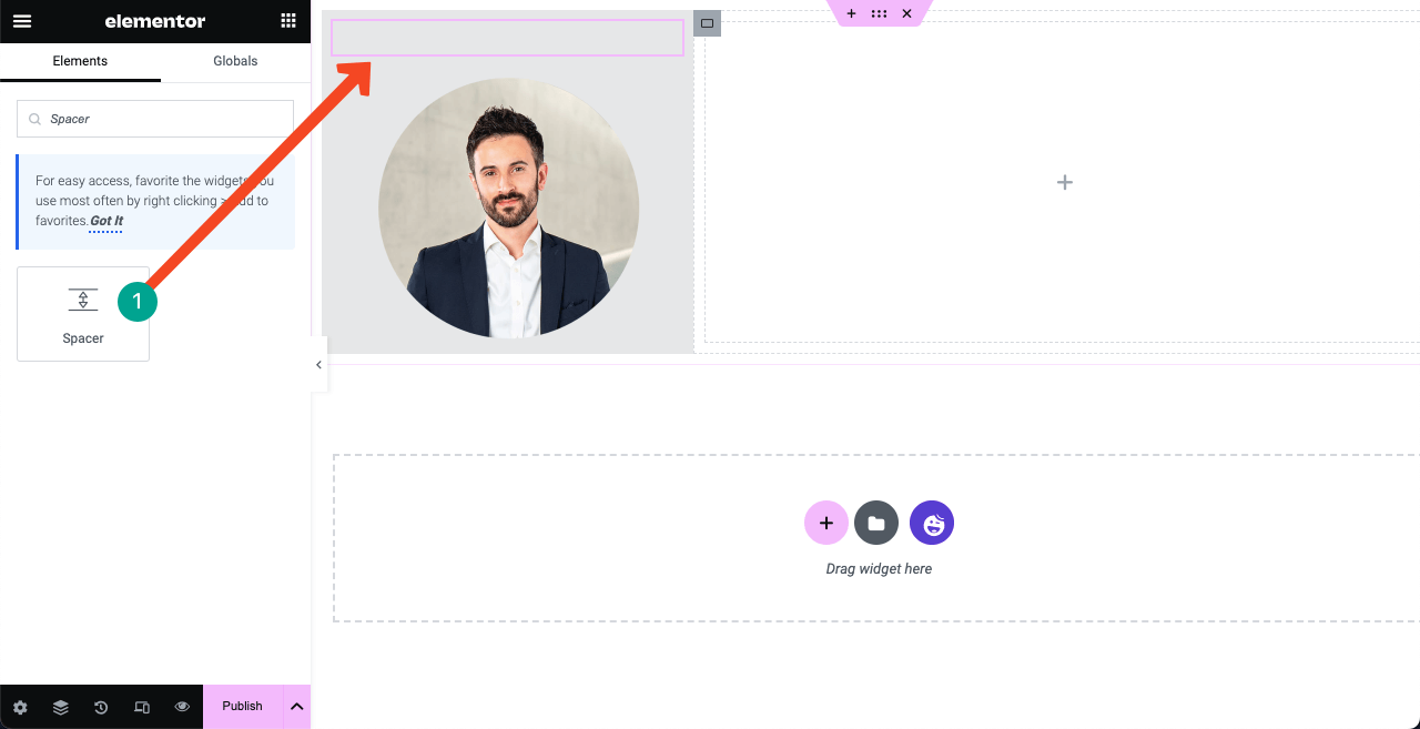
Use the Spacer widget to create a space between the top border and the image. You can use this Spacer widget anywhere if you want to create a gap/space for designing beauty.
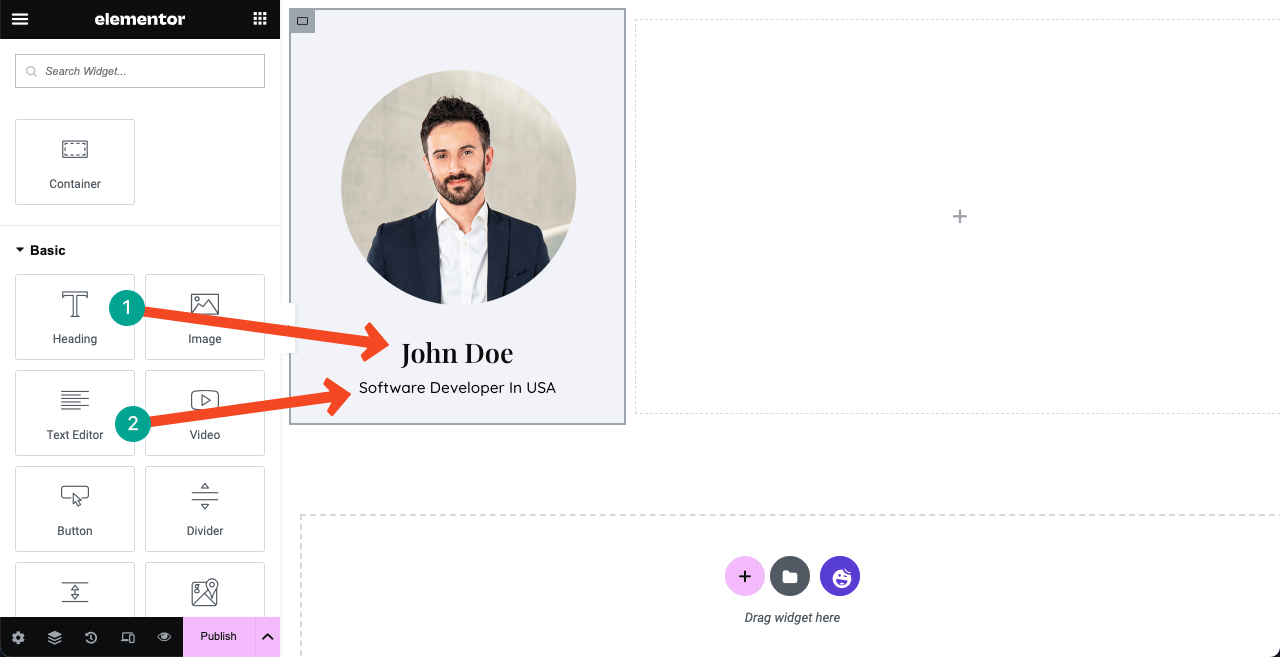
Write your name and designation below the image using the Heading and Text Editor widgets. We have respectively used the Playfair Display and Quicksand fonts for them. You can modify the font color from the style tab.
Note: You can see a vertical menu below the image and name in the demo file. After preparing the content part in the right column, we’ll show you how to create and add it to the left sidebar. Because without preparing the content part, you can’t create the menu section correctly.
Step 07: Show Your Skills, Portfolio, Education, and Experience
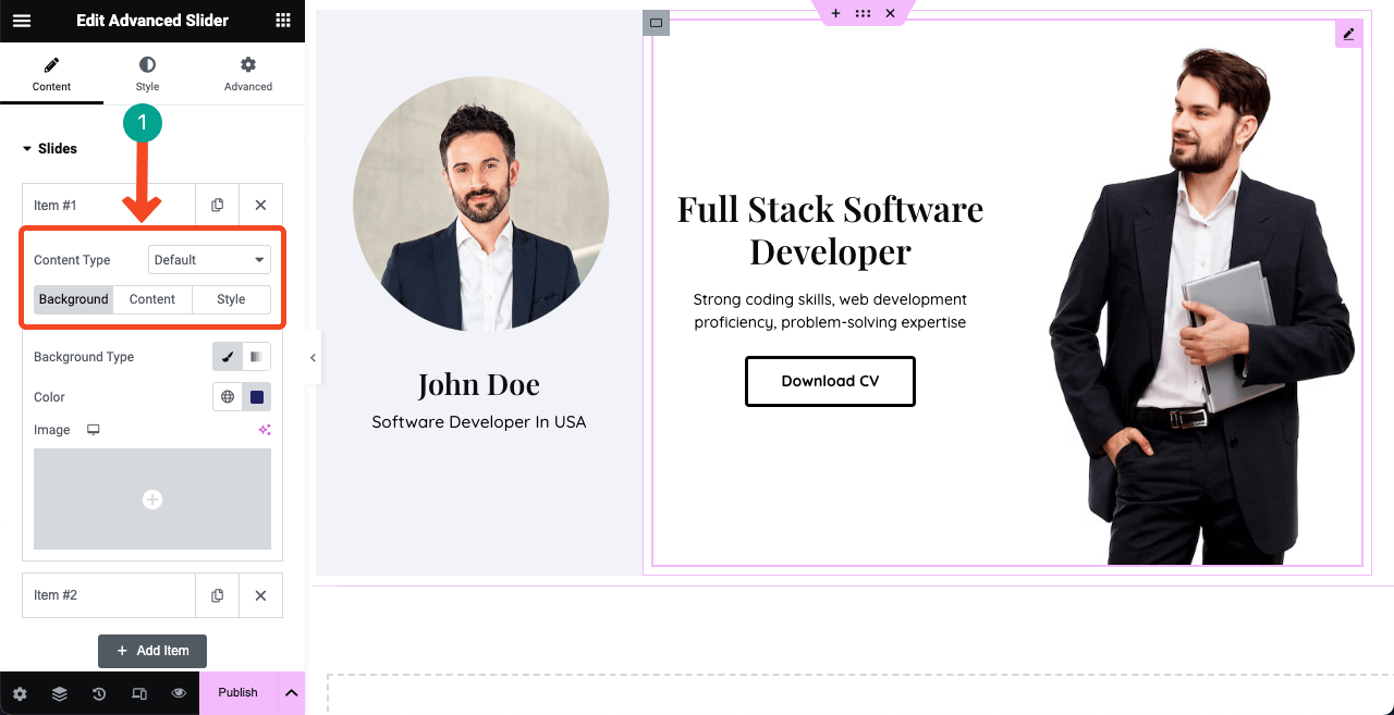
Most people love to add an animated slider in the hero section. Drag and drop the Advanced Slider widget to the right column to create the same one.
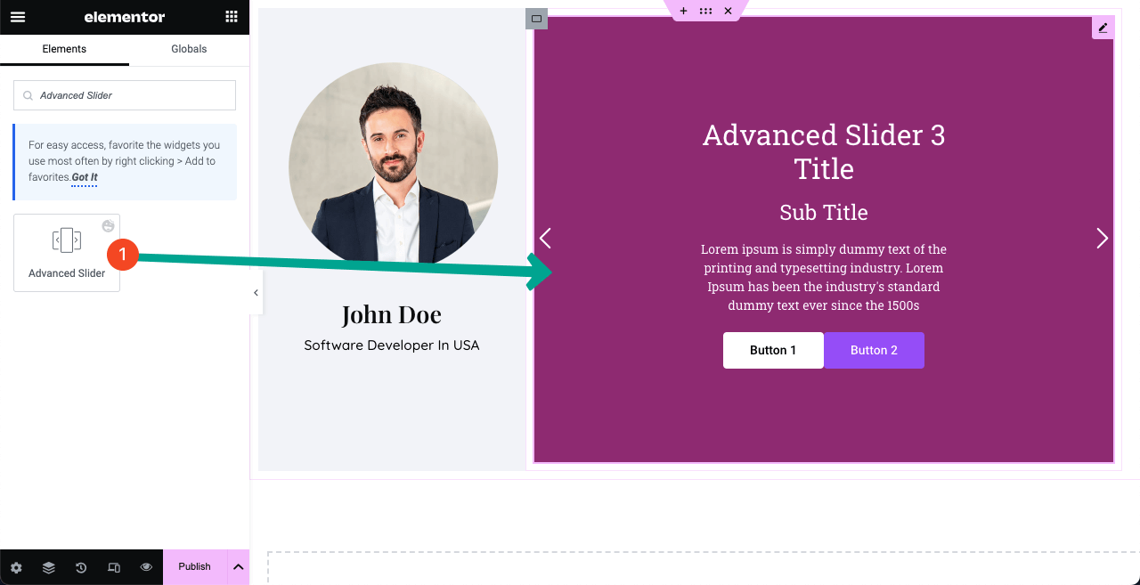
Below the Slider section, you’ll get the option to add as many sliders as you want. Each slider will provide you with three tabs: Background, Content, and Style.
The Background lets set an image, its position, background color, and display size. The Content tab allows you to add necessary texts to the respective fields. You may keep both buttons or remove one from here if necessary. The Style helps you add stylization to the content.
Hope you can do this alone. If we show every single aspect, this post will be too long.
# Create About Section
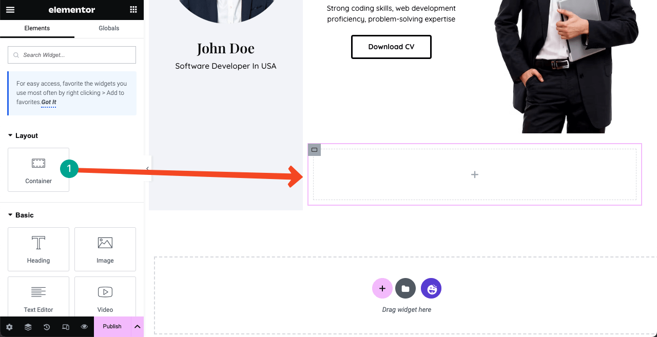
Drag and drop the Flexbox Container to create a new space for the About section. Whenever you create a new section, you must use a container again.
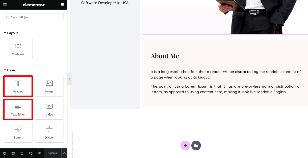
Add necessary texts to the About Me section using the Heading and Text Editor widgets. We have used the Spacer widget between them to create a space.
Apply the color (#FEF7F7) to the background from the Style tab. Added Padding 35 from Advanced > Layouts > Padding.
You may show some of your core skills in the About Me section. We have added four core skills in the image below using the Info Box widget. Before that, we added four Flexbox containers.
This means you can add more Flexbox containers inside a Flexbox container and display them vertically or horizontally. And its biggest advantage is that you can align content easily.
Going to Advanced > Border, you can add a border and shadow to each element (info box).
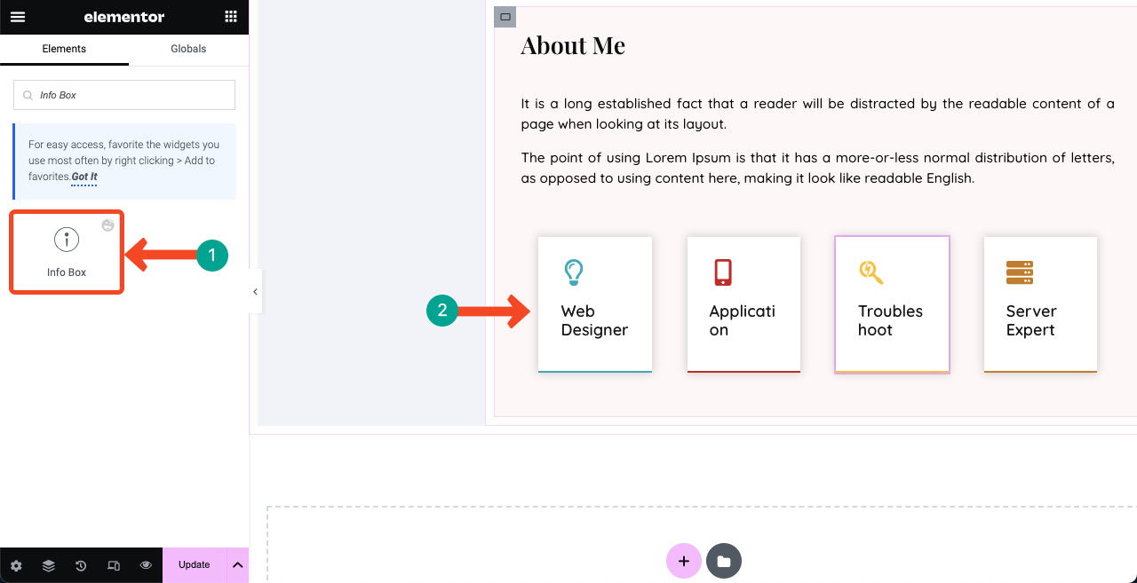
Note: Never worry if the info box texts look broken or wired. They will look good in the preview mode. See the video attached below.
You can see some unnecessary gaps between the columns. Click the three-line icon on the top-left corner. Then, go to Site Settings > Layout. Set Container Padding -1.
If you keep seeing any unnecessary gaps between sections and elements, you have to fix their padding issues by setting 0 to minus (-) value.
# Tell the Number of Projects You Have Completed
Create a banner like this using the Flexbox Container, Text Editor, and Button widgets. This may push clients to hire you seeing your successful project management skills.
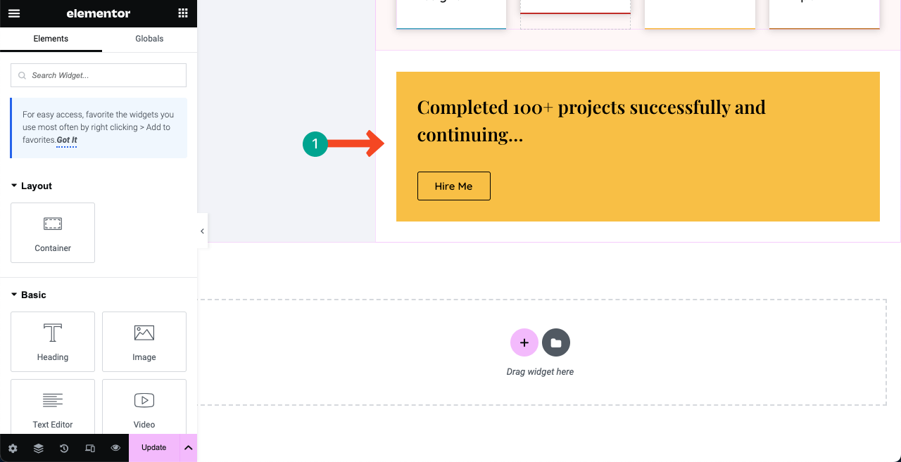
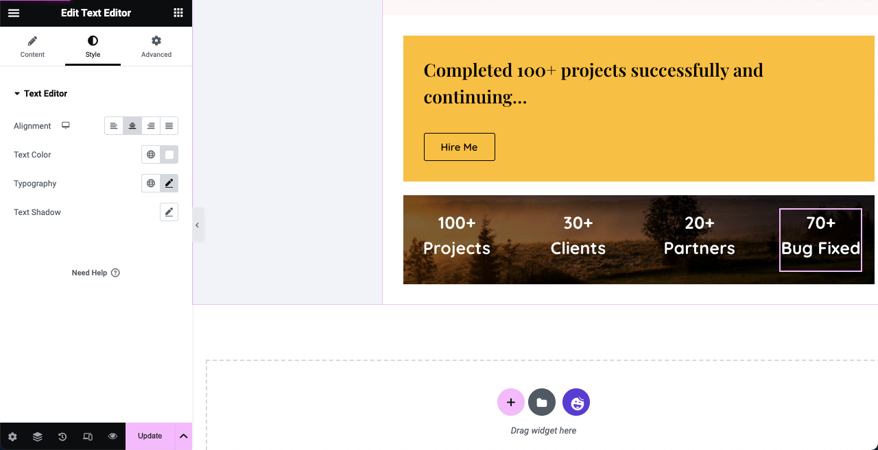
Use a new Flexbox Container. Add an image to its background. Set it Fixed from the Attachment section. This will make the image sticky even if you scroll the page.
You can drag and drop the Text Editor widget on it and showcase the number of projects, clients, partners, and bugs you have already fixed and handled. This image stickiness will add a great vibrance to your resume website.
# Create About Section
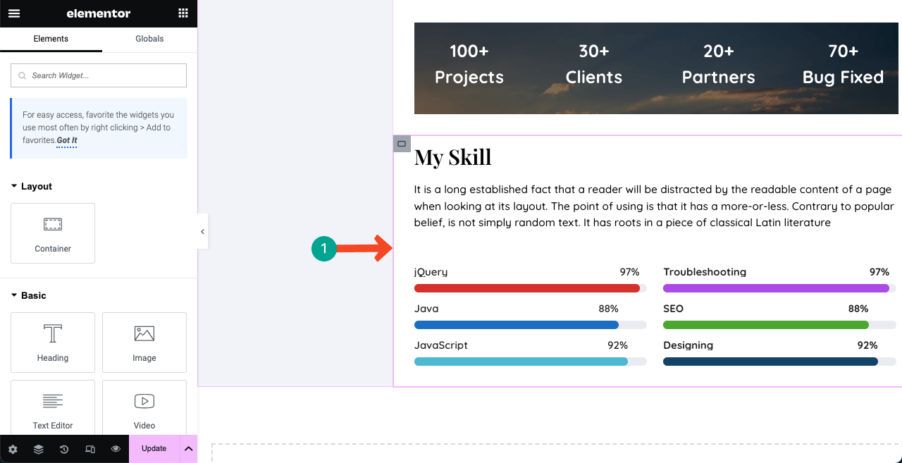
You can create a section to showcase your skills like the below image using the Skill Bars widget. And for the other texts, we have used the Heading and Text Editor widgets.
# Show Job Experience
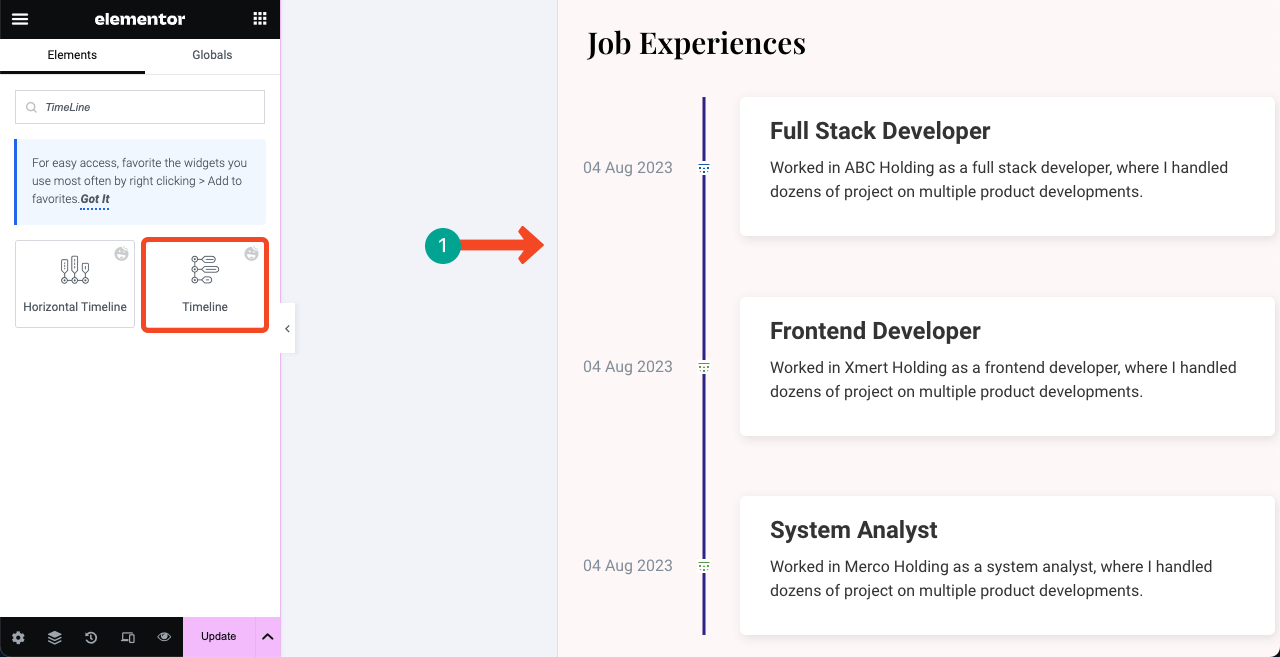
Use the Timeline widget to create a section to exhibit your previous job experiences. Add a compelling description to each respective field with accurate dates.
# Show Your Educational Background
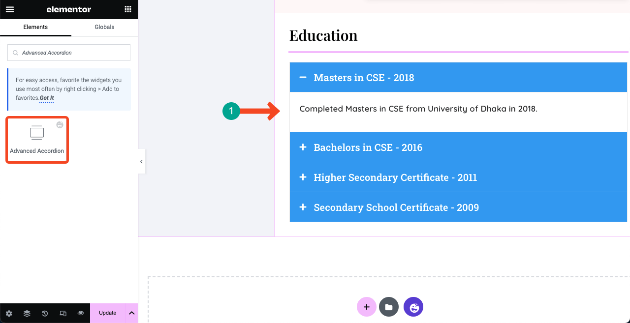
Use the Advanced Accordion widget to create a similar section to the below image to showcase your educational background. You may add the images of your certificates though we don’t see this usually.
# Show Some of Your Completed Works
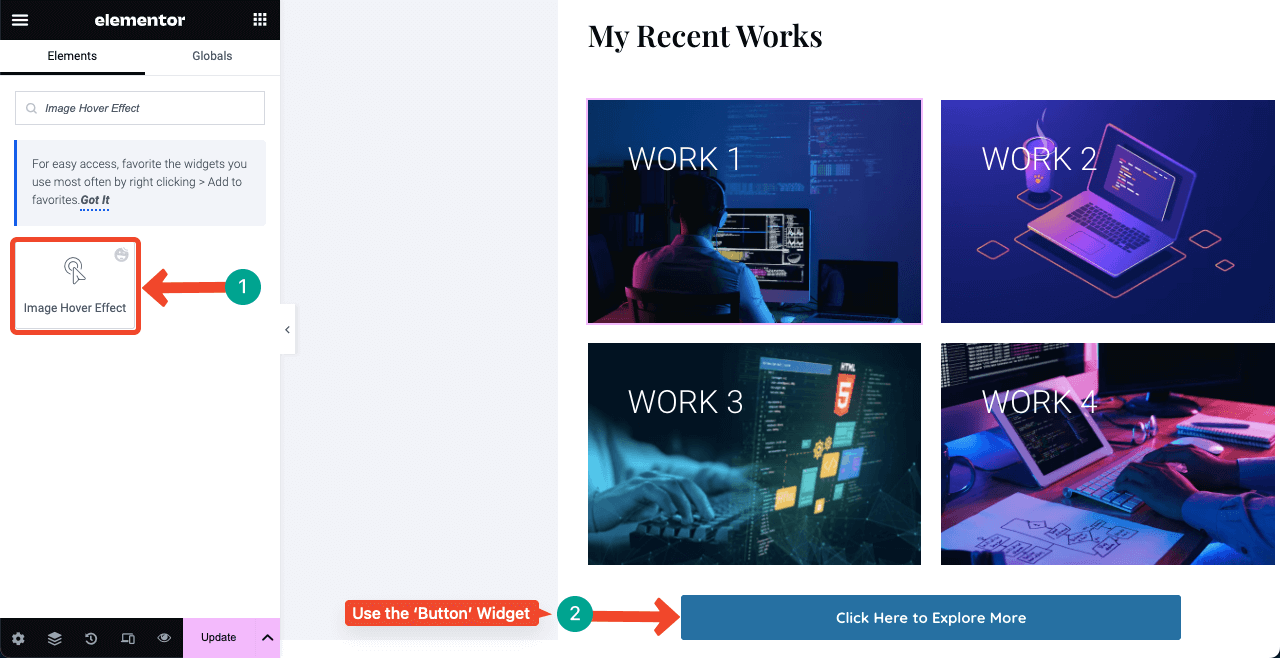
By showing some of your completed works, you can create a sense of credibility about your skills and expertise in clients’ minds. So we recommend you create a separate section and add some of your top-performing works.
You can use any suitable widget from the Elementor panel. But below, we have used the Image Hover Effect and Button widgets. You can add your project links to the featured images and allow users to explore more by clicking the attached button.
# Show Your Recent Blog Posts
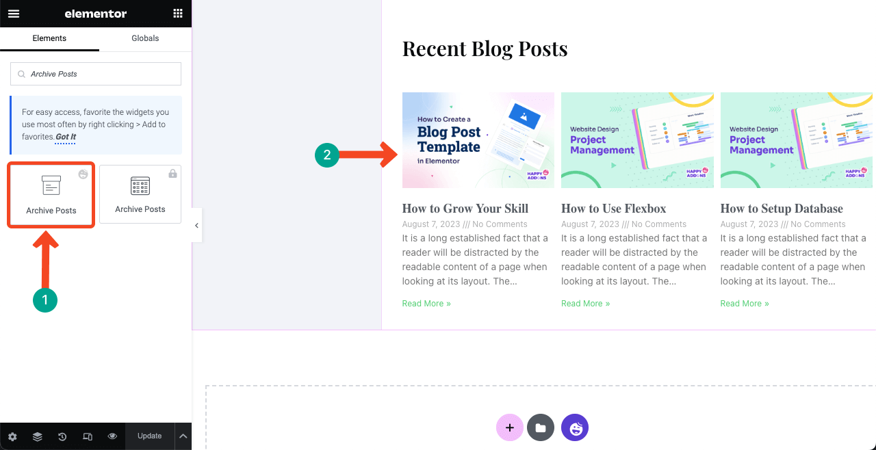
Quality blog posts can drive valuable traffic to your website. It can help rank your website on search engine result pages and get you interested clients. Hope you all already know the importance of blog posting.
So if you regularly write blog posts for your resume site, you must add a separate section on the home page to display recent posts dynamically.
Just drag and drop the Archive Posts widget to your desired suitable place. Your recent posts will automatically be shown. You may customize the amount of content to be displayed from the widget settings.
# Add a Contact Form
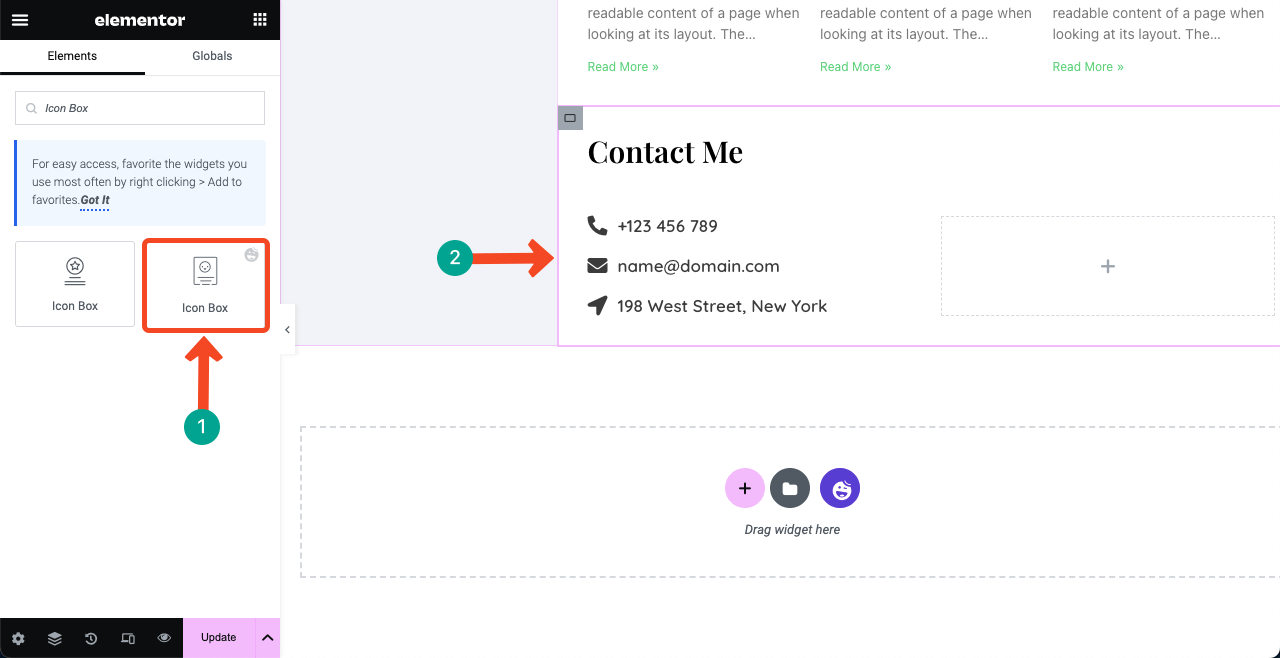
The contact form section must offer all the possible ways by which clients and employers can get a way to contact you. This section usually includes the resume writer’s phone number, email address, location, and contact form.
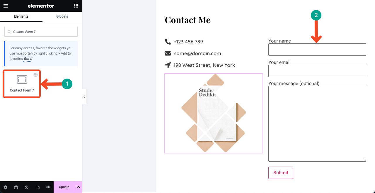
Let’s first add your contact information and local address. We have used the Icon Box widget to add the phone number, email ID, and local address. You can select your desired icons for the respective information from the comprehensive icon library coming with the widget.
Next, you have to add a contact form so people can send messages directly to your website. HappyAddons have integrations with dozens of contact form plugins. Search and select the plugin you already have installed in the backend.
For example, we have the Contact Form 7 plugin installed in the backend of our website. So we have dragged and dropped the widget to the canvas. Contact Form 7 is a forever free form plugin.
To utilize the gap below the email ID and location, we have used the image widget to add an image to beautify the section further.
Step 08: Add Navigation Menus to the Right Sidebar
We left the left sidebar unfinished and promised to complete it after designing the right column. Now, it’s time to add a navigation menu to the right sidebar listing all the sections you created on the right side. This part will is a bit tricky. So please, follow carefully.
# Create a Menu List on Your Backend
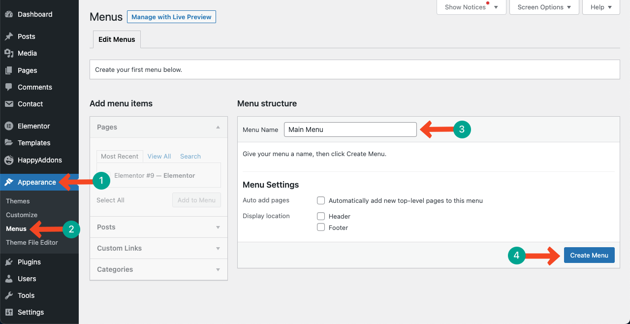
Go to your WP Dashboard. Navigate to Appearance > Menus. Give a title to your menu and then press the Create Menu button.
Go to the resume site and check the total how many sections you have created and what they are. We have created these sections:
- About Me
- My Skill
- Job Experiences
- Education
- My Recent Works
- Recent Blog Posts
- Contact Me
We will create menus accordingly. As this is a one-page resume site, the menu creation and navigational process will slightly differ from multipage websites. Toggle on the Happy Menu and go to Custom Links. You’ll get two boxes there: URL and Link Text.
In the URL box, add a custom link for each menu item.
>> The formula is page url/# section name. Suppose fuadalazad.com is the page where I have published all the above content. To create the About menu, type: http://fuadalazad.com/#About.
In the Link Text box, type the section name only, like About. Press the button Add to Menu. Watch the video below for further clarification.
Do this for all the sections one by one. Once you are done, come to the elementor canvas again.
# Add a Navigational Menu to the Frontend
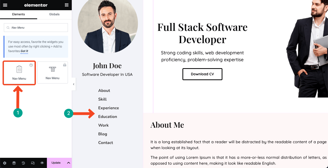
Drag and drop the Nav Menu widget to the left sidebar below your name and designation. You’ll get an option to select the menu you created on the backend.
To display the menu vertically, go to the Style tab and modify the Horizontal Padding value. Then, customize the font style and hover effects.
# Link Menus to Their Respective Sections
Select each section respective to the menus and type their names individually into the CSS ID box one by one. This will instantly take you to the section whenever you click on particular items on the menu list. We have demonstrated the process below. You’ll see the magic at the end.
Ensure you have used the exact same words you used in the navigation menu for respective sections. Any spelling mistake can ruin the entire function.
Step 09: Add a Copyright Text
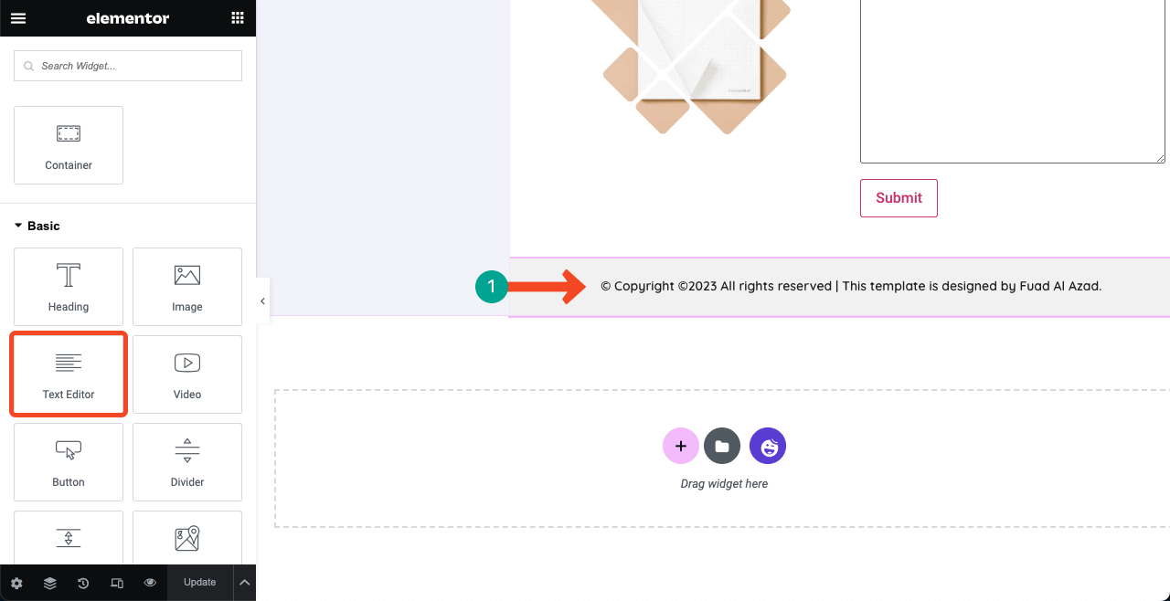
A copyright disclaimer can protect your content from theft or misuse by others. With a copyright statement, you can signal to Google that you are the original owner of the content. If someone tries plagiarism your content, you’ll have the authority to ask Google to take action against them.
Step 10: Make the Left Sidebar Sticky
As we have used lots of Flexbox containers to create sections, it may be difficult for you to find out the mother container of the left sidebar, and so does for the right. Better if you click the Navigator icon at the bottom of the elementor panel.
It will show you all the mother layers and sub-layers used. Select the mother container of the left sidebar. Then, navigate to the Advanced tab > Position and select Fixed.
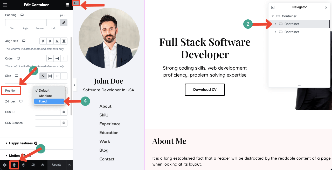
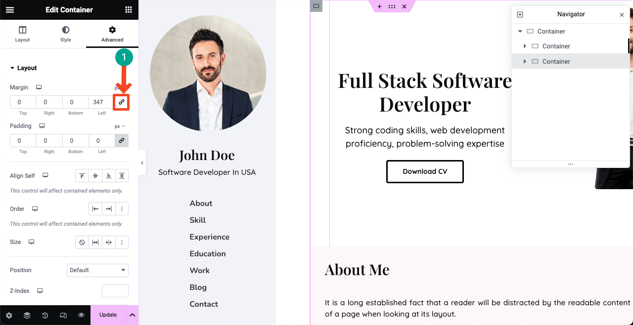
But this can cause the right column to move to the right sidebar. No worries!
Select the mother container of the right column. Go to the Advanced tab. Deselect the Margin link. Set a suitable value on the Left box till the alignment is perfect.
Step 11: Preview the Design
Go to the preview mode of your website. Click the menu item and see the right column scrolling while the left sidebar/navigation menu stays fixed. Isn’t it a wonderful resume site?
Step 12: Make The One Page Resume Website Mobile Responsive
So far, we have designed our website layout perfect for the desktop view only. But it may happen that many clients will visit the website from tabs and mobile phones. So you need to optimize it for other devices, which is also time-consuming.
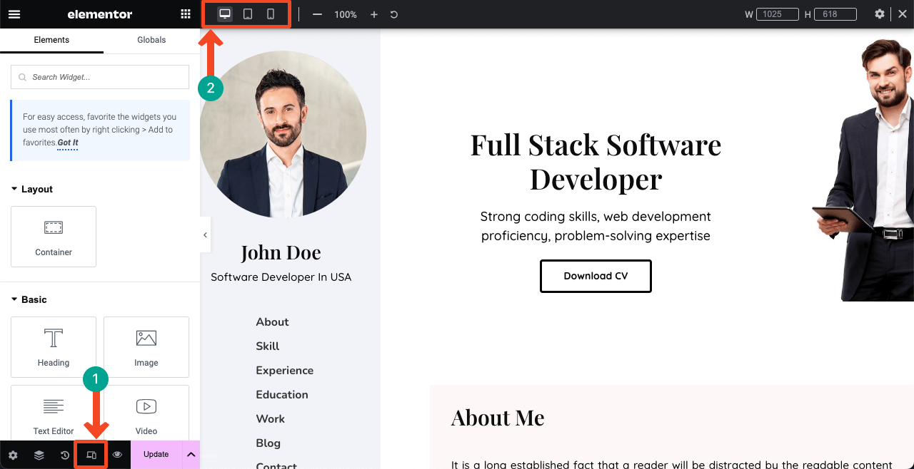
Click the Responsive Mode icon. This will open up an additional bar, including different device modes on top of the canvas. Switching between them, you can see the current status of all these elements on the tab and on mobile phones.
You may find them scattered across other displays and have to reorganize them. You won’t be able to show all the elements you have shown on the desktop. So you need to do separate wireframing for other devices.
We plan to cover another detailed article on how to make a resume website mobile responsive. If you love to have a blog post on this topic, please subscribe to us with your opinion.
FAQ on How to Create a Resume Website
Hope you have a resume site or planning to create one. But don’t know how to get the best of it. We’ll share with you some crucial suggestions in this section.
-
What are the elements a resume website must have?
About section, professional experience, skills, education, projects completed, portfolio, testimonials, contact information, downloadable CV PDF, etc.
-
How to Promote Your Resume Website to Attract Leads and Traffics?
1. Link the Website to Job Portals
2. Share The Website on Social Media
3. Link the Website to Self-Promotional Platforms
4. Link the Website to Public Forums -
What is the difference between a resume and a portfolio website?
A resume website mainly showcases the professional background, work experience, education, skills, and achievements. This is nothing but an online version of the traditional resume.
A portfolio website focuses on showcasing creative works, projects, artwork samples, etc., that explain your skills and experiences.
-
How to make a one page resume website template lightweight and fast-loading?
Since a one-page resume website template has to cover lots of content, it tends to become heavy-weighted. The following tips can help you make the template lightweight and fast-loading:
1. Optimize and compress images before uploading
2. Minimize CSS and JavaScript
3. Use a lightweight theme
4. Install a Cache plugin
5. Enable lazy loading
6. Use a content delivery network (CDN)
7. Select a fast hosting server -
Are a header and footer necessary for a one page resume website?
It actually depends on your design. The website we have designed in this article doesn’t need a traditional header and footer. But they may be required for other types of designs. Just explore Canva, Dribble, and Colorlib. You’ll get countless design inspirations for one page resume website templates.
Final Words!
A resume website is more than just a page online. It’s a canvas that showcases a testament to your journey, skills, educational background, and professional experiences. It provides you with an opportunity to inspire and connect with numerous people in the digital world.
We have tried our best to show you a guide on using Elementor to create your resume website. Actually, creating a website is a long and continuous process. You may not get used to using Elementor and HappyAddons overnight.
But if you continue practicing for a few days, you’ll gradually become a master of their ecosystem. After that, you can craft different types of website designs with them. Hope you have loved our efforts. In case of any help, comment us below or message our support team.

