While visiting an eCommerce website, you may have seen a lot of categories in the menu bar. After hovering over a specific category, you will see a large drop-down menu with more categories. This is called the mega menu.
A mega menu is a web element used to guide users to navigate a website’s lower-level sub-pages, categories, and subcategories. Most big websites like eCommerce, news, and hotels usually have a mega menu.
A mega menu improves your website’s UX design and keeps users attached for a long time. However, you can also add content blocks, sliders, images, icons, videos, etc., to the modern-day mega menu.
In this blog, we are going to show you 10 well-structured mega menu examples of ten different websites.
Along with that, we also cover these topics in this article-
- Why and When You Should Use A Mega Menu
- 10 Good Mega Menu Examples
- Mega Menus Best Practices
- How to Create a Mega Menu in WordPress Using Elementor and Happy Addons
- FAQs on Mega Menus
Let’s start with the basics.
Why and When You Should Use A Mega Menu on Your Website
If your website deals with many categories and subcategories, a mega menu will be the right choice to set your website navigation.
A mega menu not only gives you the option to display essential website elements but also helps your website users find their required data. Thus, it improves your users’ experience. Generally, you can see the mega menu in eCommerce, hotels, restaurants, and other websites that deal with web content.
Here are some possible areas where you need to use a mega menu. You can,
- Create a mega-menu for your eCommerce website
- Display many product categories for online stores
- Use a mega menu to display topics and categories in blogs and magazines’ website
- Add a mega menu for your big-sized corporate websites
- Design a mega menu to feature rooms and accommodations on hotel websites
Learn how to create a menu in WordPress.
10 Good Mega Menu Examples
In this part of our blog, we are going to show good mega menu examples. Here, we’ve picked different types of websites. That ultimately helps you to see different use cases of a mega menu.
- InVision
- Dribbble
- weDevs
- Adidas
- Figma
- Asana
- Bobbi Brown
- eBay
- Food Network
- Evernote
- Canva
- Visme
- Fiverr
- Apple
Let’s get started:
1. InVision
InVision is a popular website that principally provides a project-handling solution that centralizes the entire workflow system. It has an organized mega menu that links many essential internal pages. Under the Product menu item, you see the menu has many internal pages under three different categories: Product Overview, Freehand, and For Teams.
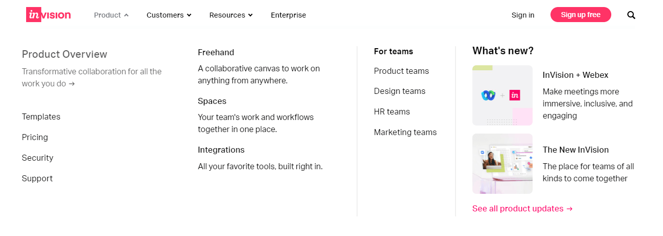
The product menu item also has an option to display the product update where you find the update of the InVision products. Ultimately, this is an ideal mega menu example that helps users to navigate the website easily.
2. Dribbble
Dribbble is a popular marketplace where designers can showcase their work. It has a beautiful mega menu design that improves the user experience. Under a single menu item like Marketplace, you see an icon with an internal page link and a short description of the page.
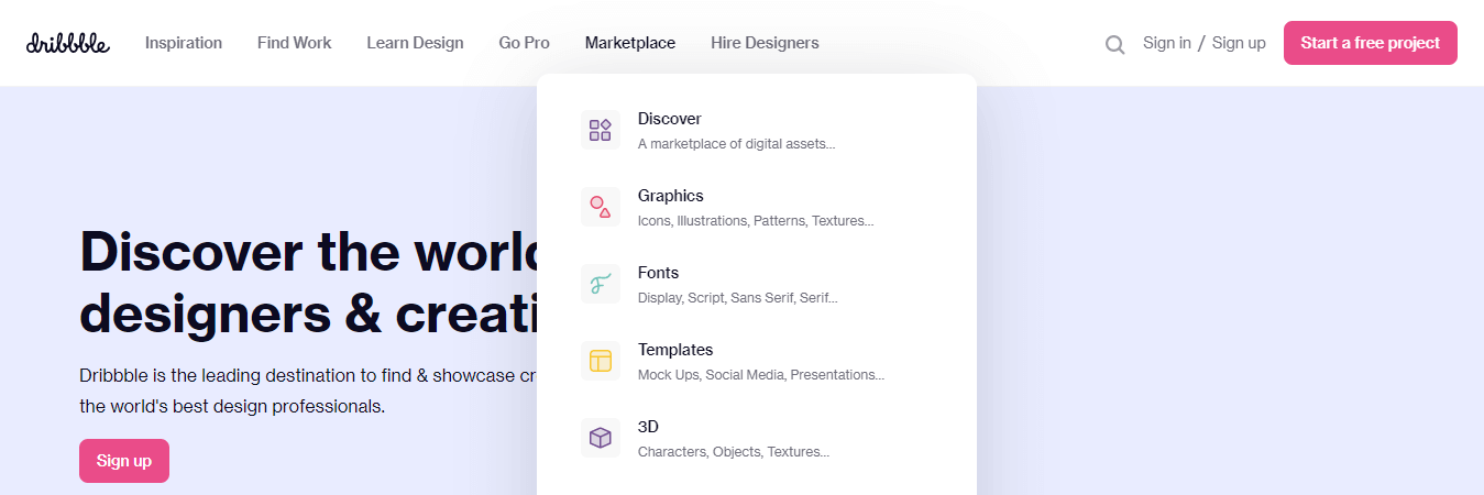
However, this menu has another area that displays the specific categories. In short, it’s another great example of a good mega menu.
3. weDevs
weDevs is one of the popular WordPress products-based companies that built some great products including the Dokan Multivendor Marketplace plugin. It comes with a very clean and simple mega menu. You will notice that under the Products menu item, there are multiple products showcased with a product logo and a brief tagline.
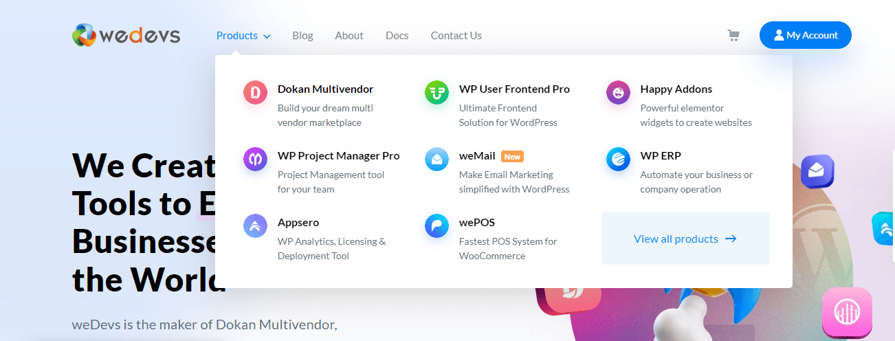
Also, it has a link to View All products to go to the product page. It is responsive, so you can easily use it on your small devices.
4. Adidas
Adidas is one of the world’s most popular sports brands. If you visit the official Adidas website and go to the menu area, you’ll see their mega menu. It is well-organized.
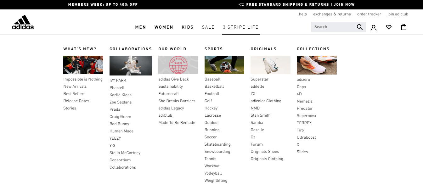
Under the 3 STRIPE LIFE menu item, there are six categories such as What’s New, Collaborations, Our World, Sports, Originals, and Collections. Each of the categories has several internal pages and starts with an image.
5. Figma
Figma is a popular design tool. On their website, they use the handy mega menu to display their essential website content. Their mega menu is different from others.
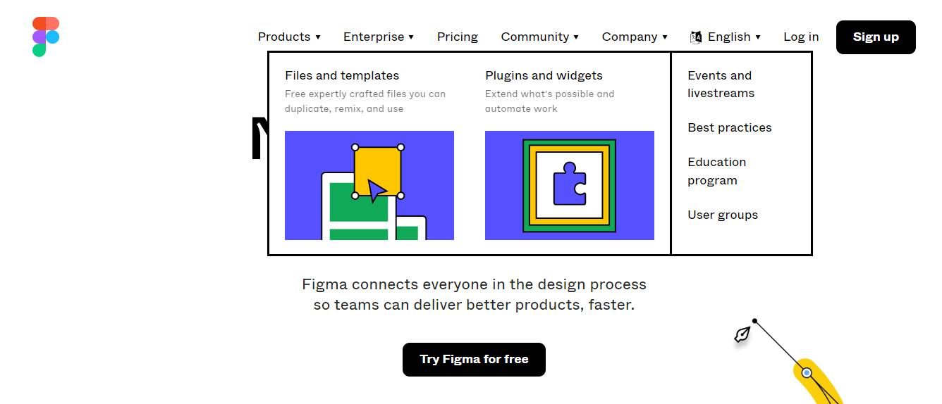
Here they use infographics to improve their user experience. Also, they separate the menu sections using a solid border.
6. Asana
Asana is a well-known web and mobile work management platform made for managing teams and their work. This popular website has a large-scale mega menu. It displays many necessary website contents.
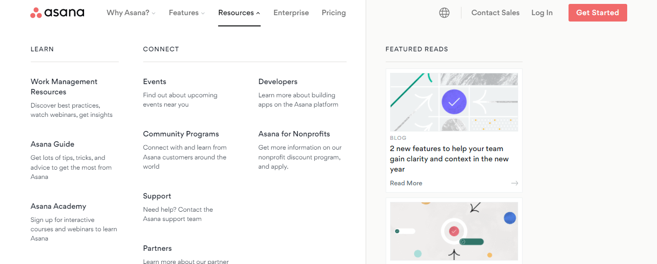
Under the Resouces main menu item, the mega menu shows two-dimensional menu content using two categories, LEARN and CONNECT. Both of these categories have many internal pages that are systematically listed. However, it also has a FEATURED READS option to showcase the feature blog posts of the website.
7. Bobbi Brown
Bobbi Brown is another great example of a modern-day mega menu. It is an online store that mainly sells cosmetic items. This website has a mega menu that is very simple in design but dazzling.
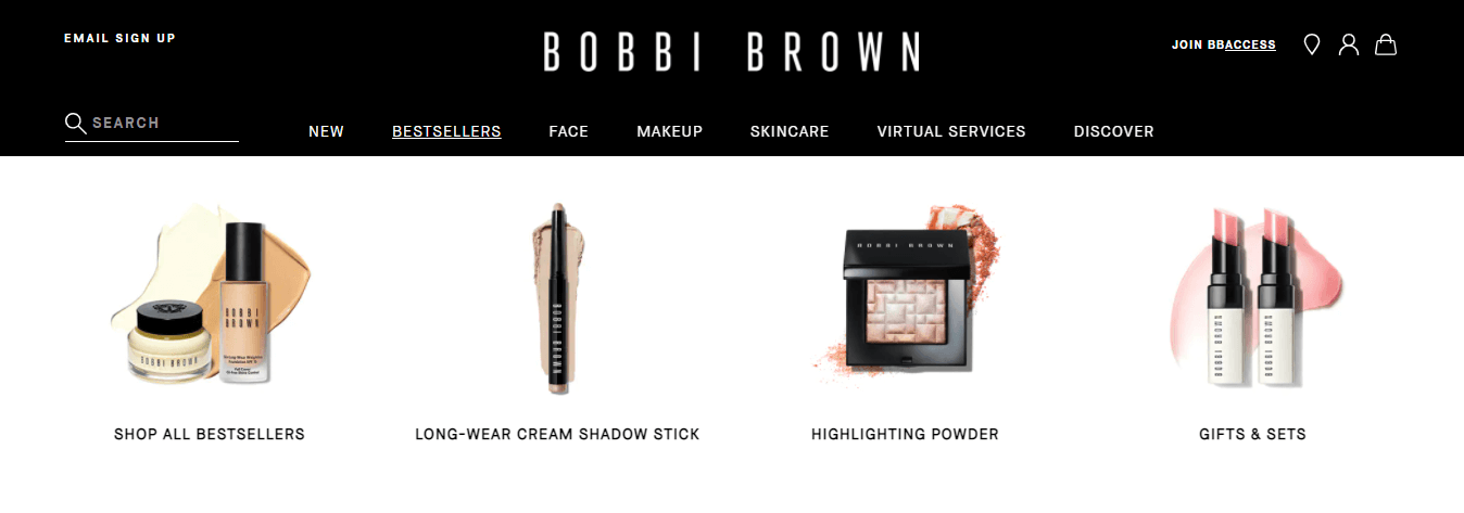
It displays cosmetic items with an image and the category name. It also focuses on responsive design so that anyone can access the mega menu using their mobile phones and tablets.
8. eBay
Most of you are familiar with eBay, one of the world’s biggest eCommerce brands. This top eCommerce website has a rich mega menu. Under each of the main menu items, there is a mega menu. Focus on the Fashion menu.

Under this menu item, there is a big-sized mega menu used to showcase the Most Popular Categories and More Categories. These two categories have tons of subcategories, which are also listed as menu items. However, it also displays a featured product that grabs the customer’s attention.
Read: eBay: Magical Journey of Becoming Global E-Commerce Business Leader
9. Food Network
Food Network is a restaurant website that has a mega menu to display the restaurant food menu. Under the Recipes menu item, it has a mega menu that shares the RECIPE OF THE DAY and TRENDING RECIPES.

Their mega menu presentation is iconic. Each recipe has an image that attracts customers. However, it also has an option to display the other Recipes List and a button to SEE ALL Recipes.
Learn more about how to create a restaurant website using WordPress and Elementor.
10. Evernote
Evernote is a tool specially made for project managing, organizing, note-taking, archiving, and task management. This website has a stunning mega menu to show its valuable features.

This is a beautiful mega menu that comes with unique green icons, feature names, and a short tagline. Also, it has a SEE ALL FEATURES link to see all the features of Evernote.
11. Canva
Canva is a cloud-based popular graphic design tool. Actually, it’s a lifesaver to countless users who want to get their designs done in a short time with low design skills. Canva has a comprehensive mega menu as it covers lots of features, options, and pages.
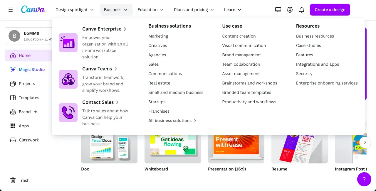
Canva mega menu navigates you to design canvas, readymade templates, pricing plans, and educational content. It also holds subcategories under the main menus.
12. Visme
Visme is another cloud-based graphic designer platform, alternative to Canva. Here too, you will find countless design options as well as a large number of ready-made templates by which you can complete your design in no time with very little skill.
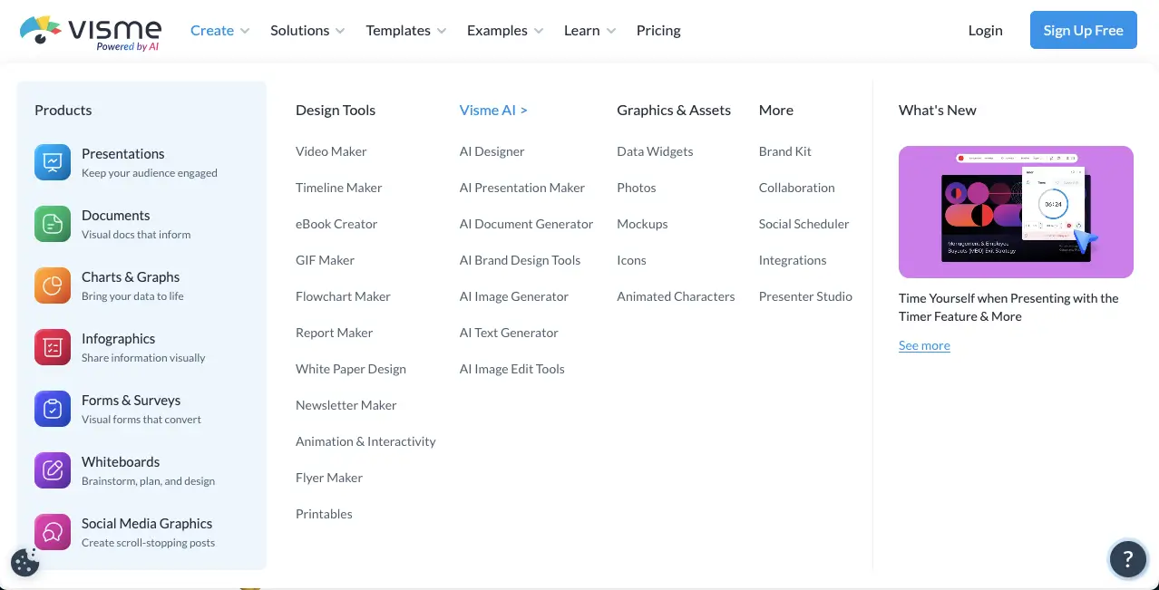
Visme has an eye-soothing and feature-rich mega menu covering lots of options. It includes numerous categories and subcategories for navigating you to all the features, functionalities, and pages your site has. Its mega menu also works perfectly on mobile devices and smaller screen sizes.
13. Fiverr
Fiverr is a renowned platform for employers to outsource jobs. Millions of freelancers upload their gigs there from which employers find their desired freelancers and complete projects. Freelancers can now sell a wide variety of services on Fiverr, although there were only a few at the beginning.
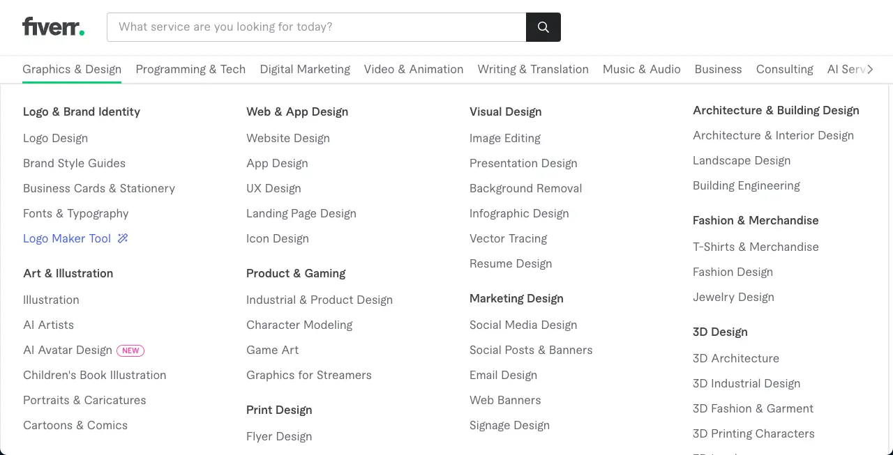
And to give space to all these options, Fiverr had to create a large mega menu. You’ll find almost all types of freelancing jobs and services you can imagine in this mega menu. Employers can use this mega menu to find specific gigs of respective freelancers and hire them.
14. Apple
You will hardly find someone who has never heard of Apple. It’s an American multinational technology company. It develops and sells software and electronic products for customers. Apple also maintains a mega menu to showcase their products, mission, vision, and valuable information.
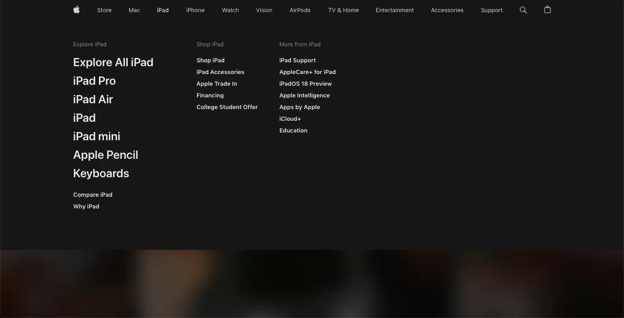
Apple has a simple mega menu. Although not gorgeous like the others mentioned above, its mega menu is enough to deliver the message and navigation required for the website.
5+ Mega Menu Best Practices
Based on your needs, you can create a mega menu for your website. But make sure that your mega menu is well-designed, responsive, and easy to use. To make your mega menu flawless, you should follow the tips below.
- Keep your mega menu simple for users to scan
- Focus on responsive design
- Try to add icons/images to make it more engaging
- Use one single link color
- Avoid having links too close together
- Make sure that all menu items are visible at once, and skip the scrolling
- Use one trigger option: hover or click
Bonus: How to Create a Mega Menu in WordPress Using Elementor and Happy Addons
Back in the day, creating a mega menu for a WordPress website was a disaster. You need to write custom code, install 3rd-party plugins, and sometimes need to hire an expert to finish the job properly.
But the current scenario is different. You can efficiently design your own website mega menu using Elementor and Happy Addons.
Happy Addons is one of the popular and fast-growing Elementor addons that comes with an extraordinary widget Happy Mega Menu. With this advanced widget, you can create a mega menu in real-time. This drag & drop widget allows you to add icons, badges, images and saved Elementor templates into the mega menu.
However, it is also focused on responsive design so users can easily access your website mega menu using mobile or other small devices.
Using the Happy Mega Menu widget, you can create a large-scale mega menu like the above examples weDevs, Adidas, Dribbble, InVision, and more.
Why waiting? Let’s watch this step-by-step video tutorial and learn how to create a mega menu in WordPress.
Read the Happy Mega Menu documentation and learn how to use this widget properly.
FAQ(s) on Mega Menus
There are many questions people often ask online regarding the mega menu. Here, we’ve answered some common questions that may help you to learn more about the mega menu.
1. What is a Mega Menu?
A mega menu is a largescale dropdown navigation menu used to showcase enormous internal page links of a website. It differs from the default WordPress submenu or dropdown menu. In a mega menu, you can add icons, images, and other advanced features to decorate your website navigation area.
It allows your website visitors to access the deepest sections of your website using the main menu. However, A mega menu improves a website’s usability, helps drive more sales, increases conversions, and helps your visitors browse your website for longer.
2. How Can I Create a Mega Menu for My WordPress Website?
You can use a mega menu plugin to create a mega menu for your website. But if you are an Elementor user, you can simply create a mega menu with the help of Happy Addons’ Happy Mega Menu widget. We’ve already discussed this. Follow the above part of our blog.
3. Are Mega Menus Good or Bad for SEO?
Basically, a website Mega menus don’t impact your website ranking. But it helps to improve your website navigation. That’s why you can say it is good for SEO.
On the other hand, the code of the mega menu mainly loads first as it displays to your website. As the mega menu listed many internal pages or other necessary web elements, it slows down your website losing speed.
For that reason, it is bad for SEO as Google measures the page loading time for scoring your website SEO.
4. Should I Use Mega Menu?
It depends on your purpose. Typically, a mega menu is used for a large website such as eCommerce, blogs, magazines, news, etc. If you have such a website or a large content-based website then you should use a mega menu.
5. Does the Mega Menu Work with Elementor?
Yes, the mega menu is fully-compatible with Elementor.
Learn Perfecting Your Website Navigation Using Mega Menu
In this blog, we’ve listed 10 good mega menu examples. So you can get the right idea about the mega menu. However, we’ve also covered some necessary information regarding the mega menu, like why & when you should use the mega menu, mega menu best practices, and answered common questions that people often ask online on the mega menu.
Apart from that, we’ve discussed how to create a mega menu in WordPress with Elementor. Now creating a mega menu is not difficult for Elementor users with the help of Happy Addons’ Happy Mega Menu widget.
If you like this post, share it on your social channels. And don’t forget to join our newsletter to get more handy blogs on WordPress and Elementor.
Why HappyAddons Pro is your ideal Elementor companion!
HappyAddons vs. The Rest: Unmatched Features and Stellar Support for your design journey
-
150+ exclusive collection of customisable widgets
-
20+ feature set to unleash your potential
-
500+ premium templates for inspiring designs
-
Our expert support team is always at your service
-
14-Days Money back. Peace of Mind Guaranteed
Subscribe to our newsletter
Get latest news & updates on Elementor





2 Responses
Thanks for the article. This is so helpful and explanatory.
Thanks, Tina, for stopping by and sharing your experiences with us.
Regards,
Team HappyAddons.