



Do you know 85 percent of buyers base their purchasing decision on the website’s color? But unfortunately, most of the developers and site owners are still unaware of this fact.
Color plays an important role in how we perceive the world around us. It can sway our thinking, change actions, and cause reactions. For example, the color of a mango (green, yellow, or orange) sets the customer’s perception of what freshness or sweetness level they will receive from that specific fruit. Based on this insight, they will decide whether to buy it or not.
It means color can determine how you will react to a particular event. That is the reason the website color selection process must be well-organized. If a designer selects the website colors properly, thus it will definitely affect the conversion rate and revenue.
With the best website color scheme you can-
- establish your brand identity
- grab traffic attention
- turn visitors into advisors
- get them more engaged with your site
In this blog, we will cover everything you need to know about website color palettes. From the importance of the right color palette to how to choose the best color for a website- you will get everything to learn!
Why You Should Care About Color?
Color impacts the human brain because it can greatly affect our physiology since it influences our blood pressure, anxiety, pulse, metabolism, eyestrain, etc.
Also, we know visual content affects in online purchase, and so do colors.
Studies suggest that people make a subconscious judgment about a product within 90 seconds of initial viewing. Up to 90% of that assessment is based on color alone.
University of Winnipeg in Canada
Remember, the time any potential customer lands on your website, he/she has to make a lot of decisions before making the final purchase. And more importantly, every element of your website impacts their actions. The color combination of your platform is an important aspect that matters greatly but is underrated mostly.
If I ask you to think about Coca-Cola, what is the first thing that will pop up in your mind?
A iced cold bottle of Coca-Cola might be the first thing.
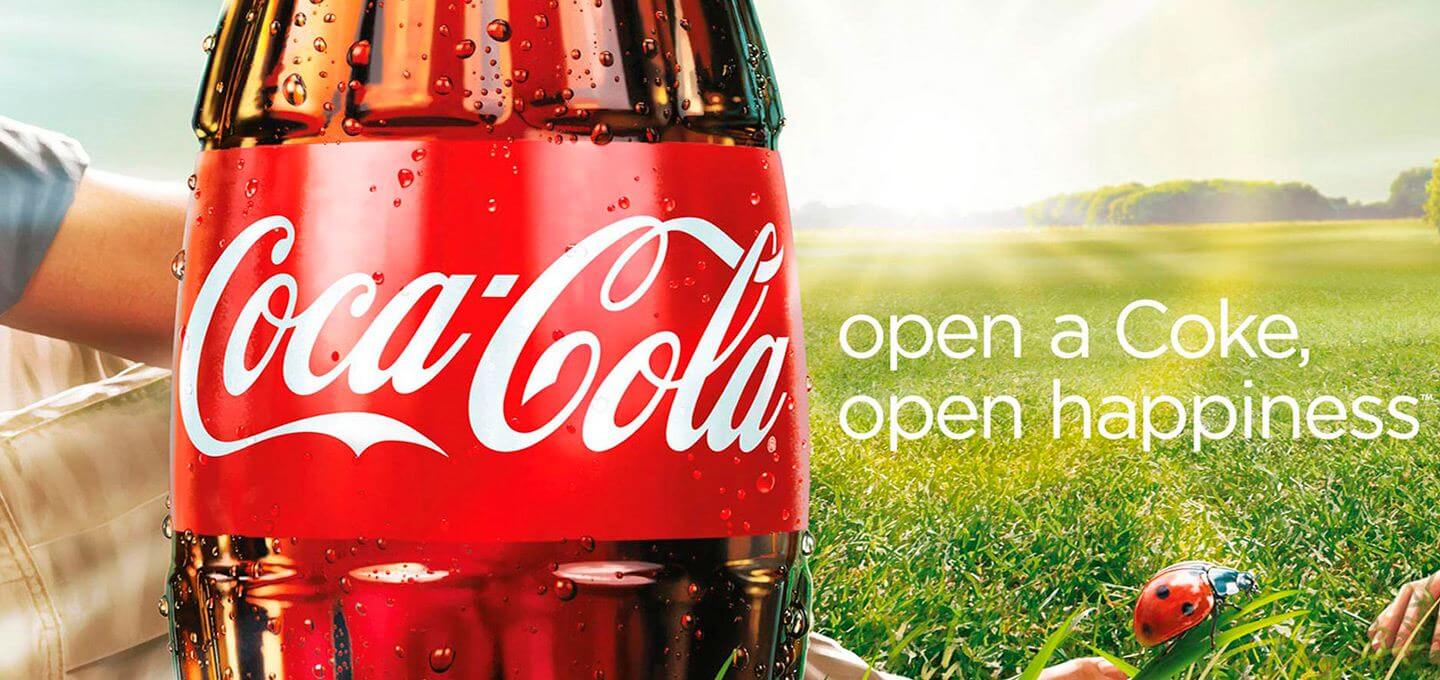
But next, it may be the iconic red logo that will come into your mind. Now, it’s really hard to think about this popular drink without seeing the red color.
Do you know Coca-Cola did not use this red color randomly as their brand color. There are actually two main reasons behind it-
- The fire engine red color makes it unique on store selves among other competitors.
- Every color resembles a specific emotion. When people see red color, it may evoke feelings of love, excitement, boldness, and passion. And these are precisely the feelings Coca-Cola wants you to associate with its drink.
Beyond telling visitors about your company, your website design can play a crucial role in their snap judgments about your brand.
Rather, it’s your duty to keep your traffic engaged and convince them to come back. Therefore, you have to be strategic in every part of your website.

How to Use the Righ Color Scheme to Increase Website Conversions
People take only a few seconds to form either a positive or negative interaction with your website. Since color has a great impact on the human mind, you must be careful while selecting colors for your website.
First, find out the companies around the web similar to yours. Now, visit their website and notice what type of colors they have used in their sites. Then, try to identify the reasons to pick those colors. It gives you a primary idea of which colors you should start with.
You can see the graphics created by Material UI, which demonstrates all the colors used by top websites around the world.
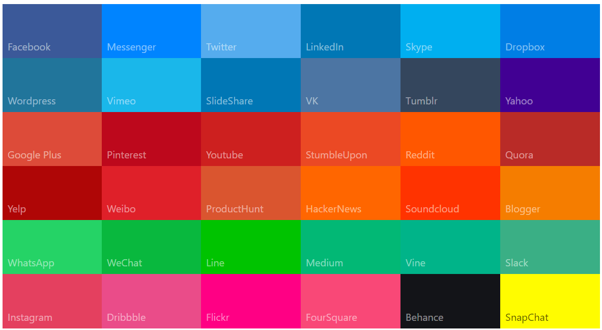
When you realize the behind story of why they have used these colors over others, you can understand how colors work together to make an eye-catching website.
1. The Color Must Reflect Your Brand
Color helps people recognize your brand.
The color scheme of your website works as a booster in your customers’ purchase decisions- if they can’t even realize it consciously. Luckily, you can use this concept in your favor. Utilize the color considering your audiences’ preference and make the first impression of your brand memorable one.
All you need to establish a solid brand identity. As it’s important to build trust and continue a long-term relationship with your customers. Your brand color should reflect on your website. So that people can easily relate your website to your brand.
Oral-B: The largest brand of toothbrushes uses blue as their brand color. They use blue as their base color on the website, too. So that people can easily correlate the brand with the website.
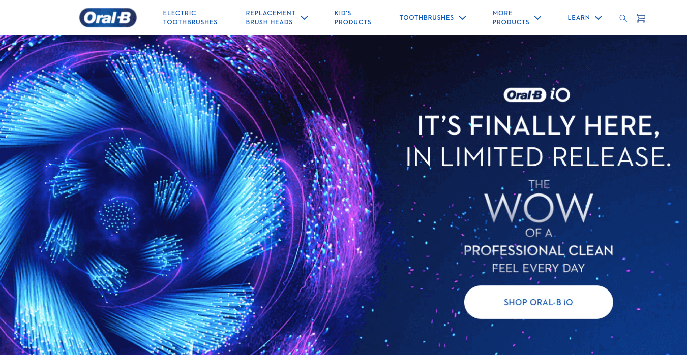
A large number of businesses and banks use blue to create a sense of security and trust in the brand. Evidently, blue is the number 1 preferred color by both men and women.
2. Get to Know Color Psychology Basics
Top brands don’t pick their brand/website color by accident. They properly research every aspect of their industry first and then come out with a logical conclusion. The final color has been used in their branding and marketing initiatives.
Remember, different colors have the ability to attract particular types of customers and also can alter consumer behavior.
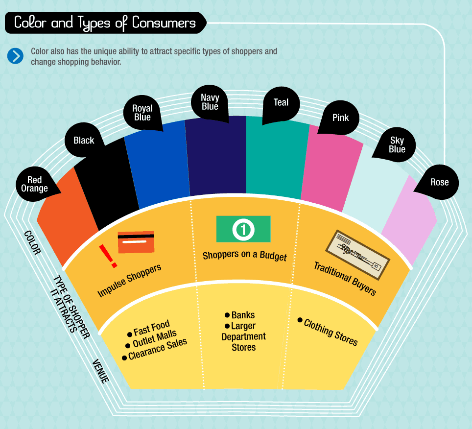
So you have to decide first what type of customers you want to have on your site. Depending on your customer category, you should set your website’s color. After all, without potential traffic, all your efforts become zero!
Color Preferences by Gender
Different genders respond to colors in different ways!
In a survey on color and gender, 35% of women claimed blue as their favorite color, followed by purple (23%) and green (14%). Meanwhile, 33% of women marked orange as their least favorite color, followed by brown (33%) and gray (17%).
CLINIQUE- a leading cosmetic brand in the United States, uses purple as their main color. Because they have a large female customer base. Plus, they don’t use any shade of orange, brown, or gray on their homepage.
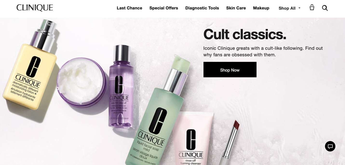
A large number of people think that Pink is the most favorite color of women. But the real scenario is quite different. Though pink represents femininity in color psychology but it attracts all the women or most of the women. So use a color other than pink- like blue, purple, or green will increase your chance to get a positive response from your female audience. And that may, eventually, improve conversions.
Color preferences of male is slightly different from women- that is quite obvious!
If your target audience is male, then you should go for blue, green, and black. These colors are generally treated as masculine colors. Do avoid the colors like- purple, orange, and brown.
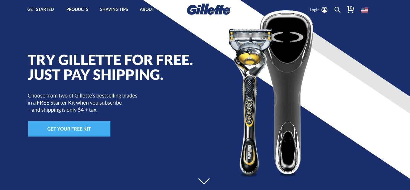
Gillette uses dark blue as their primary color base to attract male customers.
So, using the right color combination you can change people perceptions to your brand- subconsciously.
For example, from the above statistics, you can see that blue is the favorite color for both men and women. And both of them dislike orange and brown. So, if you intend to target both genders for your marketing, then you would consider blue or green for painting your website.
Color Preferences by Age Group
It may be a wonder that people’s color preferences can change with age. So, your target audience’s age can affect how your marketing materials will be perceived.
Here are people’s favorite color by age group:
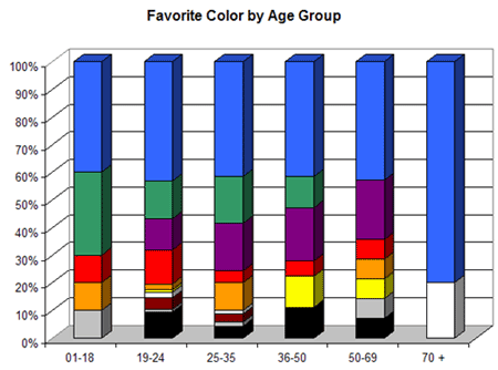
Here are people’s least favorite color by age group:
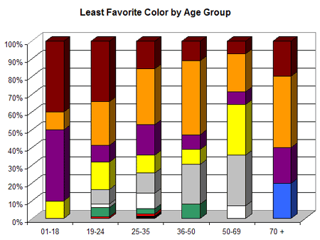
If your customers belong to a specific age group, then this too will be a factor to consider.
Pretty convincing! Right? Let’s move to the next point.
3. Leverage Yourself with Color Theory
As we said, every color represents a specific meaning and has the ability to turn your mood in a particular direction.
Let’s see how colors can help you to represent your brand based on your business type and intended audience with some real-life examples.
Warm Colors
These colors have an energetic effect on the visitors. But if you use them alone on your website it might be over-stimulated. It’s better to mix them with cool and neutral color for balance.
| Color_Name | What Stands for | Mostly Used for | Top brands |
| Yellow | Youthfulness, Optimism & Cheerfulness | grabbing the attention of window shoppers | DHL, CAT, Hertz, McDonald’s, etc. |
| Orange | Friendliness, enthusiasm & creativity | creating a sense of haste or impulse | Amazon, bing, Fanta, Firefox, etc. |
| Red | Passion, energy, urgency, excitement, active, love, intensity, & danger | triggering strong emotional reactions like to stimulate appetite | Netflix, Toyota, YouTube, Coca-Cola, etc. |
| Pink | feminine, sweetness, innocence, soft, romance | promoting women products | Barbie, pink – victoria’s secret, etc. |
Cool Colors
Spread a calming and soothing effect on the visitors. That is the reason a large number of brands use them on their websites. But remember, the excessive use of these colors can make your traffic boring.
| Color_Name | What Stands for | Mostly Used for | Top brands |
| Green | Wealth, health, tranquility & nature | environmental and outdoor products | Tropicana, Animal Planet, Starbucks Coffee, Spotify, etc. |
| Purple | royalty, success, glamour, ambition, spiritual | beauty & anti-aging products | Crown Royal, Cadbury, Hallmark, Yahho, etc. |
| Blue | trust, security, stability, peace & calmness | commercial business & banks | Oral-B, American Express, Dell, etc. |

Neutral Colors
These are great for ensuring balance in web design. You can use them with warm and cold colors to tone down primary colors.
| Color_Name | What Stands for | Mostly Used for | Top brands |
| Gray | respect, wisdom, patience, modernity, longevity, & intelligent | technology & industry | Apple, BOSCH, TESLA |
| Black | Power, luxury, sophistication, strength & precision | luxury brands | CHANEL, Louis Vuitton, L’Oreal Paris, Lamborghini, etc. |
| Brown | friendships, earth, outdoors, security, endurance | food industry | UPS, Hershey’s, Cotton, J.P. Morgan, M&Ms etc. |
Now you have a better idea of what a particular color means, which one works best for your business, or how you want the visitors to feel when scrolling on your site.
Let me help you with a quick example!
If you are selling kitchen towels, then you should go for colors like green (health, tranquility), yellow (lively, fresh), blue (peace, calm), or even red (passion, energy). Instead of using brown (friendships, endurance) or black (power, luxury).
4. Add Primary, Secondary & Neutral Colors
Hopefully, you have already selected your primary color. Now, matching your primary color to its complementary colors can make it more appealing for your viewers.
Get some ideas on how to mix the colors properly and where to use them.
- Primary colors: Use them to the most viewed places on your website. Such as header, notice, banner, CTA buttons, download form, etc. These bold and vibrant colors will attract visitors attention and encourage them to take the required actions.
- Secondary Colors: These colors are used in the less important parts of the website. Such as subheadings, secondary buttons, active menu items, sidebars, or supporting sections like FAQ and Reviews.
- Neutral Colors: Colors like White, Black Gray are mostly used as background on a website. You can also use them some colorful sections of your site just to tone it down or refocus the eyes.
Take a moment, think more about what you actually want, and then come out with some productive ideas.
5. Developing Tints & Shades
Once you finalize your base color, you can get forward to working on the color scheme. Some website works with only one color to design their websites, but is mostly better to work with at least a few shades or tints. So you can tone your primary color down or brighten the tint where you want. It lets you add different flamer on your website keeping the same base color indeed.
For example, if you use the lighter version of a color as the background on your website, then you can design the CTA button with the primary or brighter color to make it more visible to the viewers.
Here is a design of UI Maniac- who has followed the same technique while designing this template.
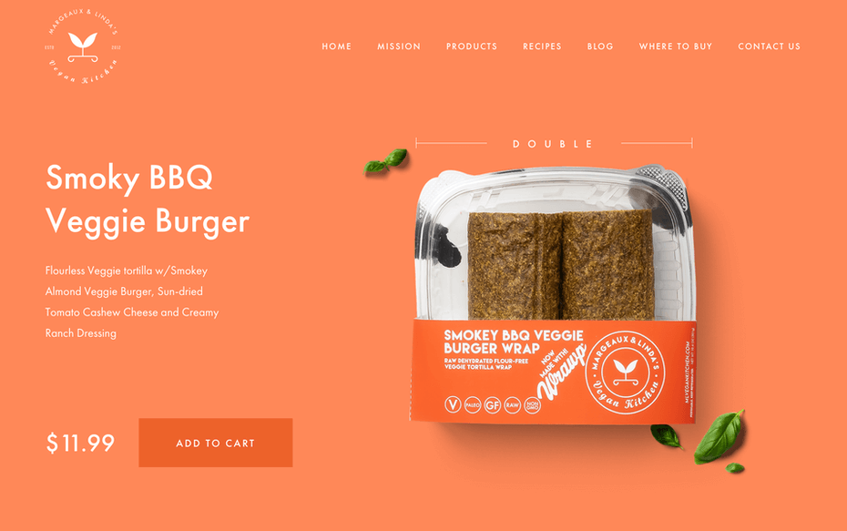
You can get help from Adobe Color Wheel. It’s a reliable tool to select colors for your website. Set the middle selector to your base color and explore some exclusive combinations following the color rules.
6. Implement 60-30-10 Rule
It’s an old-school practice to balance the colors on your website. As much as challenging it to select the base color, it is also difficult to determine how much of a color should be applied to your illustration. This technique helps you mix the colors in the right proportion.
You can follow a 60-30-10 ratio to form an effective website and app color scheme. It means that the main color will be applied to 60% of the website, the secondary color will cover the next 30% and the last 10% will be used as the accent color that contrasts with the two main colors.
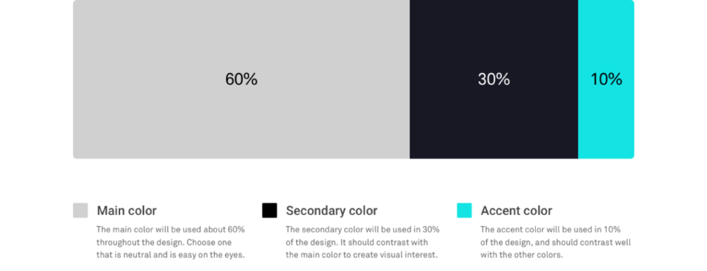
Distributing the colors with these proportions will make your website visually pleasing to the visitors’ eyes.
7. Contrast Your Colors
Color contrast is another vital element to consider while creating your website color scheme. It is important to direct your visitors towards a particular action. Suppose you want your traffic to pay special attention to a specific area of your website (like CTA buttons, signup buttons, etc.). In that case, you can use two highly contrasting colors together, like orange and green or black and red, for your background and button.
Remember, if you use high contrast all throughout the website, then it will be difficult to read the text. So, apply mid-level contrast to the maximum portion and use high contrast only when you want to highlight some key elements.
The highest-converting colors for calls to action are brighter colors – like red, green, orange, and yellow. On the other hand, darker colors- like black, dark gray, brown, or purple- have very low conversion rates.
How Website Colors Can Impact Your Conversions & Sales
Color works as a strong psychological influencer on the human brain. So, it can affect your conversion rate significantly. However, many people think that colors won’t make any difference in buyers’ actions. But several studies have already proved that there is a connection between the color a person sees and the acts they do afterward.
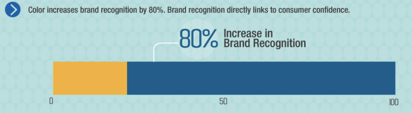
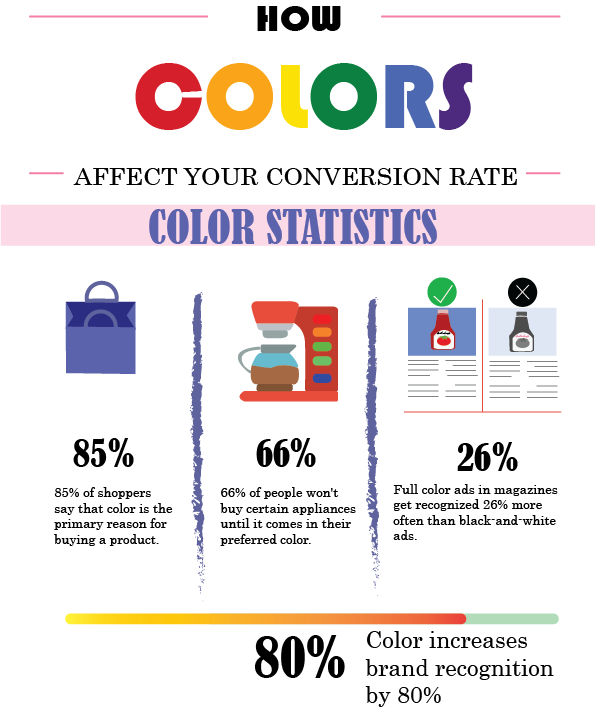
80% increases in brand recognition when using color. Brand recognition directly links to consumer confidence.
85% of shoppers place color as a primary reason for why they buy a particular product.
Color is a key element of a brand or product “personality”. For instance, some food products come in different packets with multiple colors, though they are quite similar in taste. They do that because people may get biased by their favorite color, and it triggers their appetite.
A recent case study showed that adjusting color, among other elements, can increase conversion by as much as 24%.
When asked, most people respond quickly to tell about their favorite color. Their preference mostly depends on how the color makes them feel or how it is linked to a past memory. Color, however, affects many of our daily decisions, consciously or unconsciously, from what we eat to what we wear.
This extends to website design, too.
Final Thought
While building a website, you possibly keep everything easily accessible for your visitors. Let’s assume you have a site with simple navigation, quick loading time, great performance, and engaging content. Aside from these qualities, your website should contain a color that resembles your brand and convert more people into permanent customers.
You should think over:
- Which age group and gender you intend to target?
- What type of products/services you are providing?
- What are your competitors up to?
- Which color represents your brand well?
- Which color can your visitors interact quickly with?
Once you are sure about your destination, it will be easy to reach.
However, choosing the right color scheme is not a simple task. As you have to choose from 1.8 million colors while designing a website. And when you start mixing the colors together the array of possibilities instantly becomes infinity. But not all colors are perfect for your business!
Remember, when you pick the right color for your website, you are not only making your website attractive for your visitors- You are also making your brand remarkable.
![Black Friday and Cyber Monday are around the corner, and people are waiting for these festivals to grab the best product deals. That is why giving an attractive look to your website during this festive season is very necessary. But, creating a whole new landing page might be difficult in a short period of time. Don't worry. By using Happy Elementor Addons Black Friday and Cyber Monday Landing Page templates, you can easily develop a whole new landing page in a few minutes. In this today's blog, we are going to show how to boost your website design using HappyAddons templates during this festival season. Before that, we'll talk a bit about these two festivals and why they are important to online business communities. What are Black Friday and Cyber Monday? Black Friday is the immediate following of the famous Thanksgiving day. This is when people start shopping to celebrate the Christmas festival. Since the late 1980s, retail sales on this day have constantly been suppressing the past volumes. See the graph below. Source: Salecycle.com The first Monday following Thanksgiving day each year is called Cyber Monday. It was first introduced in 2005 by the USA National Retail Federation to encourage people to buy online. Though this festival originated in the USA, it is celebrated globally today. See the stats below. Source: Salecycle.com It indicates customers' buying behavior around this day is growing up over time. Many customers today keep a budget to buy products on these two days. So, why won’t you prepare a Cyber Monday landing page if you have an online store? Importance of Designing Landing Pages for Black Friday and Cyber Monday Festival Having a well-design website is one of the major checklists if you are running an online business. Most importantly, you have to make sure that your website remains up-to-date to boost your sales. That is why you need to redesign your website or make a new landing page during the Black Friday and Cyber Monday festivals. Because most online product & service-based businesses promote special deals during these two festivals. Here are some remarkable ways dedicated landing pages during these festivals can positively impact the performance of your online business. Boosts your product salesIncreases conversion rateOpportunity to collect potential email leadsGrabs users' attention toward your siteReduces bounce rateIncreases website visitors. Elementor Black Friday New Seasonal Kit is Already Here! Source: Elementor To make this Black Friday more enjoyable, Elementor has launched a New Seasonal Kit that includes landing pages, sections, pop-ups, and vector assets. All these design elements are made by the Elementor team so that one can easily use them on their website to ensure more sales and conversions. New Elementor Black Friday Seasonal Kit offers: 3 Landing pages6 Sections 6 Popups A collection of stickers & animations You can only get these ready-made Black Friday landing pages and sections if you have Installed Elementor Pro on your site. However, if you are looking for templates that are outside of the box, you can go with Happy Addons, the fastest Elementor Addons on the market. It's very easy to use, flexible and has tons of advanced features and widgets that can ease your website design journey. Also, you'll get several festival landing page templates & blocks. Moreover, you can use free Black Friday and Cyber Monday design blocks and templates to decorate your site. Most importantly, these templates and blocks are easy to customize and can be used for multiple purposes. Now let's see how you can use the Happy Addons templates to design your website according to the Black Friday theme. Pre-Requisites to Use HappyAddons Templates to Design Black Friday and Cyber Monday Landing Pages You must have the following plugins installed on your site to get access to the HappyAddons Template library. Make sure you’ve installed and activated the Happy Addons Free & Premium version of your website. Elementor (Free)Happy Addons (Free)Happy Addons Pro If you are new to Elementor, check this Step By Step Guide For Beginners. If you want to explore the readymade templates of HappyAddons before installing these plugins, you may visit by clicking on the button below. Check out Happy Addons Templates How to Design Black Friday Landing Page on Your Website Once you have the plugins (mentioned above) installed, your website is ready to follow the tutorial guide explained in this section. Get ready now! Step 1: Open a New Page with Elementor Create a new page or open the existing page with Elementor. Next, you have to select the Elementor Canvas option.Unless you select Elementor Canvas, you may watch the header, footer, and unnecessary other texts on the page. These might be irritating to you.Once you open the page with Elementor Canvas, your page will be completely clean. Watch the video below on how to do it. Step 02: Go to HappyAddons Library Click on the HappyAddons Library Icon. It will open up a modal popup. Here you'll find numerous stunning premade Blocks and Pages created by the Happy Addons team. Kindly explore them to create a list of your favorite items. Step 03: Import a HappyAddons Black Friday Template Go to the Page tab on the modal popup.Select Black Friday from the left-side filter option.You will several good-looking templates on your screen.Take your cursor on the one you like and hit on the INSERT button. Wait for a while to finish the installation process. You will get the template on your screen with editable sections and options. Step 04: Set the Black Friday Campaign Deadline A deadline creates a sense of urgency in customers' minds. So, better if you add a deadline section on the page to show your Black Friday deals. The good thing is that if you select the template as we did, you will automatically get a deadline or countdown option. You have to customize it as you want. Step 05: Show Image Carousel Slider on Your Black Friday Landing Page Using the Image Carousel, you can slide show demonstrating discounts on your product categories. Drag and drop the Image Carousel widget on any landing page section. Next, from the Elementor panel, you can add photos and text to the widget. Do it accordingly. Thus, you can add more sections and options on the landing page. Hope you can do it yourself. Step 06: Make the Black Friday Landing Page Mobile Responsive Making a web page mobile responsive with Elementor is super easy. You'll get the mobile responsive option on the Elementor footer section. Clicking on it will open up the option to view your landing page on different device screens. We have explained the process in the video below. Note: Don't delete any widget or section while customizing your landing page for any particular device. Because if you delete a widget or section on any device screen, it will also be applied on other devices. However, you may change their position or alignment or hide them. It won't make any impact on other devices. Step 07: Final Preview of Our Landing Page Here is the final interface of our Elementor Black Friday landing page that we've designed using the Happy Addons' ready-made Template. Get Happy Addons to Add a Black Friday Theme Landing Page on Your Website How to Design Cyber Monday Landing Page on Your Website You will require the same prerequisites (Elementor and HappyAddons Plugins) to design the Cyber Monday landing page on your website. Hope you have them ready on your website. Now, let's get into the tutorial part. Step 01: Import a Cyber Monday Readymade Landing Page Template Go to the HappyAddons Template library.Choose the Cyber Monday template you like.Click on the INSERT button. Wait for a while to finish the installation process. You'll get a page design like the following image below. Step 02: Edit Different Sections of the Page In the first tutorial, you saw the deadline/countdown option was already embedded in the template. But this template doesn't have it. So, you can bring it to your page? Very simple. Create a new section by clicking on the plus icon.Type Countdown on the Elementor search bar.Drag and drop the widget on the section. Customize the Countdown section from the Content and Style tabs of the Elementor panel. Using the Heading widget, we have added the FLASH DEALS text next to the countdown to make it more meaningful. Thus, you can use other exciting widgets on the template to make your landing page super gorgeous. Step 03: Promote Products on the Landing Page Promotional landing pages usually include a section to showcase some hot-selling products to generate instant sales. Using the Image and Button widgets, we have created this section under the FLASH DEALS.You may customize it more as you wish. Step 04: Make it Mobile Responsive We already showed you the process in the first tutorial on making a mobile web landing page responsive. Hope you can do it here as well, following the same guideline. Click on the Responsive Mode icon and do the rest yourself. Bonus: Black Friday and Cyber Monday Landing Page Design Key Considerations Whenever you design a landing page, you need to consider why you need to design this page and what elements they should keep on the page. Because if you are not adding all the necessary features to your page, it will not serve its purpose. This is why you need to focus on a few things before designing your Black Friday landing page. Here are some points you must consider in designing Black Friday and Cyber Monday landing pages. Add Black Friday textSet deals deadlineShow your best-discounted productsAdd coupon code Focus on responsive page designMake your page visually appealingImprove your page user experience or page structureSet a proper website navigation FAQ on Black Friday and Cyber Monday Landing Page Design Now, we'll answer some common questions on Black Friday and Cyber Monday Landing page designs commonly found online. How much does it cost to design a landing page?The cost of designing a landing page varies depending on the complexity of the design, the level of customization required, and whom to hire for the page. A simple landing page can be designed for as little as $25, while a more complex design with multiple customizations can cost upwards of $2,00.However, if you have Elementor and HappyAddons installed, you can design unlimited landing pages at a minimal cost. But like any other tool, you must have a kind of enterprise on them. As they are drag-and-drop builders and their numerous tutorials and documentation are available, they won't take you more than a month to be used to. Check out some wonderful YouTube tutorials on these two plugins. Hope you will enjoy them.How many hours does it take to design a landing page?It mainly depends on the level of design complexity and your web design skill. However, both in Elementor and HappyAddons, you will get countless readymade templates and block sections. You can design a beautiful landing page in 3-5 hours by making a proper combination of them.Can I design Black Friday and Cyber Monday Landing pages with Elementor and HappyAddons free versions?Surely, you can design Black Friday and Cyber Monday Landing pages with Elementor and HappyAddons free versions. But only with the pro versions, you can't add too many exciting features to your pages. For example, free versions will give you access to only a limited number of readymade templates.If you are just a beginner-level designer, free versions are enough. But if you are a professional designer or have a web designing agency, pro versions are a must. Are You Ready To Design Your Black Friday and Cyber Monday Landing Page? Customers look forward to this kind of occasion to buy their favorite products at a minimum price. Naturally, they are drawn to websites that look good and give a festive vibe. That is why adding a Black Friday and Cyber Monday landing page during the festival season will give you an extra edge over the competitors. The above guide shows how to design your Elementor Black Friday Landing page using the Happy Addons' Black Friday Templates and how it can help boost your holiday sales. So if you have any queries regarding this blog, you can comment on us in the below box. If you like this post, then share it on your social channel. Don't forget to subscribe to our newsletter. Also, follow our Facebook and Twitter channels for regular updates. Subscribe to our newsletter Get latest news & updates on Elementor [yikes-mailchimp form="1"] ":36560} /--](https://happyaddons.com/wp-content/uploads/2021/11/How-to-Design-Black-Friday-and-Cyber-Monday-Landing-Page-300x188.png)
2 Responses