

When it comes to designing a website, color is arguably one of the most important factors. It improves visual engagement, eases navigation, and helps users identify different sections. Moreover, triggering color pallets enables web elements to speak with visitors.
Each color has unique features that affect human psychology in different ways. This is why once you plan to create a website, you cannot just select a color scheme randomly. Failing to choose the right color can severely damage your brand identity and web appeal to visitors.
To reduce the risk, this article will introduce you to some of the best website color schemes modern web designers use frequently. It will help you stand out with your website in the competitive online space. So, let’s get into this discussion.
Table of Contents
- What Is the Color Scheme?
- Why Color Scheme Is So Important in Modern Web Design
- What Do Colors Mean to Different Audiences?
- What are the Best Color Schemes for Websites of Different Types
- Bonus: Best Web Design Tools to Practice on Color Scheming
- FAQs on Best Website Color Schemes
- Final Takeaways!
What Is the Color Scheme?
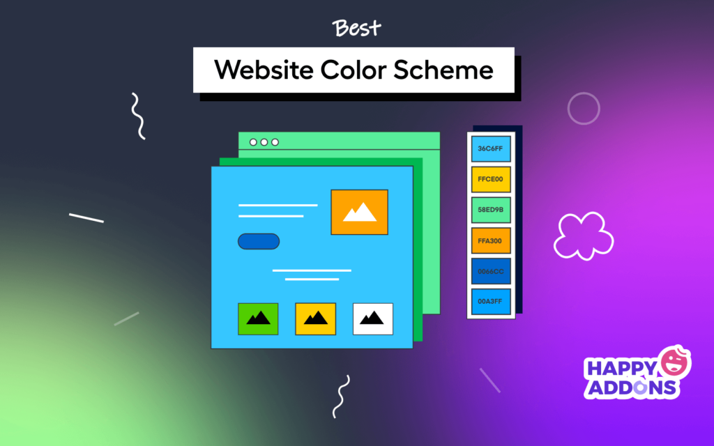
A color scheme is a combination of two or more colors used to create the aesthetic appeal of any particular object, such as websites. When the colors are viewed together, they produce a harmonious feeling, enhancing the overall visual beauty of different sections of the website.
As people have different tastes, it’s important to provide enough variety of colors so everybody can find at least something they like. Colors can convey specific moods or atmospheres. There are many ways to create a color scheme. You may use specific colors together, select some neutral colors, or use different shades of a single color.

Why Color Scheme Is So Important in Modern Web Design
A well-chosen color scheme not only makes a website great but also helps to create a cohesive and inviting environment. Below are some key points why color schemes are so important in modern-day web design.
- Sets a Unique Tone
An eye-catching color scheme helps to stand out a website from its competitors by setting a unique tone. For example, a Green or Blue color scheme on a health-related site can denote your topic’s seriousness.
- Helps to Navigate
Color schemes can improve the navigation system of a website. For example, if your navigation bar/menu is in Royal Blue, Green, or Orange, users will more likely be able to find it quickly.
- Conveys Brand Message
Color schemes can communicate the brand message of your website to users. For example, if you plan to design a website for a fashion company, you might choose colors that reflect the brand’s aesthetic.
- Creates Color Contrast
A complementary color scheme may include two or more varieties of color. It can create a wonderful contrast among different elements on a website and make them more visible.
- Improves Readability
A good color scheme creates a feeling of warmth and coziness. It establishes a soothing environment for our sight, which improves readability score in the end.
What Do Colors Mean to Different Audiences?
In art and culture, colors symbolize specific meanings and evoke emotions. Without knowing them well, no one can portray a meaningful design. There are different types of colors used in web design. Let’s take a look at their meaning below.

What are the Best Color Schemes for Websites of Different Types
Which color scheme is best for a website depends on several factors, such as the website’s purpose, target audiences, activities, and more. Let’s explore some of the best website color schemes modern web designers use in their projects. This will inspire us to select the right color scheme for our sites later.
1. Best Color Schemes for Online Store
There are different types of online stores. The most popular ones are fashion, Restaurants, and Grocery stores. Below are some standard color schemes for each.
# Fashion Store
As Pink and Purple symbolize love, sweetness, luxury, and romanticism, premium-category fashion stores use these colors on their websites. You can apply the Pink and Purple colors to the banner design, category name, logo, CTA buttons, and background.

Some other websites also add Blue-Aegean (1E456E) and Green-Basil (32612D) to portray a feeling of peacefulness.
# Restaurant Website
You will find a variety of restaurants around. Depending on the main dishes, they love to apply color schemes on their website. For example, if a restaurant offers spicy fast and continental food, they tend to apply a red and orange mixed color palette. Because it gives them a warm feel for food.

Above, you can see the color scheme used by Burger King – a prominent global fast-food chain. But if you offer health-oriented foods, you may use Green colors. And if it’s a cafeteria that sells soft drinks only, Green-Pine (234F1E) and Red-Jam (610F0B) colors will work the best.
# Grocery Website
Grocery websites sell a variety of products, from vegetables to electronics, used for household purposes. So, you can apply any kind of color scheme to your grocery shop. But if your grocery store is good at a specific product type, it is better to illustrate its color on your website.
For example, you may sell dairy and bakery items. But if your website is special for fresh fruits and vegetable items, better if you apply Green and Yellow color sheds on it.

2. Best Color Schemes for Blog Websites
A blog is an informational website that publishes posts and articles of new information about ongoing topics. There are different types of blogging sites. The most popular of them are informational sites, affiliate marketing sites, review sites, etc. Check out some standard color schemes you can apply to them.
# Informational Site
You can create any type of informational blogging site based on your personal preferences. Suppose you are a programming expert and blogger on CSS/HTML and other technical topics. Below is a standard color scheme you can use on your site.

The sole purpose of any informational blogging site is to let people read your messages. So, it is pointless to use too many contrasting colors. If you do so, it may distract visitors and hook their eyes to something else other than reading. This is why the Black and White color scheme combination is best for this type of site.
# Affiliate Sites
The purpose of affiliate websites is to let people read the texts and information and to impulse them to buy products. This is why you may include contrasting and trigger colors in your web color scheme. Below is the color scheme that the WP Hive affiliate site uses.

You may also use other types of color sheds for your affiliate sites. If they promote software products, you may consider using Orange (FF6200), Pink-Rosewood (A04142), Pink-Strawberry (F1634C), or any other color you want.
# Review Site
People come to review sites to explore honest feedback about products and services before they buy them. Green is a symbol of peace, trust, and calmness, so it is a commonly used color in review websites. Below is an example.

Blue symbolizes comfort, clarity, trust, and peace. This is why numerous review sites like Capterra and TrustRadius design their websites with blue alongside green.
3. Best Color Schemes for Portfolio Website
A portfolio site is an online resume. Using a portfolio site, one can showcase his works, talents, and experiences to others. It opens the door to job-seeking employees and lets employers find them through online exploration. The type of portfolio site you want to build should follow your skills, knowledge, and experience.
# Photography Portfolio Site
Photography portfolio sites don’t include too much text. They try to hook the attention of visitors and audiences to the photography. They love to use normal color schemes for fear that gorgeous colors may reduce the glamour of the photography. The Black and White combination can help you best in this case.

Learn how to create a resume website without coding.
# Portfolio sites for Engineers and Technicians
If you are a civil engineer and want to design a portfolio site related to construction engineering, you must use Orange and Red color sheds. Because they symbolize strength, intensity, warmth, success, and enthusiasm. Below is an example you can see.

But if you are a computer programmer, architect, or designer, you may use Pink-Rosewood (A04142), Purple-Magenta (A01959), and Blue-Denim (151E3E) colors.
4. Best Color Schemes for Business Websites
A business website is an online portal that publishes information about products and services for all types of audiences, such as customers, retailers, wholesalers, agents, suppliers, and distributors. It allows anyone to communicate with them. Business websites can be of many types.
# Corporate Website
A corporate website officially represents a brand and its products online. It will showcase both product photography and their information in detail. Nothing will happen if the visitors come and go only. The web must ensure a sense of trust and a peaceful interface so visitors feel love to extend their sessions.
The combination of Blue, Green, Black, and White has been seen to work well in most cases. Below is an example of the color scheme FUJI Elevator Company uses.

You will also find different examples. For example, Microsoft includes Purple-Jam (951217) and black-and-white combinations on its sites.
# Event Management Website
An event management firm takes care of all the responsibilities of an organization or family to execute a successful event. It’s a day-long or half-day program where they entertain guests and offer catering services.
Event management firms tend to design their websites with a warm and gorgeous color scheme to grab visitors’ attention. Below is an example.

However, depending on your event management services, you may apply other color palettes.
5. Best Color Schemes for Educational Websites
On educational websites, students and visitors tend to stay longer. To ensure a tranquil environment for visitors, it is recommended not to use any eye-screaming color. If you visit websites like Khan Academy, Udemy, and Coursera, you’ll find they use light versions of Blue and Green colors.

6. Best Color Scheme for Entertainment Website
Red, Purple, and Yellow are the foundational color of any entertainment website. Because they evoke a sense of thrill, joy, and passion. Just visit YouTube, Netflix, Netflix, and other streaming channels, and you will find examples of this.

However, there are always some exceptions. For example, Spotify uses the Green-Parakeet (03C04A) and Black-Metal (0D0B0A) color codes to design its interface.
7. Best Color Schemes for Job Website
A job website is typically a website on which employers advertise their available jobs to potential applicants. Employers specify career development opportunities, job responsibilities, salaries, and more in detail.
Similar to blogs and educational websites, visitors tend to stay here long. This is why most job websites use cool colors – a combination of Blue and Green.

8. Best Color Schemes for Online Forums
An online forum is a website where people can talk to each other about topics that interest them. Forum sites allow people of the same interests to create groups to talk in detail about specific topics, like books, software, movies, music, and more.
Some forum sites allow registered users to post messages and rate the messages after they receive an answer or reply. There are no specific color schemes that all online forums must follow. But if you create an online forum to promote a product or service, you may use its brand color. Below is the color scheme that Quora is using.

9. Best Color Schemes for Wiki Website
A wiki website is an open-source platform where users can edit and contribute information. Wikis are mostly used by journalists, scientists, and other professionals to document information.
Designers set the brand color based on the niche for which the wiki website is built. However, here again, designers have to ensure a clean interface, as visitors will stay long and focus on information. Below is the color scheme used by wikiHow.

10. Best Color Schemes for Media Websites
As media portals mostly cover hot and spicey news, they love to apply a combination of Red, Orange, and Blue color schemes on the interface. Because Red and Orange create a warm environment, and Blue adds a flavor of coolness.
However, media portals keep their layout backgrounds clean and white. Red, Orange, and Blue are applied to the logo, menu bar, and headings. Below is an example of the Fox News website’s color scheme.

You may visit the websites of BBC, Reuters, CNN, and Deutsche Welle for more inspiration.
11. Best Website Color Schemes for Crowdfunding Sites
Crowdfunding websites provide a platform for spirited entrepreneurs to raise money from many people to start a venture. They share their start-up ideas on these platforms. If someone loves it and wants him to execute the plan, donates or invests money in his project.
Billions of dollars are generated each year from crowdfunding websites. Some prominent ones are Kickstarter, Indiegogo, Patreon, Crowdfunder, and Gofundme. Their websites use cool color palettes – a mixture of Green, Blue, and Pink.
Because these color schemes symbolize trust, security, and peace – we already talked about it above.

12. Best Color Schemes for Government Websites
When designing a government website, you can illustrate national color codes. Most government websites follow this practice. For a quick exploration, you may check out some embassy websites. We have shown the color scheme used on the USA embassy website.

Note: No matter what color scheme you use on the government website, ensure your texts and content are perfectly visible and visitors don’t get an eye-screaming experience. Basic web design principles can help in this case.
Bonus: Best Web Design Tools to Practice on Color Scheming

When you think of practicing web color scheming, you’ll obviously look for a platform that allows you to create a header, footer, and entire website layout. Only after that can you apply color palettes on its different parts to visualize how it looks.
Elementor and HappyAddons are two great web design tools you can use for this purpose. They are actually drag-and-drop page builders by which you can create an entire website without a single line of coding.
Happyaddons is an addon of the Elementor plugin. It comes with more exclusive features and widgets by which you further power up your website. From Elementor Panel > Style, you get the color option. You can apply any color to the elements of your web pages.

Both Elementor and HappyAddons have free versions available. You can use them on your WordPress localhost to practice color scheming in real time. You’ll find tons of tutorials, blogs, and documentation about these plugins online.
If you have any problems, you can contact support. Explore them by clicking the buttons below.
FAQs on Best Website Color Schemes
Now, we’ll answer some of the most frequently asked questions about the best website color schemes.
-
What should you consider when creating a color scheme for a website?
There are a number of factors one should consider in creating a color scheme for a website. Check them out below.
1. Know about your brand target audiences.
2. Set brand colors as your primary colors.
3. Set contrasting colors as your secondary colors.
4. Use primary colors in the header, headings, logo, CTA buttons, and links.
5. Use secondary colors in your texts and layout background.
6. Maintain color consistency in the entire website. -
What are the best website color scheme generators?
Below are the names of some of the best website color scheme generators you may use for your website.
1. Adobe Color
2. Paletton
3. Canva
4. Khroma
5. Coolors
6. ColorSpace
7. Colorkuler -
What color works best to reduce stress?
Blue and Green are the two colors that work best to reduce stress from human psychology. Next to them, Purple also works well.
-
How many colors are there on the web?
Web technology uses the RGB color format. It stands for Red, Green, and Blue. So, any color we see on the web combines these three colors. Again, you can set each parameter from the value 0-255 to define their intensity. It means there is a total of 256*256*256 = 16,777,216 possible colors on the web.
-
How many colors should a designer use on a website?
A web designer shouldn’t use more than three primary colors on a website. To create a pleasing color contrast, you may use some more color as the secondary color.
Final Takeaways!
Finding the best color scheme to complement your modern web design might be challenging if you are a newbie. But with a little research, it will gradually become easier for you to find some catchy and stylish options.
We have tried to compile a list of the best color schemes used by some of the most popular websites worldwide. So, whenever you want to update your current website or design a new one from scratch, you may follow them for quick inspiration.
It’s no secret that web design is constantly evolving. The latest trend is to use modern and versatile color schemes. I hope you have found this article helpful and enjoyable. If you would like to receive more interesting pieces like this one, subscribe to us and follow our Facebook and Twitter channels.


2 Responses
I went through your article which was on a color scheme for a website or blog. Below I have mentioned very simple steps, which you can follow.
1.Understand your brand or topic.
2.Research color psychology.
3.Start with a base color.
4.Create a complementary color palette.
5.Consider contrast and readability.
6.Use color harmonies.
7.Test your color scheme.
8.Consider accessibility.
According to my point of view, these points must be included in your article.
Thanks Julia for stopping by and sharing your insights.
Regards,
Gobinda
Team HappyAddons