
When you scroll a web page, either on a phone or desktop, you constantly swallow the text written on it. No matter how gorgeous it looks, everything becomes pointless or less meaningful if its texts aren’t written with eye-soothing typography.
You may create a beautiful website without good typography concepts, but impossible to take it to the greater stage.
Yet, it is one of the most overlooked aspects of web design which is why many websites fail to entertain their target audiences. No matter! This article will present you with a thorough discussion of the fundamental of typography in web design.
It will also shed light on the typography elements commonly used, how to use them, and the alarming mistakes people usually do with them. Hope you’re going to have a wonderful journey. Have a cup of coffee and keep reading it to the end.
Table of Contents
- What is Typography in Web Design?
- Common Typography Elements Used in Web Design
- Fundamentals of Typography in Web Design You Must Know
- Alarming Typography Mistakes People Do in Web Design
- Best Web Design Tools to Create Eye-Soothing Typography
- Bonus Point: What is Fluid Typography?
- FAQs on Fundamentals of Typography in Web Design
- Final Takeaways on Fundamentals of Typography in Web Design
What is Typography in Web Design?
Typography refers to the design and composition of typefaces, text layouts, and graphics in web or print documents. It helps to create a pleasing and organized presentation of text copies so it becomes perfectly readable to anyone.
Web typography refers to the design principles used to make the text look good on a website. It creates a sense of cohesion between the content and establishes emotional attachments with the users.
There are a few key factors to consider while deciding on typography. They are typeface, size, space, alignment, and more. We’ll talk about them in detail in the next section.
Common Typography Elements Used in Web Design

Typography is the craft of endowing human language with a durable visual form – said Robert Bringhurst, writer of the book The Elements Of Typographic Style.
Good typography helps readers devote less attention to the reading mechanics and focus more on the message. So, what makes great typography? There are several elements involved in it. Let’s know about them –
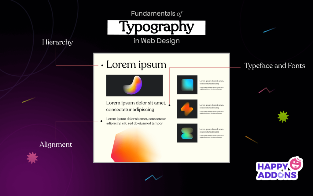
a. Typefaces and Fonts
A typeface refers to the specific art, form, and design of a set of letters, including alphabetic and numerical characters. There are three basic typefaces used in web design: serif, sans-serif, and decorative.
You can notice the tiny decorations at the endpoints of the first one. They are known as serif typefaces. The Sans-serif typeface doesn’t have any decoration inside or outside. The decorative typeface may come in any shape, like cartoon or animated.

A Font is any specific decoration of alphabets and numerical characters of any of these three typefaces. For example, Times New Roman, Georgia, Didot, Garamond, etc., are the most popular Serif fonts. Arial, Roboto, Lato, PT Sans, etc., are similar to some popular Sans-Serif fonts.
You can apply bold, semi-bold, narrow, and italic styles in most fonts. This is called the font family.
b. Kerning, Tracking, and Legibility
Kerning refers to the horizontal space between two adjacent characters used to create a better pair of letters. Kerning can involve moving individual letter pairs closer together or apart, usually by small increments.

The idea of Tracking is almost similar to kerning. The only difference is kerning indicates a custom space between two adjacent characters, but tracking ensures the exact same gap among all the characters in a word or sentence.
Legibility describes how correctly someone can distinguish the individual character on a typeface. Though you shouldn’t confuse legibility with readability, sound legibility can improve the readability power.
c. Leading
Leading means the vertical spaces between texts and sentences. You can count this space using pixels or points. Below is an example of the term ‘Leading’ in typography.

d. Hierarchy
Most web pages are designed with multiple sections. Under the parent sections come the sub-sections. The text which one is most important comes in Title/H1 size. Similarly, other texts keep coming in the form of H2, H3, H4… according to their importance.

e. Contrast
Contrast indicates that you often have to vary color, styles, sizes, and typefaces on some of your texts to make them different from the rest texts and background. It is mostly applied to decorate the headers of newspapers, magazines, and landing pages.

f. Consistency
Consistency means using the same typeface, font, and styling in all sections throughout the same web page. Suppose you have used the black-color Roboto font in H2 of a blog post and Loto in the description body section. Make sure you have applied the same in all the rest H2 and body sections. Using multiple typefaces randomly on the web page can make it messy and disorganized.
g. Alignment
Alignment ensures all the texts, buttons, graphical images, and other elements are in their accurate straight lines. It ensures every element maintains an equal distance from each other on the web page. Most web designers create a margin for the perfect alignment of the logo, header, sidebar, banner, main body, and others.
h. White Space
White Space refers to the blank space around the text and graphical elements. Its importance is also often neglected in web design. But the lack of proper white space makes the web interface highly cluttered, messy, and unreadable.
Here’s a demonstration below of how this happens. Say which one is easy to ready. Obviously, the one with white space.

These are the basic typography elements of web design. There are many other elements too apart from them. But without the above-mentioned, designing a website is impossible.
Fundamentals of Typography in Web Design You Must Know
A great designer knows how to work with text not just as content, he treats text as a user interface.
Oliver Richenstein
After knowing about typography elements, it’s important to understand how to apply them for a great web design. Let’s explore the fundamentals of typography, where you’ll find the answer to this question.
1. Don’t Use Too Many Typefaces on a Website
Typefaces can be a great way to add personality and interest to a website. But using too many can make your site look busy and unprofessional. Too many typefaces can also lead to confusion among readers.
Because they’ll find themselves in a dilemma to understand which typeface carries the maximum importance. So, use not more than two typefaces on a website. You’ll find many top-performing websites online using only one typeface.

Note: To grab visitors’ attention, you may use creative typefaces on CTA buttons, clickable banners, and pop-ups.
2. Select Those Typefaces that Suit Any Size
Once you start studying typefaces, you’ll find that some are designed only for large sizes and others for small. Some typefaces suit well only with bigger screens like laptops and desktops, not with tablets and mobile screens.
Using such typefaces can make it difficult for many visitors to read your texts, especially those who have dyslexia and eye-problem. So, use a typeface that perfectly suits all screen sizes. There are many free tools available that can help with this process. For example, Google Fonts and Typo3.
3. Use Fonts that Have Distinguishable Letters
Distinguishable letters improve the reading power of dyslexic people. It instantly lets the visitors sort out what type of content they are viewing whenever they land your web posts or pages. It can also help you with legibility.

4. Use Sans Serif Fonts in the Body Part
Sans Serif fonts are super popular for their clear-cut shapes and layouts. It makes them ideal for headings, subheadings, and other important content. Additionally, they are less distracting than other fonts, which can make your UI look clean and more professional.
Sans Serif works well on smaller screen devices. Because they are comparatively less cluttered than other fonts. However, if you plan on using Sans Serif on your website, make sure of proper kerning, leading, and tracking issues.
5. Avoid Using Eye Screaming Colors in Fonts
We often think of heavily saturated red, yellow, and orange as eye-screaming colors. This is partially true. When the pair of text and background colors don’t sync with each other and create an uncomfortable environment for our sights, it is called eye-screaming color.
In graphic design, colors are categorized into cool and warm categories. Cool colors are green, blue, and purple. Warm colors are yellow, orange, and red. The eye-screaming situation mostly happens when you apply the same color type on both your text and background. Below is an example of it.

6. Try to Use Standard Fonts on Your Main Body
If you are a newbie designer, it will trigger your mind to use numerous font styles on web pages. Because you believe it will make your web pages catchy. But reality doesn’t work that way. Using too many font styles can distract your readers and hook their focus on your font styles.
Better if you use standard fonts and typefaces so readers can stick their focus on your message. However, you may use creative and decorative font styles if you are a branding, marketing, or copywriting agency.
7. Maintain a Typographic Hierarchy
We have already talked about the hierarchy above and how it works in web design. Creating an effective text hierarchy can be challenging, but it’s worth it. A well-ordered hierarchy makes a web page easier to navigate, increases user satisfaction, and reduces user confusion.
It saves them time and helps users easily to find what they’re looking for. You must create this hierarchy based on the value of text content. Below we have attached a photo of The Washington Post’s online portal for demonstration.

8. Avoid Blinking Texts and Animations
Animation today is an indispensable part of web design to grab visitors’ attention instantly. But animated or blinking texts on the main body may yield reverse results. Because they may count them as ads, gimmicks, or else.
This is why you must avoid applying these features to your main text copies. But if you apply text animation and blinking attributes on banners, CTA buttons, and pop-ups, then it’s fine.
Alarming Typography Mistakes People Do in Web Design

Now, we’ll cover some common but alarming typography mistakes people make in web design. Leaving them unsolved can severely impact the brand value of your website. Let’s explore them.
i. Unadjusting Orphans and Widows
This is a disgusting type of mistake that can ruin the elegance of your entire design. Orphan and Widow are two technical terms. They refer to a single word or a short sentence appearing at the bottom or top of a page or a column.

ii. Poor Judgement in Setting sound Lengths
Setting sound lengths for text copies matters greatly in digital and print media. By reducing the font size, you can include even 100+ characters in a single line. But when a text line is excessively long, it becomes hard for many readers to follow through and grab their position in the next line.
Using 75 characters is standard practice to write texts on any website. Newspaper and magazine portals use even less number of characters as they publish content grid-wise. So, before designing a website, be sure about its purpose and the character length per line that will fit with it.
iii. Messing Up the use of punctuation marks
The use of punctuation marks is another most ignored aspect in typography engineering. Even many of us don’t know how many punctuations marks there are in the English language. Average people are seen to know the use of 4-5 of them.

But there are 17 most used punctuation marks in the English language. You must know how to use them to make your messages meaningful. Besides, some people mistakenly leave double/triple spaces before beginning a new sentence after the full stop(.). Never do it again.
iv. Forgetting to Highlight the Valuable Information
Often it might happen you are so busy that you forget to highlight valuable declarations. Suppose there is a Black Friday and Cyber Monday discount offer going on. But you forget to highlight triggering words – Discount, Free Deals, Buy One Get One, etc.
Can you imagine how severely it will hit back on your business? So, before you click the publish button, check twice-thrice times to see if you have done everything accurately.

v. Using Excessive Weights
Weight refers to the boldness of a font. Just as you shouldn’t use a variety of typefaces on the same webpage, neither should excessive font weights. Whether you are an eCommerce, blog, business, or magazine portal, your goal should be – visitors read your message and buy products.
Amusing them with caricature-type typography shouldn’t be your objective. Use standard font weights and typefaces to hook their focus to your deals and messages.
Best Web Design Tools to Create Eye-Soothing Typography

You’ll find today numerous web design tools online by which you can design gorgeous websites overnight. But many will require you so much effort to learn them. And this process will take away tons of hours and weeks from you. Even many no-code users will find them difficult to use.
If you are a WordPress user, there are two great tools available for you – Elementor and HappyAddons. Elementor is a robust drag-and-drop page builder by which you can design top-notch web pages without any coding experience.
HappyAddons is a powerful add-on of Elementor, coming up with many unique features and widgets. The good thing is that you’ll get 800+ varieties of Google Fonts in both of these tools. You’ll find Sans, Sans-Serif, and Decorative types of fonts there.
If necessary, you can add more custom fonts to them. You will also get the option to customize the weight, style, color, and alignment of your fonts and text copies. So, why shouldn’t you have a look into them when they can take care of both your graphic and typography issues?
Bonus Point: What is Fluid Typography?
Fluid typography is a typography style that automatically scales between the minimum and maximum value based on the window size of your devices. It means that texts will remain legible and easy to read from small to big on all kinds of screens.

It creates a more impressive experience for users. Because texts appear to move and change as you scroll through your screens. Another notable benefit is that it can make your content more interactive, leading to a higher engagement level with users.
Though this approach is mostly used in typography, you can apply fluid sizing in the margin, gap, padding, and other places as well. WordPress 6.1 comes with the built-in fluid typography feature via the theme.json file. It allows you to take the responsiveness of your website to the next level.
Here’s a guide on how to add fluid typography support to the WordPress block theme.
FAQs on Fundamentals of Typography in Web Design

Now, we’ll answer some most frequently asked questions related to typography in web design.
-
What is the importance of typography in web design?
Typography carries a good chunk of importance in creating a beautiful web design. Below are some most notable of them.
1. Sound font improves readability.
2. It contributes to highlighting your brand tone and feel.
3. Good typography hooks readers’ attention to the end.
4. It creates a certain mood or feeling.
5. It helps to create an information hierarchy.
6. Artistic fonts make your user interface clean and beautiful. -
What are the latest typography trends?
Keeping up with trends can help you forecast and prepare your business to grab future potential. Below are the latest typography trends in the digital and print industry.
1. Big and bold headlines.
2. 3D typography in logo design.
3. Retro fonts to add nostalgic flavors.
4. Plain sans-serif fonts to write blog posts.
5. High-contrast fonts in designing web banners and pop-ups. -
What are the best websites for free fonts?
You can download tons of free fonts from the following websites.
1. fonts.google.com
2. fonts.com
3. fontbundles.net
4. behance.net
5. dribble.com
6. dafont.com
7. urbanfonts.com -
What are the best clean fonts for websites?
Open Sans, Roboto, Lato, Helvetica, Arvo, Merriweather, Alegeya, Tisa, Primetime, Moon, Nova, Literata, Chelsea, etc., are currently popular and the best clean fonts for websites.
-
What is the best font size for mobile websites?
This font size may vary depending on the mobile screen sizes. However, 16 pixels is still followed as the standard font size in mobile responsive websites.
Final Takeaways on Fundamentals of Typography in Web Design
Hope you have enjoyed a wonderful time. We are now at the end of this blog post. We tried out best to cover everything you need to know about typography in web design. Please let us know through the comment section if you feel we have missed something.
Our editor will include them in the blog in the update. If you love to receive more interesting articles like this one, subscribe to us. Follow our Facebook and Twitter channels for regular updates.
Subscribe to our newsletter
Get latest news & updates on Elementor