

Alignment is a mandatory web design principle without which its impossible to create aesthetically pleasing page layouts. It allows the elements on a page to be visually organized and connected to one another. It helps to create a sense of trust, balance, structure, and hierarchy on web pages.
Due to the lacking of concepts in perfect alignment, most developers fail to curate a wonderful perspective on web interfaces.
This is why having a good understanding of alignment is a must to become a talented web designer. This blog will help you explore everything you need to know about alignment in web design – its importance, principles, and examples. Let’s get into the discussion.
Table of Contents
- What is Alignment in Web Design?
- Importance of Alignment in Web Design
- What are the Different Types of Alignment in Web Design?
- Principles of Alignment in Web Design
- Use Elementor and HappyAddons to Perfectly Align Your Web Design
- Bonus: Examples of Some Good and Bad Alignment
- FAQ on Alignment in Web Design
- Final Remark!
What is Alignment in Web Design?
Alignment refers to the practice of arranging visual elements on web pages, such as text, shapes, images, menu items, and CTA buttons. It sets a foundation upon which designers gather all these elements and create an invisible connection between them.
Perfect alignment helps you establish a sense of hierarchy, highlight key elements, and create a seamless flow on your web interface. So visitors can easily explore your site and find the information they are looking for.
Importance of Alignment in Web Design

Without proper alignment, it’s impossible to take the UX of your website to the next level. Let’s now look at some key points why good alignment matters a lot in web design.
a. Sharpens Aesthetics
Websites like eCommerce, magazines, and news ports usually have limitless content. Perfect alignment helps to ensure a clean interface and present contents in a visually appealing way.
b. Improves Readability
Once the interface is clean and the contents are presented orderly, visitors can easily navigate them and find out the one they desire. Thus alignment improves the readability score.
c. Boosts Usability
Visitors tend to complete more actions on those websites that they find comfortable. For example, they may submit forms, hit the CTA buttons, click on your internal links, download your products, and more.
d. Increases Engagement
A comfortable and distraction-free environment can automatically draw readers’ attention to specific sections. It can significantly amplify the visitors’ sessions on your site and reduce bounce rates.
e. Makes Responsive
Over 50% of web traffic today is generated from mobile devices. Alignment can help you modify the shape and position of your text, logo, images, shapes, and other elements so they are properly visible from mobile and other devices.
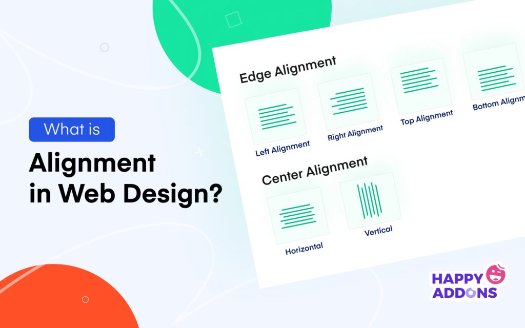
What are the Different Types of Alignment in Web Design?

There are different types of alignments used in web design. But only six of them are basic types. We have explained them below.
# Left Alignment
In left alignment, web elements are aligned to the left side of a canvas. When a new element is added, it starts from the left-bottom side of the element above. Left alignment is applied mostly to the text elements of online news portals, magazines, and blogging sites.
# Right Alignment
It aligns the elements to the right edge of the web canvas. Websites usually adopt this alignment style to display additional data alongside the main information. For example, table of content, tags, categories, form popup, promotional ads, etc.
# Center Alignment
In center alignment, texts, images, and other elements are aligned around the middle point of the canvas. It mainly highlights the most powerful and influential elements of any web page and post. For example, blog title, featured image, quotation, pricing table, modal popup, etc.
# Justified Alignment
It tries to cover up the entire space of a web canvas, from the right edge to the left. This type of alignment is used only with descriptive passages. Web designers avoid using it on titles, headings, meta-data, and images.
# Horizontal Alignment
Horizontal alignment refers to the state when the left, center, and right-sided elements of a website stay on an invisibly straight line, from right to left. You can use it on any part of the website. Designers mostly use it to decorate their header and footer sections.
# Vertical Alignment
In vertical alignment, web elements also stay on an invisible straight line, but from top to down. A perfect web design actually refers to the combination of vertical and horizontal alignments.
Principles of Alignment in Web Design

Now, we’ll talk about the principles of alignment in web design you must follow to layout your website aesthetically. You may count them as best practices too.
1. Focus on Square and Rectangular Shapes
If you are a fee-hand designer, you can create any shape to present your artwork. But when it comes to UI and web design, you must focus on square and rectangular shapes. Because they are easy to create and highly alignment-friendly.
Besides, square and rectangular shapes indicate comfort, security, familiarity, and a sense of peace in the human mind. This is why whenever you visit a website, you find squares and rectangular shapes are used in most numbers to present information.
2. Follow Grid Structure

A grid structure refers to a pattern where horizontal and vertical lines cross over each other, creating a series of squares and rectangular forms/blocks. But why should you use a grid structure? Because it will help you make your content more organized and design quickly.
You can also create a perfect framework for positioning text, images, shapes, and other elements. And you don’t have to spend much time in horizontal and vertical mapping.
3. Use the Right Reading Pattern
Reading pattern is a scientific study that reveals which direction our eyes move/scan a website. Remember, 80% of visitors only scan websites. They don’t love to read out every single word of a post. You must present the most important information in such a way that they automatically come to the readers’ eyes while they scan your site.
An ideal solution could be using the right reading pattern. There are many types of reading patterns. F-shape and Z-shape are the two most used of them. Watch the image below. You will get a quick demonstration.
4. Create a Wireframe

A wireframe is a low-fidelity visual representation of a website’s structure designed to create a rough idea of how all the elements on a website will be together in the end. It’s a blueprint that plans out a website’s user interface and flow.
Creating a wireframe can help you specify the overall layout, navigational elements, and content areas of your website. You can fix the alignment even before you start giving it a digital touch.
5. Get the Right Tool for Designing
Gone are the days when you had to depend on HTML/CSS coding. But there are lots of easy solutions today by which you can build and design an entire website from scratch without any coding experience. But among them, there are some tools that are best only for experts.
Don’t worry if you’re a beginner. The next section will introduce you to two super web designing tools that are equally great for beginners and experts. Using them, you can curate top-notch alignments for your website.
Use Elementor and HappyAddons to Perfectly Align Your Web Design

Elementor and HappyAddons are two powerful drag-and-drop page builder plugins. They require you no coding experience to design a catchy website from scratch. You can add responsive headers, footers, navigation menus, CTA buttons, page links, contact forms, banners, and whatever you want.
Most importantly, they will give you the ultimate authority to move every single element of your page and align their positions. HappyAddons is actually an addon to the Elementor plugin. Both of them will offer you 100+ exclusive features and widgets.
# Grid Layout Feature
Besides, HappyAddons have an exciting Grid Layout feature you can use for perfect alignment on web design. You can change the Grid number and their width as you wish according to your web elements. So, if you are planning to design a long page for your website, this feature will be a great handy option for you.
Here’s a short video clip and documentation on how to use this grid layout feature.

Let’s check out these plugins to explore more.
Note: Both of them have a free version available by which you can develop a basic-level website.
Bonus: Examples of Some Good and Bad Alignment
While evaluating the beauty of a website, don’t just look at its alignment. There are some other factors too you should focus on equally. For example, color, typography, loading speed, and easy functionality. Let’s look at two websites, one of which is an example of good alignment, and the other is bad.
Example of A Good Website
www.wedevs.com is a software development agency specializing in WordPress plugins and themes. Dokan is one of their flagship products. You will hardly find any design-related error on their web interface, whether color, font, typography, or alignment.
It’s today an ideal website for numerous software startup companies around. Below is a short snapshot of it.

Example of A Bad Website
www.blueskycapitaladvisors.com is a financial advisory agency. It guides people on how to invest their money in better ways to reap expected returns. But you will find lots of eye-screaming errors on their website. Alongside alignments, it has plenty of issues with the color scheme, font family, and shapes.

FAQ on Alignment in Web Design
We’ll now answer some questions frequently found online related to the topic of alignment in web design.
-
How is alignment used in web design?
Alignment is placing all the elements of a website in an organized way to make them look aesthetically wonderful. It helps you create a graceful environment, create a balance among elements, and grow a meaningful connection among them.
-
What are the types of alignment in web design?
There are mainly six types of alignment in web design. They are:
1. Left alignment
2. Right alignment
3. Center alignment
4. Justified alignment
5. Horizontal alignment
6. Vertical alignment -
What is the difference between alignment and balance in web design?
Balance deals with the length, width, and weight of the elements used on a canvas to design something. Alignment creates an invisible connection and presents them with a unique perspective.
-
What are the principles of web design?
Web design isn’t static. Its trends and philosophies change over time. But there’re some evergreen rules that are a must to create top-notch web designs. They are:
1. Have a catchy logo
2. Add simple navigation
3. Use easy-to-read typography
4. Avoid eye-screaming color scheme
5. Maintain visual hierarchy
6. Follow a popular reading pattern
7. Use meaningful images
8. Optimize page speed
9. Have triggering CTA buttonsTo learn more, visit this article – 17+ web design principles.
-
Which alignment type is good for web texts?
There are different types of texts used in web design. You can apply the following alignment types over them.
Left alignment – Product features, descriptions, articles, news, and blog posts.
Center alignment – Blog titles, quotations, and image descriptions.
Right alignment – Languages (Arabic, Hebrew) that follow the RTL method.
Final Remark!
No matter how resourceful your website is, unless elements are perfectly aligned, it will be hard for users to find the expected content quickly. We’ve tried to cover a complete overview of what alignment is and how to make it outstanding on your website.
Hope you have enjoyed it. If you love to receive more interesting articles like this one, subscribe to us and follow our Facebook and Twitter channels for regular. Have a great day ahead!
Subscribe to our newsletter
Get latest news & updates on Elementor
[yikes-mailchimp form=”1″]


2 Responses
The explanation and examples are listed is really awesome Thanks for sharing.
Our pleasure Mindamade. Thanks for inspiring us.
Regards,
Gobinda
Team HappyAddons.