
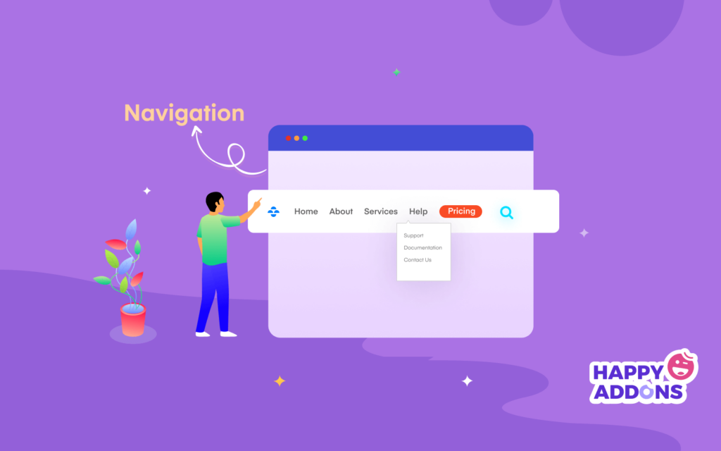

Your website’s navigation allows users to quickly find the information they are looking for. There are different types of website navigation such as horizontal, vertical, and drop-down. You can use the navigation menus for different use cases of your website.
Well-designed website navigation positively impacts your website traffic, boosts conversion, reduces bounce rate, and improves your time on site.
Almost 50% of visitors will use the navigation menu to nevigate the website.
HubsPot
So, how can you make the navigation of your website more attractive to your users and improve user experience?
In this blog, we are going to share 8 best practices for website navigation in WordPress. Learn the secret tips and take your website navigation to the next level.
8 Best Practices To Improve Your Website Navigation
It’s time to share the 8 tips that you should follow while designing your website navigation. You can also use apply these tips to your website’s existing navigation bar.
Here are the tips.
- Use Short Menu Titles
- Focus on Responsive Design for Every Screen Size
- Add Breadcrumbs
- Manage the Number of Menu Items
- Avoid Multiple Dropdown Menu Items
- Add a CTA Button to the Top Navigation
- Use Sticky Top Navigation Bar
- Add a Search Option to the Menu
Let’s get started.
1. Use Descriptive but Short Menu Titles
It’s recommended to make your website menu item names short. Try to keep it to one or two words. If you add a long text to your menu items, users can distract. Even, there will be responsive issues raised when users access your navigating menu using mobile devices.
Ideally use one or two words, but use enough of a description that users and search engines can predict what they will find on each page.
2. Focus on Responsive Design for Every Screen Size
Whenever you are working on designing a website menu, you should focus on responsiveness. Because users can access your website menu using different devices. If your navigation menu doesn’t work on small devices like mobile, tabs, etc then it will create a bad impact on your website.

Your users will leave your website due to this issue. Even search engines like Google also measure your website’s SEO score negatively. So, make sure your website navigation design is compatible with every screen size.
3. Add Breadcrumbs
Breadcrumbs are mainly visible top of the website and show you the user’s journey of a website. Adding breadcrumbs can be great to navigate your website users in the right direction. However, it also makes a positive impact on website SEO. By activating breadcrumbs, users can easily return back from the current page to the previous page.

Most of the WordPress themes come with the breadcrumbs functionality. However, you can also use SEO plugins to activate this feature on your website. If your website is made with Elemdentor, you can follow this step-by-step tutorial article and learn how to add breadcrumbs on Elementor.
4. Manage the Number of Menu Items
Keep your navigation menu simple and minimal. Your menu items should be a maximum of six or seven so that users can easily navigate to their desired pages. When you add too many items to the navigation menu, it becomes clustered.
Also, users find it difficult to find the option they were looking for as they have to search for the option. And no user has that much time.
5. Avoid Multiple Dropdown Menu Items
A dropdown menu refers to a sub-menu mainly displayed under a parent menu. If your website has multiple sub-pages or categories, you can create a dropdown menu to showcase these important menu items. It’s best practice to add one or two dropdown menus at a time.

Try to add limited sub-pages or categories to ensure a better user experience. If your website has enormous categories like an eCommerce website then you should use a mega menu.
Learn how to create a mega menu for your website using Elementor and Happy Addons.
6. Add a CTA Button to the Top Navigation
CTA (call-to-action) button is an effective web element you may often find in the different places of a landing page. It’s mainly used for driving users towards your goal conversion. You can also see a CTA button in the modern-day navigation menu.

While adding a CTA button, you should focus on the button design and try to make it colorful and simple. It will ultimately help users to get and visit the most important page of your website.
7. Use Sticky Top Navigation Menu
You can experiment with a sticky top navigation menu on your website. Activating the sticky menu is a great way to keep your brand logo in users’ minds as they browse your website.

It also helps users to access the navigation menu while scrolling down. You can read this article to learn how to design a sticky header using Elementor.
8. Add a Search Bar to the Menu
Basically, users don’t visit your website to read or explore your entire website content. That’s why adding a search bar in the navigation menu is recommended. It helps users to find necessary pages or information on your website without scrolling the whole website.

As a website owner, you can also use this search bar to check the old data of your website. It saves valuable time for yourself and your visitor ultimately ensuring a better user experience.
Let’s read this article and learn how to add a search bar on your WordPress website.
Bonus: How to Design a Custom Header Using Elementor

A website heading is the first thing that users first see when they come to your website. That’s why you should design a header that is clear and functional. Creating a custom header with Elementor is fun. You can use the Elementor widgets or ready-made Header Blocks to design the Header.
Before you start first install and activate both the FREE & Premium versions of Elementor.
- Elementor (Free)
- Elementor Pro
You can design a custom header for your website following the below steps:
Step 1: Add Site Logo Widget
Every website has its own logo. So the first step is to add the logo. You can use the Elementor logo or image widget for adding your website logo.
Step 2: Add Nav Menu Widget
It’s time for adding the navigation menu to the header. Elementor comes with the Nav Menu widget with its pro version. Just drag & drop the widget to the suitable place for your header. After that, you can manage the menu design in your own way.

Note: Make sure that you’ve created a menu for your website. if you don’t have any menu on your website, the Nav Menu widget won’t work.
You can read this tutorial blog to learn how to create a menu in WordPress.
Step 3: Add a Search Bar
If you want to add a search bar option to your header, you can easily do it using the Elementor Search Form widget. After finishing the header design, you’ll get a stunning header like the below image.

Check out the full step-by-step guide here: How To Design A Custom Elementor Header
FAQ(s) on Website Navigation
These are the common question that is often people asked about then website navigation.
1. What is website navigation?
A navigation menu is used to display links to essential internal pages or other web content of a website. basically, users use the menu to navigate the website.
2. What are the types of navigation menus?
These are the navigation menus you often find on a website-
# Horizontal Navigation Menu
# Navigation Menu
# Footer Navigation Menu
# Hamburger Navigation Menu
# Vertical Sidebar Navigation Menu
3. What is a Hamburger menu?
The hamburger menu is a type of menu commonly used for mobile or small devices.
Follow Our Tips & Keep Improving Your Website Navigation
From the above discussion, hopefully, you’ve learned how to improve your website navigation by following the tips that we’ve shared. There are some other things that you should consider while designing your website menu.
Your menu should be descriptive, you should add a footer menu for showcasing other necessary pages. Also, you can use Google Analytics to monitor your menu and avoid displaying social media icons in the navigation bar.
Hope this article will help to make better website navigation. If you still need more guidance, you can share your queries with us using the comment section.
Please join our newsletter and share the post on your social channel so that people can also improve their website navigation.


One Response
Clear and intuitive user interface design is key to creating websites that visitors can navigate effortlessly. Your article highlights essential navigation best practices, showing how thoughtful structure and hierarchy can improve user satisfaction and engagement. Understanding these principles ensures that users find what they need quickly, reducing frustration and bounce rates.