







Creating a beautiful website is not a difficult task today. You will find numerous web builders online by which you can create catchy websites in the quickest possible time. But beauty is always in the eye of the beholder. What looks beautiful to you may not be attractive to others.
The effectiveness of a web design is judged by its users, not the owners. A great web design doesn’t mean appearance only. It’s a combination of appearance and functionality. No matter how beautiful a website is, it will surely lose its user base if its functionalities are overcomplicated.
Again, Google doesn’t love to promote a website that is poorly designed. So what makes a good web design? This article will present to you some universal rules experienced designers follow as the principles of beautiful web design. Let’s dive into the discussion without wasting any more time.
Web Design Statistics That Will Blow Your Mind

As of December 2010, there were only 255 million websites. But in the last twelve years, the total number of websites has crossed the figure of 1.8 billion. More new websites are being created every day to meet the demand of the growing number of users and customers.
To stand out in this crowded space, you must have knowledge of the latest trends and technologies in web design. Here we have covered some latest statistics to help you understand why web design is so important for the growth of any business. Have a look at them below.
i) About 50% of users say that web design is crucial in formulating an opinion about a website. (PR Newswire)
ii) 39% of online users care more about web color than any other website’s visual elements. (PR Newswire)
iii) Around three-fourths of internet users love to revisit a website if it’s mobile-friendly. (WebFX)
iv) Web users are more likely to avoid those websites that take more than three seconds to load. (Web Performance Guru)
v) 90% of buyers say that image quality influences them a lot while purchasing online. (Meero)
vI) Eye-catchy CTA buttons can increase conversion rate by as much as 34%. (CXL)
vii) 60% of users say that usability and easy navigation are the two most important characteristics of a good web design. (Statista)
viii) People spend about 6 seconds at the logo and navigation bar before moving on. (Missouri University of Science and Technology)
Apart from these, you’ll find many more statistics available online. Hope these are enough to help you understand the need for a beautiful web design.
The Principles of Beautiful Web Design
Web design is an ever-changing landscape. It doesn’t mean only what you see on the screen. It also means how different things work together as a whole. This is why it is vital for all designers to review the basic web design principles to keep their web layouts fresh and evergreen.
Let’s check out the principles of beautiful web design below and have a note of them.
1. Know the Purpose of Your Website
Without a clear goal in mind, it is difficult to design a website that is appealing to the target audience. Some common purposes of creating a website include providing information, selling products or services, circulating news, imparting education, giving entertainment, etc.
Each of these purposes requires different design elements and principles. Knowing the purpose of your website can help you identify your target audiences and the type of content you must create. It can also help you design a solid marketing strategy to beat the competition and stand out in the market.
2. Have an Eye-Catchy Logo
A logo is more than just a design. It sets the foundation of your brand identity and creates a solid first impression. Yet many people don’t take logo design seriously. Often, they try to copy the famous logos of others or design something that cannot convey the brand message properly.
But these can severely affect the branding of a website. Remember, a logo is a silent ambassador of a brand and business. So, ensure the following principles while designing a web logo.
- Make the logo easy to remember.
- Never copy more than 50% of others’ logos.
- Apply the same color palette used on your website (brand color).
- It should look great on any color background.
- Use a text meaningful to your audiences.
- It should be usable as a sticker on the product label.
3. Make Sure to Add Simple Navigation
Simplicity in web navigation is a prerequisite for both user experience and ranking websites on the top of search engines. Users love to find their desired information when they explore a website as soon as possible. One way to achieve this is by updating your web navigation system. How to do that?
Try to keep the texts of your navigation bar simple, highlighted, and organized to make them easy to read. Next, check all the posts-and-page links on your website are working correctly. Never leave any broken link unfixed for a long time.
You may wonder how to check if there is any broken link on your website. There are many web apps like Ahrefs, Semrush, and MozBar by which you can audit your site and find broken links. Finally, remove unnecessary images next to the links to save web users from any distractions.
4. Use Easy To Read Fonts
Whenever a visitor reaches a website, the first two things they look at are texts and images. If your fonts make your texts hard to read, visitors will likely give up and move on to another website. You must choose the font types based on your website and alter them in different sections.
If you make a comparison between a news portal and a photography site, you will find huge differences in font styles. There are four major types of fonts: Serif, Sans Serif, Script, and Display. You can use them in your blog title, subheading, product description, and internal texts as they suit.
Apart from these, there are many other unconventional fonts, like image and cartoon fonts. You can use them in designing our web banner, hero section, and featured images.
5. Use Eye Soothing Color Pallet
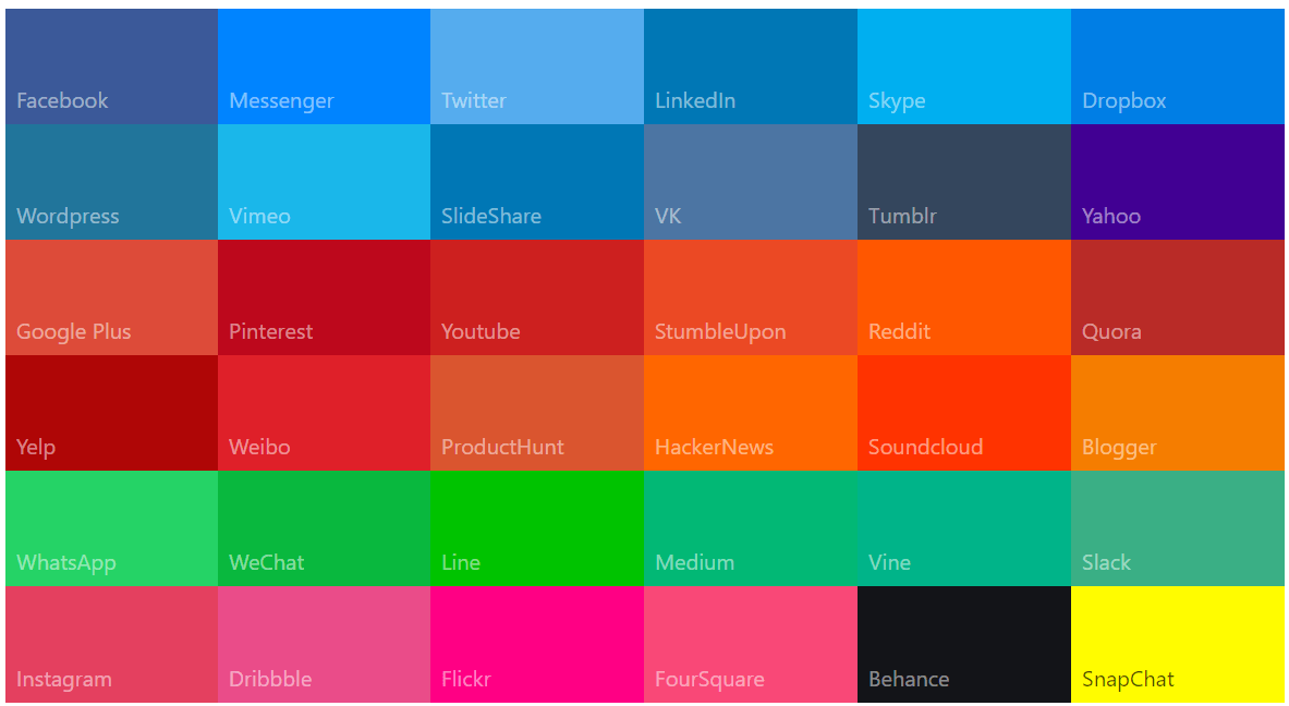
Choosing the right color pallet can give an aesthetically pleasing experience to the user. Never use too bright or deep color pallets because many users find them eye-screaming. Otherwise, it will be difficult for the user to focus on what you are saying and can distract them from your content.
Better you choose a soothing color palette. An excellent way to use warm colors such as yellow, orange, and red. These colors are associated with happiness, warmth, and comfort. They will help to ease users into your website and make them feel at home.
6. Maintain Visual Hierarchy
Visual hierarchy is the process of arranging or displaying the essential elements of your website on top in order of importance. According to Behavior and Information Technology, it takes online users 0.5-5 seconds at best to have an impression on a website.
If they don’t find anything valuable within this time, a big chunk of them has a high possibility of leaving your website. The idea of hierarchy can help you a lot in this case. You can display the value proposition, forms, CTA buttons, promo banners, discount offers, etc., on top based on your website.
7. Follow F-Shaped Pattern for Text Content
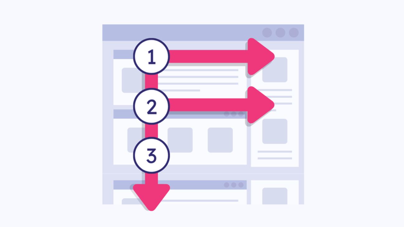
F-Shaped Pattern is a discovery of modern science that describes the common eye movement of online users when they visit a website. Suppose one of your web pages/posts gets thousands of visitors daily. Do you think all of them read out each of your content extensively?
Only a few may read your entire content, but the rest will just skim through. And most of them will skim through the content in the F-Shaped Pattern. This is why applying the F-Shaped pattern to publish your content can ensure a better visual hierarchy and boost the conversion rate.
8. Use Relevant Images
Long content without images is an entirely boring thing to web visitors. It gives them a feeling of eye-screaming. Images after a certain number of words can create a peaceful atmosphere for their eyes. However, you need to include relevant images that make your content more meaningful.
There are some rules for using images on a website:
- Choose clear and high-resolution images
- Don’t use images that have copyright issues
- Compress them before uploading them to your site
- Add alt-tag and do other SEO parts
- Make sure images work fine on mobile devices
9. Highlight Key Information
People often bury the most important information within different pages during web design. It leads to another bad user experience as users have to scroll through long web pages for finding information. This is why you need to highlight the key information on your main landing pages to save the valuable time of web visitors.
Some most common tactics you can follow are using headings, subheadings, bold text, underlining text, and changing text color. Also, you can use images or change the background color of specific sections to highlight all your key information.
10. Optimize CTA Buttons
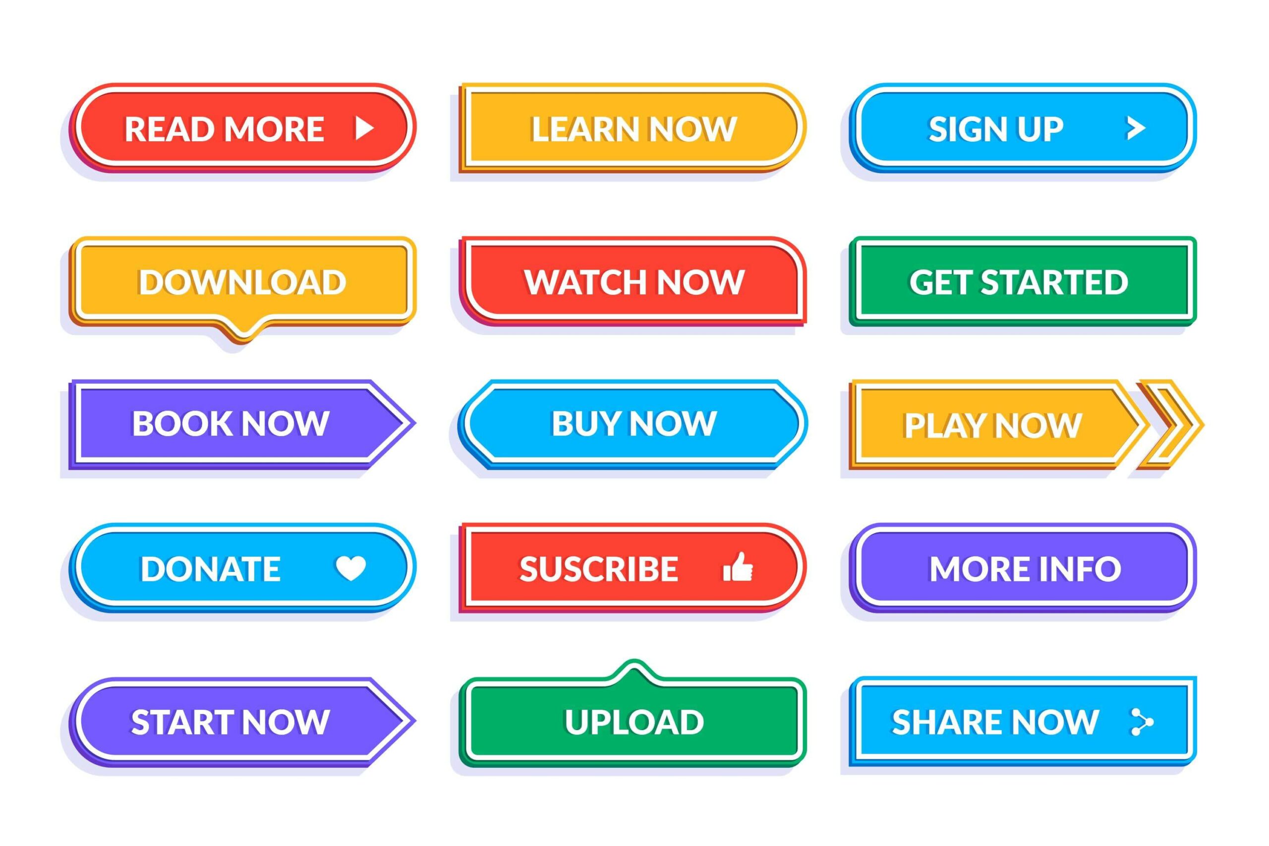
The goal of CTA buttons is to psychologically motivate your customers to take some specific actions you desire them to do. Some popular CTA buttons are Buy Now, Add To Cart, Sign Up, Join Now, Subscribe, Learn More, Get Started, Download, etc.
You can use CTA buttons on your home page, hero section, product sections, web banners, pop-ups, and blog posts. Check the following rules are applied while creating your CTA buttons.
- Buttons are correctly sized and don’t take up too much space
- Typography and background color make them visible
- CTA button links aren’t broken and working nicely
11. Keep Enough White Space
White space is an essential part of web design principles. It refers to the empty space between elements on the web page. Most people might think white space equals a cleaner and neater design, but that’s not always the case.
To create perfect white space, identify the areas that need it first. Avoid too many elements on one page, and ensure each has its own purpose. Next, use CSS to add space between elements, texts, and images. Finally, use images or fonts if you have left any gaps unfilled.
12. Maintain Minimalist Design Consistency
Minimalism is the use of clean and simple designs that focus on the content rather than the design itself. You will find many designers who spend hours and hours creating unique appearances for each of their pages. They blend too many elements like gifs, videos, banners, and typography all in one place.
But they forget these too many elements in one place can distract the audience. It can seriously harm the user experience too. Only a minimalistic design can bring a balance between your aesthetic design and content presentation.
13. Use Grid Layout
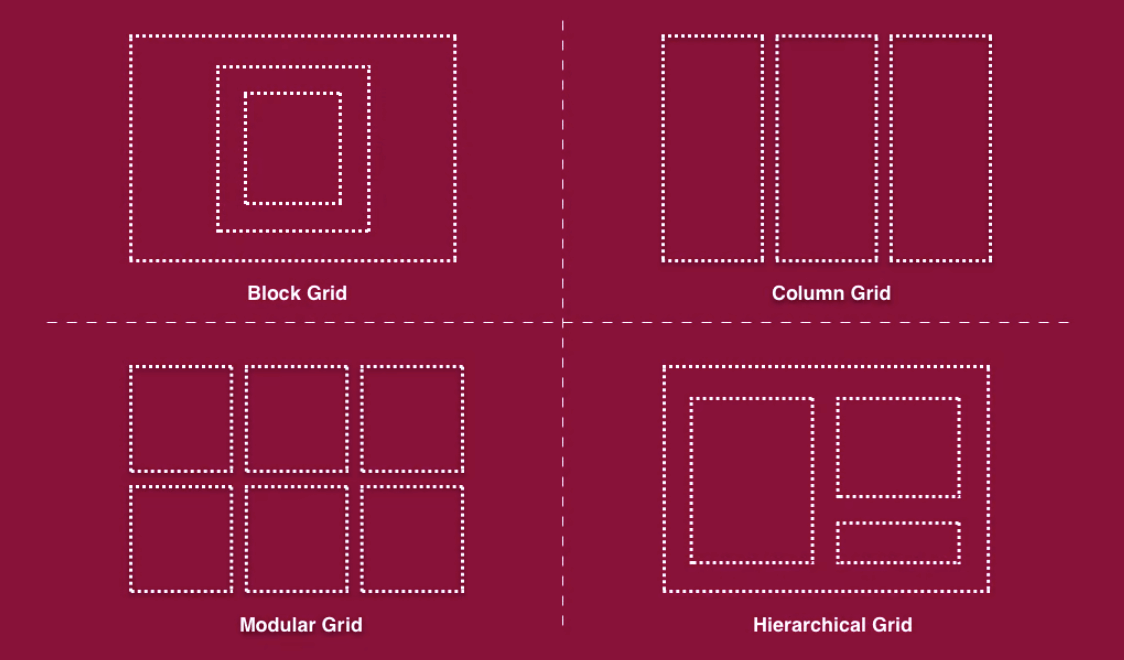
Grid layout is a great way to organize your web content on one page and make them easy for viewers to find what they want. It will make your website easier to navigate and will look more professional.
There are several different grid layouts, but the most common is the two-column grid. It divides a page into two columns, with the content in the first and the sidebar in the second.
Another standard grid layout is the three-column grid. This layout divides a page into three columns, with the content in the first column, the sidebar in the middle column, and the footer in the last column. If you are designing a website that has a lot of content, you should try to use a grid layout.
14. Write Compelling Copy
Copywriting refers to the text content that someone writes for landing pages, product description, social media posts, emails, and sales pitches. Compelling copywriting helps to create a sense of urgency and excitement around the website, which can boost the traffic level.
Copywriting can be divided into two categories: headline and body copy. Headline writing focuses on the title and subtitle of the page. And body copywriting covers everything else, from the introduction to the footer. To write compelling copy, first, you need to understand the consumer’s needs.
Next, you need to know what keywords to target and how to make your content SEO-friendly. Next, you must ensure that your copy is easy to read and understand. You should also use exciting images and videos to engage the reader.
15. Place Related Elements Close To Each Other
When related elements are placed close, web pages become easier to navigate and read. It also reduces the number of clicks necessary to get from one page part to another. It will improve usability and user-friendliness at the same time.
You can take the following ideas on how to place related elements close to each other.
- You may place the main menu bar near the top of your web pages so that it is easy to find.
- Ensure the key contents are covered within the middle parts of your pages.
- Location, contact information, social links, etc., are covered in the footer.
- Create a subscription form and place it above the footer.
16. Eliminate Distracting Points
Another important web design principle everyone must follow is eliminating distracting points. It means ensuring that all design elements are easy to focus on and don’t pull your attention away from the task.
One way to do this is to keep your colors simple and tasteful. You don’t need an overwhelming amount of colors to create a beautiful design, and overuse of colors can be pretty distracting. You should use texts and images that are relevant. It will make your website organized and clutter-free.
17. Mobile Responsiveness
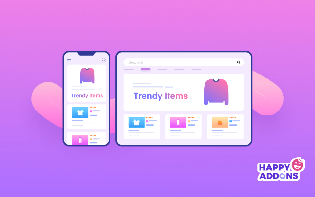
Mobile responsiveness enables users to access your website from any device they have. They can browse the site on their smartphones, tablets, or laptops. If your website isn’t mobile-friendly, people can’t use it comfortably.
First, choose a mobile-friendly theme or template to make your website mobile responsive. After that, check your website in different device layouts to see if your buttons, images, and elements are correctly displayed there or not. If not, you have to rearrange them for better results on particular devices.
18. Reduce Page Loading Time
Search engines can negatively mark your website if it takes more time to load. According to HubSpot, 0.5-4 seconds is the ideal loading time for any website. Google doesn’t love promoting websites that take more than this period to load.
There are many ways you can reduce the web page loading time. For example
- Compress the size of images, videos, and GIFs before uploading them
- Uninstall the heavy-weight unnecessary plugins
- Use a fast-supportive hosting solution
- Reduce your number of redirects
- Frequently cache your web pages
19. Provide Contact Information
Contact information allows visitors to find and contact you if they have questions or want to book an appointment. In addition, it can help you generate leads and sell products. Visitors will likely be frustrated if they don’t find it on your website.
You can create a contact us page or include the necessary information (name, address, email, phone number, WhatsApp social channels, etc.) in the footer section. You can even include all this information on the About Us page.
20. Follow Users Feedback
Following user feedback is the last but mandatory thing you must consider in web designing. If not users find your website friendly and valuable to them, all your time and struggle will go in vain. This is why you must check whether target audiences like your website!
If they have any dissatisfying issues, you must identify and resolve them right away. Besides, you can do some A/B testing before implementing any new idea. It will help you understand whether this new idea is going to be user-friendly or not. Thus you can implement new changes on your website with certainty.
Give an Aesthetic Look To Your Website Using Elementor and HappyAddons
If you are a WordPress user, you probably have heard the name ‘Elementor’ at least once. Elementor is a web designing plugin by which you can create and unique design website as you wish without a single line of coding.
If you are a no-code user yet wish to design your website with Elementor and HappyAddons(an extension of the Elementor plugin), you can make your dream come true. Both have various features, a drag-and-drop interface, a wide range of integrations, and an extensive library of pre-made templates.
Elementor
Elementor has free and pro versions of the plugin, with 100+ widgets. The free version will allow you to use 31 widgets by which you can create a basic-level website. Moreover, it has 24 exclusive eCommerce website templates by which you can design your eCommerce website. Check out the snap video of its widgets below.
HappyAddons
Already we said, HappyAddons is an extension of Elementor. It has additional 110+ widgets and 20+ features. It also has a free and pro version. But the most exciting thing is that HappyAddons will give you free access to 60+ widgets which is more than the Elementor free version.
It means by using Elementor and Happaddons together, you can create a fully functional website with ease. And using any of their free versions, you can create almost any kind of website. Have an eye on the widgets of HappyAddons in the video below.
Click on the video below to check out how to use the Elementor and HappyAddons plugins.
FAQs on Good Web Design Principles
Now we will answer some most frequently asked questions on the principles of beautiful web design commonly found in various online sources.
-
What are the basic elements of any web design?
The basic elements of any web design are landing pages, layouts, color, fonts, texts, images, videos, GIFs, shapes, background space, headings, sub-headings, etc.
-
What qualifications do you need to be a web designer?
You need the following skills and qualifications to be a good web designer:
1) Knowledge of HTML, CSS, and JavaScript
2) Design sense on color, font, shape, and typography
3) Profesional skill in Dreamweaver, Showit, or Figma (optional)
4) Understanding of SERP and SEO
5) Problem-solving ability -
What is the difference between web design elements and web design principles?
The web design elements are landing pages, layouts, colors, shapes, fonts, etc. Principles of web design teach us how to use these elements to create a wonderful website.
-
What are the types of web design?
There are various types of web design. Check out the list below:
1) Static website
2) Single-page website
3) Dynamic website
4) F-shape layout website
5) Z-shape layout website
6) Box shape layout website
7) Grid shape layout website -
What are the best web design tools?
There are numerous tools you will find online to design your website. Some of the most popular ones are:
1) Elementor (A WordPress Page Design Tool)
2) Figma
3) Bubble
4) Wix
5) Webflow
6) Adobe Dreamweaver
7) Shopify
Key Takeaways of This Discussion
Without a website, it’s quite impossible for any business today to survive sustainably in the market. If you plan to start an online business or marketing, your website will be the most valuable platform to educate people about your products, services, and business.
So if you don’t properly design and organize your website, it will never be able to meet your goals and objectives. As a designer, it is important for you to know the latest trends and technologies to keep your website clean, user-friendly, and evergreen.
We have tried our best to cover all the principles of beautiful web design in this article so that you can do this rightfully. We hope you have found this article helpful enough to grow your design knowledge. If you love to receive more interesting articles like this one, subscribe to us and follow our Facebook and Twitter channels.
Subscribe to our newsletter
Get latest news & updates on Elementor
[yikes-mailchimp form=”1″]
![Black Friday and Cyber Monday are around the corner, and people are waiting for these festivals to grab the best product deals. That is why giving an attractive look to your website during this festive season is very necessary. But, creating a whole new landing page might be difficult in a short period of time. Don't worry. By using Happy Elementor Addons Black Friday and Cyber Monday Landing Page templates, you can easily develop a whole new landing page in a few minutes. In this today's blog, we are going to show how to boost your website design using HappyAddons templates during this festival season. Before that, we'll talk a bit about these two festivals and why they are important to online business communities. What are Black Friday and Cyber Monday? Black Friday is the immediate following of the famous Thanksgiving day. This is when people start shopping to celebrate the Christmas festival. Since the late 1980s, retail sales on this day have constantly been suppressing the past volumes. See the graph below. Source: Salecycle.com The first Monday following Thanksgiving day each year is called Cyber Monday. It was first introduced in 2005 by the USA National Retail Federation to encourage people to buy online. Though this festival originated in the USA, it is celebrated globally today. See the stats below. Source: Salecycle.com It indicates customers' buying behavior around this day is growing up over time. Many customers today keep a budget to buy products on these two days. So, why won’t you prepare a Cyber Monday landing page if you have an online store? Importance of Designing Landing Pages for Black Friday and Cyber Monday Festival Having a well-design website is one of the major checklists if you are running an online business. Most importantly, you have to make sure that your website remains up-to-date to boost your sales. That is why you need to redesign your website or make a new landing page during the Black Friday and Cyber Monday festivals. Because most online product & service-based businesses promote special deals during these two festivals. Here are some remarkable ways dedicated landing pages during these festivals can positively impact the performance of your online business. Boosts your product salesIncreases conversion rateOpportunity to collect potential email leadsGrabs users' attention toward your siteReduces bounce rateIncreases website visitors. Elementor Black Friday New Seasonal Kit is Already Here! Source: Elementor To make this Black Friday more enjoyable, Elementor has launched a New Seasonal Kit that includes landing pages, sections, pop-ups, and vector assets. All these design elements are made by the Elementor team so that one can easily use them on their website to ensure more sales and conversions. New Elementor Black Friday Seasonal Kit offers: 3 Landing pages6 Sections 6 Popups A collection of stickers & animations You can only get these ready-made Black Friday landing pages and sections if you have Installed Elementor Pro on your site. However, if you are looking for templates that are outside of the box, you can go with Happy Addons, the fastest Elementor Addons on the market. It's very easy to use, flexible and has tons of advanced features and widgets that can ease your website design journey. Also, you'll get several festival landing page templates & blocks. Moreover, you can use free Black Friday and Cyber Monday design blocks and templates to decorate your site. Most importantly, these templates and blocks are easy to customize and can be used for multiple purposes. Now let's see how you can use the Happy Addons templates to design your website according to the Black Friday theme. Pre-Requisites to Use HappyAddons Templates to Design Black Friday and Cyber Monday Landing Pages You must have the following plugins installed on your site to get access to the HappyAddons Template library. Make sure you’ve installed and activated the Happy Addons Free & Premium version of your website. Elementor (Free)Happy Addons (Free)Happy Addons Pro If you are new to Elementor, check this Step By Step Guide For Beginners. If you want to explore the readymade templates of HappyAddons before installing these plugins, you may visit by clicking on the button below. Check out Happy Addons Templates How to Design Black Friday Landing Page on Your Website Once you have the plugins (mentioned above) installed, your website is ready to follow the tutorial guide explained in this section. Get ready now! Step 1: Open a New Page with Elementor Create a new page or open the existing page with Elementor. Next, you have to select the Elementor Canvas option.Unless you select Elementor Canvas, you may watch the header, footer, and unnecessary other texts on the page. These might be irritating to you.Once you open the page with Elementor Canvas, your page will be completely clean. Watch the video below on how to do it. Step 02: Go to HappyAddons Library Click on the HappyAddons Library Icon. It will open up a modal popup. Here you'll find numerous stunning premade Blocks and Pages created by the Happy Addons team. Kindly explore them to create a list of your favorite items. Step 03: Import a HappyAddons Black Friday Template Go to the Page tab on the modal popup.Select Black Friday from the left-side filter option.You will several good-looking templates on your screen.Take your cursor on the one you like and hit on the INSERT button. Wait for a while to finish the installation process. You will get the template on your screen with editable sections and options. Step 04: Set the Black Friday Campaign Deadline A deadline creates a sense of urgency in customers' minds. So, better if you add a deadline section on the page to show your Black Friday deals. The good thing is that if you select the template as we did, you will automatically get a deadline or countdown option. You have to customize it as you want. Step 05: Show Image Carousel Slider on Your Black Friday Landing Page Using the Image Carousel, you can slide show demonstrating discounts on your product categories. Drag and drop the Image Carousel widget on any landing page section. Next, from the Elementor panel, you can add photos and text to the widget. Do it accordingly. Thus, you can add more sections and options on the landing page. Hope you can do it yourself. Step 06: Make the Black Friday Landing Page Mobile Responsive Making a web page mobile responsive with Elementor is super easy. You'll get the mobile responsive option on the Elementor footer section. Clicking on it will open up the option to view your landing page on different device screens. We have explained the process in the video below. Note: Don't delete any widget or section while customizing your landing page for any particular device. Because if you delete a widget or section on any device screen, it will also be applied on other devices. However, you may change their position or alignment or hide them. It won't make any impact on other devices. Step 07: Final Preview of Our Landing Page Here is the final interface of our Elementor Black Friday landing page that we've designed using the Happy Addons' ready-made Template. Get Happy Addons to Add a Black Friday Theme Landing Page on Your Website How to Design Cyber Monday Landing Page on Your Website You will require the same prerequisites (Elementor and HappyAddons Plugins) to design the Cyber Monday landing page on your website. Hope you have them ready on your website. Now, let's get into the tutorial part. Step 01: Import a Cyber Monday Readymade Landing Page Template Go to the HappyAddons Template library.Choose the Cyber Monday template you like.Click on the INSERT button. Wait for a while to finish the installation process. You'll get a page design like the following image below. Step 02: Edit Different Sections of the Page In the first tutorial, you saw the deadline/countdown option was already embedded in the template. But this template doesn't have it. So, you can bring it to your page? Very simple. Create a new section by clicking on the plus icon.Type Countdown on the Elementor search bar.Drag and drop the widget on the section. Customize the Countdown section from the Content and Style tabs of the Elementor panel. Using the Heading widget, we have added the FLASH DEALS text next to the countdown to make it more meaningful. Thus, you can use other exciting widgets on the template to make your landing page super gorgeous. Step 03: Promote Products on the Landing Page Promotional landing pages usually include a section to showcase some hot-selling products to generate instant sales. Using the Image and Button widgets, we have created this section under the FLASH DEALS.You may customize it more as you wish. Step 04: Make it Mobile Responsive We already showed you the process in the first tutorial on making a mobile web landing page responsive. Hope you can do it here as well, following the same guideline. Click on the Responsive Mode icon and do the rest yourself. Bonus: Black Friday and Cyber Monday Landing Page Design Key Considerations Whenever you design a landing page, you need to consider why you need to design this page and what elements they should keep on the page. Because if you are not adding all the necessary features to your page, it will not serve its purpose. This is why you need to focus on a few things before designing your Black Friday landing page. Here are some points you must consider in designing Black Friday and Cyber Monday landing pages. Add Black Friday textSet deals deadlineShow your best-discounted productsAdd coupon code Focus on responsive page designMake your page visually appealingImprove your page user experience or page structureSet a proper website navigation FAQ on Black Friday and Cyber Monday Landing Page Design Now, we'll answer some common questions on Black Friday and Cyber Monday Landing page designs commonly found online. How much does it cost to design a landing page?The cost of designing a landing page varies depending on the complexity of the design, the level of customization required, and whom to hire for the page. A simple landing page can be designed for as little as $25, while a more complex design with multiple customizations can cost upwards of $2,00.However, if you have Elementor and HappyAddons installed, you can design unlimited landing pages at a minimal cost. But like any other tool, you must have a kind of enterprise on them. As they are drag-and-drop builders and their numerous tutorials and documentation are available, they won't take you more than a month to be used to. Check out some wonderful YouTube tutorials on these two plugins. Hope you will enjoy them.How many hours does it take to design a landing page?It mainly depends on the level of design complexity and your web design skill. However, both in Elementor and HappyAddons, you will get countless readymade templates and block sections. You can design a beautiful landing page in 3-5 hours by making a proper combination of them.Can I design Black Friday and Cyber Monday Landing pages with Elementor and HappyAddons free versions?Surely, you can design Black Friday and Cyber Monday Landing pages with Elementor and HappyAddons free versions. But only with the pro versions, you can't add too many exciting features to your pages. For example, free versions will give you access to only a limited number of readymade templates.If you are just a beginner-level designer, free versions are enough. But if you are a professional designer or have a web designing agency, pro versions are a must. Are You Ready To Design Your Black Friday and Cyber Monday Landing Page? Customers look forward to this kind of occasion to buy their favorite products at a minimum price. Naturally, they are drawn to websites that look good and give a festive vibe. That is why adding a Black Friday and Cyber Monday landing page during the festival season will give you an extra edge over the competitors. The above guide shows how to design your Elementor Black Friday Landing page using the Happy Addons' Black Friday Templates and how it can help boost your holiday sales. So if you have any queries regarding this blog, you can comment on us in the below box. If you like this post, then share it on your social channel. Don't forget to subscribe to our newsletter. Also, follow our Facebook and Twitter channels for regular updates. Subscribe to our newsletter Get latest news & updates on Elementor [yikes-mailchimp form="1"] ":36560} /--](https://happyaddons.com/wp-content/uploads/2021/11/How-to-Design-Black-Friday-and-Cyber-Monday-Landing-Page-300x188.png)
6 Responses
Great article! I found your insights really informative and engaging. As a web designer I can relate to the points you’ve raised.
Thank you so much for your kind feedback! Hope this article will help you in your professional web design and development journey. If you need further insights, feel free to reach out anytime.
Thank you for sharing this comprehensive article on the basic principles of web design! It’s greatly appreciated. Keep up the excellent work of sharing valuable resources like this!
Thanks Rohit for stopping by and share your opinions.
Regards,
Gobinda
Team HappyAddons
One principle that often gets overlooked is designing for AI agent interactions — structuring your site so agents can parse content efficiently. It’s worth considering if you use tools like CartPilot.
It was very useful for me. Keep sharing such ideas in the future as well. This was actually what I was looking for,
and I am glad to.