
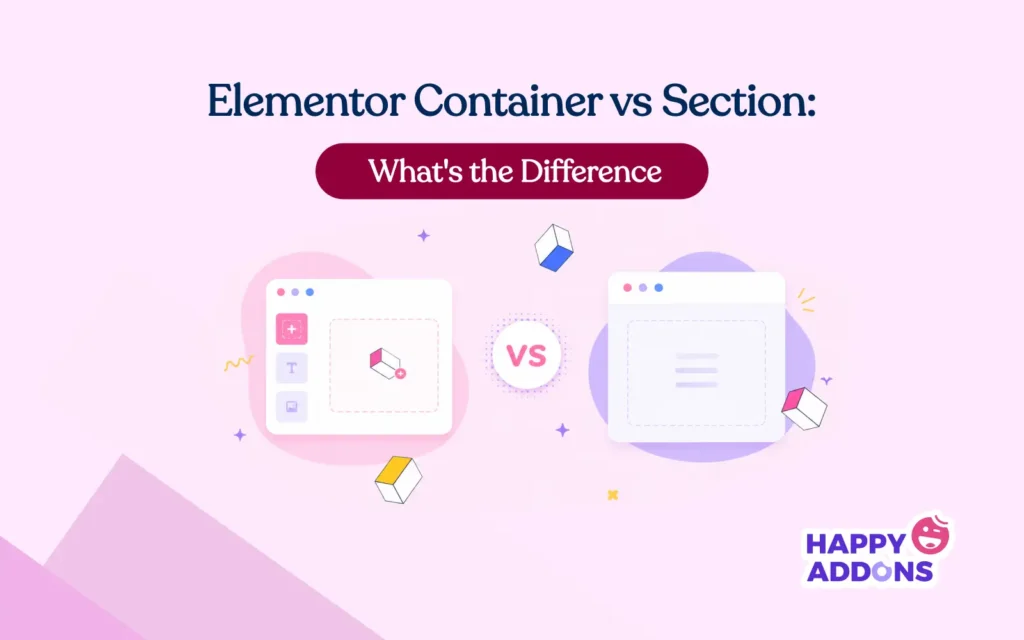

If you have been building websites with Elementor for some time, you have probably faced this question – should I use a Container or a Section?
At first, both look similar. They both hold content and help you build layouts. But in reality, they work in very different ways. If you choose the wrong one, it can affect your site speed, design, and flexibility. So, understanding the difference between them is a must.
In this guide, you will learn what Sections and Containers are, how they are different, when to use each one, and how tools like HappyAddons work with both. This will help you make the right choice every time. Let’s get started!
What Is a Section in Elementor?
The Section is Elementor’s original layout building block. It was introduced when Elementor first launched. It follows a classic three-tier hierarchy:
- Section → the outermost wrapper that spans the full width of the page
- Column → horizontal divisions inside the Section
- Widget → the actual content elements (text, images, buttons, etc.) placed inside columns

When you add a new row to your page in older Elementor setups, you are essentially adding a Section. You then choose how many columns you want (one column, two columns, three, and so on), and Elementor lays them out side by side using a CSS float-based or inline-block model.
What is a Container in Elementor?
The container is also known as the Flexbox Container. This is actually a core structural widget of the modern Elementor system. It was introduced in Elementor 3.6 as an experimental feature and made stable in Elementor 3.16.
It is built entirely on CSS Flexbox, the same layout model that professional front-end developers use to build responsive, dynamic interfaces. Containers offer a single, unified wrapper that can hold any number of widgets — or even other Containers — in any direction.

Learn how to create a contact form with Elementor.
Elementor Container vs Section: A Quick Snapshot
Before diving deep, let’s have a quick snapshot of the differences between the Elementor Container and Section.
| Feature | Section (Classic) | Container (Modern) |
|---|---|---|
| Layout Structure | Fixed structure: Section → Column → Widget | Flexible structure: Container → Widget / Container |
| Design Flexibility | Limited to column-based grid | Full flexibility with Flexbox (row/column control) |
| Performance (DOM) | More HTML elements, heavier DOM | Fewer elements, lighter DOM |
| Page Speed | Slower due to extra wrappers | Faster due to cleaner structure |
| Responsiveness | Basic control, often needs CSS | Advanced control without CSS |
| Alignment Control | Limited alignment options | Full control (justify, align, gap, wrap) |
| Ease of Use | Very beginner-friendly | Slight learning curve (Flexbox basics) |
| Nesting | Needs Inner Section (adds complexity) | Unlimited nesting, no extra element needed |
| Modern Design Support | Not ideal for complex layouts | Best for modern UI/UX layouts |
| Future Support | Stable but not evolving much | Actively developed and future-focused |
Check this tutorial on how to create a photography website.
Elementor Container vs Section: Comparison Between Them in Detail
Understanding the difference between these two layout systems goes beyond just knowing their names. Here is a detailed breakdown of how they compare across every dimension that matters.

1. Layout Structure Difference
With Sections, you are locked into a rigid grid: Section > Column > Widget. We have already shown it above. If you want two widgets side by side, you need a Section with two Columns. If you want three widgets of different widths, you adjust the column percentages. This works well for traditional grid layouts, but becomes limiting when your design calls for something more nuanced.
With Containers, the structure is flat and flexible. A single Container can hold multiple widgets arranged horizontally or vertically. You can nest Containers inside each other to any depth without adding unnecessary wrapper elements. A complex layout that required four layers of nesting with Sections might need only two with Containers.

Here’s a guide on how to create a clothing website.
2. Performance Difference
With Sections, Elementor adds multiple hidden layers to build your layout. Even a simple row needs extra structure in the background. As you add more sections across your page, these layers keep increasing. This makes the page heavier and can slow down loading speed, especially on large landing pages.
With Containers, the layout is much simpler and cleaner. You need fewer layers to create the same design. This keeps your page lightweight and faster. As a result, your website loads quicker, feels smoother, and gives a better experience to your visitors.
Note: In the latest versions of Elementor, Containers are now the default layout system. So, whenever you create a new section, it automatically includes a container by default. Inside this container, you can directly add widgets. You can also add sub-containers and place widgets inside them.
Read out the best and proven tips on how to increase the speed of the Elementor website.
3. Flexibility in Design

Sections give you a structured grid layout. This structure is predictable and easy to use. It is good for simple page designs. You work with rows and columns in a fixed way. It helps you keep content aligned and organized without much complexity.
Containers offer more design freedom. They are built on Flexbox, which allows flexible layouts. You can create vertical or horizontal layouts inside a single row. Elements can grow or shrink based on space. You can easily control alignment, spacing, and positioning.
This makes it easier to build advanced layouts like complex hero sections, dynamic cards, and modern landing pages with uneven or overlapping designs.
Here’s a guide on how to increase sales on your WooCommerce store.
4. Mobile Responsiveness Control
Sections and Containers both support mobile responsiveness and allow you to adjust layouts for tablet and mobile devices. With Sections, responsive control is more limited and usually depends on stacking columns when the screen size gets smaller. In many cases, you may need custom CSS to fine-tune how elements behave at different breakpoints.
Containers offer stronger and more flexible responsive control. Since they are built on Flexbox, you can easily change direction, wrapping, and alignment for each breakpoint directly from the settings panel. You can set a layout to be horizontal on desktop and automatically switch it to vertical on mobile. This can be done without writing any CSS, making responsive design faster and more precise.

Here’s a quick tutorial on how to make a website mobile responsive.
5. Ease of Use for Beginners vs Advanced Users
Sections are arguably easier to grasp for absolute beginners because the concept is intuitive: “I’m adding a row, and inside that row I’m adding columns.” The visual metaphor maps cleanly to how most people think about page layouts.
Containers have a steeper initial learning curve because they introduce Flexbox concepts — direction, justify content, align items, wrap — that require some foundational understanding to use effectively. However, once you understand these concepts (even at a basic level), you gain far more control over your designs.
For beginners, a 30-minute introduction to Flexbox basics is enough to get productive with Containers. The investment pays off immediately.
6. Nested Structure Handling
Nesting is where the contrast becomes starkest. With Sections, nesting is possible but limited. You can use the “Inner Section” widget to create a nested layout inside a column — but this adds yet another layer to the DOM and has its own limitations on depth and flexibility.
With Containers, nesting is natural and unlimited. Drag a Container inside another Container. Make that inner Container a flex row with three child Containers. Each of those can hold its own widgets. There is no artificial depth limit, and no special “Inner Container” widget is needed — it’s just the same Container element all the way down.

Want to build your agency site faster? Explore the best ways to build your agency site 3x faster.
When to Use the Section on Elementor Websites
The Section is not obsolete — it still has valid, practical use cases. Here’s when sticking with it makes the most sense.

a. When Working with Older Elementor Websites
If you are maintaining a website that was built entirely with Sections, adding Containers to the mix creates a hybrid that can be harder to manage than a pure approach. Unless you are doing a deliberate, planned migration, it’s often smarter to keep working with Sections on established sites.
b. When Using Third-Party Widgets Built for Sections
Some older Elementor add-ons and widget libraries were built specifically for the Section > Column > Widget structure. Dropping these widgets into a Container may work in many cases, but occasionally causes unexpected layout or styling issues. Check the compatibility documentation of your add-ons before switching.
c. When Your Team Is Not Familiar with the Flexbox System
If you’re working in a team environment and your collaborators are not yet comfortable with Flexbox concepts, a Container-based workflow can slow production down while people get up to speed. In that situation, completing the project with Sections and scheduling a team training session for the future is a reasonable strategy.
Check this guide on how to build a clothing website.
When to Use the Container on Elementor Websites
For most new work, the Container should be your default starting point. Here’s why.

a. For New Websites and Landing Pages
Every new Elementor project started today should use Containers. Elementor’s own templates and the entire direction of its development are Container-first. Starting with the modern system ensures you’re building on a foundation with a long future ahead of it.
b. For Faster Performance and Cleaner Code
If page speed matters to you — and it should, especially for landing pages where every millisecond of load time affects conversion rates — Containers give you a measurable advantage. Leaner DOM, fewer wrapper elements, and cleaner HTML output all contribute to faster rendering.
c. For Advanced Responsive Design Control
When you need precise, breakpoint-specific layout control without writing custom CSS, Containers are the only real option. Flexbox-native responsiveness is one of the Container’s strongest practical advantages for professional web designers.
d. For Modern UI/UX Layouts
Contemporary web design — asymmetric layouts, dynamic card grids, full-bleed hero sections with layered content, sidebar-content hybrids — all map naturally to Flexbox thinking. If your design inspiration comes from modern UI, Containers will let you realize it far more faithfully.
Explore the proven tips on how to improve the user experience on your website.
How HappyAddons Works with Container and Section

HappyAddons is one of the most feature-rich and widely used Elementor addon plugins in the WordPress ecosystem. With over 150 widgets, 35+ features, and a library of pre-designed templates, it extends Elementor’s native capabilities, significantly speeding up the design workflow.
So, if you ever feel that Elementor isn’t enough to extend your design capabilities, you must try HappyAddons. Once you have both Elementor and HappyAddons, you really can do magic with your site.
a. Supports Both Layout Systems
HappyAddons widgets are designed to function correctly whether you drop them into a classic Elementor Column inside a Section or directly into a Flexbox Container. This means you can use it on sites built years ago without worrying about breakage.
b. Widgets Optimized for Modern Container Structure
Many of HappyAddons’ more advanced widgets — card layouts, pricing tables, feature grids, team member showcases, and testimonial sliders — were designed with Flexbox in mind. When placed inside Containers, they respond naturally to the parent Container’s flex properties.

c. Why It Still Supports the Section for Backward Compatibility
HappyAddons understands that a huge portion of the WordPress community is running production websites built on the classic Section model. By maintaining full backward compatibility, HappyAddons ensures that upgrading the plugin never disrupts an existing site — regardless of which layout system it uses.
d. Smoother Design Workflow with Pre-Built Widgets
The most practical benefit of using HappyAddons alongside Elementor’s Container system is speed. Instead of building complex widgets from scratch — a tabbed content block, an animated counter, a filterable portfolio — you pull a HappyAddons widget into your Container layout, adjust the settings, and move on.
FAQ on Elementor Container vs Section
Let’s now take a look at some of the most frequently asked questions on today’s topic below.
Is Container Better Than Section in Elementor?
For most use cases — especially new builds — yes, the Container is the better choice. It produces a lighter DOM, gives you native Flexbox control for responsive design, and aligns with the direction Elementor’s development is heading.
Can I Use Both Together?
Yes. Elementor allows you to use Containers and Sections on the same page and even on the same website. However, mixing them without a plan can create inconsistency and make debugging harder. If you do use both, be intentional about which you use where and document your reasoning.
Does Container Improve SEO?
Indirectly, yes. Containers produce fewer DOM elements, which contributes to faster page rendering, better Core Web Vitals scores, and a cleaner HTML structure that is easier for search engine crawlers to parse.
Since Google uses page experience signals — including load speed — as ranking factors, the performance improvements from Container-based layouts can positively influence your search rankings over time.
Should Beginners Use Container or Section?
Beginners should start by learning the basics of Elementor with Sections, as the row-and-column mental model is easier to grasp initially. Once comfortable with building pages, they should invest an hour learning the fundamentals of CSS Flexbox and then transition to Containers. The learning curve is modest, and the long-term payoff in flexibility and performance is well worth it.
Will Section Be Removed in Future Elementor Versions?
As of now, Elementor has not announced a timeline for removing Sections. Given how many existing websites depend on Sections, any removal would likely come with a long deprecation period and migration tools.
However, Elementor’s entire forward momentum is clearly behind the Container system. New features, new templates, and development resources are all focused on Containers. While Sections aren’t going away immediately, they are effectively in maintenance mode.
Final Takeaway!
The debate between Elementor’s Container and Section is not really a debate at all — it’s more of a transition story. Sections served the Elementor community well for years. They’re intuitive, widely supported, and perfectly capable for traditional web layouts.
If you’re maintaining an older site, working with legacy third-party widgets, or collaborating with a team that hasn’t yet learned Flexbox, Sections are a reasonable choice.
Containers are the future of Elementor design. They’re faster, more flexible, natively responsive, and produce cleaner code. For every new project — especially landing pages where speed and conversion performance matter — Container should be your default starting point.
Hope you enjoyed this post. Thanks for reading this to the end. Subscribe to receive regular newsletters and any important updates from our end.

