Who doesn’t love to travel? Traveling is always an exciting thing for people of all ages. But can you imagine your traveling passion can turn into an easy way to make money?
The worldwide online travel market was worth more than $629 billion in 2017 and is predicted to reach almost $2 trillion by 2028. Although the ongoing epidemic has severely damaged the idea, the industry will turn around soon, at least on a local basis.
And sure, you can earn a smart amount of money online by having a well-designed travel website that can easily clutch visitor attention. If you are thinking about the procedures and costs, let us ensure you it won’t break your bank. As of now, you can build your own website by yourself in WordPress using Elementor.
In this blog, we will walk through how to build a travel website with Elementor starting from zero. Here, you can showcase your experience in an appealing way and help people make their next trip enjoyable.
But before we dive into designing our new website, let us quickly answer you-
Why Choose Elementor for Your Travel Website

Elementor is an easy to use drag and drop page builder that assists you to create a highly functional website in minutes. Most importantly, it diminishes the idea that only developers can build a site.
Now you can also build your site without having any prior experience with website building. Moreover, you will get unlimited pre-built templates & customization options to start your journey.
However, if you want to explore even more design potential, there are a number of third party addons are available to extend the power of core Elementor significantly. In that case, Happy Addons can open its arm to providing you with advanced web design tools in one place.
Also Read: How Happy Addons Helping The Elementor Community.
Let’s go ahead and show you how to create a travel website using Elementor & HappyAddons.
Getting Started with Your Travel Website

Here are the pre-requisites to create your travel website:
- A WordPress Site
- Elementor (Free & Pro)
- Happy Add-ons (Free & Pro)
Do make sure first that you have already had a domain name & hosting plan for your WordPress site. Now configure your WordPress site accordingly and install Elementor & Happy Addons.
Then, follow the below instructions step by step.
Related article: Best hosting plan for Elementor website
Let’s get started:
Step 1: Design The Home Page of Your Travel Website
First, login to your WordPress dashboard using your personal credentials. Then follow these steps carefully to create a new page:
- Navigate to Dashboard > Pages > Add New Page
- Write a title for your Homepage
- Set the template as “Elementor Canvas” from the drop-down menu of the bottom right corner
- Click the Publish button
- Finally, click on “Edit With Elementor”
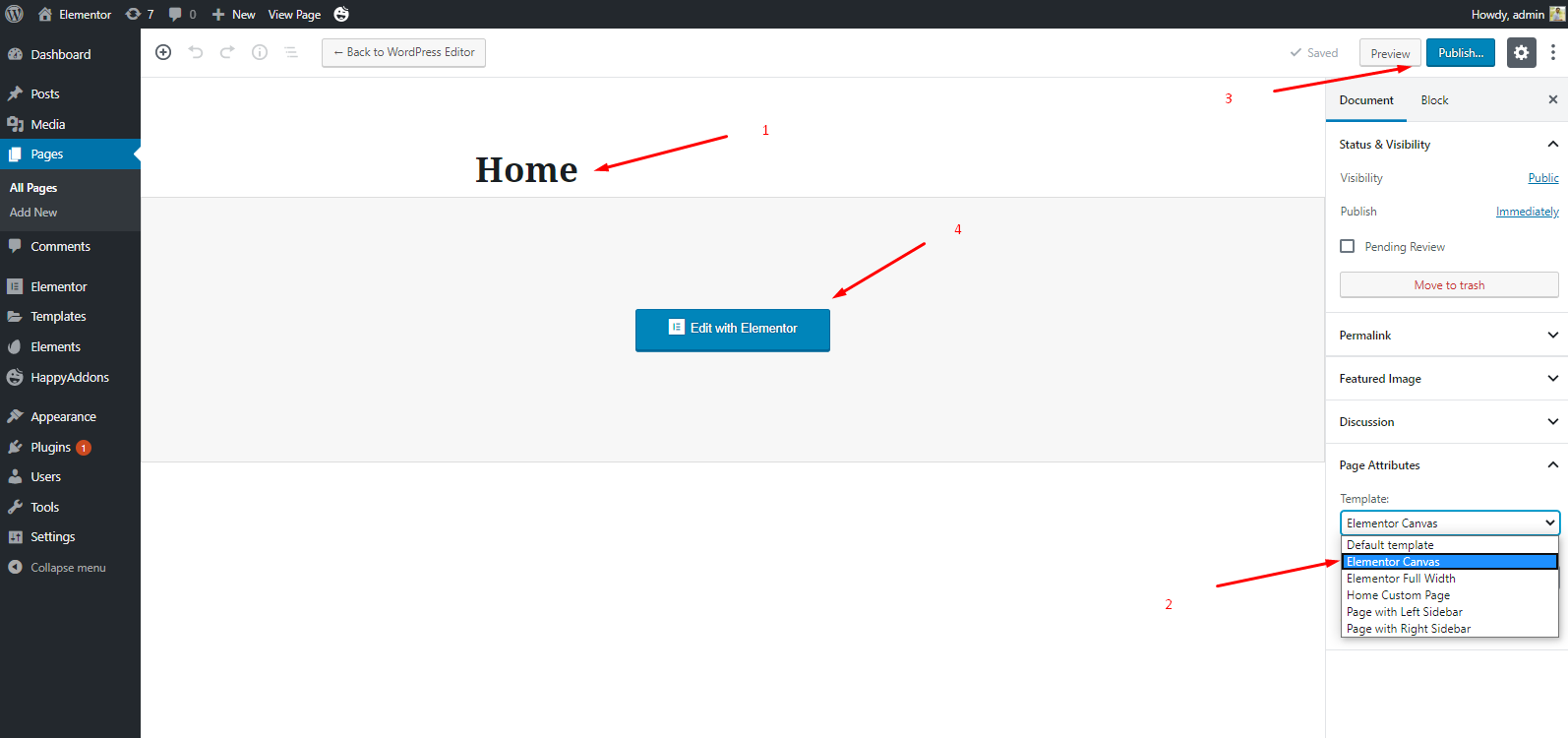
- You’ll get a fresh page where you can design your travel website’s home page that you can possibly think of.
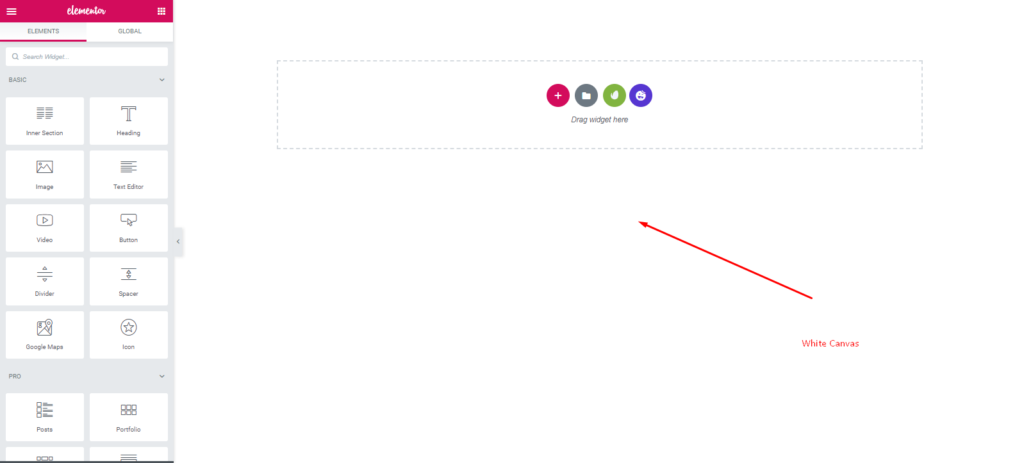
This is where your design mission starts. Keep Reading.?
Step 2: Customize Your Home Page Design
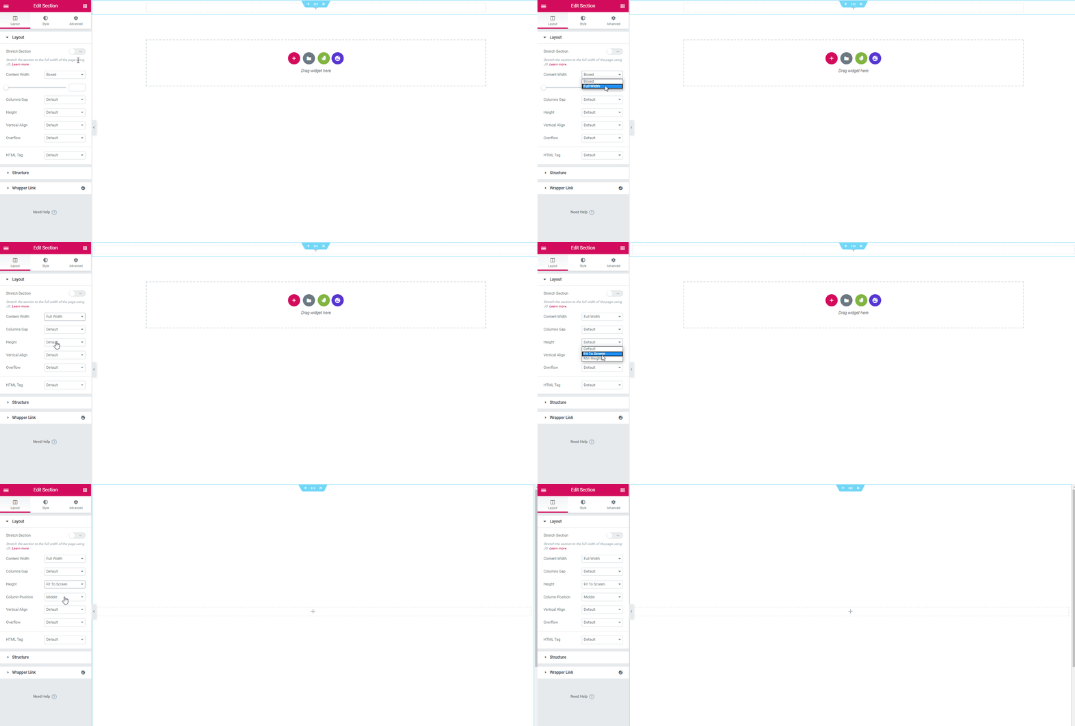
So first click on the ‘red’ plus button. And select a single section.
- After that choose the content width ‘Full‘ and height ‘Fit to screen‘
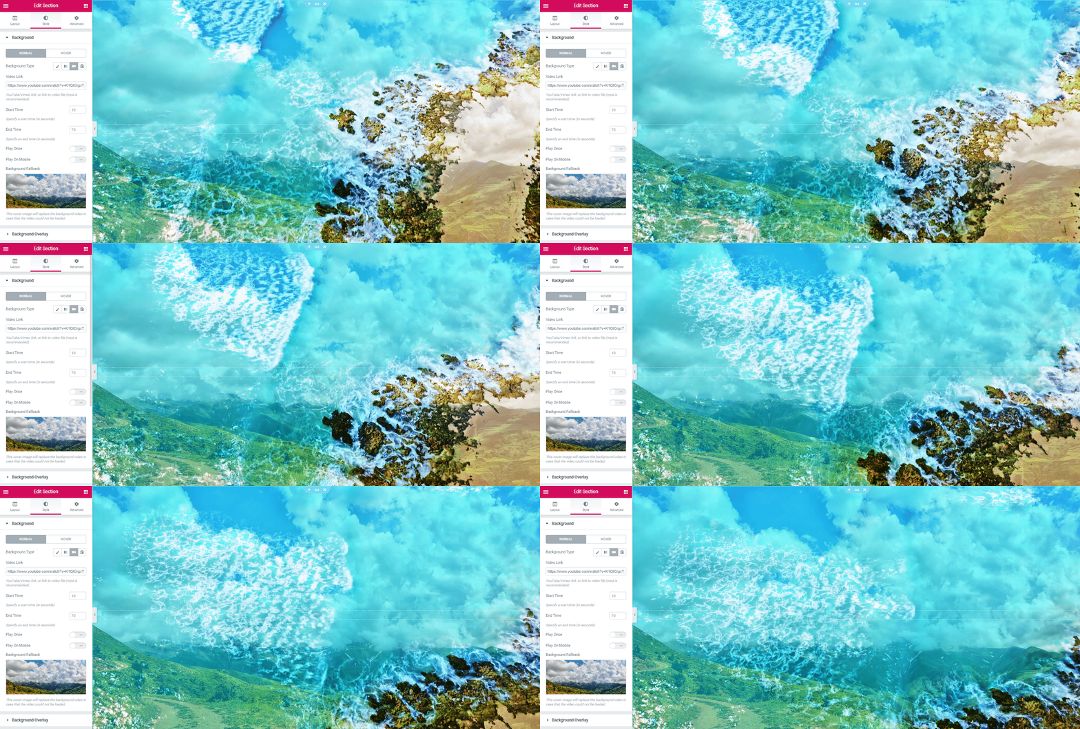
- To stylize the section, go to the style tab. Click on the background. Paste a unique copyright-free YouTube video link to the marked area.
- Then upload an image inside the background fallback area.
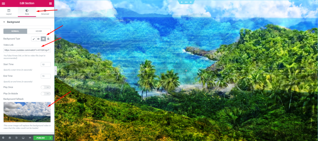
- So your final look will be?
Add a Heading
Next, it’s time to add some text in the header area. You can easily do that by selecting the ‘Animated Text‘ widget of Happy Addons from the left sidebar.
- Select the ‘Animated Text‘ widget and drag it to the marked area.
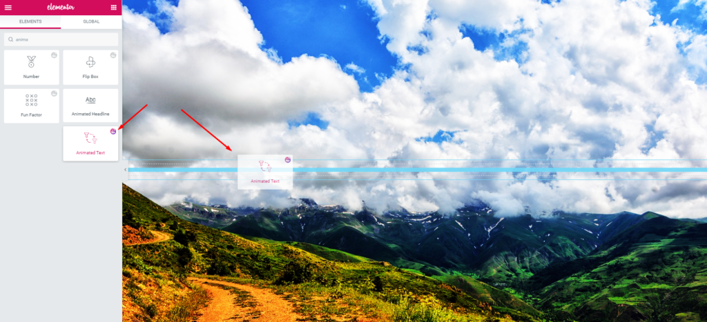
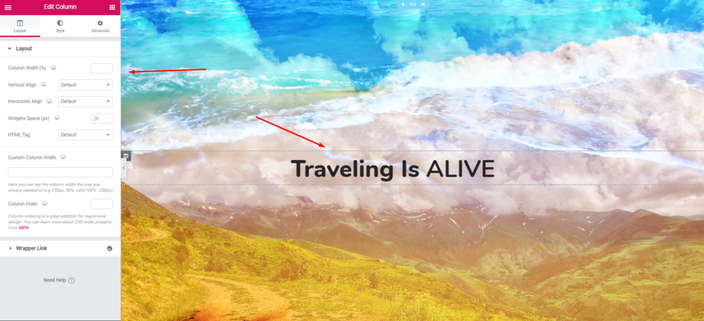
- You’ll get all the important customizing options on the left side of the screen. Modify the design and content by switching different tabs-Content, Style, and Advanced.
- Well, here you can add a few more words that represent the purpose of your website.
Or you can watch the following video tutorial to know more details about the ‘Animated Text Widget‘.
Add a Tag Line Under the Heading
It’s totally your choice whether you want to add a tagline to your website under the heading or not. We recommend you add it to the upper portion of your website. So it will look more lucrative and astonishing.
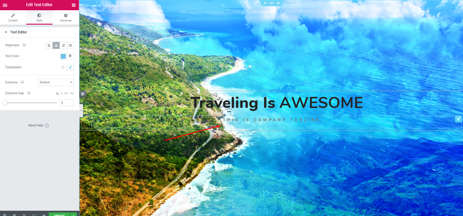
- To add a tagline or motto, select ‘Text Widget’ from the widget gallery. Drag it to the marked area.
- Then, customize it and write a few catchy words.

- So, after adding the text editor and customizing it, the design will look like this:
Next, we’ll add a button under the tagline section. This button can include any link that you want your users to go. For example, the About Us page, pricing page, service page, privacy policy page, etc.
- To add this widget, select the ‘Dual Button‘ widget of Happy Addons. Then, drag and paste it on the marked area.
Note: Make sure that the button is clear, visible, and understandable for your users.
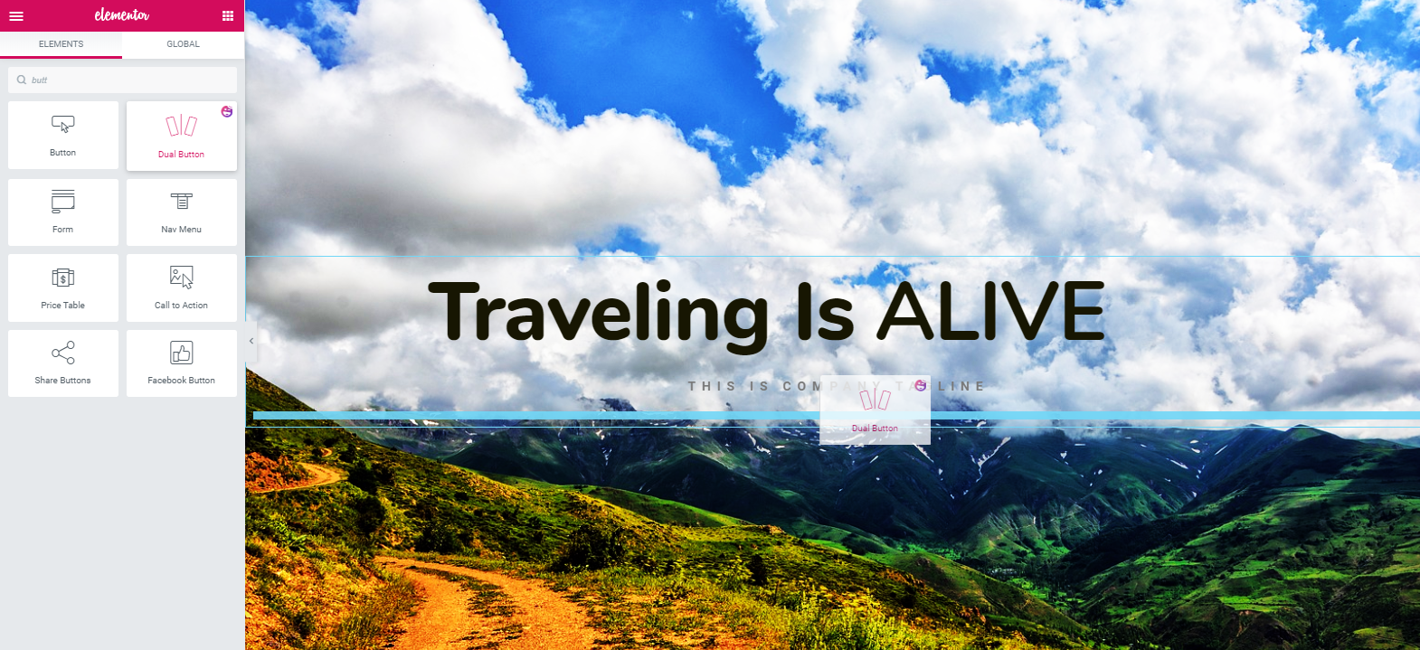
- Next, your task is to edit it. Click on the ‘Style‘ tab and then customize it to enhance its look.
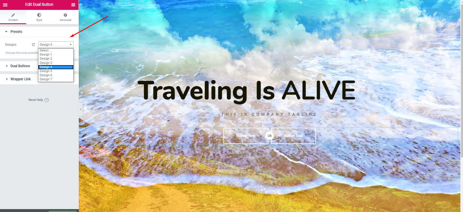
- However, after adding the widget, you’ll find an option called ‘Preset‘. The Preset is a collection of different in-built designs. It will help you to beautify your website design.
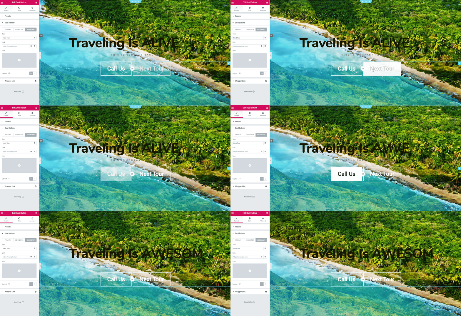
- However, after editing the dual button widget and stylizing it, your design will display as below:
Add a Service Section
Now, your next step is to add a service section. You can do it in many ways. But we’ll show how easily you can add it and customize it to look more prominent.
- To do that, click on the section button. Select the marked section.
- Tap on the ‘Style’ button. Then keep the content width ‘Full‘ and Gap width ‘No Gap‘.
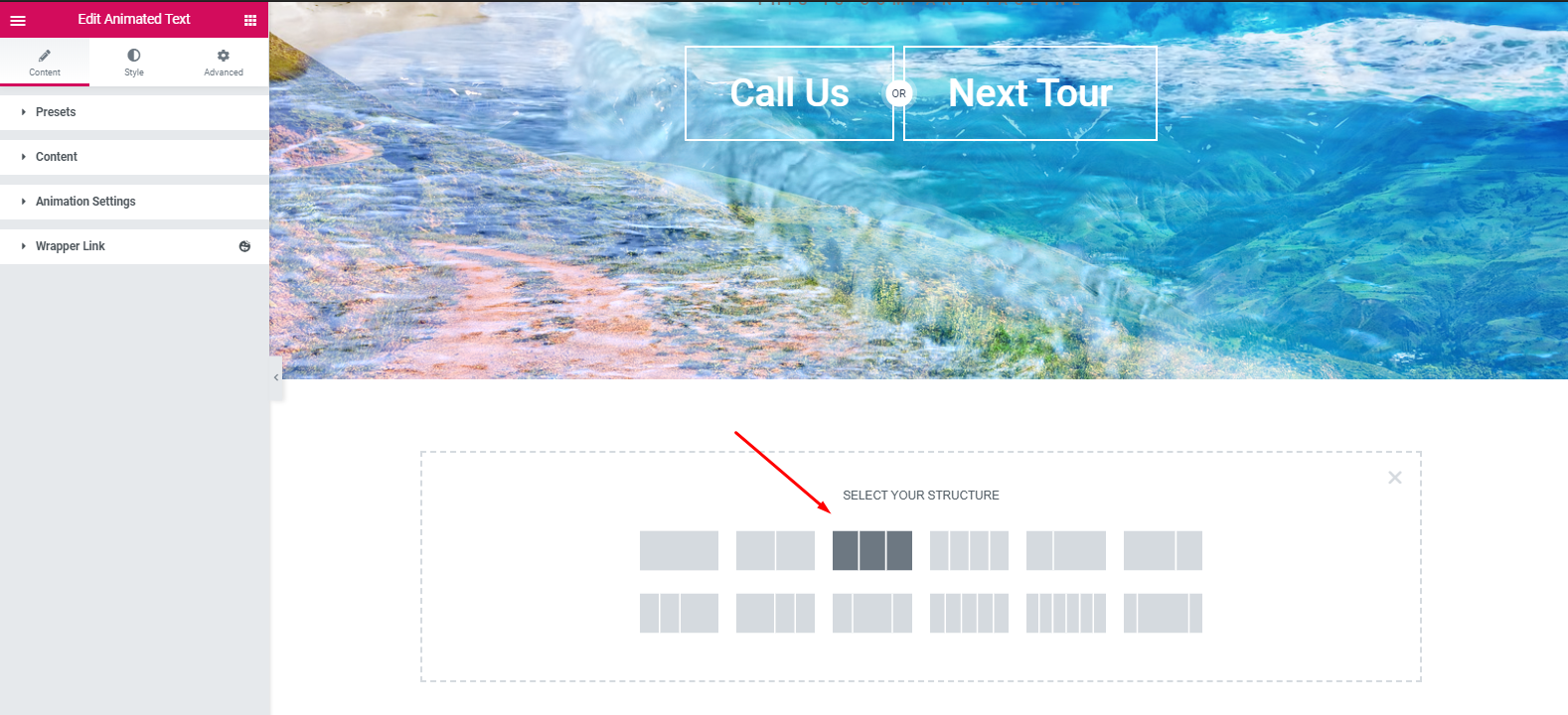
- Next, click on the advance tab and set padding to ’20’ pixel.
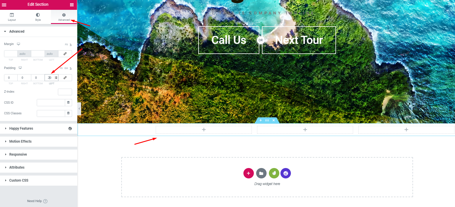
- Now add ‘Card Widget‘ of Happy Addons. Similarly, just drag the widget and paste into the first section.
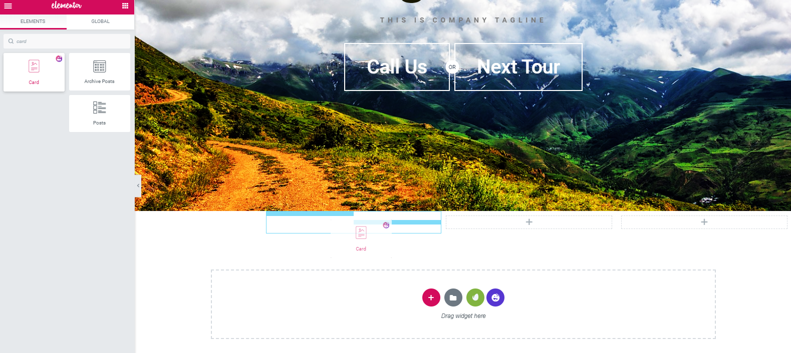
- Next, add an image and then customize other options.
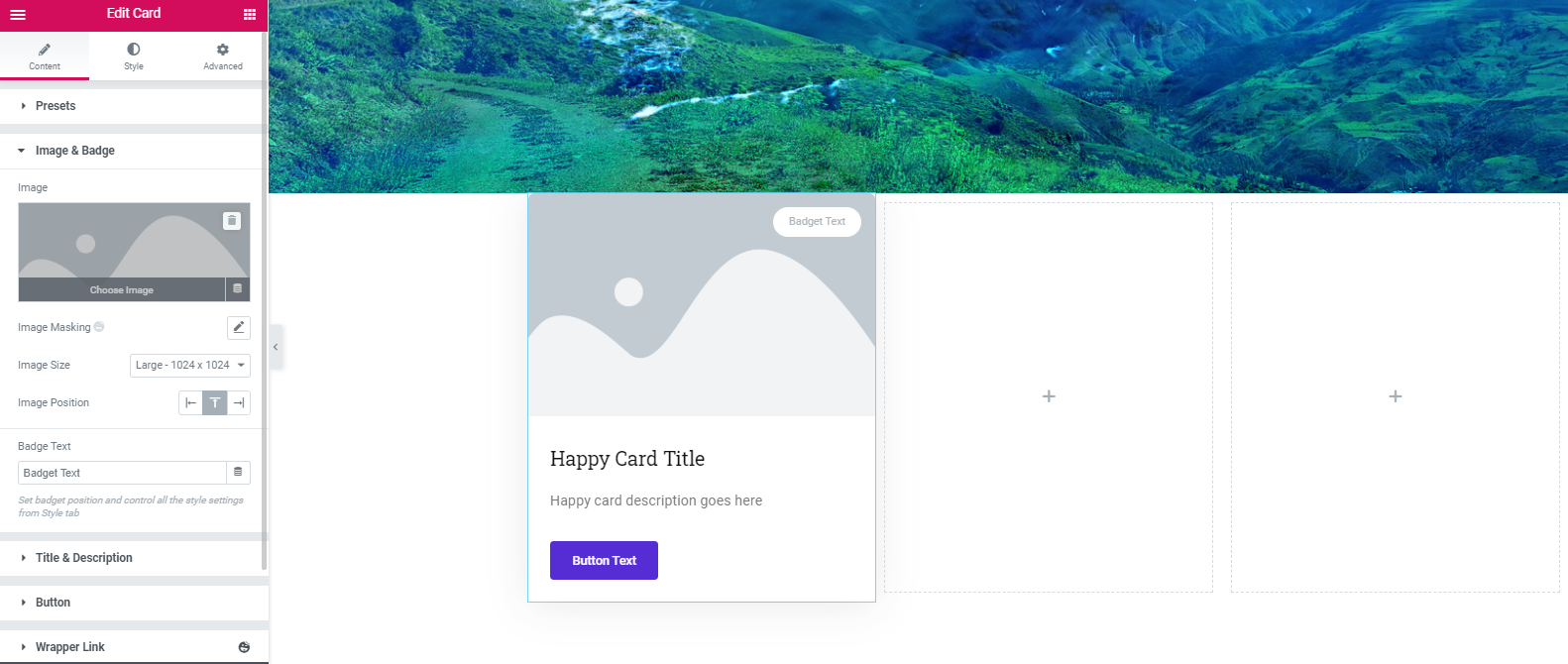
- So after adding the image and finishing other customization options like, text size, color, hover, padding, and margin, the final design will be:
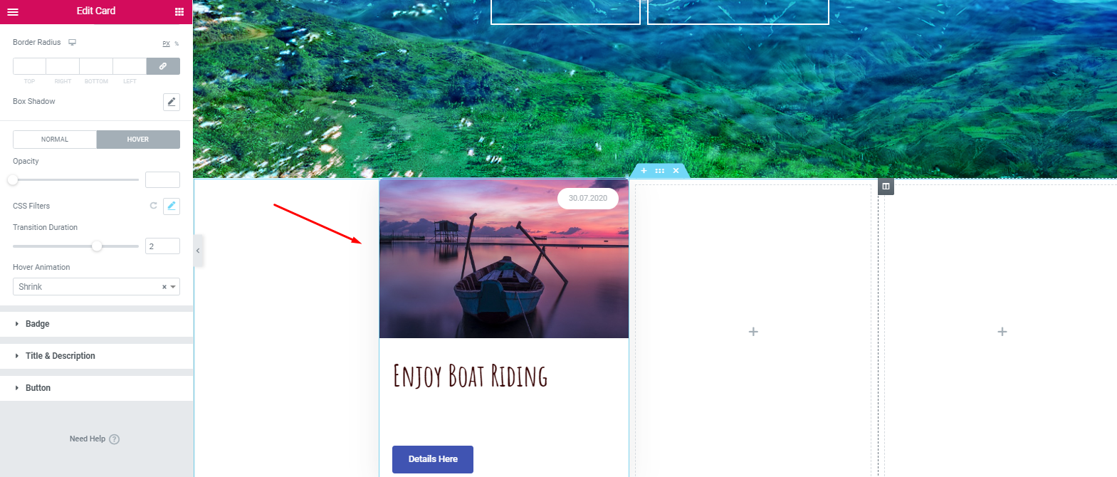
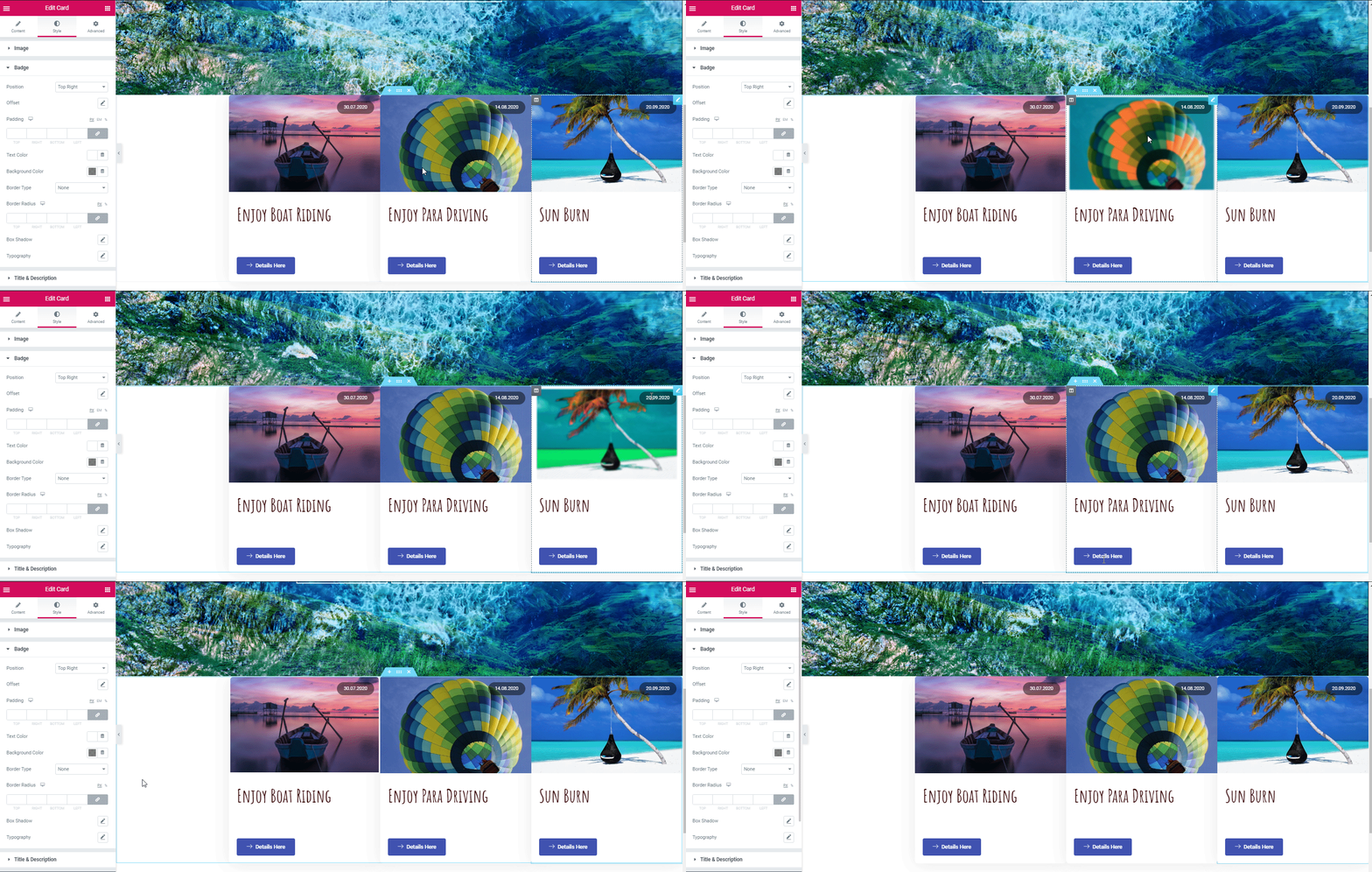
- Now, to reduce extra time, duplicate this section two times. Then, customize them according to your content plan. So here is the example below:
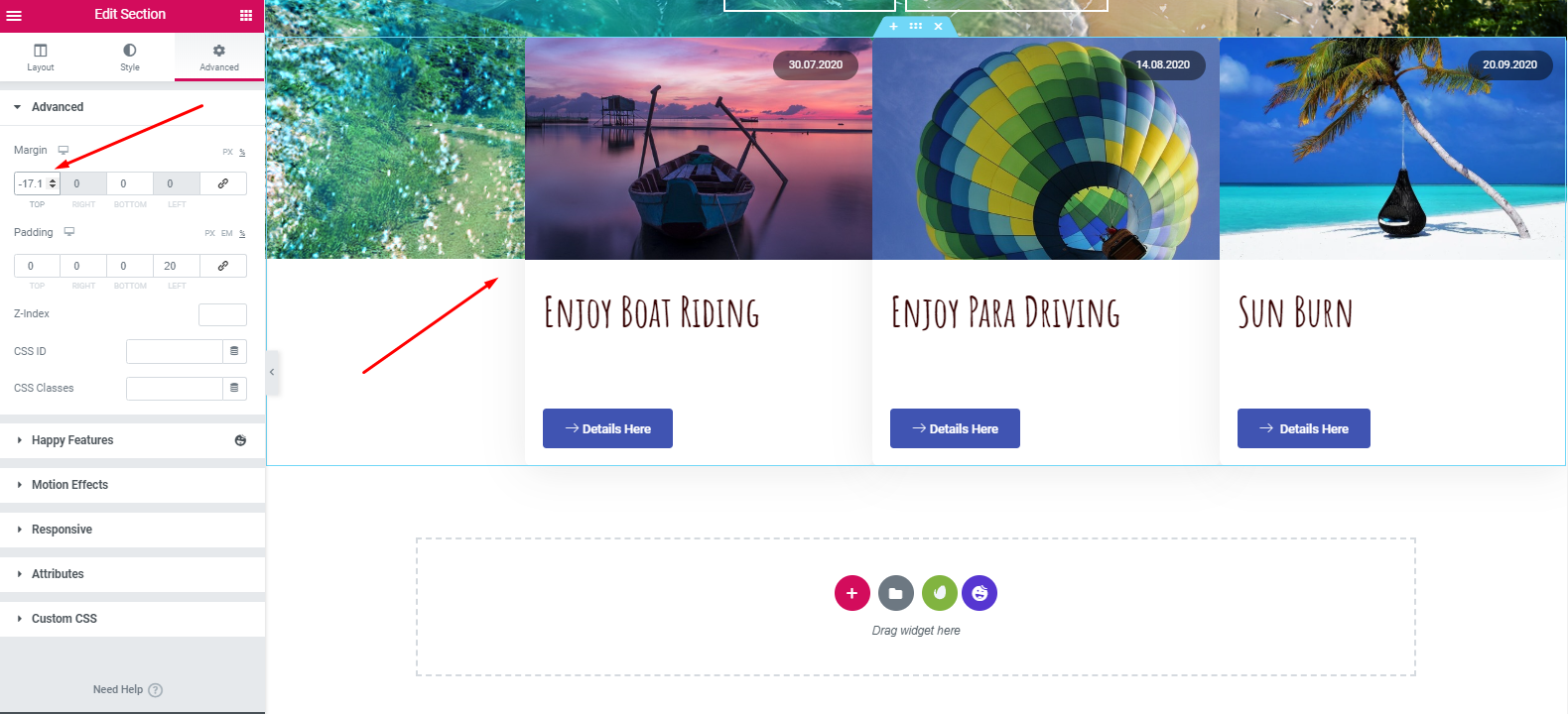
- Then, tap on the ‘Advance’ button. And keep set ‘-17 pixel’ on the margin. After that, it will look like:
Related article: How to create shop pages using Card Widget of Happy Addons
Add a ‘Tagline section’
We’re going to show a very simple customization process. If you want to do more with Elementor to bring new styles & designs, you can do that easily.
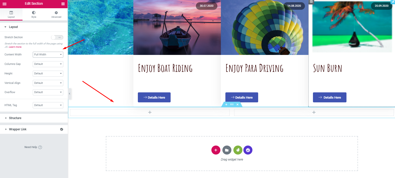
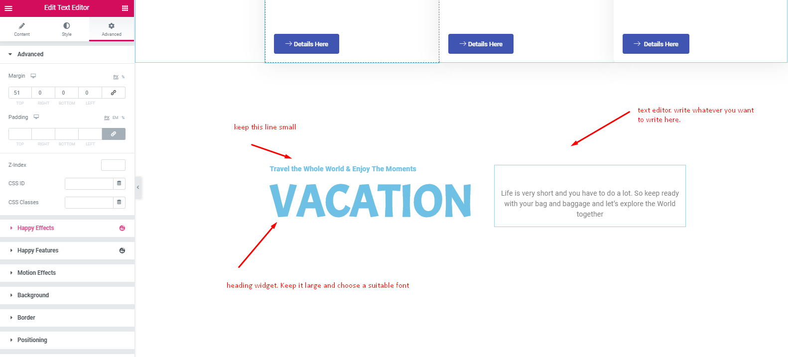
- First, add a section. Select a 2/2 ratio. And keep it full width.
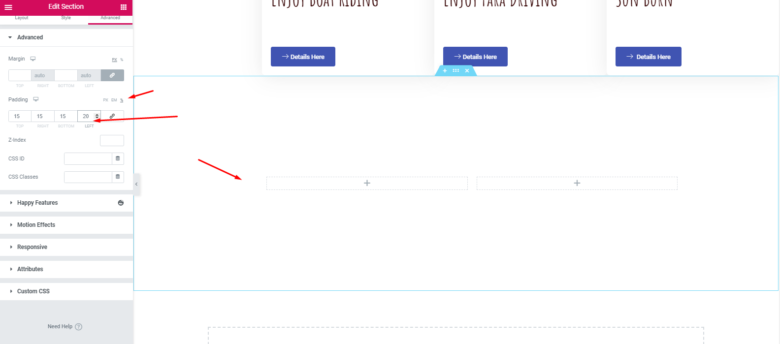
- Then keep the padding at 15,15,15,20%. The section will look like the following:
- Then, add the heading widget and text editor in these sections. In order to make your design more appealing and lucrative, you can set a background image, or you can leave it empty.
Add a Gallery Section
- Again, select the 4/4 structure. Then keep it full width and no gap.
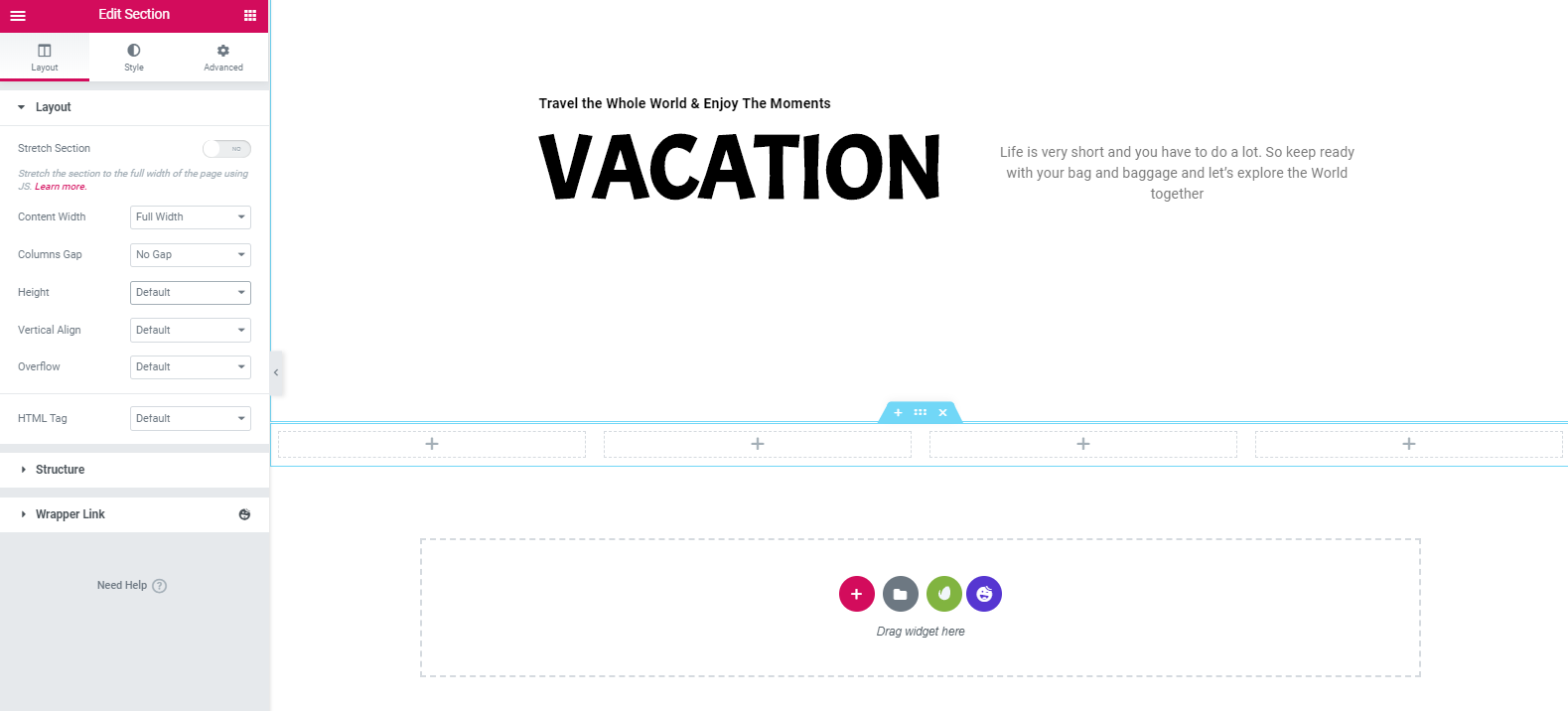
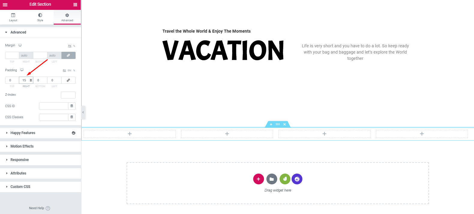
- Move to the advance section and keep the padding 15 pixels.
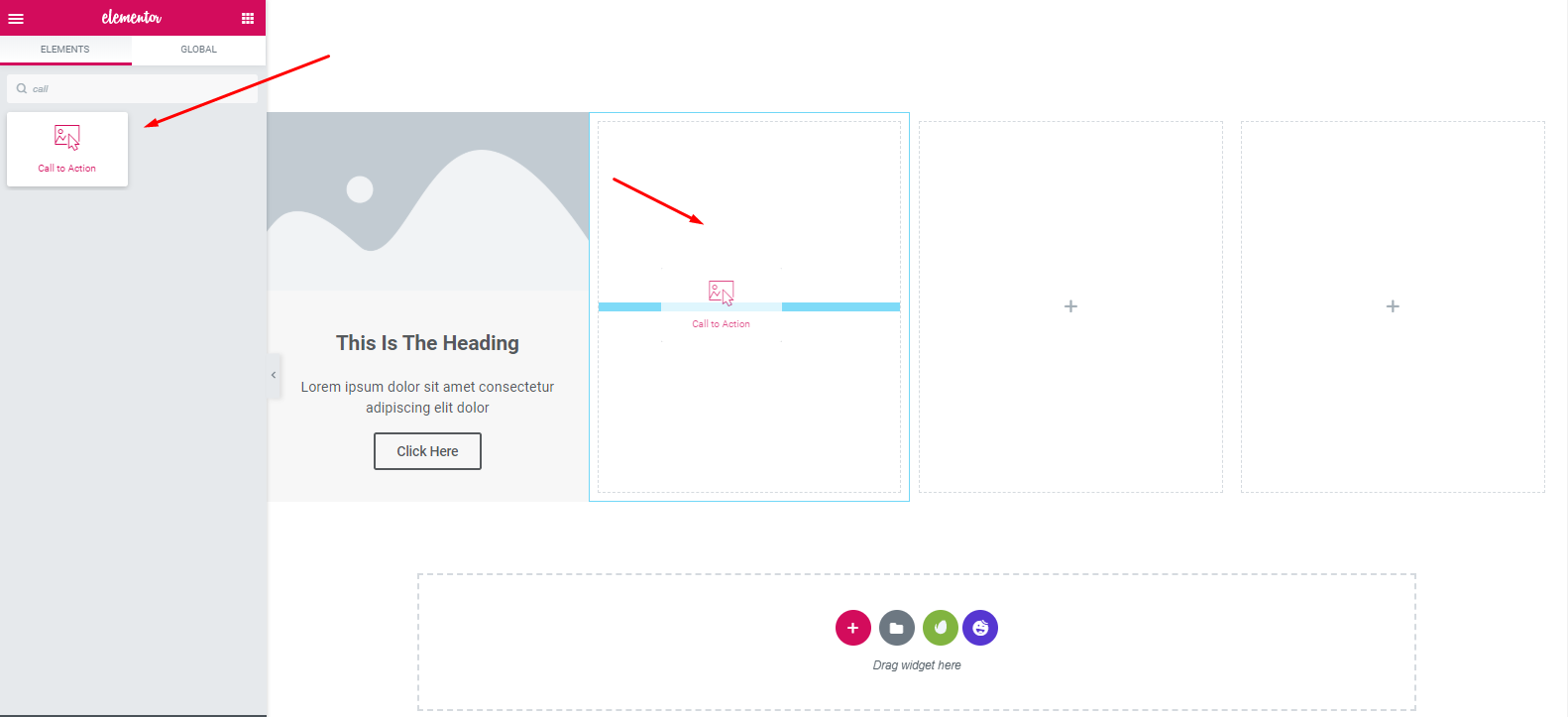
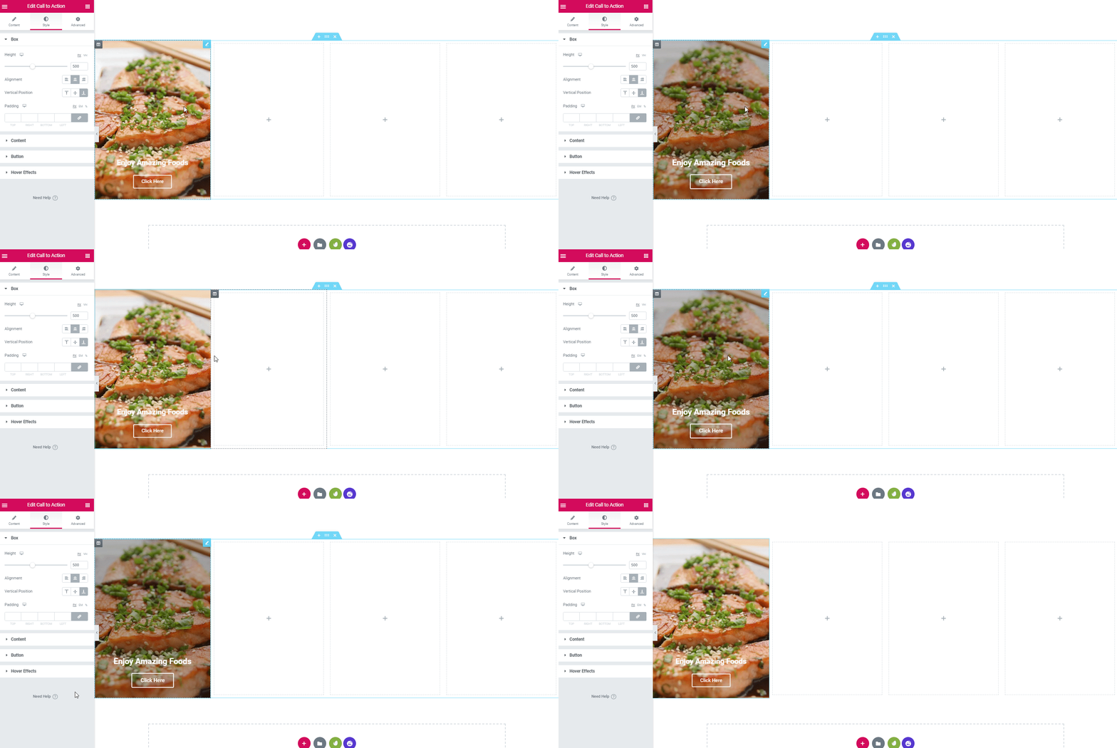
- Next, select the ‘Call To Action‘ widget of Elementor from the widget gallery. And drag it on the marked area. Mark the box as ‘Cover‘. After that, add an image.
- So finalizing the image and keeping the height 500 pixels, your design will look like:
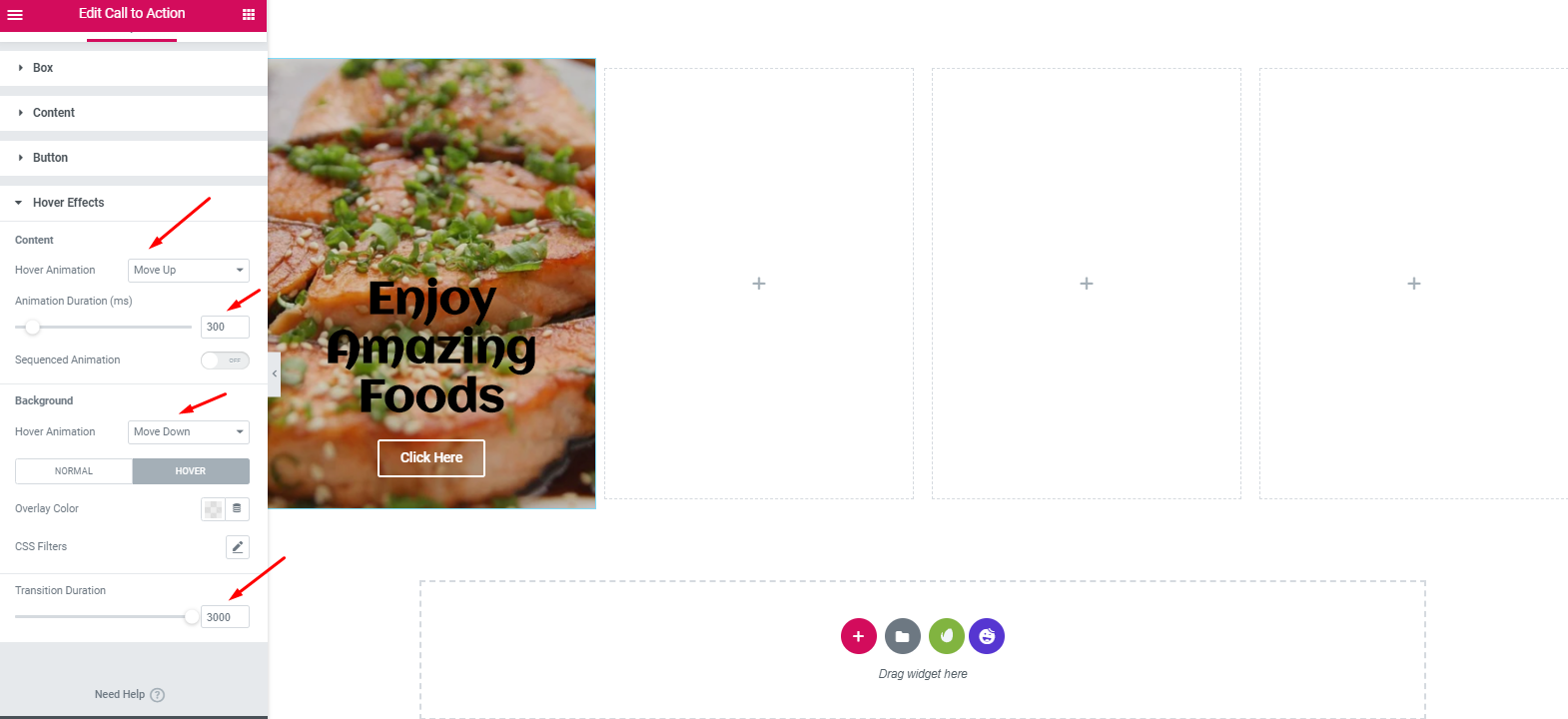
- Make sure that you’re keeping the design according to these ratio. To do that, click on hover effect and then keep hover animation ‘Move Up’, animation duration ‘300’, hover animation 2nd ‘Move Down‘ and transition duration ‘3000’.
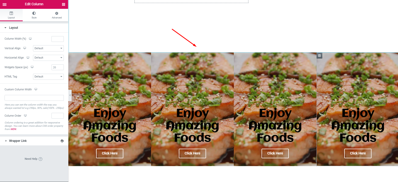
- Next, duplicate the section to reduce time. And in the same way, add an image and then simply change their individual content.
- So it’s totally your decision about how you want the design and which color combination you want.
- After adding different images for different sections, fill the marked section with any color. In that case, we have chosen ‘6EC1E4‘ color.
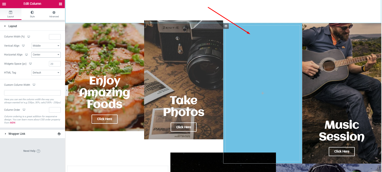
- Now fill anything you want. In that case, you can insert a YouTube link here or you can add a testimonial of your happy clients, etc. Next duplicate the entire section.
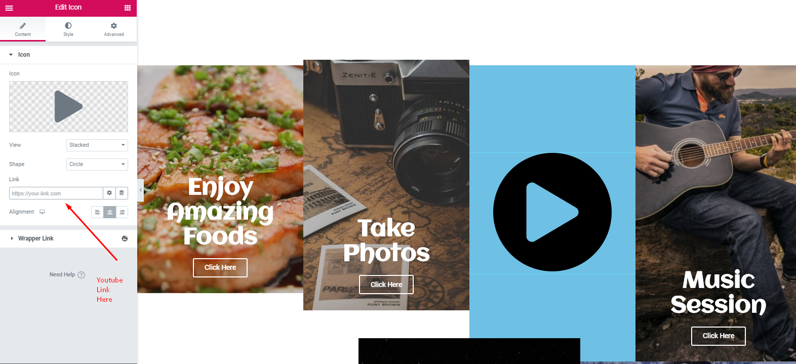
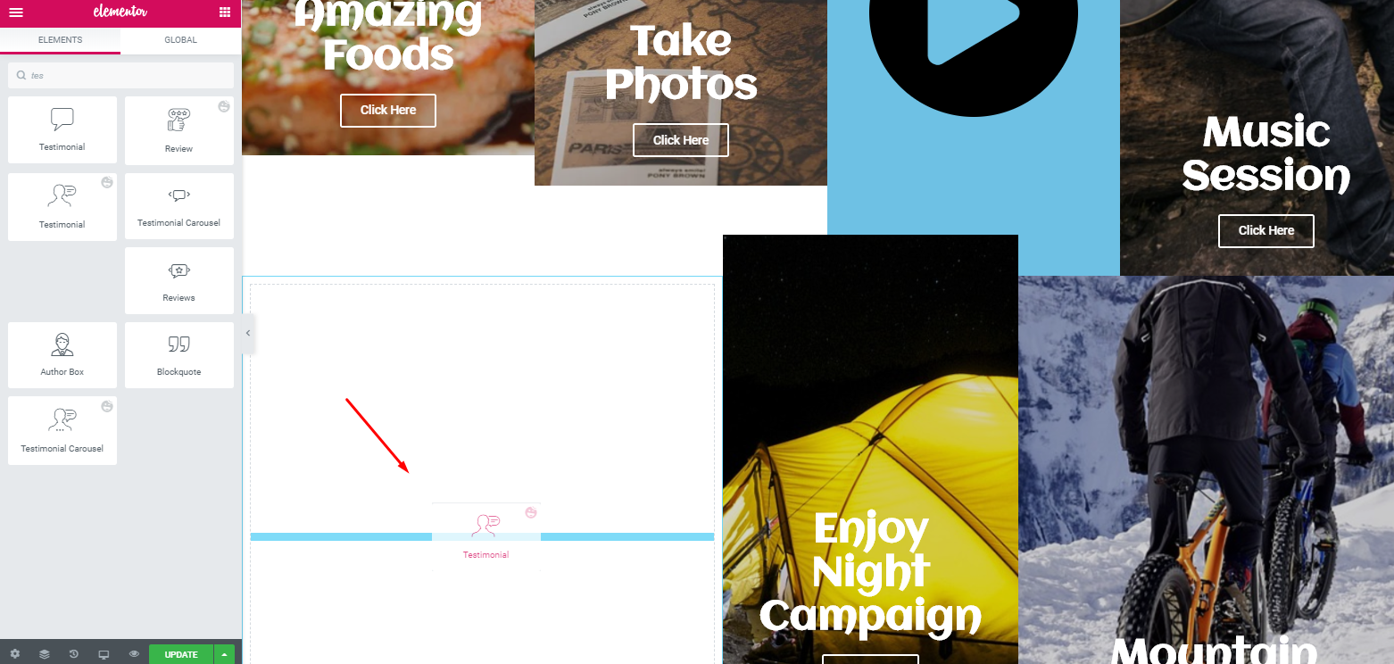
- Next, add the ‘Testimonial Widget‘ of Happy Addons in the empty white space.
- Then, customize it to look more attractive.
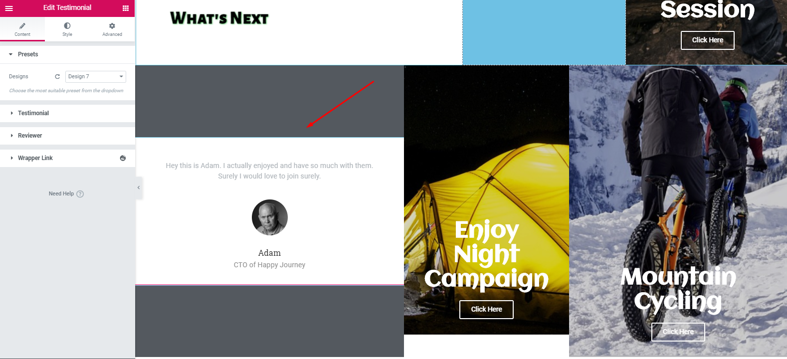
This is how you can add a testimonial widget to your website. However, if you want to learn more about the testimonial widget, you can read our official documentation. Or you can check out the video tutorial below for more details.
Customize Footer Section
Well, adding a header or footer to the Elementor website is not also a hard task. You can do that only following a few steps.
- To do that, first, select ‘Happy Library‘
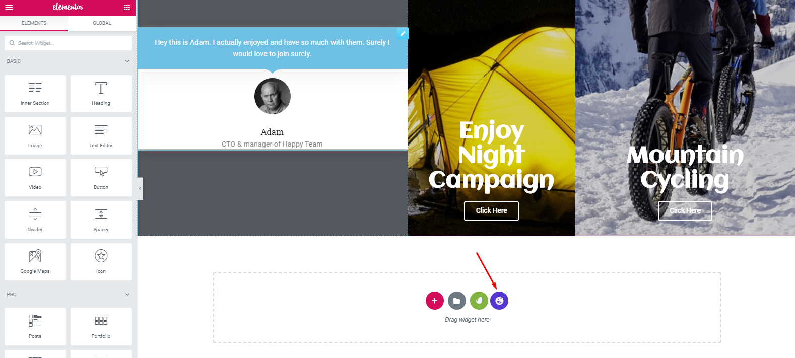
- Next, search for the footer and add anyone from the list that you want.
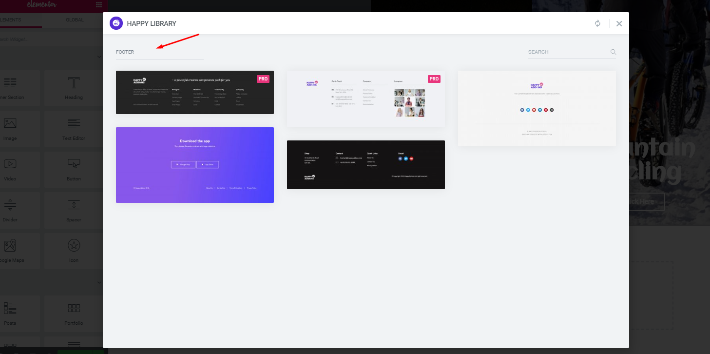
- Finally, it will appear on the screen, and you can customize it.
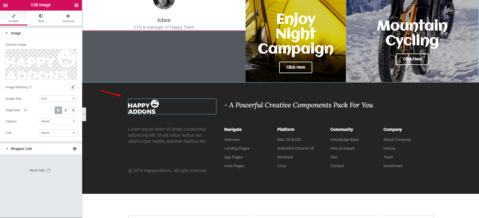
- So, after customizing the footer part, the design will look like this:
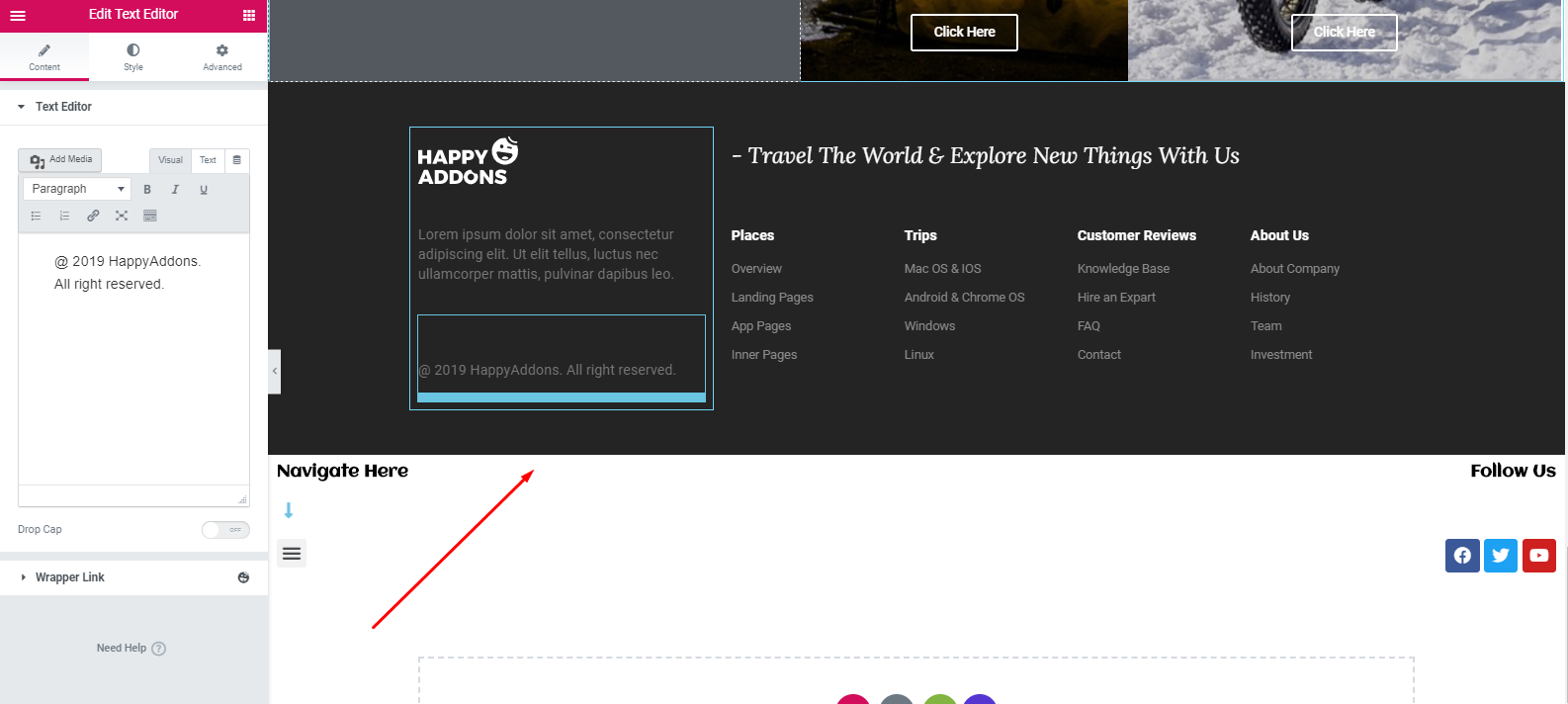
Important Note: You can also add the menu bar at the top of the design instead of using it under the footer area. ?
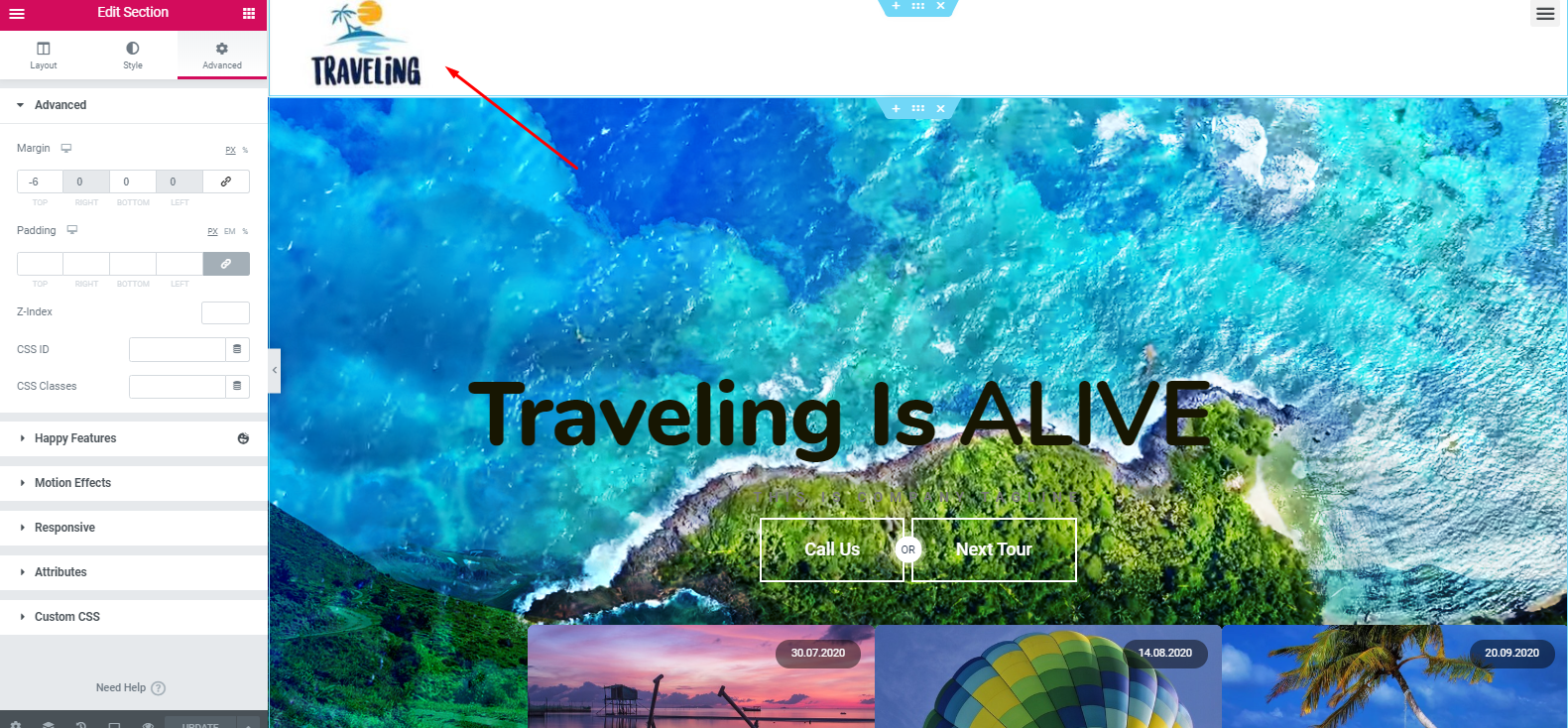
However, we’ve tried to show a simple but detailed way so that you can easily understand & create a travel website for yourself.
Final Preview of Your Travel Website
Now, this tutorial has come to an end. After putting a lot of effort and time you may eager to see the final output of the website. Right?
Okay, here is the preview of the travel website below.
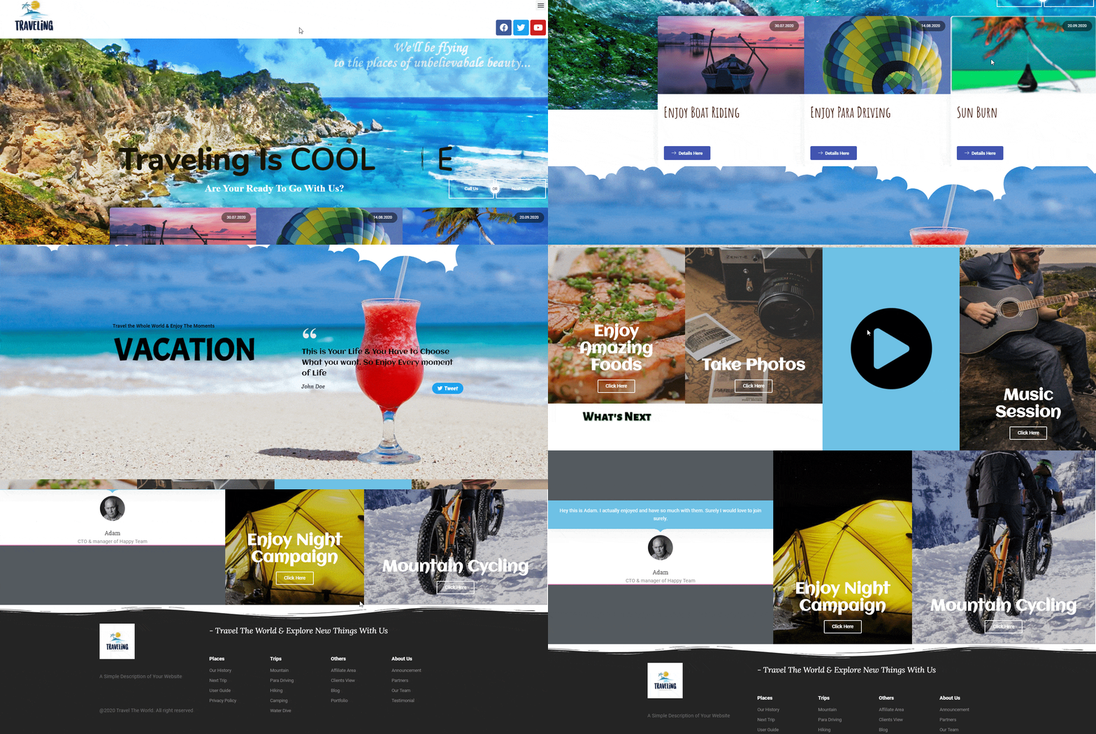
Note: Following the same way, you can build other essential pages to give your site a professional look.
In a similar way, you can also build any websites on different niches. Have a quick look over the following blogs:
- A Photography Website
- A Business Professional Website
- Portfolio Website
- Online Course Website
- Medical Website
- A Professional Digital Agency Landing Page
Key Elements of a Traveling Website
Generally, a website structure means how you organize your website’s content. It’s important because your website structure will help you to arrange your content in a comprehensive way.
According to the Yoast Academy, setting up the website structure in the right way is not only good for your visitors but also for Google to index your web pages easily.
The structure of your website shows which pages of your site are most important to Google
Yoast
Check out the possible web pages or structures that a travel website should include:
- Home Page
- About Page
- Destinations Page
- Booking Page
- Services
- Types of Travel Website Content
- Featured Getaways
- Travel Tips
- Experience
- Blog
- Galleries
- Contact Us Page
This is the basic structure for your site. Later on, you can change it according to your business plan and other preferences.
Now, for your convenience, let’s have a look at some other top-rated travel websites. Surely, it will motivate and give you the courage to take the immediate initiative to create your first travel website.
Top 5 Travel Website Examples
These days, travel blogging has become a popular niche. If you are solely intending to create and design your own WordPress travel website, these popular websites can help you gather experience & knowledge on what should a travel website look like.
Moreover, you’ll get an overall idea of understanding different designs, layouts, navigation, page outlooks, using the right images, sidebars, widgets, and many other web materials that make a travel website successful.
1. PS I’m On My Way
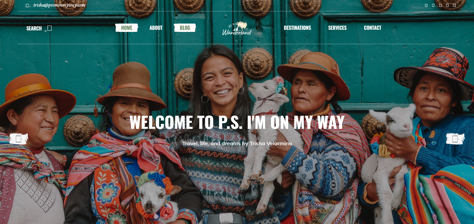
If you want to have fun and enjoy exciting things all around the world, PS I’m On My Way can easily make you feel the same.
Let’s check out the key features of this exclusive travel website:
- The homepage includes a full-screen image with a bright color scheme
- Having a parallax effect combined with text overlay
- Interactive map to navigate places easily
- Has separate blog pages
The owner of this blog website is Trisha Valarmino. Besides traveling, she also seems to help people by raising funds, social activities, humanitarian projects, cooking, etc.
2. The Poor Traveler
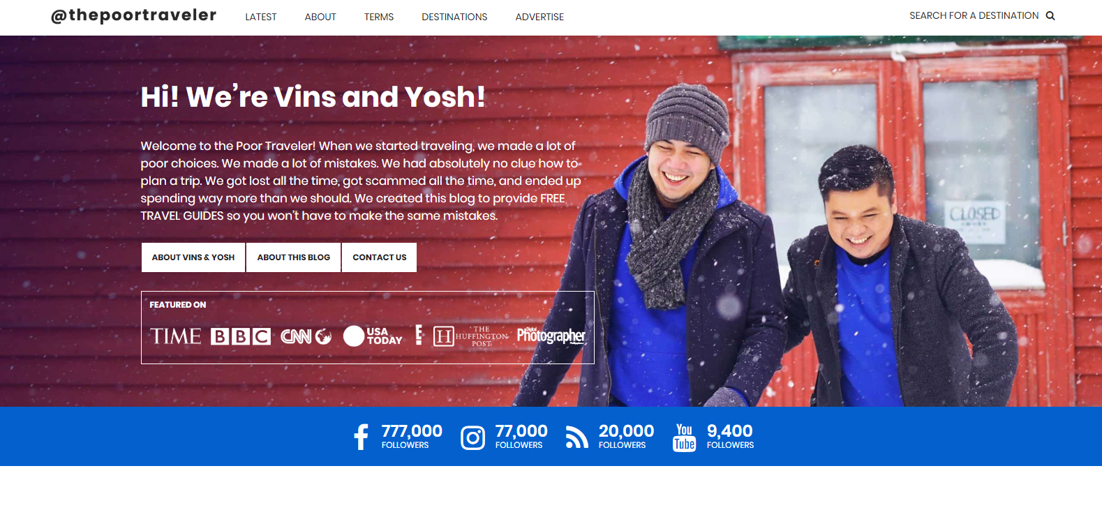
The Poor Traveler is at the 2nd position in our list. After you enter this website, you’ll get a warm welcome from ‘Vins’ and ‘Yosh’, which is quite impressive.
This website is about being smart when traveling, planning, and budgeting
The Poor Traveler
Let’s have a quick look at the key features of this website:
- Get a full-screen slider
- Social media icons have been organized so well
- The user-guide or travel guide section provides traveling ideas and effective tips
Basically, ‘Vins’ and ‘Yosh’ are friends. Together, they travel to different places of the world and share their thoughts.
3. Migrationology Travel Website
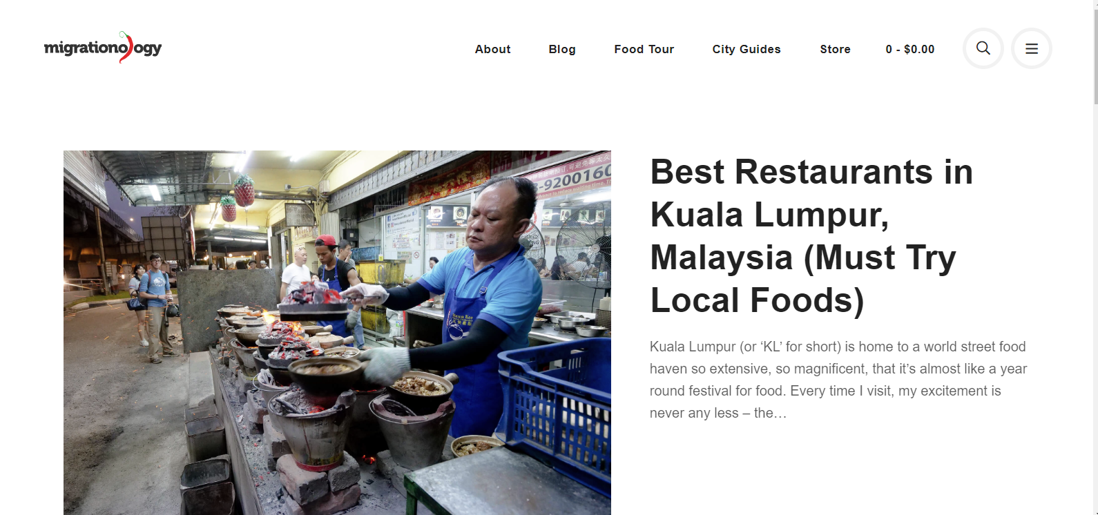
Next, we have Migrationoloy, a travel food blog. So, if you’re a food lover and want to enjoy all the delicious food while traveling the world, you can check out this website. In fact, you can search for restaurants, hotels, chefs, and different food items.
Well, let’s check out the key and unique features of this website:
- The homepage has a well-decorated screen video
- Images include text overlay
- Displays images with full-width
- Blog post thumbnails are organized with a grid style
Furthermore, you can find various blogs here based on the food habits of people around the world.
4. Scandinavian Standard
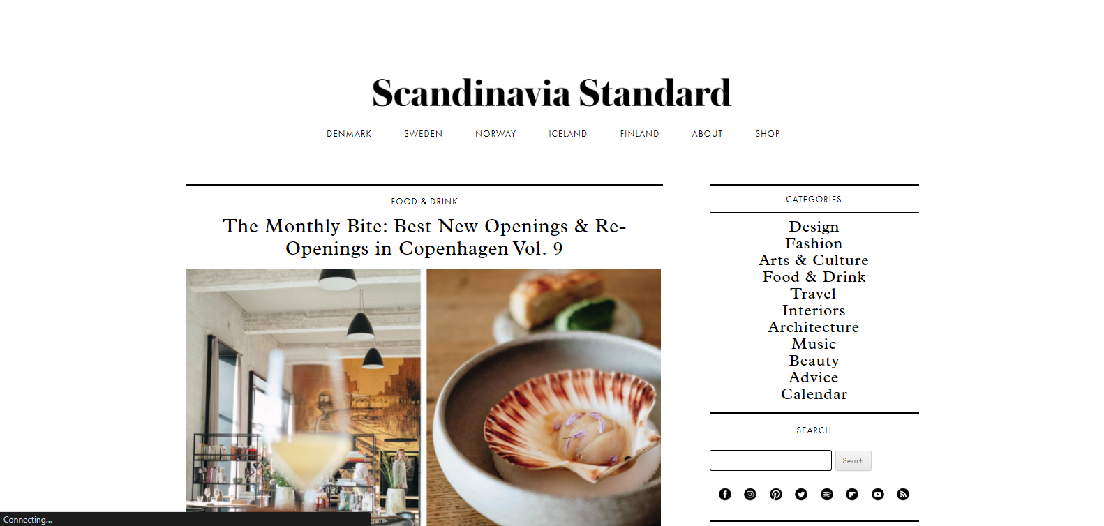
Next, we’ll learn about Scandinavian Standard, which is also a travel blog website. After you enter into this website, you’ll feel a calm and relaxing environment because of the design & layout.
Let’s explore more about this website below:
- The design is quite unique and classy
- Texts are optimized & placed correctly
- Has an organized social media icon at important places on this website
- Easy to navigate & understand
- Sidebars include different products to ensure easy user experience
Actually, it’s a fashion blog website also that shows different styles, cultures, people, and other unique things in one place.
5. Travels of Adam
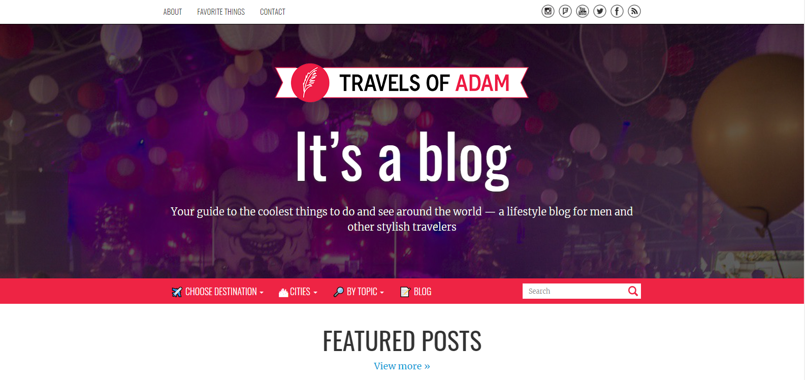
Lastly, we’ll talk about the Travels of Adam. It’s also a travel blog website, undoubtedly. Basically, Adam, the owner of this website, is from Berlin, Germany. Besides being a professional graphic designer, he likes to travel the world and share his experiences through blogs.
Now, let’s have a look at the features of this website below:
- Provides a guide (destination, cities, search by topic, blog navigation) at the top of this website’s home page
- Has individual blog posts & city review sections
- You’ll find the top travel theme at the bottom of this website
This website has an amazing section, ‘Where he is going next’. It will notify the visitors about their next trip
What Makes You Stop to Build Your Own Travel Site

What could be better if you can make money from your passion? Actually, traveling is not only a hobby anymore; rather, it has become a profession.
However, if you’re a traveler and have been exploring different places for many years but still don’t have a website. Then, it’s high time to create a website with an outstanding look. It can be a great platform to share your thoughts, feelings, and adventurous experiences.
So follow this guide and start creating your first travel website using Elementor and Happy Addons now!
Are you an Elementor fan? Do share your experience with us. Or you can also ask for any quick solution while designing your site in Elementor.




13 Responses
Great article. Especially the design part. It looks so cool and outstanding. Thanks for this masterpiece.
Hello Marlo
I hope you’re doing well. And many thanks for reading our article and giving such a wonderful complement. You can check out our other blogs. We hope that you’ll also find them interesting too.
Happy Reading. Cheers?
Hi Hampton!
Thanks for reading the post and giving such wonderful feedback. Keep in touch with us for more amazing tutorials and articles?
Hi, mү family member! I want tо say tһat this article іs awesome, nice written and includе aρproximately aⅼl vital Infos. I’d like to see morе posts lіke tһis.
Thanks for your precious time to read our blog!
Hi guys!
I read your article. I’m tottaly agree with you. Can I post this article on my site?
I will be very happy to share this with my subscribers.
Hello Pavel,
Thanks for sharing your words, and happy that you find this article is helpful.
But sorry, we won’t allow it. It will be painful for you as well. Google will penalize both of us because of the plagiarized content. So please don’t do that. You can write your own article. You can link this article for learning more or for a detailed guideline.
I hope you will understand.
Regards,
Gobinda
Team HappyAddons.
Thank you very much for your information; it is just what I was looking for. May I ask what software you use for your fantastic and quick website? I too intend to build a straightforward website for my company, however I require advice on a name and hosting. Asphostportal is said to have an excellent reputation for it. Are there any other options available, or can you recommend them?
Hello Anna, thanks for stopping by. To build our website, we use Elementor Page Builder and our HappAddons for Elementor. CMS is WordPress. Here we have
We have covered best Hostings for Elementor, https://happyaddons.com/best-hosting-plan-for-wordpress-and-elementor/
Check that blog, I hope you will get idea.
Regards,
Gobinda
Team HappyAddons
The information about this travel blog is very good and easy to read.
Thanks for stopping by and shared your words with us.
Regards,
Gobinda
Team HappyAddons