



The modern web industry is constantly evolving. Visitors today expect more comfort and better experiences from websites than ever before. This is why UX design has been so important. According to HubSpot, 88% of customers are less likely to return to a website with a bad UX.
By understanding the basics of UX design, implementing intuitive navigation, and utilizing A/B testing, web owners can ensure the best possible experience for every user. This article will reveal the secrets of how to improve website user experience (UX) and take it to the next level.
It’ll also cover some more valuable points like how to measure the user experience of a website, elements to include, and more. So, get into the discussion without wasting any more time.
What is User Experience in Web Design?
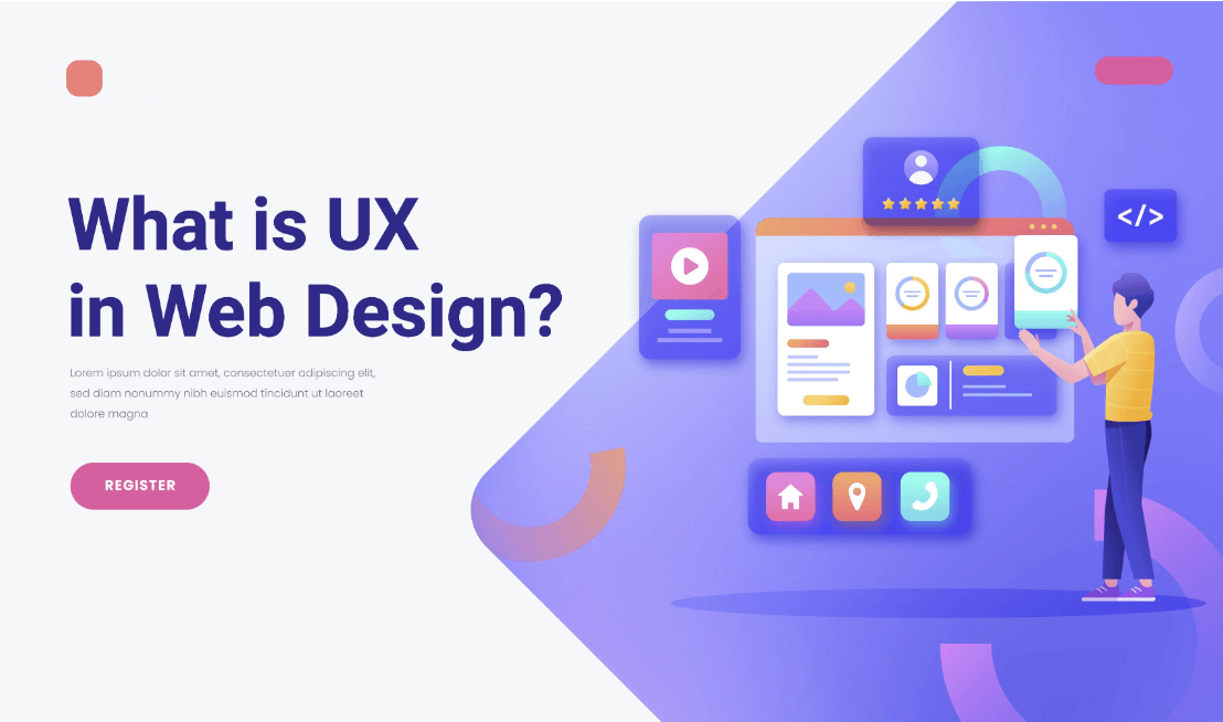
User experience (UX) refers to the feeling people display while navigating a website, whether from a desktop or mobile phone. It is often interchangeably used with the terms ‘usability’ and ‘user interface design‘.
The wonderful user experience of a website indicates it has an easy-to-navigate surface, a simple layout, contrastable color consistency, engaging typography, and more. You can uphold the brand value of your site and create a heavenly environment by enhancing its UX.
Factors that Influence User Experience
Several factors robustly influence the user experience of a website. We call them the elements of UX design. Let’s have a quick look at them below what they do.
- Usability – How easy is your website to use?
- Usefulness – Defines if it can satisfy the user requirements.
- Value – Whether the web content has utility and is worth users’ time.
- Credible – Explains if visitors can trust your content and brand identity.
- Findable – It lets people easily navigate your website.
- Desirable – Can it resolve the needs and queries of users?
- Accessibility – It allows people with audio-visual disabilities to perfectly explore web content.
Note about Accessibility: Dyslexia and color blindness are two common visual disabilities that many people can’t read out texts well if the font, style, and color don’t suit with readers’ eyes. If the audio-video files on your websites aren’t noise-free, people with hearing disabilities will fail to catch them. We will talk more about them in the following parts of this write-up.
Statistics on the Importance of User Experience in Web Design

A well-designed user experience helps you create a catchy web interface and takes its presence to the top of the search engine result page. Below are some intriguing statistics on the importance of user experience in web design.
- 75% of customers judge the credibility of a website based on how it looks – Pop Web Design.
- Every dollar spent improving UX returns $10 to $100 – UX Planet.
- Businesses lose sales by 35% due to poor UX – Amazon Web Services.
- 0.1-second site speed increase can bring lots of sales – Deloitte.
- Over 50% of users will avoid a website that isn’t mobile friendly – Think with Google.
- 70% of customers abandon their carts due to poor UX – Kinsta.
- A good interface can improve the conversion rate by 200% – Intechnic.
Hope these statistics are enough for you to understand the importance of user experience in web design. You will find lots of similar stats like these online.
Secrets on How to Improve Website User Experience
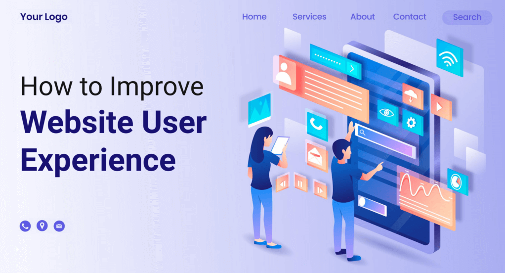
There is no end to the discussion of how to improve website user experience. Newer advancements will continue to revolutionize this segment over time. But there are some evergreen secrets without which it’s impossible to offer meaningful experiences to the users. Let’s explore them in this section.
1. Use Simple and Clear Navigation
Navigation helps you take users to the most important post, pages, and web sections. Make sure your header, footer, FAQ section, etc., are clearly visible. Today’s users already have a sense of where to find these navigational elements.
All you have to do is keep the navigational language easy to read and properly understandable. And maintain a hierarchy while designing the navigational mapping in which the most critical categories and elements will come on top.
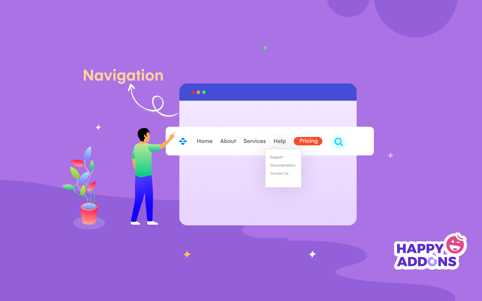
Note: Sticky transparent header is a new trend in the web industry. It is a navigation bar that stays fixed at the top even when users scroll down their web page. Here’s how to create the sticky transparent header.
2. Differentiate Hyperlinks
The hyperlink is a word, point, phrase, or sentence that can take users to another location. Web owners use it to grow their internal and backlinks and pass traffic to other posts and pages. Most websites use a contrastive color, underlining, and more to differentiate their hyperlinks.
The length of hyperlinks carries a value. It can have a positive impact on improving your domain authority. So, don’t randomly select a word or phrase for hyperlinks. Select words in such a way that they become meaningful and trigger visitors to click on them.
3. Use Images Wisely
Long content without images becomes boring to web users. Meaningful images make your discussion vivid. Several studies have found that people remember 80% of what they see and 20% of what they read. The reason is that 65% of people around us are visual learners – Prof. William C. Bradford.
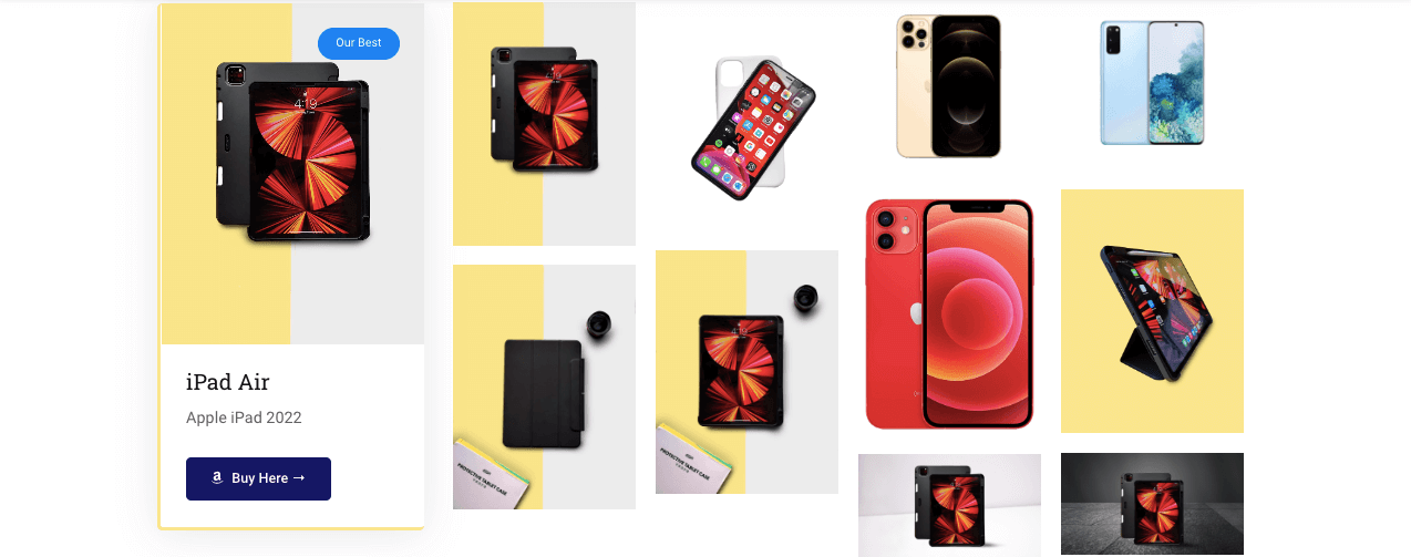
You will find endless fascinating stats on it. Apart from all these, quality images are helpful to boost your SEO scores. Adding descriptions and alt-tags that are properly optimized with keywords can help your content appear both in the web and image sections.
Note: Most newbie users tend to copy images from other sources even if they are copyrighted. Never make that mistake. Freepik, Canva, Unsplash, and Pixabay are some great sources for finding copyright-free images.
4. Apply the Right Color Scheme
Color has a mighty power to influence human psychology in different ways. It’s an influential element to amplify the design aesthetic of any website. According to many top design firms, 39% of people value color more than any other element of web design – HubSpot.
Applying the right color scheme can help invoke emotional attachment, create a visually pleasing environment, and present all the web sections in a differentiable way. If you don’t know how to select the right color contrast, here’s an article best website color scheme for modern web design.
5. Use Easy to Read Typography
Without a good typography sense, it’s impossible to take your website to the greater stage. Yet it’s one of the most overlooked aspects of UX and web design. Typography refers to the composition of fonts, typefaces, contrast, consistency, alignment, etc.
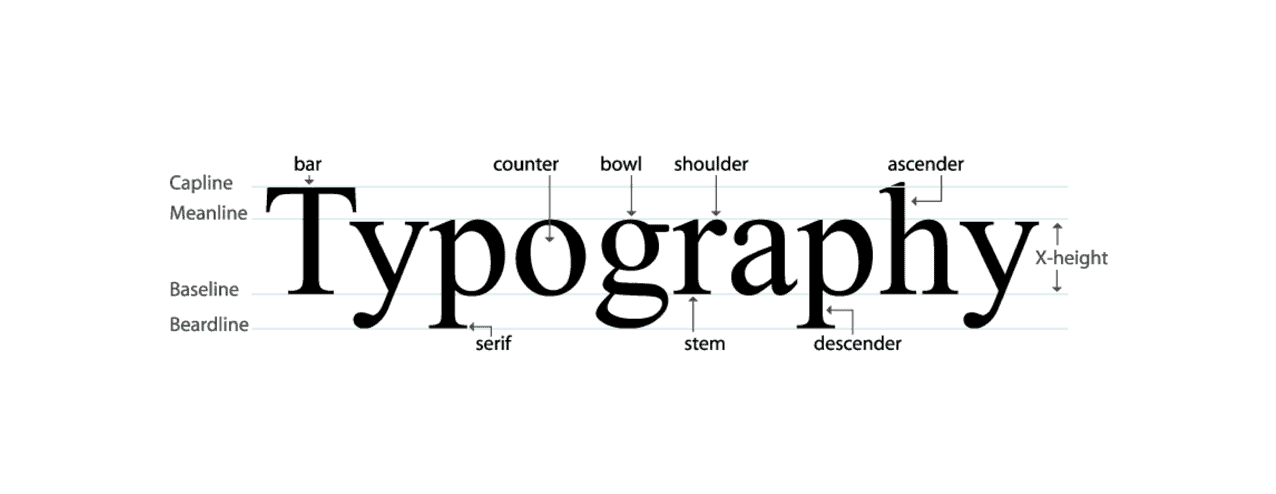
Dyslexia, color blindness, amblyopia, and glaucoma are some common eye disorders. Among them, at least 10% of the population around us suffer from Dyslexia – British Dyslexia Association. It means failing to choose the right typography will cause you to miss out on a large number of potential readers.
Explore the fundamentals of typography in modern web design.
6. Keep Enough White Space
White space refers to the blank space between all the elements on a website. Some web developers still believe showing too much content in a limited space can satisfy web users. But things have changed a lot. According to Neil Patel, today’s average visitors are skimmers, not readers.
Showing up too much in limited space means you give them less opportunity to read your content. It can be boring for them too. So, don’t saturate your web pages with too much content. Use the F-shape pattern to publish them. Because it follows the common eye movement of online users when they visit a website.
7. Create a Website Wireframe
A website wireframe is a blueprint that helps you visualize how all the parts on a website will look after it comes online. With this approach, you can map out the structure of your website and fix the placement of all important elements before you start coding.
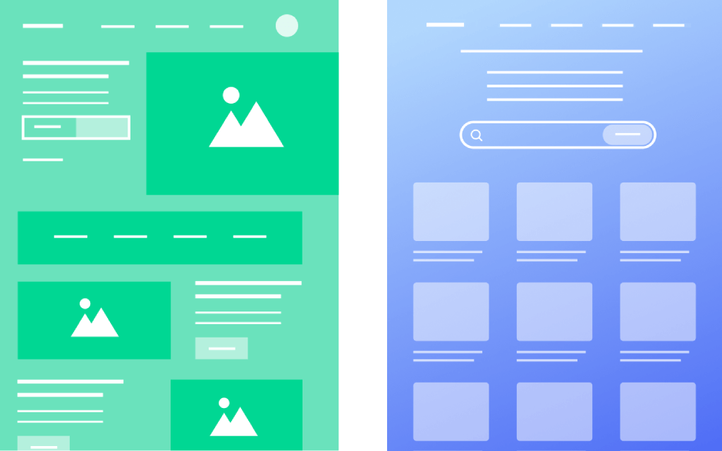
So, you don’t have to take the hassle of correcting white space, header, footer, CTA buttons, etc., over and over again while continuing your design. If you are a freelancer and work for a client, wireframing can allow you to take the client’s confirmation in advance whether he likes the design. Thus it can save you time a lot.
8. Use Attractive Call to Action (CTA) Buttons
Call-to-action (CTA) buttons play an important role in converting users to the ones you want. According to Creative MMS Today, revenue is increased by 83% when CTA buttons are well-placed and relevant to the sections. There are different types of CTA buttons used on the web. The popular ones among them are shown in the image below.
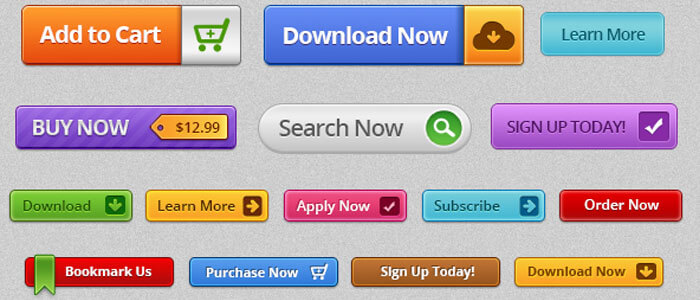
How to create engaging CTA buttons that convert? Be clear, use commanding verbs, apply catchy colors, write engaging copy, add fancy graphics, and highlight the key values. Explore the best practices for creating killer CTA buttons.
9. Eliminate Redundant and Unnecessary Elements
If you don’t know how to make your website fresh and clean, try eliminating the redundant and unnecessary eliminates. Below are some proven tips you can apply.
- Don’t show pop-ups multiple times during the same user session.
- Normalize links, CTA, and navigation menus that don’t work.
- Stop automatically playing any sound or jingle, as it may scare some users.
- Never publish the under-maintenance pages.
- Remove Splash pages.
Note: A splash page is a page that automatically precedes before users step on their desired landing page. Instead, you can show modal or slide pop-ups.
10. Be Responsive and Mobile Friendly
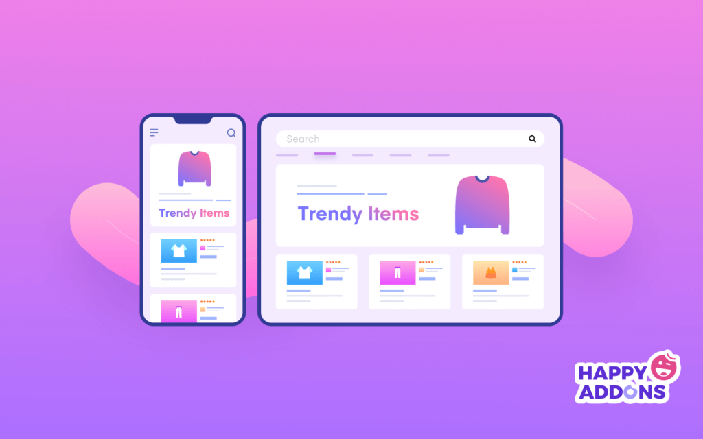
Mobile responsive websites are highly likely to rank on search engine result pages. The reason behind that is over 50% of traffic for any website today is generated from mobile devices – HubSpot. But to many web developers, this mobile optimization process becomes a lot boring.
Because they have to update the shapes, patterns, positions, and font sizes for mobile devices based on their screen sizes. A quick solution you may adopt is installing a mobile responsive theme. It will automatically optimize all the elements of your website for mobile devices.
11. Optimize Page Speed
From Unbounce, over 70% of customers have admitted that page loading speed strongly affects their willingness to purchase products from online retailers. If a page takes more than five seconds to load, you shouldn’t expect anything better from that site.
Infusing too much weighty graphical content while designing is the key reason why a website may become excessively heavy. There are many tools and manual ways by which you can reduce your content size to optimize page speed.
Check out the best WordPress caching plugins to optimize your page speed.
12. Be Careful in Ad Showing
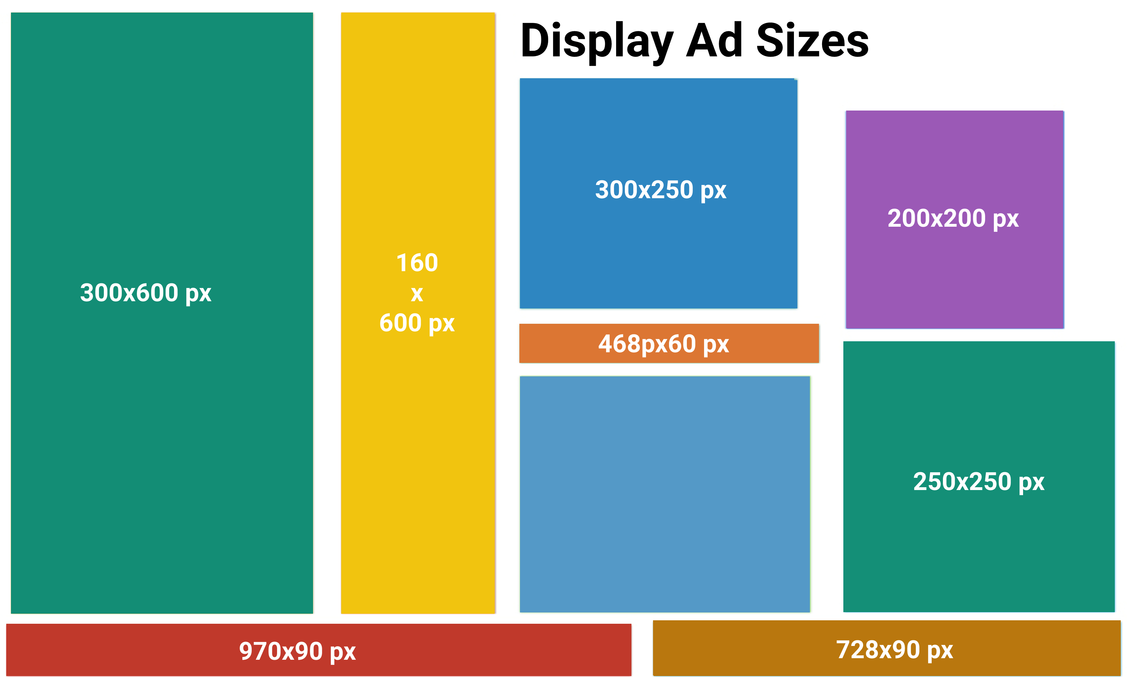
Ad is a powerful way to monetize any website and generate earnings. But randomly selecting a place and publishing any size of the ad can destroy the visual environment of your website. According to Google, the top-performing ad sizes are 600*600, 160*600, 300*250, 200*200, 468*60, 250*250, 970*90, and 728*90 (pxl).
Make sure those ads are properly displayed on mobile devices as well. Don’t saturate your post and pages with redundant ad posts. The best practice is to display the ad a maximum of once to twice.
13. Enable Multi-Lingual Feature
If you plan to design a global website, enabling the multi-lingual feature is a must. It will translate the texts of a website into the local language of the user visiting. According to Statista, over 2.14 billion users of the world are ready to buy products online at least once a year.
And over time, they will love to read product information in their own language. So, enabling the multi-lingual feature means you are opening up the window of your website to reach global users.
14. Conduct UX Audit Regularly
Everything in the world is changing. And so do the UX design trends of the modern website. What seems charming today may not be equally enticing tomorrow. This is why you need to conduct the UX audit of your website after regular intervals.
Alongside, you need to study the blogs and articles of top web builder agencies so you can instantly become familiar with the latest advancements in UX design. Engaging with a UX design consultancy can also help you interpret these trends effectively, providing actionable insights that go beyond basic research.
How to Measure the User Experience of a Website
Already you know the importance of measuring the user experience of a website. Now, we will unveil the tools and metrics you can use. Let’s explore them.
i. Average Time on Each Task
It defines how long it takes for users to complete each task on a website. Suppose you have a contact form that shouldn’t take more than 10 seconds to complete. If the average time spent on it exceeds 10 seconds, there is obviously a problem.
ii. Task Completion Rate
To buy a product online, customers have to complete several steps. Search the product, visit the product page, add-to-cart, go to the check-out page, and complete payment. Task complete rate describes the percentage of customers who have completed all these steps.
iii. Error Occurrence Rate
When some stops are completing a task due to any problem, it’s counted as an error. Due to downtime, theme-plugin conflict, and responsiveness issues, various errors may occur. Having too many errors means the UX lacks perfection.
Note: Explore how to solve website downtime and theme-plugin conflicts.
iv. Mobile Responsiveness
If the widgets, content, CTA buttons, animations, and forms equally work well on mobile and tablet devices, the website doesn’t pass the fair UX standard. According to Impact, 48% of users get frustrated when a website isn’t mobile-responsive.
v. Retention Rate
Most users love to visit a website again if its UX is top-notch. Using Google Analytics or other tools, you can quickly evaluate and improve the retention rate of your website. If the average retention rate is over 20% for up to 90 days, it’s assumed that the website has good UX.
vi. Check by Tools
Finally, you may take the help of some established tools to measure your website’s user experience (UX). They are:
- Crazy Egg
- Google Analytics
- Qualtrics
- Optimizely
- UsabilityTools
- Hotjar
- Microsoft Clarity
Bonus: Create Top-Notch UX Design for Your Website with Elementor and HappyAddons
Elementor and HappyAddons are two great page builder plugins by which you can design a brand new website from scratch without a single line of coding. Elementor is the core plugin with 100+ widgets and dozens of features available. HappyAddons is a powerful addon to this plugin with 110+ more exciting widgets and features. Together with them, you can make magic on your site.
You can use them to take care of your typography, shape creation, placement, color scheme, CTA button, animation, form building, mobile responsiveness, and more. Both these plugins have a free version available on WordPress.org.
You may start your no-code web designing initially with their free versions. The free versions will let you use tons of exciting widgets that are enough to get ready a basic functioning website. If you are satisfied, you can upgrade to the pro version anytime.
FAQs on How to Improve Website User Experience (UX)
Now, we’ll answer some questions on the topic of how to improve website user experience commonly found online.
-
What are the bad user experience examples for websites?
You will find endless bad user experience examples online. Most notable of them are pointed out below.
1. Excessively long dropdowns
2. Using unfamiliar words and industry jargon
3. Intrusive pop-ups and videos
4. Awful color scheme
5. Poor navigation
6. Confusing onboarding flow
7. Redundant CAPTCHA -
What are the key concepts of user experience design?
There are basically five key concepts of user experience design. They are balance, contrast, gestalt, scale, and visual hierarchy.
-
What are the four stages of UX design?
Based on your target, you may add up new stages. But there are primarily four stages of the UX design process. They are research, design, A/B testing, and application.
-
What is the difference between UI and UX design?
UI refers to the elements you can visualize on a website, like a header, footer, logo, pop-up, animation, CTA, etc. And UX refers to people’s experience while interacting with these elements. While making a hierarchy, UX usually comes first and follows UI.
-
What are the pillars of UX?
There are three pillars of UX. They are content, code, and design.
Final Takeaways!
A great design does refer to the visual appearance only when it comes to a website. It’s a combination of design, aesthetics, and functionality. Right now, there are around 1.7-1.9 billion active websites on the web. This number will keep going up over time.
And successful will be only those who will care about user experience and prepare their websites accordingly. Hopefully, this article has enhanced your idea of how to improve website user experience (UX) and amplified it with some new concepts.
If you love this article, please let us know by commenting below. Subscribe to us for more exciting articles, and follow our Facebook and Twitter channels for regular updates.
Subscribe to our newsletter
Get latest news & updates on Elementor
[yikes-mailchimp form=”1″]
![Black Friday and Cyber Monday are around the corner, and people are waiting for these festivals to grab the best product deals. That is why giving an attractive look to your website during this festive season is very necessary. But, creating a whole new landing page might be difficult in a short period of time. Don't worry. By using Happy Elementor Addons Black Friday and Cyber Monday Landing Page templates, you can easily develop a whole new landing page in a few minutes. In this today's blog, we are going to show how to boost your website design using HappyAddons templates during this festival season. Before that, we'll talk a bit about these two festivals and why they are important to online business communities. What are Black Friday and Cyber Monday? Black Friday is the immediate following of the famous Thanksgiving day. This is when people start shopping to celebrate the Christmas festival. Since the late 1980s, retail sales on this day have constantly been suppressing the past volumes. See the graph below. Source: Salecycle.com The first Monday following Thanksgiving day each year is called Cyber Monday. It was first introduced in 2005 by the USA National Retail Federation to encourage people to buy online. Though this festival originated in the USA, it is celebrated globally today. See the stats below. Source: Salecycle.com It indicates customers' buying behavior around this day is growing up over time. Many customers today keep a budget to buy products on these two days. So, why won’t you prepare a Cyber Monday landing page if you have an online store? Importance of Designing Landing Pages for Black Friday and Cyber Monday Festival Having a well-design website is one of the major checklists if you are running an online business. Most importantly, you have to make sure that your website remains up-to-date to boost your sales. That is why you need to redesign your website or make a new landing page during the Black Friday and Cyber Monday festivals. Because most online product & service-based businesses promote special deals during these two festivals. Here are some remarkable ways dedicated landing pages during these festivals can positively impact the performance of your online business. Boosts your product salesIncreases conversion rateOpportunity to collect potential email leadsGrabs users' attention toward your siteReduces bounce rateIncreases website visitors. Elementor Black Friday New Seasonal Kit is Already Here! Source: Elementor To make this Black Friday more enjoyable, Elementor has launched a New Seasonal Kit that includes landing pages, sections, pop-ups, and vector assets. All these design elements are made by the Elementor team so that one can easily use them on their website to ensure more sales and conversions. New Elementor Black Friday Seasonal Kit offers: 3 Landing pages6 Sections 6 Popups A collection of stickers & animations You can only get these ready-made Black Friday landing pages and sections if you have Installed Elementor Pro on your site. However, if you are looking for templates that are outside of the box, you can go with Happy Addons, the fastest Elementor Addons on the market. It's very easy to use, flexible and has tons of advanced features and widgets that can ease your website design journey. Also, you'll get several festival landing page templates & blocks. Moreover, you can use free Black Friday and Cyber Monday design blocks and templates to decorate your site. Most importantly, these templates and blocks are easy to customize and can be used for multiple purposes. Now let's see how you can use the Happy Addons templates to design your website according to the Black Friday theme. Pre-Requisites to Use HappyAddons Templates to Design Black Friday and Cyber Monday Landing Pages You must have the following plugins installed on your site to get access to the HappyAddons Template library. Make sure you’ve installed and activated the Happy Addons Free & Premium version of your website. Elementor (Free)Happy Addons (Free)Happy Addons Pro If you are new to Elementor, check this Step By Step Guide For Beginners. If you want to explore the readymade templates of HappyAddons before installing these plugins, you may visit by clicking on the button below. Check out Happy Addons Templates How to Design Black Friday Landing Page on Your Website Once you have the plugins (mentioned above) installed, your website is ready to follow the tutorial guide explained in this section. Get ready now! Step 1: Open a New Page with Elementor Create a new page or open the existing page with Elementor. Next, you have to select the Elementor Canvas option.Unless you select Elementor Canvas, you may watch the header, footer, and unnecessary other texts on the page. These might be irritating to you.Once you open the page with Elementor Canvas, your page will be completely clean. Watch the video below on how to do it. Step 02: Go to HappyAddons Library Click on the HappyAddons Library Icon. It will open up a modal popup. Here you'll find numerous stunning premade Blocks and Pages created by the Happy Addons team. Kindly explore them to create a list of your favorite items. Step 03: Import a HappyAddons Black Friday Template Go to the Page tab on the modal popup.Select Black Friday from the left-side filter option.You will several good-looking templates on your screen.Take your cursor on the one you like and hit on the INSERT button. Wait for a while to finish the installation process. You will get the template on your screen with editable sections and options. Step 04: Set the Black Friday Campaign Deadline A deadline creates a sense of urgency in customers' minds. So, better if you add a deadline section on the page to show your Black Friday deals. The good thing is that if you select the template as we did, you will automatically get a deadline or countdown option. You have to customize it as you want. Step 05: Show Image Carousel Slider on Your Black Friday Landing Page Using the Image Carousel, you can slide show demonstrating discounts on your product categories. Drag and drop the Image Carousel widget on any landing page section. Next, from the Elementor panel, you can add photos and text to the widget. Do it accordingly. Thus, you can add more sections and options on the landing page. Hope you can do it yourself. Step 06: Make the Black Friday Landing Page Mobile Responsive Making a web page mobile responsive with Elementor is super easy. You'll get the mobile responsive option on the Elementor footer section. Clicking on it will open up the option to view your landing page on different device screens. We have explained the process in the video below. Note: Don't delete any widget or section while customizing your landing page for any particular device. Because if you delete a widget or section on any device screen, it will also be applied on other devices. However, you may change their position or alignment or hide them. It won't make any impact on other devices. Step 07: Final Preview of Our Landing Page Here is the final interface of our Elementor Black Friday landing page that we've designed using the Happy Addons' ready-made Template. Get Happy Addons to Add a Black Friday Theme Landing Page on Your Website How to Design Cyber Monday Landing Page on Your Website You will require the same prerequisites (Elementor and HappyAddons Plugins) to design the Cyber Monday landing page on your website. Hope you have them ready on your website. Now, let's get into the tutorial part. Step 01: Import a Cyber Monday Readymade Landing Page Template Go to the HappyAddons Template library.Choose the Cyber Monday template you like.Click on the INSERT button. Wait for a while to finish the installation process. You'll get a page design like the following image below. Step 02: Edit Different Sections of the Page In the first tutorial, you saw the deadline/countdown option was already embedded in the template. But this template doesn't have it. So, you can bring it to your page? Very simple. Create a new section by clicking on the plus icon.Type Countdown on the Elementor search bar.Drag and drop the widget on the section. Customize the Countdown section from the Content and Style tabs of the Elementor panel. Using the Heading widget, we have added the FLASH DEALS text next to the countdown to make it more meaningful. Thus, you can use other exciting widgets on the template to make your landing page super gorgeous. Step 03: Promote Products on the Landing Page Promotional landing pages usually include a section to showcase some hot-selling products to generate instant sales. Using the Image and Button widgets, we have created this section under the FLASH DEALS.You may customize it more as you wish. Step 04: Make it Mobile Responsive We already showed you the process in the first tutorial on making a mobile web landing page responsive. Hope you can do it here as well, following the same guideline. Click on the Responsive Mode icon and do the rest yourself. Bonus: Black Friday and Cyber Monday Landing Page Design Key Considerations Whenever you design a landing page, you need to consider why you need to design this page and what elements they should keep on the page. Because if you are not adding all the necessary features to your page, it will not serve its purpose. This is why you need to focus on a few things before designing your Black Friday landing page. Here are some points you must consider in designing Black Friday and Cyber Monday landing pages. Add Black Friday textSet deals deadlineShow your best-discounted productsAdd coupon code Focus on responsive page designMake your page visually appealingImprove your page user experience or page structureSet a proper website navigation FAQ on Black Friday and Cyber Monday Landing Page Design Now, we'll answer some common questions on Black Friday and Cyber Monday Landing page designs commonly found online. How much does it cost to design a landing page?The cost of designing a landing page varies depending on the complexity of the design, the level of customization required, and whom to hire for the page. A simple landing page can be designed for as little as $25, while a more complex design with multiple customizations can cost upwards of $2,00.However, if you have Elementor and HappyAddons installed, you can design unlimited landing pages at a minimal cost. But like any other tool, you must have a kind of enterprise on them. As they are drag-and-drop builders and their numerous tutorials and documentation are available, they won't take you more than a month to be used to. Check out some wonderful YouTube tutorials on these two plugins. Hope you will enjoy them.How many hours does it take to design a landing page?It mainly depends on the level of design complexity and your web design skill. However, both in Elementor and HappyAddons, you will get countless readymade templates and block sections. You can design a beautiful landing page in 3-5 hours by making a proper combination of them.Can I design Black Friday and Cyber Monday Landing pages with Elementor and HappyAddons free versions?Surely, you can design Black Friday and Cyber Monday Landing pages with Elementor and HappyAddons free versions. But only with the pro versions, you can't add too many exciting features to your pages. For example, free versions will give you access to only a limited number of readymade templates.If you are just a beginner-level designer, free versions are enough. But if you are a professional designer or have a web designing agency, pro versions are a must. Are You Ready To Design Your Black Friday and Cyber Monday Landing Page? Customers look forward to this kind of occasion to buy their favorite products at a minimum price. Naturally, they are drawn to websites that look good and give a festive vibe. That is why adding a Black Friday and Cyber Monday landing page during the festival season will give you an extra edge over the competitors. The above guide shows how to design your Elementor Black Friday Landing page using the Happy Addons' Black Friday Templates and how it can help boost your holiday sales. So if you have any queries regarding this blog, you can comment on us in the below box. If you like this post, then share it on your social channel. Don't forget to subscribe to our newsletter. Also, follow our Facebook and Twitter channels for regular updates. Subscribe to our newsletter Get latest news & updates on Elementor [yikes-mailchimp form="1"] ":36560} /--](https://happyaddons.com/wp-content/uploads/2021/11/How-to-Design-Black-Friday-and-Cyber-Monday-Landing-Page-300x188.png)
2 Responses
I went through your article which was on user experience on wordpress website. Here, I would like to add some easy points in your blog which are as follows.
1.Optimize Load Speed
2.Improve Mobile Responsiveness
3.Enhance Navigation
4.Improve Content Readability
5.Enhance Visual Appeal
Hope, these points might help you.
Thanks Julia for sharing your points with us. I hope readers will find these helpful.
Regards,
Team HappyAddons.