You are here, which means you’ve decided to start your own eCommerce store. It’s a challenging but exciting time!
You have a great idea for some killer products that can also provide affordable prices for your customers, and with the right marketing plan, your business can bloom. But hold your horses. You need to think about one more important process.
The process of designing eCommerce websites!
Today, this article is about how you can design your product page with the new HappyAddons WooCommerce widgets to make it more attractive!
What Do You Need to Start an Online Store?
As much as you would like to start your own online store as quickly as possible, you need to take one step at a time.
More than 43% of the web is controlled by WordPress!
WordPress is a great platform to start any kind of website. WooCommerce is the plugin for the answer to building an eCommerce website from scratch!
And for designing a website, WordPress has plugins like Elementor and third-party addons like HappyAddons. That means the combination of
WooCommerce+ Elementor + Happy Addons = A great eCommerce website with a exquisite design.
Happy Addons recently launched some new WooCommerce widgets that will help give your eCommerce website an amazing look.
Introducing the New WooCommerce Store Widgets of Happy Addons
If you are thinking about designing an eCommerce website from scratch, Elementor has widgets that will help you. And there are third-party add-ons that will help you add more flare and customization to your store.
Happy Addons is a part of that chain as well. Recently, they have launched some widgets that will help any eCommerce site owner to design their product page or, we can say, redesign their product page. And with the right customization, the product page will look stunning.
Here are the widgets:
Let’s have a quick look at the HappyAddons’ new WooCommerce widgets.
1. Product Grid
The perfect product page will attract more customers than regular. So, when you are designing your WooCommerce page, it is important that the product page is in perfect alignment with WooCommerce.
That’s exactly what the Product Grid widget will do. It will create the perfect harmony between your product page and your site design. And with features like,
- 2 types of Skin ( Classic & Hover )
- Ability to adjust perfect image size
- Query option shows what you want to show and what you don’t (in terms of products)
- The quick view option and load more button
- All the style options you want for customization.
Redesigning your product page will be easy.
2. Product Carousel
Well, if you don’t like the still images of your products, you can always add a little bit of animation with the Happy Addons Product Carousel Widget. It’s the perfect WooCommerce carousel widget for your Elementor-built WooCommerce site.
This widget also has features along the lines of the Product Grid widget,
- Modern and Classic skin type
- You can control the animation speed and enable auto-loop
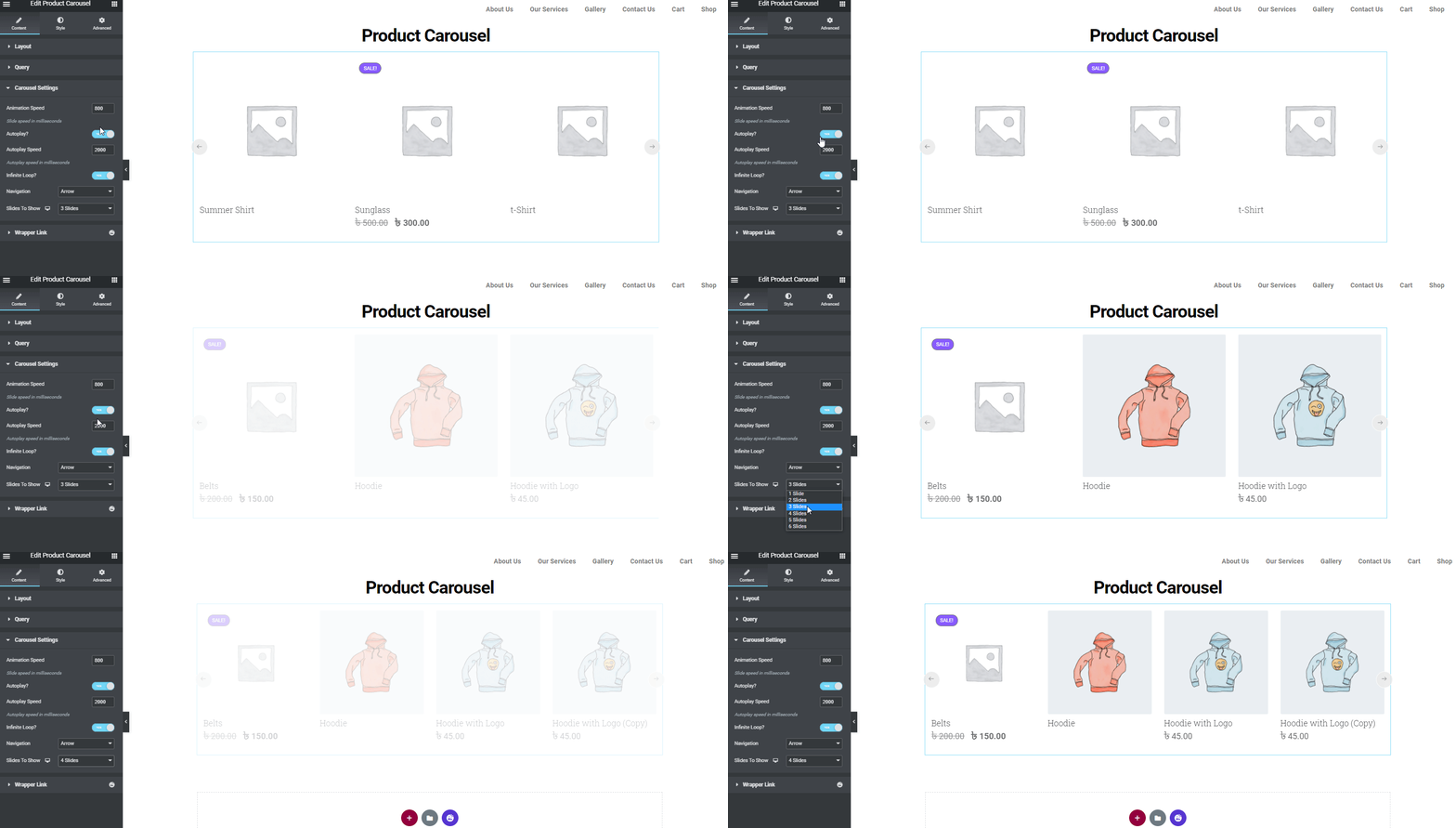
- Query to show products you want
- Number of slides you want to show
3. Product Category Grid
If you are trying to target a specific genre or audience, then you display the products category-wise, which can do the magic. So, when you are designing an eCommerce website, you should keep that in mind.
So, when you are designing an eCommerce site from scratch, you will not forget. But, in that case, the Product Category Grid of Happy Addons can be a great way to rectify that mistake.
- Minimal and Classic skin type
- Ability to control the category per page
- Option to add a featured image
- The query option
- Load more button.
These features will further your cause.
4. Product Category Carousel
And again, if you are bored with the still images of the product category, you can animation to create more of an impact on your audience’s mind, using the Product Category Carousel widget.
- Category count and image overlay
- Query to show specific products
- Animation speed control and infinite loop option
- All the customization options you want.
This widget has all the works.
Well, now that you are acquainted with all the WooCommerce widgets, let’s see how you can use them to find the answer to how to design an eCommerce website.
5. Single Product
You should focus on the product design of your eCommerce store. Try to make them more elegant so that customers can interact with your products.
Recently, Happy Addons introduced a new WooCommerce widget called “Single Product”. With this widget, you can now decorate your store’s individual products and give them a stylish look to attract more customer attention and ultimately increase sales.
- Get three different skins: classic, standard, and landscape
- Able to add badges
- Resize the product image
- Easy-to-customize
6. Mini Cart
Want to boost your conversion rates on your eCommerce store? Try the new Happy Addons’ Mini Cart widget and help your customer to add or remove products in their cart whenever they need.
- Easy to add different parts of your website
- Design cart buttons
- Live cart viewing option
- Enhance your customer experience
7. Cart
If you want to redesign the default WooCommerce cart page and need a suitable solution, you should use the Happy Addons ‘Cart‘ widget. This powerful widget allows you to customize the current cart page in your own way. And make it more exclusive for getting a better user experience.
8. Checkout
You don’t need to depend on the default checkout page style. The Happy Addons’ Checkout widget also gives you the options to customize your eCommerce store checkout page in a more organized way. Let’s make the checkout page more stunning.
Awesome Way of (Re)Designing eCommerce Product Pages Using the New WooCommerce Widgets
Let’s say you have already designed your whole eCommerce store. But you are not getting the response you were looking for. Now, you want to add a little bit of a twist to your product page.
We are going to show you exactly how you can redesign your product page so that you get the desired result you were looking for.
Firstly, get the HappyAddons Pro, as all these WooCommerce widgets are only available in the premium version. Later, go through this step-by-step guide:
Step 1: Add a short preview of your products
As you have seen, filmmakers usually release a preview of their films before the release of the whole film. That’s because they want the audiences to have an idea of what their film is all about. That also creates buzz around the film.
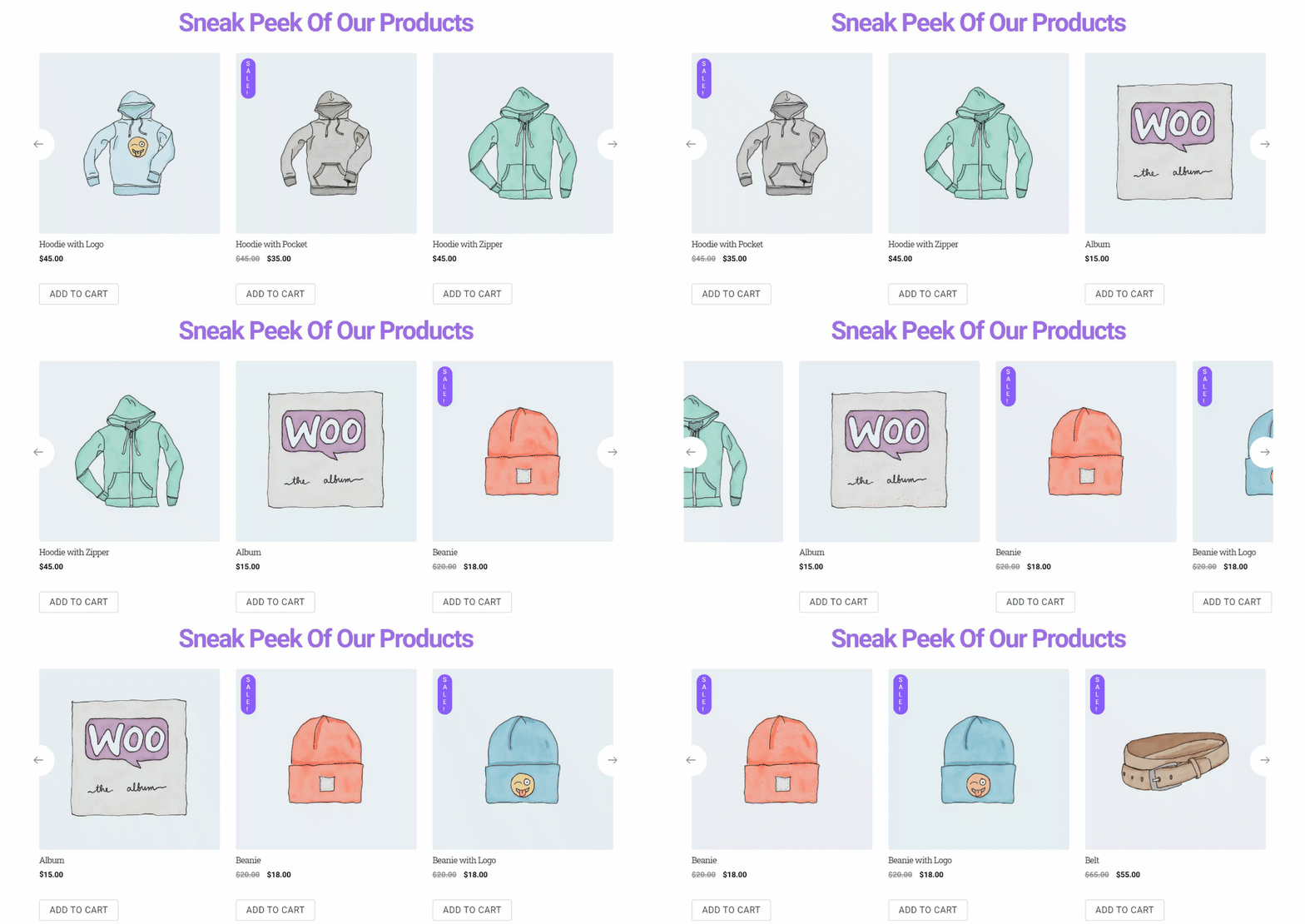
Why don’t you do that with your products as well? Use the product carousel widget to give the customers a sneak peek of your products. You don’t need to show all the products. Just show the best-selling ones or the ones that are in demand right now.
Step 2: Target audience of the specific genre with categories
It becomes easier for your customers to find products when they know the categories of products you are selling.
For example, if any customer is looking for t-shirts, he will get irritated if he has to look through other products as well. So, if there was a category for t-shirts, he/she could visit that page and find the design he/she was looking for.
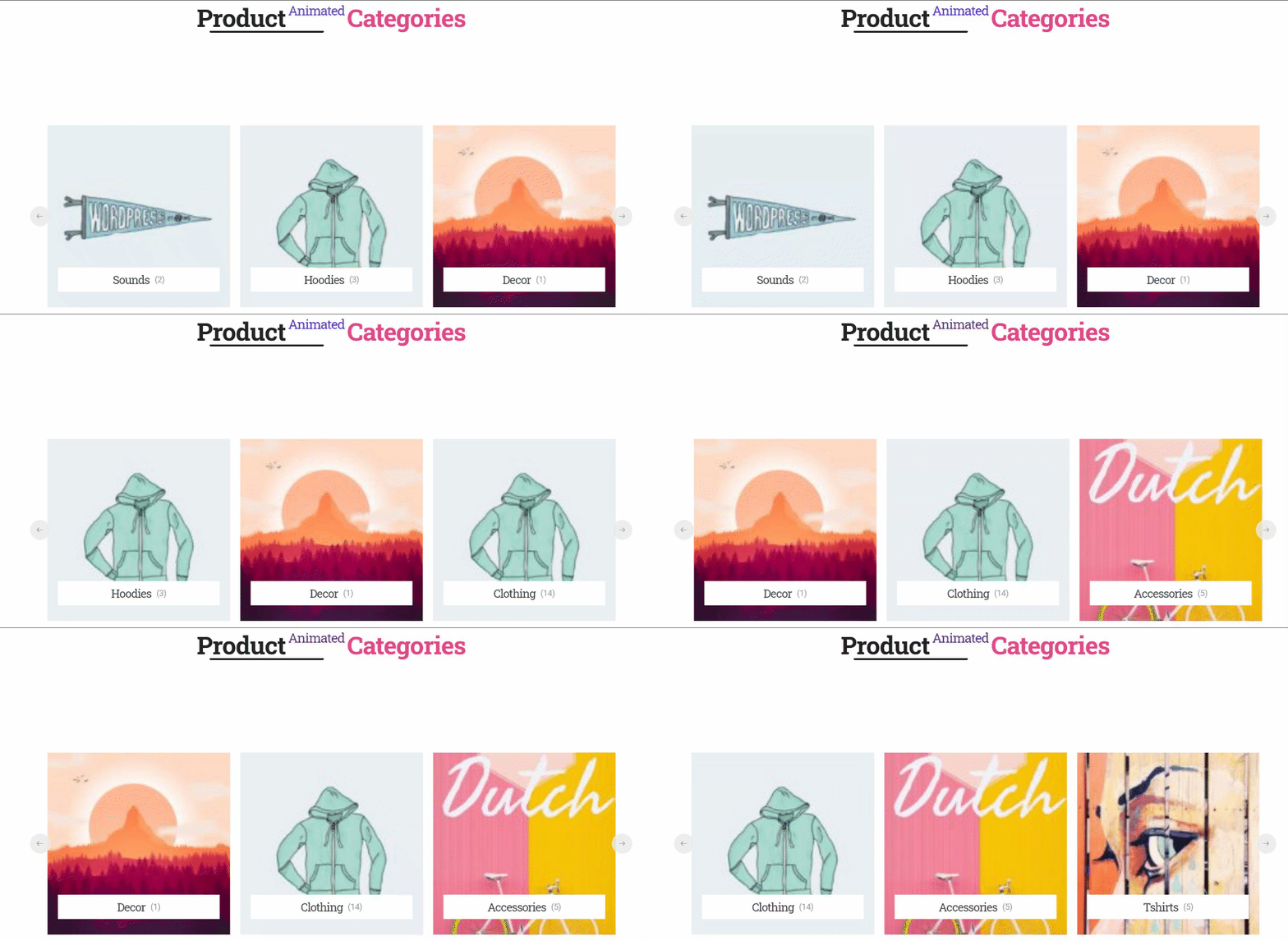
Using the product category grid you can easily add a Category Section that will showcase all the categories of your products and help you gain the attention of your targeted audience.

Now, if you want to add an animation, you can certainly use the product category carousel widget. It’s totally based on your designs.
Step 3: Show what kind of products you have ( Keep it fresh )
So, the final step of (re)designing an eCommerce website is to add your products.
No, don’t add all the products available in your store. That will totally destroy the design of your website. It is better to add one or two products from all the categories.
But what makes it unique is that you can keep updating the product list after a few days. That way, when people will revisit your page again, they will feel you have added new products to your store.
And it will certainly keep your website fresh. Using the Query option of the product grid widget, you can include and exclude products using various terms.
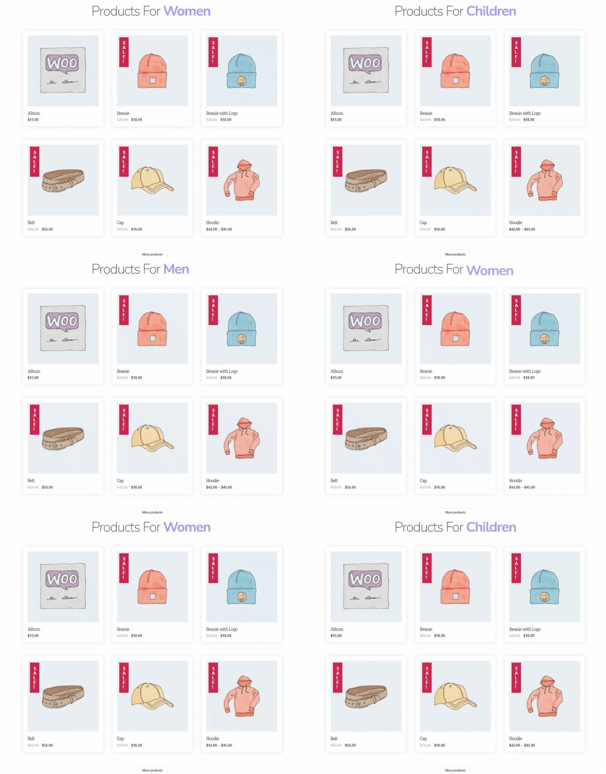
Here is a demo version of what your product page may look like after redesigning.
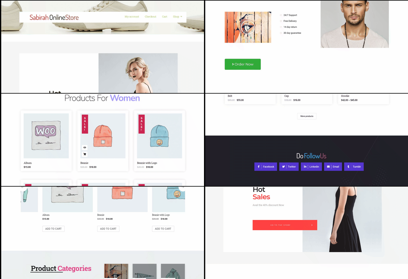
This is just a start. Happy Addons is planning to release widgets that will help you learn step-by-step instructions on how to build an eCommerce website. So, just wait patiently.
Well, let’s spotlight on some important facts that you should consider before starting your journey-
Designing an eCommerce Website – Why Is It So Important?
An attractive website design will make the ordinary content extraordinary!
How many times have you visited a website but quickly redirected because of its poor design? Although the website had great potential to earn success, however, the poor design let it down.
So, before we get down to designing an eCommerce website, we need to make sure you know its important aspects. Like,
Improve eCommerce Site Navigation
When you start designing an eCommerce website from scratch with careful considerations, you can make sure easy navigation for your users. You are ensuring the users can find exactly what they are looking for.
Holding onto a customer’s attention, your website design should be as inherent as possible.
Boost Brand Awareness
Brand awareness! To succeed, you need your brand to grow. When your website has a consistent look that will attract customers, your conversion rate will increase automatically.
Your website look is what reflects how your business is!
You need to know step-by-step how to build an eCommerce website so that you can complement your design with your products.
Clean & Modern Website Design
The study shows the website’s overall look and feel contribute 94% to mark the first impression!
If your website design fails to live up to the standard and doesn’t yield user-friendliness, it will get rejected by most of the users. Implementing the right design conveys the type of products you offer or how serious you are.
Building Trust & Crushing the Competition
In an age where people are very cautious about buying products online, a great website design will help regain the confidence of your users and thus build trust, which is very important in online business.
Moreover, when you are investing in designing an eCommerce website, it is bound to give you an extra advantage over your competition and earn you more profits!
Imply Essential SEO Strategies
SEO! Yes, last but certainly not least, you can improve your Search Engine Optimization of your eCommerce site drastically using an awesome design.
The content of your website is influenced by your website design, which, in turn, affects how search engine spiders index and crawl your site!
If you are thinking of starting your new eCommerce store, the facts about the importance of website design may worry you. Don’t worry.
Here are some tips on how to design an eCommerce website with WooCommerce.
E-commerce UI Design Considerations

- Keep true to your Brand identity: Establish your own unique brand identity and the branding should be apparent throughout the website. You should choose a style that makes clear what type of products you are selling.
- Use pop-up windows wisely: Yes, yes we know how critical pop-up windows are for any website. However, you and we both know that pop-up windows can be a distraction.
So, avoid using too many pop-up windows. And if you need to use pop-up windows, try to give only the necessary information. Which will help the customer’s need. Otherwise, there is no need to break the concentration of a user who is going through your content. - Create an awesome product page: Here’s where you need to be creative and persuasive when designing your eCommerce website.
For considerations, your design should have,- Well-defined product categories
- Make product search easy and simple
- Filtering product option
- Product quick-view
- Informative product images (videos should be great)
- The right amount of product information
- Related and recommended products.
- Easy to understand the cart and checkout page: It is an essential part of your website designing. The shopping cart is where the shoppers review their selected products, make the final decision, and proceed to checkout. So you need to use CTA’s, provide adequate feedback, and if possible use a mini cart widget.
As for the checkout page, you must provide various payment options and also keep it as simple as possible. - Do not over-design: Don’t go overboard. When you are trying on how to create an eCommerce website using WordPress, you might get tempted. As all the process is drag-and-drop building, you may want to add as many elements as possible. Don’t do that.
Simplicity is the new complex!
Keep it simple and follow the guide. And you will have yourself a great eCommerce site with an awesome design!

With this much information. It is normal to get startled. However, as we told you, if you use page builders like Elementor with the added help of Happy Addons, you can easily know how to design an eCommerce website by following all the criteria.
Elementor already has widgets that will help you design your WooCommerce store. However, Happy Addons has also recently released 4 new WooCommcerce widgets that will help you redesign your product page and give it more flair.
Let’s get to know them, shall we?
Before Signing Off
We are at the end of the year 2024. It’s been quite a year with ups and downs. However, we are hoping for a fresh new start in 2025.
Along with that, we want your eCommerce store to have a fresh new look as well. That’s why we tried to show you some design techniques for designing an eCommerce website using the new widgets of Happy Elementor Addons.
You can also read HappyAddons Year In Review.
So, if you have any more suggestions and feature requests, let us know. Check out the video tutorial also…


