When it comes to designing or creating any WordPress site, most of the users from the WordPress community prefer Elementor as the page builder. The reason is quite simple. It’s easy to use, understand, and apply, even if you’re a non-techie person.
Elementor captures your mind and then visualize it to a unique creation.
However, if you’re a new Elementor user, or already have used it, never mind. We’ll show the top Elementor website examples in today’s post. It might surprise you to think about how these websites were created with Elementor! Maybe it could encourage you to explore more using the Elementor page builder.
Anyway, enough talk! Let’s not prolong our words. And get into an elaborate discussion.
Table of Contents
- Top 10 Awesome Elementor Websites with Live Examples
- Bonus: Happy Elementor Addons As an Enhancer of Elementor Workflow
- Conclusion
Top 10 Awesome Elementor Websites with Live Examples
Elementor publishes the top 20 websites every month. And it’s called ‘ShowCase‘. In the monthly showcase, you’ll find different websites from a different arena. Furthermore, you’ll get a complete idea of how majestically these websites were built!
As an Elementor user, watching these websites and their designs may increase your confidence to do more with Elementor.
However, let’s see the websites that were built with Elementor:
Top 10 Elementor Websites list ⬇
- Escapebox
- MAISQ
- Steel Box Co
- Snackapeel
- The Phlywheel Shop
- Lullaai
- Cocoon Style
- Team One Security
- Chocolates Van Hecke
- Michael Casado
➪ Escapebox
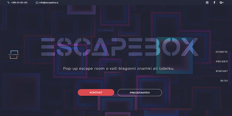
Generally, EscapeBox is well-known for gamification. And they amazingly represent the whole idea using quality Elementor design. And also you’ll feel like you’re in the visualization.
They used lots of artistic designs and some innovative layouts for the entire website. And this suits very perfectly with the theme. For example, using of hero banner, sectioning and also image selection was just too cool.
➪ MAISQ
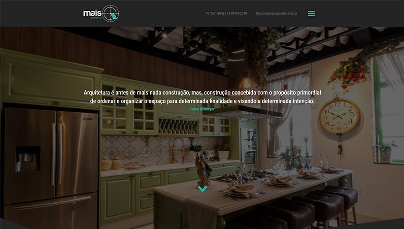
If you’re looking for any architectural materials or ideas, this website can assist you with that. Using MAISQ, you can get lots of architectural, interior, and exterior design ideas.
The most interesting part of this website is, that you’ll be overwhelmed with a full-width photo banner which looks pretty much cool. And guess what the whole site is created using Elementor. Not to mention, they utilized the section order pretty nicely.
We all know that Elementor is all about sectioning. The more you can do sectioning in the right way, the better you can create something different. So, this website could be the best example of a professional website.
➪ Steel Box Co
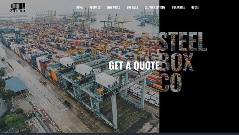
Steel Box Co basically supplies new and used shipping containers. You’ll get different containers here at a very reasonable price. They bring out the nice flavor on the entire website using Elementor features.
You’ll also see a hero banner having their company’s name and also they used the clipping mask. Therefore, it looks different and like an extension of the image. Furthermore, the color scheme on the 1st page looks awesome and the mixture of Grey & silver.
Overall, this website is a masterpiece with an improved website design.
➪ Snackpeel

Whoa! this is another website with splendid creativity. Yes, if you browse this website you’ll feel like you’re in the orange world. The scrolling effect will 100% give users an enjoyable feeling. As you can see the hero banner.
They utilize Elementor in a comprehensive way. However, this website originates from North America. And recently they launched their microsite to educate their customers. Therefore, they can learn ‘How to create Nutritionally balanced snacks with cuties’.
Overall, you can see lots of unique things here. And also they employed all the essential Elementor addons nicely.
➪ The Phlywheel Shop
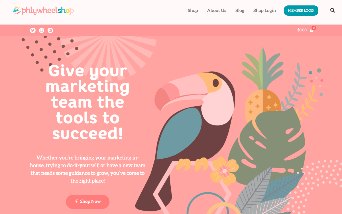
Like other Elementor Websites, this one also shows amazing use of Elementor. And they properly utilized the whole concept. As a result, you’ll see the beauty inside the website.
Generally, the Phlywheel shop is a part of Phlywheel.com, founded by a Woman which is a DIY marketing platform. For example, you’ll get digital marketing tools, consulting or mentoring ideas, and community resources to help business people with marketing, etc.
The website looks very good with a variety of different colors. Especially pop style, bright & cheerful color and more. So this can be a perfect example of the Elementor site having a cool landing page.
➪ Lullaai
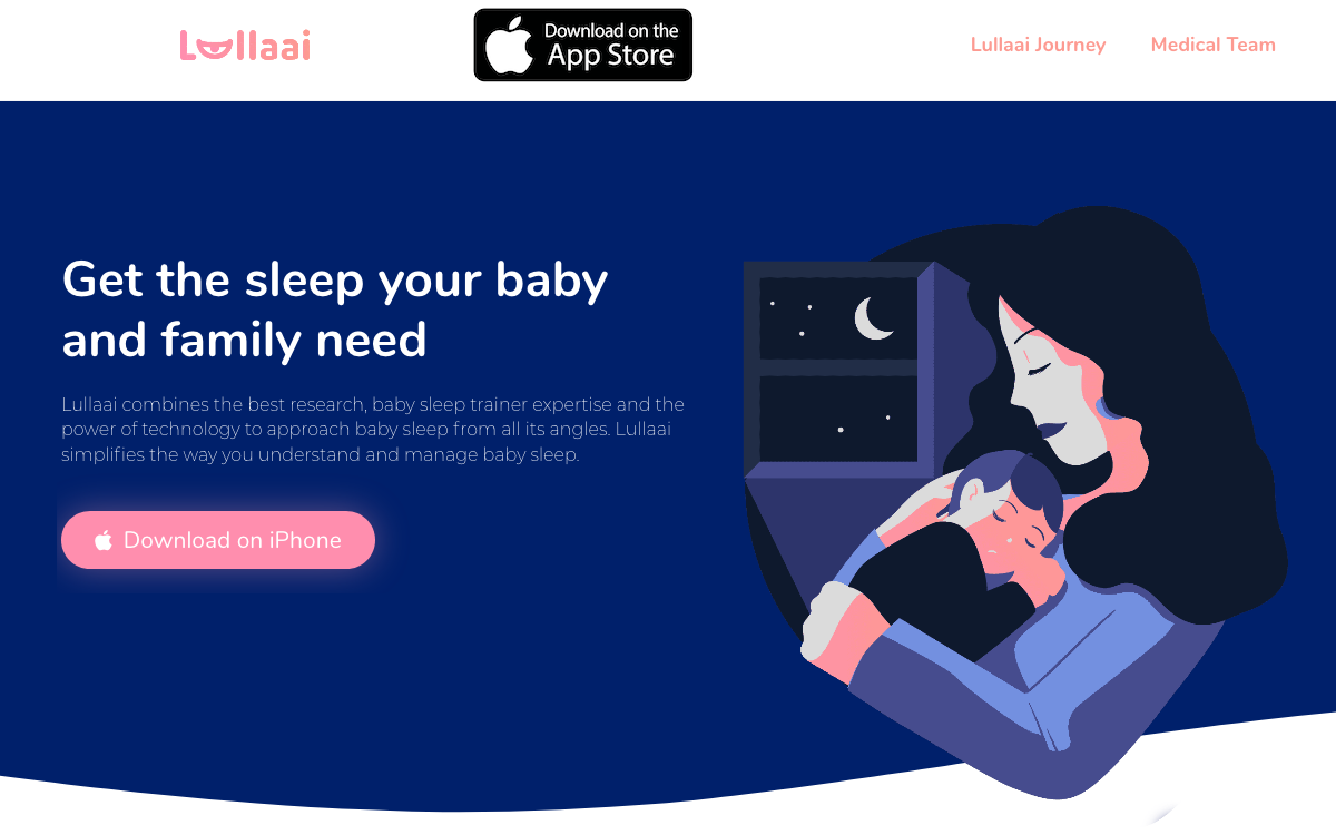
Can you imagine, AI can track your sleeping pattern? Well, this is not a story rather its a reality. Lullaai exactly provides the same thing. Yes, at first glance, you might think this website a startup. But after sometimes, you’ll definitely understand what it’s about.
The whole design with an extraordinary illustration will soothe your mind. And the dark blue color matches the whole scenario. However, they’ve used the OceanWP theme.
➪ Cocoon Style
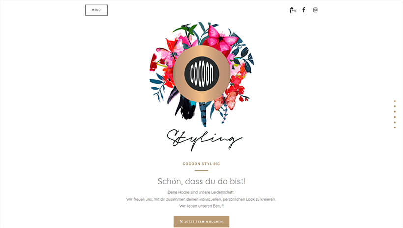
Do you love different styles or love to make up all the time? This website can be the perfect one. Yes, you’ll get all the hair and makeup artist here. Moreover, they can be a great mentor for your style. You can contact them, schedule a call, or get ideas from them.
Anyways, this website also seems to be a complete Elementor site. The company’s logo is displayed on the banner and the image will begin with a slider. Furthermore, you’ll also see a sticky side navigation bar when you click on the menu button.
➪ Team One Security
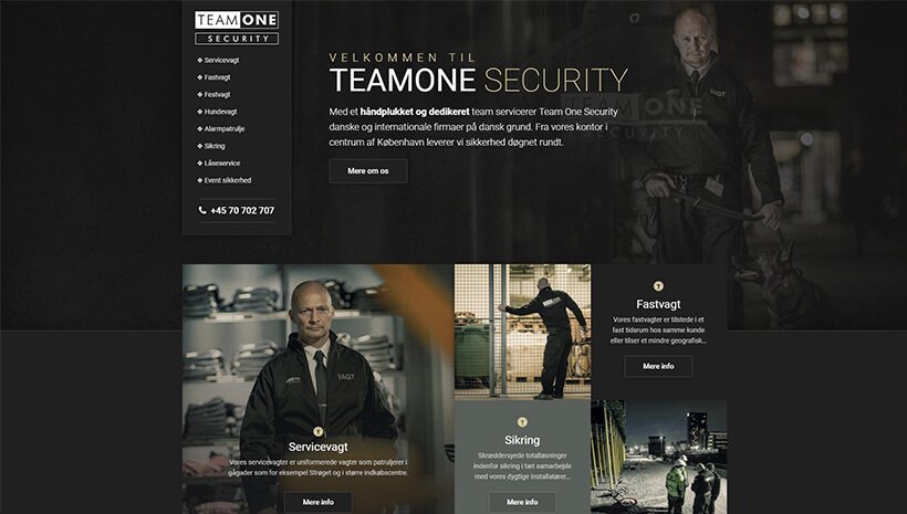
If you’re looking for the best security guard for your company or anywhere, you can choose them from here. Yes, Team one Security exactly does the same thing. The origination of this website is from Copenhagen.
Anyways, let’s talk about design. Using the Elementor website builder, they represent the whole idea amazingly, especially, placing of contents, photos, and other contents. Overall, they used the Elementor layout perfectly, and this is why it looks quite unique.
➪ Chocolates Van Hecke
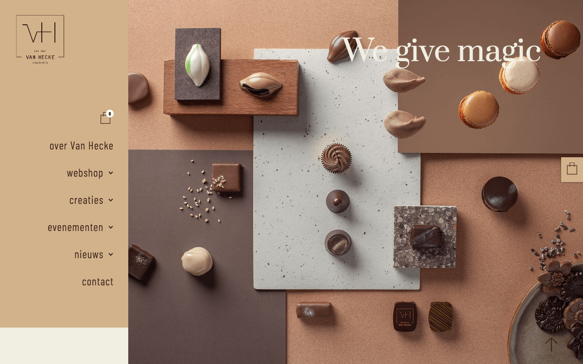
Chocolates Van Hecke has been providing high-quality services in making chocolates, since 1937, in Ghent, Belgium. This is really amazing to know, they have been keeping the same quality for four generations.
When it comes to the designing factor, we’ll say, it’s just marvelous. Because if you enter the website you’ll definitely be impressed with the outlook. The proper use of lightweight text and the thin golden frame outside the photos adds some extra texture.
➪ Michael Casado
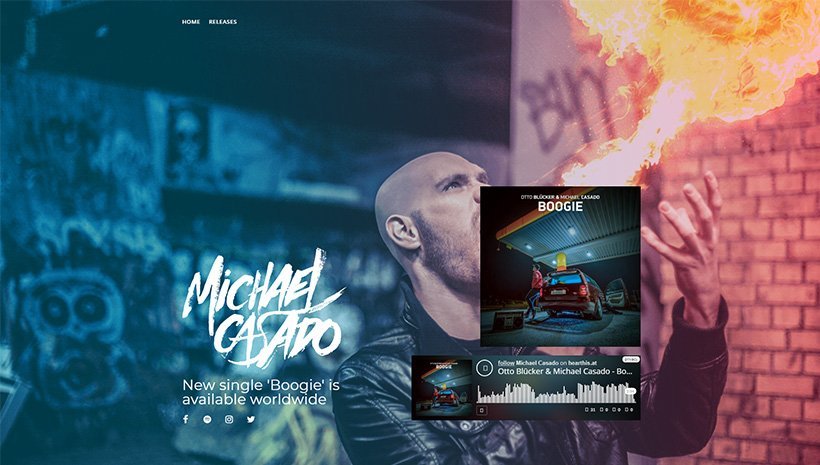
Do you have an interest in music? Actually, who doesn’t have? Right? You’ll get a musical feel throughout this website. Basically, Michael Casado is a music writer and producer who started his own label in 2014.
Now we’ll talk about the design. You can find a full-width photo banner. And the owner properly placed the Elementor section. Each section also has a background photo. Furthermore, the playlist collection sections are divided into four columns. The images change frequently every second. Casado managed to use all the Elementor features professionally.
Bonus: Happy Elementor Addons As an Enhancer of Elementor Workflow
Every successful tool must need some enhancer or addons to power up its strength. Yes, like other addons of Elementor, Happy Addons precisely does the same thing.
So if you want to do some extra-ordinary with Elementor, Happy Addons could be your best companion to do that. And the interesting fact is, it works smoothly with Elementor.
However, in our previous post, we mentioned Happy Addons so many times. So we’ll not prolong our words saying its features. Rather, we’ll simply show some effective terminologies that could boost your Elementor workflow.
You can also read the article on ‘Happy Addons Features‘.
However, let’s check out the following core features of Happy Addons:
- Preset: Preset is a collection of bunches of designs. After utilizing Happy Addons you can use this feature. So using it, you will get some pre-built designs.
- Cross-Domain Copy Paste: You can copy-paste items from other domains and then use them accordingly. Repeated works can be done like buttons, cards, team members, etc.
- Live Copy: With this pro-feature, you can copy any design from the HappyAddons Demo site to your main site with the Live Section Copy feature.
- Floating Effect: Did you ever see elements are floating on the website page? If not, then this feature can help you to do this swiftly.
- Image Masking: With Elementor built-in customization process, you can’t change the image ratio or size. But this feature will let you do this seamlessly.
So, these are the features of Happy Addons. And using them perfectly you can visualize your imagination into reality. ?
Conclusion
Elementor is a prominent WordPress page builder, and there is no doubt. Furthermore, it’s one of the most installed free WordPress page builders, with over two million installs and an impressive 4.8-star rating.
The purpose of this blog is to display the most interactive Elementor websites to you. And these websites could help you to know how astoundingly you can employ Elementor. As a result, you can also use them for your own website.
Anyways, for your convenience, read the article on ‘How Elementor Changed the Era‘. This will help you to know the tips and tricks about Elementor.
So if you can merge something extraordinary with it, then surely you can create amazing designs for your website.

