How to use the Age Gate widget to create an age verification banner notice on your Elementor site
Welcome to the documentation for the HappyAddons new “Age Gate” widget! This widget ensures that visitors confirm their age before accessing specific content on your website. Whether you’re managing a liquor store, a gaming platform, or any other age-restricted content, the Age Gate widget provides an easy solution for age verification. This widget integrates seamlessly with your Elementor-powered website, allowing you to create a secure and compliant user experience.
For example, let’s consider a pretend scenario. Imagine you have a gaming platform and want to ensure that only visitors over 16 years are allowed to access certain pages. By using the Age Gate widget, visitors will be asked to enter their date of birth or confirm their age before proceeding to the page. This simple but effective age check helps prevent underage access, ensuring both legal compliance and peace of mind for your business.

Pre-requisite
To enable the Age Gate widget, you need to have,
- Elementor Free
- HappyAddons Free
Adding the Age Gate Widget:
PS: If you want to show the Age Verification Notice all over the site, then add the Age Gate widget to the Header by using the Theme Builder.
To add the Age Gate widget to your page, follow the below-mentioned steps:
- Open Elementor and edit the page where you want to add the Age Gate widget.
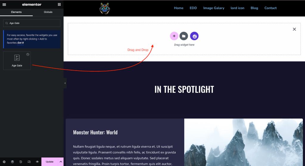
- In the Elementor panel on the left side of the screen, search for “Age Gate” in the search bar.
- Click and drag the Age Gate widget anywhere on the page.
- The Age Gate widget will now appear on your page; you can now configure it as needed.
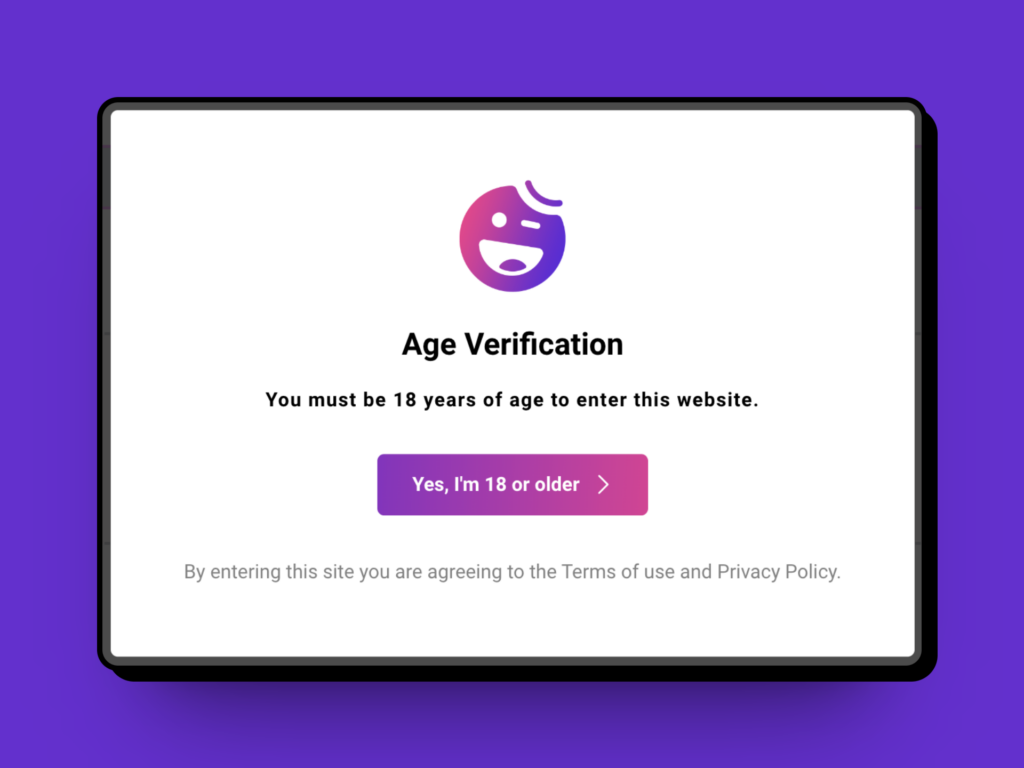
The Default View of our Age Gate Widget
Configuring the Age Gate widget:
Content:
Age Gate:
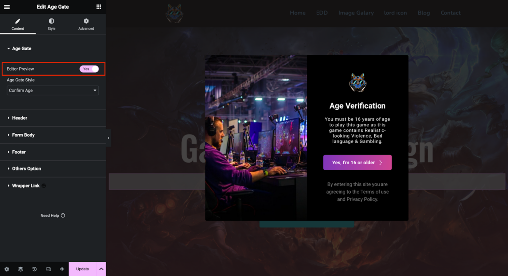
The very first setting you will see by navigating the Content section is Age Gate. Under the Content settings, you can enable the Live Editor Preview of the widget. By enabling the Editor Preview, you will be able to design while viewing the live preview.
Age Gate Style:
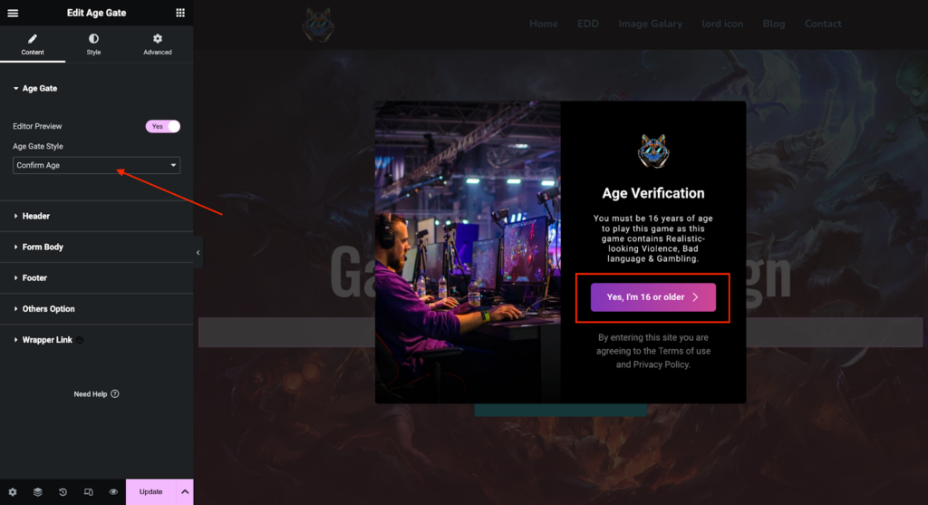
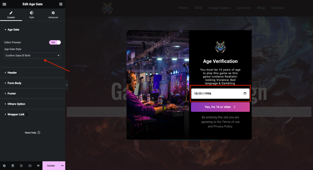
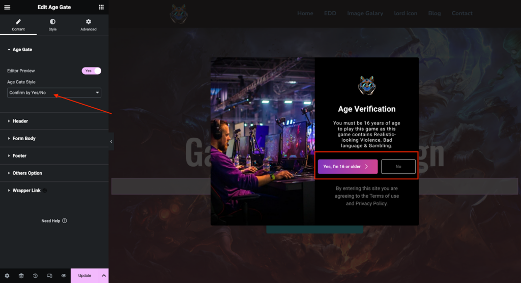
You will have 3 different Age confirmation Styles. Either your users have to confirm their age by clicking the confirmation button, Date of Birth, or Yes/No button. The Reference images are given below:
Confirm age by Confirmation Button:
Confirm age by Birth Date:
Confirm age by Yes/No button:
Header:
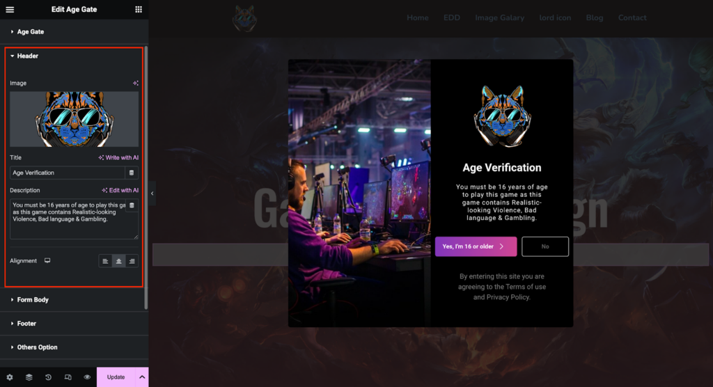
You can add an Image, Title, and description of the Age Gate widget. You can align the Title and Description position here in the Header section.

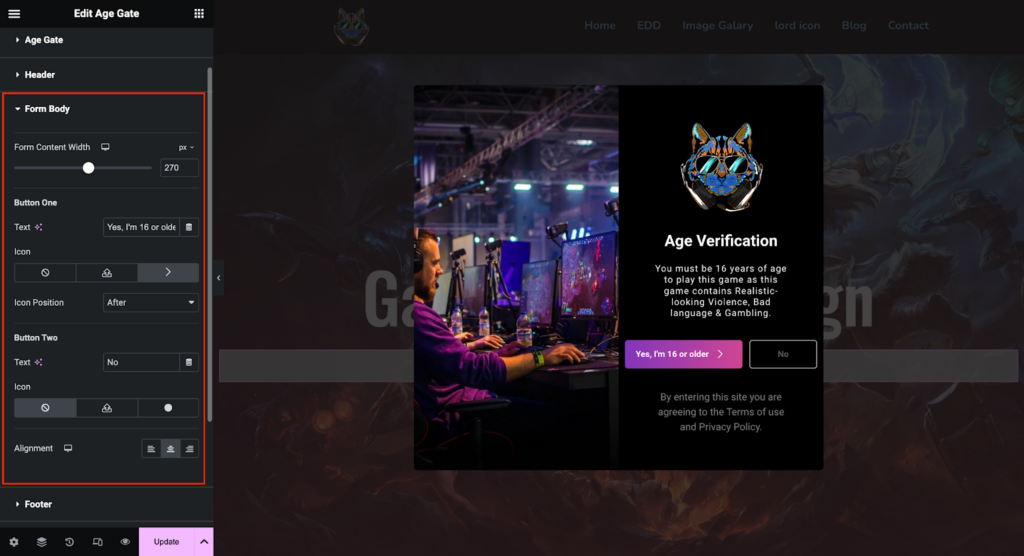
Form Body:
According to the Age Gate styles, you can control the form body. For example, if you choose the Age Confirmation Button,, you can add button text and icon with its position and align the button position.
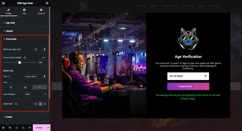
On the other hand, if you select the Confirm by Birth Date style, you can add the Minimum Age Limit and Form content width by pixel or percentage. You can control the button and icon as well.
Lastly, if you select the Confirm by Yes/No button then you can add Button 1 and Button 2 text as Yes/No or as per your preference. You can add icons, text, and positions as well.
Footer:
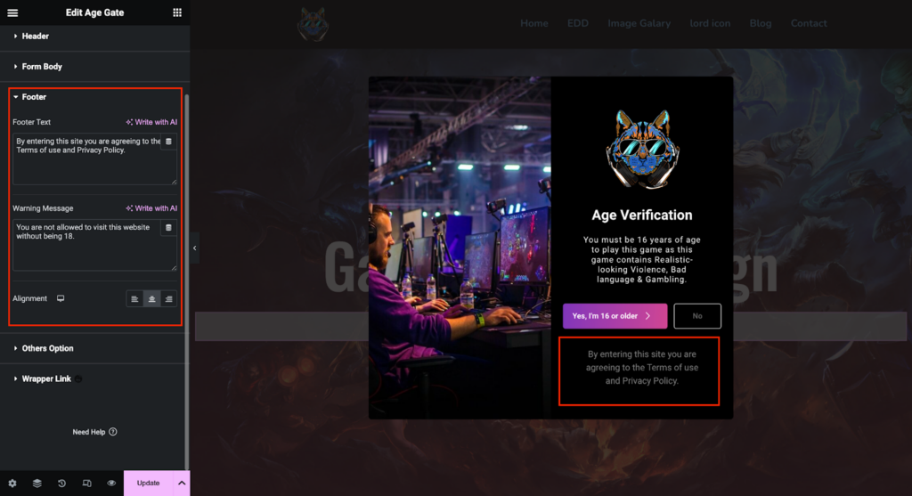
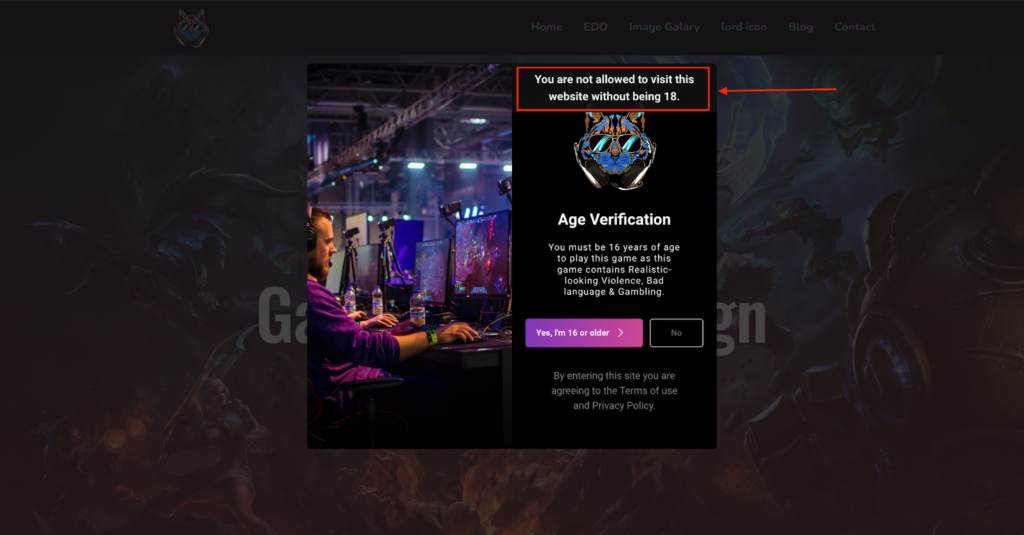
You can add Footer Text and Warning Message in the Footer settings. Alignment control of the text is also available in this section.
Frontend view(Warning Message):
Others Option:
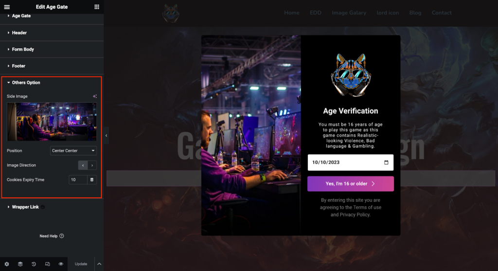
You can add the Side Image here. You can set the Image position and Direction to display the image as your preference. Along with that, you can set the Cookie Expiry Time here as well. The cookie expiry time will allow users to use cookies for a certain period of time.
Style:
Box Style:
Header Image:
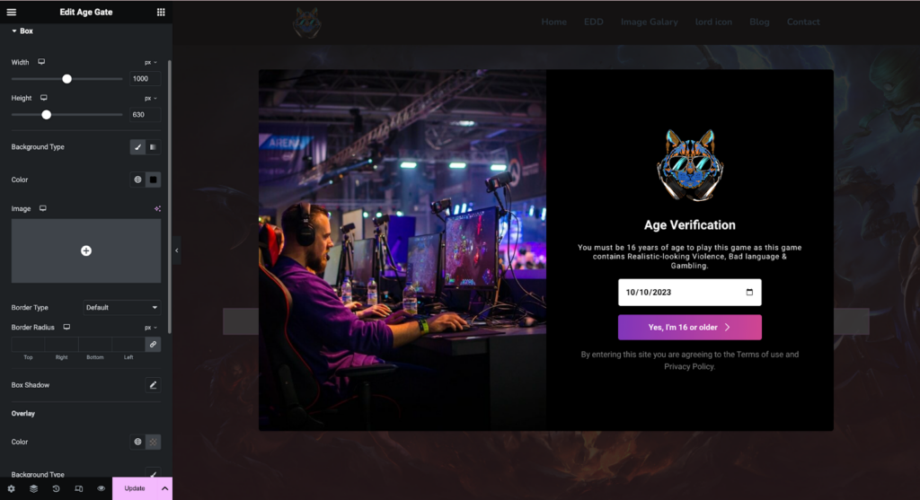
You can set the popup box width and height according to your design. You can select the background option as Image or Color.
You can set the Border type and radius. You will also find the Box Shadow and Overlay option right underneath the Border Control.
Title:
You can set the Color and Typography for the title. Here, you will get the Margin and Padding control for the title.
Description:
You can set the Color and Typography for the description. Here, you will get the Margin and Padding control for the description as well.
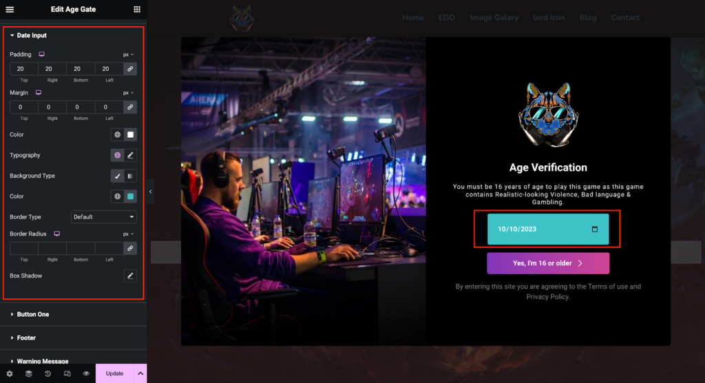
Date Input:
You can set the Color and Typography for the Date Format of the Age Gate widget. You will get the Margin and Padding control. Border control and Box Shadow are also available in this style setting. You can choose the Background type as a solid color or a gradient color.
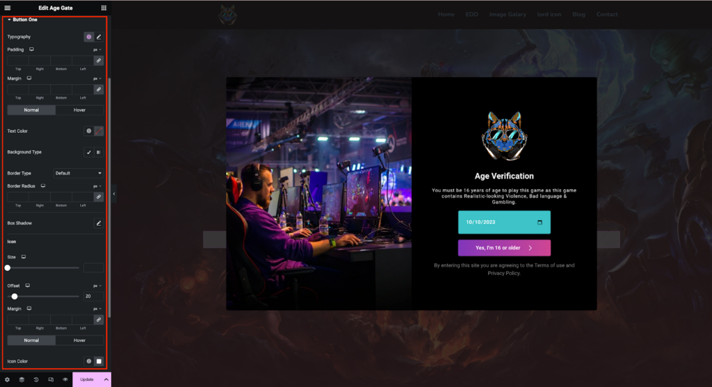
Button:
You can set the Color and Typography for the Button of the Age Gate widget. You will get the Margin and Padding control. Border control and Box Shadow are also available in this style setting. You can choose the Background type as a solid color or a gradient color.
You can set the icon size, color, and offset for responsive devices. There is a hover style setting available on this particular button and Button Icon.
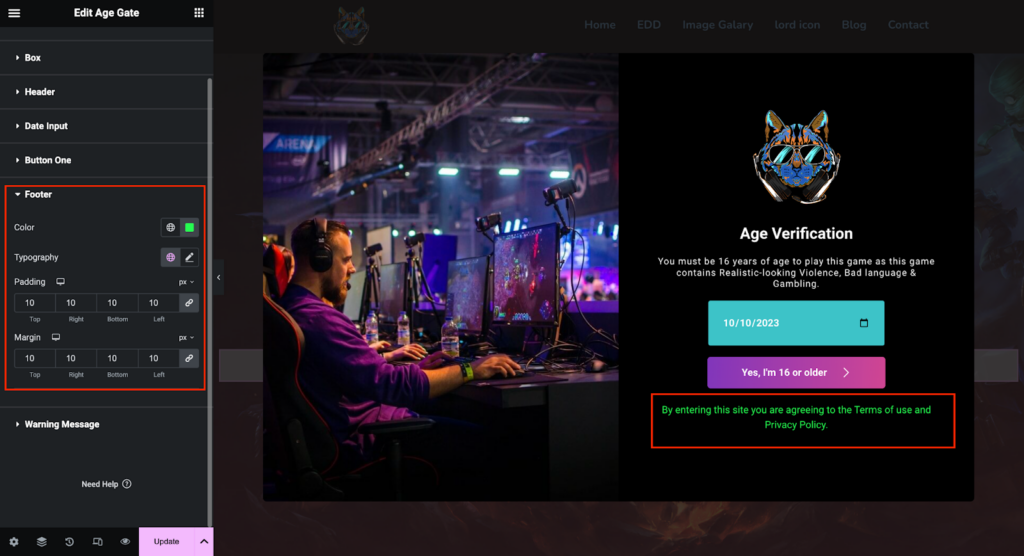
Footer:
You can set the Color and Typography on the Footer section of the style tab. Here, you will get the Margin and Padding control for the title.
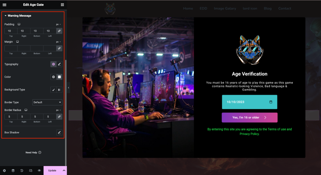
Warning Message:
You can set the Color and Typography for the Warning Message of the Age Gate widget. You will get the Margin and Padding control. Border control and Box Shadow are also available in this style setting. You can choose the Background type as a solid color or a gradient color.
Congratulations! You have successfully configured the Age Gate widget. If you have any further questions or need additional support, don’t hesitate to reach out. Thank you for using HappyAddons.
