Want to add an image accordion on your website? Take a look at Happy Addons‘ new ‘Image Accordion‘ free widget. Now, you can easily design and customize an image accordion to your Elementor website in an organized way.
How To Use Image Accordion Widget
Pre-requisites
To use that excellent Image Accordion widget, you need the following things:
- Elementor (Free)
- Happy Addons (Free)
Let’s get into deep and exploring the following steps:
Step 1: Find & Add Image Accordion Widget
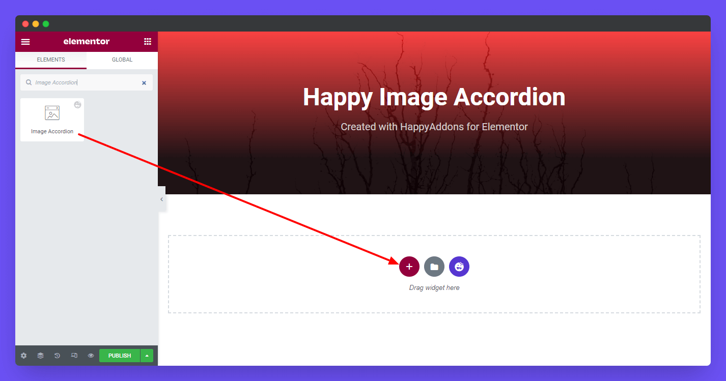
First, find the ‘Image Accordion‘ widget in the search bar. Then drag and drop it onto the selected area.
Step 2: Add Image Accordion Content
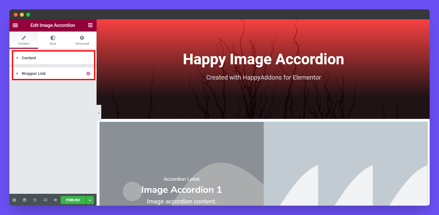
In the content section, you’ll get the Content option so that you can add content into the accordion. Here are the options.
- Items
- Style
- Active Behavior
- Text Align
- Horizontal Align
- Vertical Align
- Enable Content Animation?
Items
In the items, you’ll find the possible options to add an item. Here are they.
- Choose Image
- Label
- Title
- Title Icon
- Icon Position
- Description
- Enable Button
- Enable Popup
- Enable Link
- Active
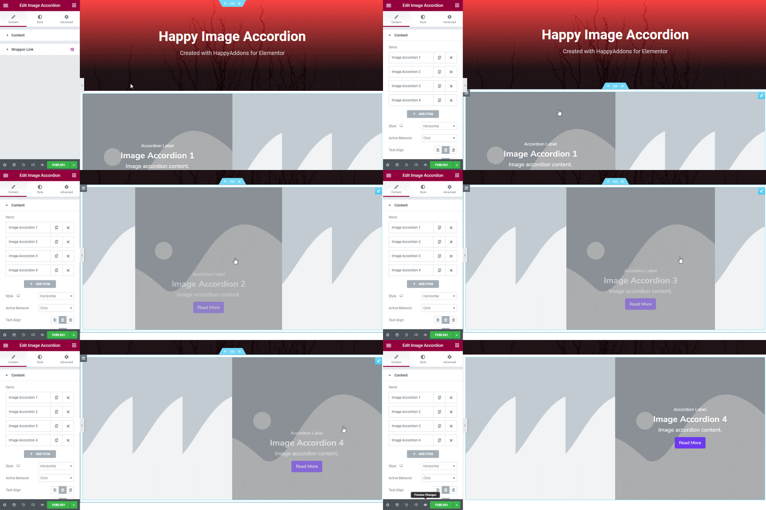
By default, when you’ve added the widget, the accordion image will look like this image below.
Let’s add our own accordion items and explore particular topics step by step.
Choose Image
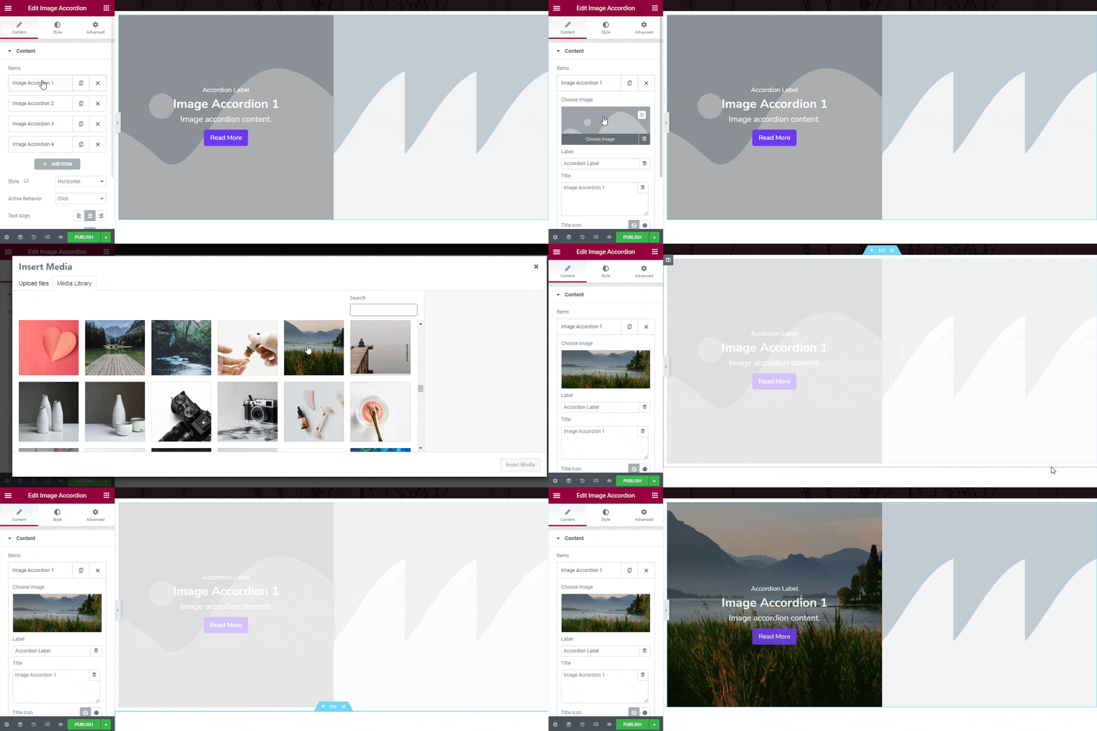
First, you need to add an image for the accordion. Click the Choose Image and select an ideal image for the accordion.
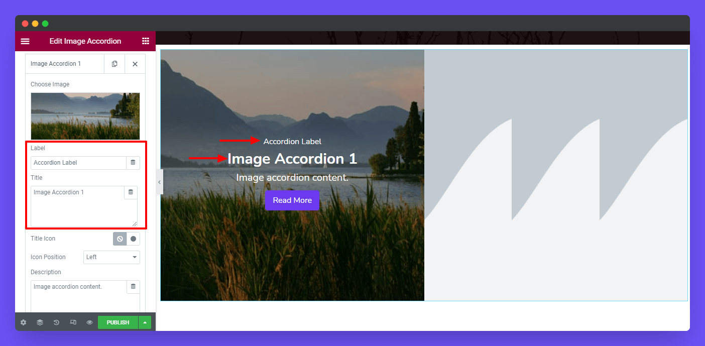
Write a Label & Title
According to your purpose, you can add a Label & a Title.
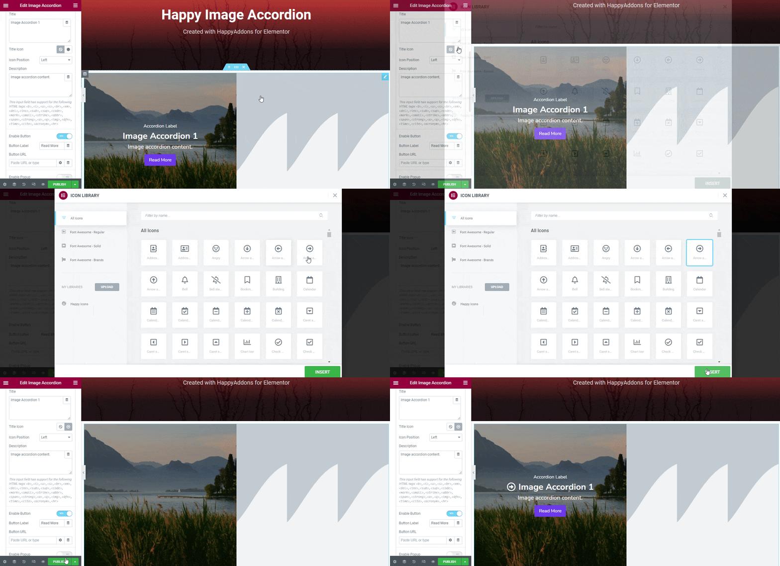
Add Title Icon
If you need, you can easily add a catchy Icon to the Title.
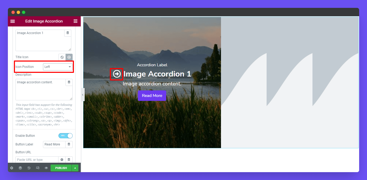
Set Icon Position
You also define the Position Left & Right of the Icon.
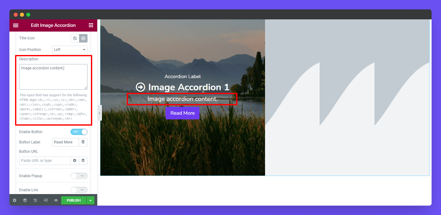
Write a Description
Well, you can even write a Description to describe your accordion image.In the description area, you can also add an HTML tag.
This input field has support for the following HTML tags: <b>,<i>,<u>,<s>,<br>,<em>,<del>,<ins>,<sub>,<sup>,<code>,<mark>,<small>,<strike>,<abbr>,<span>,<strong>,<a>,<q>,<img>,<dfn>,<time>,<cite>,<acronym>,<hr>
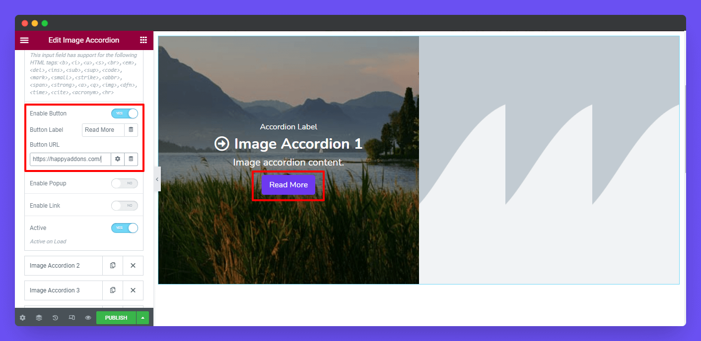
Enable Button, Label/Text, & URL
If you want to add a button to the accordion, you can do it by enabling the Button. After doing this, you can add a Button Label/Text & URL to the button. Follow the below image to learn how the button will work.
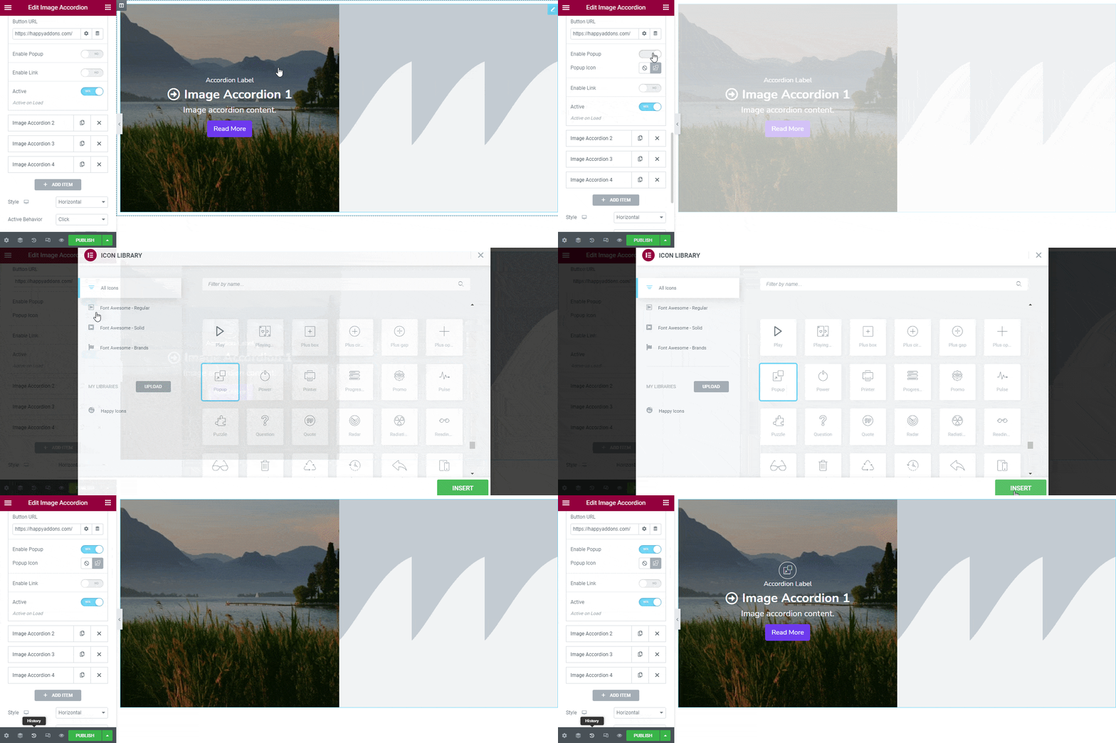
Enable Popup & Popup Icon
Based on your need, you can also Enable Popup and add Popup Icon. Check out the image below to know how to add a popup icon.
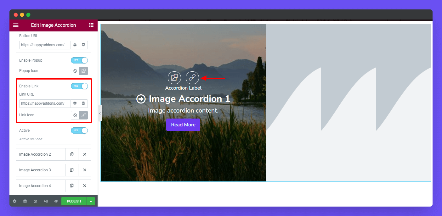
Enable Link
You can able to add a custom Link to your popup icon.
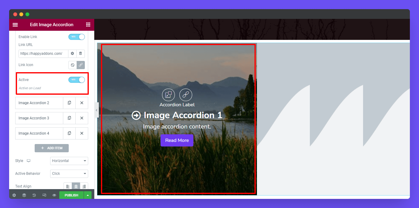
Active
In the Active area, you can select which item will be active on the frontend view during the first loading time.
Note: We’ve also added another four items following the above way.
Style
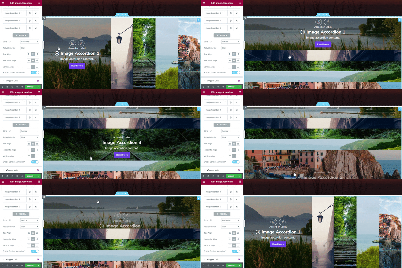
In Items->Style, you can set the items styles Horizontal and Vertical.
Active Behavior
You can define the Active Behavior of the accordion such as Click and Hover. If you select the Click as the active behavior, the item will work when you click on it. On the other side, whenever you select the Hover as the active behavior, the item will work when you hover over it.
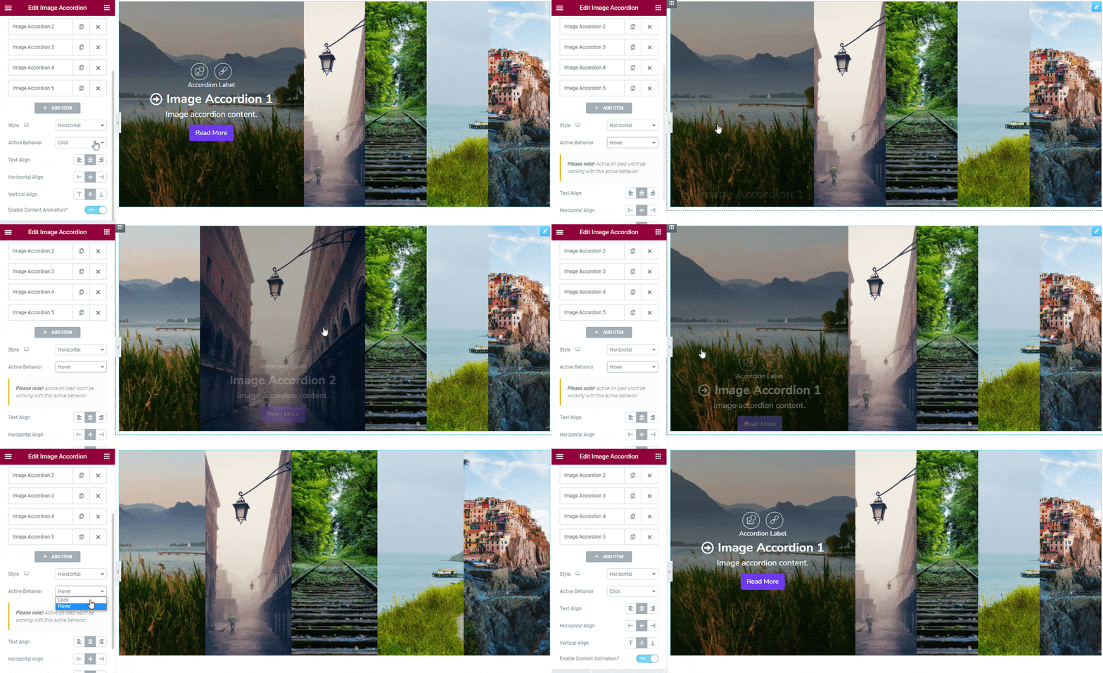
Note: When you select the Hover as the active behavior the Active on Load will no longer work. That’s means the first item will be counted as the activated item when the page load.
Text Align
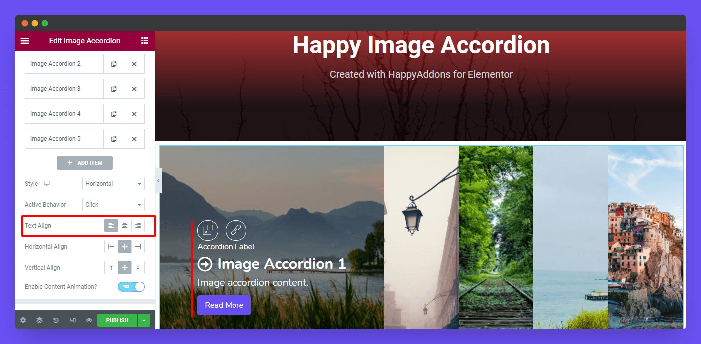
You can also set the Text Align like Left, Center, & Right.
Horizontal Align
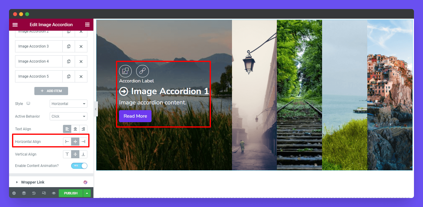
You can able to define the Horizontal Align as Left, Center, & Right.
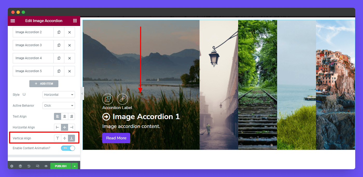
Vertical Align
Like the Horizontal Align, you can set the Vertical Align as Top, Center, & Bottom.
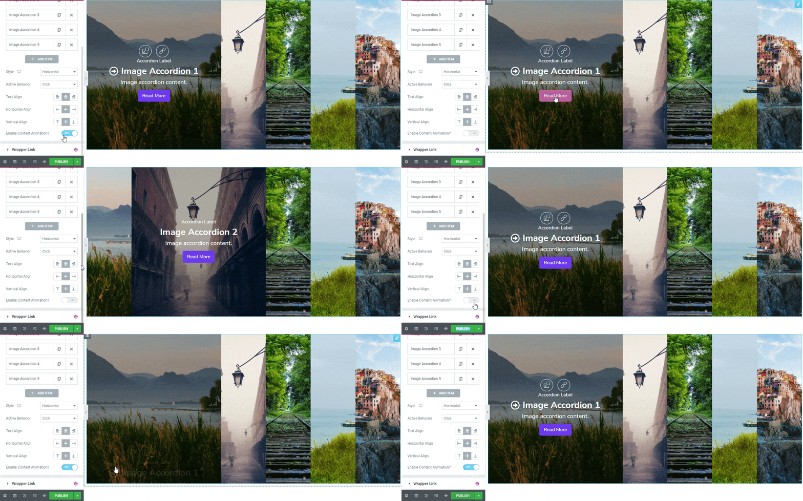
Enable Content Animation?
If you want to add animation to the image accordion, you need to Enable Content Animation.
Step 3: Style Image Accordion
In the Style section, you’ll get all the styling options to decorate the image accordion content. They are.
- Common
- Title
- Content
- Button
- Actions
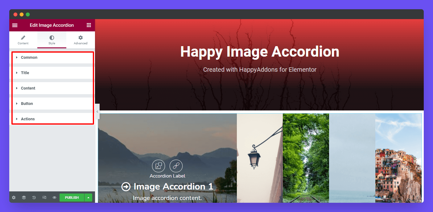
Let’s check out all the style options one by one.
Common
In the common style area, you can customize the entire content Height, Margin, Padding, Border Type, Border Radius, Box Shadow, and Background Color.
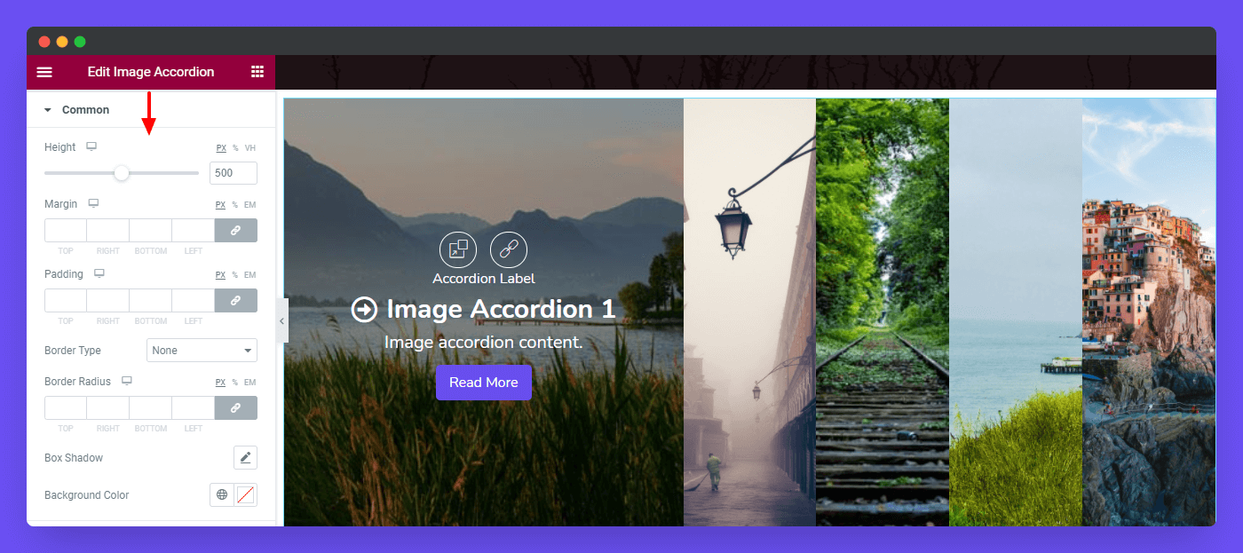
Image Controls
You can also redesign the according image in the Common->Image Controls area. Here, you can set the individual image Gutter and Radius. See the image below to understand how Gutter will work.
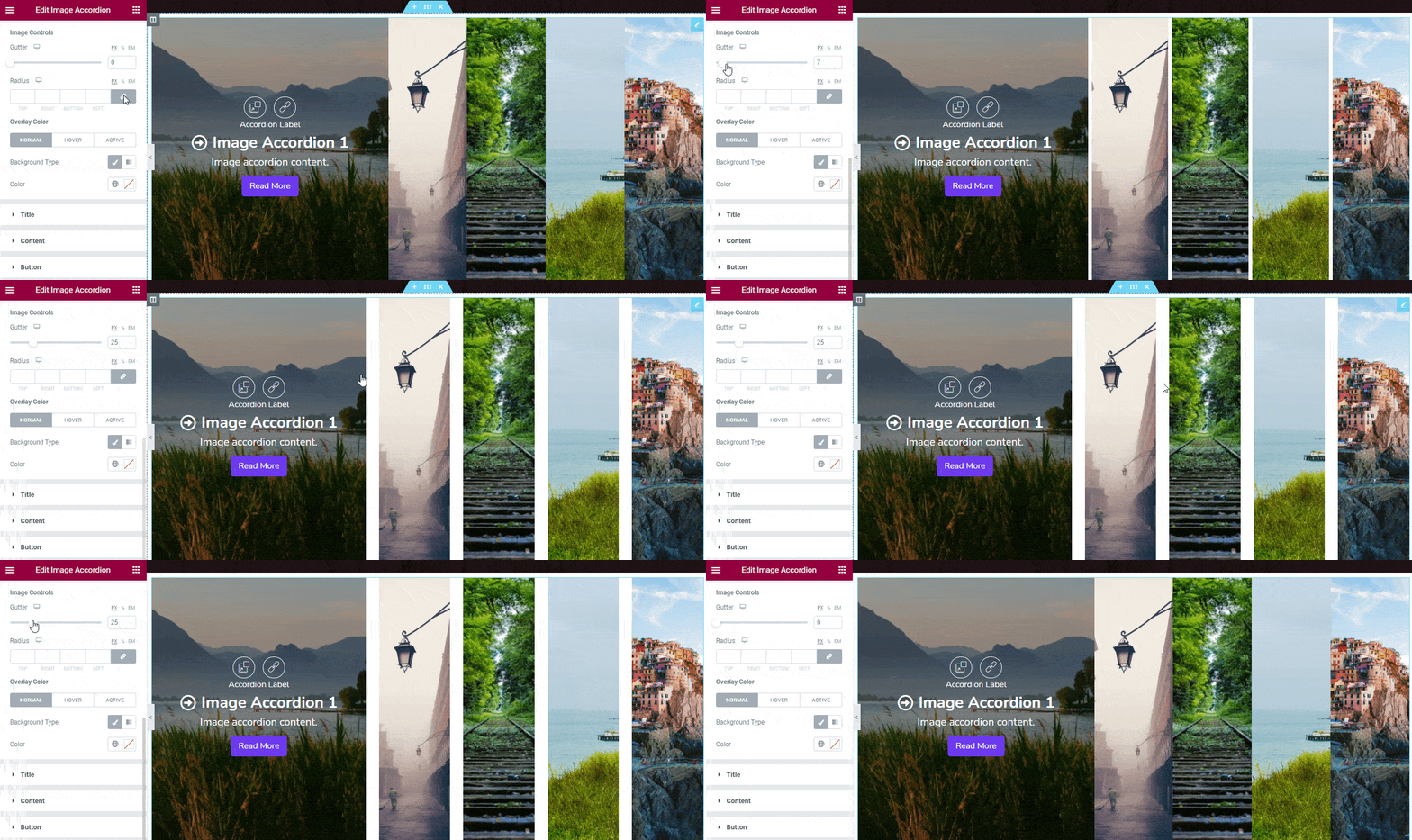
You can also select the content Overlay Color in the common style area.
Title
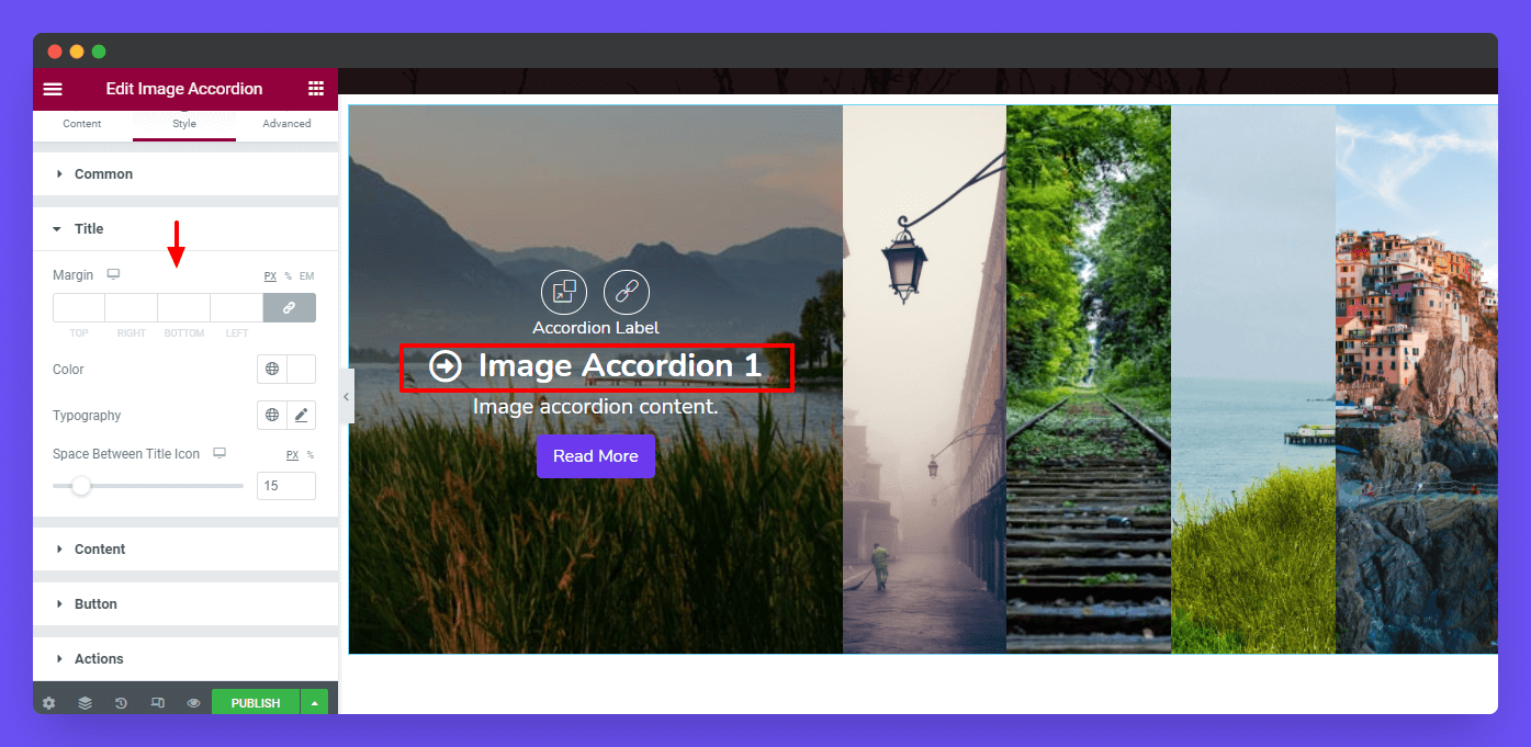
Here in the Style-> Title section, you can set the Title’s Margin, Color, Typography, and Space Between Title Icon.
Content
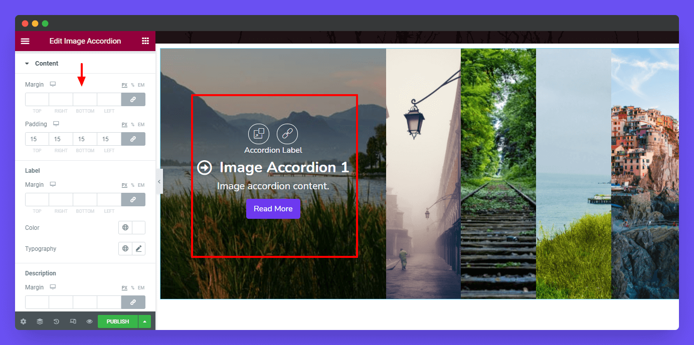
If you want to restyle the accordion content, you need to click the Style-> Content. Here, you can set the entire content Margin & Padding.
Label
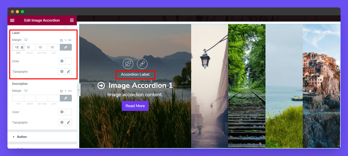
In the Content-> Label section, you can customize the label using the Margin, Color, & Typography.
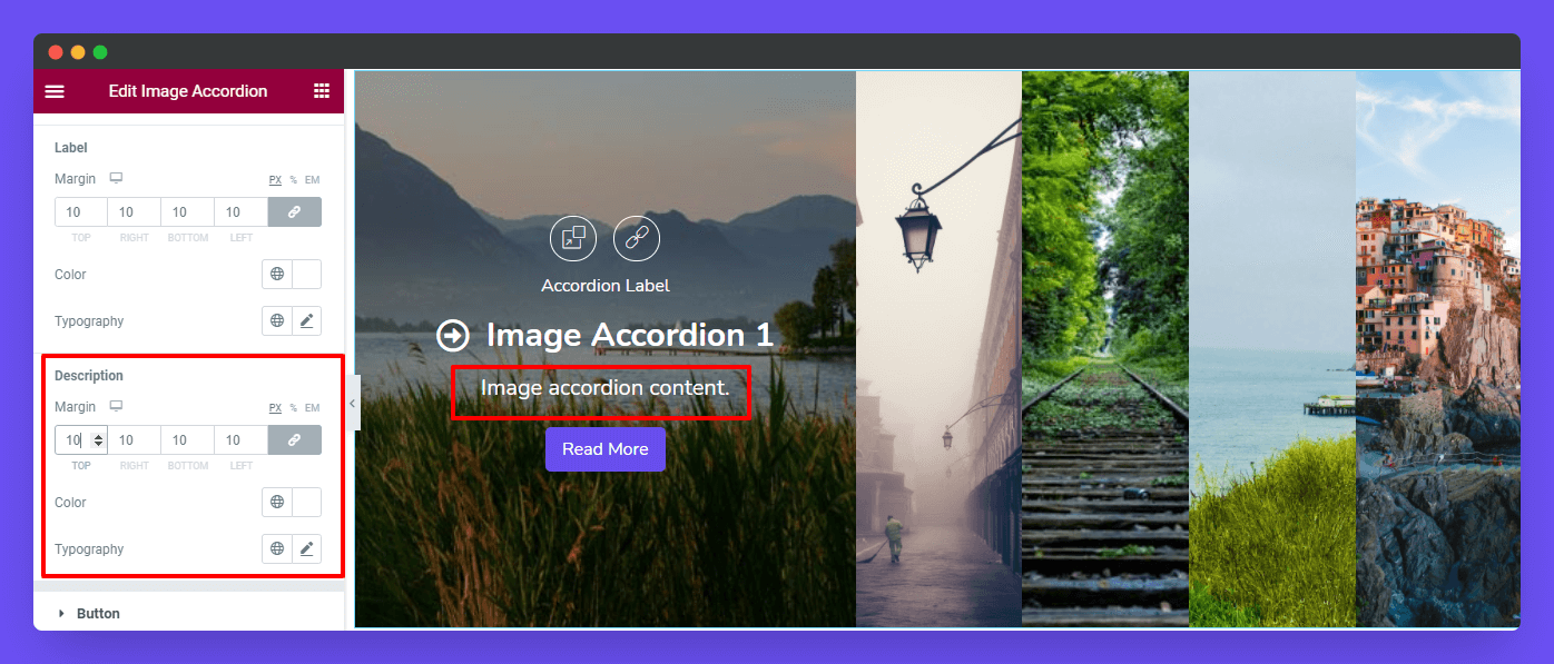
Description
Like the Content Label, you can able to reset the Description design.
Button
There are styling options Padding, Typography, Border Type, Border Radius, Color, and Background Type which will help you to change the Button default style.

Action
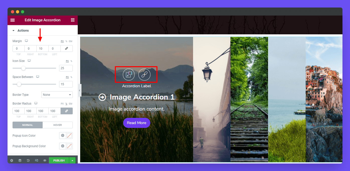
You can also set the Action’s content Margin, Icon Size, Space Between, Border Type, and Border Radius.
Style Actions’ Popup & Link
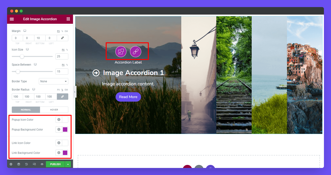
You can also change the Popup Icon Colo & Popup Background Color in your own way. And even define the Link Icon Color, and Link Background Color.
Step 4: Advanced Settings
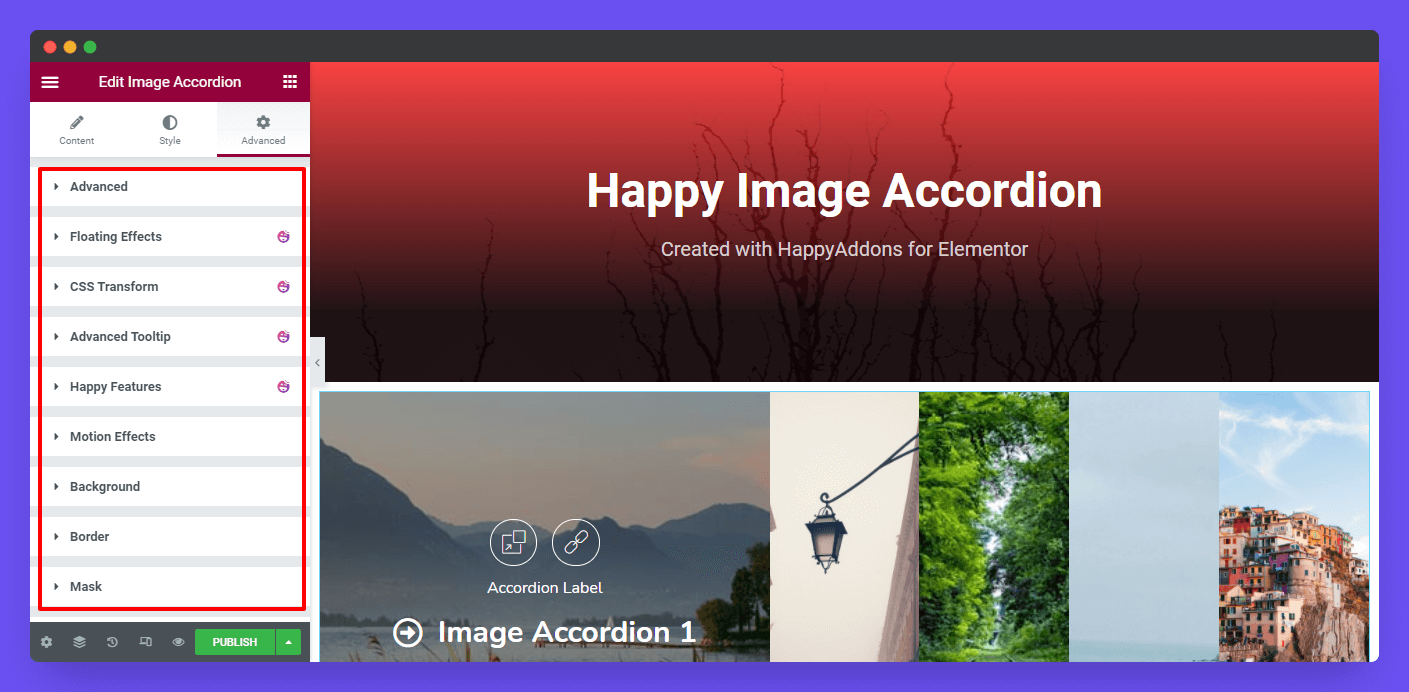
If you want to add motion effects, happy effects, background, or make it responsive and more intriguing, click on ‘Advanced‘ to explore those options. the ‘Advanced‘ is a default feature of Elementor.
Give a read to this Document to know more about advanced features & functions.
Final Preview
Here is the final preview of the Image Accordion widget.
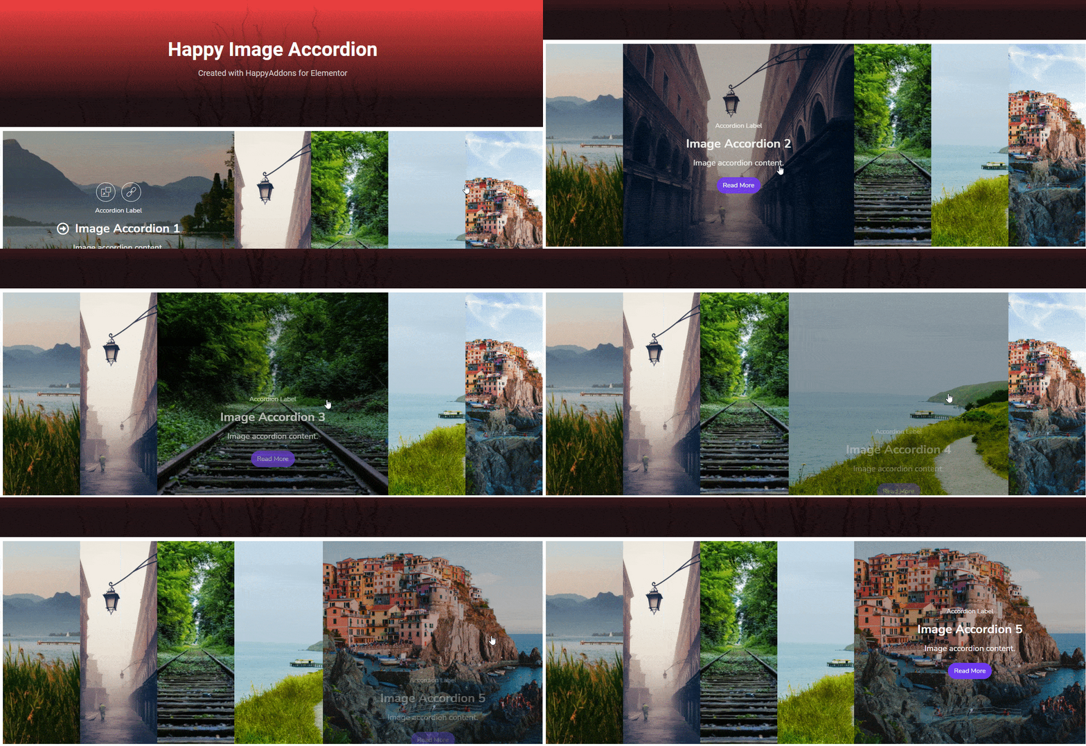
That’s it.
