Do you want to add a comparison table to your Elementor powered website to compare your product? Take a look at Happy Addons’ new free Comparison Table widget. From now, you can efficiently design and customize a responsive table for product comparison.
How To Use Happy Addons’ Comparison Table Widget
Pre-requisites
To use that amazing widget, you need to install and active the following plugins to your website:
- Elementor (Free)
- Happy Addons (Free)
Let’s get started:
Step 1: Find & Add Comparison Table Widget
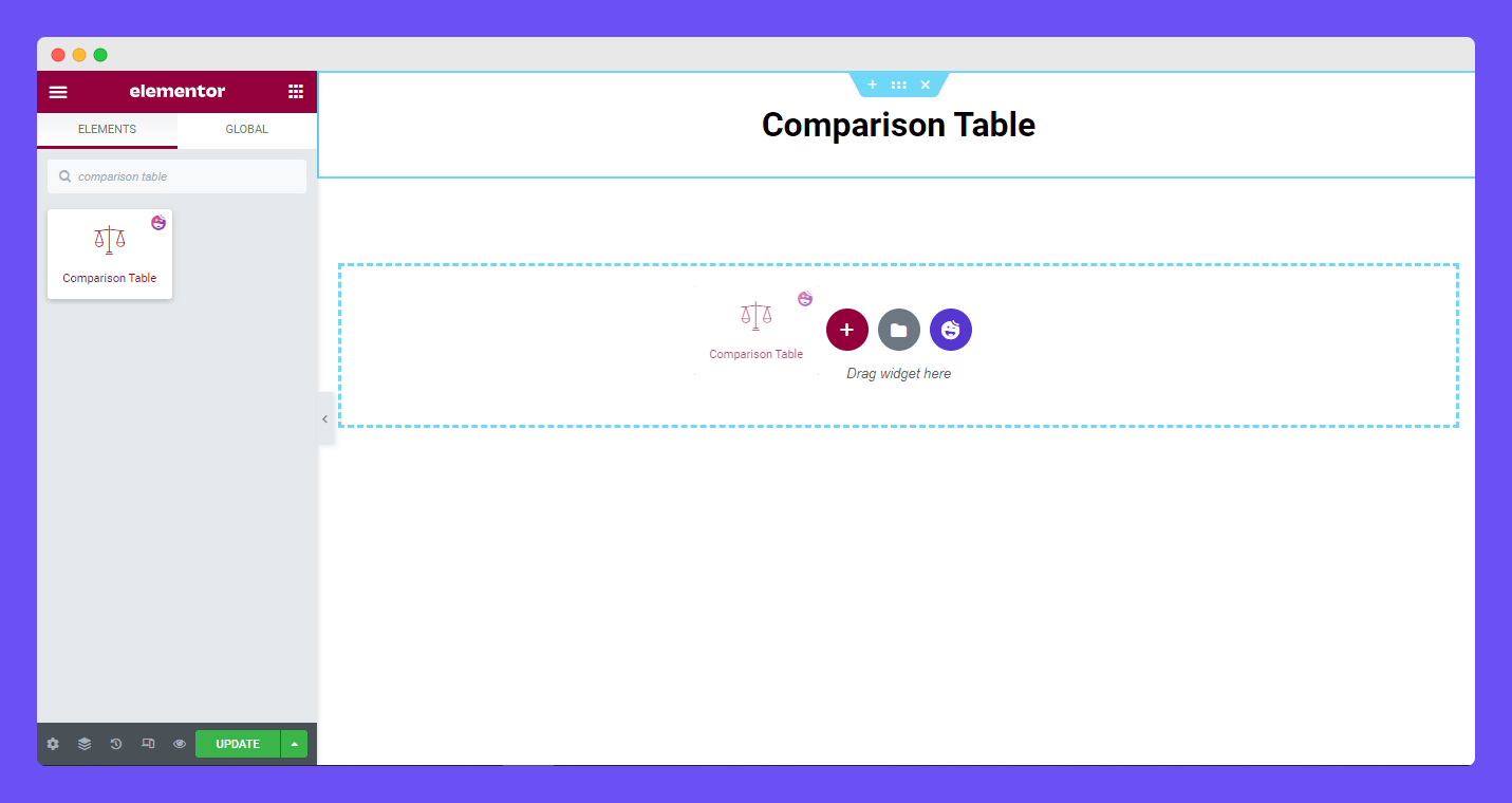
First, find the widget from the Elementor left sidebar menu. Then select the widget and drag it to the suitable area of your page.
Step 2: Add Comparison Table Content
In the content section, you’ll get the Content options so that you can add content into the comparison table. The options are.
- Table Head
- Table Row
- Table Button
- Table Settings
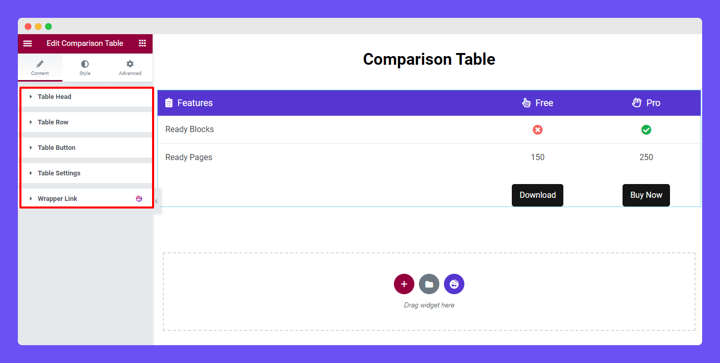
Table Head
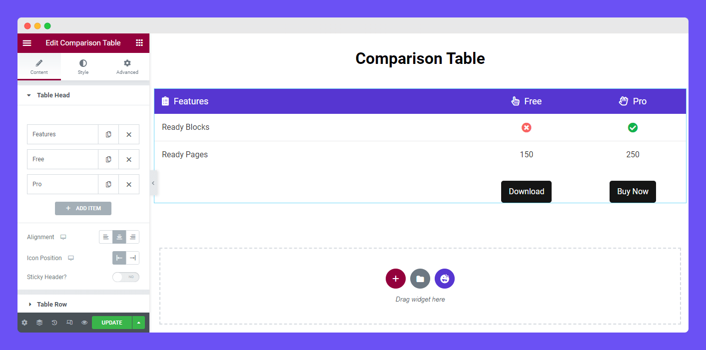
In the Content–>Table Head, you can add the table head item by clicking the Add Item button. You can easily copy and remove an item from here. You are able to set the Alignment and Icon Position of the head content.
Add Sticky Header
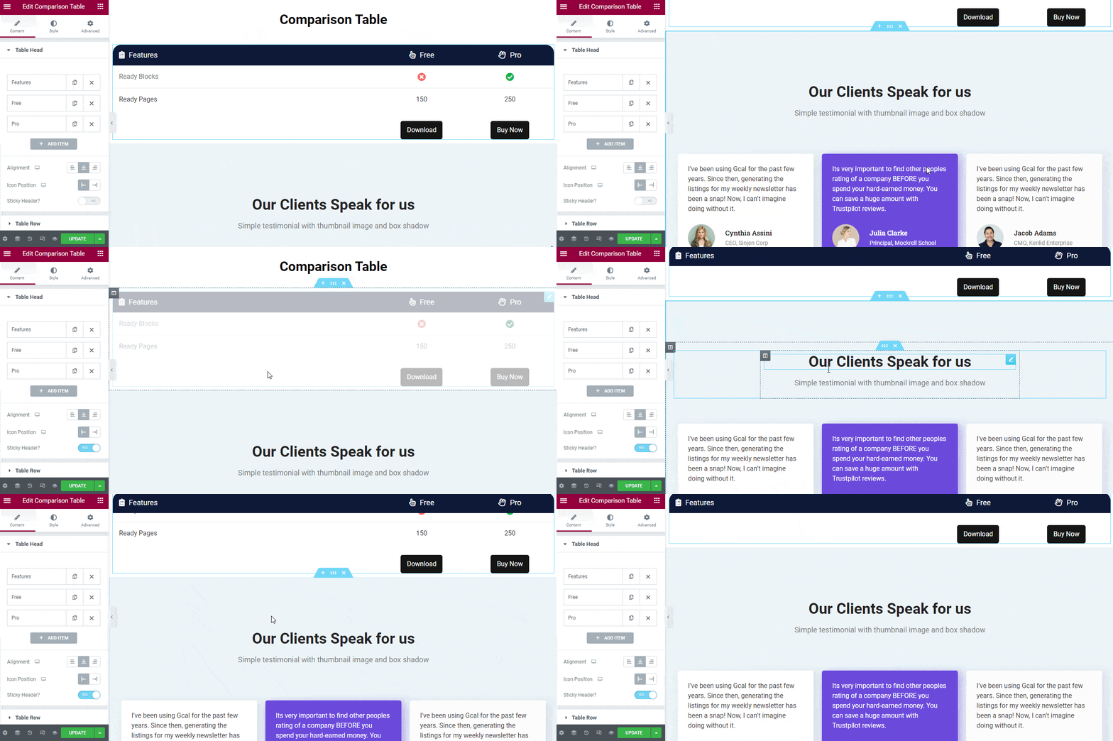
Also, you can activate the Sticky Header option to display the header on the top of the table whenever you scroll down.
Manage Table Head Items
If you want to add content to an individual item, you need to open an item first. After that, you can add a Title, manage Content Width, add Icon, and set the Icon Color according to your need.
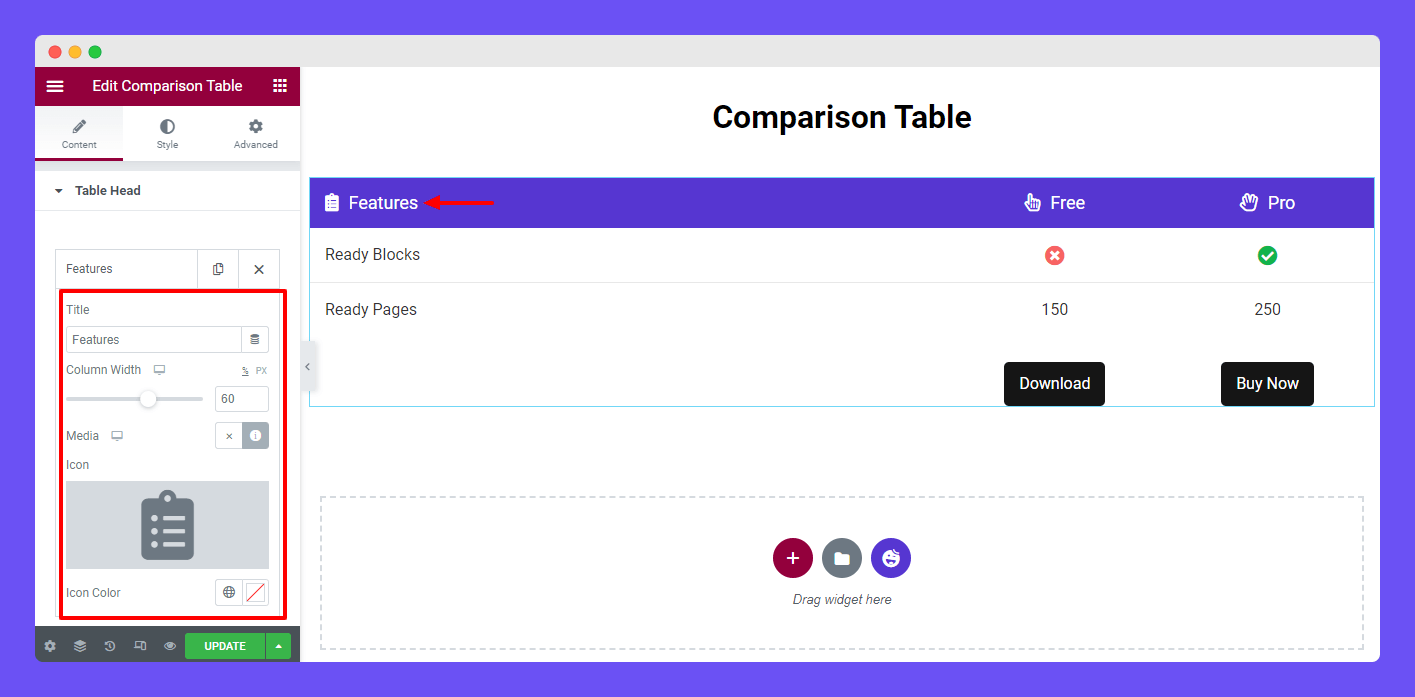
Note: The default entire Column Width is defined 100%. As we’ve added three Columns we’ve set the first Column Width 60%. And the other two Column Width is set at 20%. You can also use the Pixel (PX) for setting the table Column Width.
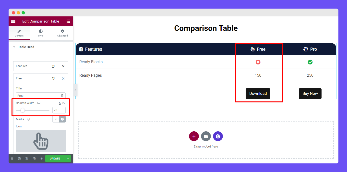
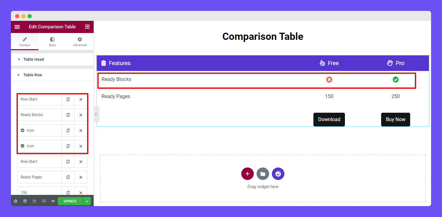
Table Row
To customize the Table Row, you need to open the table row first. Here, you see by default we’ve added two rows with columns.
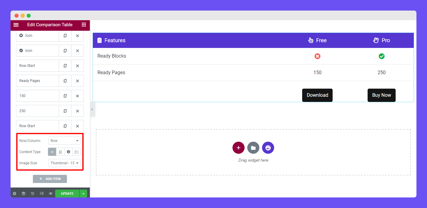
Add a Table Row
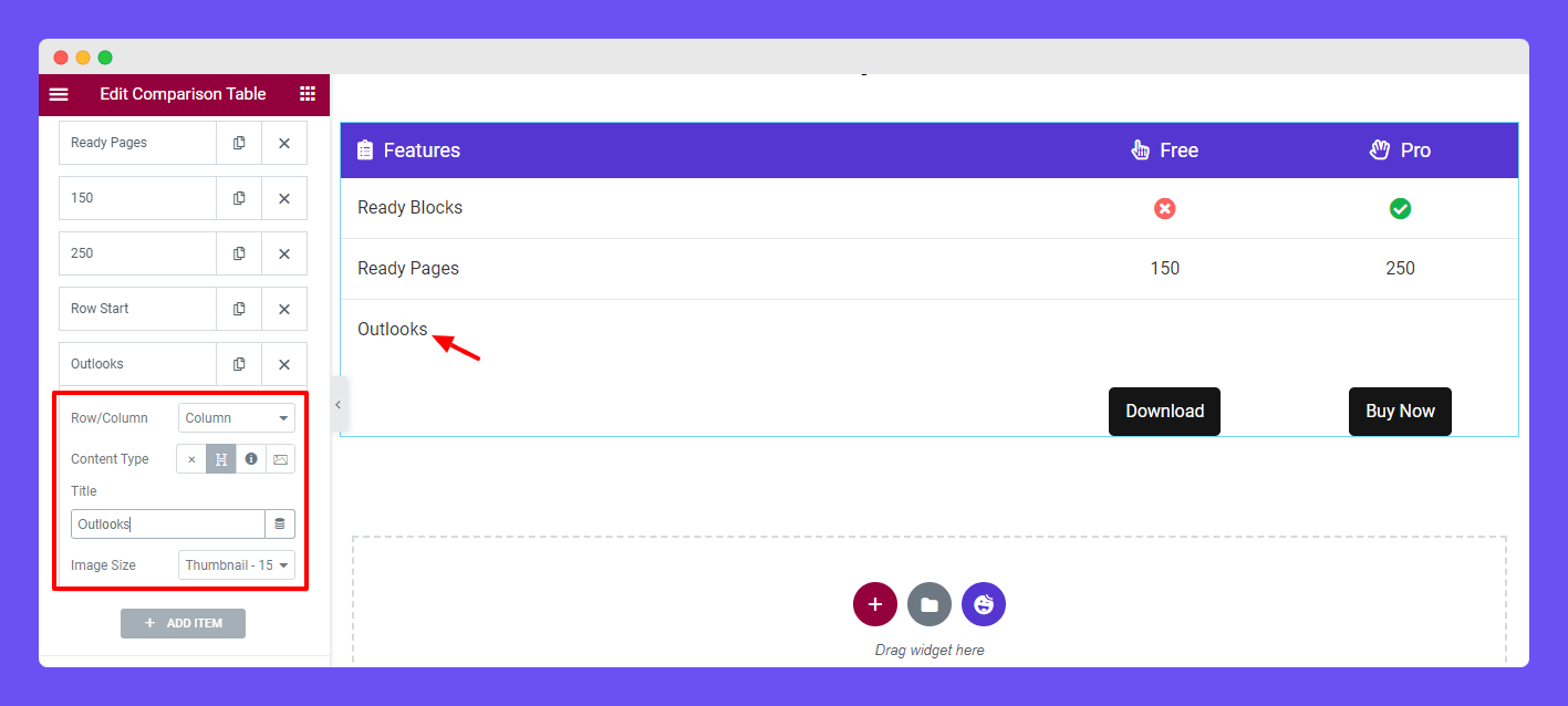
Let’s create a row and add a couple of columns to it. To do this first click the Add Item. Then you’ll get the option for adding a row. Here, you select the Row instead of a Column and set the Content Type blank as it’s a row. And you don’t need to change the Image Size so keep it default.
You can add three types of content in the column like Heading, Icon, and Image.
Add Column with Heading
Now, it’s time to add a Column into the Row. For doing this, you need to add an Item first. Then select the Column and set Content Type–> Heading. Finally, write the Title of the heading.
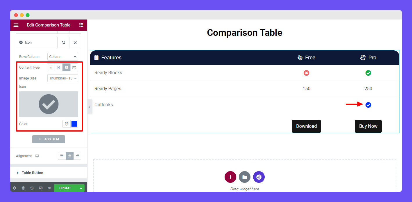
Add Column with Icon
You can also add an Icon to the column and set a unique color on it.
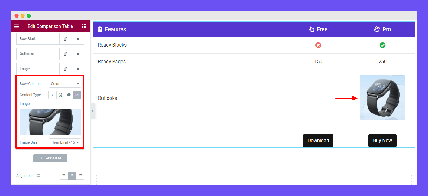
Add Column with Image
Similarly, we’ve also created another Column. Now we’ve set the Content Type–>Image and added an image to the column.
We also added another column with an image.
Note: When you add content to a column then the content will display from Right to Left.
Table Button
If you want to customize the Table Button content, you should go to the Content–>Table Button area. Here, you can add the Title and insert a Link to the button.
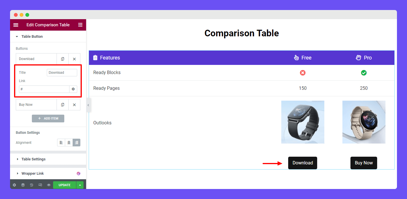
Table Settings
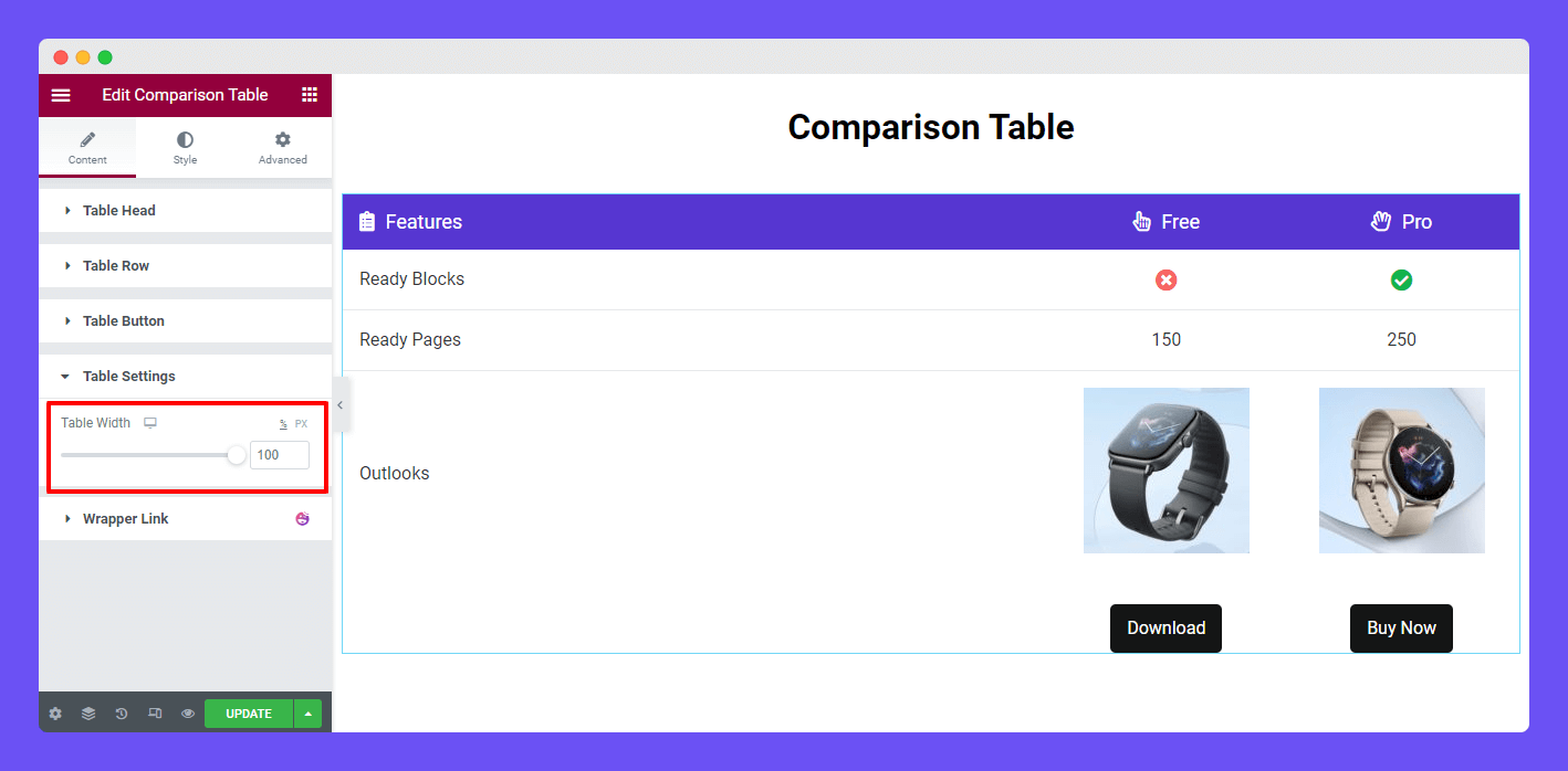
In the Content–>Table Settings, you can manage the Table Width.
Step 3: Style Comparison Table
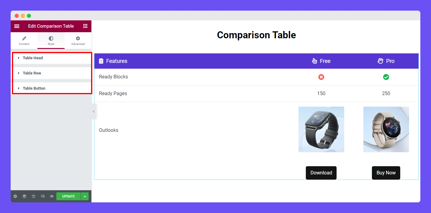
You’ll get all the necessary settings in the Style area to customize the table Head, Row, and Button.
Style Table Head
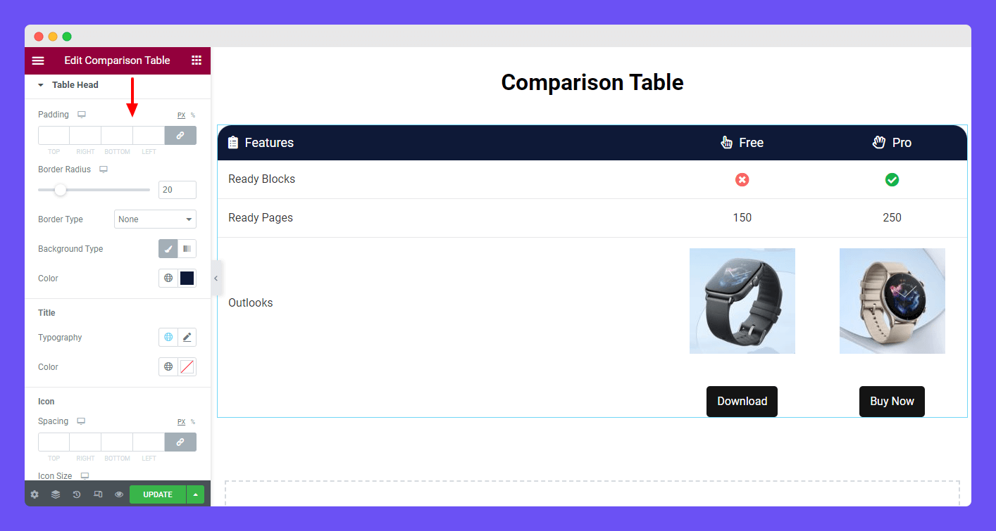
To style the Table Head section, you need to go to the Style–>Table Head area. Here, you can change the Padding, Border Radius, Border Type, and Background Type of the table header. You are able to set the Title‘ Typography and Color.
You can also change the Icon’s Spacing, Size, and Color in this area. Before changing the Icon Color, you should read the below note.
Note: If you’ve added Custom Style then Icon Color will be overwritten for that cell.
Style Table Row
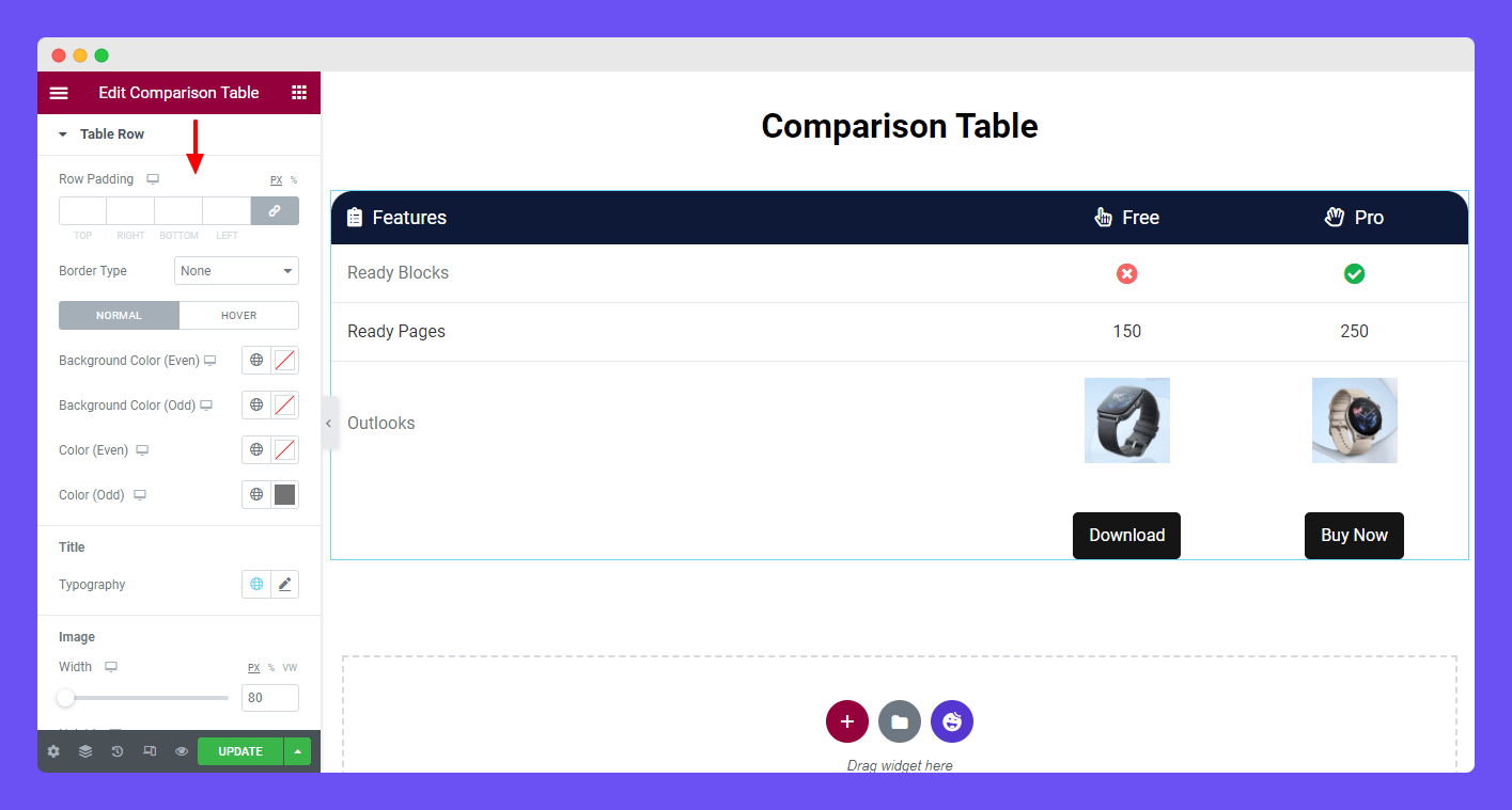
You can easily customize the Table Row default style using the Table Row style options. You can change the Row Padding, Border Type, Background Color (Even), Background Color (Odd), Color (Even), and Color.
Also, customize the Title–>Typography, Image Width & Height, and Icon’s Spacing, Size, and Color.
Note: If you’ve added Custom Style then Background Color, Color, Icon Size, and Icon Color will be overwritten for that cell.
Style Table Button
According to your need, you can change the Button‘ Typography, Border Radius, Padding, Border Type, Text Color, Background Color, and Box Shadow.
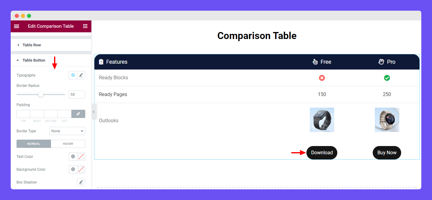
Step 4: Advanced Settings
If you want to add motion effects, happy effects, background, or make it responsive and more intriguing, click on ‘Advanced‘ to explore those options. the ‘Advanced‘ is a default feature of Elementor.
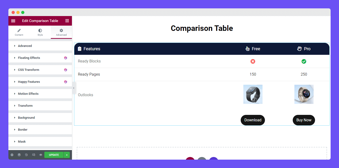
Give a read to this Document to know more about advanced features & functions.
Final Preview
Using this exclusive widget, you can easily create this type of comparison table.
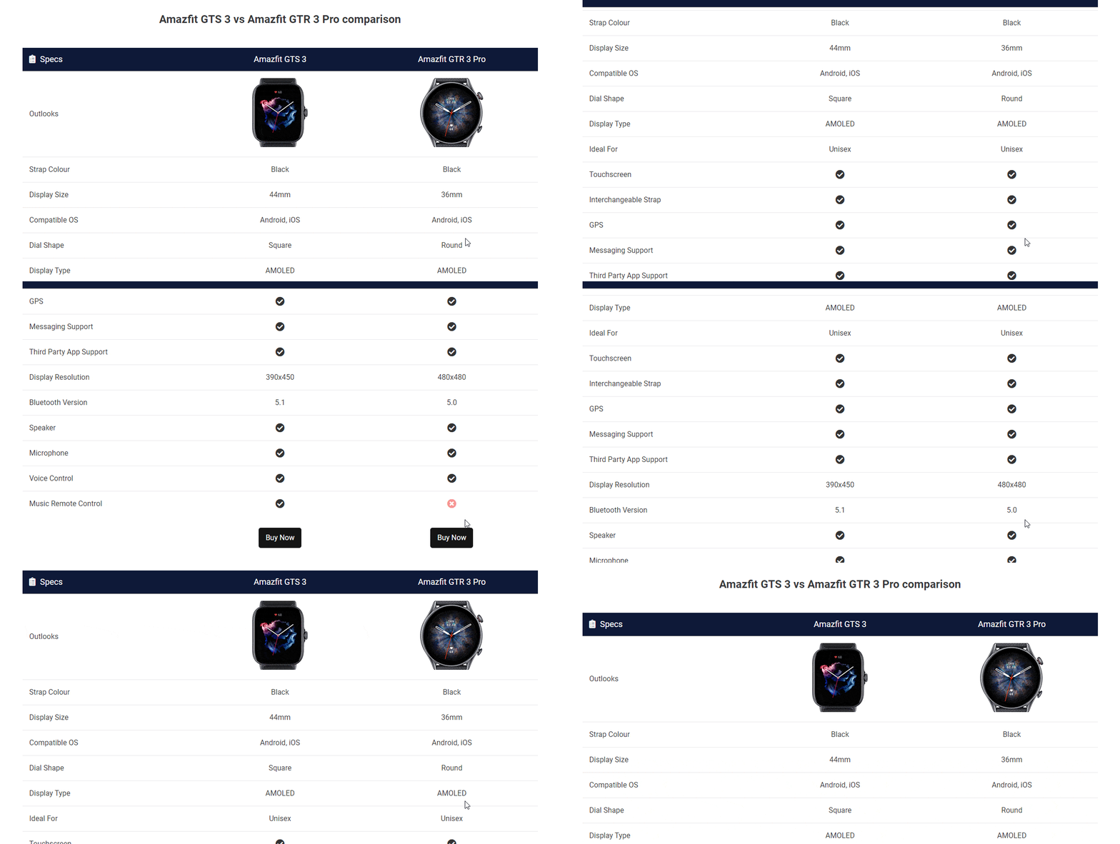
You can check out this handy video tutorial to learn how to use this widget.
Here is an example of a product page with a comparison table.

Feature Enhancement of Comparison Table (Version 3.4.4)
Happy Addons’ version (3.4.4) comes with some enhancements to its Comparison Table widget. Here is the list of Comparison Table widget enhancements.
- Add Title HTML Tag in the Table Head section
- Write Description in Table Head/Column area
- Customize button with new Custom Style option
Let’s see how these features work:
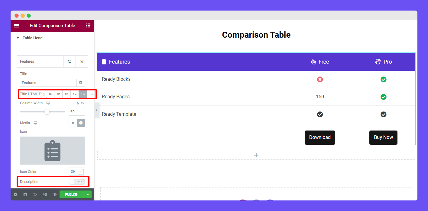
Title HTML Tag
In the Table Head area, you can set the heading HTML tag to the individual item. To do this, open an item first. Then you need to select the required HTML using the Title HTML Tag option.
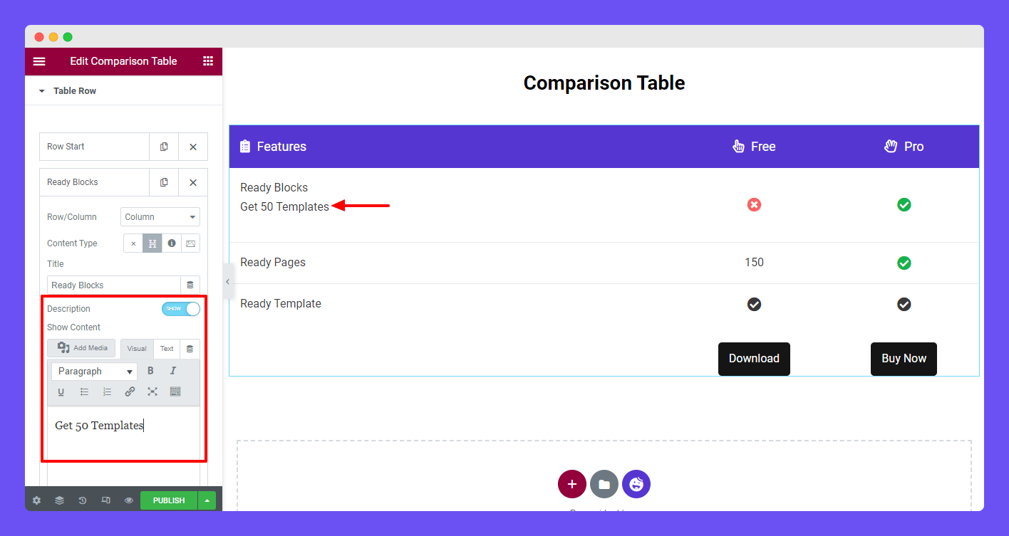
You are able to write a description under the heading items. Enable the Description option. After that, you’ll get a text editor for writing your description.
Write Description To Table Column
Go to Table Row first. Then click an individual table column and enable the Description option. And write a suitable description using the text editor.
Add Custom Style to the Table Button
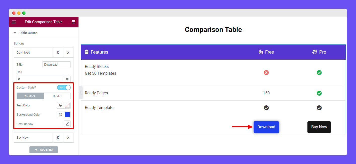
Now, you are able to design your custom button using the Custom Style option. Active the Custom Style first. Then you can add Text Color, Background Color, and Box Shadow to your button. Also, you can set the different button styles on the Hover mood.
That’s it.


