Need a handy tool to create a stunning content switcher on your Elementor website? Take a look at Happy Addons’ new ‘Content Switcher‘ free widget. Now, you can effortlessly add and customize switchable content with this completely flexible widget in a more organized way.
Pre-requisites
To use that cool Content Switcher widget, you need the following things:
- Elementor (Free)
- Happy Addons (Free)
How To Use Content Switcher Widget
Let’s check out how to use the Content Switcher widget and customize it step-by-step:-
Step: 1
Add Content Switcher Widget
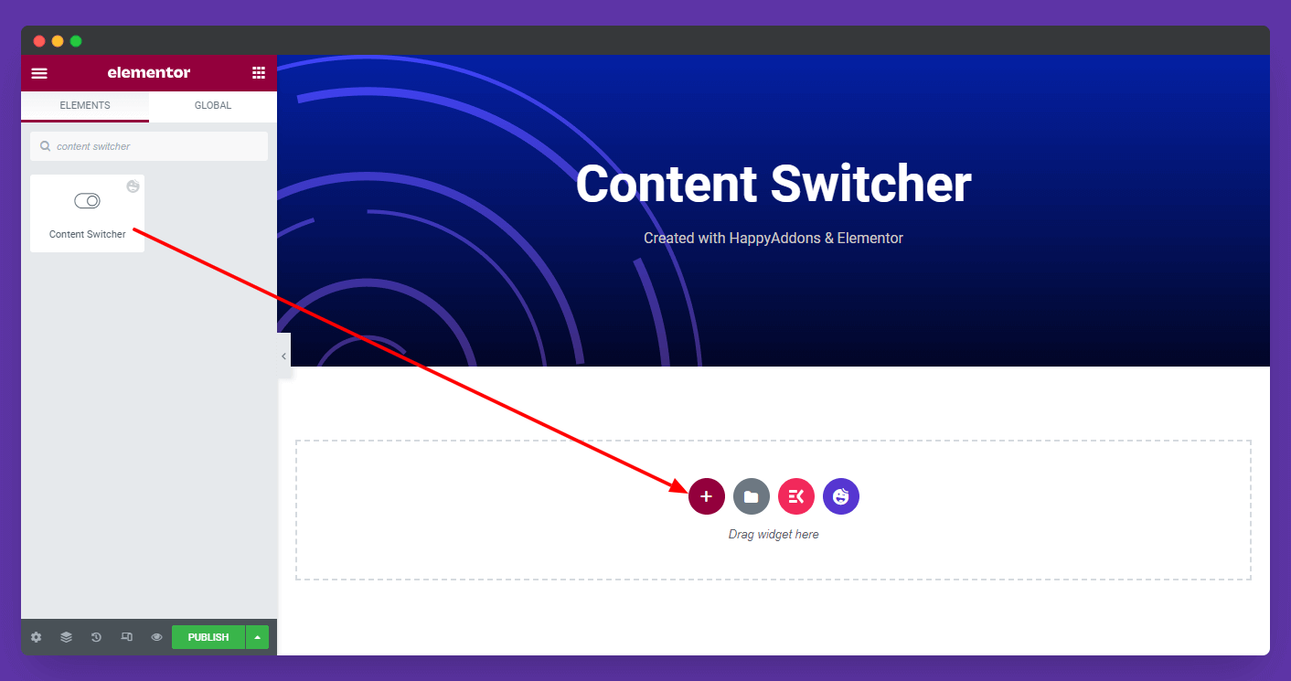
First of all, you need to find the widget from the left sidebar menu. Then drag and drop it onto the selected area.
Step: 2
Content Optinos
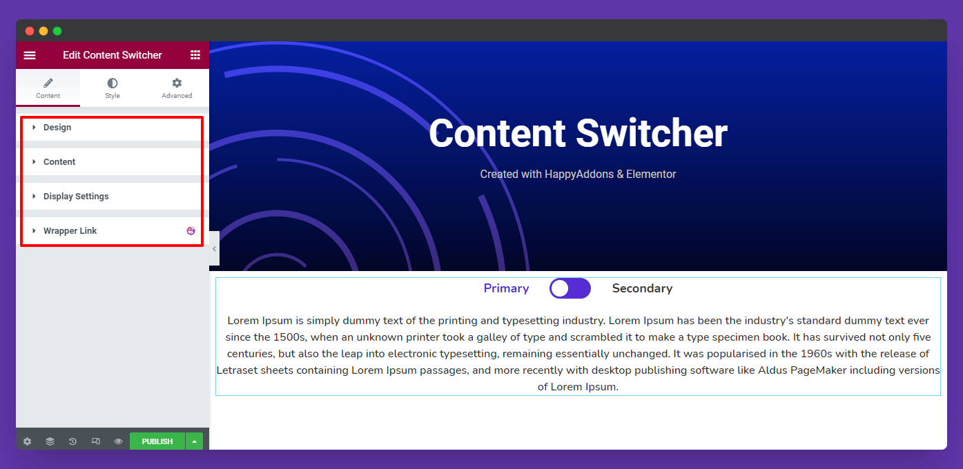
In the Content area, you’ll get the three content options of the Content Switcher. Here are they.
- Design
- Content
- Display Settings
Let’s explore all the content options one by one.
Design
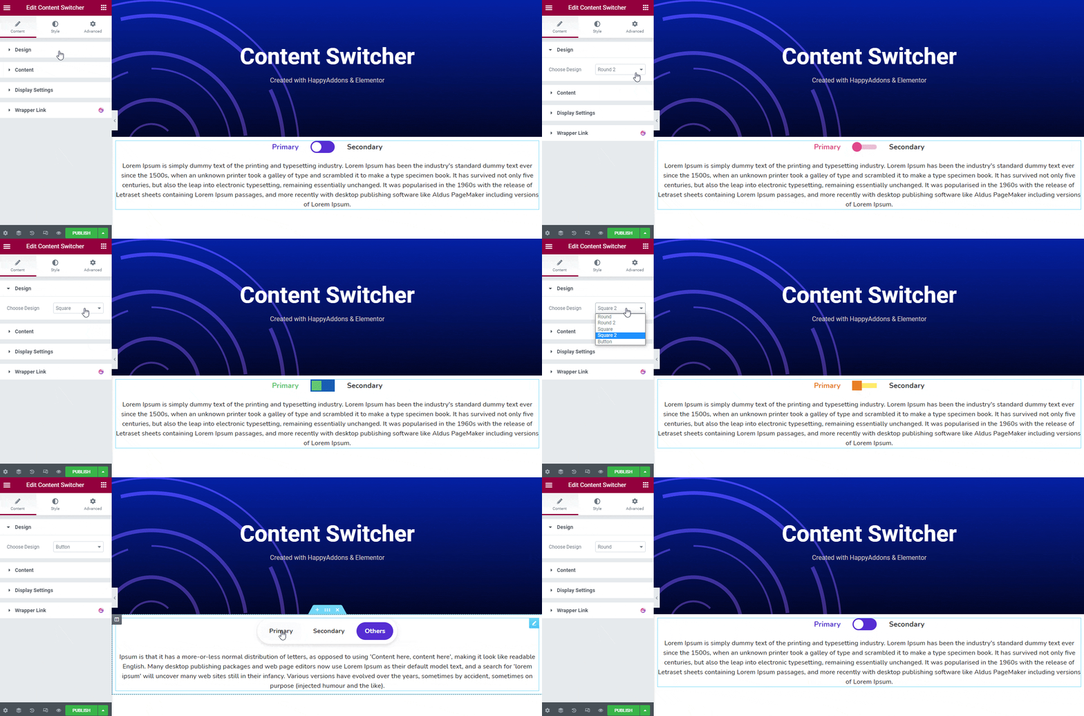
There 5 design presets in the Content Switcher. They are.
- Round
- Round 2
- Square
- Square 2
- Button
Add & Customize Content Items in The Content Section
In the Content area, you can add your content Items. Here, you can set the content items..
- Title: You can write your content Title.
- Type: There are three Content Types Plain/HTML Text, Saved Sections, and Saved Page you can use to a add content.
- Icon: You able to add Icon into the content
- Icon Position: You can also set the Icon Position Left & Right.
- Active: Uing the active option, you can define which content will remain active.
Let’s see how can you add and customize content using different content types.
Plain/HTML Text
The Plain/HTML Text is the default Content–>Type whenever you’ve added the widget in your Elementor page. You can change the default content items on your own. Let’s see.
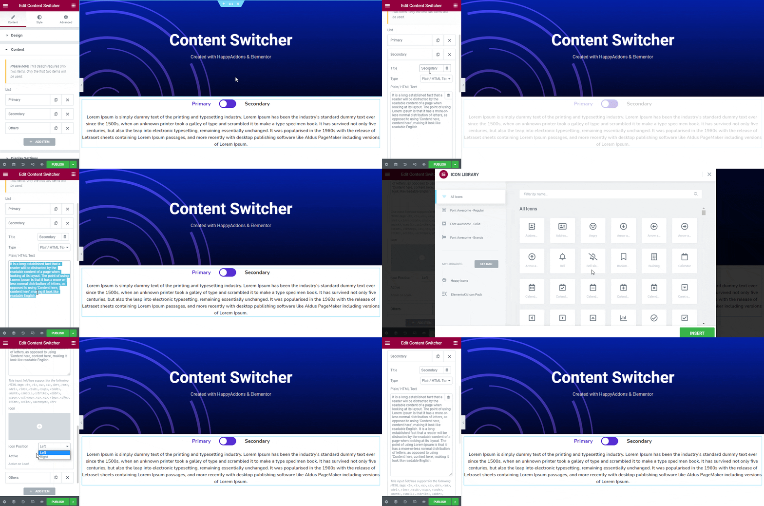
Note: Remember only the first two items will be used as your switchable content. If you want to add more content to the switcher, you have to set Button Design Preset.
Save Section
You can use any of them to add & customize your switcher content. Here you’ve used our prebuilt Saved Section as our switchable content.
First, you select the Round Design. Second, we set our content Type as a Saved Section. Finally, select the correct section from the drop-down list. Let’s have a look.
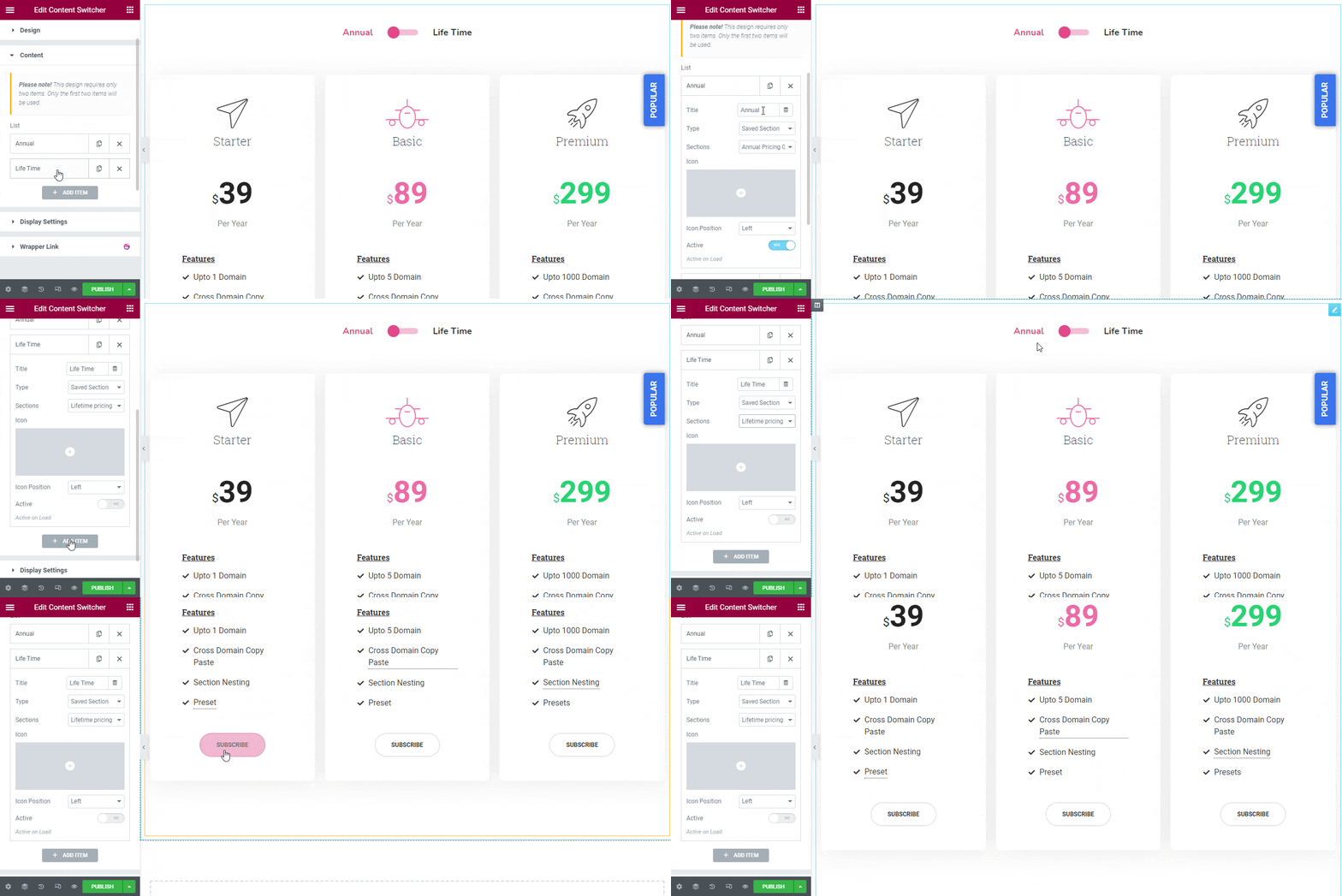
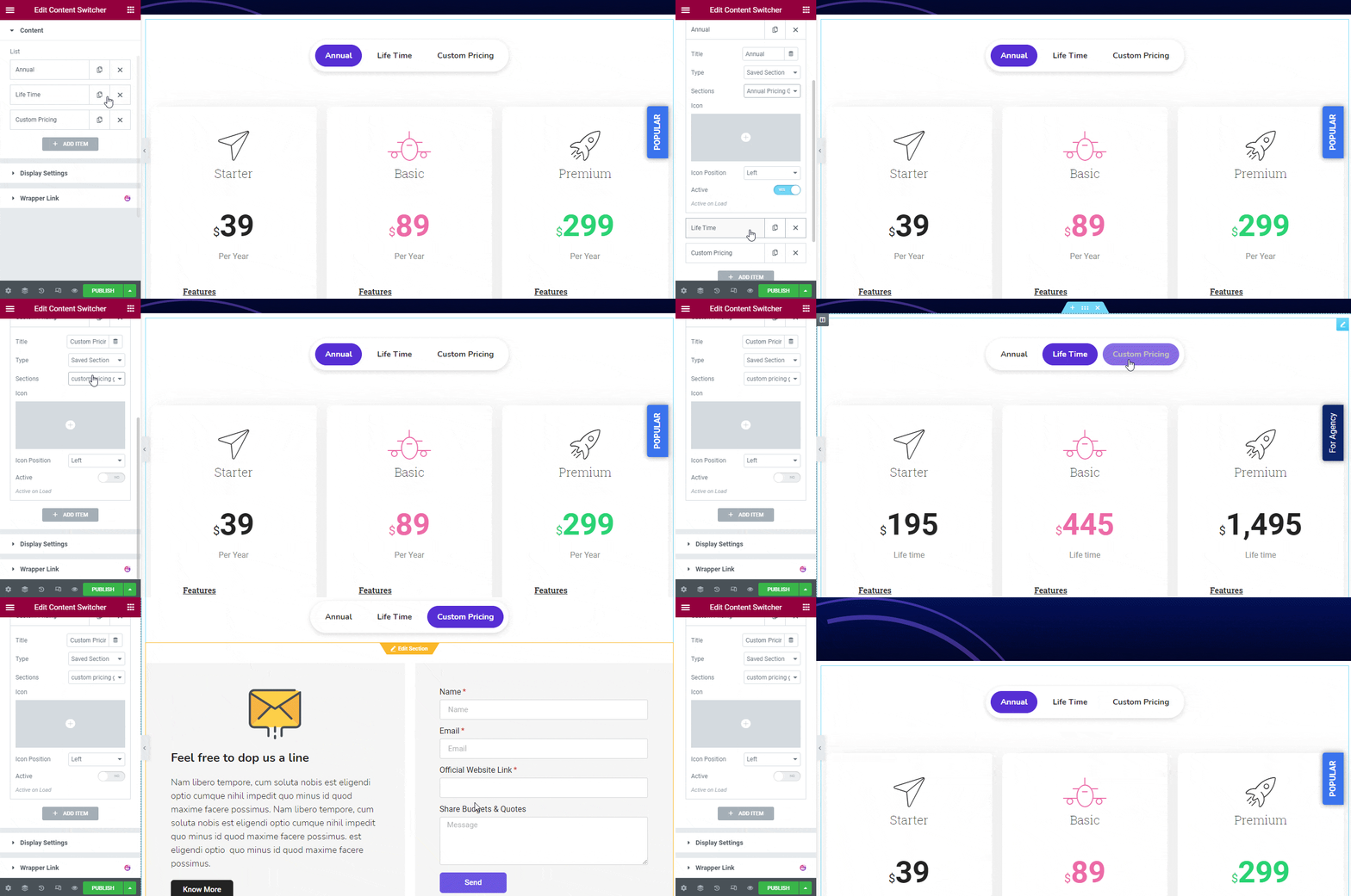
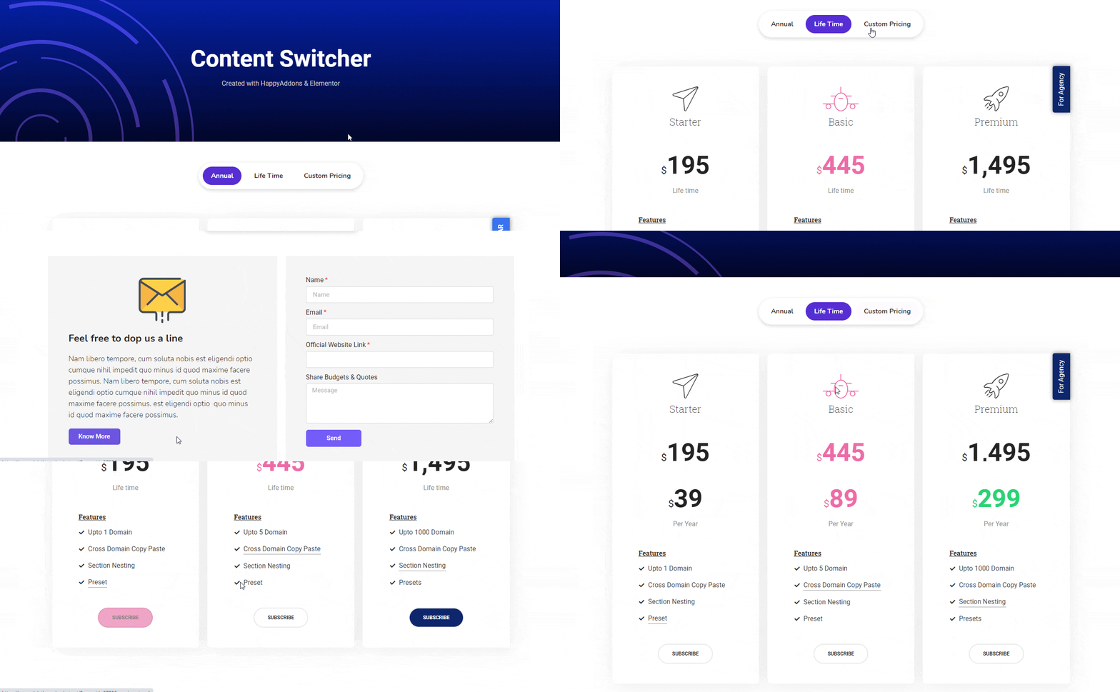
If you want to switch multiple different contents using the switch, you also can do it. First, select the Button Design. Second, add your items to the content area. Like above we’ve again used three of our premade Saved Section as our content Type. Here, we’ve created a pricing plan switcher.
Let’s see how it look likes.
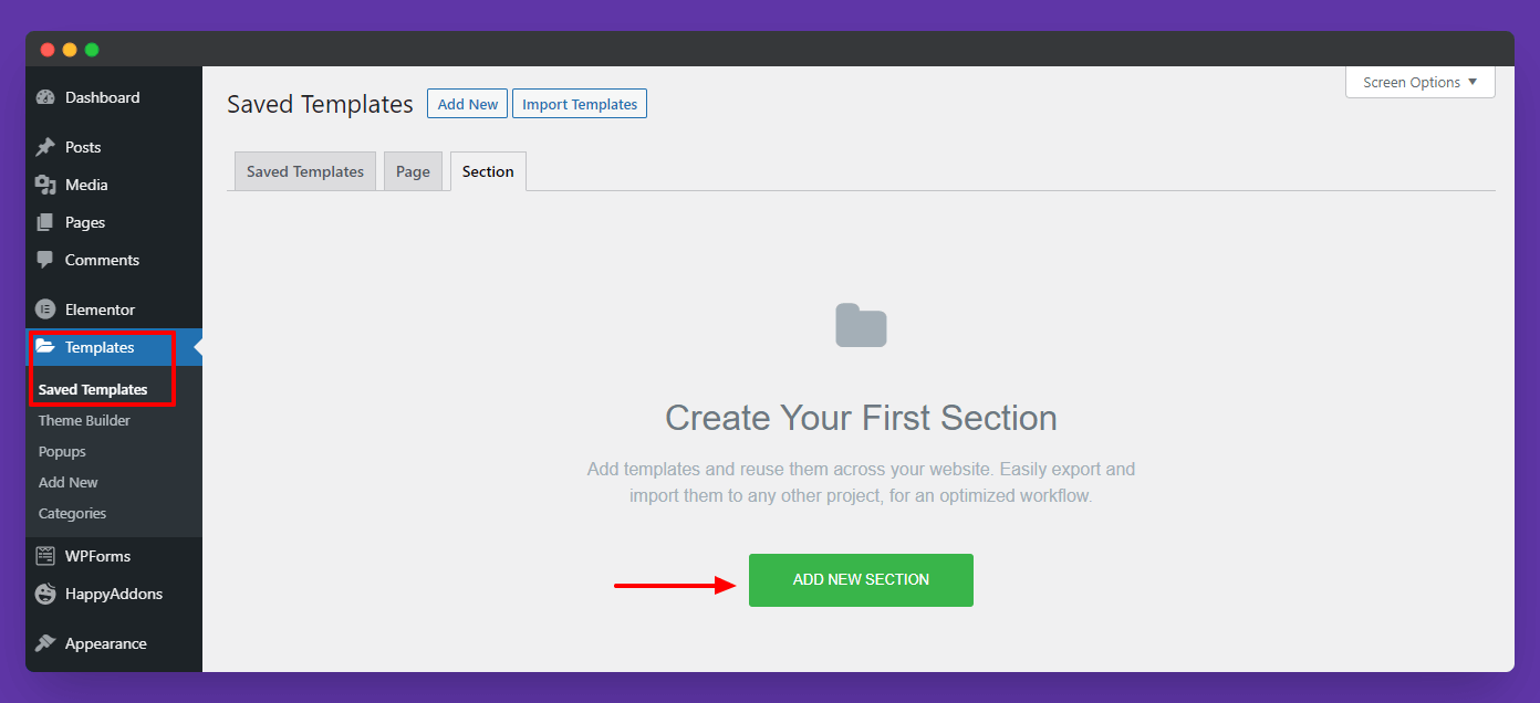
Note: You can find your Saved Elementor Sections in your website Dashboard–>Templates-Saved Templates–>Section area.
Display Settings
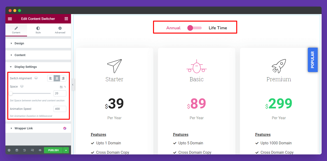
According to your need, you able to set the Display settings like Switch Alignment, Set Space between switcher and content section, and Animation Speed.
Step: 3
Style Options
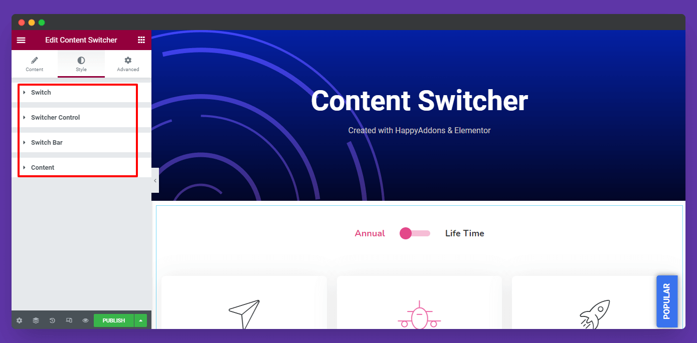
In the Style section, you’ll find four different styling options to design the content switcher. Here are they.
- Switch
- Switcher Control
- Switch Bar
- Content
Let’s see how they work.
Switch Style
In the Switch style area, you’ll get tons of options to change your switch..
- Typography
- Icon Spacing
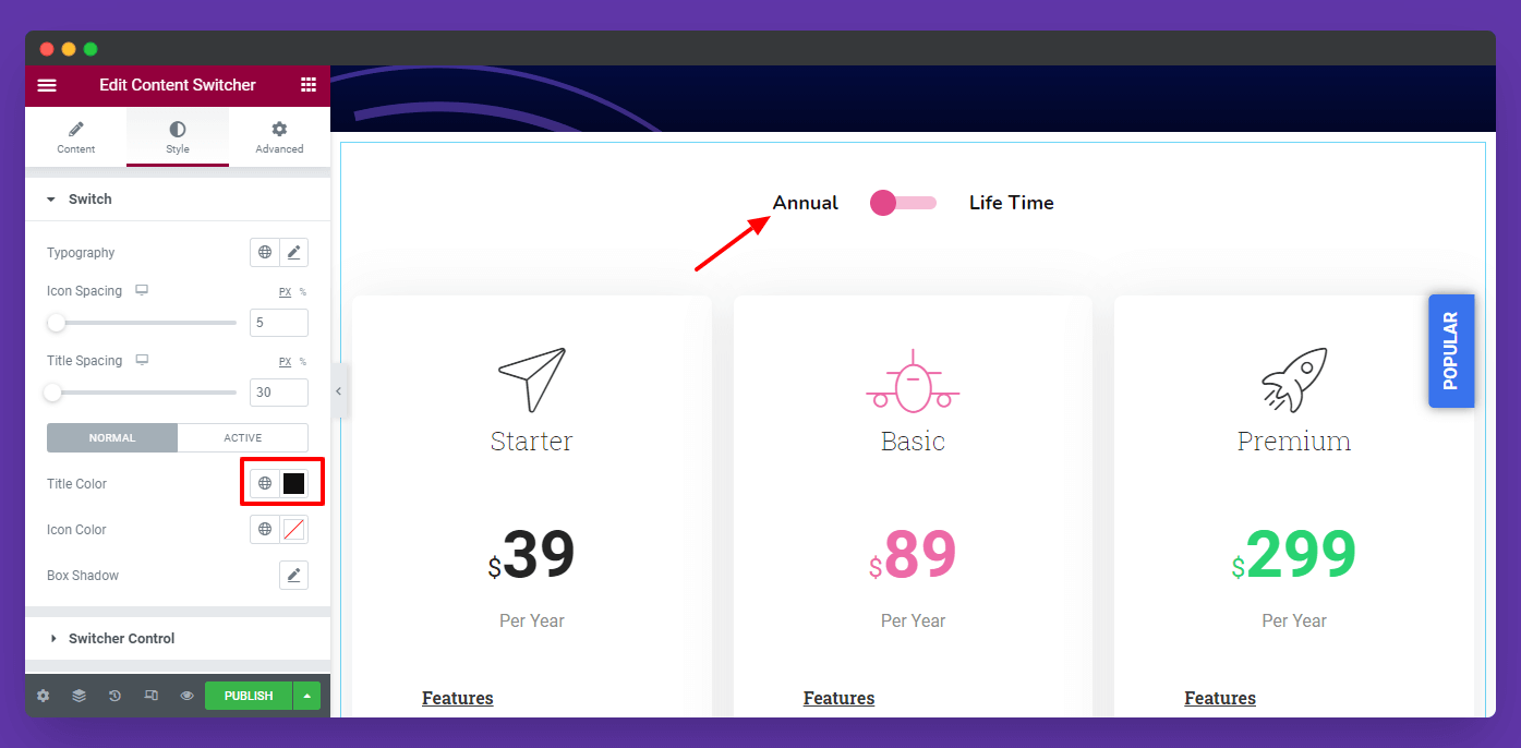
- Title Color
- Icon Color
- Background Color
- Border Type
- Border Radius
- and more.
Here, you see how can we’ve changed the Title Color.
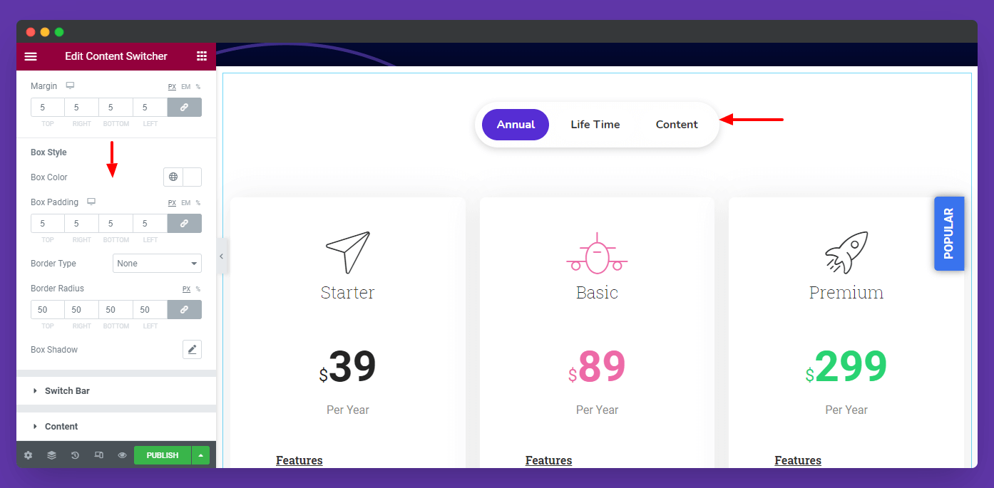
If you select the Button Design Preset, you’ll get an extra option to style the Button Box. Here you can change Box Style..
- Box Color
- Box Padding
- Border Type
- Border Radius
- Box Shadow
Switcher Control Style
If you want, you can also change the Switcher Control style like Switch Size (px), Color, and Background Color.
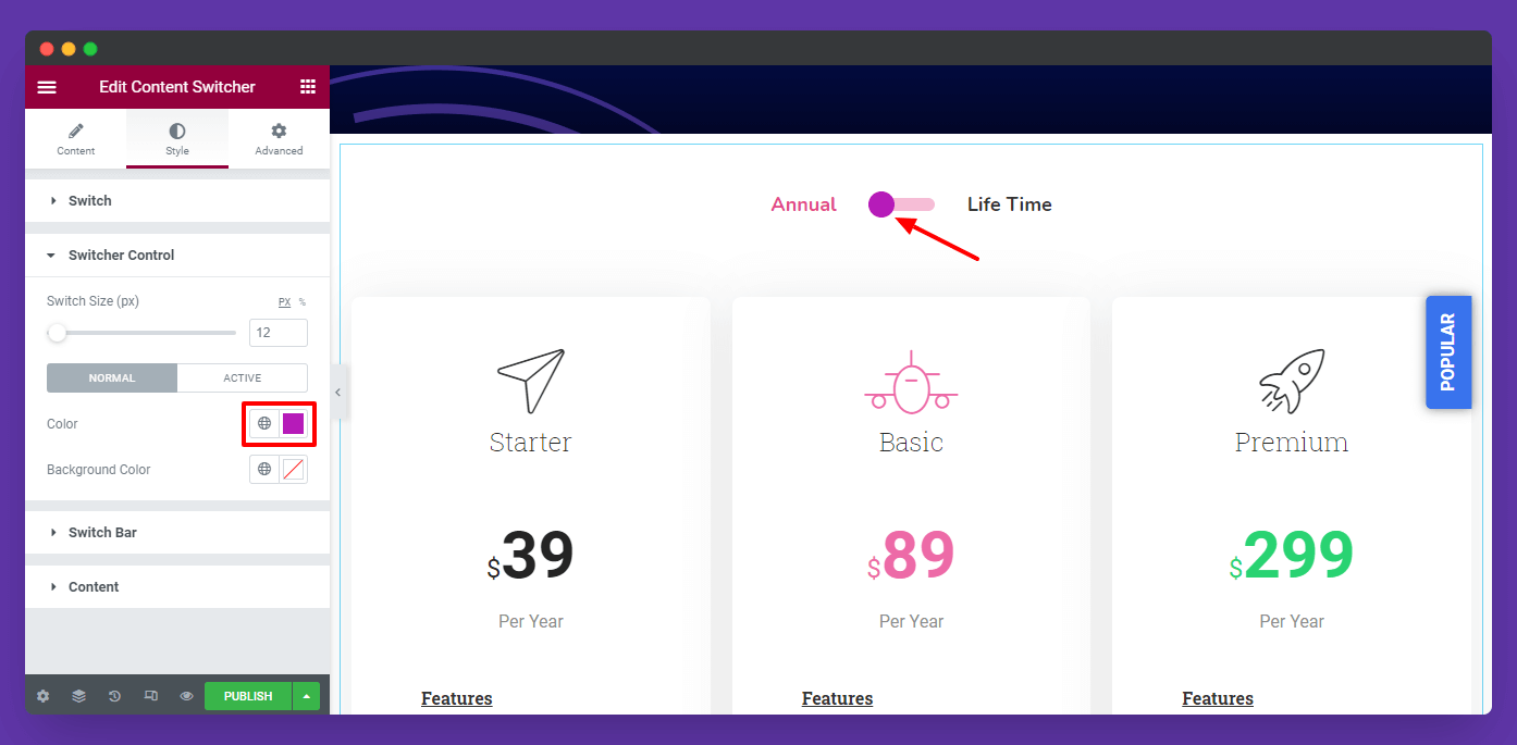
Note: You will only get the Switcher Control Style when you set the Design–>Round/Square presets.
Switch Bar Style
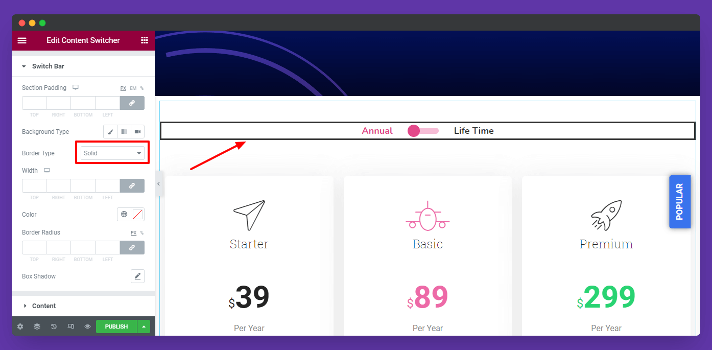
These are the styling options that will help you to redesign the Switch Bar.
- Section Padding
- Background Type
- Border Type
- Border Radius
- Box Shadow
Content Style
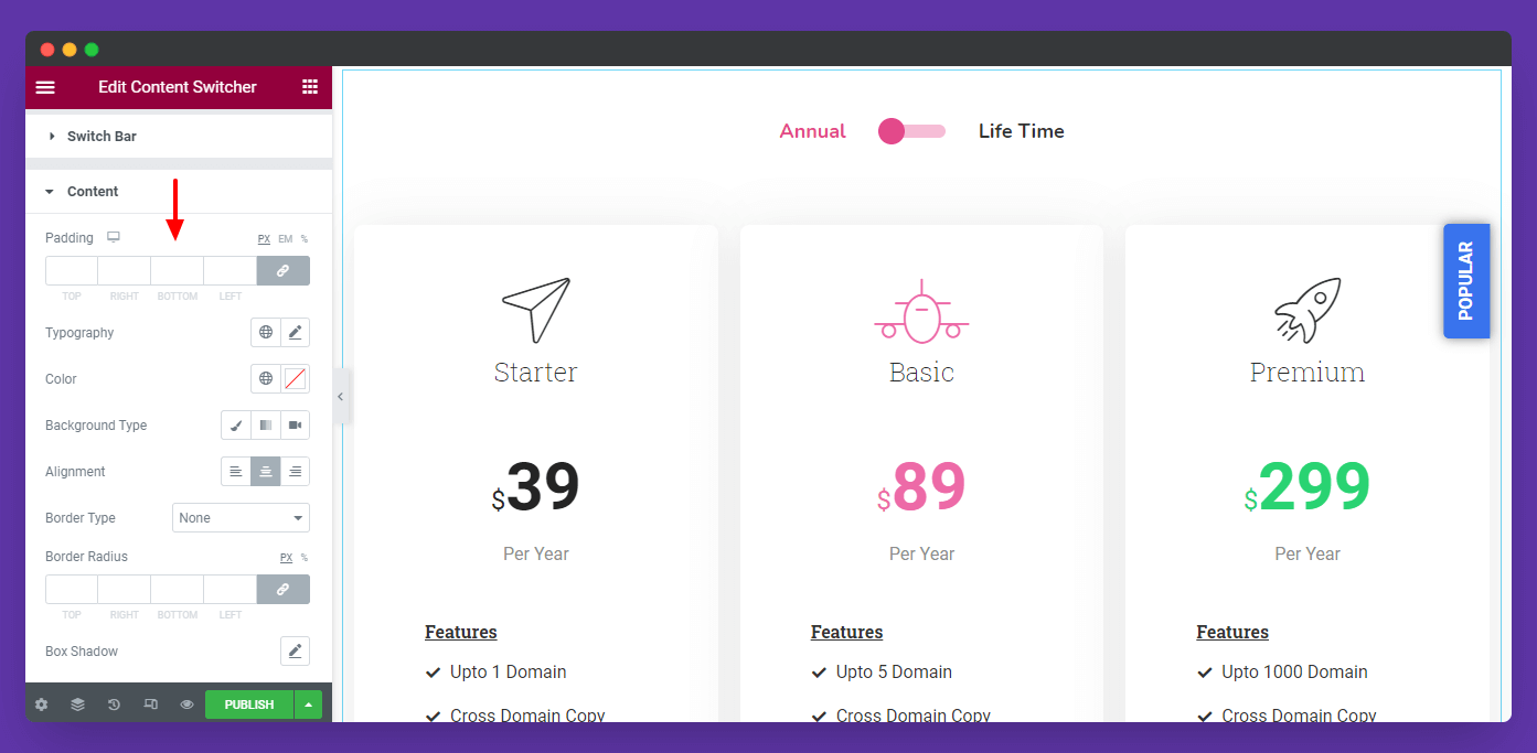
You can also style the Content..
- Padding
- Typography
- Color
- Background Type
- Alignment
- Border Type
- Box Shadow
Step: 4
Advanced Options
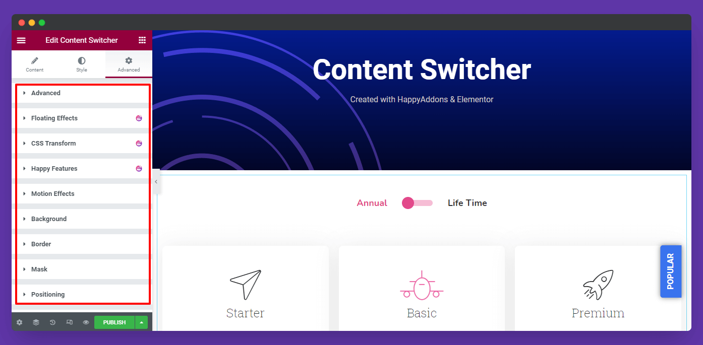
If you want to add motion effects, happy effects, background, or make it responsive and more intriguing, click on ‘Advanced‘ to explore those options. the ‘Advanced‘ is a default feature of Elementor.
Give a read to this Document to know more about advanced features & functions.
Final Preview
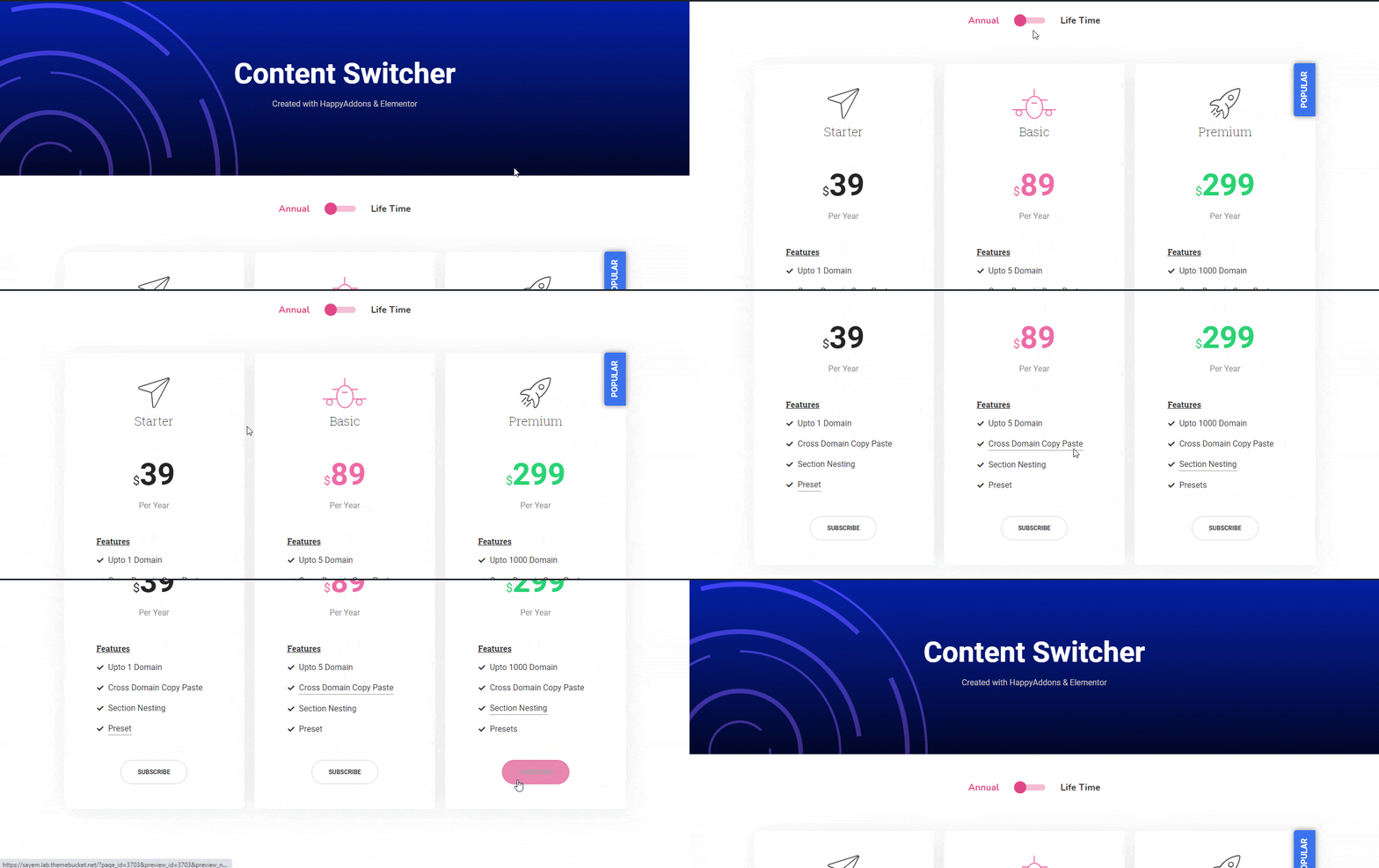
Here is the final preview of the round Content Switcher demo.
Here is the final preview of the button Content Switcher demo.
That’s it.
