


The Image Cycle widget in HappyAddons lets you display multiple images in a continuously rotating circular orbit. It is ideal for showcasing portfolios, products, projects, services, or other visual content in an engaging and interactive layout.
You can customize the images, links, animation style, rotation, text, sizing, borders, shadows, and other visual properties directly from Elementor—without writing custom code.
Availability: The Image Cycle widget is available in the free version of HappyAddons.
What You Can Create with Image Cycle
The Image Cycle widget can be used to:
- Showcase portfolio projects.
- Display products or product categories.
- Present client or project images.
- Create an animated hero section.
- Highlight services or case studies.
- Build an interactive visual gallery.
- Add an animated visual element to a landing page.
- Present multiple images around a central content area.
Requirements
Before using the Image Cycle widget, make sure you have:
- WordPress installed on your website.
- Elementor installed and activated.
- The free version of HappyAddons installed and activated.
No HappyAddons Pro plan is required to use the Image Cycle widget.
How to Enable the Image Cycle Widget
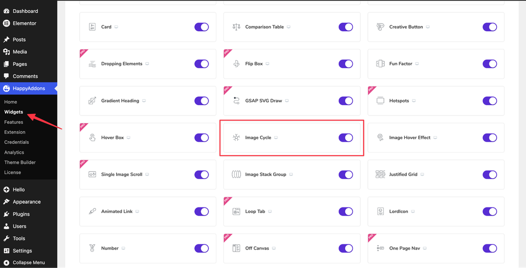
Before adding the widget to an Elementor page, make sure it is enabled in HappyAddons.
Step 1: Open HappyAddons Widgets
From your WordPress dashboard, go to:
HappyAddons → Widgets
Step 2: Find Image Cycle
Use the widget search field to find Image Cycle.
Step 3: Enable the Widget
Turn on the Image Cycle widget.
Once enabled, the widget will be available in the Elementor editor.
How to Add the Image Cycle Widget
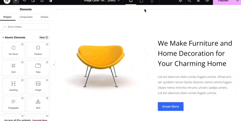
Once the widget is enabled:
- Open the page where you want to add the Image Cycle.
- Click Edit with Elementor.
- Create a new section/container or select an existing one.
- Search for Image Cycle in the Elementor widget panel.
- Drag and drop the widget onto the page.
Once added, the widget will immediately display a default circular animation with image placeholders.
Content Settings
The Content tab contains the main content and animation-related configuration options.
Before adjusting the animation, start by adding your images.
Image Items
By default, the Image Cycle widget includes 8 image items.
Each item can be configured separately.
To add an image:
- Open the Content tab.
- Expand an image item.
- Select or upload an image.
- Configure the available options.
- Repeat the process for the other image items.
Each image can have its own settings.
Adding More Images
If you need more than the default eight images:
- Scroll to the bottom of the image items.
- Click Add Item.
- A new image item will be added.
- Add and configure the image.
You can add additional items as needed.
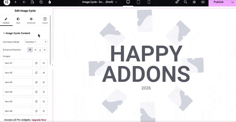
Image Settings
Each image item provides controls for configuring the corresponding image.
Image
Select the image you want to display in the image card.
For the best visual result, use images that have a consistent style and appropriate dimensions.
Image Resolution
You can select the image resolution used by the widget.
Choose a resolution appropriate for the displayed image size. Using unnecessarily large images may increase page size without providing a noticeable visual benefit.
Image URL
You can add a URL to an individual image.
When visitors click the image, they can be directed to the specified URL.
This is useful for linking images to:
- Product pages
- Portfolio projects
- Case studies
- Service pages
- Landing pages
- External websites
For example, if the Image Cycle is being used as a portfolio showcase, each image can link to its corresponding project page.
Configure these settings for each image item as needed.
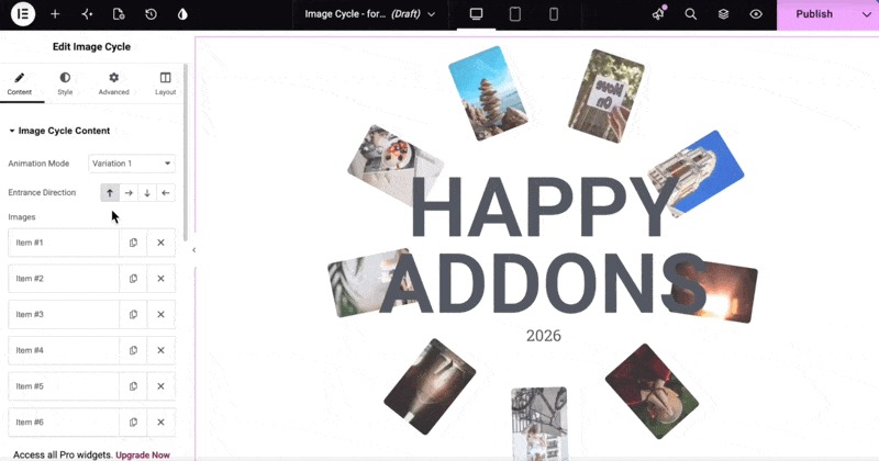
Animation Mode
The Image Cycle widget provides three animation variations.
Each variation provides a different visual style for the image cycle.
Select the variation that best fits your design.
Variation 1
When Variation 1 is selected, an additional setting called Entrance Direction becomes available.
This option is specific to Variation 1 and is not available with the other variations.
Entrance Direction
Entrance Direction determines the direction from which the image cards enter the canvas during the entrance animation.
Choose the direction that best matches your layout and the visual effect you want to create.
Heading and Subtitle
The Image Cycle widget can also display text along with the image animation.
You can configure:
- Title
- Title Second Line
- Subtitle
These options are useful when you want to provide context for the images.
Title
Enter the primary heading for the widget.
For example:
Our Creative Portfolio
Title Second Line
Use this field to create a second line within the title.
This can be useful for emphasizing a phrase or creating a two-line heading.
Subtitle
Add supporting text below the title.
For example:
Explore some of our latest projects and creative work.
HTML Tags
You can change the HTML tag used for the title and subtitle.
Depending on your page structure, you may select an appropriate heading or paragraph tag.
Available options may include:
- H1
- H2
- H3
- H4
- Paragraph
Choose the tag based on the semantic structure of your page rather than its visual appearance.
Tip: If you are unsure which HTML tag to use, keeping the default value is generally the safest option. You can control the visual appearance through typography settings.
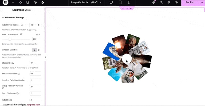
Animation Settings
The Animation Settings section gives you control over the size, speed, direction, and behavior of the Image Cycle animation.
The following options are available.
Initial Circle Radius
Initial Circle Radius determines the size of the circular orbit at the beginning of the entrance animation.
The image group starts from this radius and transitions toward the final circle radius.
For example:
- A smaller value creates a smaller initial orbit.
- A larger value creates a larger initial orbit.
The default value is 50.
If you change the value to 30, the images will begin from a smaller orbit before expanding to their final position.
When should you change it?
Use a smaller value when you want the images to begin closer to the center.
Use a larger value when you want the entrance animation to begin with a more expanded arrangement.
Final Circle Radius
Final Circle Radius determines the size of the circular orbit after the entrance animation finishes.
Increasing the value makes the final orbit larger.
Decreasing the value makes the image group more compact.
Example
A smaller radius can work well for:
- Compact sections
- Smaller screens
- Hero sections with limited space
A larger radius can work well for:
- Wide desktop layouts
- Large hero sections
- Designs where the Image Cycle is the primary visual element
Rotation Direction
Rotation Direction determines the direction of the continuous image rotation.
You can choose the available direction options, such as:
- Clockwise
- Counterclockwise
Choose the direction that best complements your page design.
Stagger Delay
Stagger Delay controls the time gap between each image appearing during the entrance animation.
A higher value creates a larger delay between images.
A lower value causes the images to appear closer together in time.
Use a higher value when:
You want the entrance sequence to feel slower and more deliberate.
Use a lower value when:
You want the entire image group to appear quickly.
Entrance Duration
Entrance Duration controls how long the entrance animation takes to complete.
A shorter duration creates a faster entrance.
A longer duration creates a slower, more noticeable entrance.
Choose a duration that works well with the overall animation style of your website.
Heading Fade Duration
Heading Fade Duration determines how long the title and subtitle take to fade into view.
A shorter duration produces a quicker text appearance.
A longer duration creates a more gradual fade-in.
For most designs, a subtle and reasonably short fade works well.
Group Rotation Duration
Group Rotation Duration determines how many seconds the complete image group takes to make one full rotation around the orbit.
For example:
- A lower value makes the group rotate faster.
- A higher value makes the group rotate more slowly.
Recommendation
Use a slower rotation when visitors need time to inspect individual images.
Very fast rotation may make the content difficult to follow or become visually distracting.
Card Flip Interval
Card Flip Interval determines how frequently each image card flips to reveal its back face.
The value is measured in seconds.
A shorter interval causes cards to flip more frequently.
A longer interval gives visitors more time to view each card before the next flip.
Initial Scale
Initial Scale controls the size of the images when the entrance animation begins.
The images can initially appear larger or smaller before transitioning toward their normal size.
A larger initial scale creates a more noticeable zoom-out effect.
A value closer to the normal scale creates a subtler transition.
Opacity
Opacity controls the transparency of the orbiting images during the animation.
A higher opacity makes the images more visible.
A lower opacity makes them more transparent.
Avoid reducing the opacity too much if the images contain important information.
Pause Rotation on Hover
Enable Pause Rotation on Hover to stop the continuous orbit rotation when the visitor moves the mouse over the widget.
This gives desktop visitors an opportunity to inspect the images without the orbit continuing to move.
This option can be particularly useful for:
- Portfolio showcases
- Product displays
- Interactive galleries
- Project showcases
Animation Play on Appearing
Enable Animation Play on Appearing if you want the Image Cycle animation to start when the widget enters the visitor’s viewport.
When this option is enabled, the animation waits until the Image Cycle section becomes visible while scrolling.
For example, if the widget is lower down on a long page, the animation will start when the visitor scrolls to that section.
This can make the animation feel more intentional and engaging.
Style Settings
After configuring the content and animation, open the Style tab.
The Style tab lets you customize the visual appearance of the Image Cycle widget.
Depending on the available controls, you can customize:
- Height
- Padding
- Overflow
- Background
- Typography
- Text color
- Image width
- Borders
- Border radius
- Object fit
- Box shadow
Layout Settings
Height
Use the Height setting to control the vertical size of the Image Cycle widget.
Increase the height if the circular orbit needs more space.
Reduce it if you want a more compact section.
The ideal height depends on the circle radius and image size.
Padding
Padding controls the internal spacing around the widget content.
Increase the padding if the content feels too close to the widget boundaries.
Reduce the padding when space is limited.
Overflow
Overflow is an important setting for the Image Cycle widget because the orbiting images may extend outside the widget’s boundaries.
There are two primary options.
Hidden
When Hidden is selected, any portion of an image that extends beyond the widget’s boundaries will be clipped.
This keeps the entire animation contained within the widget area.
Visible
When Visible is selected, images can extend beyond the widget boundaries and remain visible.
This can create a larger and more expansive visual effect.
Which option should you use?
Choose Hidden when you want:
- A contained layout.
- Clean section boundaries.
- No overlap with surrounding content.
Choose Visible when you want:
- A larger visual effect.
- Images to extend beyond the widget.
- The orbit to overlap surrounding areas intentionally.
Content Styling
The content/text styling options allow you to customize the appearance of the title and subtitle.
Depending on the available controls, you can adjust:
- Background color
- Border type
- Typography
- Font size
- Font weight
- Text color
- Spacing
- Other available text properties
Use these options to match the widget with your website’s branding and typography.
Image Styling
The Image section contains controls for customizing the appearance of the image cards.
Image Width
Adjust the width of the image cards.
Increasing the width makes the images more prominent.
Reducing the width creates a smaller and lighter visual presentation.
Border Type
Choose the border style for the image cards.
Depending on the available options, you may be able to choose styles such as:
- None
- Solid
- Dashed
- Dotted
- Double
Select the border style that matches your design.
Border Width
Use Border Width to control the thickness of the image border.
A larger value creates a more prominent border.
Border Color
Set the color of the image border.
You can use your brand color or a subtle neutral color depending on the design.
Border Radius
Border Radius controls how rounded the corners of the image cards are.
A low value creates sharper corners.
A higher value creates more rounded corners.
You can use this setting to create square, rounded, or highly rounded image cards.
Object Fit
Object Fit controls how each image fits inside its container.
This is especially useful when your images have different aspect ratios.
Using an appropriate object-fit option can help maintain a consistent visual presentation without unwanted image distortion.
Box Shadow
Add a Box Shadow to create depth around the image cards.
A subtle shadow can help separate the images from the background.
Avoid overly strong shadows if you’re aiming for a clean, modern design.
Adding a Background or Watermark
You can enhance the Image Cycle section by adding a background or watermark image behind the widget.
This can be useful for adding branding or decorative elements.
For example, you can place:
- A company logo
- A brand name
- A watermark
- A subtle pattern
- A decorative graphic
behind the rotating images.
Example
A large, subtle watermark such as GZA can be positioned behind the Image Cycle.
The watermark remains in the background while the image cards rotate in the foreground.
Watermark Best Practices
For a watermark, consider using:
- Low contrast
- Appropriate positioning
- Sufficient spacing
- Transparency where appropriate
The watermark should complement the Image Cycle rather than compete with the primary content.
Responsive Design
After completing the desktop design, make sure to check the widget on tablet and mobile devices.
Circular layouts can require significant space, so settings that look good on desktop may need adjustment on smaller screens.
Pay particular attention to:
- Height
- Circle radius
- Image width
- Padding
- Typography
- Image spacing
- Animation speed
Mobile Recommendations
For smaller screens, consider:
- Reducing the Final Circle Radius.
- Reducing image width.
- Adjusting widget height.
- Reducing the number of image items if the layout becomes crowded.
- Slowing down the rotation if necessary.
Use Elementor’s responsive controls to create separate values for desktop, tablet, and mobile where appropriate.
Always preview the final design on an actual mobile device when possible.
Performance Recommendations
The Image Cycle widget itself is easy to configure, but the images you use can affect page performance.
Follow these practices for better performance.
Optimize Images
Compress images before uploading them to WordPress.
Avoid using unnecessarily large files.
Use Appropriate Image Dimensions
If an image will only appear as a small card, there is usually no need to upload an extremely large original.
Keep Animations Reasonable
Avoid unnecessarily fast or complicated animation settings.
Pay particular attention to:
- Group Rotation Duration
- Entrance Duration
- Stagger Delay
- Card Flip Interval
Avoid Excessive Images
Adding more images does not always improve the design.
Use enough images to create the desired visual effect while keeping the layout clean and easy to understand.
Common Use Cases
Portfolio Showcase
Display portfolio thumbnails around the circular orbit and link each image to its corresponding project page.
Product Showcase
Use product images to create an interactive product presentation.
Each image can link directly to the relevant product or product category.
Agency Website
Creative agencies can use Image Cycle to showcase:
- Projects
- Client work
- Services
- Case studies
Photography Website
Photographers can use the widget to create an animated presentation of selected photographs.
Brand Showcase
Display logos, project images, or other brand assets around the circular orbit.
Hero Section
Combine the Image Cycle with:
- A heading
- Subtitle
- Call-to-action
- Background image
- Supporting content
to create an engaging hero section.
Step-by-Step Configuration Example
Follow these steps to create a simple Image Cycle portfolio section.
Step 1: Enable the Widget
Go to:
WordPress Dashboard → HappyAddons → Widgets
Enable Image Cycle.
Step 2: Open Elementor
Edit the desired page using Elementor.
Step 3: Add Image Cycle
Create a new section/container and drag the Image Cycle widget into it.
Step 4: Add Images
Configure the default image items and upload your portfolio images.
Click Add Item if you need additional images.
Step 5: Add Links
Add the appropriate URL to each image if you want visitors to be able to click through to individual pages.
Step 6: Select an Animation Variation
Choose one of the three available animation variations.
Step 7: Configure Entrance Direction
If you selected Variation 1, choose the desired Entrance Direction.
Step 8: Add Text
Configure:
- Title
- Title Second Line
- Subtitle
Step 9: Configure the Orbit
Adjust:
- Initial Circle Radius
- Final Circle Radius
- Rotation Direction
- Group Rotation Duration
Step 10: Configure Entrance Animation
Adjust:
- Stagger Delay
- Entrance Duration
- Heading Fade Duration
- Initial Scale
- Opacity
Step 11: Configure Interaction
Enable Pause Rotation on Hover if you want the rotation to stop when visitors hover over the widget.
Enable Animation Play on Appearing if you want the animation to begin when the widget enters the viewport.
Step 12: Style the Widget
Open the Style tab and customize:
- Height
- Padding
- Overflow
- Typography
- Text color
- Image width
- Border
- Border radius
- Object fit
- Box shadow
Step 13: Add a Background or Watermark
If desired, add a background or watermark image to the surrounding Elementor section.
Step 14: Check Responsive Views
Preview the widget on:
- Desktop
- Tablet
- Mobile
Make adjustments where necessary.
Step 15: Publish
Once everything looks correct, click Update/Publish in Elementor and preview the live page.
Troubleshooting
Images Are Not Appearing
If your images are not displayed:
- Make sure the Image Cycle widget is enabled.
- Check that images have been assigned to the image items.
- Confirm that the images are available in your WordPress Media Library.
- Check whether the widget or its container is hidden in responsive settings.
- Clear any caching layers and reload the page if necessary.
Images Are Being Cut Off
Check the Overflow setting.
If Overflow is set to Hidden, portions of images extending outside the widget boundary will be clipped.
Try Visible if your design requires images to extend beyond the widget.
Also check:
- Widget height
- Circle radius
- Image width
- Section/container dimensions
The Orbit Is Too Large
Reduce the Final Circle Radius.
You may also need to:
- Reduce image width.
- Reduce widget height.
- Adjust the section/container dimensions.
The Orbit Is Too Small
Increase the Final Circle Radius.
You can also increase the widget height if additional space is available.
The Animation Is Too Fast
Increase:
- Group Rotation Duration
- Entrance Duration
You can also increase the Stagger Delay if you want more space between individual image entrances.
The Animation Is Too Slow
Reduce:
- Group Rotation Duration
- Entrance Duration
- Stagger Delay
Test different values until the animation feels natural.
Images Keep Rotating During Hover
Enable Pause Rotation on Hover.
This will pause the continuous rotation when the visitor hovers over the widget on devices that support hover interaction.
Animation Does Not Start Immediately
If Animation Play on Appearing is enabled, the widget is designed to start its animation when it enters the visitor’s viewport.
Scroll down to the Image Cycle section to confirm the behavior.
Best Practices
For the best results with the Image Cycle widget:
- Use visually consistent images.
- Optimize images before uploading them.
- Keep the number of images reasonable.
- Choose an orbit size appropriate for the available space.
- Use slower rotation speeds when visitors need to inspect images.
- Avoid excessive animation.
- Enable Pause Rotation on Hover for interactive desktop presentations.
- Test the widget on mobile devices.
- Make sure image links point to relevant destinations.
- Use appropriate HTML heading tags based on your page structure.
- Keep background images and watermarks subtle.
- Check the Overflow setting if images are being clipped.
- Preview the complete page rather than judging the widget in isolation.
- Consider accessibility and avoid using animation that makes important content difficult to read or interact with.
Summary
The HappyAddons Image Cycle widget provides an easy way to create an animated circular image presentation in Elementor.
You can add multiple images, assign individual URLs, choose from different animation variations, control the entrance direction, customize the orbit size and rotation, configure hover behavior, and style the image cards with borders, rounded corners, object-fit, and shadows.
You can also combine the widget with titles, subtitles, backgrounds, and watermarks to create visually engaging portfolio, product, agency, photography, and hero sections.
With optimized images, appropriate animation settings, and responsive adjustments, the Image Cycle widget can create an attractive interactive visual experience without requiring custom code.