The Happy Addons’ new ‘EDD Product Carousel‘ widget lets you showcase your products in a carousel slider. Using this advanced widget, you can design and customize the product slider in your dream style.
How To Use Happy Addons’ EDD Product Carousel Widget
You need to activate the plugins below to your website to use this widget:
Pre-requisites
- Easy Digital Downloads (EDD)
- Elementor (Free)
- Happy Addons (Free)
- Happy Addons Pro
Let’s get started:
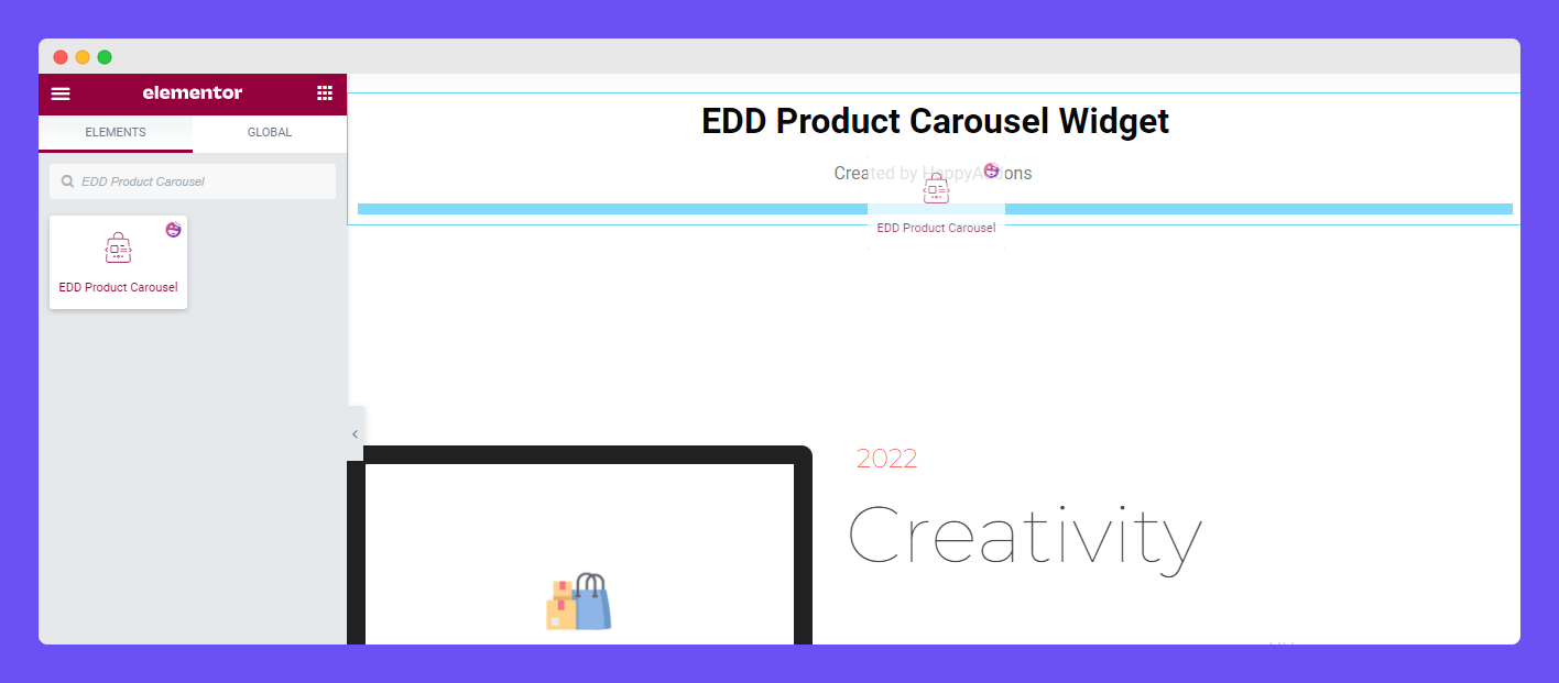
Find & Add EDD Product Carousel Widget
First, you must find the ‘EDD Product Carousel‘ widget from the Elementor widgets area. Then drag & drop the widget into the right place on your website.
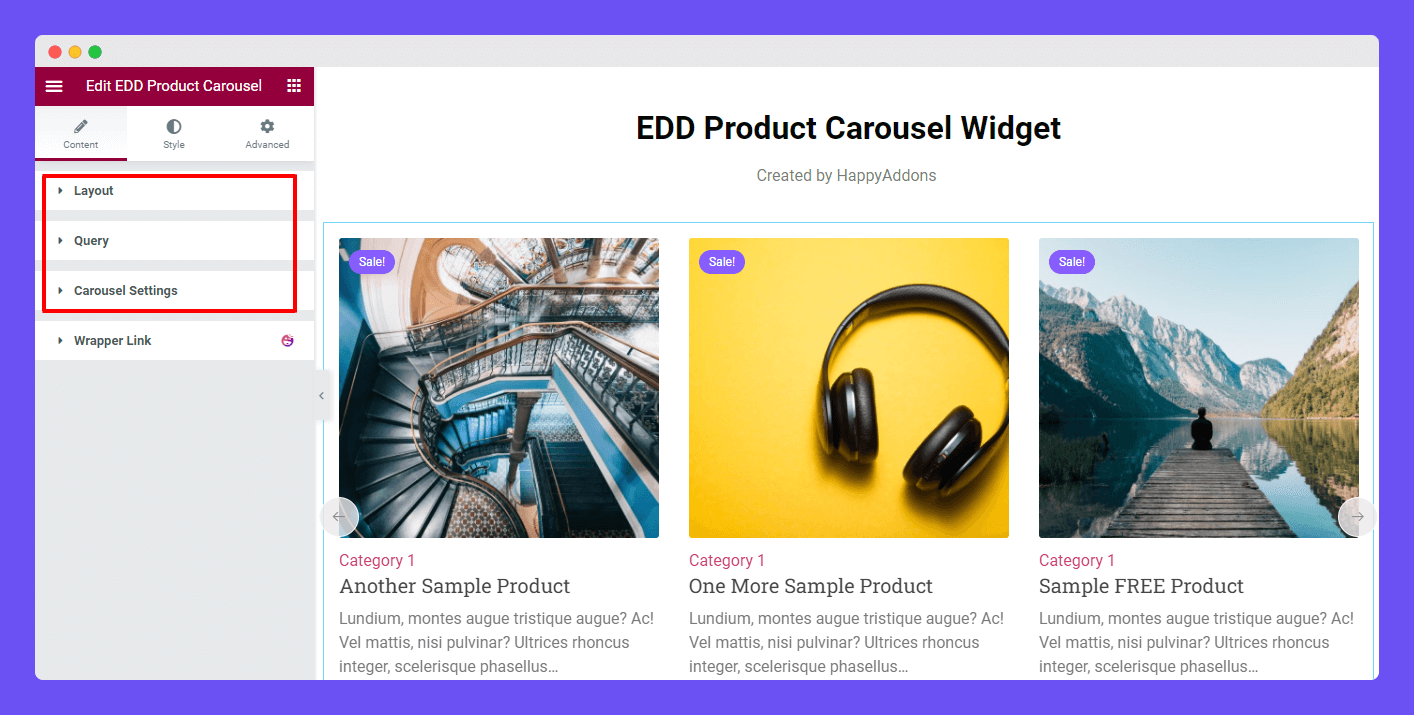
In the Content section, you’ll get three different settings to add your product carousel content. The settings are.
- Layout
- Query
- Carousel Settings
Manage Content Layout
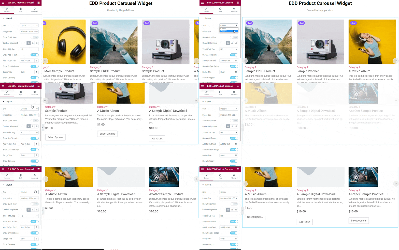
In the Content->Layout area, you’ll get two different Skins: Classic and Modern. You can select the suitable one based on the design purposes. Here’s the difference between these two skins.
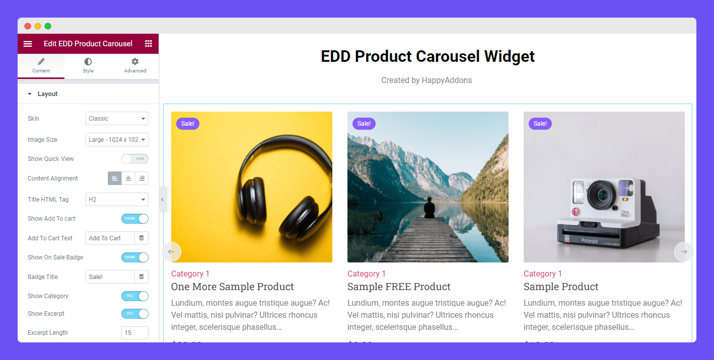
In the layout area, you can also manage the below content.
- Image Size: You are able to manage the Image Size of the carousel.
- Show Quick View: You can Show & Hide the Quick View.
- Content Alignment: You can set the Content Alignment (Left, Center, and Right)
- Title HTML Tag: You are able to select the Title HTML Tag.
- Show Add To Cart Button: You can also display the Cart Button with this option.
- Show On Sale Badge: With this option, you can show & hide the Badge.
- Badge Title: You can also write the Badge Title in your own way.
- Show Category: Using this option, you can show the product Category.
- Show Excerpt: Based on your need, you can show & hide the product description.
- Excerpt Length: You are able to manage the Excerpt Length with this option.
Set Query
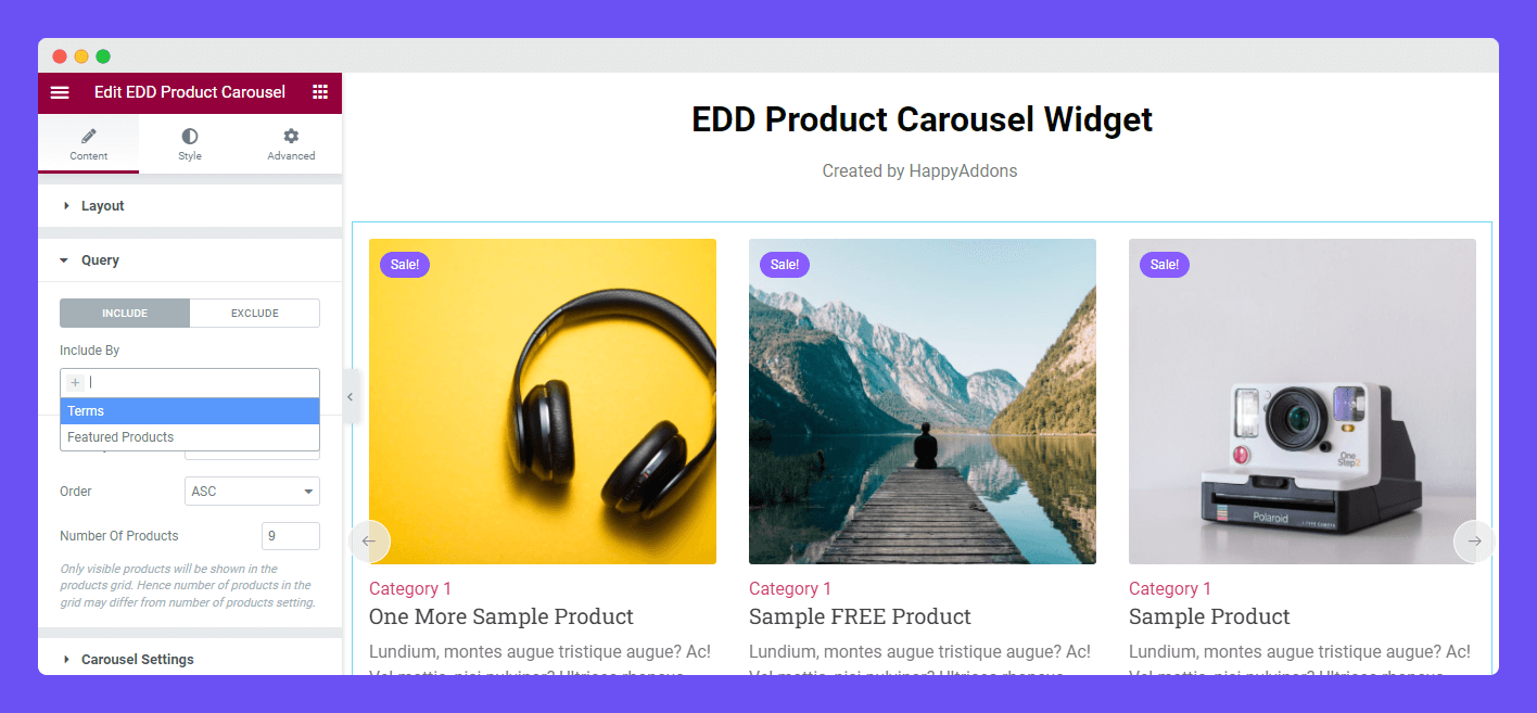
In the Content->Query area, you can set the Query using the two parameters INCLUDE & EXCLUDE.
INCLUDE: Using the INCLUDE option, you can call the Categories wise products and the Featured products. You need to select the Terms option to call the Categories wise Products.
EXCLUDE: You can use exclude option to remove particular products from the carousel. Follow the below image to learn the process. Here, we’ve excluded (A Sample Digital Download & Another Sample Product).
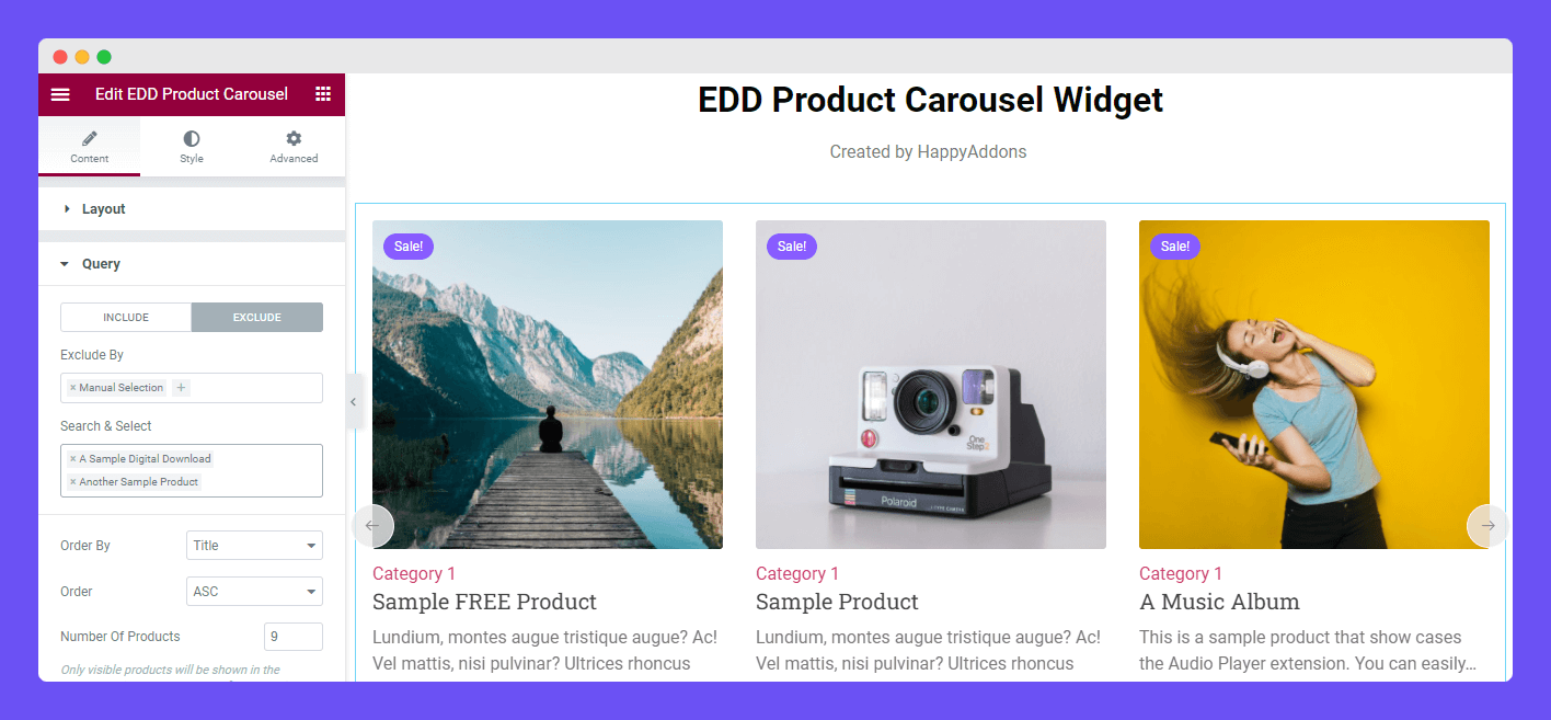
You can also set the product Order By, Order, and manage the Number of Products in the Query area.
Carousel Setting
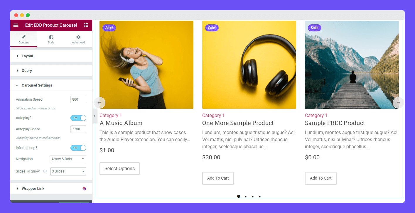
The Carousel Settings lest you manage these below settings of the slider.
Animation Speed: You can set the Animation Speed of the carousel.
Autoplay?: You can also enable the Autoplay option.
Autoplay Speed: You are able to define the Autoplay Speed.
Infinite Loop?: You can activate the Infinite Loop of the slider.
Navigation: Also select the navigation controller.
Slides To Show: You can define the sliders to show on the carousel.
Style Settings of EDD Product Carousel Widget
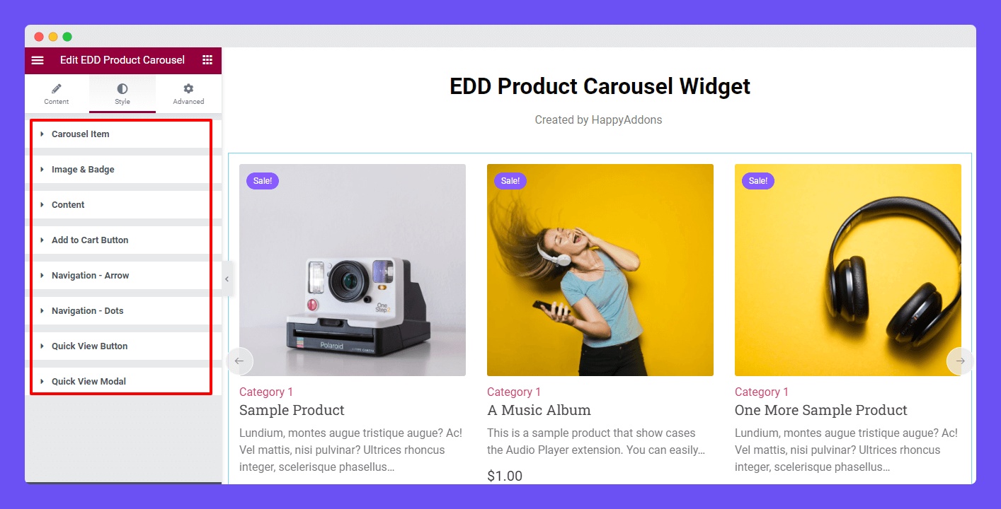
You’ll get the necessary settings to customize your product carousel in the Style area. They are.
- Carousel Item
- Image & Badge
- Content
- Add To Cart Button
- Navigation – Arrow
- Navigation – Dots
- Quick View Button
- Quick View Modal
Style Carousel Item
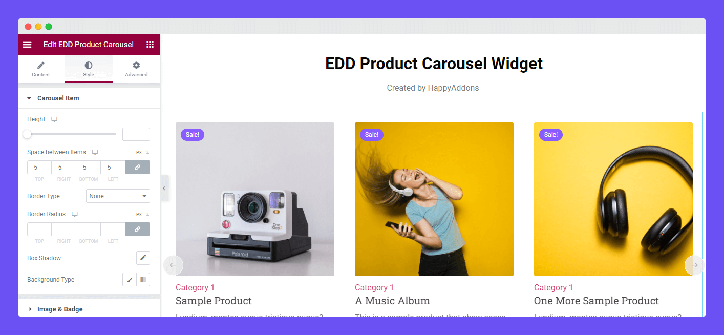
Go to the Style->Carousel Item. Here, you can set the Carousel Item’ Height, Space between Items, Border Type, Border Radius, Box Shadow, and Background Type.
Style Image & Badge
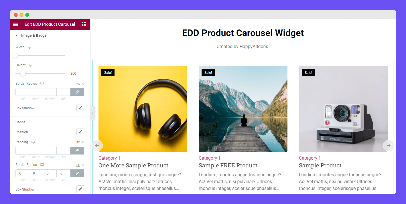
In the Style->Image & Badge section, you can set the Image Width, Height, Border Radius, and Box Shadow. Also, change the Badge style using these options Position, Padding, Border Radius, Box Shadow, Typography, Background Color, and Color.
Style Content
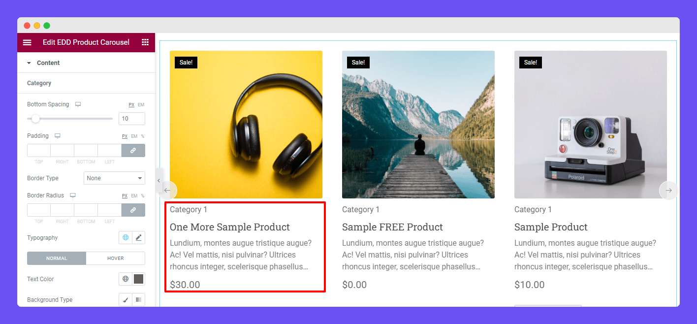
In the Style->Content area, you can customize the content design of Category, Title, Excerpt, and Price.
Style Add To Cart Button
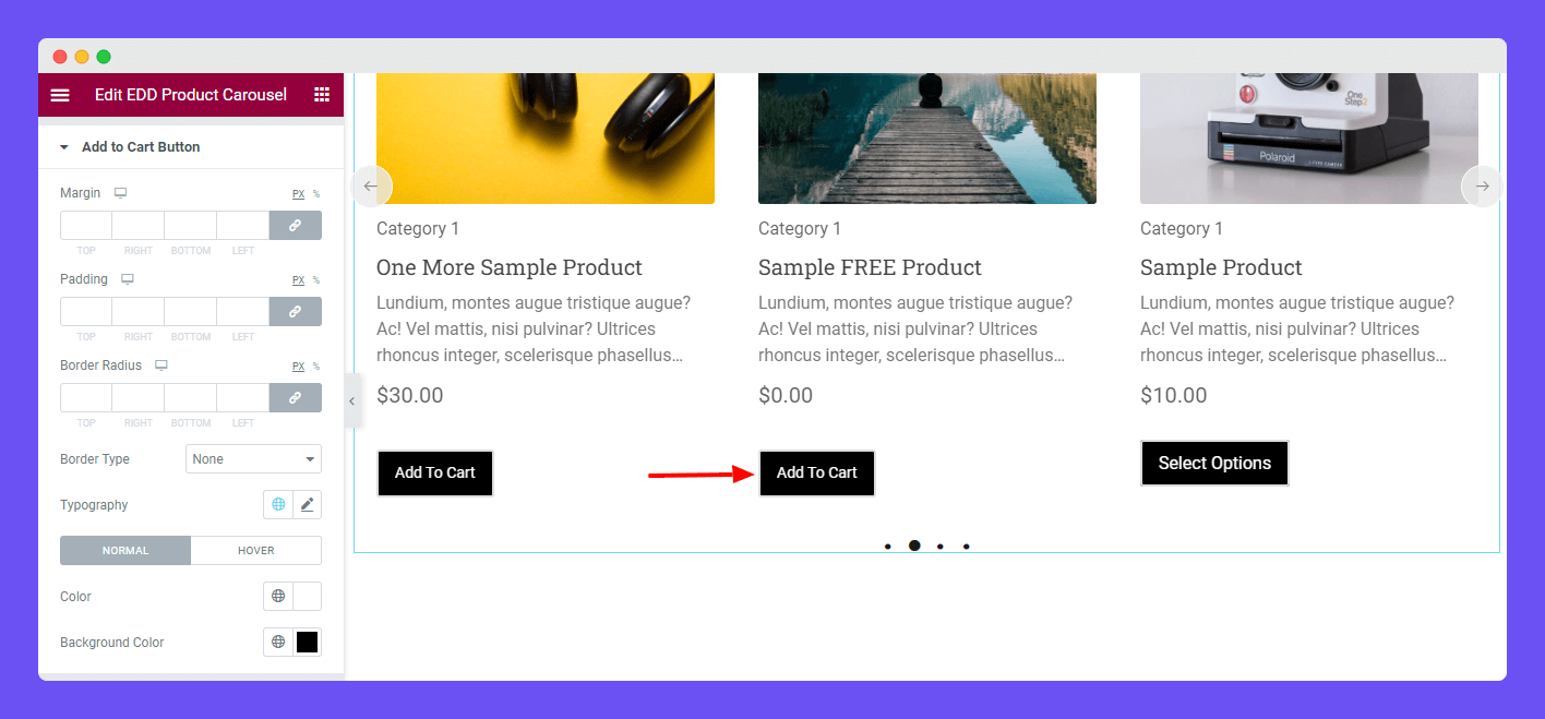
For designing the Add to Cart Button in your own style, you can use these styling options Margin, Padding, Border Radius, Border Type, Typography, Color, and Background Color.
Style Navigation – Arrow
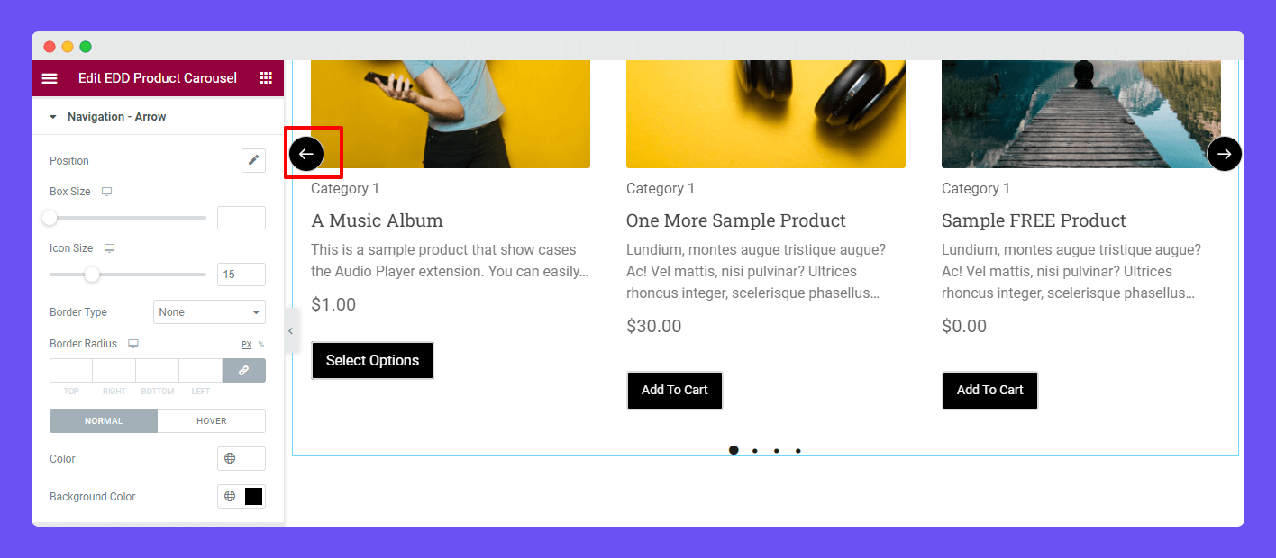
You can change the Navigation Arrow style by setting its Position, Box Size, and Icon Size. You can also add Border Type, Border Radius, Color, and Background Color of the Arrow.
Style Navigation – Dots
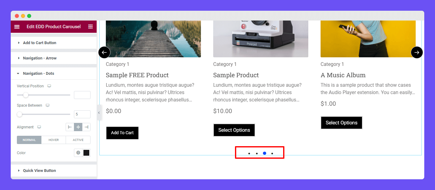
You can also manage the Navigation Dots’ Vertical Position, Space Between, Alignment, and add Color.
Style Quick View Button
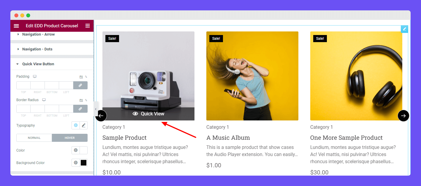
In the Style->Quick View Button area, you can restyle the default design of the Quick View Button. You can make the Quick View Button more appealing by adding Padding, Border Radius, Typography, Color, and Background Color.
Style Quick View Modal
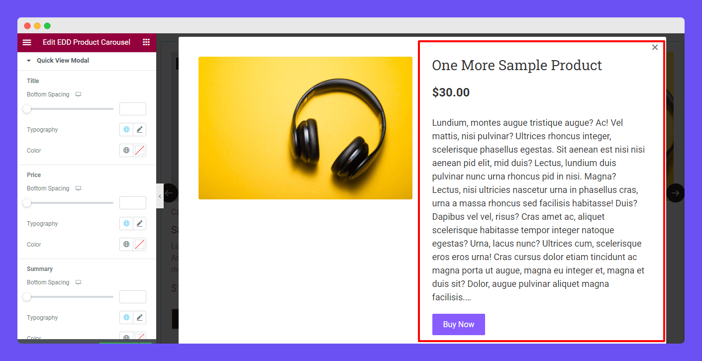
In the Style->Quick View Modal section, you’ll get the essential styling options to restyle the Title, Price, Summary, and Cart button.
Advanced Settings
If you want to add motion effects, happy effects, background, or make it responsive and more intriguing, click on ‘Advanced‘ to explore those options. the ‘Advanced‘ is a default feature of Elementor.
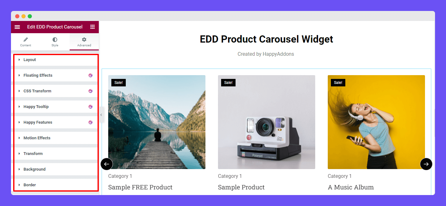
Give a read to this Document to know more about advanced features & functions.
Final Preview
Check out the final outlook of the Happy Addons’ EDD Product Carousel widget.
That’s it.
