The HappyAddons’ Table of Content widget lets you create a list of all the important headings of your blogs and web pages in just a few clicks. It allows you to add mixed flavors to your heading list and makes it appealing to the readers.
How to Use HappyAddons’ Table Of Content Widget
You need to make sure the plugins below are available on your website to use this widget.
Prerequisites
- Elementor
- HappyAddons (Free)
- HappyAddons (Pro)
Note: You can use the HappyAddons’ Table of Content widget in single post templates and on any web pages.
Let’s get started!
Step 01: Drag and Drop The Table of Content Widget
Find the ‘Table of Content’ widget from the Elementor widget area. Drag and drop it into a suitable place on your canvas.
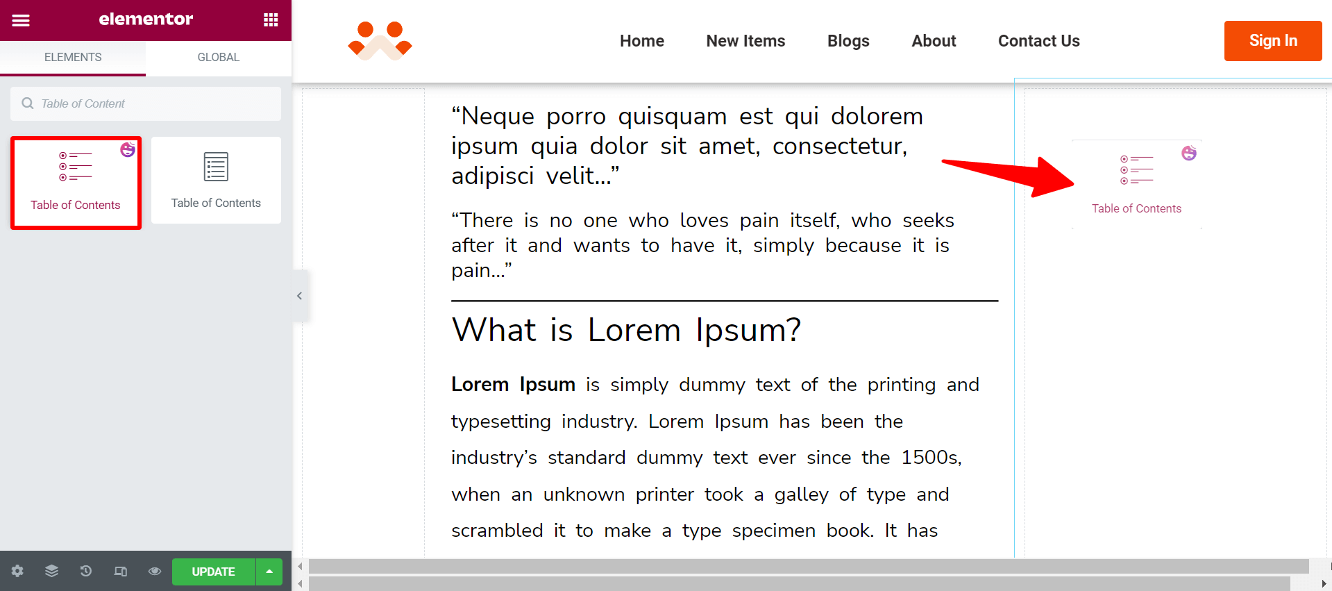
You will get the Table of Contents has been automatically added to your post. You can change the title of that table if you want.
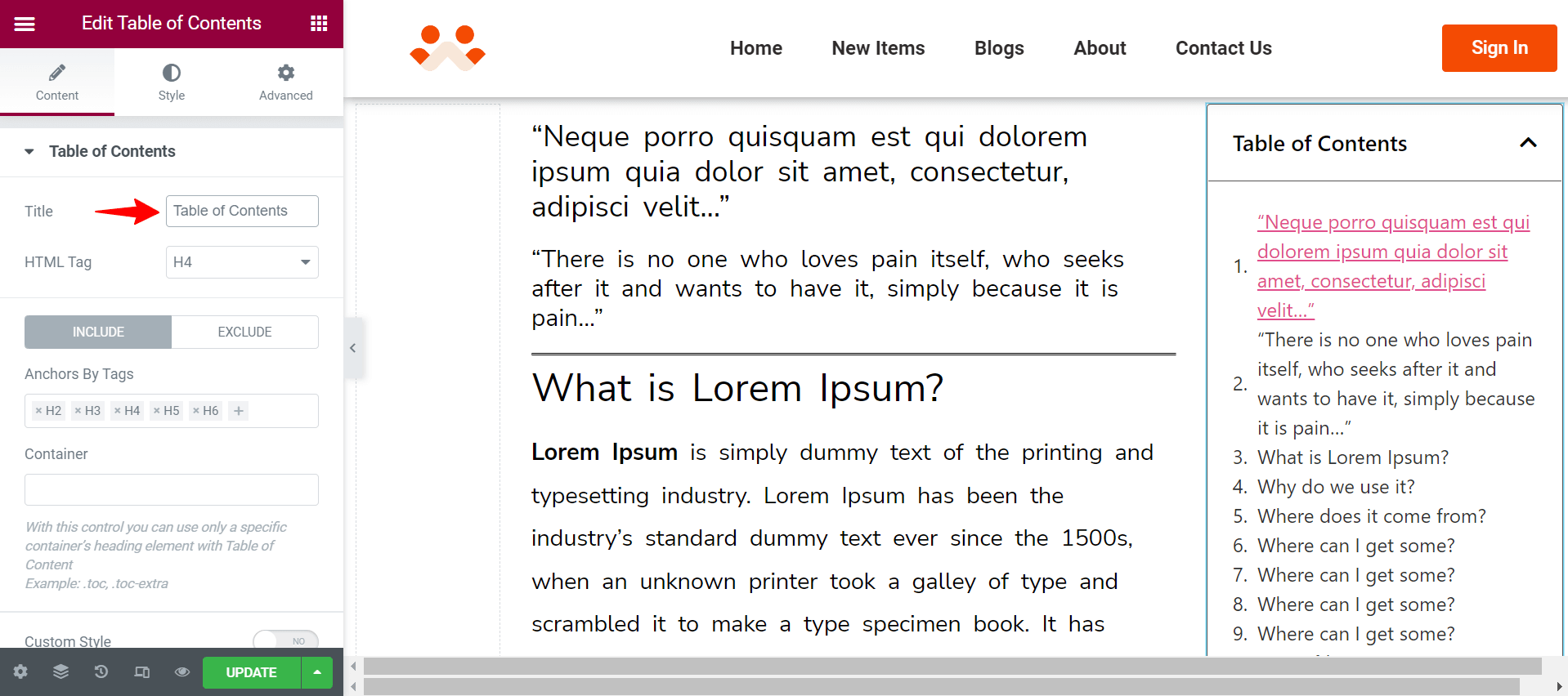
You can add and remove H-tags from the ‘Anchors By Tags’ option. It will automatically change the heading in your Table of Contents. By default H1 tag is not included, but if you want to add you can do it manually.
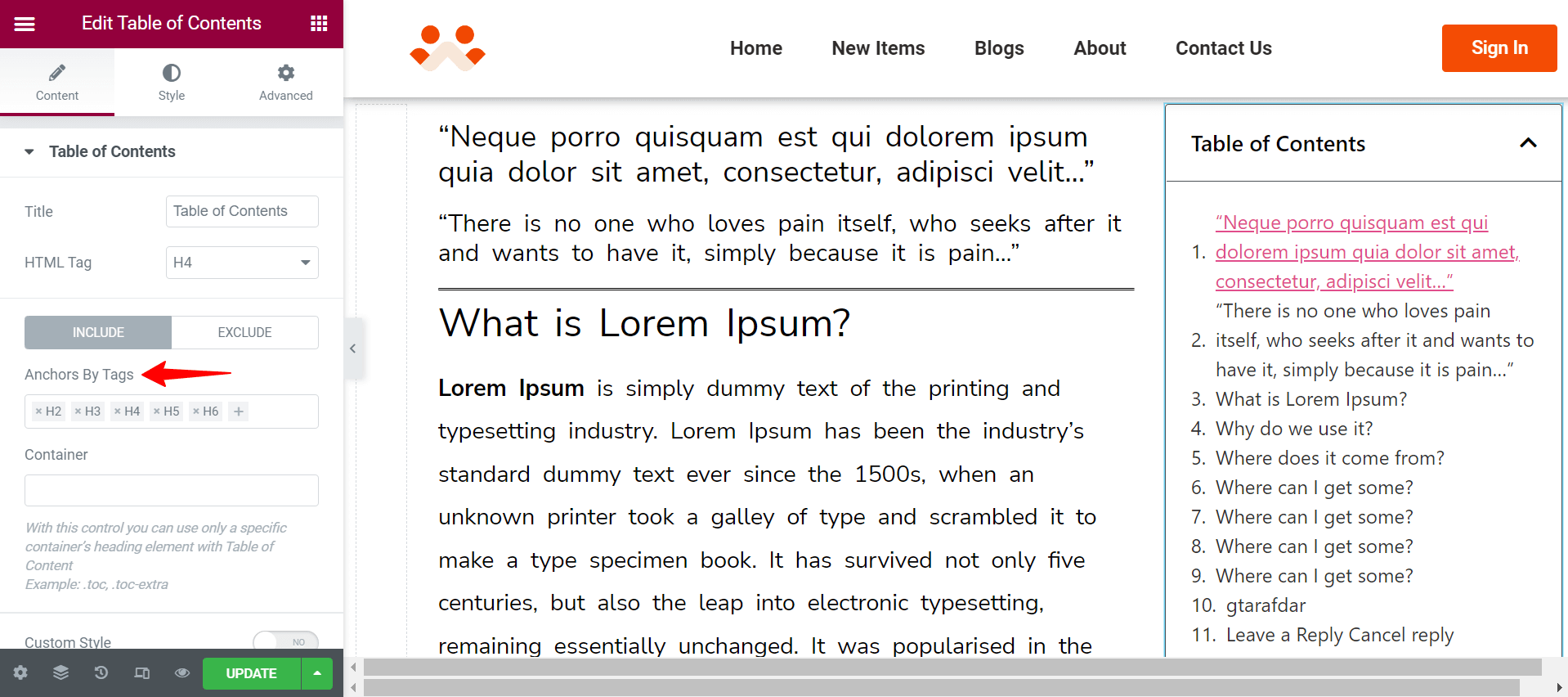
Step 02: Add Specific Container Tag
Using the container option, you can define which specific headings of a section or columns will be shown in the table of contents. Suppose you want to keep the headings only of your main body, not the footer and author. To do that-
- Select the main body of your blog or the post widget or the text editor section
- Go to Advanced > CSS Classes
- Type meaningful class on the field and copy it
- Then select your table of contents box
- Go to Container field
- Paste the same thing you used in CSS Classes (don’t forget the use dot in the class name. It’s a CSS rule for writing a class name)
You will see the author and footer headings removed from the table of contents box. Actually, it will help you to grab the titles of the specific container only.
Note: We will talk about the Custom Style option at the end. Because it is a specialized part and needs more focus.
Step 03: Customize Marker View
We will describe the custom style later in this documentation.
Styling Marker:
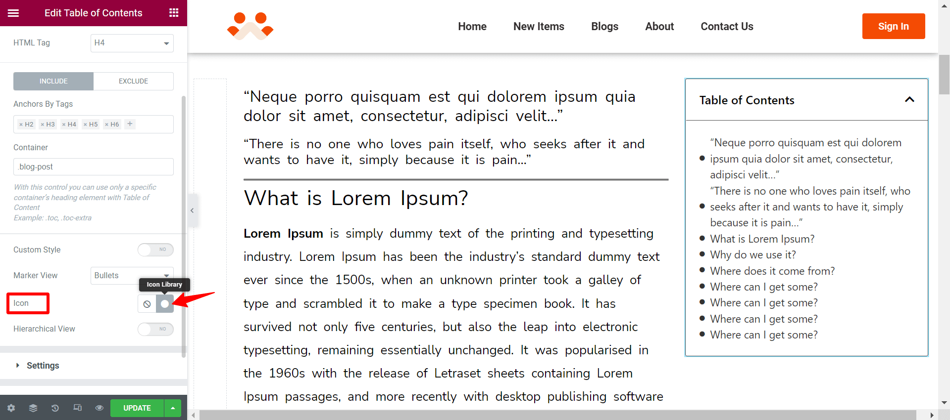
Using the Marker View option, you can set whether Numbers or Bullets style to your table of content.
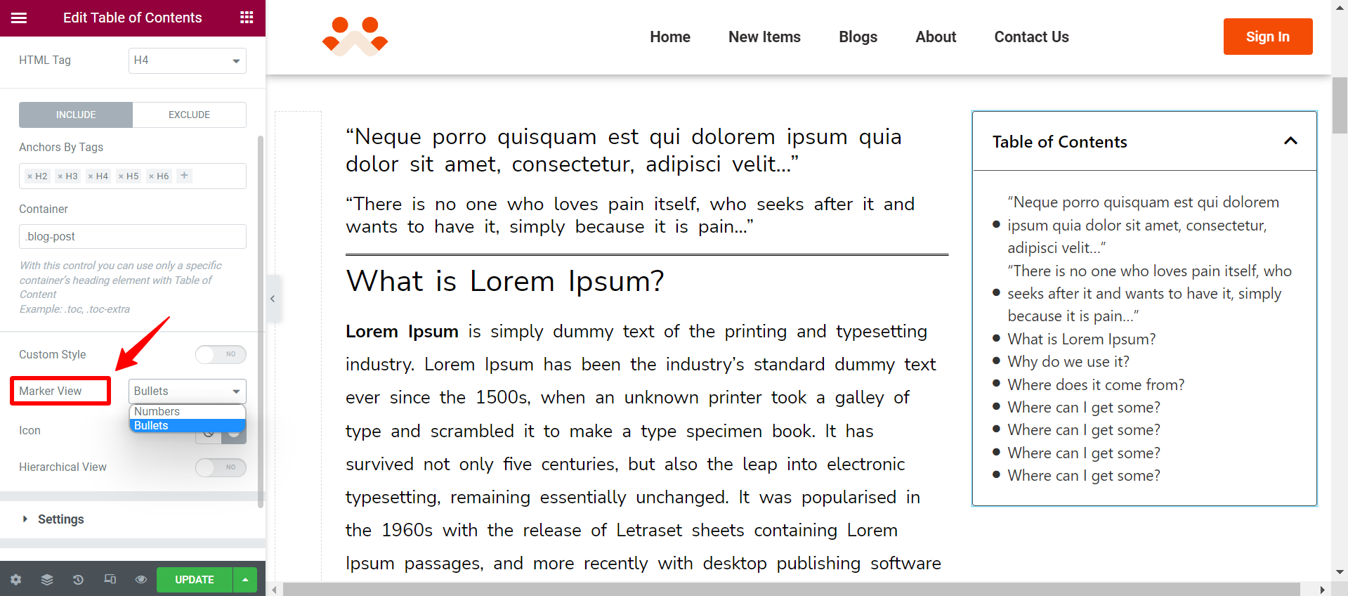
If you select the Bullet option, you can change its icon style. Click on the Icon Library option.
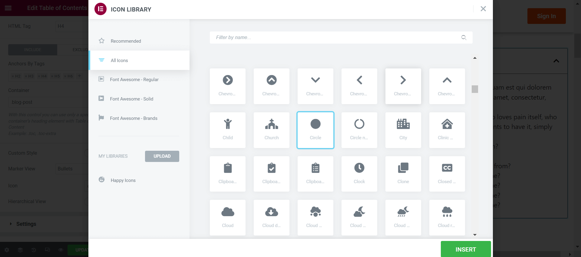
You will get a wide assortment of bullet icon styles. Choose the one you love. Click the Insert button at last.
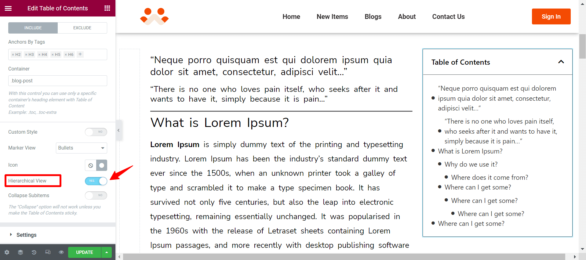
Enable the Hierarchical option. You can set a different presentation style for the table of contents.
Enabling the Collapse Subitems option, you can add the collapsible feature to your table of contents.
Note: Your ‘Collapse Subitems’ won’t work unless you make the Table of Contents sticky. We will show you how to enable the Sticky option in the step below.
Step 04: Settings Configuration
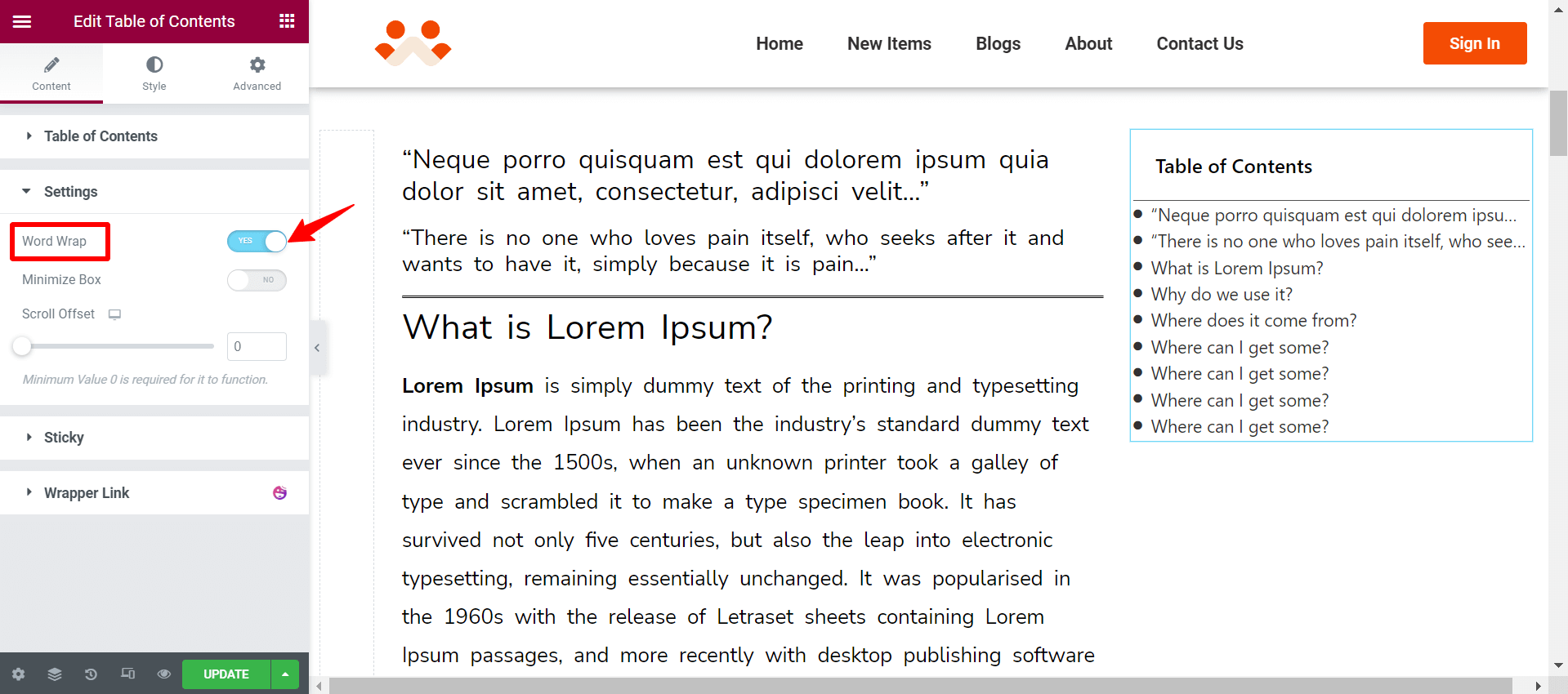
Expand the Setting section. You will get the Word Wrap option. If you enable this, your long-tail headings will get shorter in your table of contents.
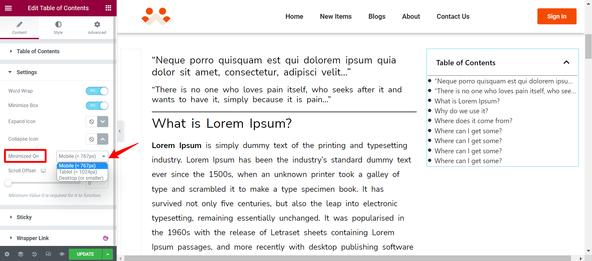
Toggle on the Minimize Box. It will allow you to set breakpoints for different devices at which your table of contents will always remain collapsed. If you are using the custom breakpoints of Elementor, it will be reflected here too.
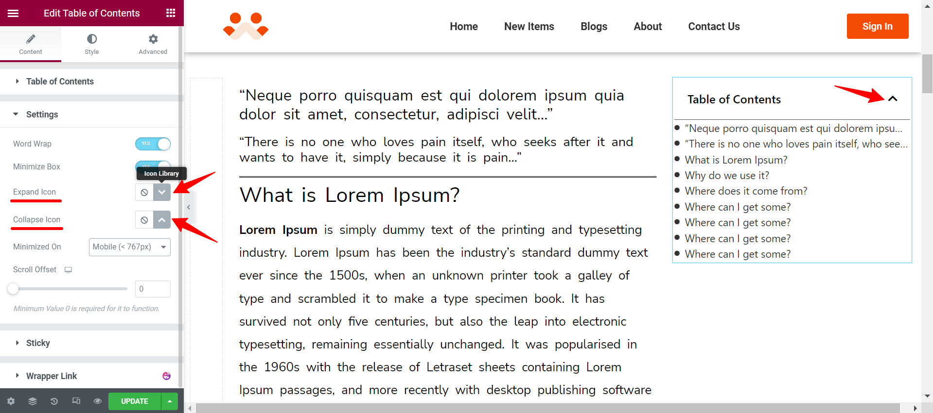
You can change the Expand and Collapse Icons by clicking the Icon Library. The process is the same as changing the Icon for Marker View, which we showed you above.
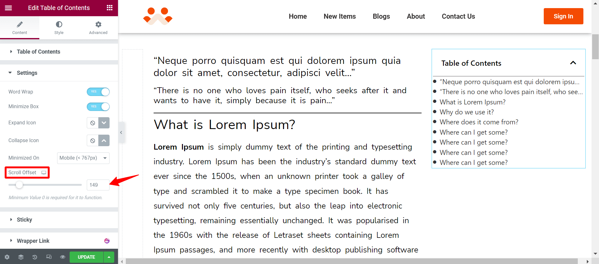
Using the Scroll Offset option, you can determine the number of pixels hidden from the view above the scrollable region.
Step 05: Add Sticky
If you enable Sticky, your table of contents will move when you scroll the device screen.
From the Sticky On option, you can define the type of devices (Mobile, Tablet, Desktop) on which this sticky feature will work.
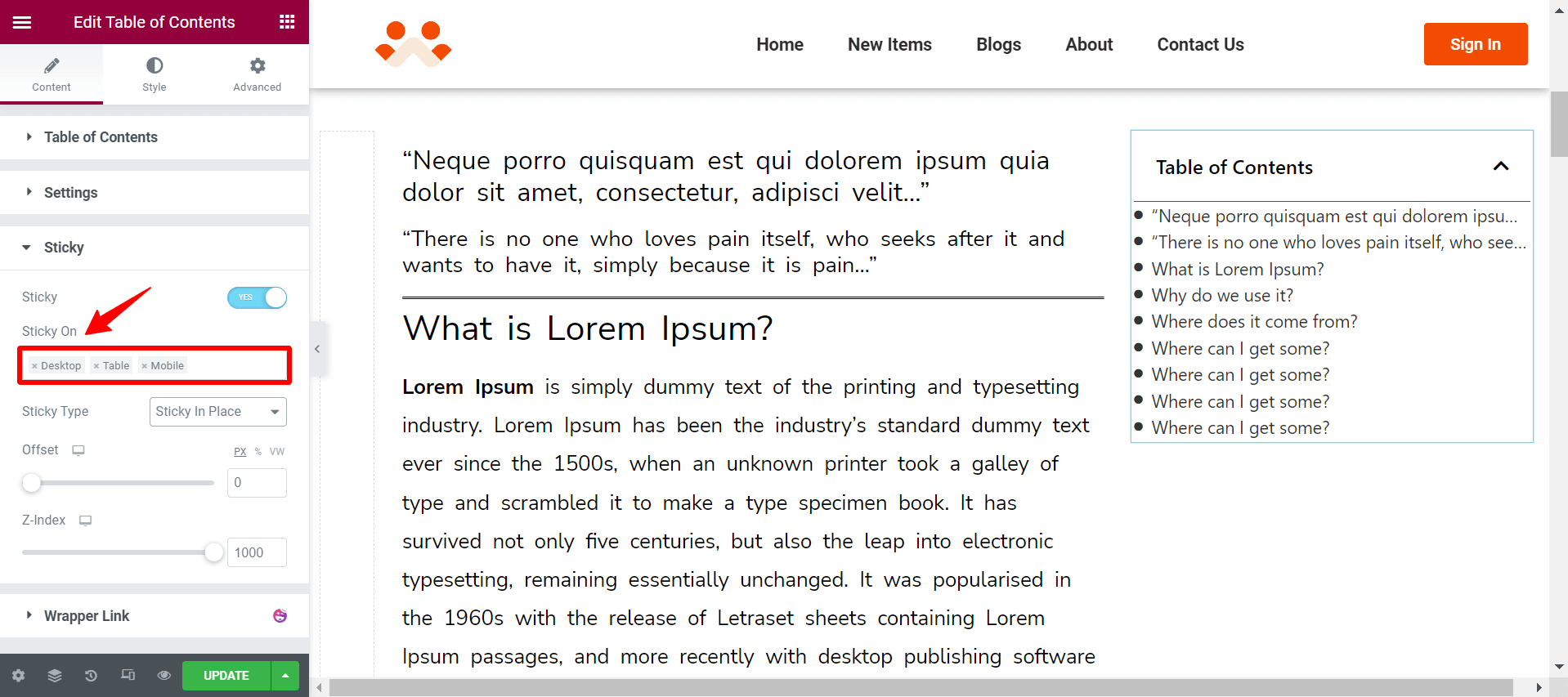
Come to the Sticky Type option. You can define here the custom position for your table of contents. You can align it horizontally, vertically, or in other ways.
Limitation of Our Sticky Feature
There is a limitation in our sticky option. You cannot make the Table of Content sticky within the column. It will overflow everywhere. You have to use the z-index value to handle the overflow.
But you can use Elementor’s Sticky Column feature available in the Advanced tab. It works perfectly within the column if you enable the feature.
Step 06: Style
Next, come to the Style tab. You can customize the color and typography of your table of contents.
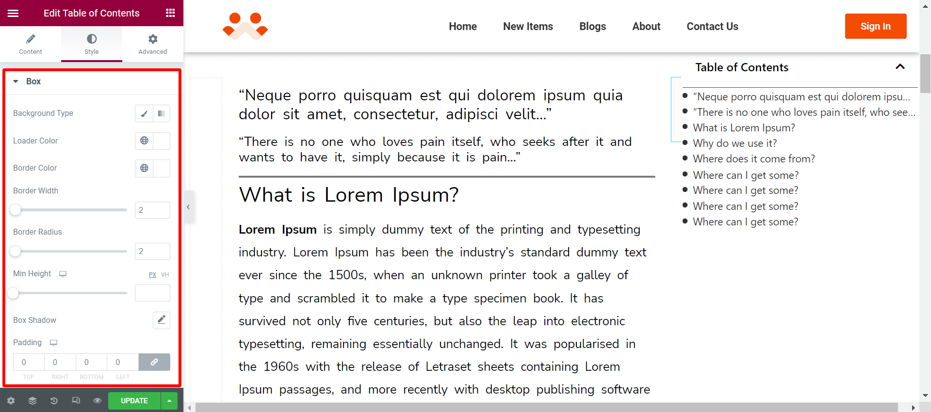
Box Section Styling – Table of Contents
You can do the following things from the box section.
- Background type will let you set color type, whether classic or gradient.
- Color will let you set the background color for your table of contents.
- You will see a loading icon if it takes time to load the table. You can select the Loader Color. It’s not visible in the editing panel but works in the front view if your content takes time to load. By default, the loader color is Gray.
- Border Color will allow you to define the color of your table border.
- Border Width lets you define the width of your table border.
- Border Radius allows you to define the radius value for the table border.
- Box Shadow helps you specify the shadow color of your table.
The Padding option lets you define the space between your table content and border.
Header Section Styling – Table of Contents
You can do the following things from the Header section-
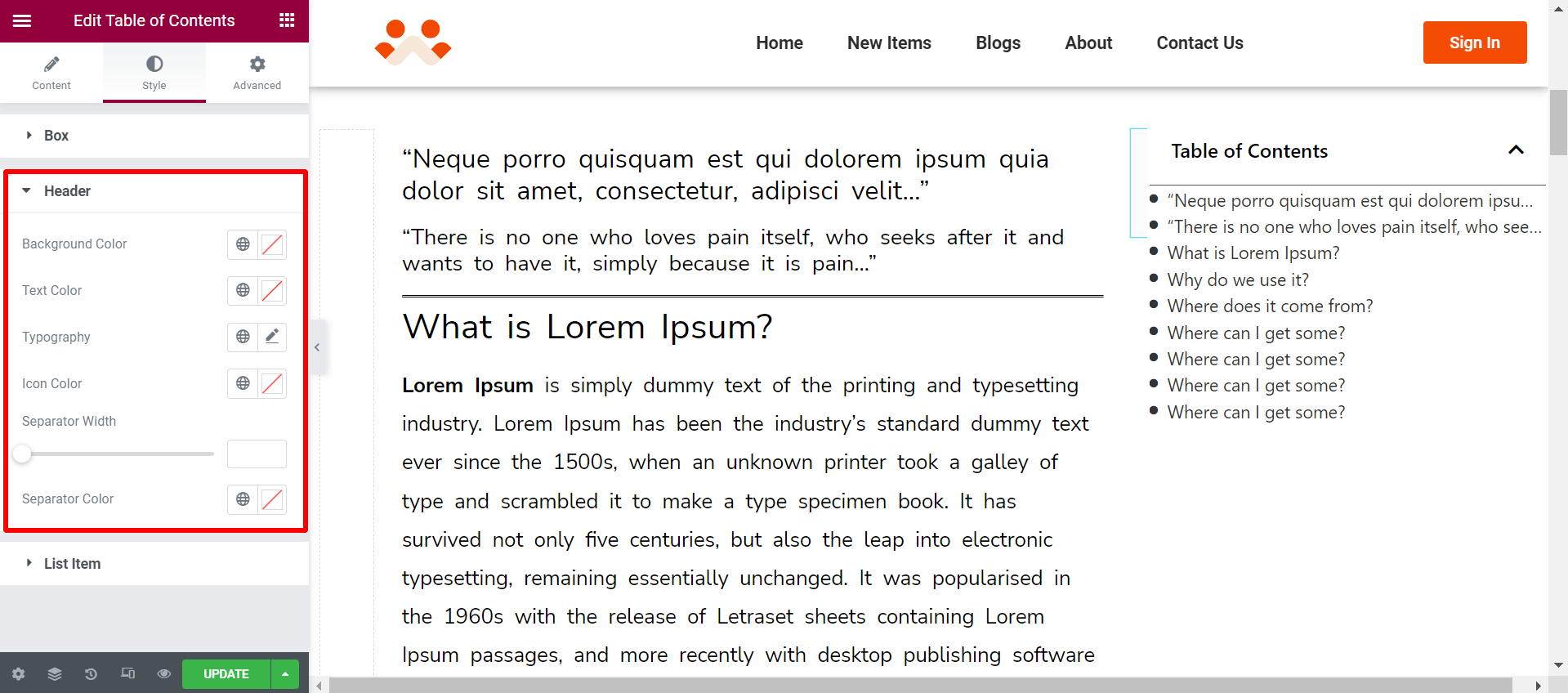
- Background Color will let you choose the color of your header background.
- Text Color will allow you to set the color for the texts of your table of contents.
- Using Typography, you can change the font style.
- Icon Color will allow you to change the collapsible icon color of the table.
- Using the Separator Width, you can create a distance between the header and the table of contents.
- Separator Color will let you fill the distance with your preferred color.
List Item Section – Table of Contents
You can do the following things from the List Item section-
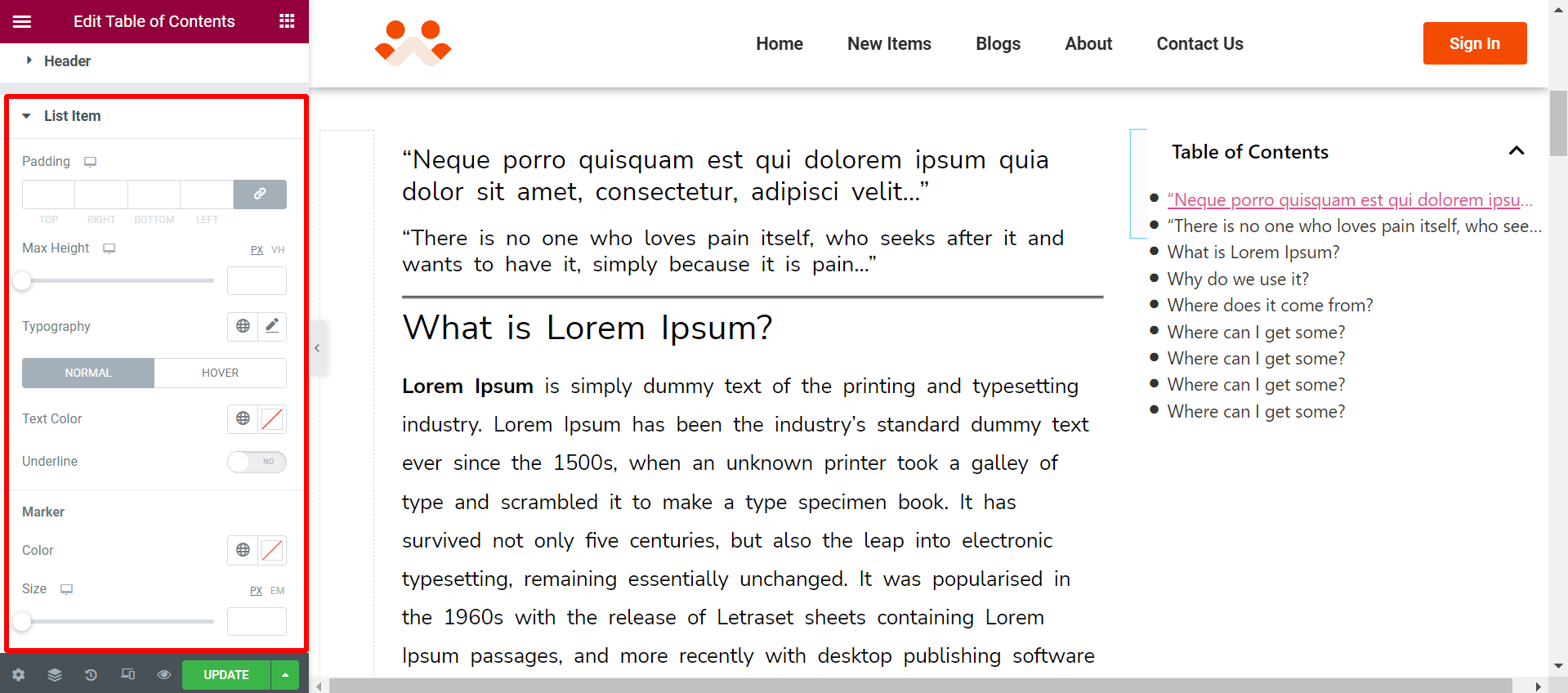
- The Padding option lets you define the space between your table content and border.
- Max Height allows you to define the height of your table of contents.
- From Typography, you can change the font style of the table.
- The Hover option will let you change the hover color.
- You can change the color of your table text from the Text Color option.
- If you toggle on Underline, all texts of the table of content will be underlined.
- From the Marker option, you can change the color and size of the bullets in your table of contents.
So far, you have learned the default options of the table of contents widget. We will show you how to apply Custom Styling to your table contents.
Step 07: Custom Styling
Go to Content > Table of Contents. Toggle on the Custom Style option.
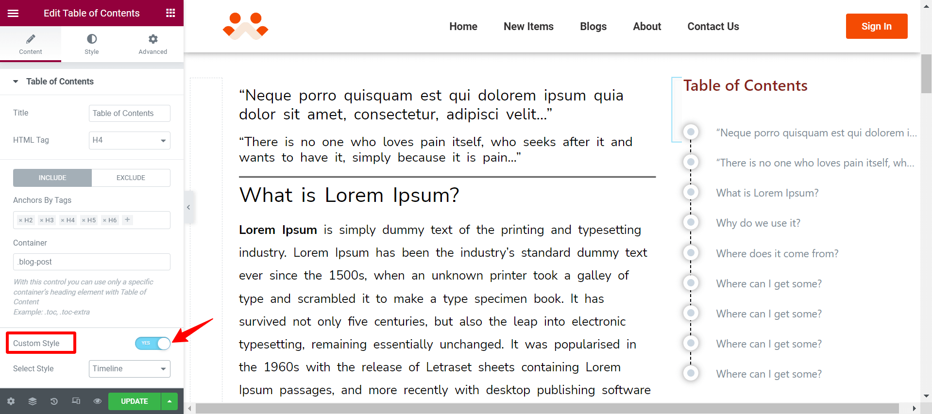
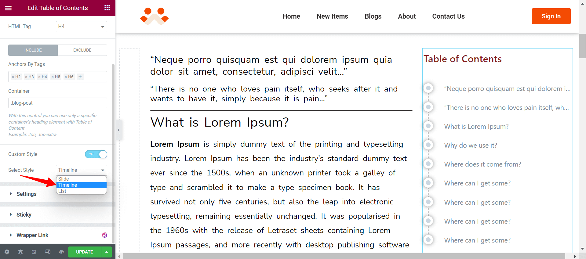
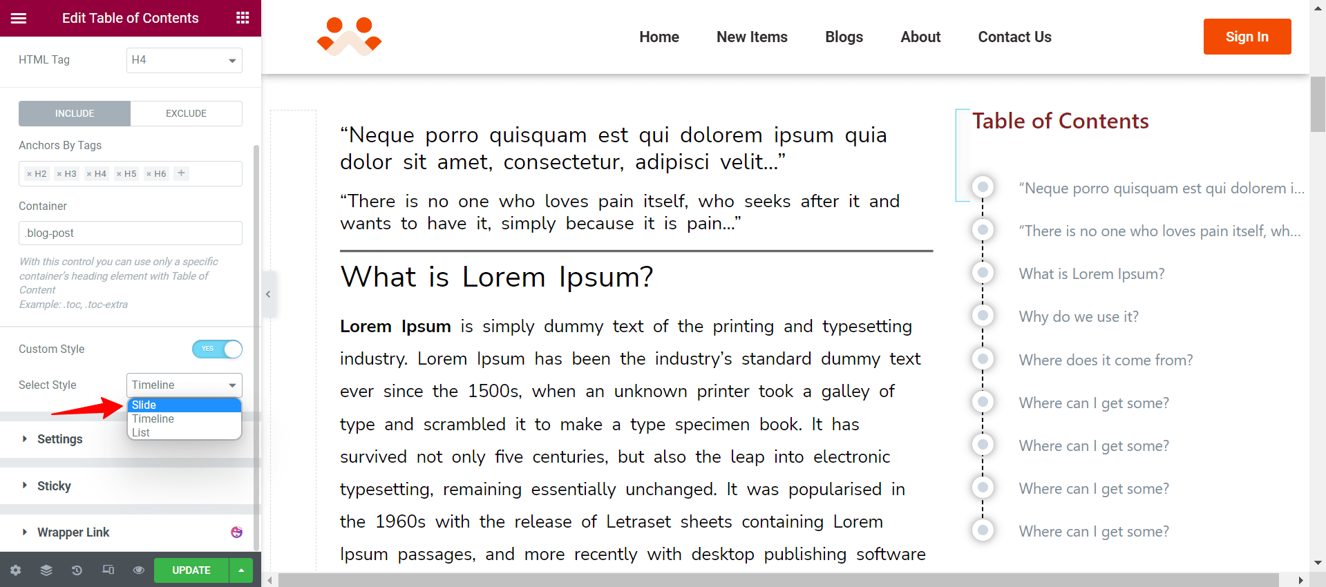
Just below, next to the Select Style option, you will get a dropdown list with three presentation styles (Slide, Timeline, List). You can choose any one of them for your table of contents.
Let’s explore how to customize your table of contents for each presentation style.
Timeline Styling
Select the Timeline presentation style.
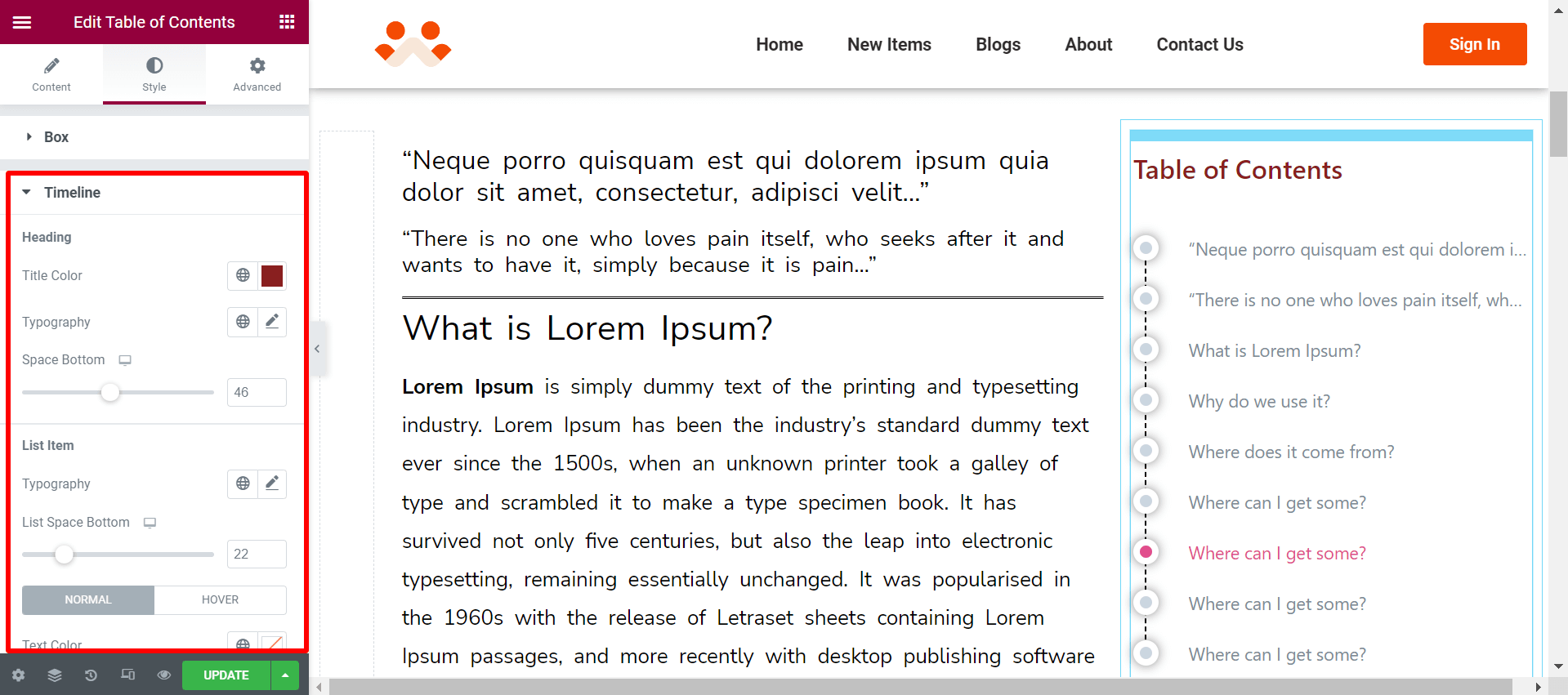
Then go to the Style tab. You will get a Timeline option here. You can do the following things here-
- The Heading option lets you specify title color, typography, and space between the header and table contents.
- List Item lets you change the typography of the table content, space between each heading, and hover color.
- The Dot option allows you to change the dot size of your table of contents, icon shadow, and the borderline between the icons.
Slide Styling
First, select the Slide option from the dropdown list.
Then go to the Style tab. You will get a new option, ‘Slide’ and expand it. You can do the following things here-
- The Heading option lets you specify title color, bar color, title typography, and space between the header and table contents.
- List Item lets you change the typography of the table content, space between each heading, hover color, and Bar color.
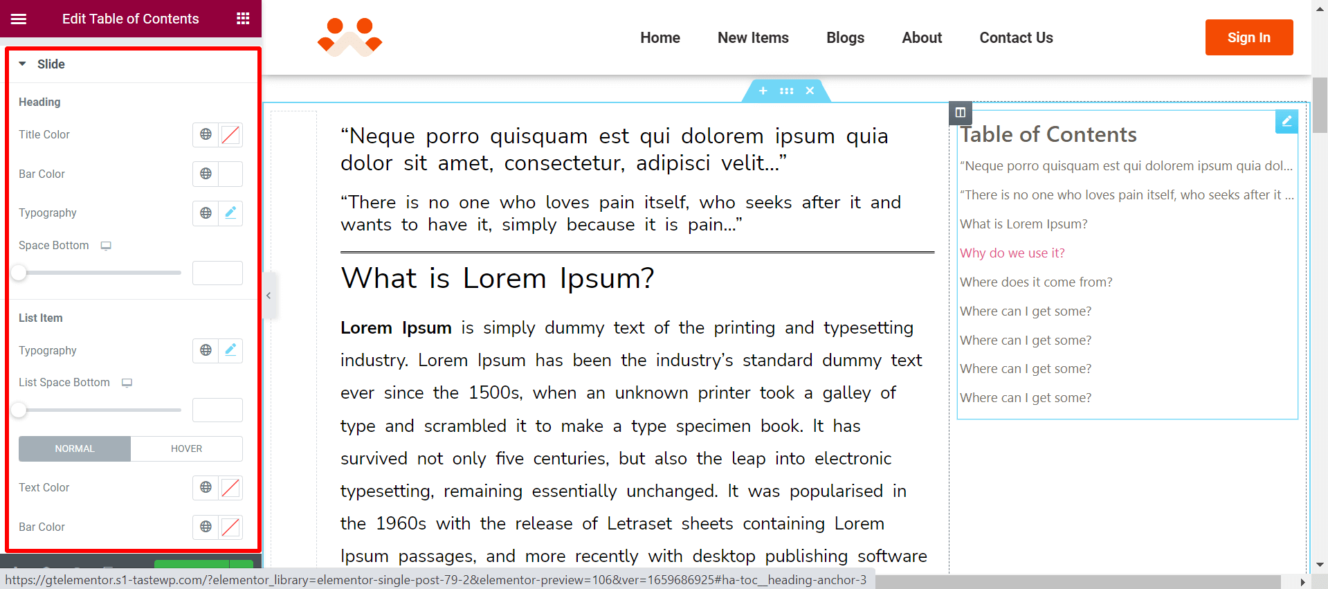
Note: Slide items will appear on hovering the icons. It’s actually, the style of Dropbox Paper Table of Content. If you are familiar with that, we believe you will like it.
List Styling
Select the List presentation style.
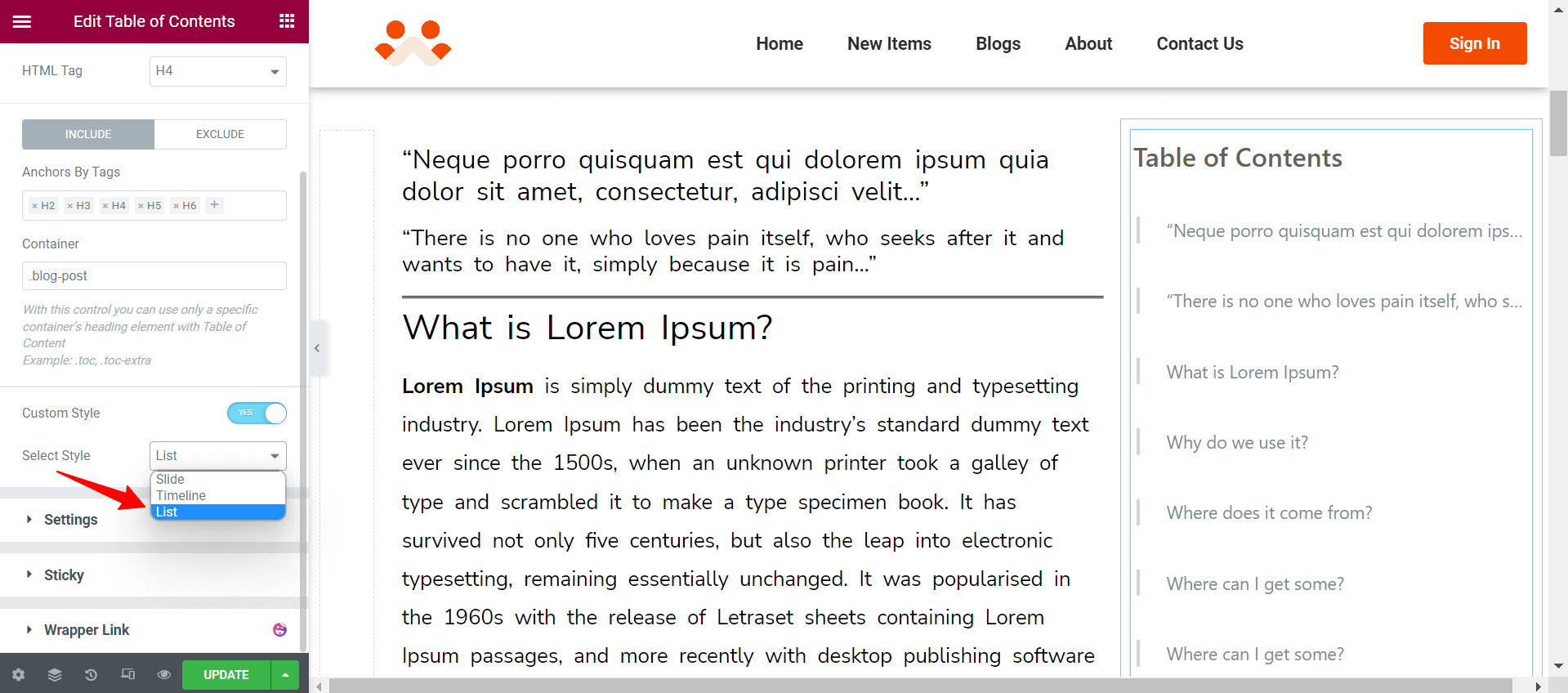
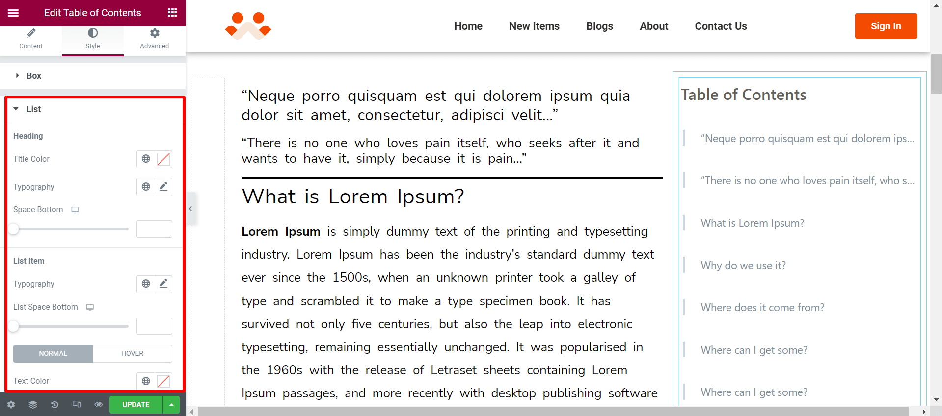
Then go to the Style tab. You will get a Timeline option here. You can do the following things here-
- The Heading option lets you specify title color, typography, and space between the header and table contents.
- List Item lets you change the typography of the table content, space between each heading, and hover color.
Step 08: Advanced Settings
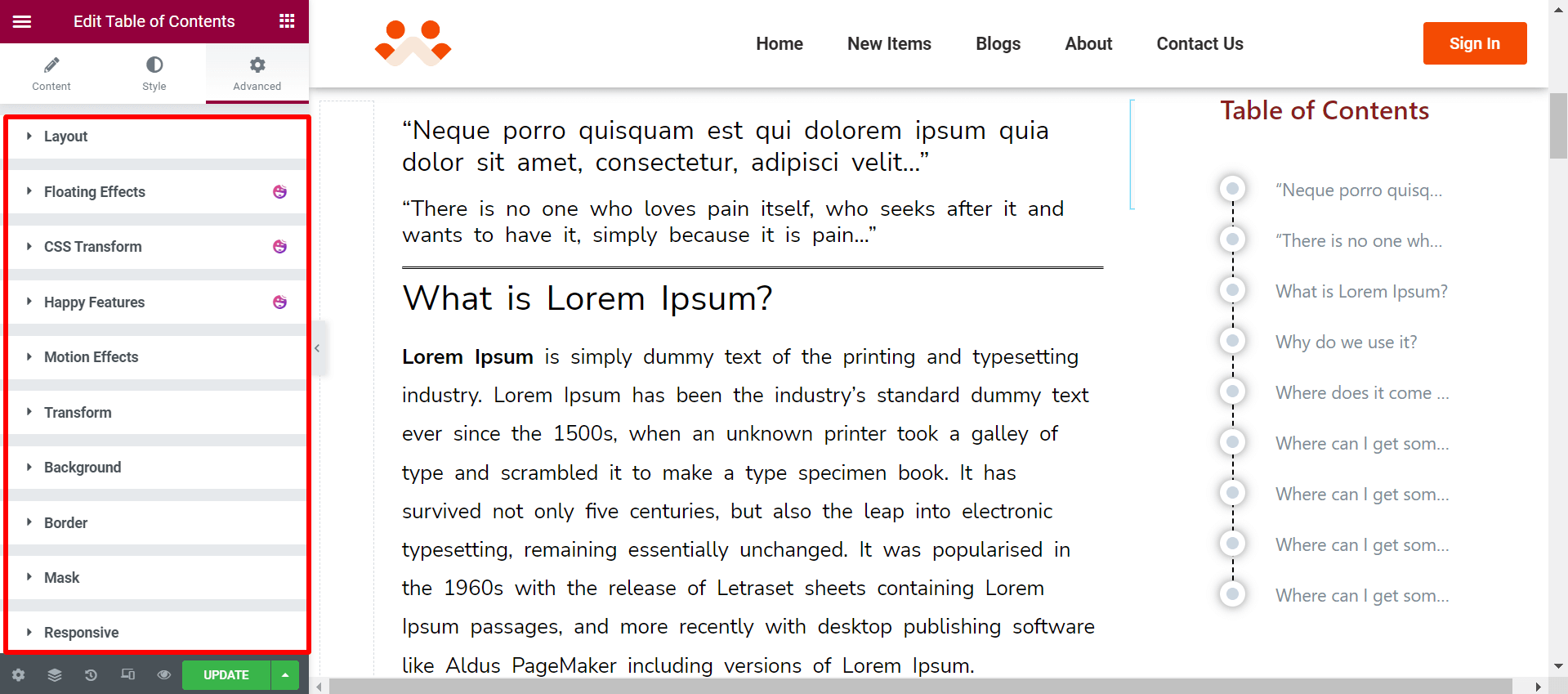
If you want to add motion effects, happy effects, background, or make it responsive and more intriguing, click on ‘Advanced’ to explore those options. The ‘Advanced’ is a default feature of Elementor.
Give a read to this Document to know more about advanced features & functions.
If you are using Elementor Pro, you can use the Sticky option to make the sticky table of content by following this method.
Here is a video tutorial if you want to see the process of how to add a table of content using the HappyAddons’ Table Of Content widget.
