How to Use Creative Slider widget of Happy Elementor Addons.
Happy Elementor Addons Plugin provides a powerful and flexible creative slider widget that allows you to add beautiful, interactive sliders to your WordPress website. The Creative Slider Widget covers you whether you want to highlight your services or create an engaging portfolio.
This documentation will walk you through using the HappyAddons Creative Slider Widget on your WordPress site.
Prerequisite
To enable the Creative slider, you need to have,
- Elementor
- HappyAddons
- HappyAddons Pro
Adding the Slider Widget
To add the Slider widget to your page, follow these steps:
- Open Elementor and edit the page where you want to add the slider.
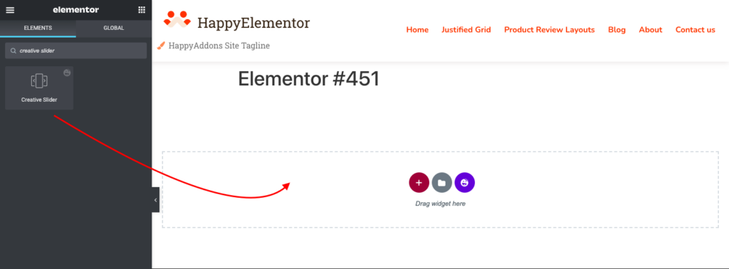
- In the Elementor panel on the left side of the screen, search for “Creative Slider” in the search bar.
- Click and drag the Slider widget onto the page.
- The Slider widget will now appear on your page; you can move and resize it as needed.
Configuring the Creative Slider Widget
The Creative Slider widget has several configurable options that allow you to customize the appearance and behavior of your slider. To access these options, follow these steps:
- Click on the Creative Slider widget to select it on the page.
- In the Elementor panel on the left side of the screen, navigate to the “Slider” tab.
- Use the various settings to configure the slider as desired.
Slider
In the Slider section, add slider items. Now, edit, copy, or remove slides from your slider. Each slide can have its unique content and style as per your requirements.
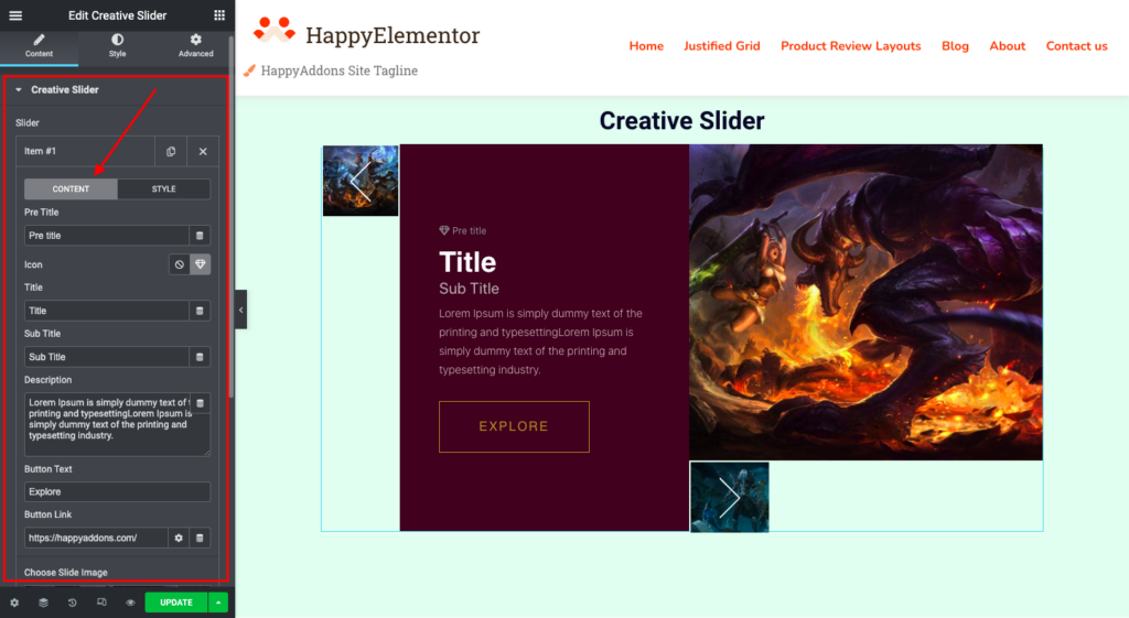
In the Content Option, you can add a pre-title, icon, title, subtitle, and description for each slide item. Along with that, you can add button text, button links, and slide images as well.
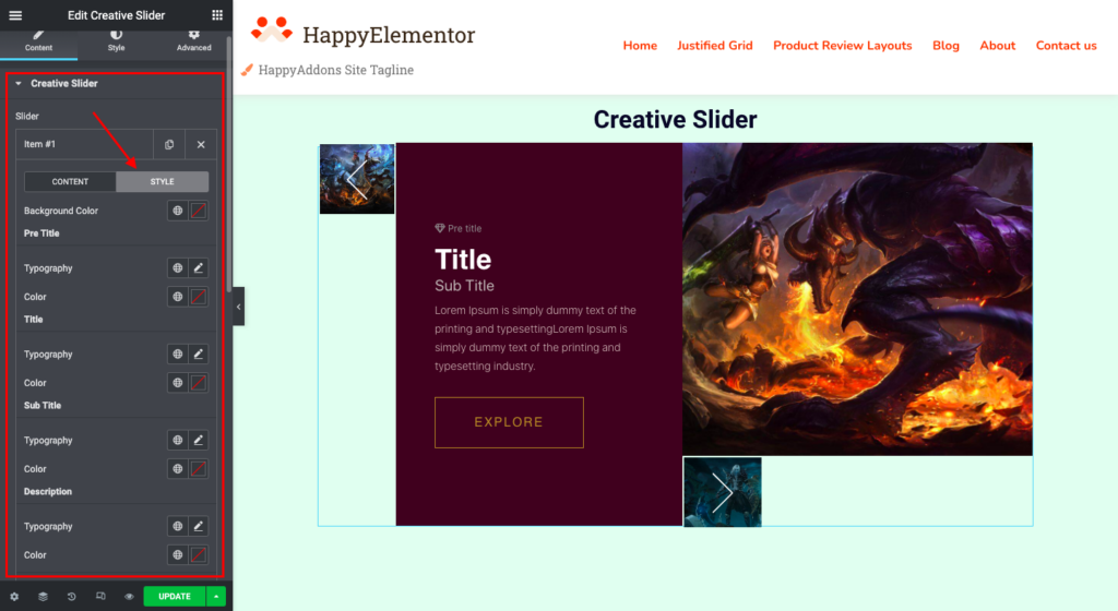
In the Styling Option, you can change the background color for each slide item and adjust the content typography and color. (Ex: Pre-title, title, Sub-title, Description)
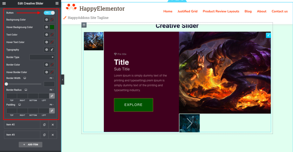
Along with that, You can enable the button styling here. You can control the button typography and choose border type, width, and border radius per your requirements. Note that you can set border width and radius for responsive devices like desktops, tablets, and mobile devices.
You can set the button padding for responsive devices and the button spacing.
To change the color of the button, you can change the color of the background, text, and border for both the hover and regular buttons.
Creative Slider Settings
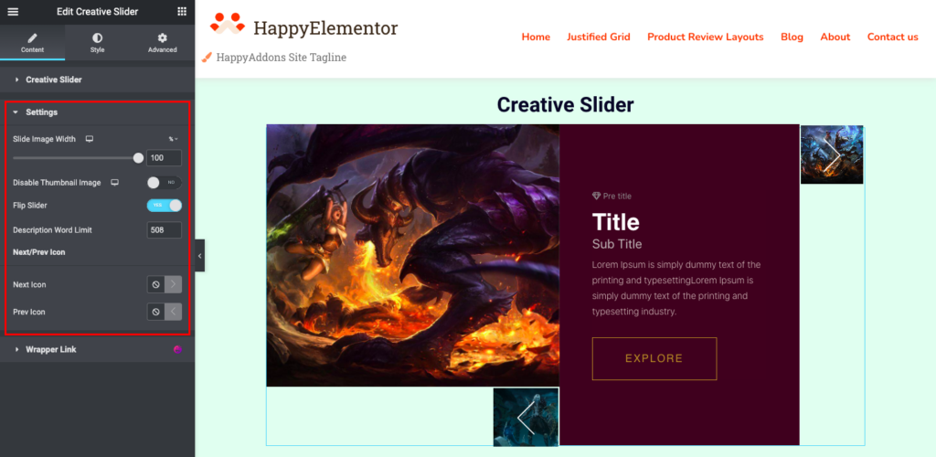
The Creative Slider Settings section allows you to configure the general appearance and behavior of the slider.
From Settings,
- There is a way to set slide image width according to the desktop, tablet, and mobile view.
- You can Enable/Disable Thumbnail Images for any specific device. (Ex: desktop, tablet, and mobile)
- Flip Slider: You can flip the slider using this option.
- Description word limit: This setting helps you to limit the word for the description.
- Next/Prev Icon: Using this setting, you can change the Next/Prev Icon.
Style:
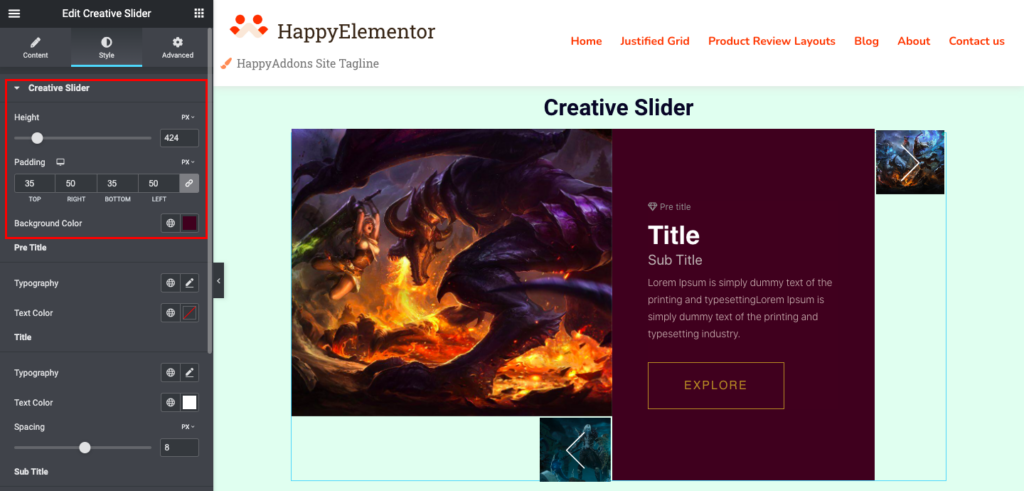
Style for Creative Slider(Slider):
You can adjust the height of the slider from the style option. Besides, you can change the slider’s background color and Padding(for desktop, tablet, and mobile) as well.
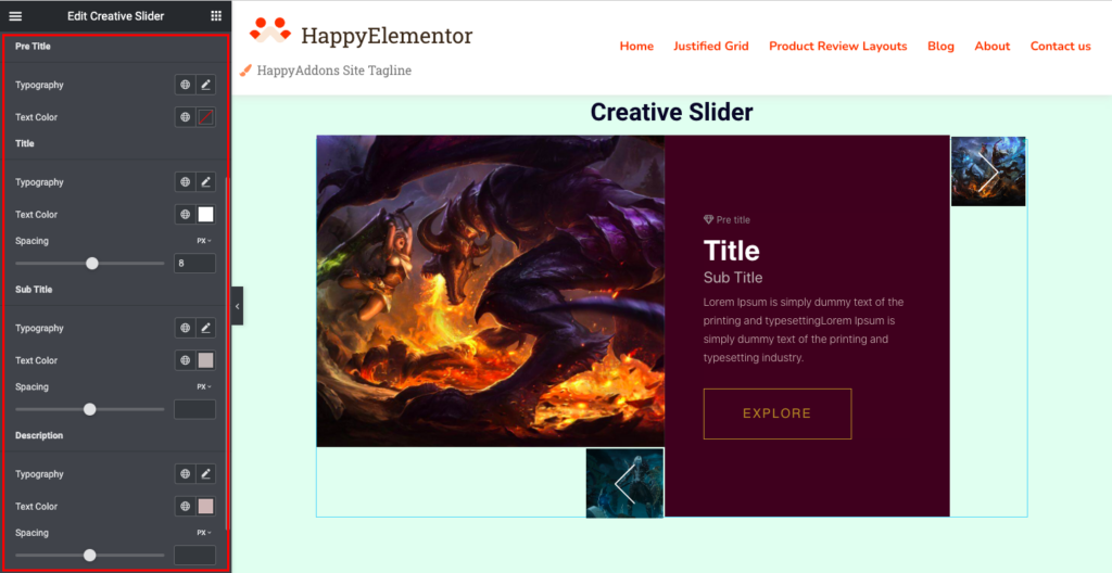
Pre-Title, Title, Subtitle, and Description:
Pre-Title: You will have the option to change the Pre-Title Background color, and you can control the typography as well.
Title, Subtitle, and Description: You can change text color and spacing. Along with that, you will have typography control as well for the Title, Subtitle, and Description.
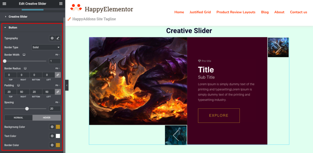
The style for the Button:
You can control the button typography and choose border type, width, and border radius per your requirements. Note that you can set border width and radius for responsive devices like desktops, tablets, and mobiles.
You can set the button padding for responsive devices and the button spacing.
To change the color of the button, you can change the color of the background, text, and border for both the hover and regular buttons.
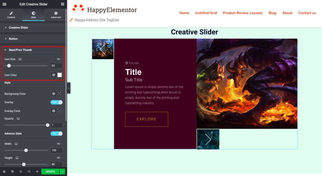
Next/Prev Thumb:
You can set the icon size and its color in this styling section.
Thumbnail Style:
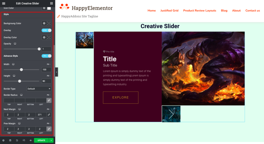
You can change the background color and overlay color of the thumbnail. To change the overlay option, simply toggle the overlay button and set the opacity.
Thumbnail Advanced Style:
In the advanced style setting of the creative slider thumbnail, you can set the custom width and height and the border type and radius for your responsive devices like desktop, tablet, and mobile.
You can also set the margin for the next and previous thumbnails.
That’s all.


