How to use HappyAddons Featured Post widget
Introduction
The Featured Post widget from HappyAddons Pro lets you highlight specific posts on your website in a visually stunning and engaging way. With built-in styling options and flexible layouts, you can easily showcase your most important or popular posts to grab your visitors’ attention.
Pre-requisites
To use the Featured Post widget, ensure you have the following installed and activated:
- Elementor
- HappyAddons
- HappyAddons Pro
Adding the Featured Post Widget
Follow these steps to add and customize the Featured Post widget:
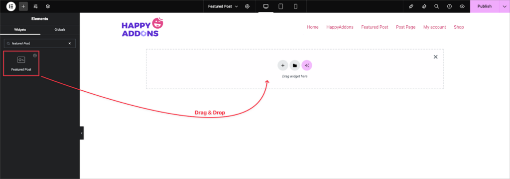
- Open Elementor
Edit the page where you want to display the featured post section. - Search for the Widget
In the Elementor panel (left side), type “Featured Post” in the search bar. - Drag & Drop
Drag the Featured Post widget and drop it onto the desired section of your page.
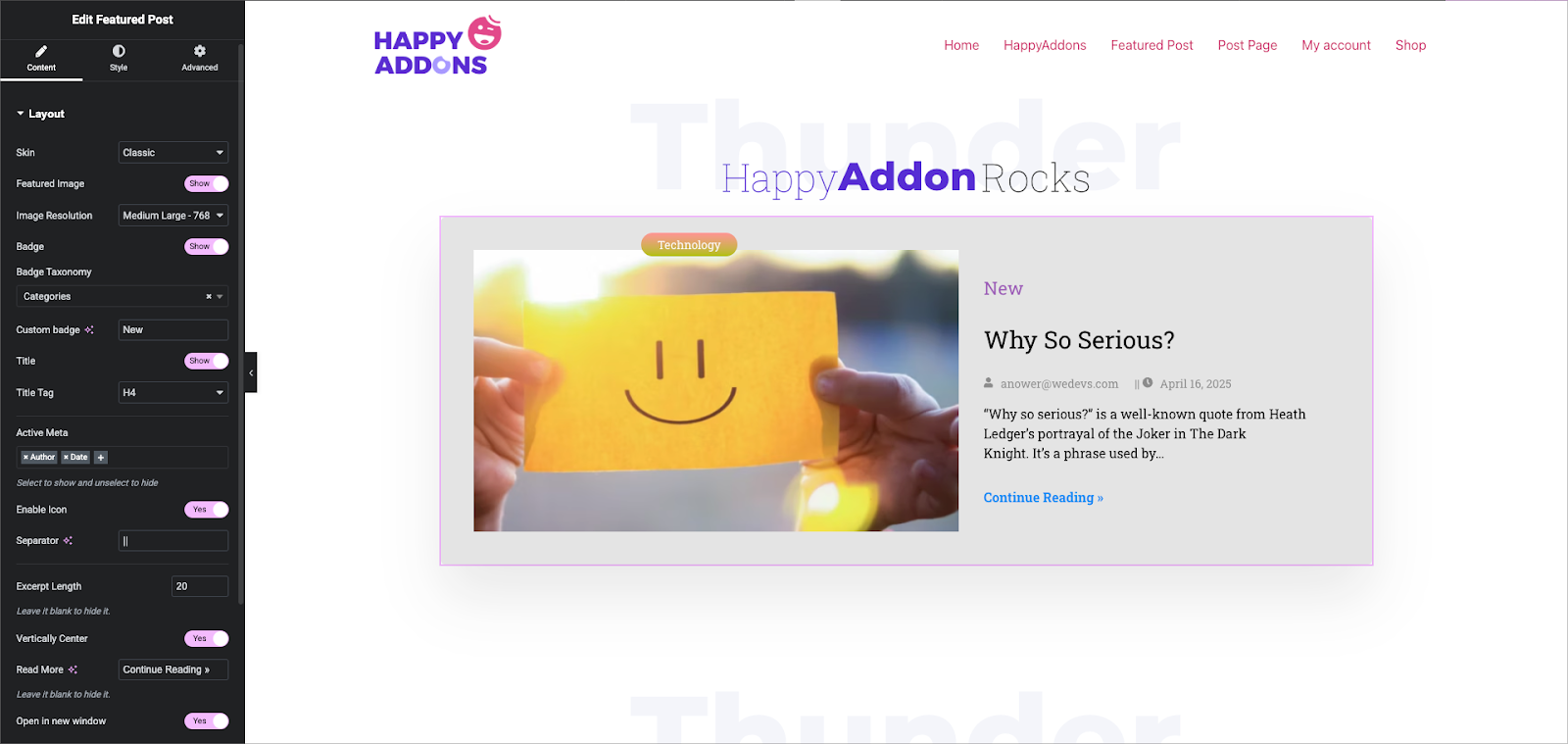
Layout
- Skin: Choose the layout style. The default options are Classic, Standard, and Outbox, which show a featured image with post content below it in a clean layout.
- Featured Image: Toggle to enable or disable displaying the post’s featured image.
- Image Resolution: Set the image size.
Badge
- Badge Taxonomy: Use this to assign a badge based on a taxonomy like Category, Tag, Product Category, or Product Tag if you want to use WooCommerce.
- Custom Badge: If you prefer a custom label, type it here — for example, enter “New” to display a badge with the text “New.”
Title
- Title Tag
Set the HTML tag for the post title, such as H4, H3, etc., based on your heading hierarchy and SEO needs.
Active Meta
Toggle which post meta information you want to show. Options include:
- Author
- Date
- Comments
Select to show, and unselect to hide any of these.
- Enable Icon: Enable this to display small icons next to the metadata.
- Separator: Choose or enter a symbol to separate meta elements (e.g., a dot or pipe).
Excerpt
- Excerpt Length
Enter a number (e.g., 20) to control how many words to display from the post excerpt.
Leave this blank if you don’t want to show an excerpt. - Vertically Center
Enable this to align the content vertically within the widget container, which is useful for balanced design.
Read More Button
- Text
Customize the label for the button — default is “Continue Reading »”.
Leave it blank if you prefer to hide the button entirely. - Open in New Window
Toggle this option to open the linked post in a new browser tab, which helps retain users on the current page.
Query Settings:
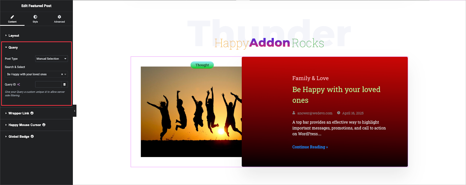
The Query settings let you control which posts are displayed in the Featured Post widget. You can choose specific post types or manually select individual posts for full control over the content shown.
Post Type
- Post
Select the type of content you want to display. This can include:- Posts
- Pages
- Custom post types (if registered)
- Manual Selection: Search & Select
- Manually choose specific posts to feature. Use the search bar to find and add individual posts.
This is useful when you want to highlight particular posts rather than relying on dynamic queries.
Query ID
Give your query a custom unique ID to enable server-side filtering or advanced control when using the same query across multiple widgets.
This is especially helpful if you’re integrating the widget with custom code or external filters.
Style:
Item Box
- Padding: Adjust space inside the box for each side (Top, Right, Bottom, Left). Use the link icon to apply the same value to all sides.
- Background Type:
- Classic: Set a solid background color.
- Gradient: Choose two colors, set their positions (e.g., 0% and 100%), select type (Linear or Radial), and adjust angle (e.g., 182°). Responsive controls are available for breakpoints.
- Classic: Set a solid background color.
- Box Shadow: Add depth with shadow effects. You can customize blur, spread, and position.
- Border Type: Choose a border style (e.g., Solid, Dashed, None).
- Border Radius: Round the corners individually or link values to apply the same radius on all sides.
- Opacity: Set visibility level. 1 is fully visible, 0 is fully transparent.
- Width: Define the box width in pixels, with responsive support.
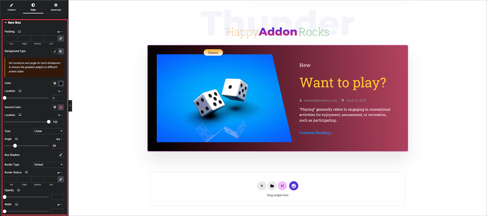
Image:
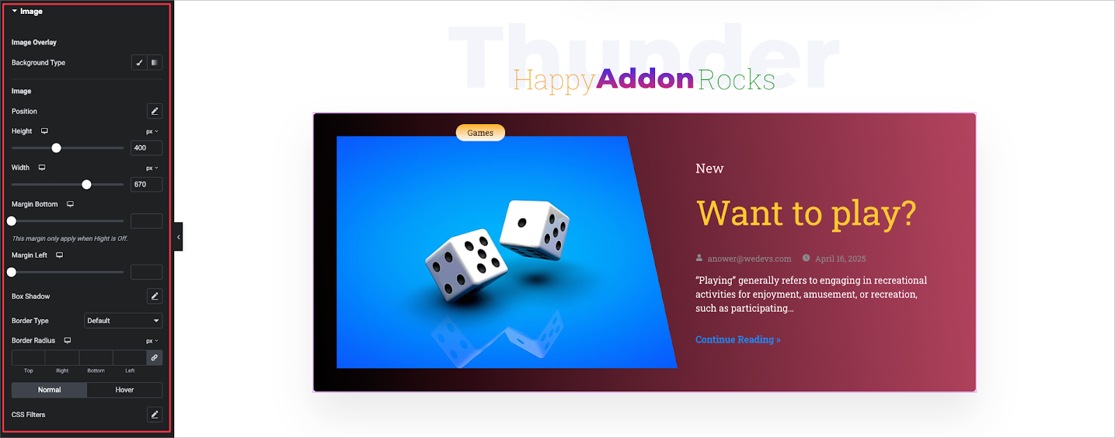
Image Overlay: Add a background overlay using Classic (solid color) or Gradient.
Position: Adjust the image position using the position controls.
Height / Width: Set the image size in pixels. Example: Height 400px, Width 670px.
Margin Bottom: Adds space below the image. Only applies if Height is not set.
Margin Left: Adds space to the left of the image.
Box Shadow: Add shadow effects around the image.
Border Type: Choose a border style (e.g., Solid, None).
Border Radius: Round image corners individually or link sides.
Normal / Hover: Customize border and shadow styles separately for normal and hover states.
CSS Filters: Apply filters like blur, brightness, contrast, etc., for custom visual effects.
Badge:
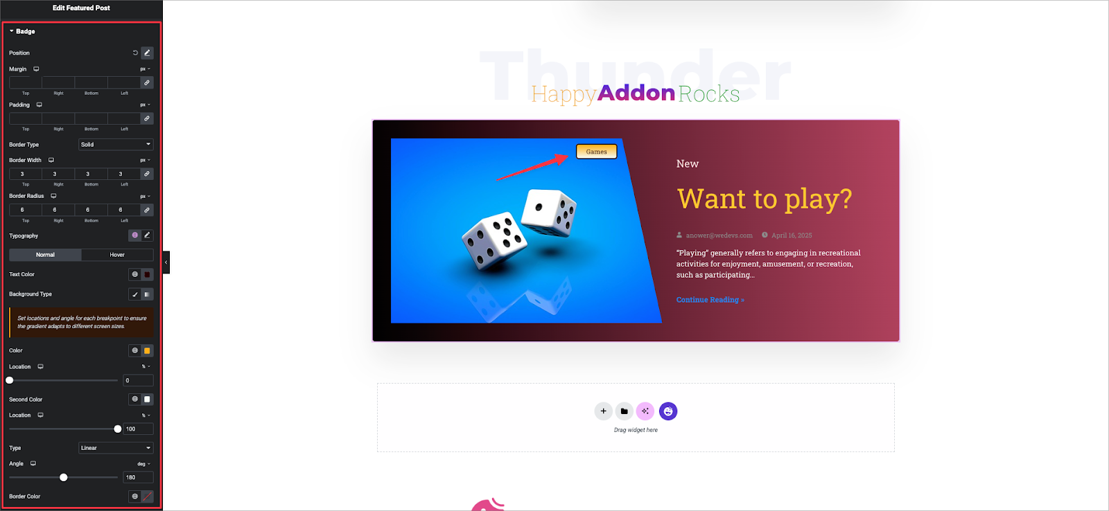
Position: Adjust the badge’s position using the position Left or Right and Top or Bottom.
Margin / Padding: Set space around and inside the badge. Configure each side or link value.
Border Type: Select border style (e.g., Solid, None).
Border Radius: Round the badge corners individually or link sides.
Typography: Customize font settings like size, weight, and line height.
Text Color: Set badge text color separately for Normal and Hover states.
Background Type:
- Classic: Solid color background.
- Gradient: Use two colors with set positions (e.g., 0% and 100%), type (Linear), and angle (e.g., 180°). Supports responsive design.
Border Color: Define the color of the badge border.
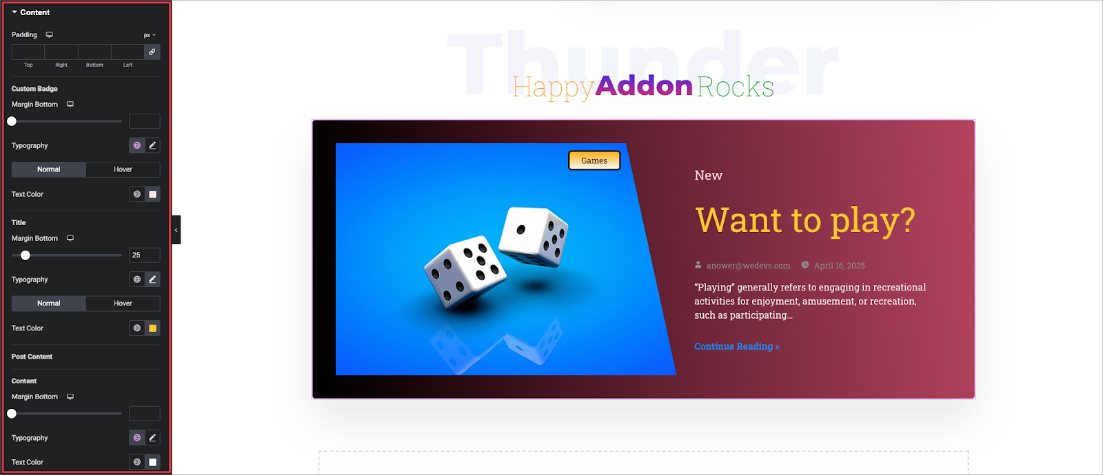
Content:
- Padding: Set inner spacing for the content area. Adjust each side or link values.
- Custom Badge – Margin Bottom: Add spacing below the custom badge.
Title
- Margin Bottom: Set space below the title (e.g., 25px).
- Typography: Customize font style, size, weight, etc., for both Normal and Hover states.
- Text Color: Choose title color for Normal and Hover.
Post Content
- Margin Bottom: Add space below the post excerpt.
- Typography: Control font settings for the excerpt text.
- Text Color: Set color for the post content.
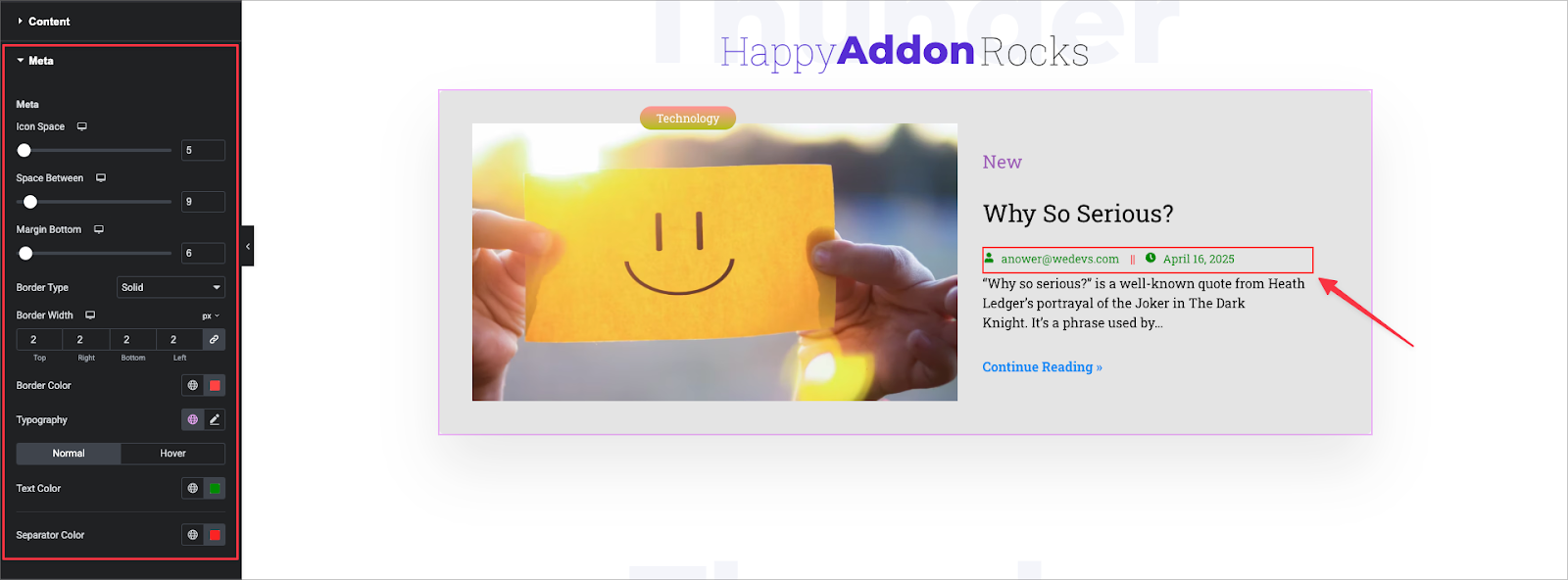
Meta
Icon Space: Set spacing between the icon and the meta text.
Space Between: Adjust space between each meta item (e.g., Author, Date, Comments).
Margin Bottom: Add spacing below the meta section.
Border Type: Choose border style if needed (e.g., Solid, None).
Typography: Customize font settings for meta text.
Text Color: Set colors for both Normal and Hover states.
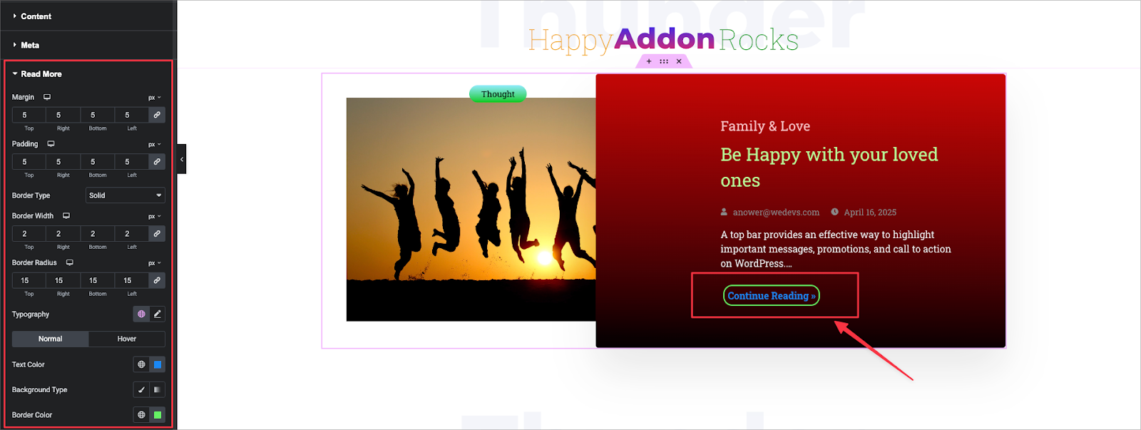
Read More Button:
Margin: Set space around the button.
Padding: Set inner spacing for the button.
Border Type: Choose the border style (e.g., Solid).
Border Width: Set the border thickness (e.g., 2px each side).
Border Radius: Round the button corners (e.g., 15px for all sides).
Typography: Customize font settings.
Text Color: Set for both Normal and Hover states.
Background Type:
- Classic: Solid color
- Gradient: Two-color background with customizable direction and position
Border Color: Set border color for Normal and Hover states.
That’s it. Cheers!
