With the new Happy Addons Pro ‘Off Canvas Content‘ widget, you can easily add and show different types of website content with great ease.
This amazing widget allows you to display useful content efficiently and make them more attractive to your customer.
Let’s see how this Off Canvas Content widget works.
Pre-requisites
To use that cool Off Canvas Content widget you need the following things,
- Elementor (Free)
- Happy Addons (Free)
- Happy Addons Pro
How to Use Happy Addons Off Canvas Content
In the following step-by-step guide, we’ll show you how to work with Off Canvas Content.
Let get started:
Step 1:
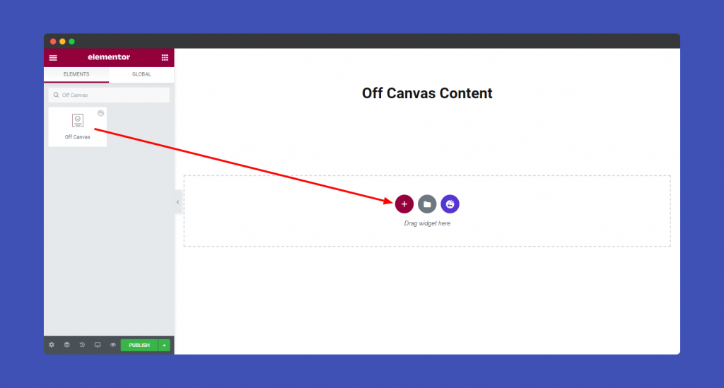
First, look for the Off Canvas Content widget in the left side menu. Then drag and drop it onto the selected area.
Step 2:
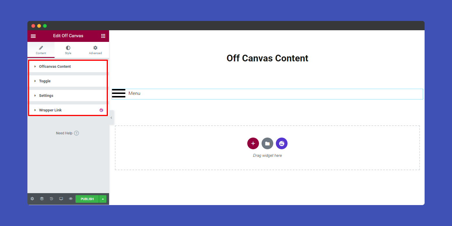
After adding the widget, you will find the Off Canvas content setting. In the content section, you’ll get the necessary content of the canvas.
- Offcanvas content
- Toggle
- Settings
- Wrapper Link
Offcanvas content
First, you have to select the Content Type from the drop-down option. Here you can choose any of the five content types.
- Sidebar: If you have any sidebar on your website, you can show it as off-canvas content.
- Custom Content: You can also manually add custom content and display them on the canvas.
- Saved Section: If you have predefined sections on your Elementor website, you can use them as the off-canvas content.
- Saved Widget: Widgets can also be set as the content type of the off-canvas.
- Saved Page Templates: Even, you can display your saved page template on the canvas.
Here we choose the Custom Content as the content type.
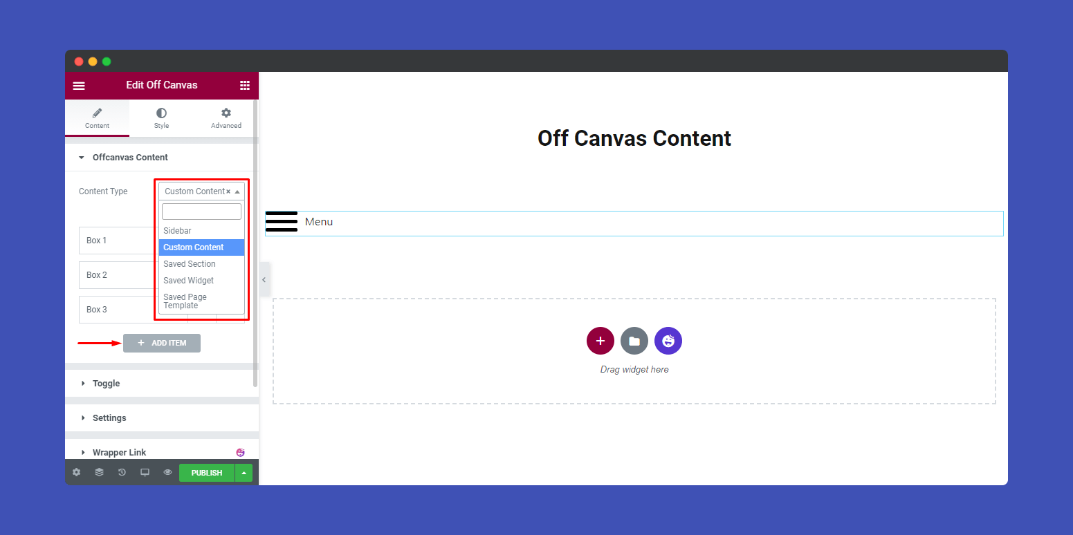
Note: You can Add Items as many as you want.
Toggle
For changing the Toggle content, you just go to Content–>Toggle. Here, you can change..
- Toggle Source: There are four Toggle Sources available such as Button, Burger Icon, Element Class, and Element ID. You can select any of them. Here we choose the Button as the toggle source.
- Position: You can set the Toggle position Inline & Floating. Here we set the Inline toggle position.
- Button Text: As you can see that we’ve selected the Button toggle source. That’s why we should add a Button Text.
- Button Icon: If you need, you can also add an icon to your button.
- Icon Position: You can able to set your icon position Before & After. Here, we set the Icon Position-> After that’s why the icon appears after the button text.
- Icon Spacing: You can also define the space between the Button Text and Icon.
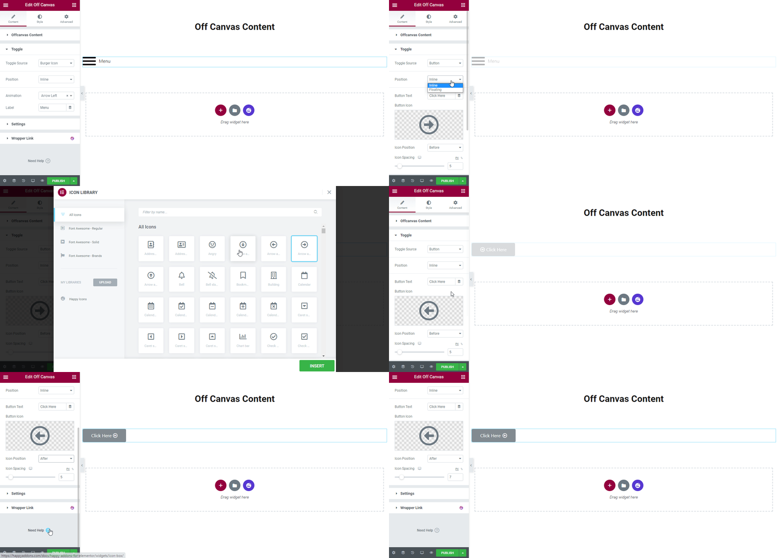
Note: You can also add a Toggle using Elementor ID and Class. Let me clarify another thing for you. If you set Toggle–>Position ‘Inline‘ then you can change the Toggle Alignment.
Setting
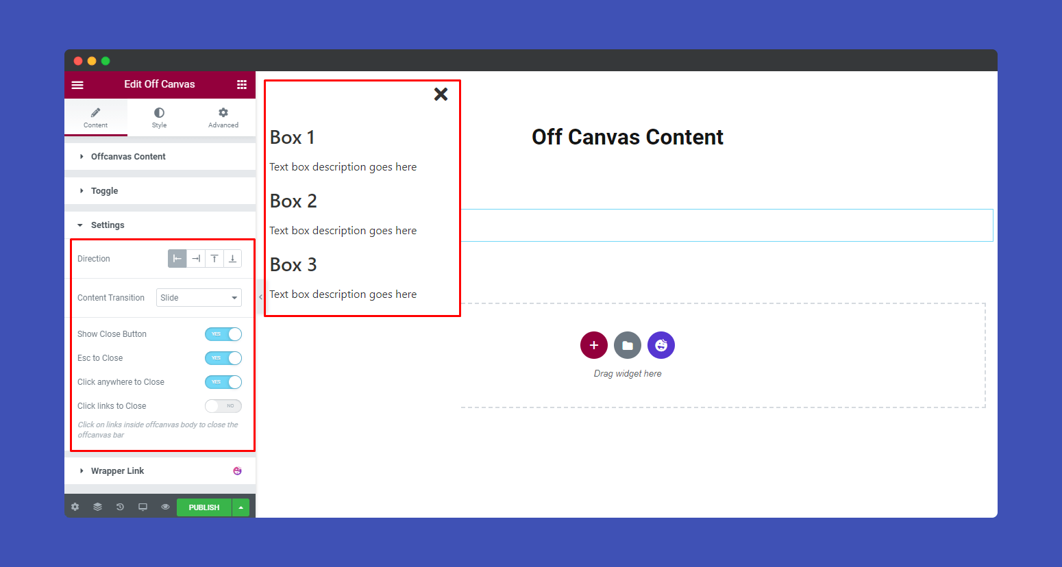
In the Content–>Setting, you will find some essential settings.
- Direction: In the Conetnt–>Settings–>Direction, you can set the direction of the off-canvas conetnt bar in the Right, Left, Top, and Bottom. Here, we set the canvas content direction left that’s the canvan appears in the left site of the screen.
- Content Transition: You can also define the Conetnt Transition such Slide, Reveal, Push, and Slide Along. You can see that we select the Conetnt Transition–>Slide.
- Show Close Button: You can able to turn On & Off the close button of the offcanvas bar.
- Esc to Close: If you turn On the Esc to close only then you’ll able to close the content by typing your Keyboard–>Esc Button.
- Click Anywhere to Close: You can close the canvas content by clicking anywhere on the screen. To do this, you need to turn On the setting.
- Click links to Close: You also click on links inside offcanvas body to close the offcanvas bar by activating the setting.
Step 3:
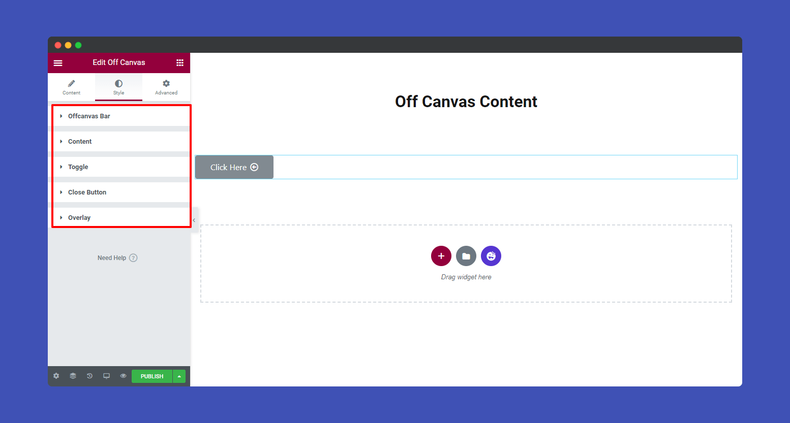
In the “Style” section, you will find five style options to design your Off Canvas. Here are the lists.
- Offcanvas Bar
- Content
- Toggle
- Close Button
- Overlay
Offcanvas Bar
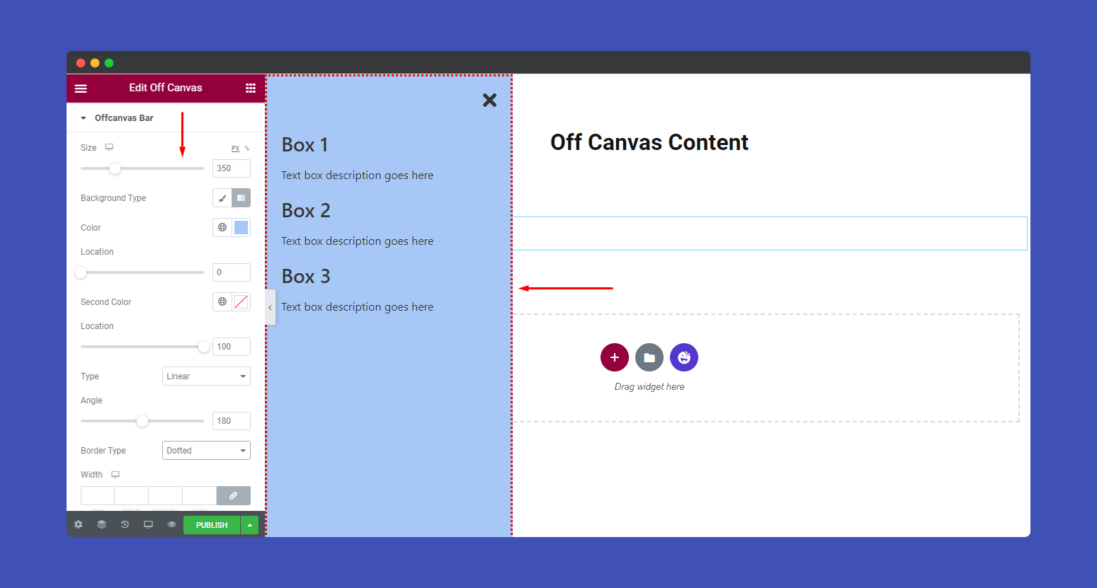
In the Style–>Offcanvas Bar, you can change the Bar Size, Background Type, Color, Location, Linear, Angle, Border Type, Width, Border Radius, Padding, and Box Shadow.
Content
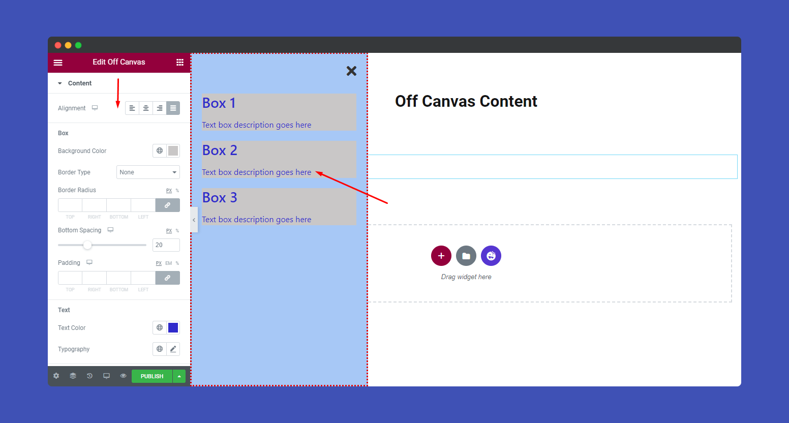
You can style your canvas content. Here you can set the Alignment even add Background Color, Border Type, Border Radius, Bottom Spacing of the Box. Also, define the Color and Typography of the Text and Link.
Toggle
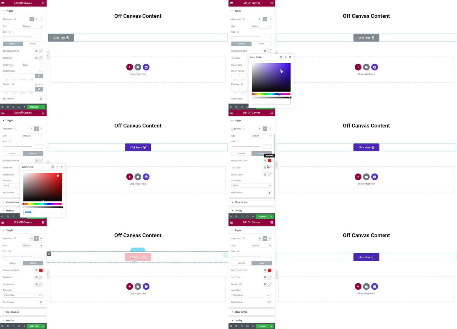
In the Style–>Toggle section, you can again customize your Toggle style. Here you’ll get lots of options to change Toggle Alignment, Size, HOVER, Background Color, Text Color, Border Type, Border Radius, Padding, Box Shadow, and Typography.
Close Button
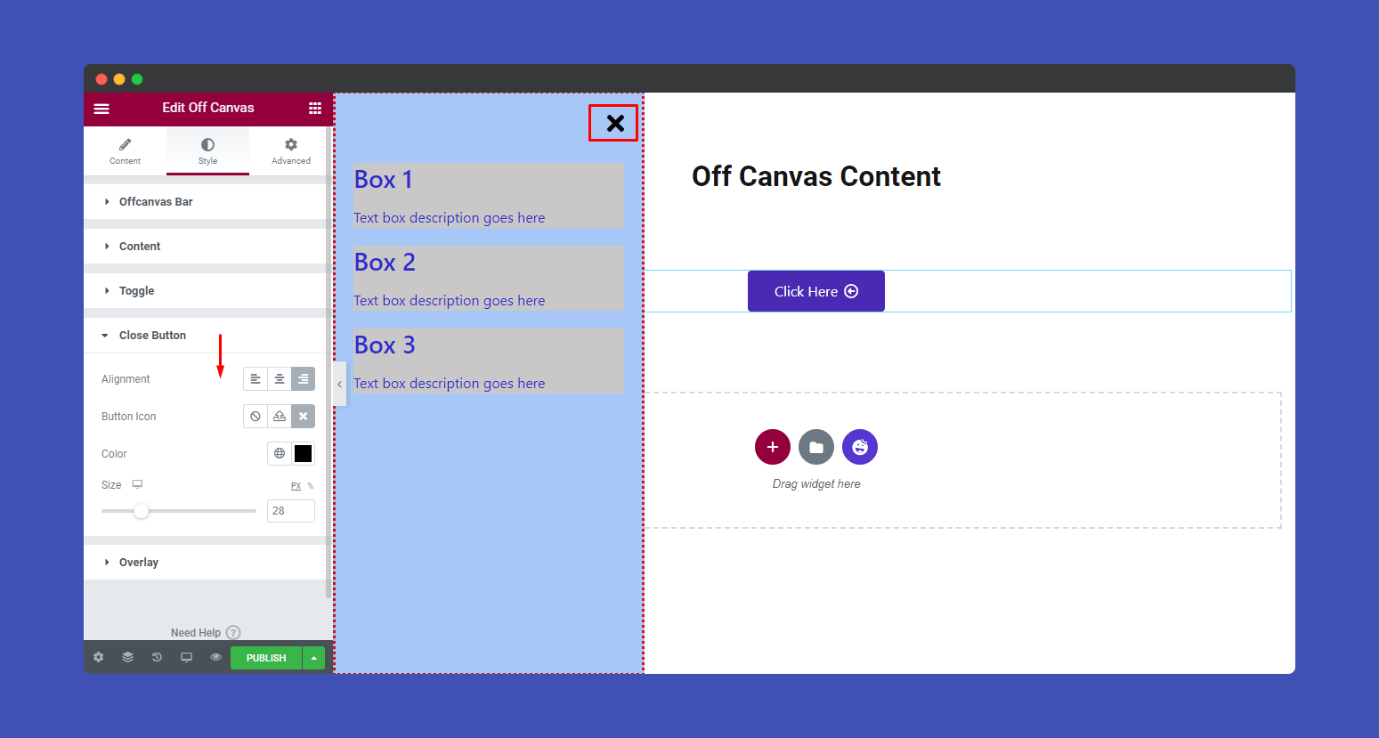
You can also edit your canvas Close Button in your own styles like set Alignment, Button Icon, Color, and Size.
Overlay
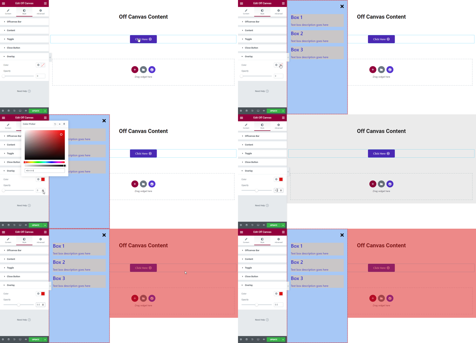
If you need, you can define ‘Overlay‘ Color and Opacity.
Step 4:
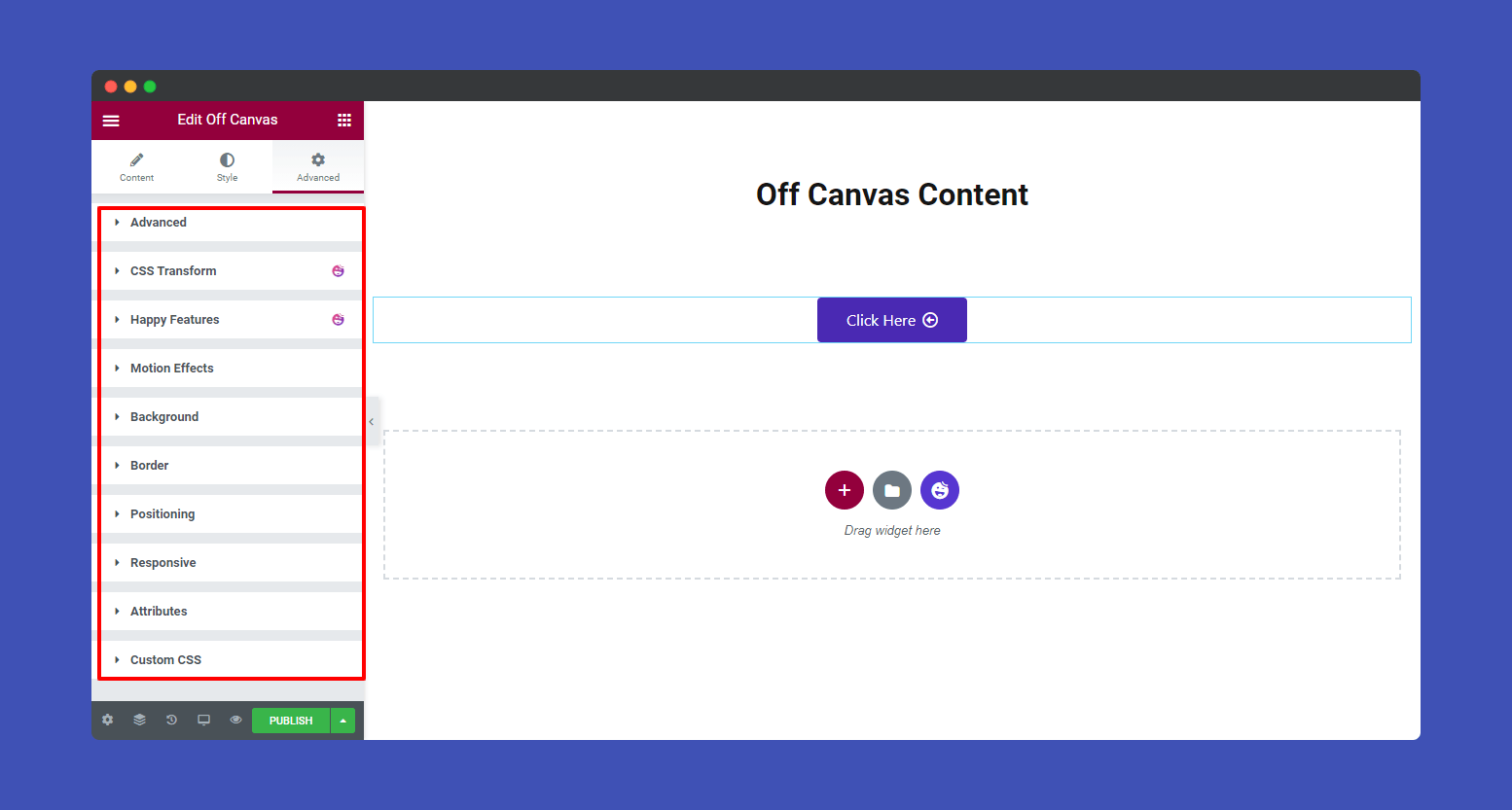
If you want to add motion effects, happy effects, background, or make it responsive and more intriguing, click on ‘Advanced‘ to explore those options. the ‘Advanced‘ is a default feature of Elementor.
Give a read to this Document to know more about advanced features & functions.
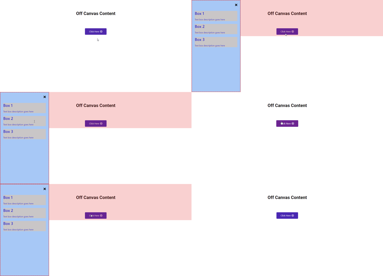
Here is the final preview of the Happy Addons Off Canvas widget.
That’s it!
