The new One Page Navigation widget of Happy Addons Pro will add an extra dimension to your website. You can easily navigate your one-page content effortlessly using some exclusive One Page Navigation designs.
Pre-requisites
To use that stunning One Page Navigation widget, you need the following things:
- Elementor
- Happy Addons
- Happy Addons Pro
How To Use One Page Navigation
Let’s get into deep and exploring the following steps one by one:
Step: 1
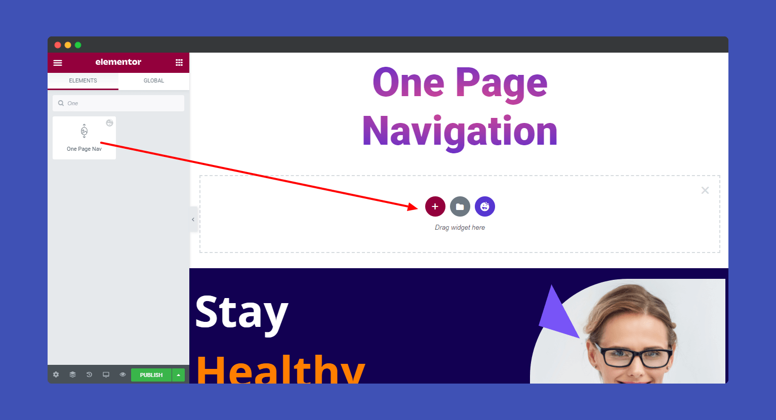
Select the ‘One Page Nav‘ widget from the left sidebar menu. Then drag and drop it onto the selected area.
Step: 2
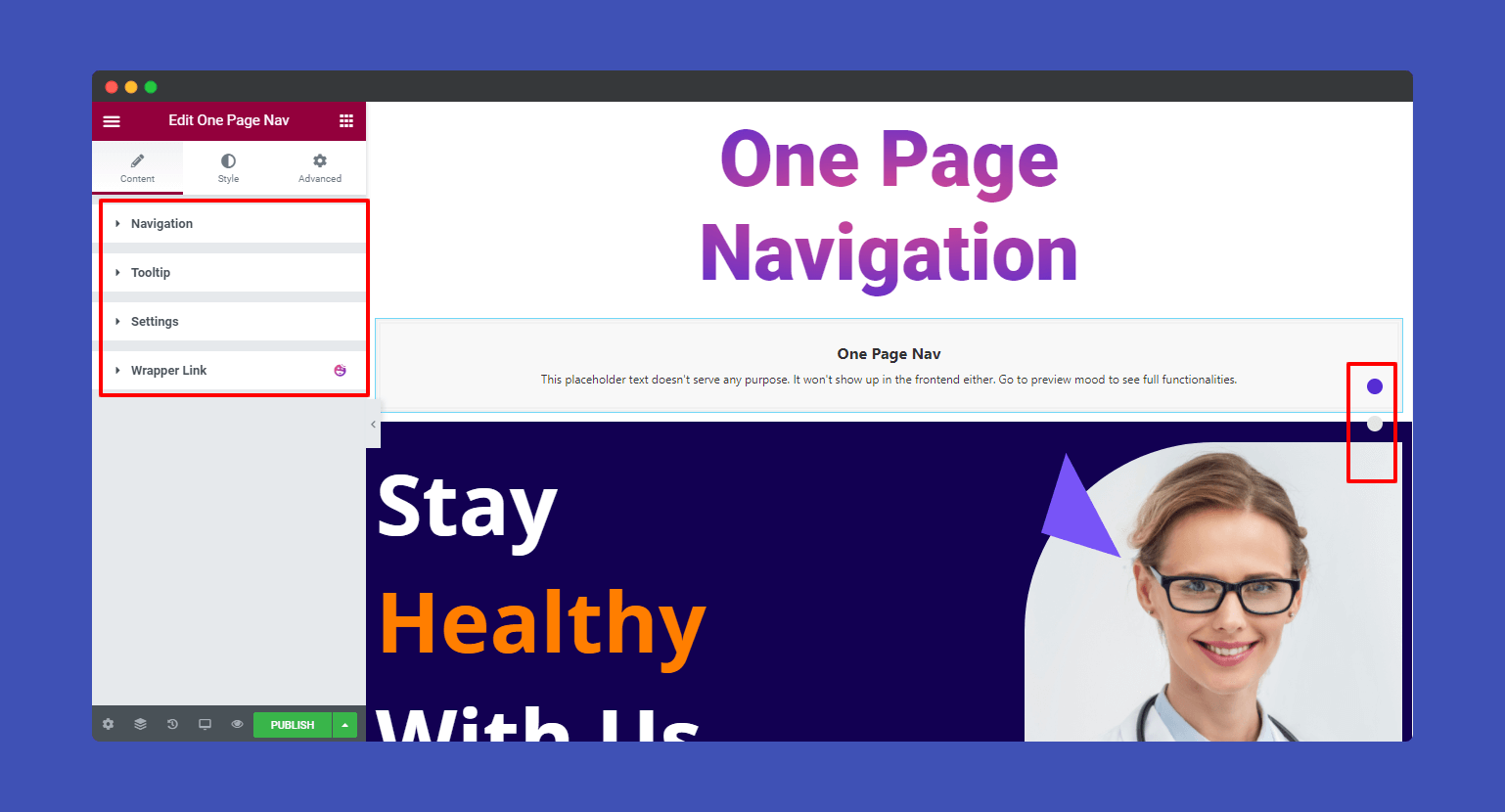
Under Content, you can find the navigation content editing options like Navigation, Tooltip, Settings, and Wrapper Link.
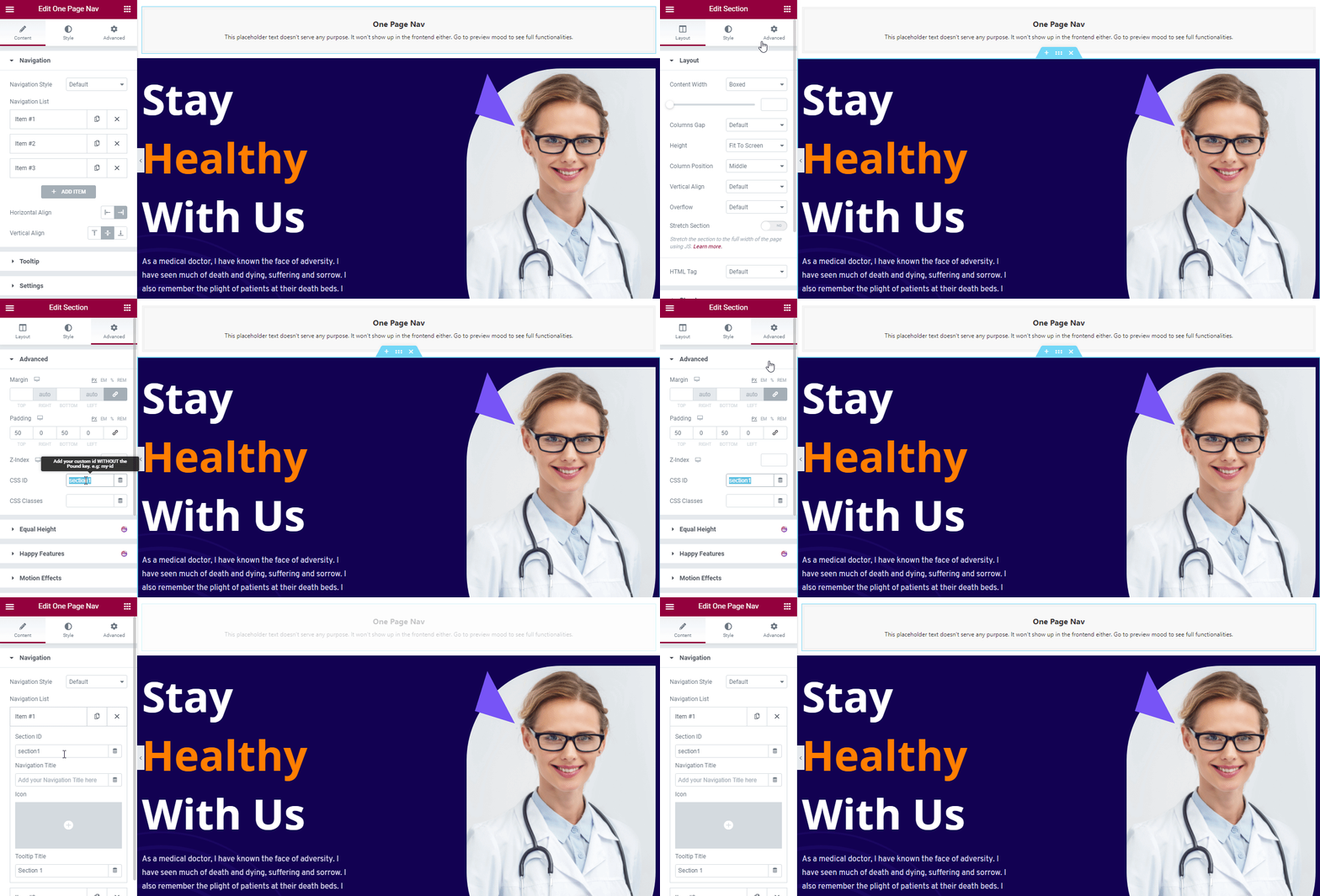
In the Content–>Navigation, you can set Navigation Style and add Navigation List Items. Define the Horizontal Align, and Vertical Align position the navigation. Here is the Navigation Style list for you.
- Default
- Berta
- Hagos
- Magool
- Maxamed
- Shamso
- Ubax
- Xusni
- Zahi

Let’s create one-page navigation using the Items–> Section Id and Advanced–>CSS Id. You can also use different names to set the navigation. But make sure the name of the Section Id and the CSS ID must be the same.
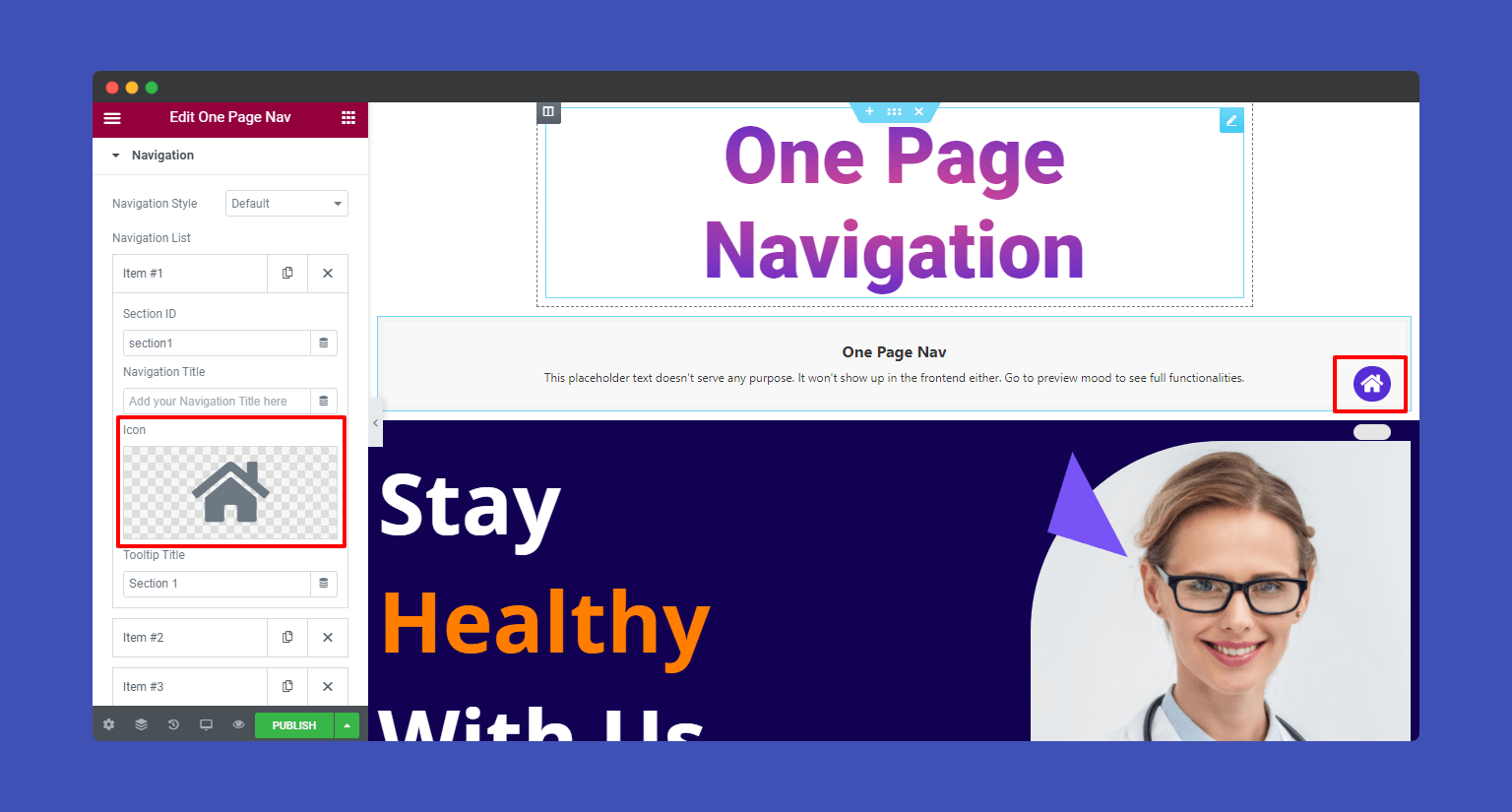
If you choose the Navigation Style ‘Default‘, you only able to add Icons in the navigation items.
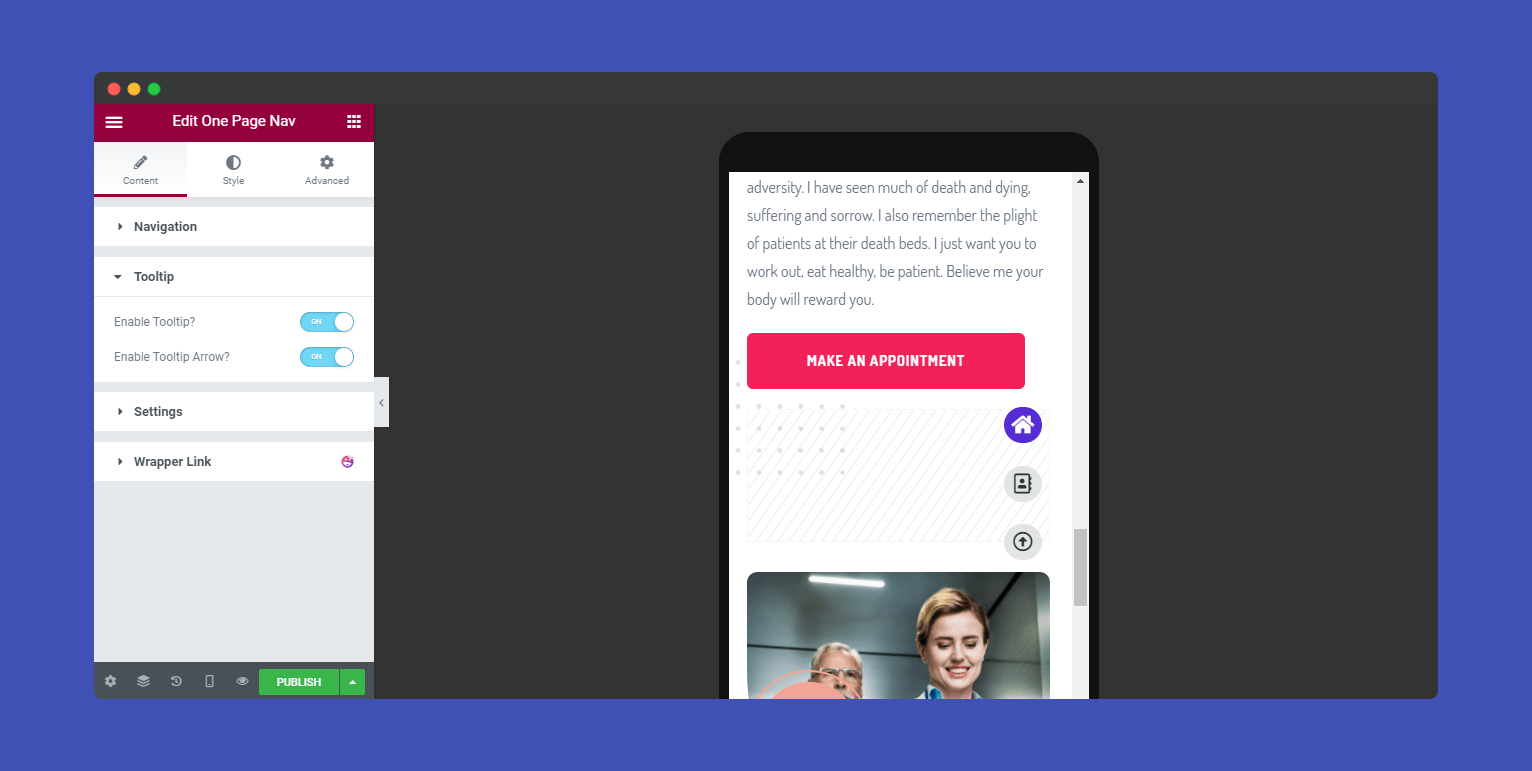
You can also set the Tooltip in the Default style only. First, you have to enable the Tooltip option.
Note: The Tooltip will work on all devices. Here we’ve used a mobile device to show how Tooltip works.
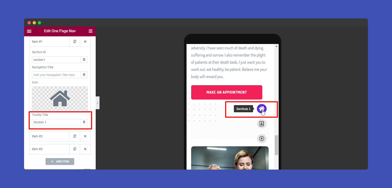
Then you can add a Tooltip Title. Here we show you how.
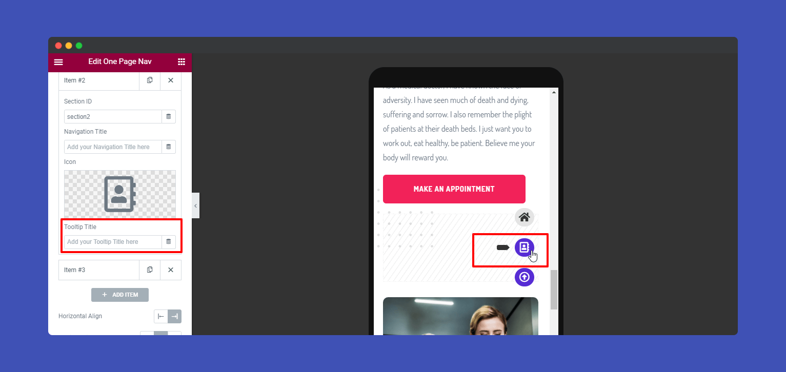
Besides, you can show the Tooltip Arrow. To do this, you need to remove the Tooltip Title from the Items. Then it’ll automatically show the Tooltip Arrow.
In the Content–>Settings, you may define the navigation controller such as Scroll Wheel, Touch Swipe, Scroll Keys. And you can set Row To Offset (px), and Scrolling Speed (px) as well.
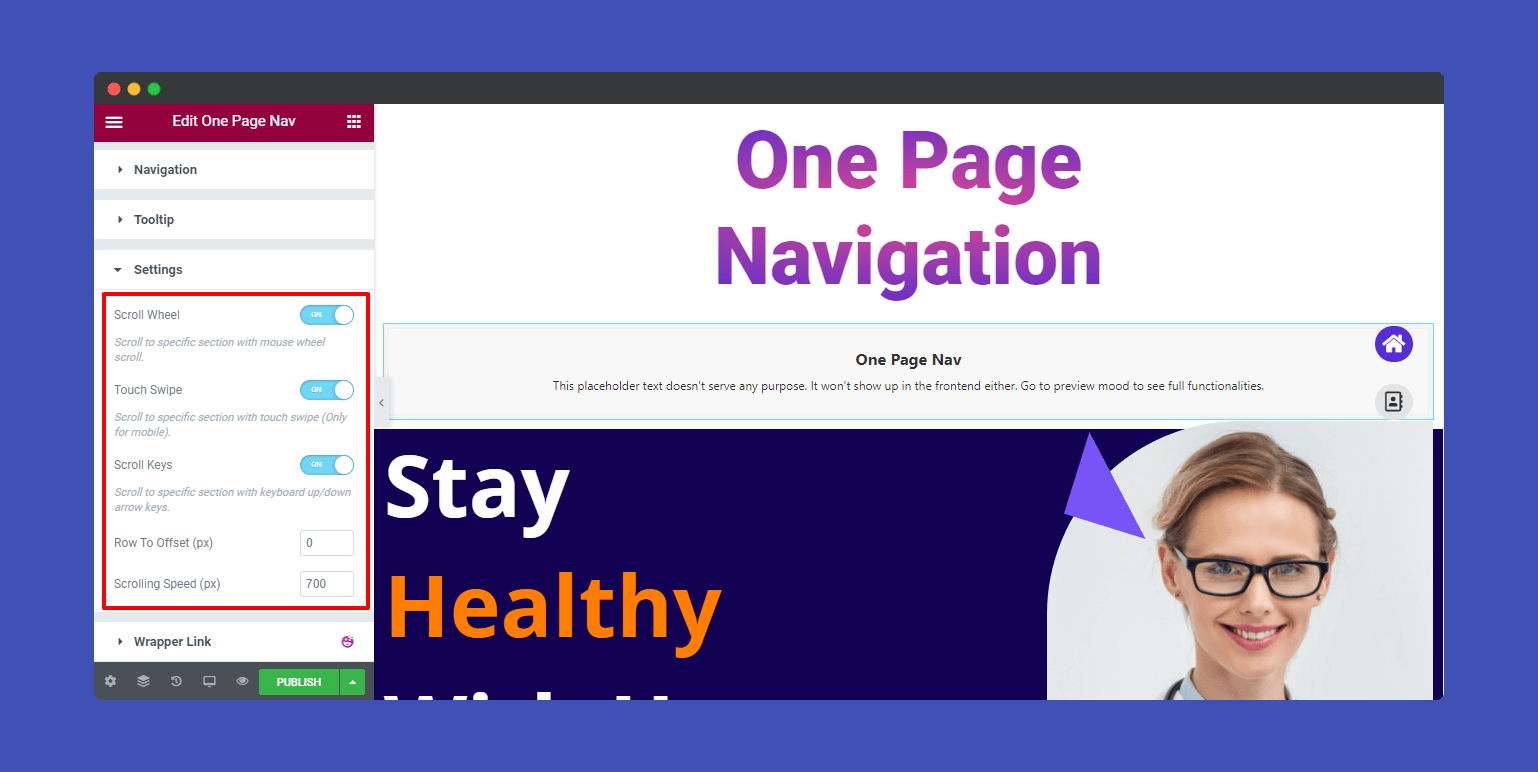
Note: Remember the Touch Swipe will work only for the Mobile.
Step: 3
There are different styling options available in the Style section according to the Navigation Style. That’s why we will show you each and every styling option based on the different Navigation Styles.
Default:
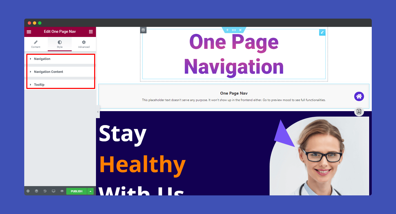
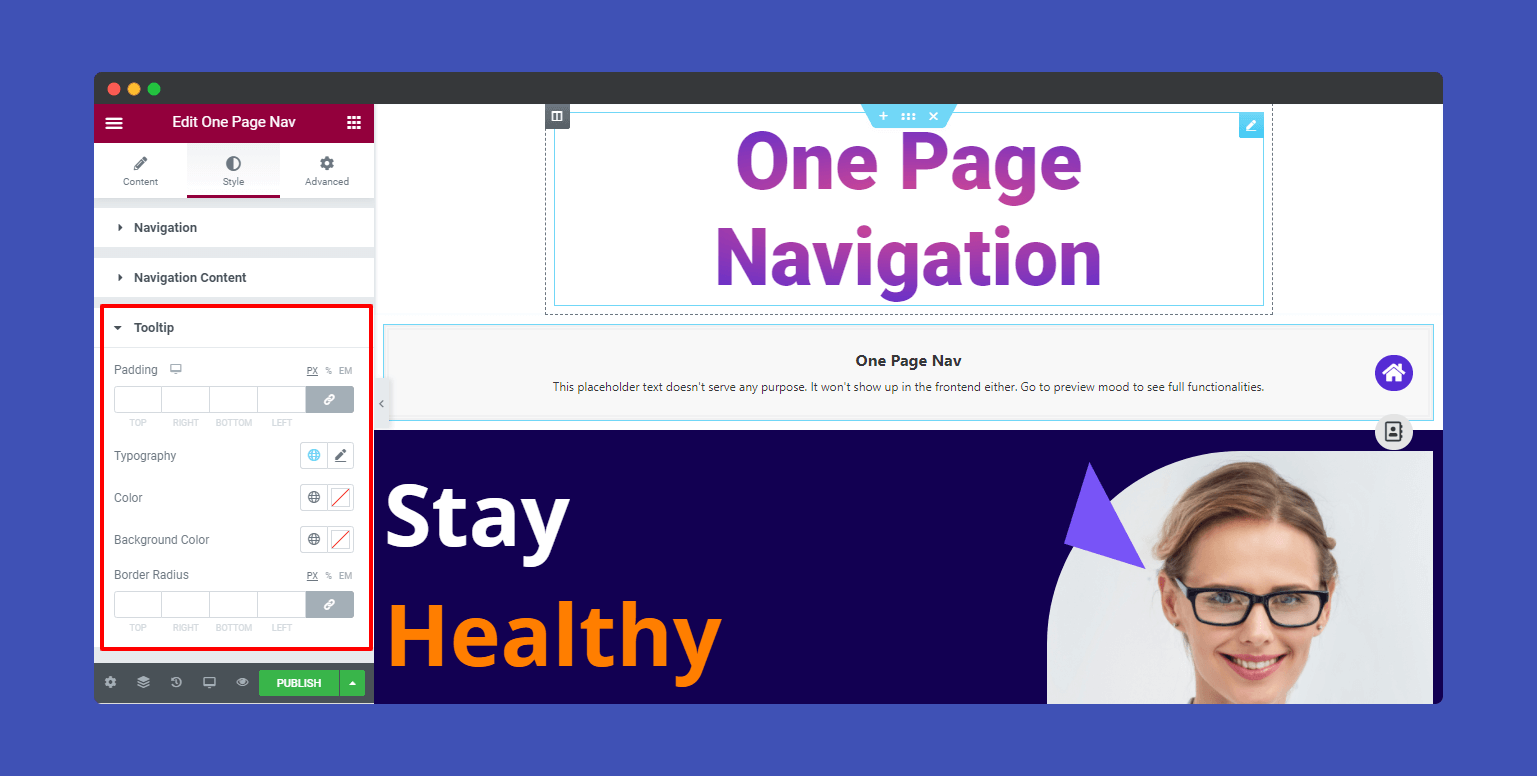
When you select the ‘Default‘ navigation style, you will have the three main style options like Navigation, Navigation Content, and Tooltip.
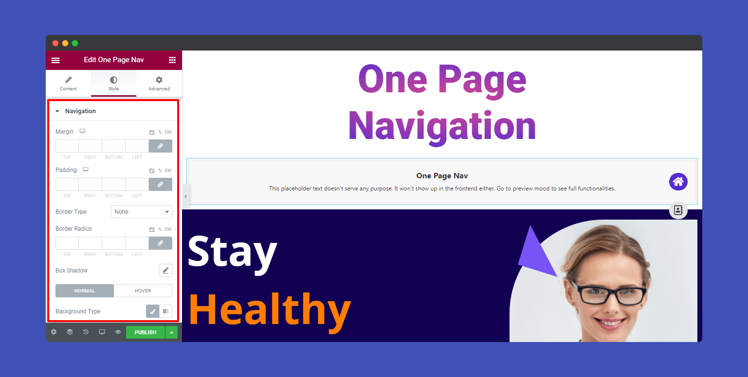
You can easily design the navigation using Margin, Padding, Border Type, Border Radius, Box Shadow, Background Type, and Image.
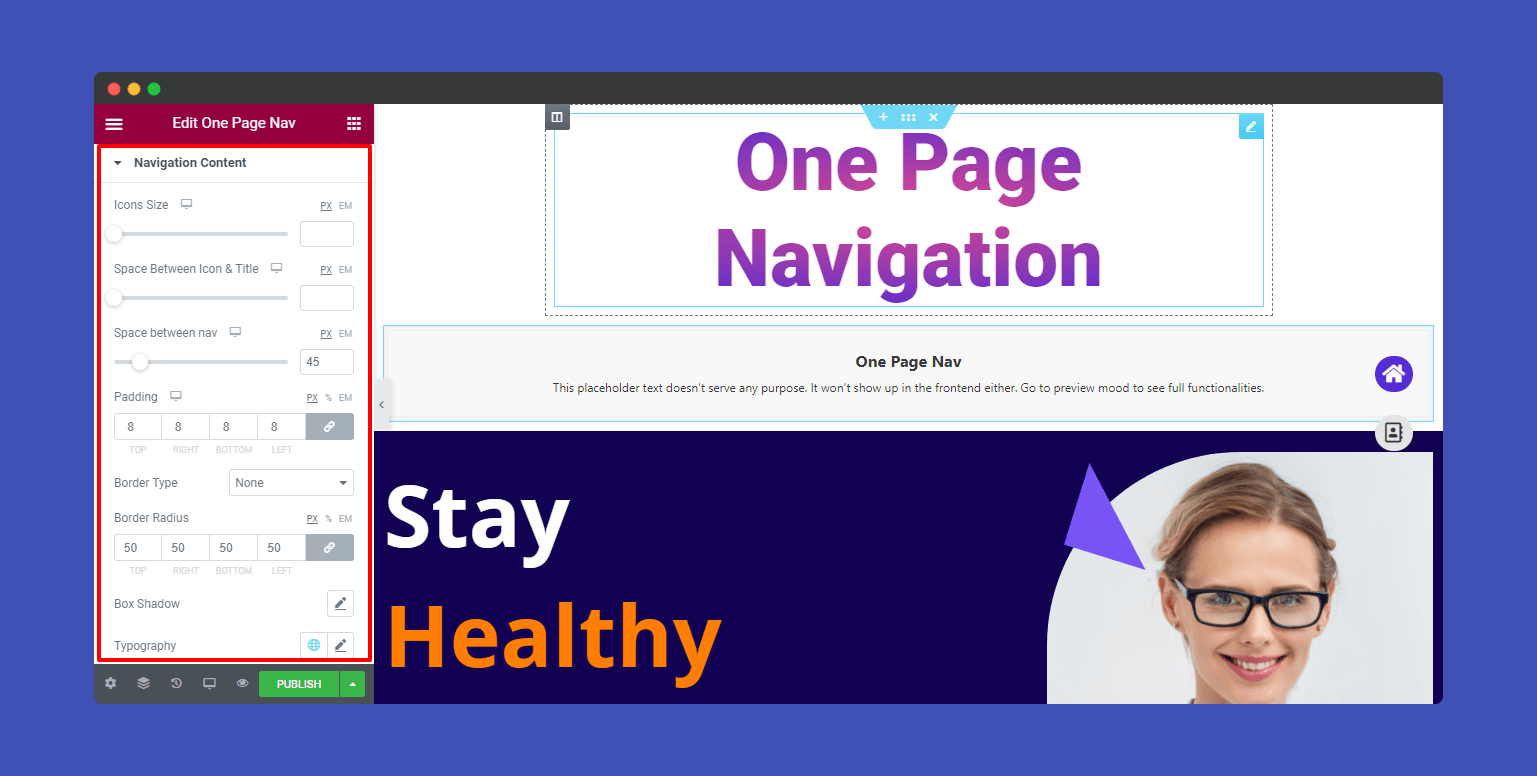
You are able to redesign the Navigation Content. These are options Icons Size, Space Between Icon & Title, Space between nav, Padding, Border Type, Border Radius, Box Shadow, Typography, Color, and Background Color to style the navigation content.
If you need, you will change the Padding, Typography, Color, Background Color, and Border Radius of the Tooltip.
Berta:
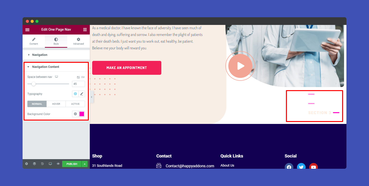
If you select the Navigation Style ‘Berta‘, you’ll get two style options Navigation and Navigation Content.
Note: Except for the Default Navigation Style, you can set the Margin of the navigator. By default, we’ve set the Margin 30px.

In the Berta style, you can design the Navigation Content in your own style. Here you can set Space between nav, add Typography, and define the Background Color.
Hagos:
Hagos is another cool navigation style. If you want, you may change its styles such as Icons Size, Space Between Icon & Title, Space between nav, Typography, and Background Color.

Magool:
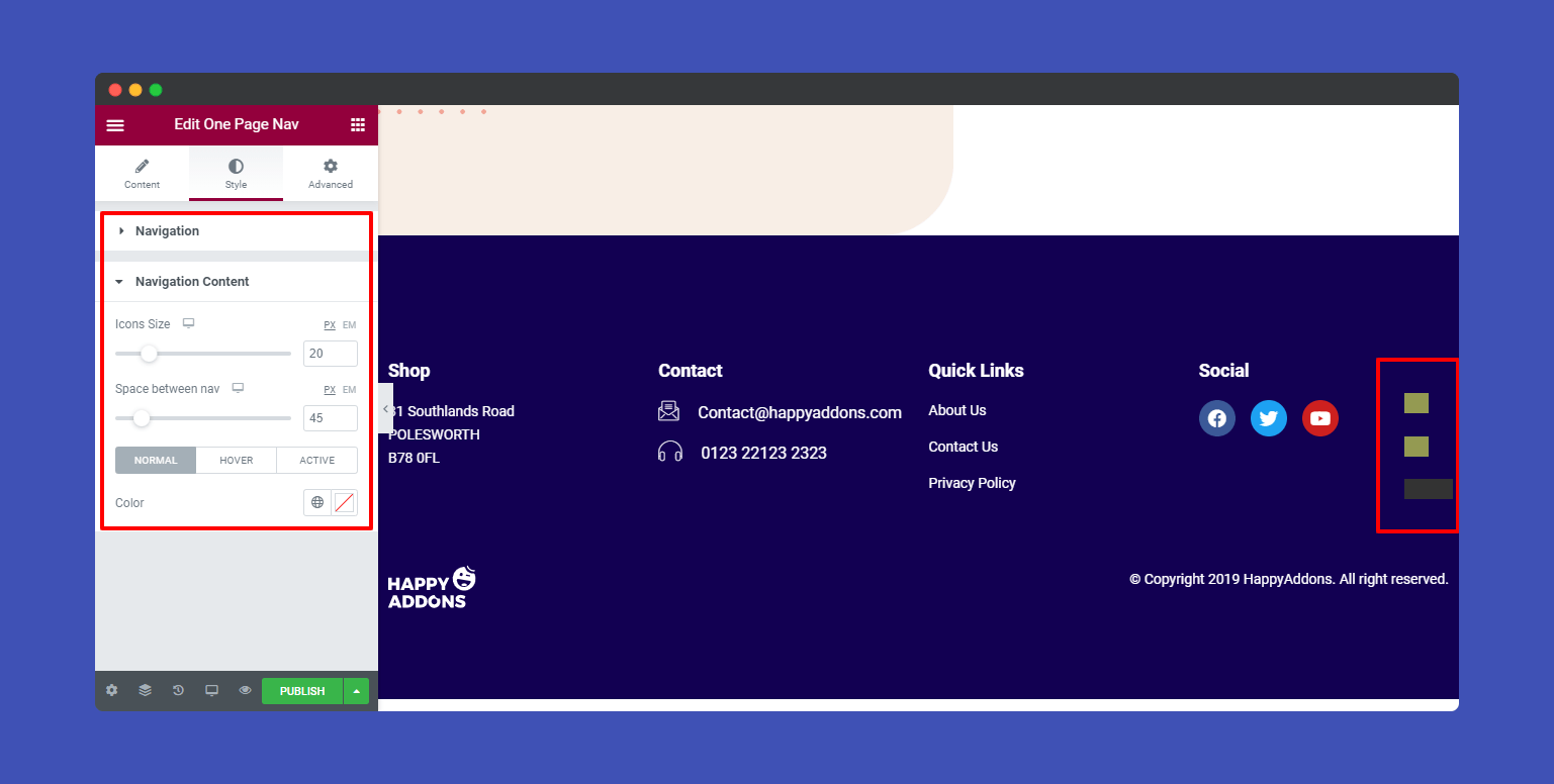
These are the options Icons Size, Space between nav, and Color for changing the style of Magool navigation.
Maxamed:
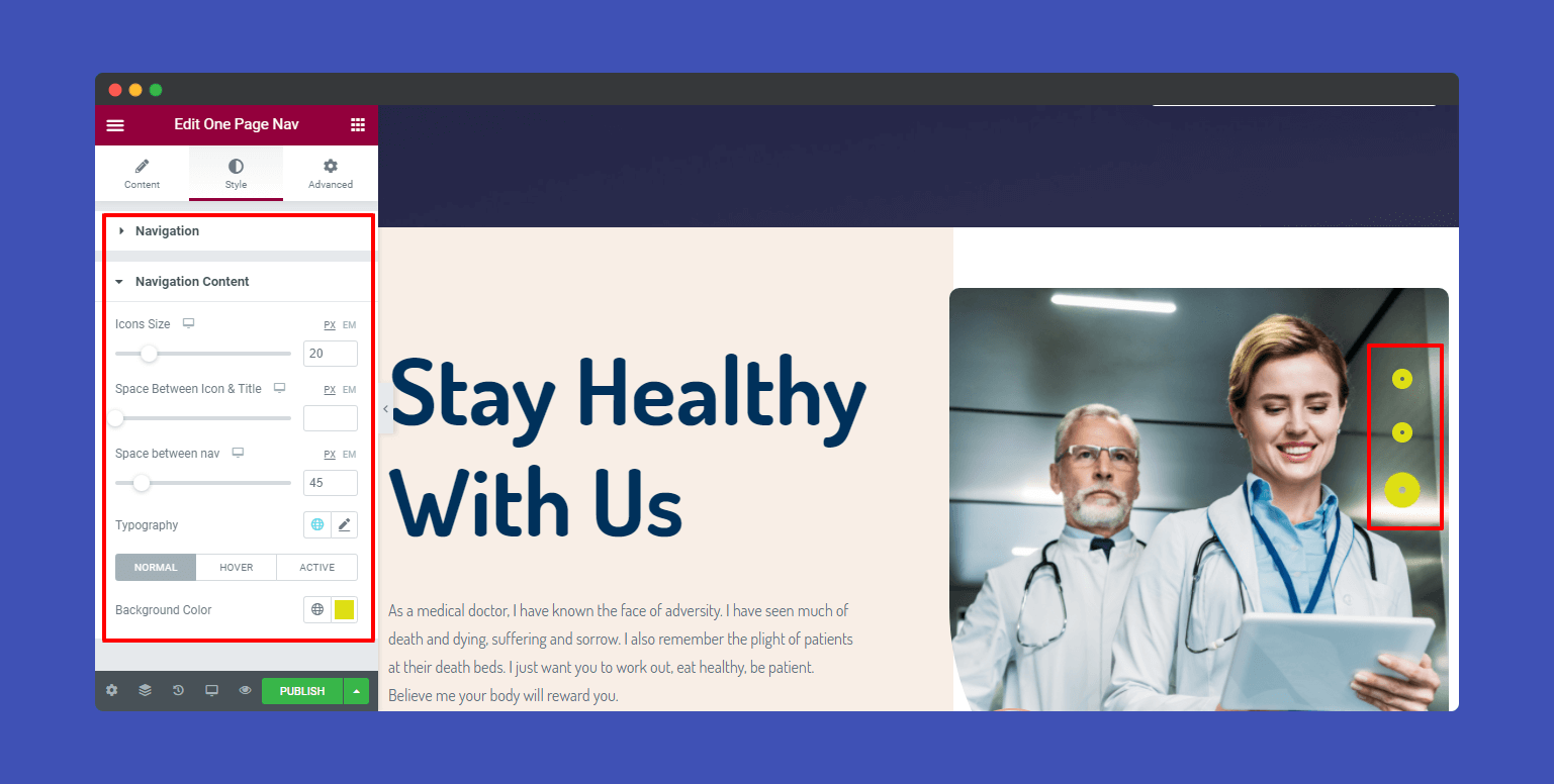
You are also able to edit the style of Maxamed. For example, define the Icons Size, Space Between Icon & Title, Space between nav. And change the Typography and Background Color.
Shamso:
Like the Maxamed, you can define the Icons Size, Space Between Icon & Title, Space between nav. And change the Typography and Background Color of the Shamso style.
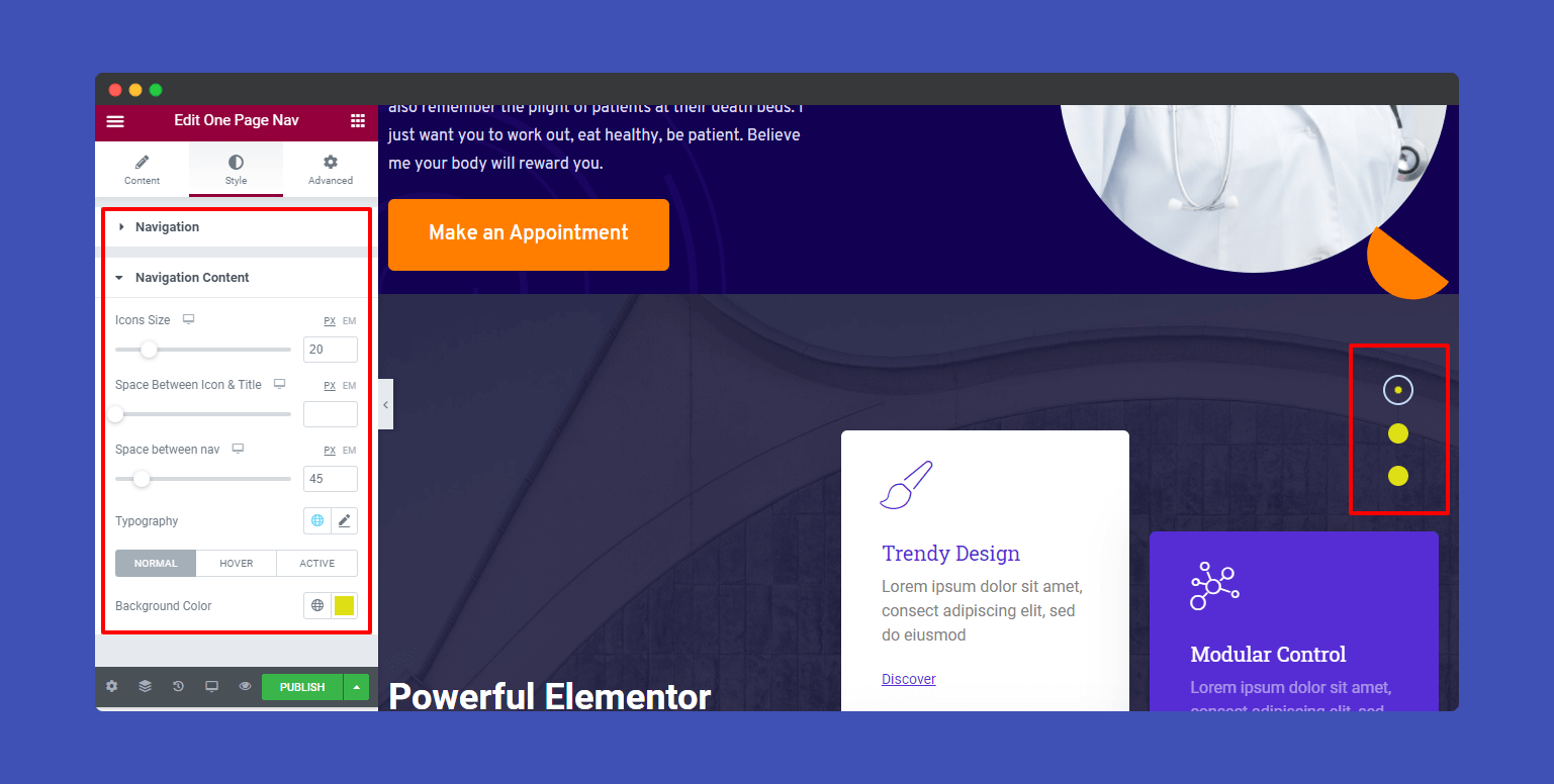
Ubax:
Same goes for the Ubax style.
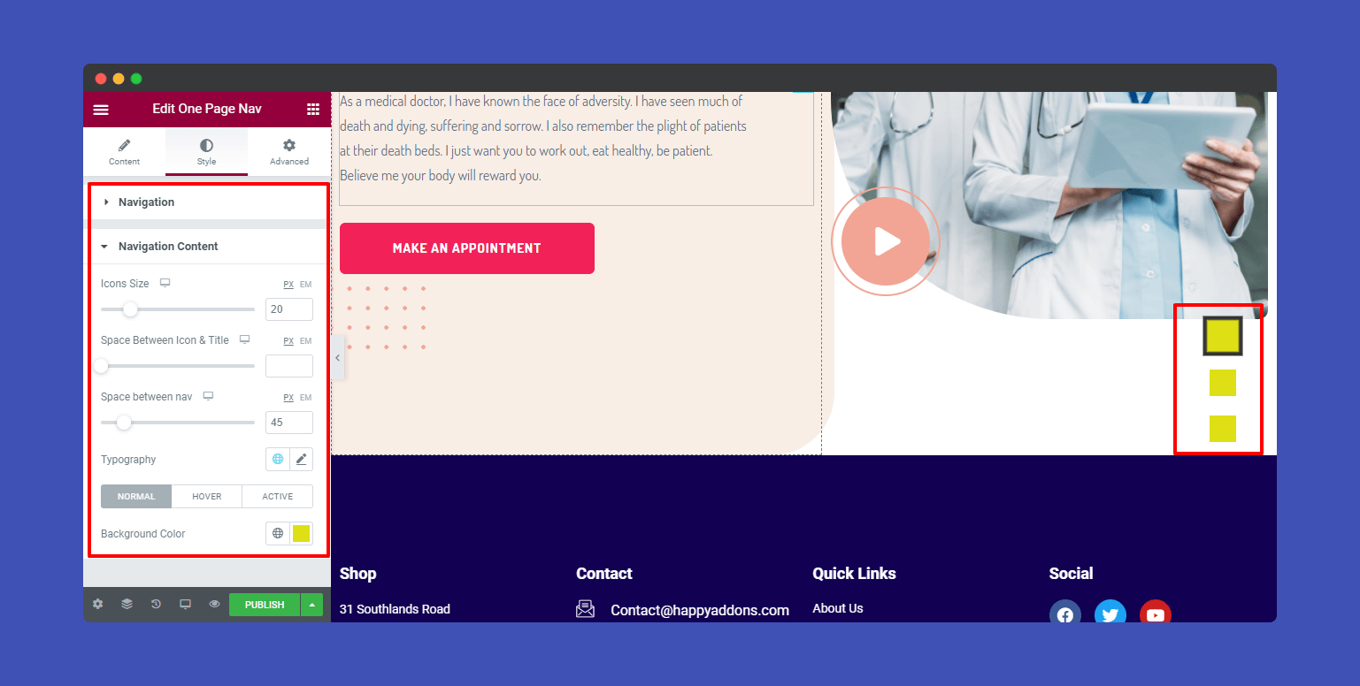
Xusni:
If you need to change the Xusni style, you can use these options Space Between Icon & Title, Space between nav, Typography, and Background Color to do so.

Zahi:
Space Between Icon & Title, Space between nav, Typography, Color and Background Color can change in the Zahi style.
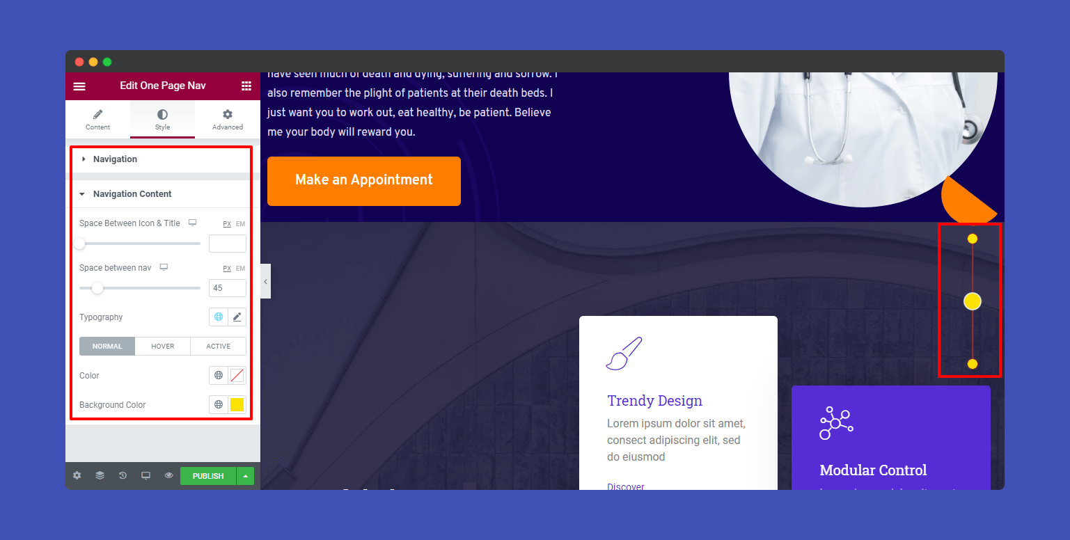
Final Style: Let’s style our one page navigation.
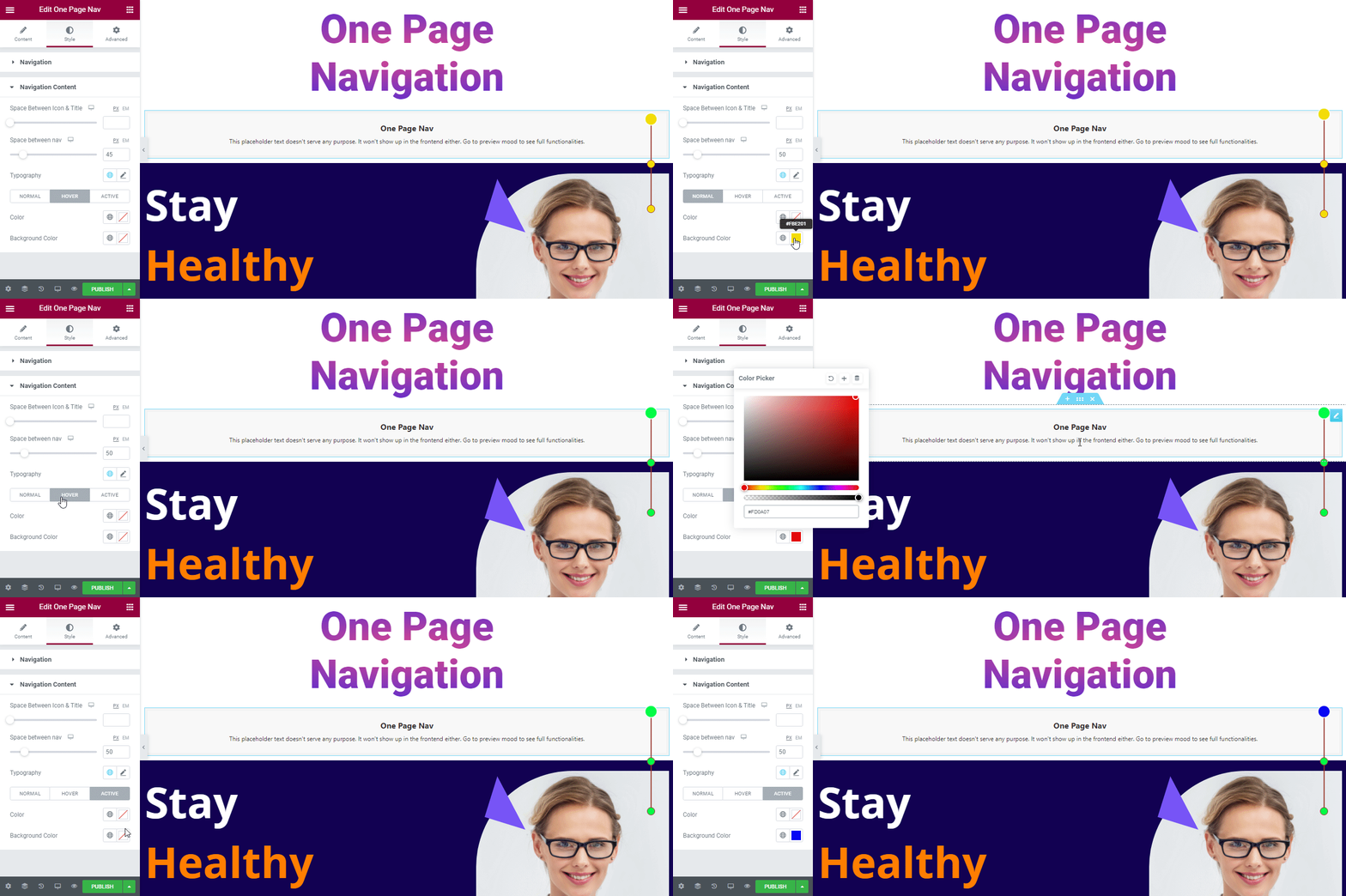
Note: If you want to display the nav at the very top of the website’s content, you must increase the Z-Index. Here is the guide.

Step: 4
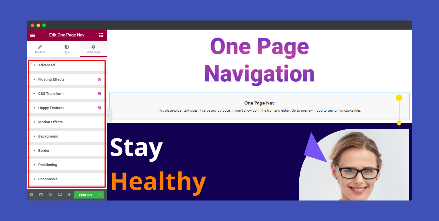
If you want to add motion effects, happy effects, background, or make it responsive and more intriguing, click on ‘Advanced‘ to explore those options. the ‘Advanced‘ is a default feature of Elementor.
Give a read to this Document to know more about advanced features & functions.
Here is the final preview of One Page Navigation widget.

That’s it.
