We bring a unique grid-styled widget for all of you – Metro Grid. You can create amazing grid styles within a few clicks. You will get 16 ready-made grid styles. Just choose one and see the magic.
Moreover, this grid widget allows you to create Photo Galleries and Video Galleries.
Supported Video Sources Are –
- YouTube
- Vimeo
- Self-hosted
Here is the overview –
Required Plugins –
To avail of that widget you will need these plugins –
- Elementor Free
- HappyAddons Free
- HappyAddons Pro
The Metro Grid widget is a premium widget of HappyAddons for Elementor.
How to use Metro Grid Widget –
To have that widget in your editor panel just search for Metro Grid in your Elementor Widget Panel and then drag it to your editor’s desired section.
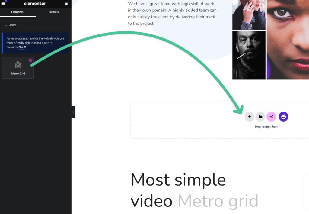
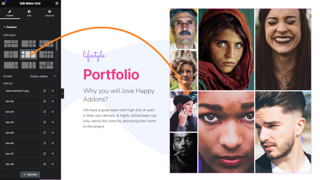
Choosing the Grid Layouts:
In the Metro Grid’s content tab you will get 16 premade Grid layouts. Choose the best fit for you and start designing.
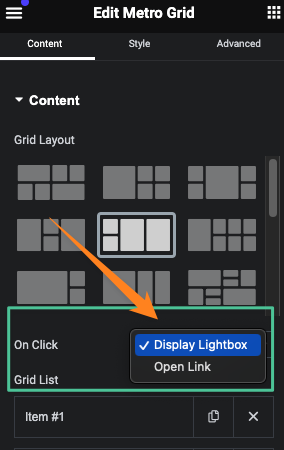
Choose On Click Media Display Style:
We have added two options for you. You can show your images and videos in Lightbox mode or direct link to the media file.
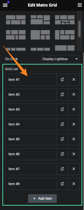
Filling the Grid Items:
In the Grid List of the Metro widget you can easily add, duplicate, or remove grid items. To add new items hit the add item button.
Filling the content in the Grid Items:
In each grid item, you will get two options.
- Image
- Video
Here is the overview of the added image. You can add images from your media library.
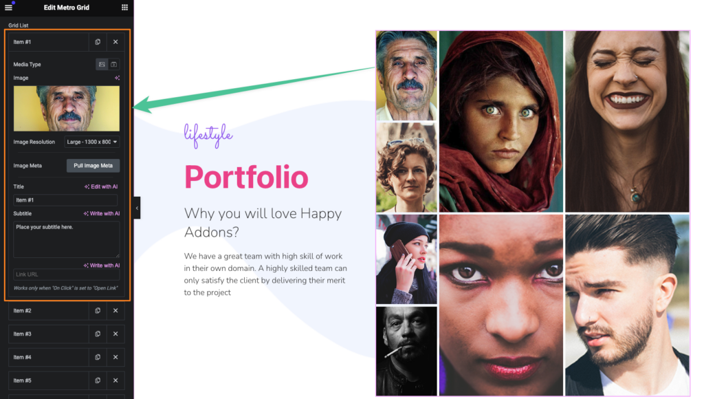
We have added an amazing feature here. If you hit the Pull Image Meta button, it will collect your selected image’s meta information for you and automatically fill the title field.
In each Grid Item, you can add a Title, Subtitle, and link for your media.
If you want to create video gallery then select video media type to create that. After selecting the video media type you will get new settings for your video item.
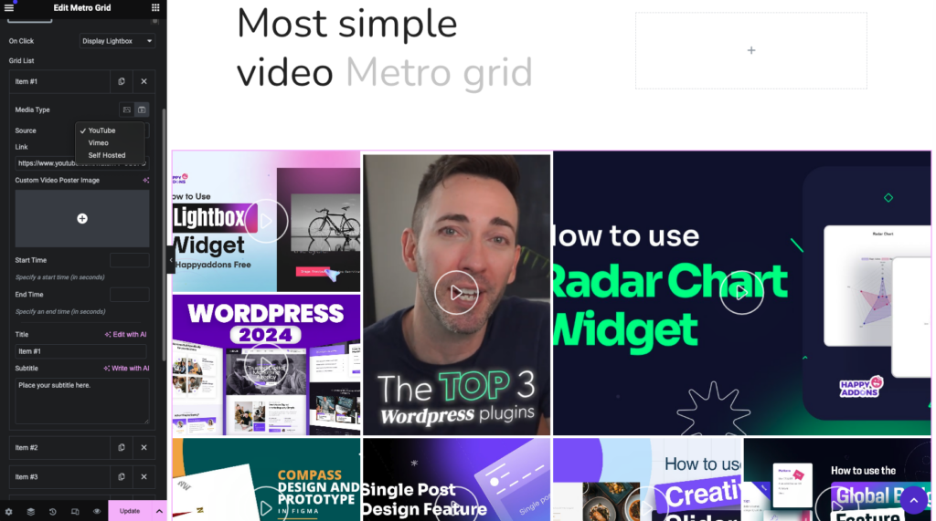
Currently, we are supporting YouTube, Vimeo, and self-hosted videos.
For YouTube videos just paste the video link. It will automatically pull the thumbnail for you. But you can set the custom poster image for you.
We have added flexibility for setting video start and end times too.
You can add custom titles and subtitles also.
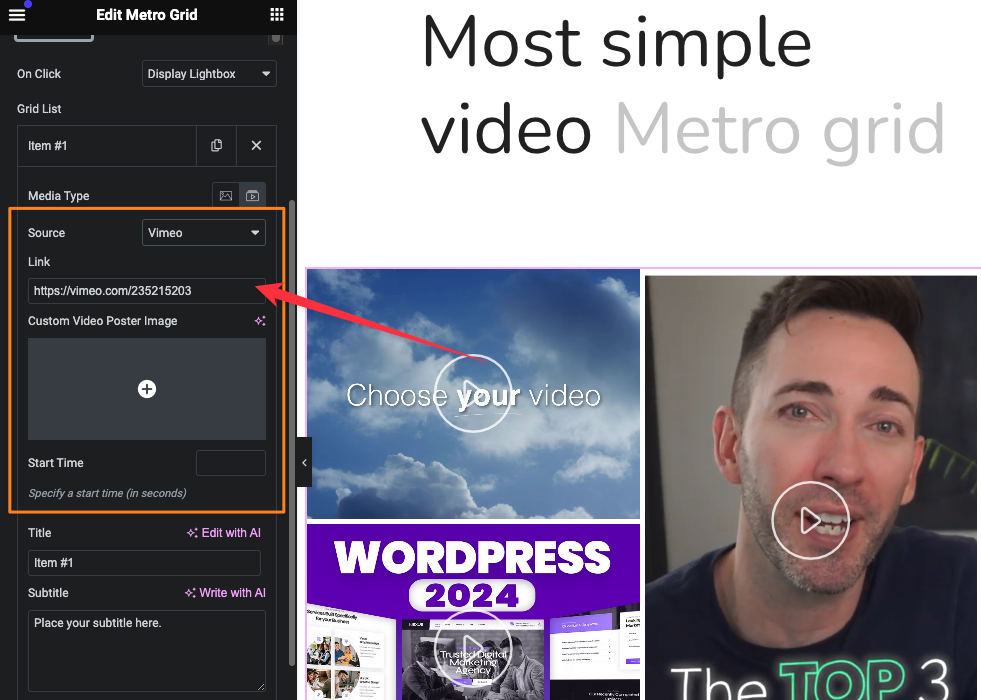
For Vimeo Videos you will get almost the same type of setting options but here is a limitation you can only set the start time for video videos.
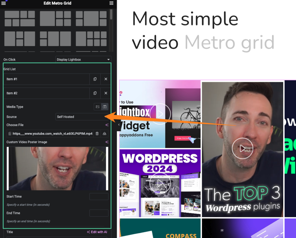
For Self-hosted videos, you will get as it is settings like YouTube Videos.
Settings for Hover Effects:
We have added separate settings for hover effects. By default, all the hover control settings are activated. However, depending on responsive modes, you can choose where the hover styles will appear.
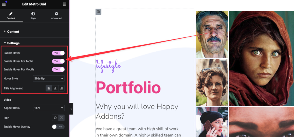
Hover Styles for Info contents for the Images and alignment control:
We have added 5 animation hover styles to show the image info. Select any of those and make lucrative and interactive grid designs.
There is an option to set the info content alignment. You can set the position left, center, and right positions for your media information.
Settings for the videos in Metro Grid:
For videos, you can set the video aspect ratios from here. We have added 6 ratios.
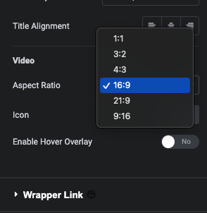
You can change the video play icon from the icon library. Also from here, you can turn on the Video Hover Overly
Styling the Metro Grid widget –
It’s time to style the Metro Grid Widget. You can easily the metro grid widget as all the settings are easy peasy.
General Styling Settings –
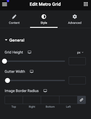
In the general tab, you will the control for Grid Height and Gutter width control. Those items will help you to customize the grid styles. Also, you can set a border radius for your media.
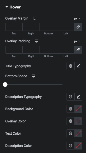
Hover Styling Controls:
You can easily customize the hover info contents of the metro grid—option for setting overlay margin, padding, bottom space, title, and description typography control. Also, you can set the background color, overlay color, text color, and description color.
Style controls for the video:
You will get the video play icon color, hover icon color, and icon size control with Icon shadow settings.
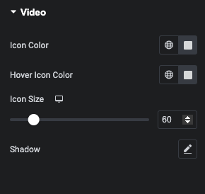
Note: Shadows will not work if you select icons other than our line icons and Huge Icons.
Thanks. That’s it.
