






Animations are a great way to make your website more engaging and interactive. With HappyAddons Global Animation, you can animate any Elementor widget without writing a single line of CSS or JavaScript. Whether you’re using native Elementor widgets or third-party widgets, the Global Animation feature gives you complete control over how your content appears and reacts to user interaction.
From simple fade-in effects to advanced scroll-based animations, you can customize the animation trigger, timing, easing, and multiple CSS properties—all from a single interface.
In this documentation, we’ll walk you through each setting and show you how to configure Global Animation for your Elementor widgets.
Prerequisites
Before getting started, make sure you have:
- HappyAddons Free
- HappyAddons Pro
- Elementor Free
Enable Global Animation
Go to HappyAddons → Features. Find Animation and enable it.
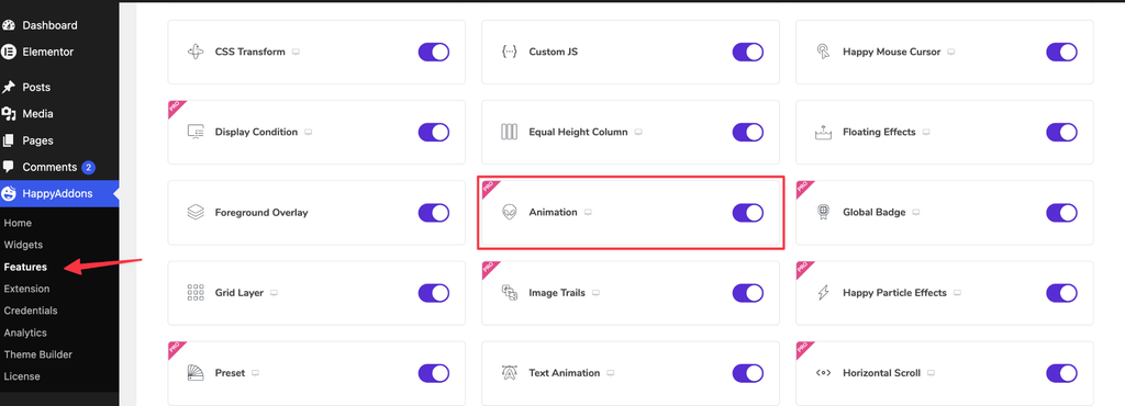
How to Access Global Animation
Open your page with Elementor. Select any widget you’d like to animate.
Navigate to: Advanced → Animation
From there, enable the Animation toggle to access all available animation settings.
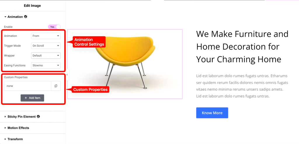
Step 1: Enable Animation
The Enable option activates the Global Animation feature for the selected widget.
Simply switch the toggle to Yes. Once enabled, all animation controls become available.
If disabled, the widget will display normally without any animation.
Step 2: Choose the Animation Type
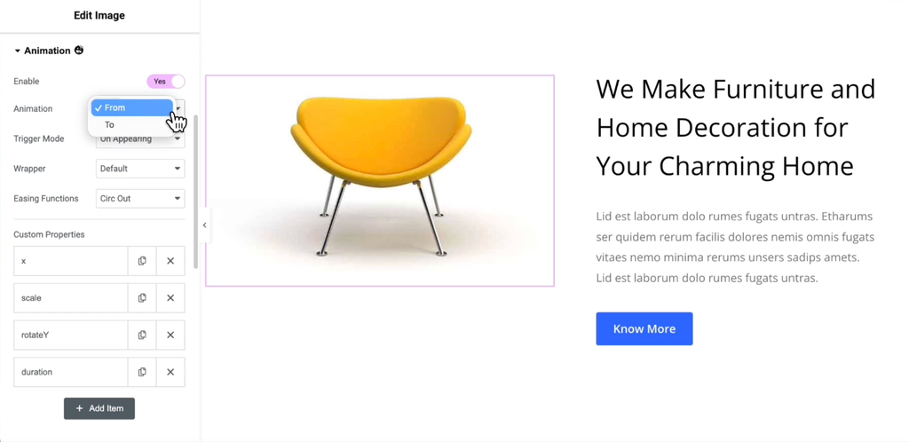
The Animation setting determines how the widget should animate.
There are two available options.
From
The widget begins from the values you define and gradually returns to its original position or style.
For example:
- Opacity: 0 → 1
- Y Position: 100px → 0px
This creates a smooth fade-up entrance animation.
This option is ideal for:
- Hero sections
- Images
- Cards
- Text blocks
- Call-to-action buttons
To
The widget starts in its default state and animates toward the values you specify.
For example:
- Scale: 1 → 0.8
- Rotate: 0° → 20°
This option works well for transformation or exit effects.
Step 3: Configure Trigger Mode
Trigger Mode controls when the animation starts.
HappyAddons provides three trigger options.
On Appearing
The animation begins once the widget enters the viewport.
This is the most common option for creating entrance animations.
Suitable for:
- Sections
- Headings
- Images
- Testimonials
- Feature boxes
On Scroll
The animation continuously responds to the user’s scrolling position.
Instead of playing once, the animation progresses smoothly while the visitor scrolls through the page.
Perfect for:
- Storytelling pages
- Parallax effects
- Interactive landing pages
- Product showcases
On Page Load
The animation starts immediately after the page loads.
This option is useful for:
- Hero banners
- Intro sections
- Loading effects
- Promotional announcements
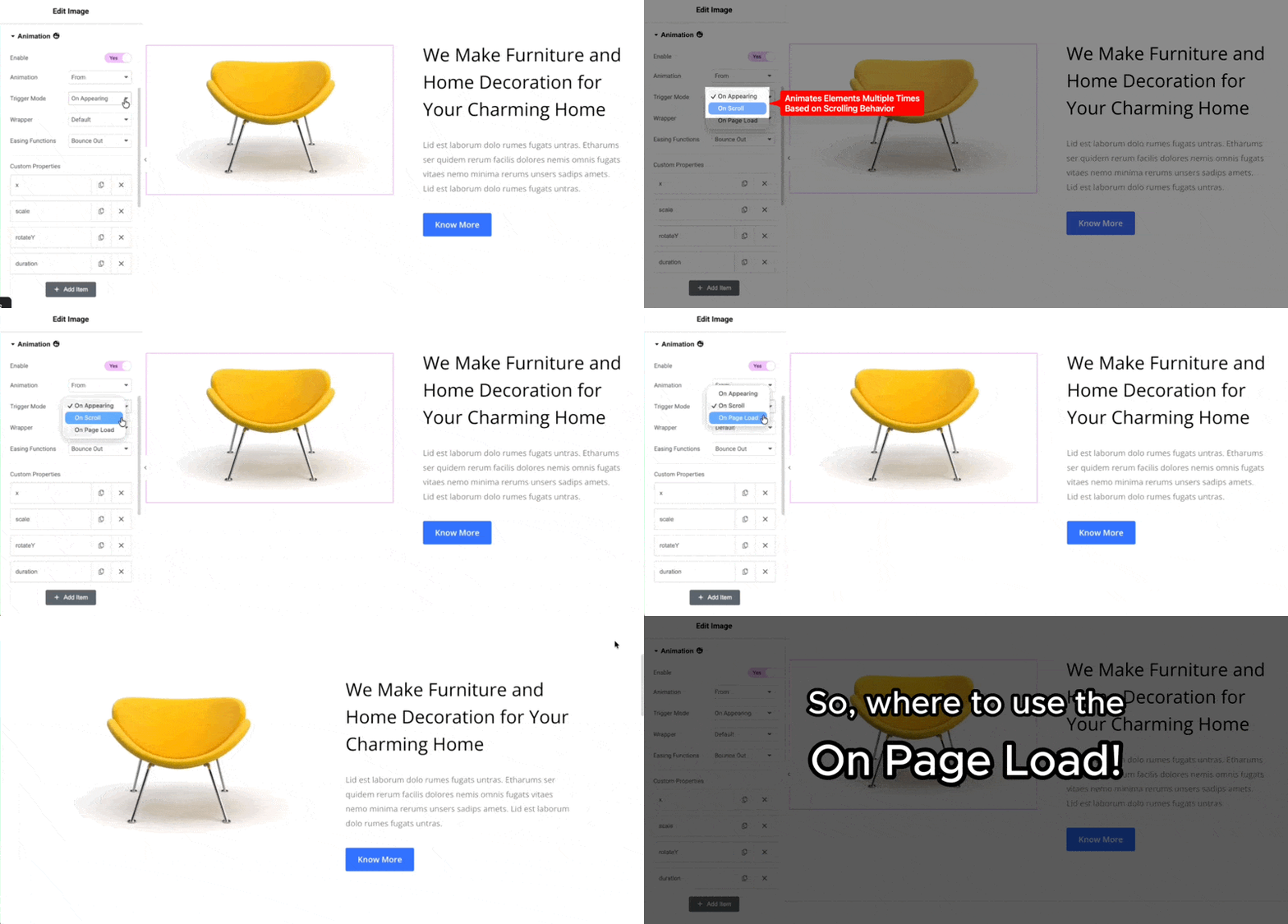
Note: Scroll-based animations require the On Scroll trigger mode to synchronize the animation with the visitor’s scrolling.
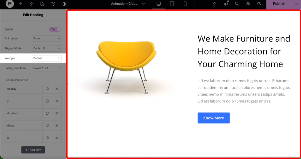
Step 4: Select the Wrapper
The Wrapper option determines which HTML wrapper the animation will target.
There are two available options.
Default
Uses Elementor’s default wrapper.
Recommended for most websites and standard animations.
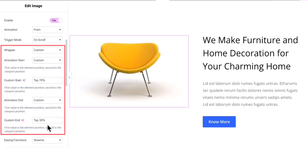
Custom
Uses HappyAddons’ custom wrapper.
This option is useful when creating advanced animations or targeting nested elements without affecting the parent widget.
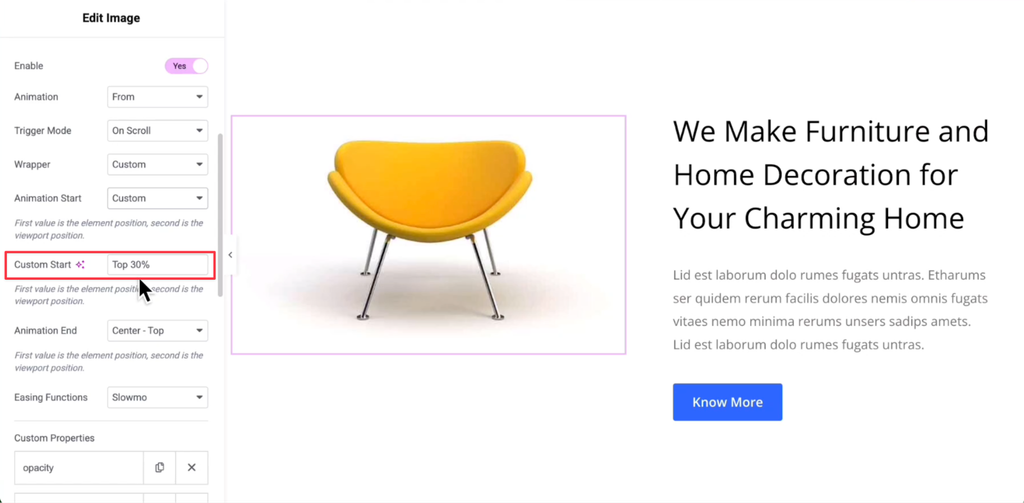
Step 5: Configure Animation Start
Animation Start determines when the animation begins relative to the widget’s position and the browser viewport.
The format follows:
Element Position – Viewport Position
For example:
Top – Bottom
This means the animation starts when the top of the widget reaches the bottom of the viewport.
Available presets include:
- Top – Top
- Top – Center
- Top – Bottom
- Center – Top
- Center – Center
- Center – Bottom
- Bottom – Top
- Bottom – Center
- Bottom – Bottom
- Custom
Choosing the appropriate start position allows you to control exactly when visitors first notice the animation.
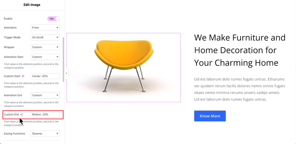
Step 6: Configure Animation End
Animation End determines where the animation finishes.
Like Animation Start, it compares the widget position with the viewport.
For example:
Center – Top
The animation completes once the center of the widget reaches the top of the viewport.
Available presets include:
- Top – Top
- Top – Center
- Top – Bottom
- Center – Top
- Center – Center
- Center – Bottom
- Bottom – Top
- Bottom – Center
- Bottom – Bottom
- Custom
The animation progresses smoothly between the selected start and end positions.
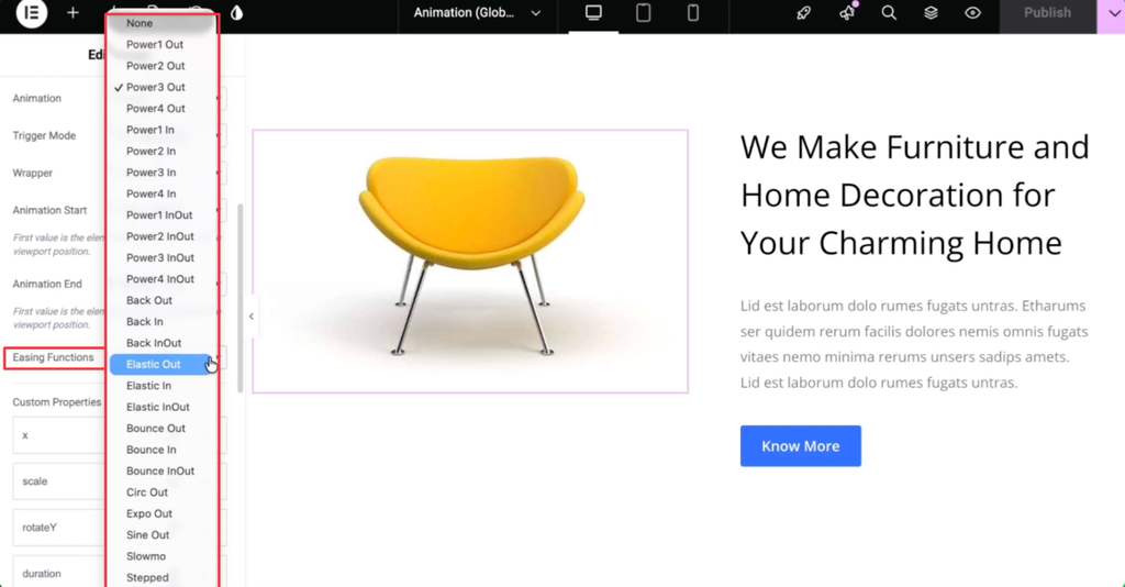
Step 7: Choose an Easing Function
Easing Functions define how the animation changes speed during playback.
Instead of moving at a constant speed, easing creates smoother and more natural transitions.
HappyAddons offers multiple easing presets, including:
- None
- Power1 Out
- Power2 Out
- Power3 Out
- Power4 Out
- Power1 In
- Power2 In
- Power3 In
- Power4 In
- Power1 InOut
- Power2 InOut
- Power3 InOut
- Power4 InOut
- Back Out
- Back In
- Back InOut
- Elastic Out
- Elastic In
- Elastic InOut
- Bounce Out
- Bounce In
- Bounce InOut
- Circ Out
- Expo Out
- Sine Out
- Slowmo
- Stepped
Commonly Used Options
Power2 Out
Provides a smooth and natural deceleration. Recommended for most entrance animations.
Elastic Out
Creates a spring-like effect before settling.
Bounce Out
Finishes with a bouncing motion.
Sine Out
Produces soft and subtle movement.
Step 8: Add Custom Properties
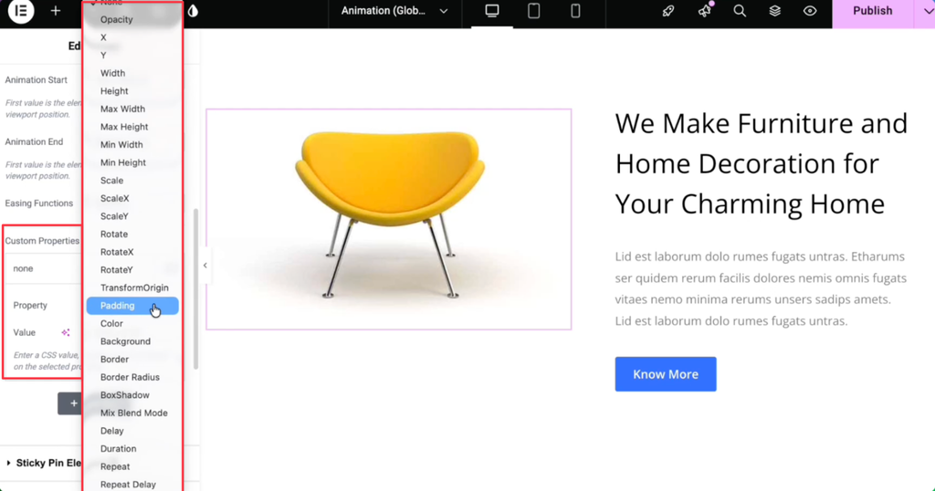
Custom Properties determine which CSS properties are animated.
You can animate one property or combine multiple properties to create unique effects.
Available properties include:
| Property | Description |
| Opacity | Controls transparency. |
| X | Moves the widget horizontally. |
| Y | Moves the widget vertically. |
| Width | Animates width. |
| Height | Animates height. |
| Max Width | Animates the maximum width. |
| Max Height | Animates the maximum height. |
| Min Width | Animates the minimum width. |
| Min Height | Animates the minimum height. |
| Scale | Scales the widget proportionally. |
| ScaleX | Scales horizontally. |
| ScaleY | Scales vertically. |
| Rotate | Rotates the widget. |
| RotateX | Rotates along the X-axis. |
| RotateY | Rotates along the Y-axis. |
| Transform Origin | Changes the transform origin point. |
| Padding | Animates padding values. |
| Color | Changes text color. |
| Background | Animates the background color. |
| Border | Animates border properties. |
| Border Radius | Changes corner radius. |
| Box Shadow | Animates box shadows. |
| Mix Blend Mode | Changes blend mode during animation. |
| Delay | Delays the animation start. |
| Duration | Sets animation duration. |
| Repeat | Repeats the animation. |
| Repeat Delay | Adds a delay between repeats. |
You can combine several properties to create advanced effects such as fade-in, slide-up, zoom, rotation, or color transitions.
Step 9: Add Multiple Animation Properties
To animate multiple CSS properties simultaneously:
- Click Add Item.
- Select a property from the dropdown.
- Enter the desired value.
- Repeat the process for additional properties.
For example, you can combine:
- Opacity
- Y Position
- Scale
- Duration
- Delay
to create a smooth entrance animation where the widget fades in, moves upward, and scales into place.
The ability to stack multiple properties makes Global Animation flexible enough for everything from subtle UI interactions to complex scroll-based effects.
Best Practices
For the best user experience, keep these recommendations in mind:
- Use On Appearing for simple entrance animations.
- Choose On Scroll for interactive scrolling experiences.
- Pair Opacity with X or Y movement for smooth reveal effects.
- Use Power2 Out or Sine Out for natural motion.
- Avoid animating too many properties on a single widget to maintain optimal page performance.
- Preview animations on desktop, tablet, and mobile devices before publishing.
- Keep animation durations between 0.6 and 1.2 seconds for most UI elements.
Note: Since Global Animation works with virtually every Elementor widget, you can apply consistent animation effects across your entire website without relying on custom code or additional animation plugins.