






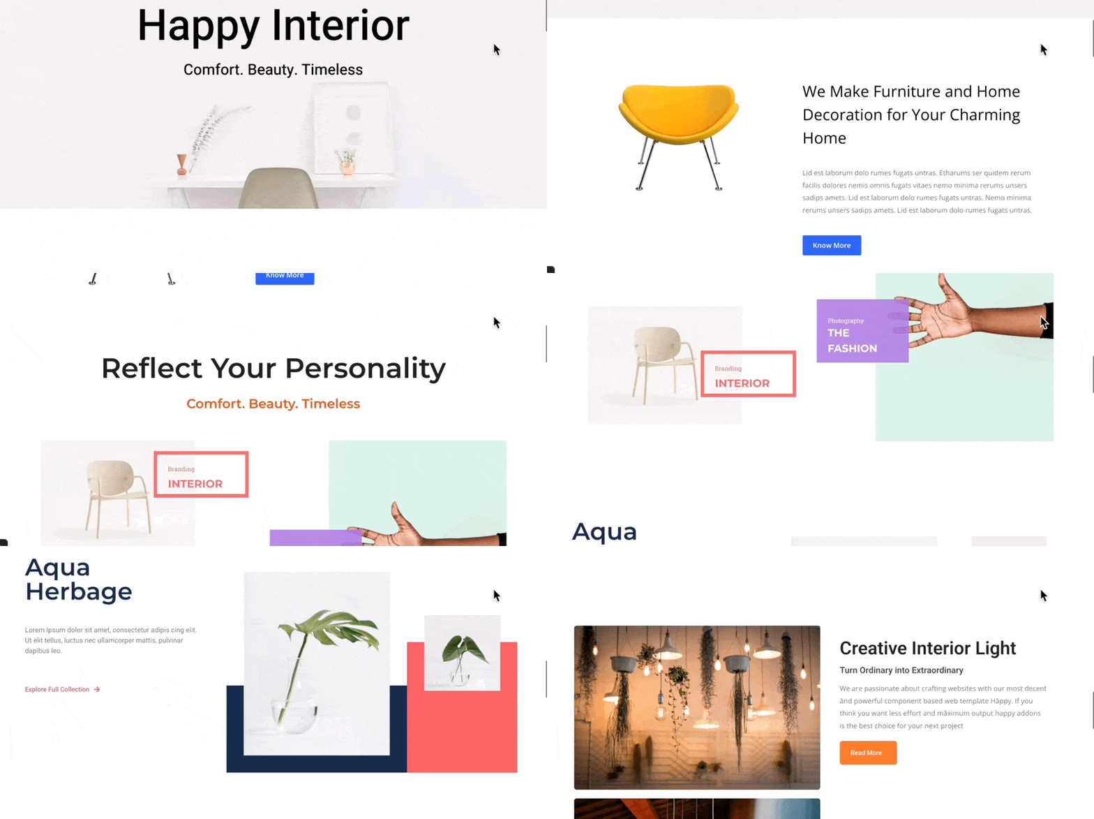
The Sticky Pin Element feature in HappyAddons lets you create engaging scroll-based layouts by keeping an element fixed in place while the rest of the page continues to scroll.
This feature is powered by GSAP animation and can be used to create interactive scrolling effects on landing pages and other layouts.
Note: Sticky Pin Element is a premium feature. You need both HappyAddons Free and HappyAddons Pro installed and activated on your website.
Getting Started
Enable Sticky Pin Element
Before using the feature, make sure HappyAddons Free and Pro are installed on your website.
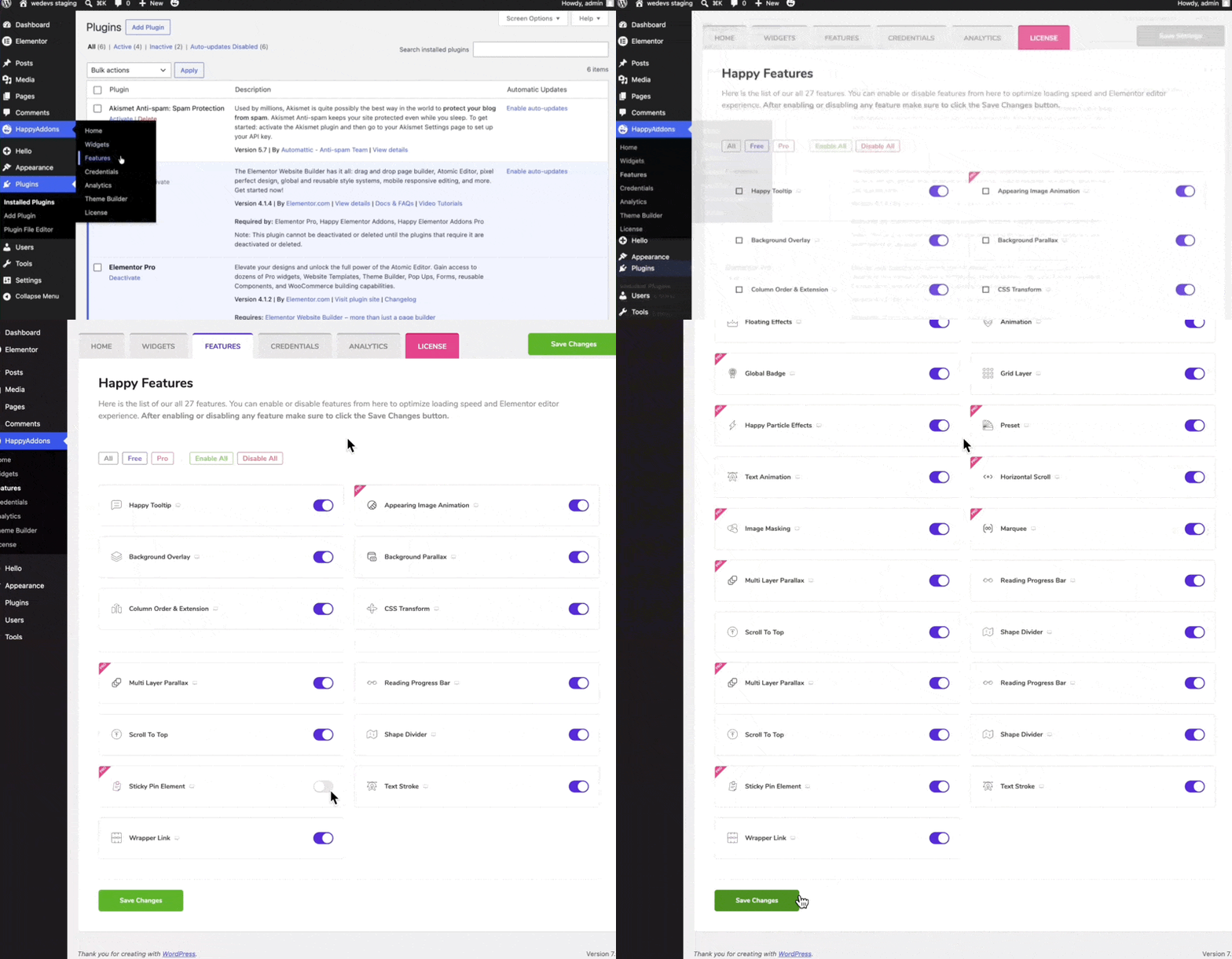
- From your WordPress dashboard, navigate to HappyAddons → Features.
- Find the Sticky Pin Element feature.
- Enable it.
Once enabled, open the page you want to edit with Elementor.
Elementor Version Compatibility
Before configuring the feature, keep the following compatibility limitation in mind.
HappyAddons GSAP features are currently not compatible with the new widgets introduced in Elementor version 4, because Elementor has not yet provided version 4 access to third-party addon developers.
HappyAddons plans to make the GSAP features compatible with Elementor version 4 as soon as the required access becomes available.
Until then, you can use GSAP features with elements and widgets introduced before Elementor version 4.
Configure Sticky Pin Element
The Sticky Pin Element feature can be applied to individual widgets as well as containers.
Pin an Elementor Widget
To pin a widget:
- Select the widget you want to pin.
- Go to the Advanced tab.
- Expand Sticky Pin Element.
- Enable the feature.
For example, you can select an Image widget and enable Sticky Pin Element from its Advanced settings.
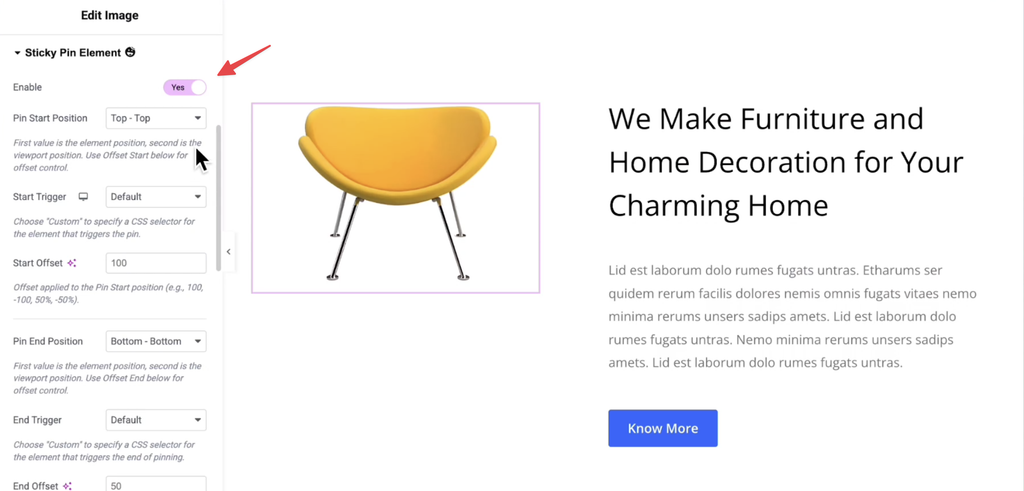
Once enabled, you’ll find several settings that control when the element becomes pinned and when the pin effect ends.
Pin Start and End Positions
The main positioning settings include:
- Pin Start Position
- Start Offset
- Pin End Position
- End Offset
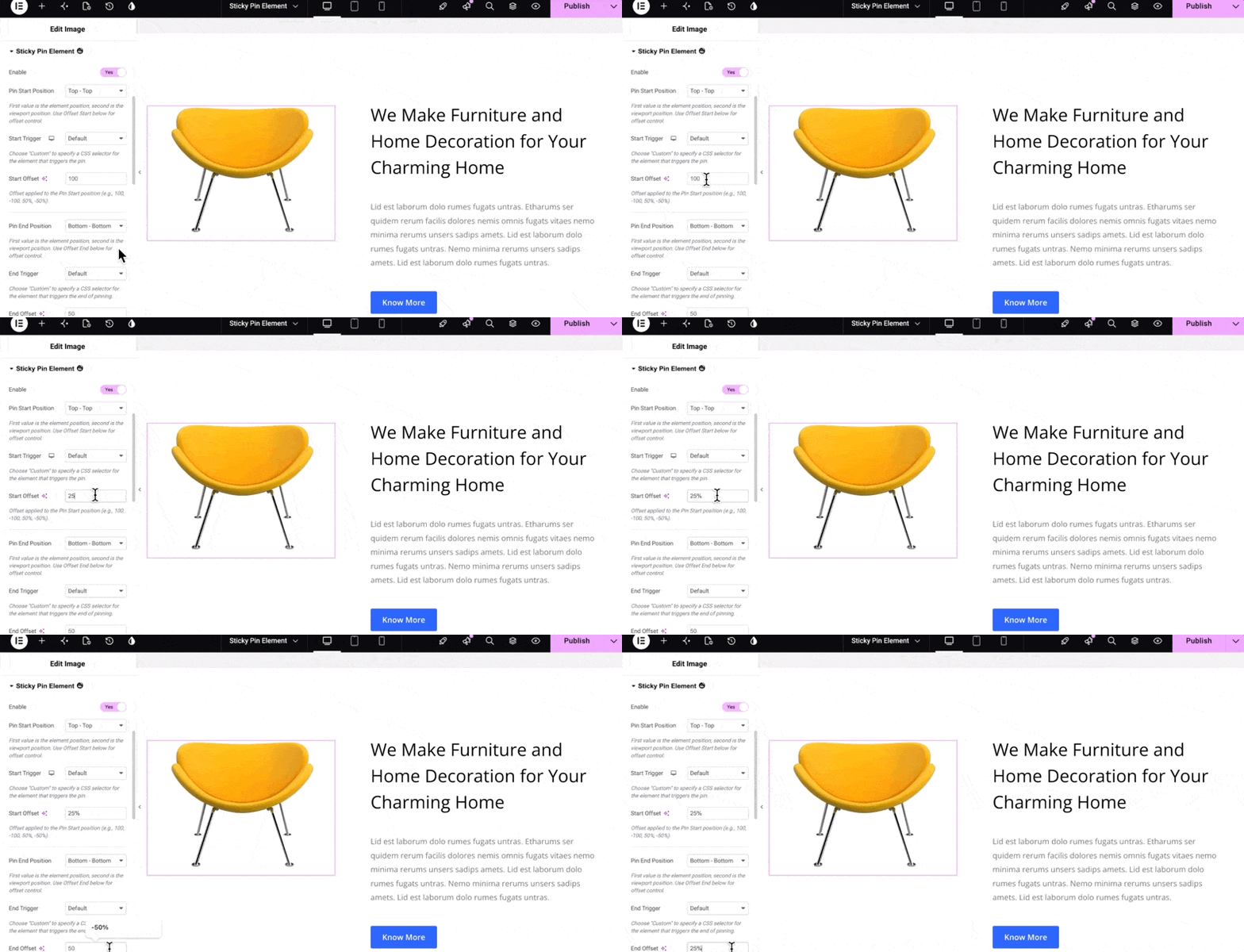
For the tutorial example, the following settings are used:
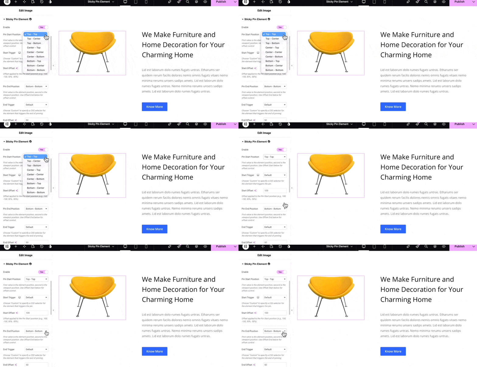
- Pin Start Position: Top, Top
- Pin End Position: Bottom, Bottom
You can select the desired positions from the available dropdown options.
Start Offset and End Offset
The Start Offset determines how far into the viewport the pinning begins.
The End Offset determines where the pinning ends.
Both values can be specified using:
- Pixels
- Percentages
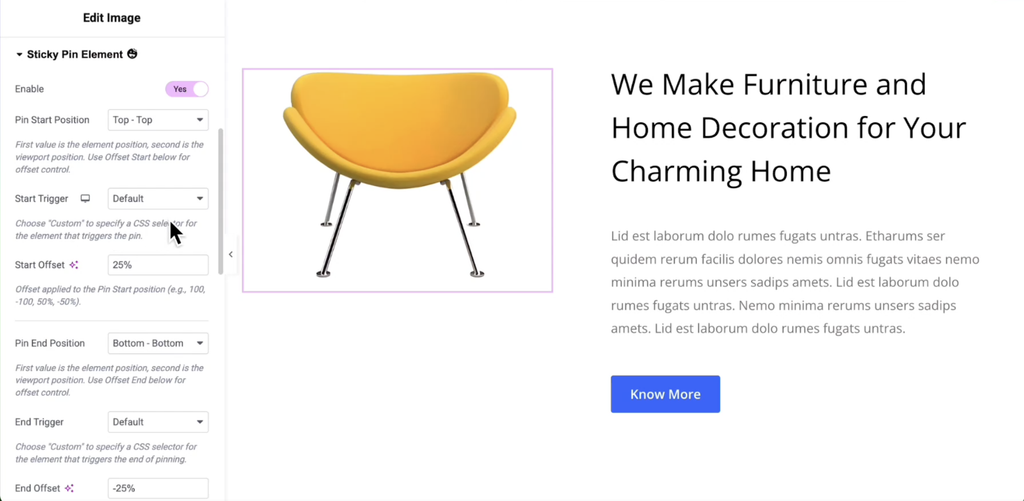
For example, you can use 25% as the start offset and -25% as the end offset.
Understanding Pin Positions and Offsets
To understand how Sticky Pin Element works, it’s important to understand the reference points used by the feature.
The sticky pin effect begins when the target element reaches a specific point in the viewport.
Element Reference Points
The element and its containing section are used to determine the reference area.
The relevant reference points are:
- Top: The top edge of the element
- Bottom: The bottom edge of the section containing the element
- Center: The midpoint between those two reference points
The top edge of the section itself is not used as a reference point for this calculation.
Understanding Viewport Values
The viewport can be measured using either percentages or pixels.
When measured from the top to the bottom:
- The value ranges from 0 to 100%.
When measured upward from the bottom:
- The value ranges from 0 to -100%.
The same concept applies when using pixel values.
Example: Using Percentage Offsets
Suppose you configure:
- Pin Start Position: Top, Top
- Start Offset: 25%
In this configuration:
- The first Top refers to the top edge of the element.
- The second Top refers to a point 25% down from the top of the viewport.
The element becomes pinned when its top edge reaches that 25% point in the viewport.
Similarly, if you configure:
- Pin End Position: Bottom, Bottom
- End Offset: -25%
The pin effect ends when the bottom edge of the section reaches a point 25% upward from the bottom of the viewport.
Preview the Sticky Pin Effect
After configuring the pin conditions:
- Set the Pin Start Position.
- Set the Start Offset.
- Set the Pin End Position.
- Set the End Offset.
- Leave Start Trigger and End Trigger at their default values for now.
- Preview the page.
The selected element will become pinned when its defined start condition is met and will become unpinned when its end condition is reached.
Use Pin Markers
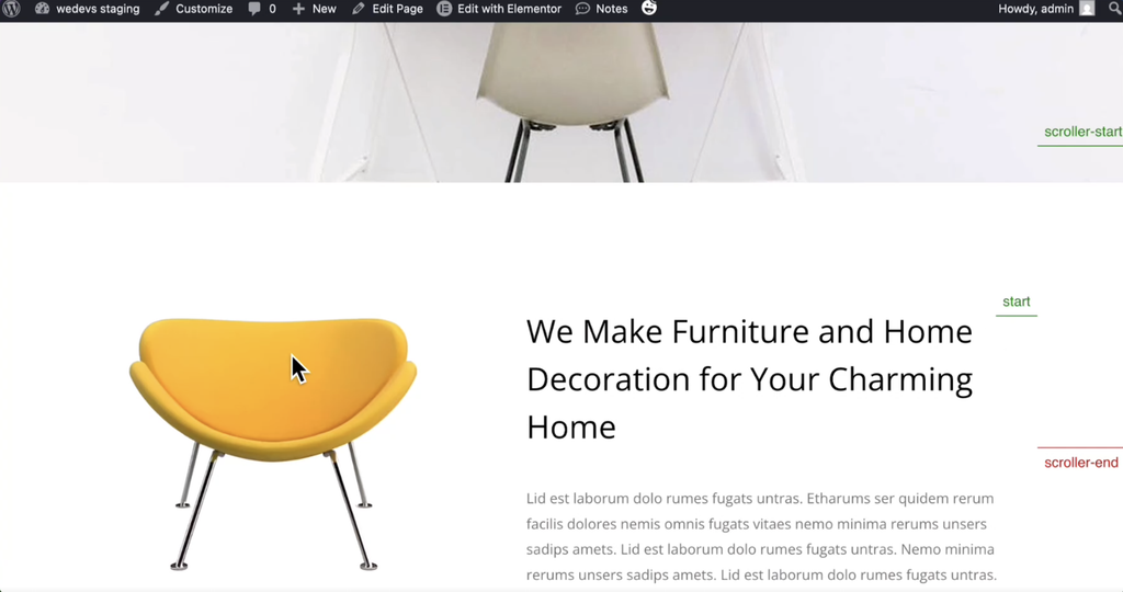
The Pin Markers option helps you visualize the reference points used by the Sticky Pin Element feature.
To use it:
- Return to Elementor.
- Enable Pin Markers.
- Open the page preview.
The markers indicate where the pin starts and where it ends based on your configured settings.
For example, with a 25% start offset, the pin begins when the top edge of the element reaches 25% down from the top of the viewport.
The pin ends when the bottom edge of the section reaches 25% upward from the bottom of the viewport.
Pin a Container
Sticky Pin Element isn’t limited to widgets. You can also apply it to an Elementor container.
To pin a container:
- Select the container.
- Go to the Advanced tab.
- Expand Sticky Pin Element.
- Enable the feature.
- Configure the pin start and end positions.
- Set the required offsets.
You can use pixels instead of percentages for the offsets.
The underlying concept remains the same: the container becomes pinned when the configured start condition is met and remains pinned until the end condition is reached.
Active Pin Style
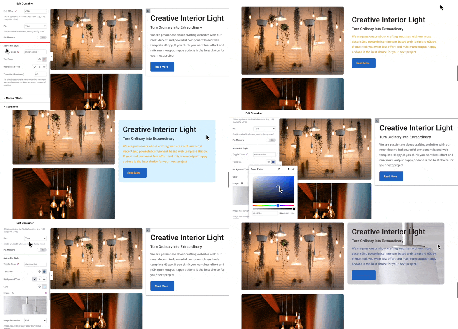
When a container is pinned, you can apply additional styling using the Active Pin Style section.
This section provides several styling options that are applied while the element is in its active pinned state.
Text Color
You can set a custom Text Color.
The selected color applies to:
- Body text
- Button text
Preview the page to see the result.
Background Color
You can also add a background color to the pinned container.
To set it:
- Expand Active Pin Style.
- Click the brush icon to enable the background option.
- Choose your desired background color.
The selected background color is applied to the entire container while the active pin style is applied.
Background Image
Instead of a solid color, you can use an image as the background.
You can also adjust the Image Position when necessary.
If the background changes significantly, you can update the text color to maintain good visual contrast.
Pin Option
The Pin option determines whether the element should actually remain pinned while the Active Pin Style is applied.
By default, the option is set to True.
Pin: True
When enabled:
- The container is pinned.
- The Active Pin Style is applied.
Pin: False
When disabled:
- The container is not pinned.
- The Active Pin Style is still applied.
This allows you to use the active styling independently from the actual sticky pin behavior.
Custom Trigger
The Sticky Pin Element feature also allows you to use another element as the trigger for the pin behavior.
This is useful when you want one element to control when another element becomes pinned.
Enable Custom Triggers
To use custom triggers:
- Select the element you want to pin.
- Enable Sticky Pin Element.
- Configure the Pin Start Position, Start Offset, Pin End Position, and End Offset as required.
- Set Start Trigger to Custom.
- Set End Trigger to Custom.
Selecting Custom triggers reveals additional fields for:
- Custom Start Area
- Custom End Area
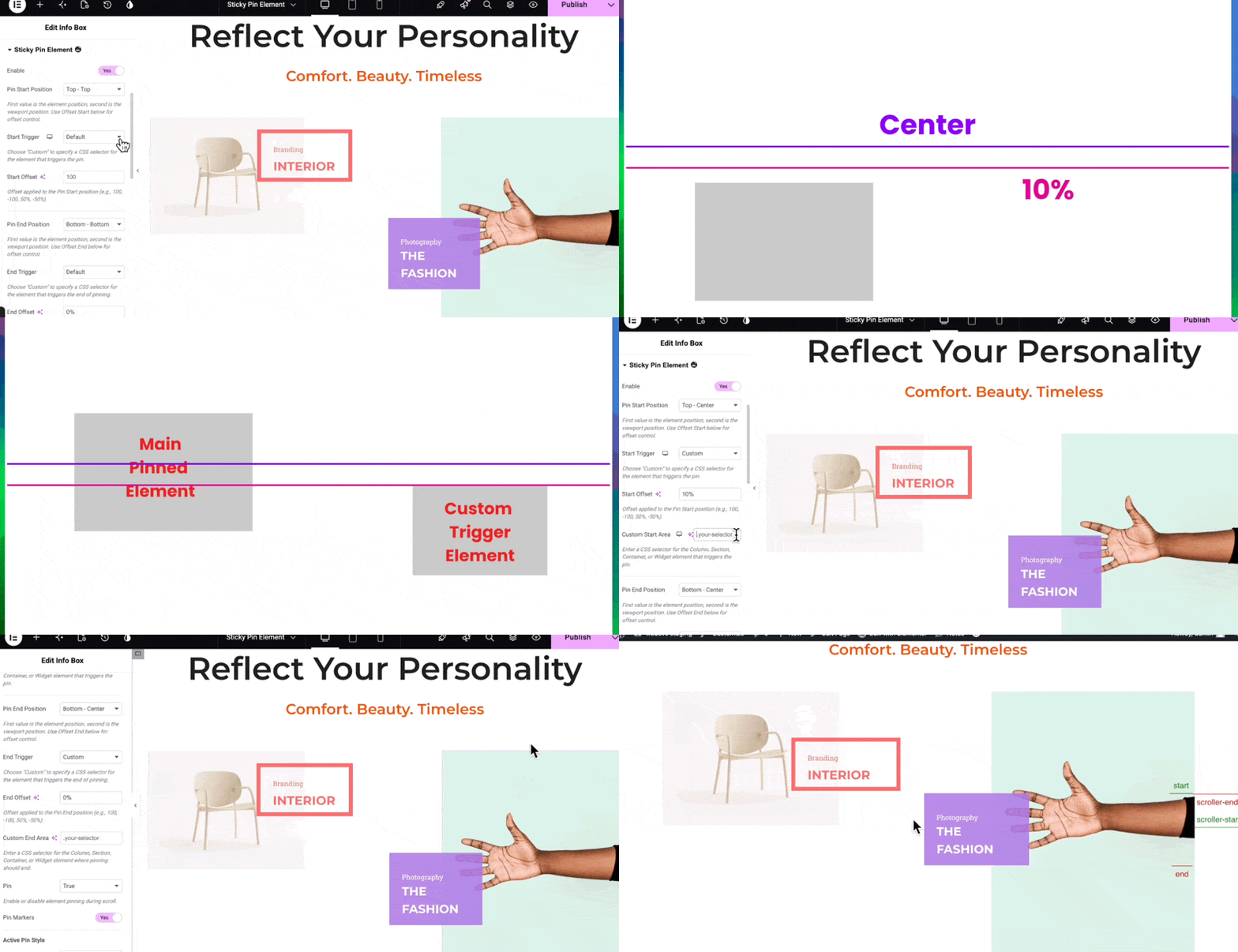
How Custom Triggers Work
With a custom trigger, you can select another element on the page and use it to determine when the main element becomes pinned or unpinned.
For example, suppose you want to pin an element with these settings:
- Pin Start Position: Top, Center
- Start Offset: 10%
Normally, the main element would become pinned when its top edge reaches a point 10% below the center of the viewport.
With a custom trigger, another element can determine when this condition is met.
Set Up a Custom Start Trigger
First, select the element that you want to use as the custom trigger.
- Select the trigger element.
- Go to the Advanced tab.
- Open the Layout section.
- Locate CSS Classes.
- Enter a class name.
For example:
test-pin
You can use any class name you prefer.
Connect the Custom Trigger to the Pinned Element
Now select the main element that you want to pin.
- Go to the Advanced tab.
- Expand Sticky Pin Element.
- Locate the Custom Start Area field.
- Enter the same CSS class used for the trigger element, including the dot at the beginning.
For example:
.test-pin
The main pinned element will now use the custom trigger element to determine when the pin starts instead of using its own position.
How the Custom Start Trigger Works
The pin conditions configured for the main element are applied to the custom trigger element.
For example, if the main element has:
- Pin Start Position: Top, Center
- Start Offset: 10%
The main element becomes pinned when the top edge of the custom trigger element reaches the corresponding position in the viewport.
This means the custom trigger element determines when the main element enters its pinned state.
Set Up a Custom End Trigger
The same concept applies to the Custom End Area.
To configure it:
- Use the same CSS class for the trigger element.
- Enter that class in the Custom End Area field of the main pinned element.
- Preview the page.
The pin markers will now display the custom trigger’s start and end positions.
Understanding Custom Pin Markers
When Pin Markers is enabled with a custom trigger, the markers help you understand exactly when the pin state changes.
- Start represents the top edge of the custom trigger element.
- When it reaches Scroll Start, the main element becomes pinned.
- End represents the endpoint of the custom trigger element.
- When it reaches Scroll End, the pin effect ends on the main element.
This makes it easier to visualize and troubleshoot custom trigger configurations.
IMAGE 8 Will be uploaded here
Practical Configuration Workflow
For a typical Sticky Pin Element setup, follow this workflow:
- Enable Sticky Pin Element from HappyAddons → Features.
- Open your page with Elementor.
- Select the widget or container you want to pin.
- Enable Sticky Pin Element from the Advanced tab.
- Set the Pin Start Position.
- Configure the Start Offset.
- Set the Pin End Position.
- Configure the End Offset.
- Preview the page.
- Enable Pin Markers if you need to visualize the trigger positions.
- Configure Active Pin Style if you want different styling while the element is pinned.
- Use Custom Triggers when another element should control the pin behavior.
Conclusion
The Sticky Pin Element feature in HappyAddons provides a flexible way to create scroll-based interactions using GSAP. You can pin individual widgets or containers, control exactly when the pin starts and ends, customize the appearance of an active pinned element, and use another element as a custom trigger.
With Pin Markers and configurable offsets, you can also visualize and fine-tune the pinning behavior to achieve the desired scrolling experience.