


The Dropping Element widget in HappyAddons lets you create interactive, animated elements that drop into position, respond to cursor movement, and create engaging visual effects on your website.
This widget is ideal for showcasing categories, services, products, features, or other content in a creative and interactive layout.
Note: The Dropping Element widget is a premium feature. You need both HappyAddons Free and HappyAddons Pro installed on your website.
Getting Started
Before using the Dropping Element widget, make sure HappyAddons Free and Pro are installed and activated on your website.
Step 1: Enable the Dropping Element Widget
- From your WordPress dashboard, navigate to HappyAddons → Widgets.
- Find the Dropping Element widget.
- Enable the widget.
- Save your changes.
Step 2: Add the Widget to Your Page
- Open the page you want to edit with Elementor.
- Create a new section or container.
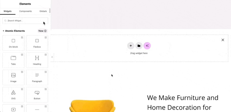
- Search for Dropping Element in the Elementor widget panel.
- Drag and drop the widget into your desired section.
Once added, several demo elements will appear automatically. By default, the widget includes 11 elements.
Managing Dropping Elements
Add or Remove Elements
The widget provides several default elements that you can customize.
To remove an element:
- Expand the element you want to remove.
- Click the X (Delete) icon.
To add a new element:
- Click the Add Item (+) button.
- Configure and rename the new element as needed.
Customize Individual Elements
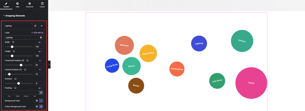
Each element can be customized independently from the Content tab.
Add a Label
Start by adding a label to each element.
For example, if you’re creating an interactive layout for a home interior website, you might use labels such as:
- Living Room
- Bedroom
- Kitchen
- Dining Room
- Office
To add a label:
- Expand an element.
- Enter your desired text in the Label field.
- The label will appear immediately on the element in the Elementor canvas.
Set Width and Height
You can control the shape of each element using the Width and Height settings.
By default, the width and height are equal, which gives the elements a round appearance.
To create a different shape, adjust the values independently.
For example:
- Width: 150px
- Height: 56px
This changes the element into a button-like shape.
Set Element Position
The Dropping Element widget allows you to precisely position individual elements using Horizontal Position (X) and Vertical Position (Y).
You can define these values in:
- Pixels (px)
- Percentages (%)
Horizontal Position (X)
Use the X value to determine where the element is positioned horizontally.
Vertical Position (Y)
Use the Y value to determine where the element is positioned vertically.
Once X and Y values are defined, the element maintains its position even after the page is reloaded.
Rotate an Element
Use the Rotate property to change the rotation angle of an element.
Enter the desired value and check the result directly on the Elementor canvas.
Adjust Padding
The Padding option controls the spacing inside an element.
Increasing the padding creates more whitespace around the content and makes the text area more compact.
Choose a value that provides a visually balanced result.
Customize Element Backgrounds
Background Color
You can assign a custom background color to an individual element.
To set a background color:
- Open the element settings.
- Locate Background Color.
- Click the brush/color control.
- Select your preferred color.
The selected color can be viewed in the preview.
Background Image
Instead of using a solid color, you can use an image as the element background.
Scroll down to the image settings and configure the image according to your requirements.
For the example shown in the tutorial, the image display size is set to Cover, allowing the image to properly fill the element background.
Follow Background Color
The Follow Background Color controls the background color that appears when the element responds to cursor movement.
When the cursor moves close to an element, the element follows the cursor and its background changes to the configured follow color.
Global Style Settings
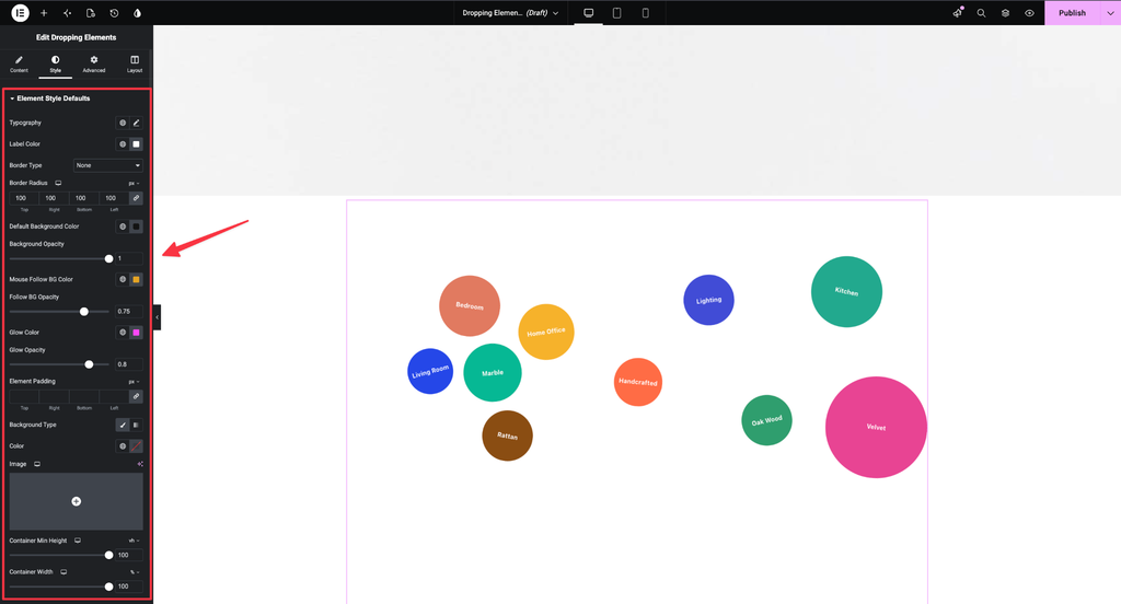
The widget provides global styling options from the Style tab.
You’ll find settings such as:
- Background Color
- Follow Background Color
- Glow Color
- Section Background
- Container Min Height
- Container Width
- Label Color
- Typography
These settings act as the default styles for the widget.
Individual vs. Global Colors
There are two places where you can configure colors:
- Content tab: Set colors for individual elements.
- Style tab: Set default colors for the widget.
The individual element settings take priority.
If an element has its own custom color configured in the Content tab, that color overrides the default color configured in the Style tab. If no individual color is assigned, the Style tab’s default color is applied.
Example
If the default background color in the Style tab is black and an individual element has no custom background color, that element will automatically use the black default.
Adjust Follow Background Opacity
The Follow Background Color also includes an opacity setting.
If the color appears too light or barely visible in the preview, increase its opacity.
After increasing the opacity, preview the page again to see the stronger follow-background effect.
Configure Glow Color
The Glow Color controls the glowing effect that appears behind an element when the cursor interacts with it.
By default, the opacity may be low, making the glow difficult to notice.
To make the glow more visible:
- Increase the glow opacity.
- Preview the page.
- Move your cursor over an element.
A visible glow will appear behind the element.
Section Background and Dimensions
From the Style settings, you can customize the overall section containing the dropping elements.
Background Type
Enable the Background Type option to add a background color to the entire section.
You can also use an image as the section background.
Container Min Height and Width
Use:
- Container Min Height to define the minimum height of the section.
- Container Width to define the width of the section.
These settings help you establish the overall layout area for the dropping elements.
Label Styling
The Label Color option controls the text color displayed on the elements.
You can also use the Typography settings to customize the appearance of the labels, including their font styling.
Animation Mode
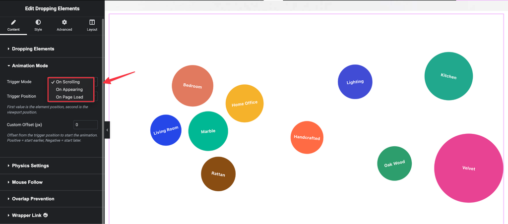
After customizing the individual elements, you can configure how they enter the page using the Animation Mode settings.
There are three animation modes available:
On Appearing
The animation can be configured to run when the elements appear in the viewport.
On Page Load
The animation runs once when the page loads.
Scrolling up or down afterward does not trigger the animation again.
On Scroll
The animation plays whenever the elements enter the viewport while scrolling.
Trigger Position
When On Scroll is selected, an additional Trigger Position setting becomes available.
The widget provides several predefined trigger positions, along with a Custom option.
The trigger position determines when the animation begins based on the relationship between the element and the viewport.
Understanding Trigger Positions
Both the element and the viewport can be considered to have three reference points:
Element:
- Top
- Center
- Bottom
Viewport:
- Top
- Center
- Bottom
For example, if you select Top Center, the animation begins when the top edge of the element reaches the center of the viewport.
Similarly, Top Top starts the animation when the top of the element/section reaches the top of the viewport.
Custom Trigger Offset
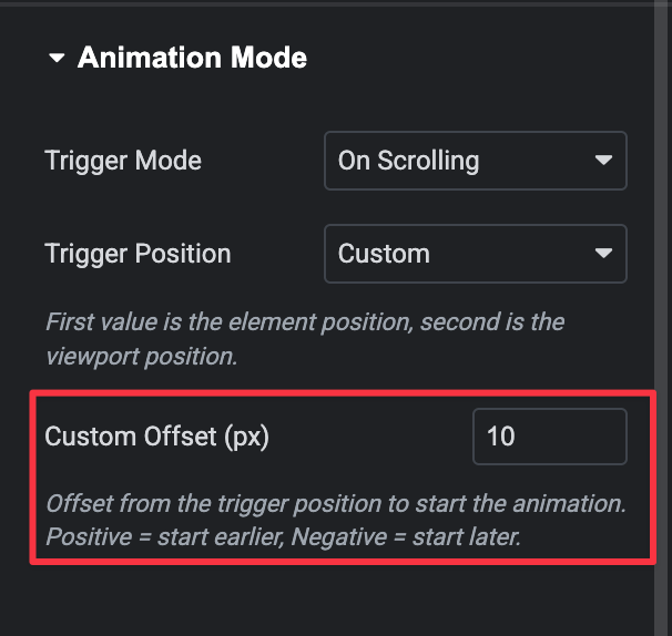
The Custom trigger position allows you to define a specific offset in pixels.
When you select Custom, the Custom Offset field appears.
Enter a positive or negative pixel value to determine where the animation should begin relative to the viewport.
Positive Offset
For example, setting the custom offset to 500px starts the animation when the top of the section reaches 500px below the top of the viewport.
Negative Offset
Setting the value to -500px delays the animation until the section has moved 500px past the top of the viewport.
Physics Settings
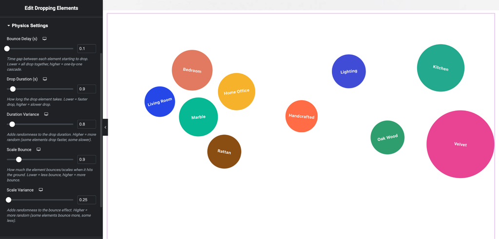
The Physics section controls the behavior and variation of the dropping animation.
Bounce Delay
Bounce Delay controls how much time passes between individual elements dropping.
A higher value makes the sequence more noticeable because each element waits longer before dropping.
Drop Duration
Drop Duration determines how long each element takes to complete its dropping animation.
A higher value creates a slower drop.
Duration Variance
Duration Variance adds variation to the drop duration.
Increasing this value causes different elements to complete their animations at slightly different speeds, creating a more randomized effect.
Scale Bounce
Scale Bounce controls how much the elements bounce after landing.
Increasing the value produces a stronger bounce effect.
Scale Variance
Scale Variance adds variation to the bounce effect between elements.
A higher value creates more noticeable differences in how individual elements bounce.
Mouse Follow
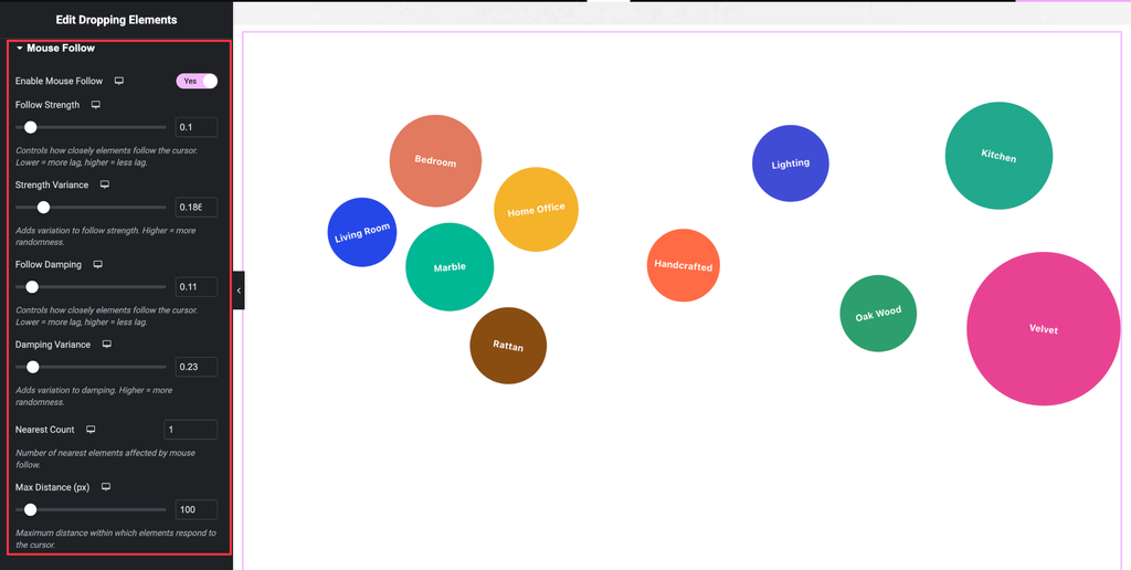
The Mouse Follow settings control how the dropping elements respond when the cursor moves close to them.
Follow Strength
Follow Strength determines how strongly an element is pulled toward the cursor.
- Lower value → weaker movement
- Higher value → stronger cursor attraction
Strength Variance
Strength Variance controls how differently individual elements respond to the cursor.
A low value gives the elements similar pulling strength, while a higher value creates more variation between elements.
Follow Damping
Follow Damping controls how smoothly an element moves toward and settles around the cursor.
A higher value creates smoother movement and allows the element to settle more naturally, reducing excessive wobbling or lag.
Damping Variance
Damping Variance adds variation to the damping behavior of individual elements.
Increasing the value causes different elements to have different damping responses.
Nearest Count
Nearest Count determines how many elements can respond to the cursor at the same time.
For example, increasing the value can cause three or more nearby elements to follow the cursor simultaneously.
Fine-Tuning Mouse Follow
If the elements move too aggressively, reduce settings such as:
- Strength Variance
- Follow Damping
- Damping Variance
Lowering these values can create a smoother and more controlled cursor-following effect.
Max Distance
Max Distance determines how far away the cursor can be before an element begins responding.
- Higher value → elements react from farther away.
- Lower value → the cursor needs to get much closer to the element before it moves.
Prevent Element Overlap
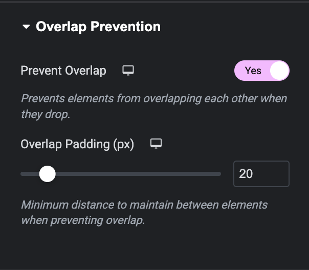
The Overlap Prevention section helps you control how elements behave when they are positioned close to each other.
Although you can manually position elements using X and Y values, the widget also allows you to position them by dragging them, which can make positioning faster.
Prevent Overlap
Enable Prevent Overlap to stop elements from overlapping on the front end.
When enabled, the widget maintains a small gap between elements.
When disabled, elements can overlap freely.
Control the Overlapping Order
You can also control which element appears above the others when elements overlap.
To change the stacking order:
- Expand the Dropping Elements section.
- Find the element you want to appear on top.
- Drag that element to the bottom of the list.
- The element placed last in the list will appear above the other elements on the front end.
Recommended Workflow
For the best results, configure the Dropping Element widget in the following order:
- Add the Dropping Element widget to your Elementor page.
- Add, remove, and rename your elements.
- Configure each element’s label.
- Adjust width and height if you need custom shapes.
- Set the X and Y positions.
- Configure rotation, padding, and backgrounds.
- Add individual background colors or images where necessary.
- Configure global styles from the Style tab.
- Set the Animation Mode.
- Choose an appropriate Trigger Position.
- Fine-tune the Physics settings.
- Configure the Mouse Follow behavior.
- Enable Prevent Overlap if required.
- Adjust the element order to control which elements appear on top.
- Preview the page and fine-tune the animation until the interaction feels natural.
Conclusion
The Dropping Element widget gives you extensive control over animated, interactive elements in Elementor. You can customize each element individually, define precise positions, create custom backgrounds, configure scroll-based animations, control dropping physics, and add engaging cursor-follow interactions.
By combining the Content, Style, Animation, Physics, Mouse Follow, and Overlap Prevention settings, you can create dynamic layouts that make your content more interactive and visually engaging.