

Introduction
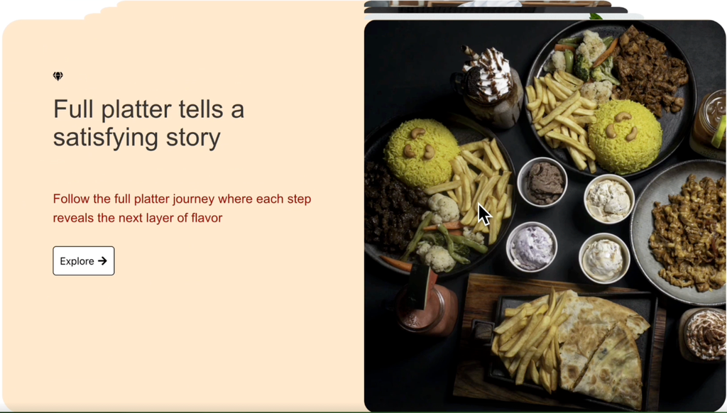
The Stacked Card widget of HappyAddons lets you create an engaging scroll-based storytelling section where content cards stack one after another as visitors scroll through the page. It’s perfect for showcasing products, services, features, portfolios, restaurant menus, or any step-by-step presentation with text and images.
Prerequisites
Before getting started, make sure you have the following plugins installed and activated:
- Elementor (Free)
- HappyAddons (Free)
- HappyAddons (Pro)
Once you have these plugins installed and activated, get started with the following steps!
How to Add the Stacked Card Widget
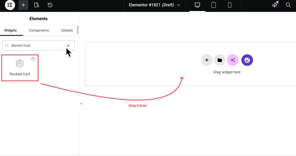
Open your page with Elementor, search for Stacked Card in the widget panel, then drag and drop it into your desired section.
Configure Cards Content
The Cards Content section is where you create and manage all the stacked cards.
By default, the widget comes with several sample cards. You can edit them or create your own.
Each card contains:
- Icon
- Title
- Description
- Button
- Image
Add an Image
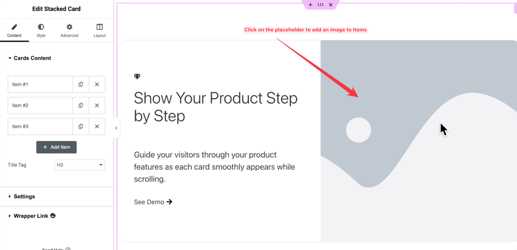
Every card includes an image placeholder on the right side.
Simply click the placeholder and choose an image from the WordPress Media Library or upload a new one.
The selected image will instantly appear inside the card.
Change the Card Icon
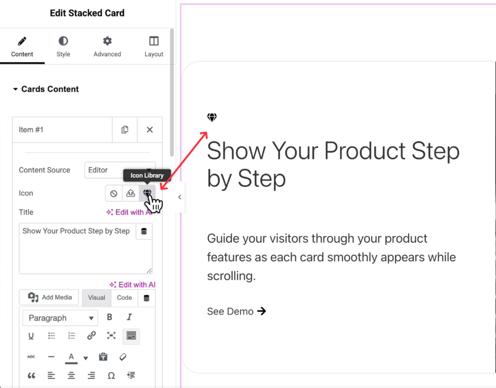
Each card includes a default icon above the title.
Click the Icon Library button to choose another icon or remove the existing one if you don’t need it.
This helps visually differentiate each card.
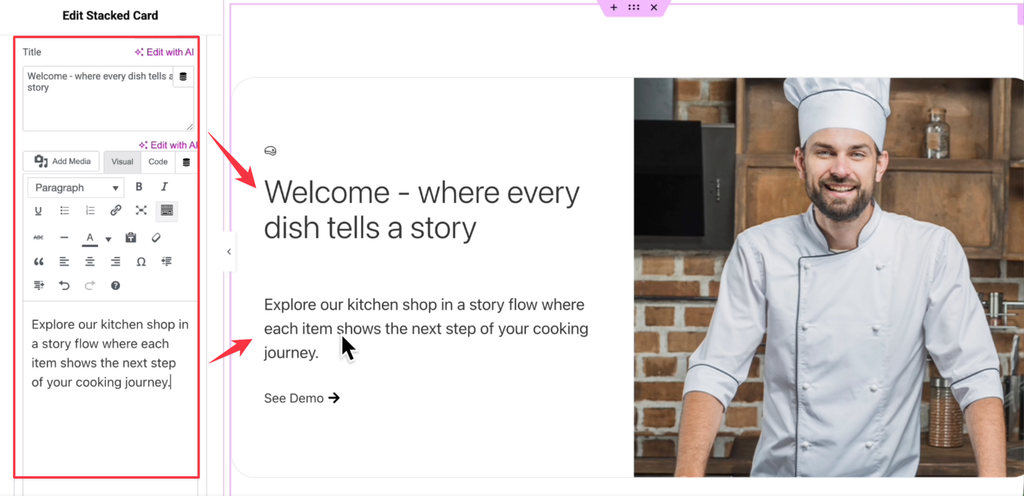
Edit Title and Description
Replace the sample content with your own.
You can edit:
- Card Title
- Description
- Button Text
Use Elementor’s editor to format the content if needed.
Add More Cards
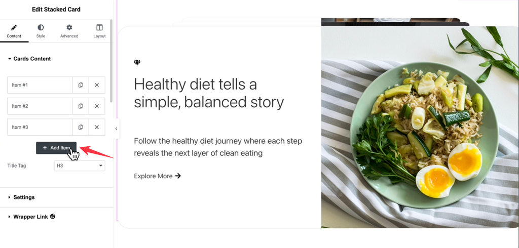
Need additional stacked cards?
Click the Add Item button to create a new card.
Each new card includes the same options as the previous ones, allowing you to configure:
- Icon
- Title
- Description
- Button
- Image
Repeat the process for as many cards as needed.
Settings
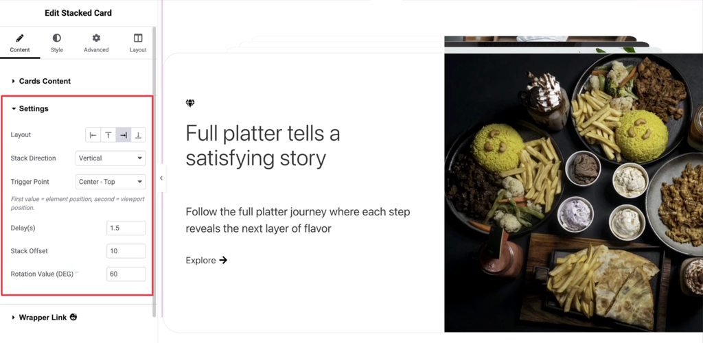
Expand the Settings section to control how the stacked cards behave while scrolling.
Available options include:
Layout
Choose the alignment of the card layout.
Stack Direction
Select how the cards stack during scrolling.
Available options:
- Horizontal
- Vertical
Trigger Point
Define when the stacking animation begins as users scroll through the page.
Delay
Control the animation delay between consecutive cards.
Stack Offset
Adjust the spacing between stacked cards.
Rotation Value
Add a rotation effect to the stacked cards by specifying the degree of rotation.
These settings help create different storytelling experiences based on your website’s design.
Style Tab
The Style tab lets you customize the appearance of every part of the widget.
Layout
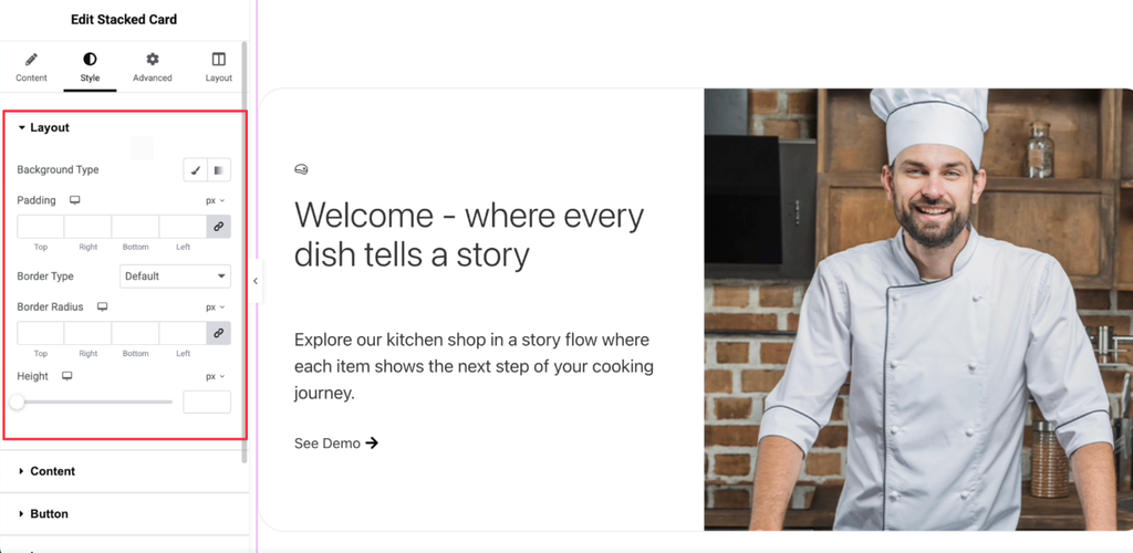
From the Layout section, you can customize the overall card container.
Available styling options include:
- Background Color
- Padding
- Border Type
- Border Radius
- Height
These controls help you match the widget with your website’s overall design.
Content
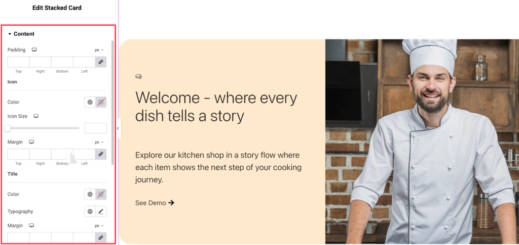
The Content styling section controls the appearance of the text and icon.
You can customize the Content Area (Padding), Icon (Color, Size, Margin), Title (Color, Typography, Margin), and Description (Color, Typography, Margin).
These settings allow complete control over the content presentation.
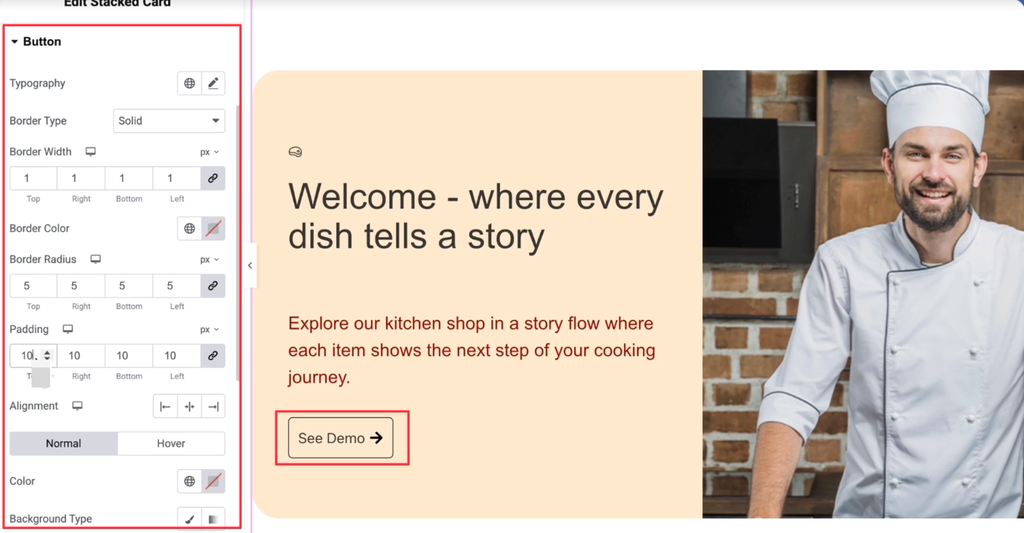
Button
Customize the button’s Typography, Border Type, Border Width, Border Color, Border Radius, Padding, Alignment, Text Color, Background Color, and Icon, with separate styling options for Normal and Hover states.
This makes it easy to create interactive call-to-action buttons that match your site’s branding.
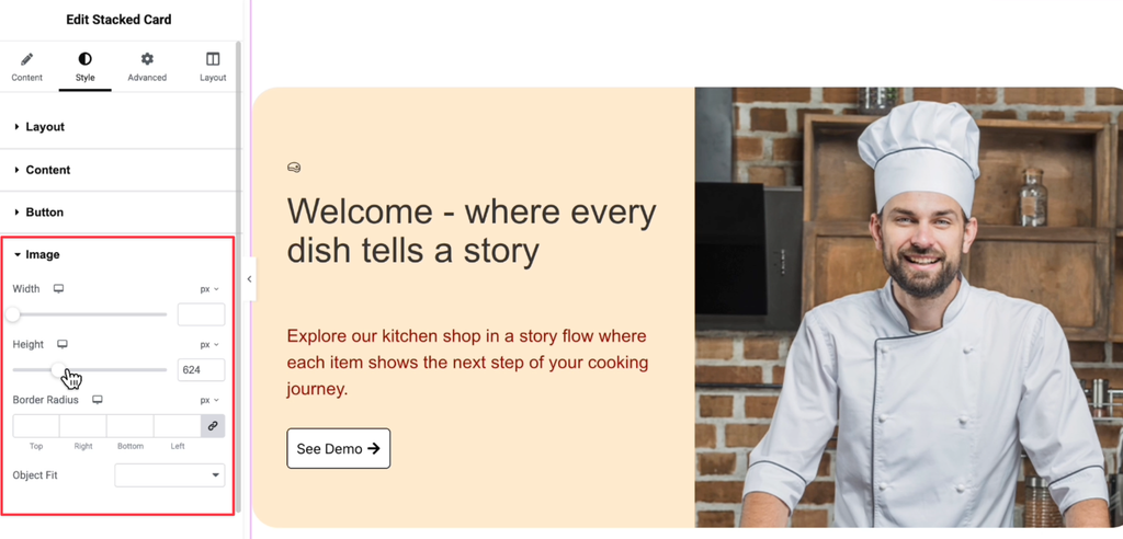
Image
The Image styling section lets you customize how images appear inside the cards.
Available controls include:
- Width
- Height
- Border Radius
- Object Fit
These options help ensure images fit perfectly regardless of their dimensions.
Final Output
Once everything is configured, visitors will experience a smooth stacked-card scrolling effect where each card appears one after another, creating an immersive storytelling experience with engaging visuals and content.