Introducing the Multi Scroll Widget in HappyAddons Pro
We are introducing another unique feature of HappyAddons Pro: Multi Scroll. This feature lets you create stunning split-screen scrolling sections using Elementor and Happy Addons Pro. With just a few clicks, you can build modern, interactive layouts that simultaneously move both left and right panels while scrolling – perfect for storytelling, portfolios, or visually rich pages.
Requirements:
To use this exciting Multi Scroll widget, make sure you have:
- Elementor Free
- HappyAddons Free
- HappyAddons Pro
Installed and Activated.
Note: For the best experience, ensure you’re using the latest version of HappyAddons Pro and Elementor. Avoid using outdated versions or incognito mode while testing the widget.
Important:
To get the best result, use the Multi Scroll widget on a dedicated page. Do not use any other widgets on that page – including header or footer widgets – as they may interfere with the scrolling behavior.
How to Enable the Multi Scroll Widget
To activate the widget:
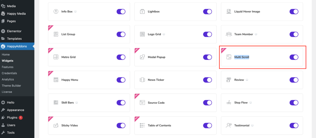
- Navigate to WP Dashboard > HappyAddons > Widgets.
- Scroll down to find the Multi Scroll widget.
- Enable it by clicking the toggle switch.
- Click on the Save Changes button.
Adding Multi Scroll Widget to a Page
To use the Multi Scroll widget in Elementor:
- From your WordPress Dashboard, go to:
Pages > Add New. - Enter a name for your new page and publish it.
- Click Edit with Elementor to open the page in the Elementor editor.
Set Up the Page Layout for the Best Experience
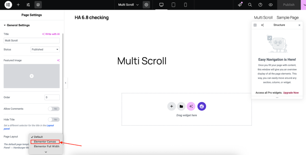
- In the Elementor editor, click the Page Settings in the lower-left panel.
- Under Page Layout, select Elementor Canvas for a full-width, clean layout that works best with Multi-Scroll.
Add the Multi Scroll Widget:
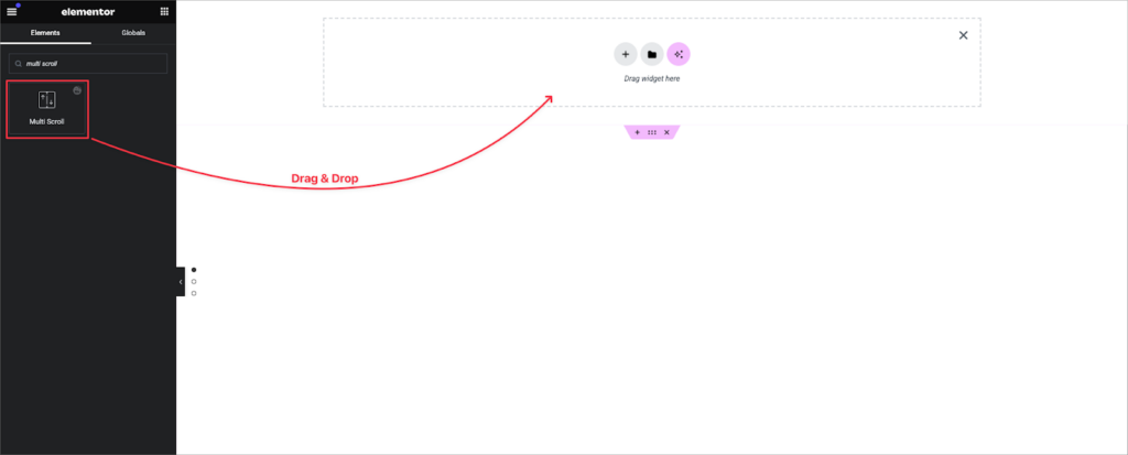
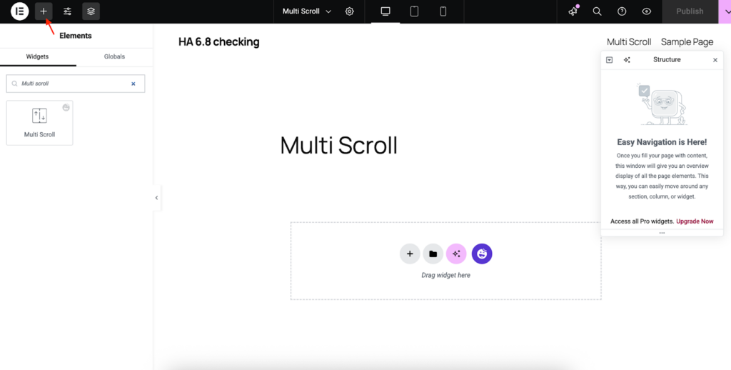
- Click the Add Element (+) button in Elementor.
- Search for Multi Scroll in the widget panel.
- Drag and drop the Multi Scroll widget onto the canvas.
You’re now ready to build engaging, scroll-split layouts with HappyAddons Pro!
Configure the Multi Scroll Widget
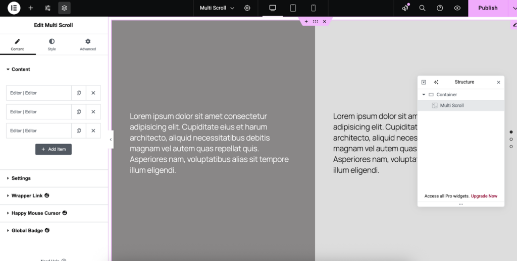
Once you’ve dragged and dropped the Multi Scroll widget onto your Elementor canvas, you’ll see a layout preview similar to the one below.
Editing the Left and Right Sections of the Multi Scroll Widget
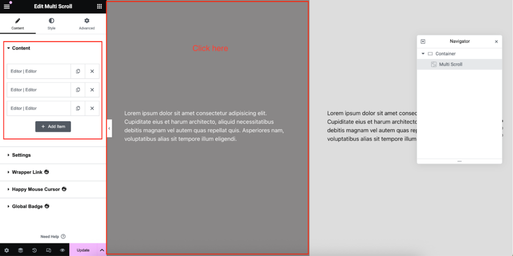
Now, click on the left side of the widget to edit its design. The Elementor sidebar will then display the Content section.
From the Content section, you can now edit the design:
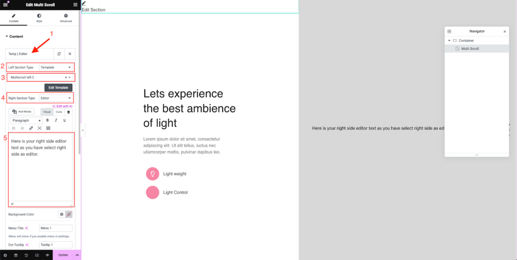
- Click on Editor | Editor.
- Set the Left Section Type to Template.
- Choose a previously saved template by typing the first three letters of its name.
The selected template will appear in the left section of the Multi Scroll widget.
To add text using the editor on the right section:
- Set the Right Section Type to Editor from the dropdown.
- Enter your desired text in the text editor.
Settings Options
- Left Section Width (%)
Set the width of the left section (e.g., 50%).
Note: The right section width adjusts automatically based on this value. - Navigation Type
Choose the type of navigation indicator (e.g., Dots, Menu).
Navigation Type “Menu”:
You can choose Menu Style navigation, where you can find buttons to switch tabs.
Navigation Type “Dot”:
- Dots Tooltips Enable
Toggle tooltips on/off for the navigation dots. - Dots Horizontal Position
Set dot alignment to either Left or Right. - Dots Vertical Position
Set vertical alignment of dots: Top, Middle, or Bottom.
- Loop Top / Loop Bottom
Enable or disable looping when scrolling reaches the start or end. - Scroll Speed
Adjust the scroll transition speed in milliseconds.
(Default: 700ms)
Style the Multi Scroll Widget
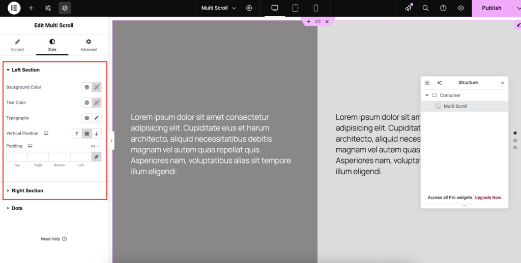
To customize the appearance of the Multi Scroll widget, navigate to the Style tab in the Elementor editor.
Here, you can individually style both the Left Section and the Right Section with the following options:
- Background Color – Choose a background color for each section.
- Text Color – Define the text color for headings and content.
- Typography – Adjust font family, size, weight, and other text properties.
- Vertical Position – Set the vertical alignment of content within each section.
- Padding – Add space around the content for better layout control.
Customize Dots & Tooltip Appearance
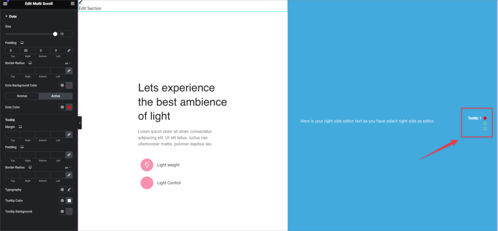
Under the Dots section of the Multi Scroll widget, you can personalize the navigation dots and tooltips to better match your website’s design.
Dot Settings:
- Size – Adjust the overall size of the navigation dots.
- Padding – Set spacing around each dot (Top, Right, Bottom, Left).
- Border Radius – Round the corners of each dot individually or link values for uniform rounding.
- Dots Background Color –
- Normal – Color when not active.
- Active – Color when selected.
- Normal – Color when not active.
- Dots Color – Set the inner color of each dot.
Under the Dot Style tab, you will find the Tooltip style options
Tooltip Settings:
- Margin – Define spacing around the tooltip (Top, Right, Bottom, Left).
- Padding – Set internal spacing within the tooltip (Top, Right, Bottom, Left).
- Border Radius – Round the tooltip corners with linked or individual values.
- Typography – Customize font, size, weight, and style of the tooltip text.
- Tooltip Color – Set the text color.
- Tooltip Background – Choose the background color for tooltips.
Check our video here:
That’s it. Cheers!
