Introduction
Transform your website’s navigation with the HappyAddons Scroll Tabs widget. This sleek, interactive feature lets tabs and their content scroll seamlessly together, offering smooth transitions and an engaging user experience. Perfect for displaying large amounts of content in a compact, organized way, with easy customization and responsive design for all devices.
Key Features:
- Smooth, synchronized scrolling between tabs and content
- Attractive animations and transitions
- Fully responsive and easy to customize
Enhance navigation and visual appeal with the HappyAddons Scroll Tabs widget.
Requirements:
- Elementor Free
- HappyAddons Free
- HappyAddons Pro
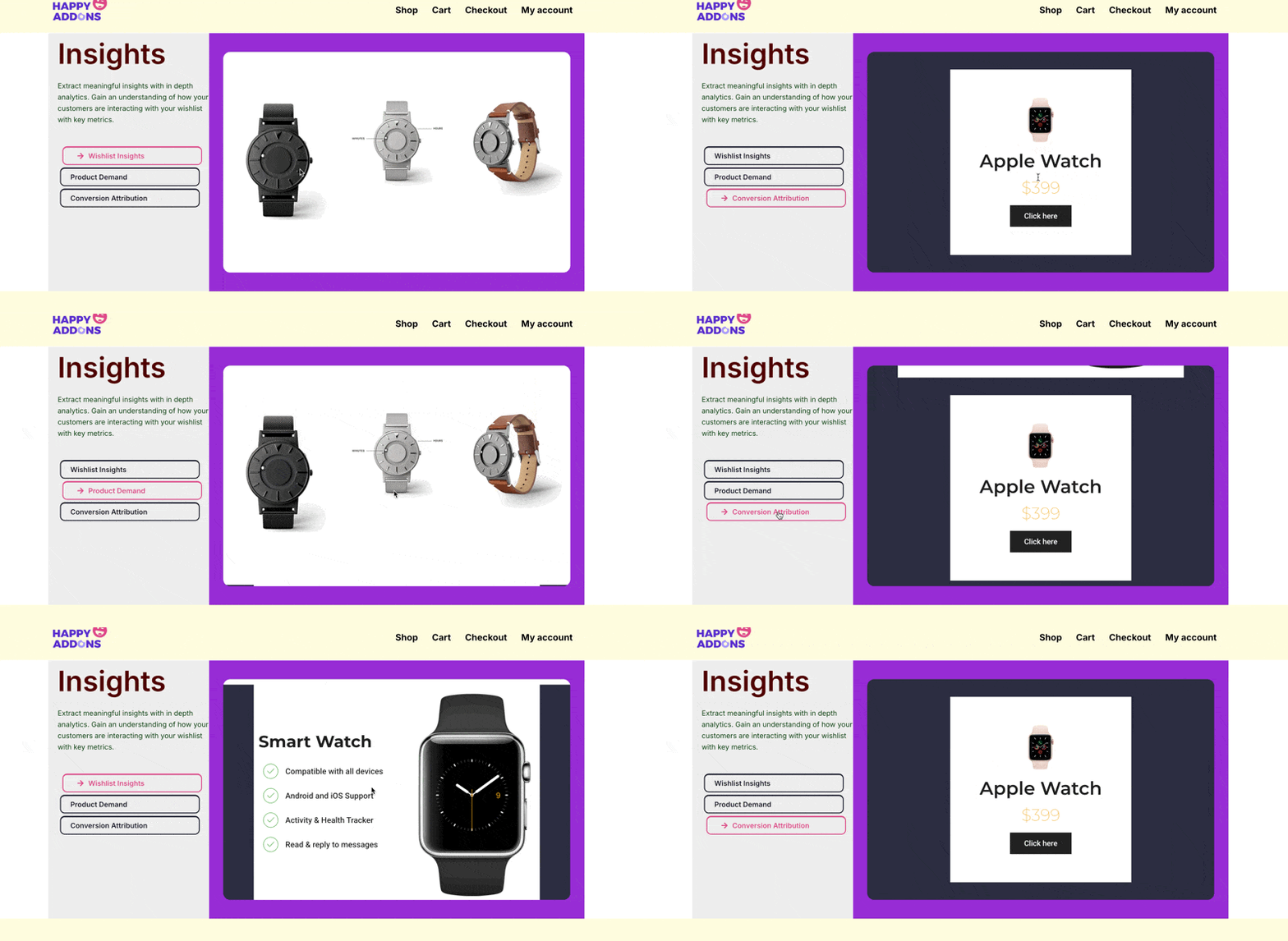
After configuration, you will have a tabs section like the following:
Let’s configure the widget:
Adding Scroll Tabs widget to a page
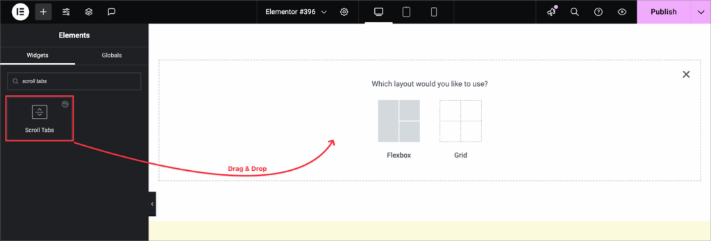
Drag and drop the Scroll Tabs widget to your desired page.
Content Settings
Tabs Content
Under the Tabs Content section, you can add the Title, Description, and Items of your tabs. Each item represents a separate tab that will appear inside the Scroll Tab widget.
You can configure:
- Title
Set the title text for the tab item. - Description
Add a description to provide more details about the tab. - Items
Add multiple tab items by clicking Add Item. You can create as many tabs as needed and manage them easily.
You can reorder the items by dragging them or remove any unwanted ones.
Item Settings
Each tab item in the Scroll Tab widget comes with its own settings. Under Item Settings, you can customize the navigation text, icons, and content type of the tab.
- Nav Text
Set the navigation label for the tab. - Nav Icon
Add an icon to display alongside the navigation text. Options include:
- None – No icon will be shown.
- Upload SVG – Upload a custom SVG file.
- Icon Library – Choose an icon from the Elementor icon library.
- Content Type
Define the type of content that will display inside the tab.
- Editor (Default): You can manually add content with the default Editor mode.
- Template – Select a pre-designed template from your Elementor library.
For better design visibility, we are using Template as the content type.
- Background Type
Set the background style for the tab content as a color or an image.

Settings
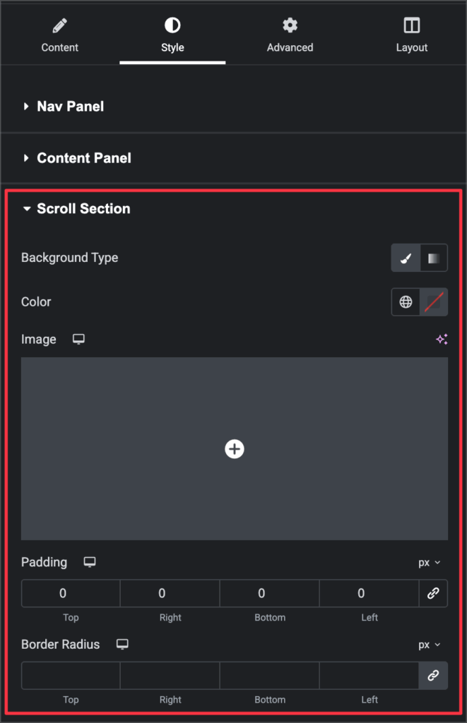
The Settings section allows you to customize the layout and positioning of both the navigation panel and the content panel of your Scroll Tab widget.
Nav Panel
- Width (%)
Set the width of the navigation panel as a percentage. - Position
Choose where the navigation panel will appear:
- Left
- Right
- Vertical Alignment
Adjust the vertical position of the navigation panel:
- Top
- Center
- Bottom
Content Panel
- Height (px)
Set a fixed height for the content panel in pixels. Example: 470px. - Alignment
Align the content within the panel. Options:
- Left
- Center
- Right
This setting only applies when the content type is set to Editor.
- Vertical Alignment
Adjust the vertical alignment of the content:
- Top
- Center
- Bottom
Style > Nav Panel
The Nav Panel style settings let you customize the look and feel of the navigation area, including background, typography, spacing, borders, and hover effects.
Nav Area
- Background Type
Choose the background style for the navigation panel:
- Classic – Apply a solid color or image.
- Gradient – Apply a gradient color effect.
- Image – Upload an image to use as the background.
- Border Radius
Set the corner radius of the navigation panel in pixels. You can adjust each side individually or link values together. - Padding
Add inner spacing inside the navigation panel.
Title – Set the text color, typography (family, size, weight, style), and margin for the tab titles.
Description – Set the text color, typography (font settings), and margin for the tab descriptions.
Nav Item – Customize typography, margin, padding, border (type, width, color, radius), and set text/background colors for normal and hover states.
States – Set text and background colors for both Normal and Hover states.

Style > Content Panel
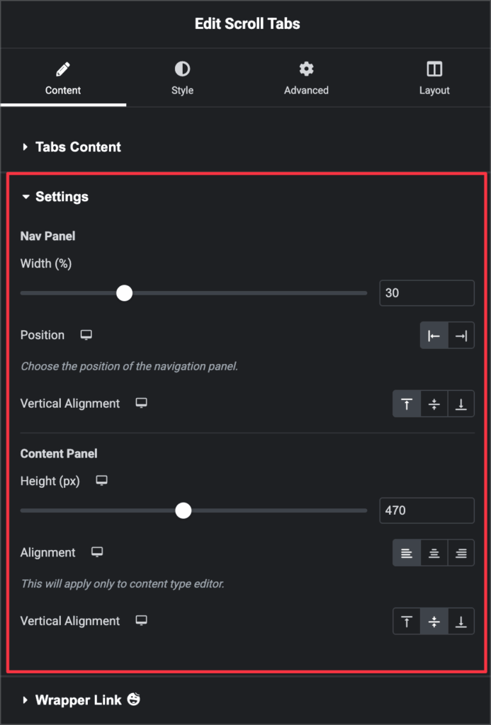
Customize the appearance of the tab content area.
- Text Color – Set the content text color (applies only to Editor type).
- Typography – Adjust font family, size, weight, and style.
- Background Type – Choose Classic (solid/image) or Gradient.
- Border Radius – Set corner radius for the panel.
- Padding – Add inner spacing for the content panel.
Style > Scroll Section
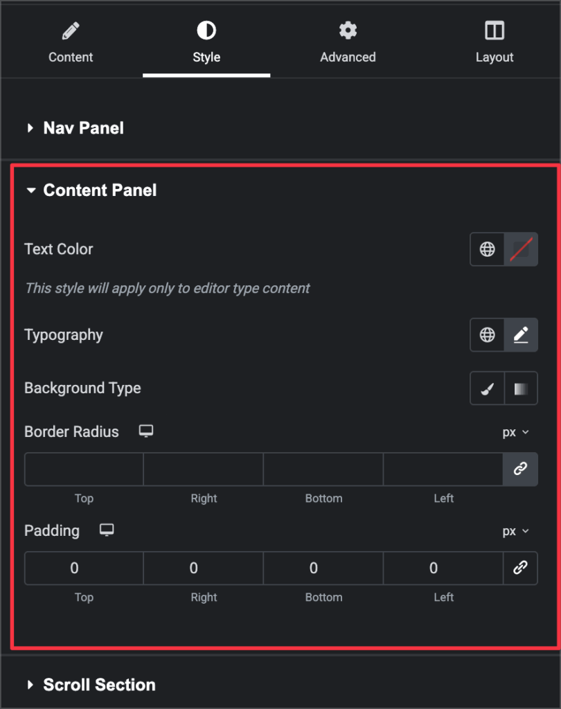
Customize the overall Scroll Tab section appearance.
- Background Type – Choose Classic, Gradient, Color, or add an Image.
- Padding – Set inner spacing for the section (can unlink values).
- Border Radius – Adjust corner radius for the section.

And that’s it. You have successfully configured the Scroll Tabs widget.
