The new Unfold widget of Happy Addons Pro will add a feature to your website. You can efficiently fold & unfold any type of large web element in a more organized way.
To use that amazing Unfold widget, you need the following things:
- Elementor
- Happy Addons
- Happy Addons Pro
How To Use Unfold
Let’s get started:
Step: 1
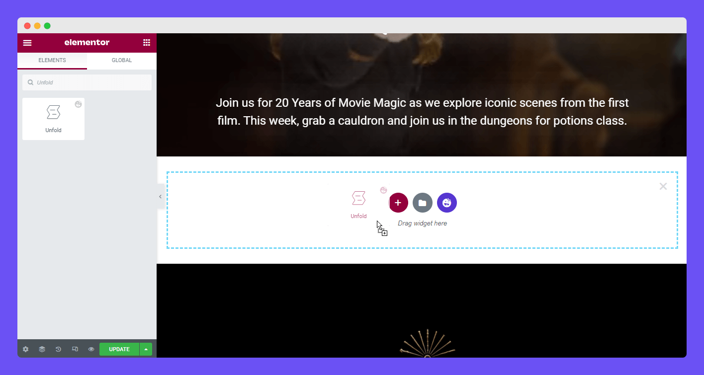
Select the ‘Unfold‘ widget from the left side Elementor widgets area. Then drag and drop the widget into the suitable area.
Step: 2
These are the Content options that will help you add to unfold content.
- Content
- Fold/ Unfold Options
- Button
- Wrapper Link
We’ll discuss all the options in the following part.
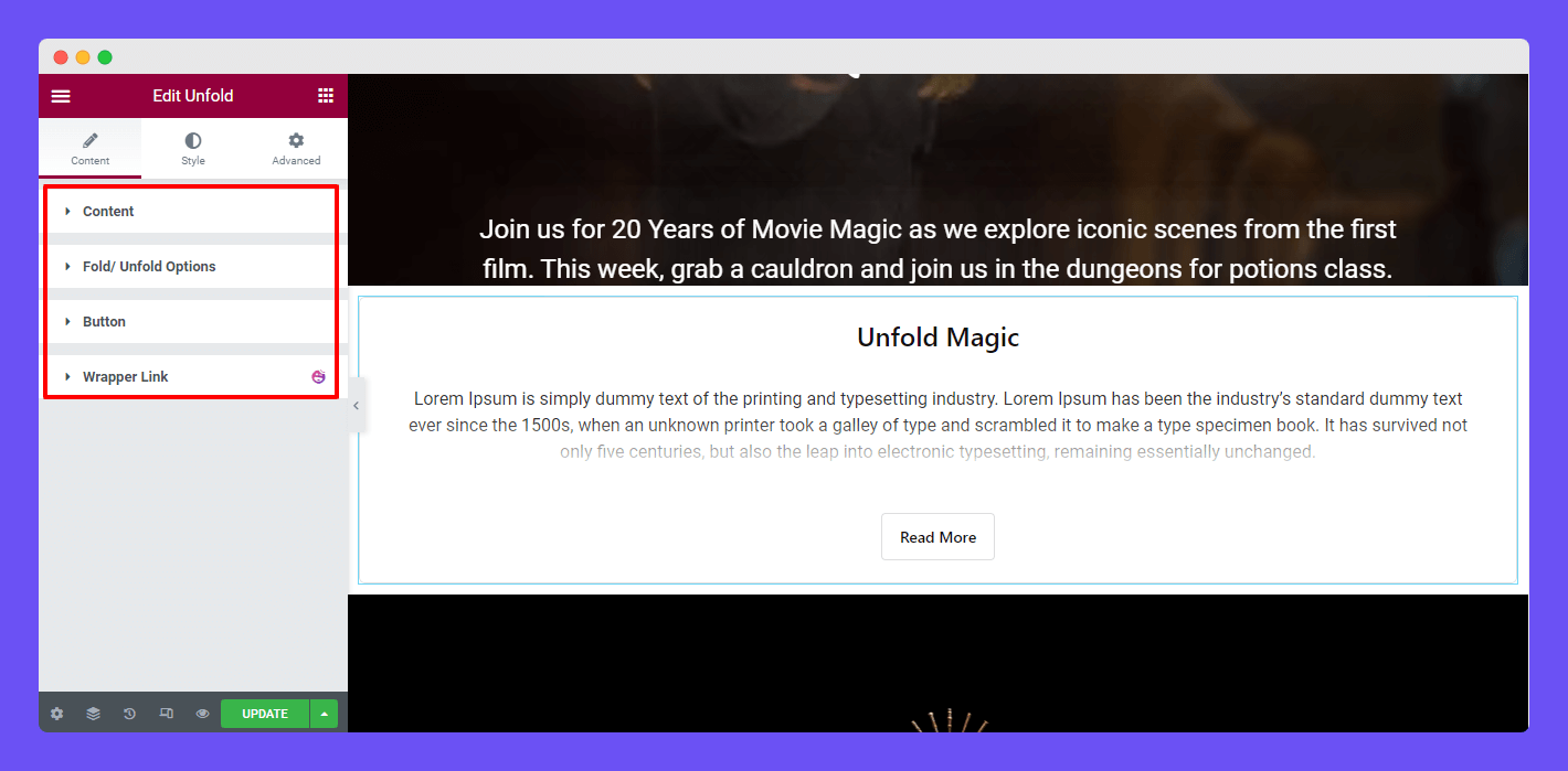
In the Content–>Content section, you’ll get all the necessary actions to add the unfold content. You can a Title set HTML Tag, and Content Source here.
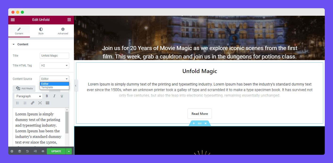
There are two different Content Sources like Editor and Template. We’ll discuss Content Source in the next part.
Content Source Editor
If you select the content source as an Editor, you need to add its content in the editor panel. You can check the below image to ensure how this works.
Content Source Template
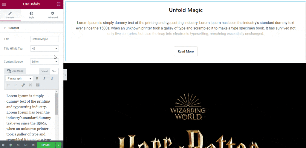
You can also add a custom template as the unfold content. To do this, you have to select the content source as Template. Now, you are able to display any type of pre-made templates as your unfolded content.
Note: If you want to show the Unfold content on the full page, you need to click the Edit Section. Then go to the Layouts area. Where you have to set the Content Width as Full Page. Also, set the Column Gap as No Gap and active the Stretch Section.
Fold & Unfold Click Trigger
There are two types of Trigger that you can use to fold & unfold your content.
- Click
- Hover
Let’s see how these two feature works.
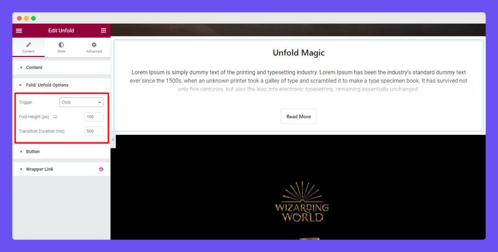
The Content–> Fold & Unfold area, you can set the Trigger of the unfold. You can choose Trigger like Click and Hover.
The Click trigger will work when you click on the button.
Fold Height & Transition Duration
You can set the Fold Height (px) according to your purpose. Remember the lower fold height indicates the maximum part of the content will go under the fold.
You can also define the Transition Duration based on the milliseconds. This means whenever you unfold the folded content it will take this time.

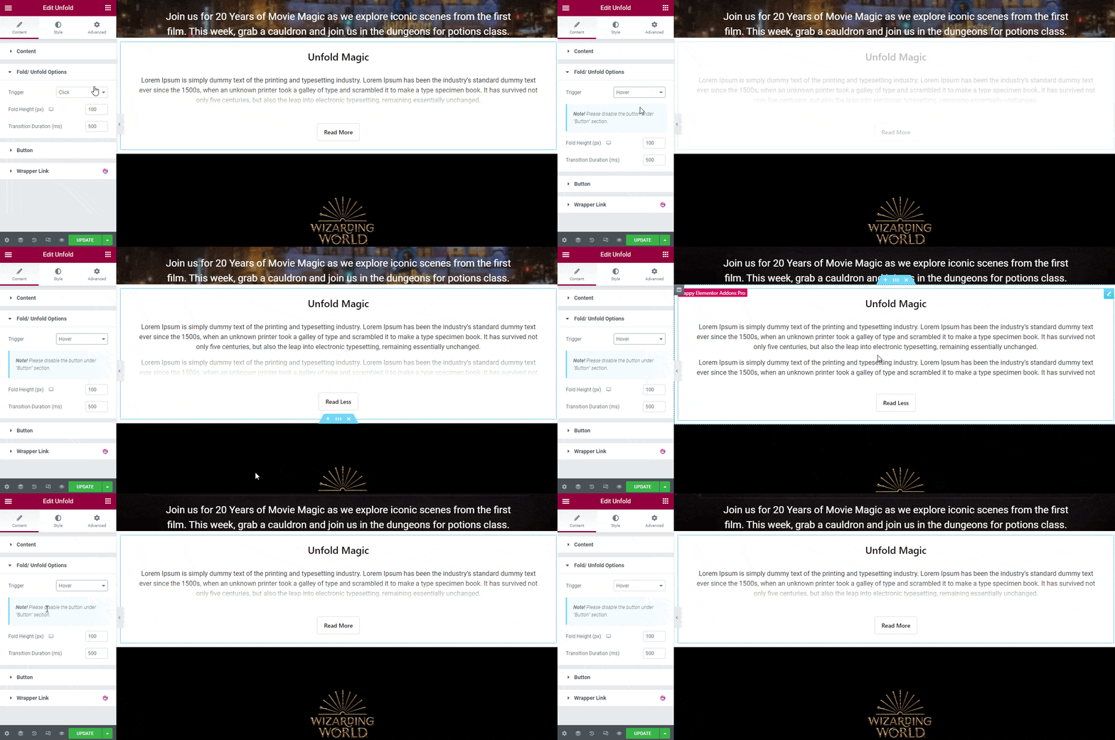
Fold & Unfold Hover Trigger
You’re also able to set the Trigger as Hover. That means whenever you’ll hover over the button then the trigger start working.
Button Content
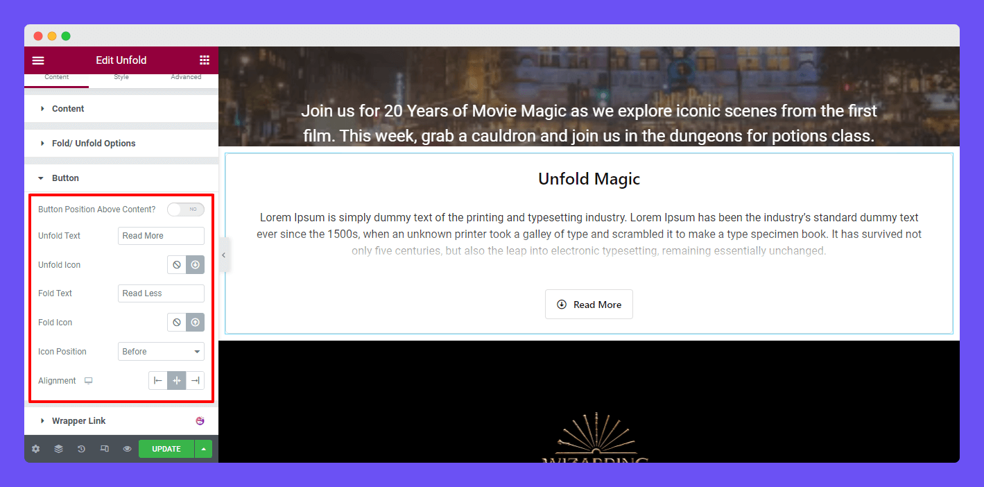
The Content–>Button section allows you to set the necessary content of the Unfold widget.
- Button Position Above Content?: By activating the option, you can the display the button position above of your content.
- Unfold Text: You can write a Unfold text in this area.
- Unfold Icon: You are able to set an icon to the button.
- Fold Text: Like the unfold text, you can write a Fold text here.
- Fold Icon: If you want to add a Fold Icon, you can use this option.
- Icon Position: You also are able to define the Icon Position Before & After the button text.
- Alignment: Finally, you can set the button Alignment according to your need.
Active Button Position Above Content
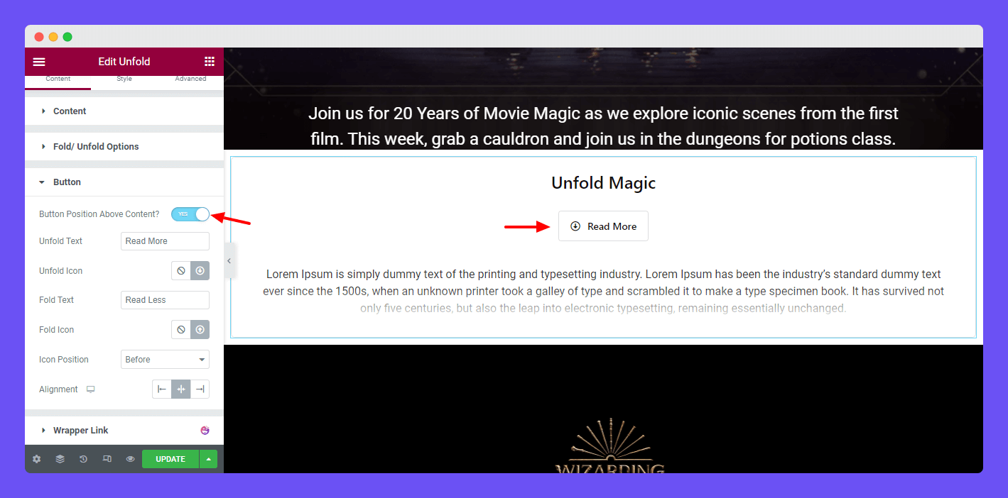
Let’s see how the button looks like if we active the Button Position Above Content.
Here you see the button have shown right after the Unfold Text and Above the Unfold Content.
Step: 3
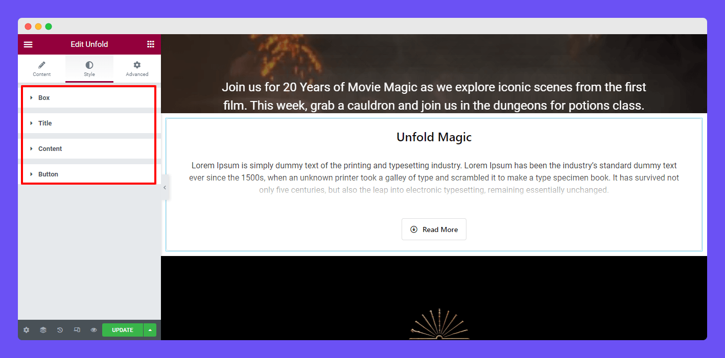
These are the Style options that you can use to customize the widget. The options are available for you.
- Box
- Title
- Content
- Buton
Style Box
In the Style–> Box section, you will get several options to style the entire content box. These are some of the notable options Margin, Padding, Border Type, Width, Border Radius, Background Type, Image, and more.
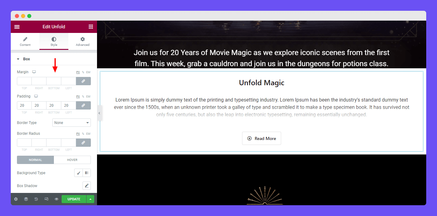
Note: By default, we’ve added 20px padding of the content box surrounding.
Overlay Settings
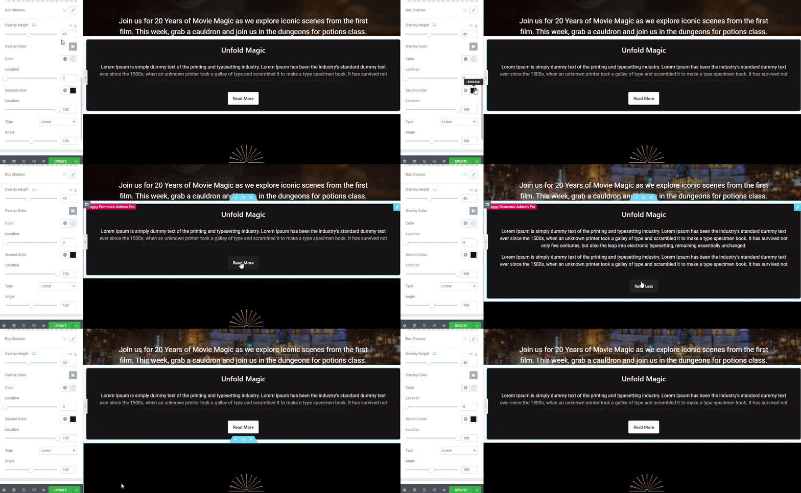
You are able to add the overlay to your fold content. Manage the Overlay Height and add a different color to make it more exclusive.
Style Title
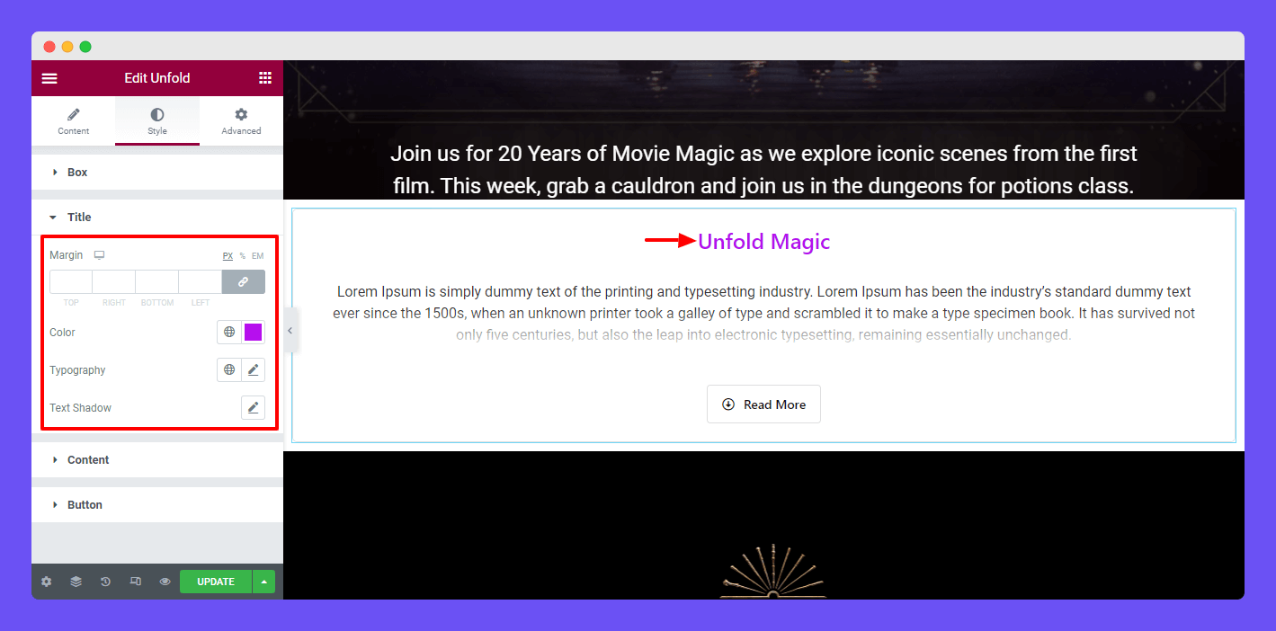
The Style–> Title section allows you to set the Title Margin, Color, Typography, and Text Shadow.
Style Content
Like the Title, you can also change the entire content Margin, Color, Typography, and Shadow.
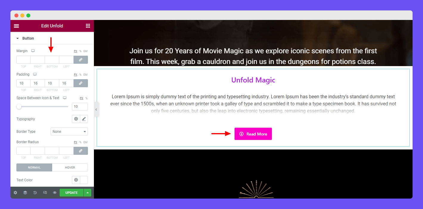
Style Button
If you want to redesign the button in your own way, you should go to the Style–> Button area and change the current design using the multiple styling options.
This Margin option allows you to add margins into the button surrounding.
Step: 4
If you want to add motion effects, happy effects, background, or make it responsive and more intriguing, click on ‘Advanced‘ to explore those options. the ‘Advanced‘ is a default feature of Elementor.
Give a read to this Document to know more about advanced features & functions.
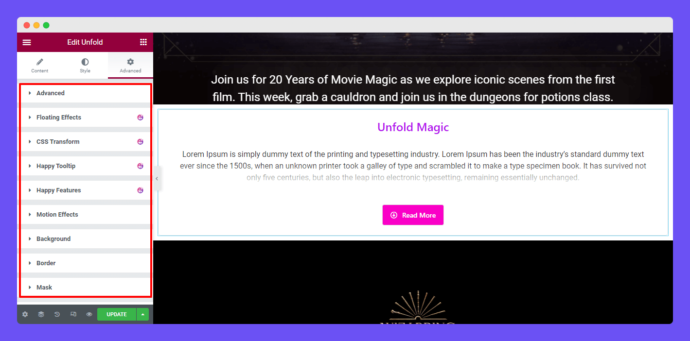
Using this Unfold widget, you are able to make this kind of design.

That’s it.
