Using the new Modal Pop-up widget of Happy Elementor Addons Pro, you can easily use creative pop-ups on your website to increase your conversion rate.
You can use templates to widgets as your pop-up! Cool, right!. Let’s see how to set it up.
Using Modal Pop-up
Go to your Elementor site and start editing the page with Elementor.
Step 1:
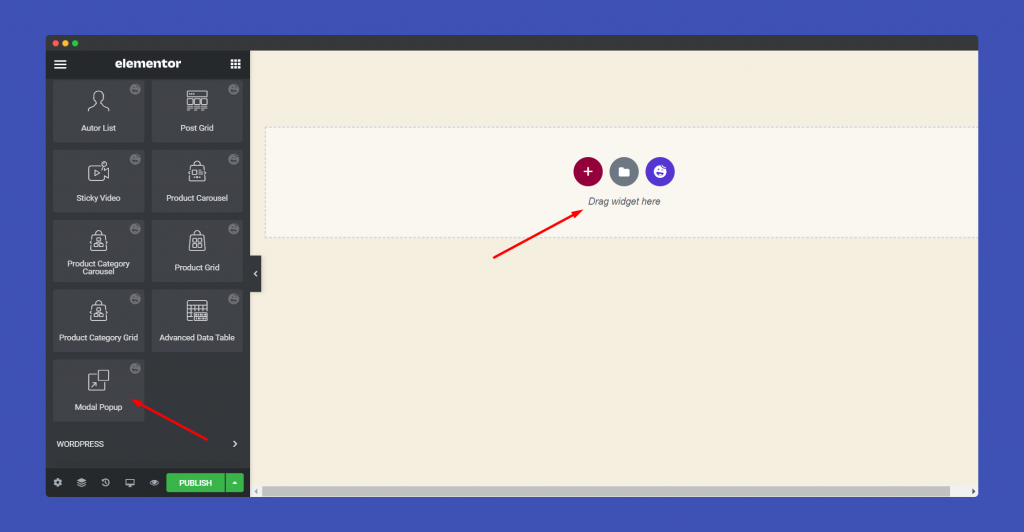
Select the Modal Pop-up widget from the menu bar on the left-hand side of your screen then drag and drop it in the selected area.
Step 2:
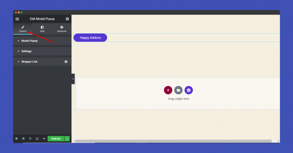
In the ‘Content‘ section, you will find options to edit ‘Modal Pop-up‘, ‘Settings‘, ‘Wrapper link‘.
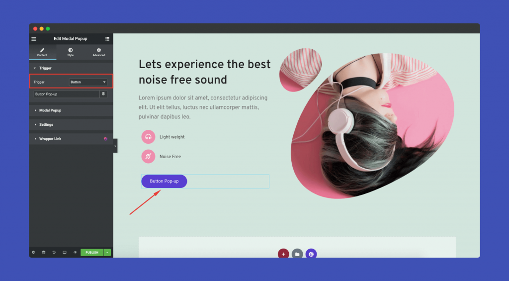
Before you start, you can use 3 types of triggers to enable your Modal Pop-Up. They are,
Button
You can use a button as a trigger. So, whenever users click the button, the Modal Pop-up will appear.
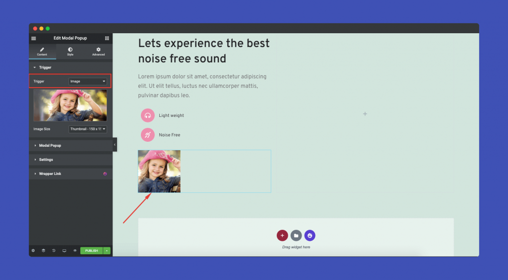
Image
Instead of a button, you can use a image as a trigger as well.
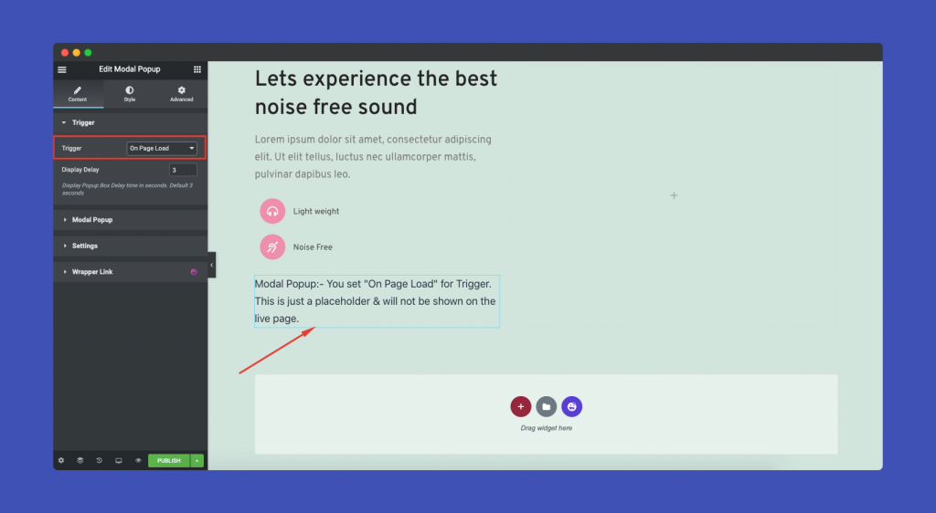
On Page Load
This means, the Modal Pop-up will trigger automatically when a user visits the website. You can choose the interval time as to when will the pop-up will appear.
Note: Once the user exits the pop-up, it will appear only when the user visits the page again or refreshes the page.
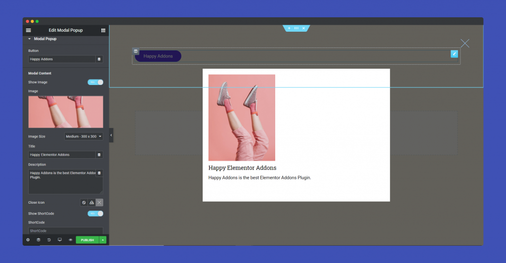
In the Modal Popup part, you can add button name, image, title, description, icon. You can also enable Shortcode mode.
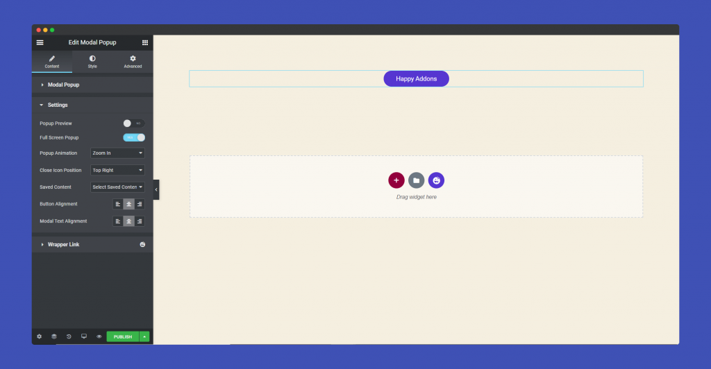
For Settings part, you can enable popup preview, select popup animation, icon position, button alignment, modal text alignment.
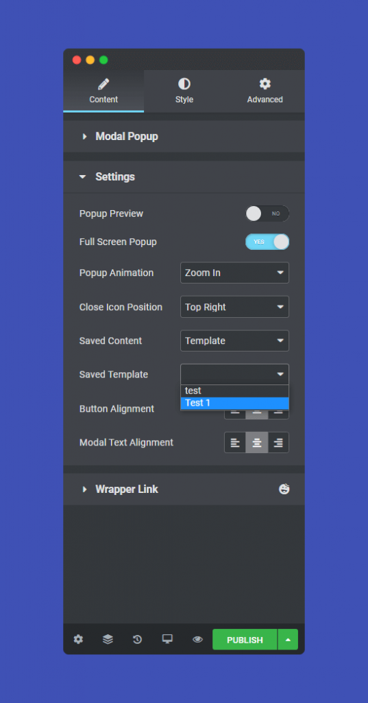
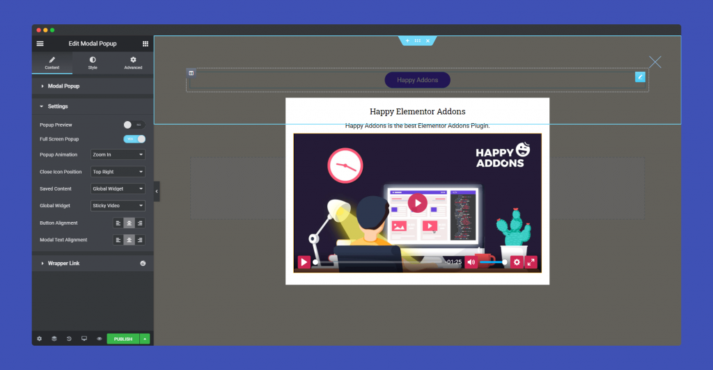
Now, you can use two types of content in the Saved Content option. Either you can use Templates or you can use Global Widgets.

If you choose a template, then you need to choose a template you have saved in the library.
So, when you open the pop-up,
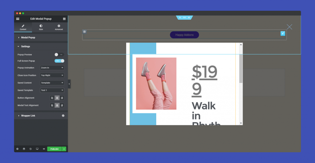
And if you choose Global Widget, you can show any kind of widget in the pop-up.
Step 3:
The ‘Style‘ section, you will have options to design ‘ Button,’ ‘popup’.
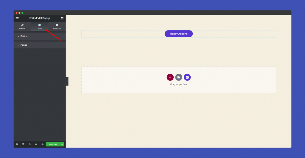
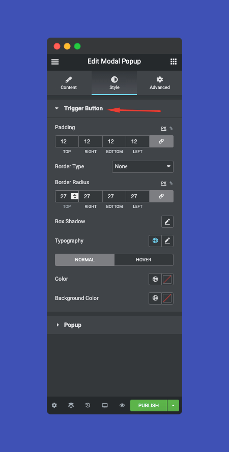
For the Button part, you can add padding, border-radius, typography, box-shadow, background color, etc.
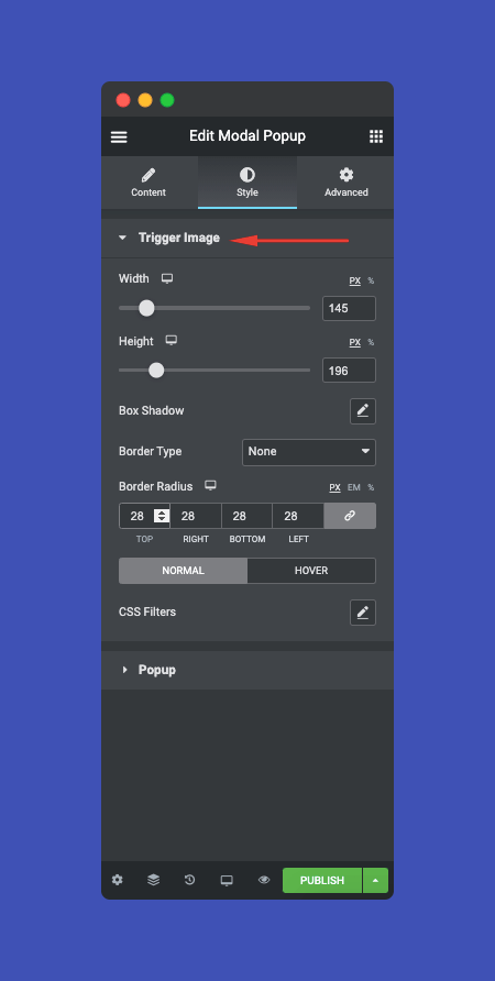
For the Image part, you can add padding, border-radius, box-shadow, background color, etc.
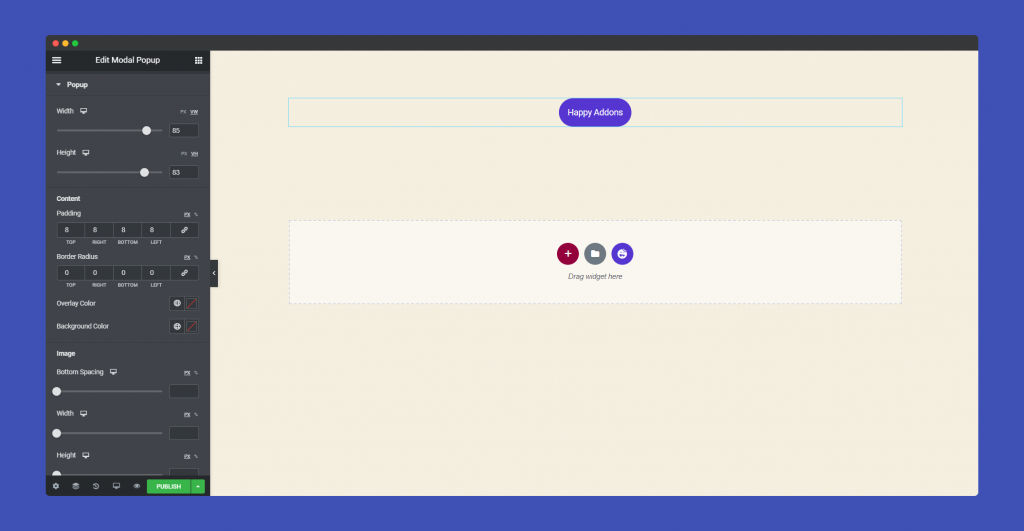
As for the Popup part, you can width, height, padding, border-radius, typography, box-shadow, background-color for content, image, title, description, close button of the pop-up.
Step 4:
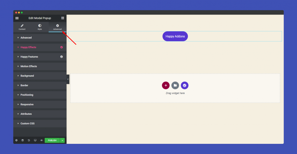
If you want to add motion effects, happy effects, background or make it responsive and more intriguing, click on ‘Advanced‘ to explore those options. the ‘Advanced‘ is a default feature of Elementor. Give a read to this Document to know more about Advanced features and its uses.
Using Shortcode
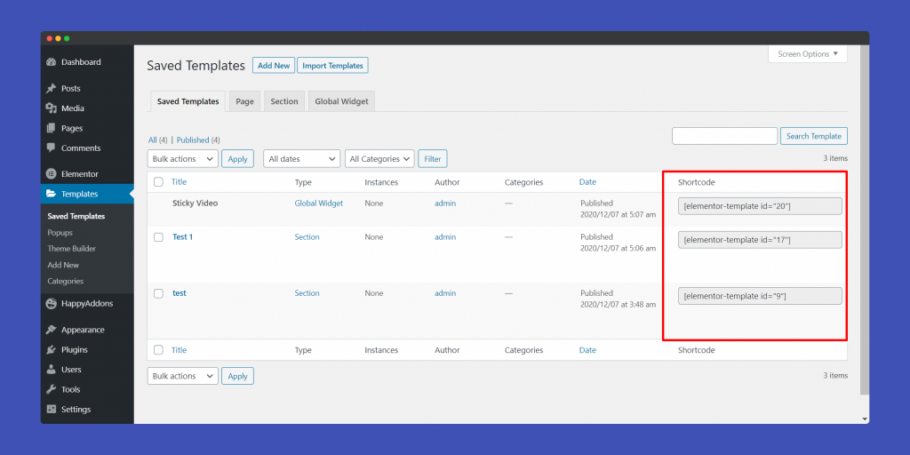
Remember, you could enable shortcode on the content section. To use shortcodes, you need to navigate to Templates-> Saved Templates. There you will find the shortcodes for your saved templates and global widgtes.
Save as Template
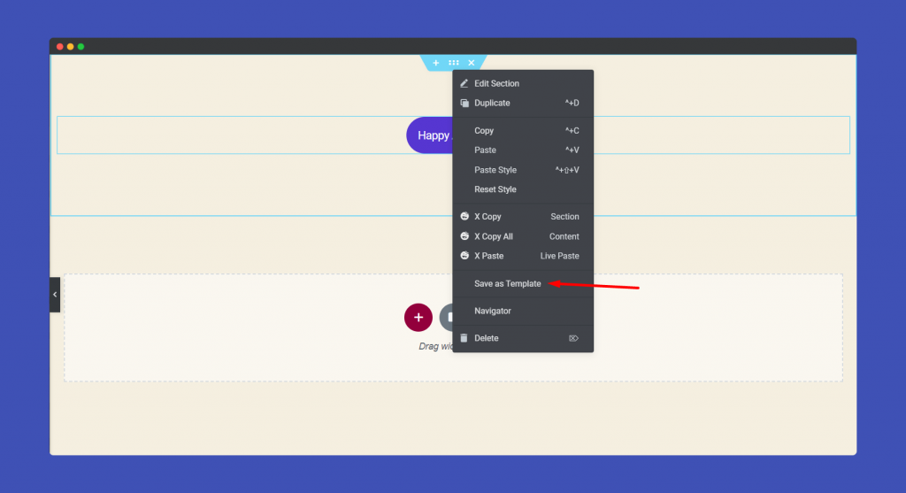
To use templates on your Modal Pop-up, you need to first save a template. That is easy. You can any of the Happy templates or blocks. Or you can create your own design.
Then when you right-click on the section you will get the option Save as template. That way your template will saved in the template library.
Save as Global Widget
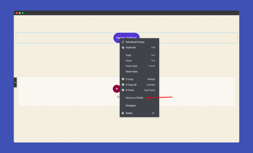
For using widget on your pop-up, just right click on the widget and choose Save as a Global. That’s it.
That’s it!
Modal Popup Enhancement in HappyAddons Version 2.11.3
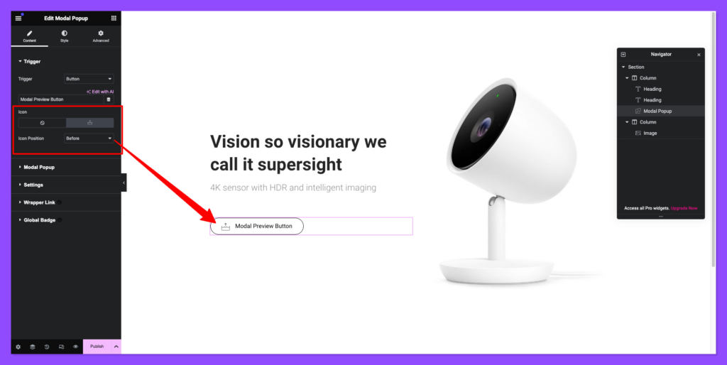
From this version of HappyAddons, you will get an option to add an icon in your modal popup button.
Icon Alignment Facility
- You can change the icon from the content tab,
- Also, you can set the position of the icon before button text or after text.
Styling the Icon
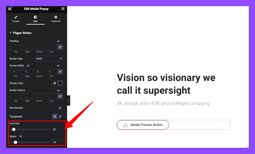
You can change the icon size and the add space between the icon and the text from the style section of the widget panel.
Note: the icon will pick the color of your typography color of the button.
